
22 Fineline Tattoos That Work With Your Body (Not Against It)
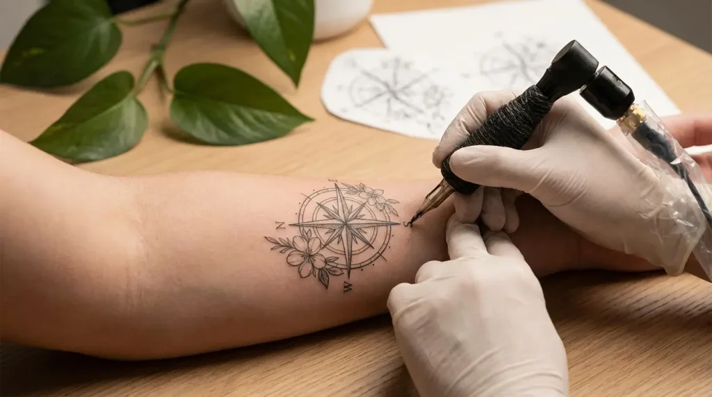
Table of Contents
Anatomy-Conscious Placements
-
Inner Wrist River Flow
-
Collarbone Branch Extension
-
Ribcage Constellation Map
-
Ankle Wraparound Vine
-
Behind-the-Ear Minimalist Symbol
Designs That Age Gracefully
-
Single-Weight Line Portrait
-
Geometric Shape Cluster
-
Delicate Text in Sans Serif
-
Botanical Stem Study
Movement-Responsive Concepts
-
Finger Side Micro Element
-
Forearm Directional Arrow
-
Shoulder Blade Asymmetric Design
-
Spine Vertical Alignment
-
Calf Muscle-Following Curve
Visibility Control Options
-
Upper Thigh Hidden Phrase
-
Inner Bicep Concealed Image
-
Underboob Centered Motif
-
Lower Back Waistband Design
Scar Integration & Skin Storytelling
-
Surgical Scar Transformation
-
Stretch Mark Incorporation
-
Birthmark Frame Design
-
Self-Harm Scar Reclamation
TL;DR
Don’t have time for 3000 words? Here’s what matters:
-
Your body moves. Your tattoo should work with that, not fight it. (Seriously, this is the whole thing.)
-
Where you put it matters way more than how intricate the design is. A simple line in the right spot beats a complex piece in the wrong one every time.
-
Your skin’s gonna change. Smart fineline work plans for that from day one.
-
Need to keep it hidden for work? Some placements stay completely covered in professional clothes.
-
Scars, stretch marks, birthmarks? Those can become part of the design instead of something to hide.
-
Single-needle work fades differently than traditional tattoos. Budget for touch-ups.
-
Good fineline artists are booked out months in advance. If someone can see you next week, ask yourself why they’re not busy.
Fine line tattoos have blown up from a niche technique into one of the most requested styles out there. Makes sense. Delicate lines that feel more like drawings than traditional ink. Designs that whisper instead of shout. An aesthetic that works for people who want body art without the visual weight of bold traditional work.
Most people scrolling through inspiration boards at 2am don’t think about this: your body isn’t a flat canvas. With excellent care, many fine line tattoos still read clearly after a decade, but only when they’re designed with your body’s reality in mind from the start.
The difference between fine line tattoos that age gracefully and those that become a blurry regret? Understanding how your skin moves, stretches, and changes texture over time. I’m not here to talk you out of delicate work. I’m helping you make smarter choices that set you up for fine line tattoos you’ll still love in twenty years.
These 22 approaches treat your body as a collaborative partner in the design process rather than an obstacle to work around.
Anatomy-Conscious Placements
Look, most people choose fine line tattoos for their delicate appearance, then slap them onto body parts that distort the design every time they move.
Let’s flip that.
Your tendons, bones, and muscle groups create built-in guidelines. Think of your skeleton as the world’s most personalized stencil. When you align ultra-thin lines with the structures already under your skin, you get fine line tattoos that look intentional from every angle instead of warped half the time.
Your anatomy does half the artistic work if you let it.
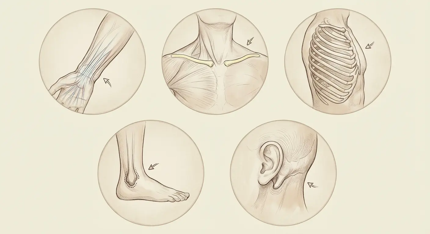
The Real Talk on What Actually Works
|
Body Feature |
Best Fineline Application |
Why It Works |
Visibility Level |
Honest Take |
|---|---|---|---|---|
|
Tendons (wrist, hand) |
Linear flows, delicate branches |
Natural movement guides, minimal distortion |
High – visible in daily life |
High visibility means constant sun exposure. Use sunscreen religiously. |
|
Bone prominences (collarbone, ankle) |
Horizontal/curved line work |
Stable placement, minimal fat padding |
Medium to High – depends on clothing |
Hurts like hell because bone = nerve proximity, but ages beautifully |
|
Ribcage structure |
Constellation patterns, dot work |
Creates living movement with breathing |
Low to Medium – easily concealed |
Prepare for the weirdest ticklish-painful sensation of your life |
|
Spine alignment |
Vertical designs, geometric patterns |
Follows body’s central axis |
Low – requires intentional reveal |
Can’t see it yourself without mirrors, but it’s a power move |
|
Joint areas (behind ear, inner elbow) |
Small symbols, minimal designs |
Naturally framed by body contours |
Variable – highly controllable |
Behind ear is loud as hell during the process. Not painful, just annoying. |
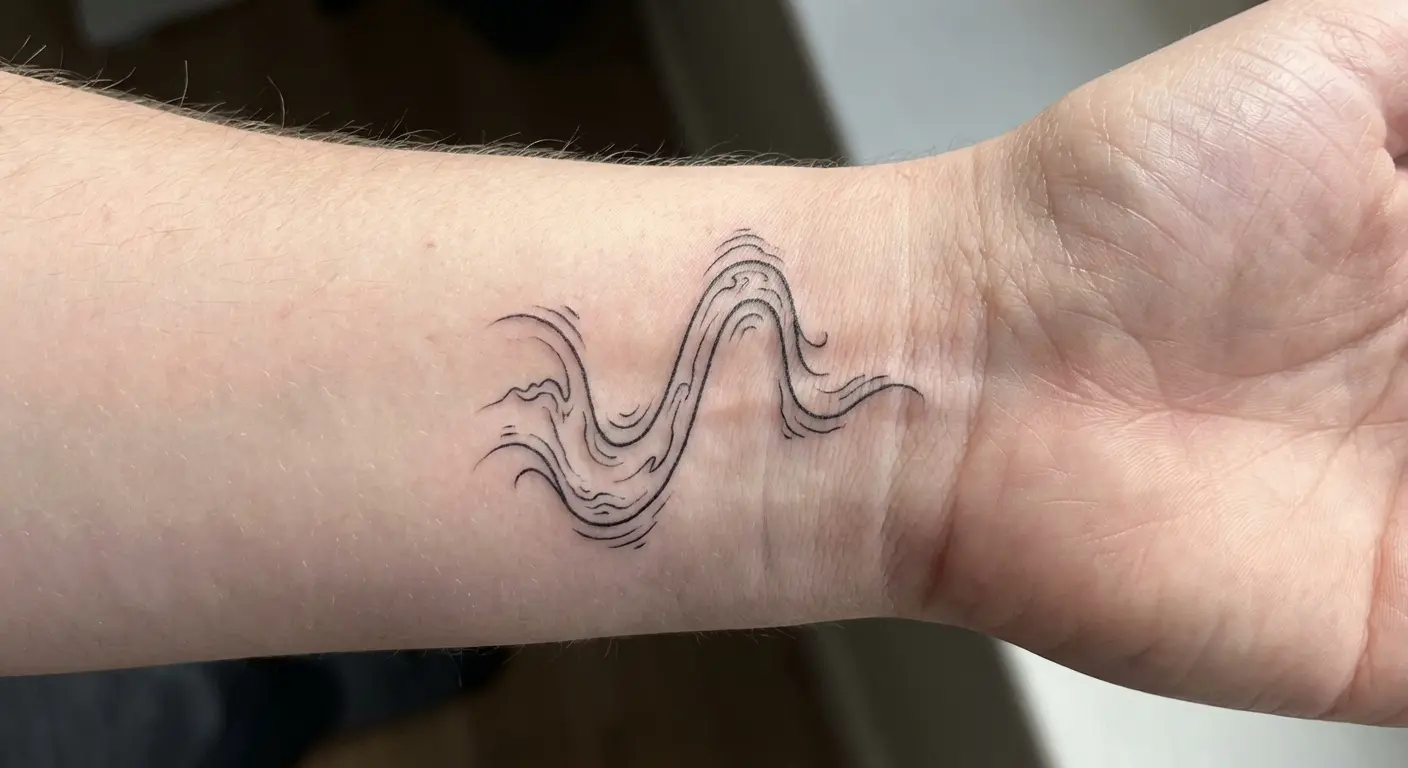
1. Inner Wrist River Flow
Look at your wrist when you flex your hand. See those tendons? That’s your guideline right there.
A fineline tattoo following these pathways looks like it’s part of your circulatory system. I’m talking about designs that run parallel to your flexor carpi radialis. You don’t need to remember that name, just look at the prominent tendon on your inner wrist when you bend your hand back.
Think: a single willow branch that follows your tendon, not a whole tree trying to fit in an inch of space. Simple flowing lines, abstract water imagery, or minimalist branches work here. The key is keeping the design narrow enough that it sits between tendons rather than spanning across them.
When you rotate your wrist, the tattoo moves with your anatomy instead of warping across it. It’s subtle but makes all the difference.
One thing that makes this work better: position the design slightly off-center toward your thumb side where the tendon definition is clearest. Your artist will know what I mean.
2. Collarbone Branch Extension
Nobody thinks about their collarbone as a design element, but it’s basically a built-in frame for your upper chest.
Your clavicle provides a natural horizontal line that most people ignore when planning chest pieces. Fineline work that follows this bone’s curve (and it does curve more than you’d think) creates an elegant frame. Delicate branch designs, geometric line work, or text that follows the bone’s path all benefit from this placement.
The collarbone sits close to the skin surface with minimal fat padding. Less ink spread over time. You’re essentially tattooing on a shelf that doesn’t shift much with weight fluctuations.
The pain level here is real. I’m not gonna sugarcoat it. Bone proximity means nerve proximity. That needle-on-bone vibration is intense. But the longevity payoff makes it worthwhile for the right design.
If you’re exploring delicate branch designs or other options, a fine line tattoo generator can help you visualize how different botanical elements will follow your collarbone’s natural curve before committing to the design.
3. Ribcage Constellation Map
Here’s what’s cool about ribs: they move every time you breathe.
Fine line tattoos featuring constellations or dot-work designs placed here move subtly, giving the tattoo a living quality. Position individual stars or connection points on the spaces between ribs rather than directly over the bone. This creates a gentle wave effect when you breathe deeply.
The design appears static when you’re still but gains dimension during movement.
Size matters here. Too large and the design distorts awkwardly, too small and it gets lost in the natural shadows your ribcage creates. Aim for a palm-sized area that spans three to four rib spaces maximum.
Side note: Orion’s belt works. The entire Milky Way doesn’t.
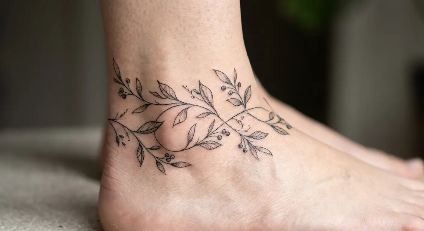
4. Ankle Wraparound Vine
Your ankle bones create natural anchor points for designs that need to wrap around a cylindrical form. Except your ankle isn’t actually round, which is where most people screw this up.
A fineline tattoo featuring a vine, chain, or abstract line that starts on one ankle bone and curves around your Achilles tendon to the other side follows your body’s existing architecture. But here’s the thing: your ankle is wider side-to-side than front-to-back.
Designs need to concentrate more detail on the sides where there’s more visible real estate and simplify across the front and back where space compresses. This creates visual balance when viewed from any angle instead of looking stretched or compressed depending on the perspective.
Your artist needs to account for this or it’ll look weird from certain angles.
5. Behind-the-Ear Minimalist Symbol
The spot behind your ear offers a flat canvas about the size of a quarter that’s naturally framed by your ear’s curve and hairline.
Fine line tattoos featuring symbols, small geometric shapes, or tiny illustrations work here because the placement itself makes them feel intentional rather than random. Your ear creates a natural border that gives even the simplest design a sense of completion.
Visibility is completely controllable based on hairstyle. The skin here is thin and the tattoo process is loud. You’ll hear the needle more than feel it. That buzzing goes straight into your skull. It’s not painful, just really, really annoying.
Healing is typically straightforward since the area doesn’t flex or stretch much during normal movement.
Designs That Age Gracefully
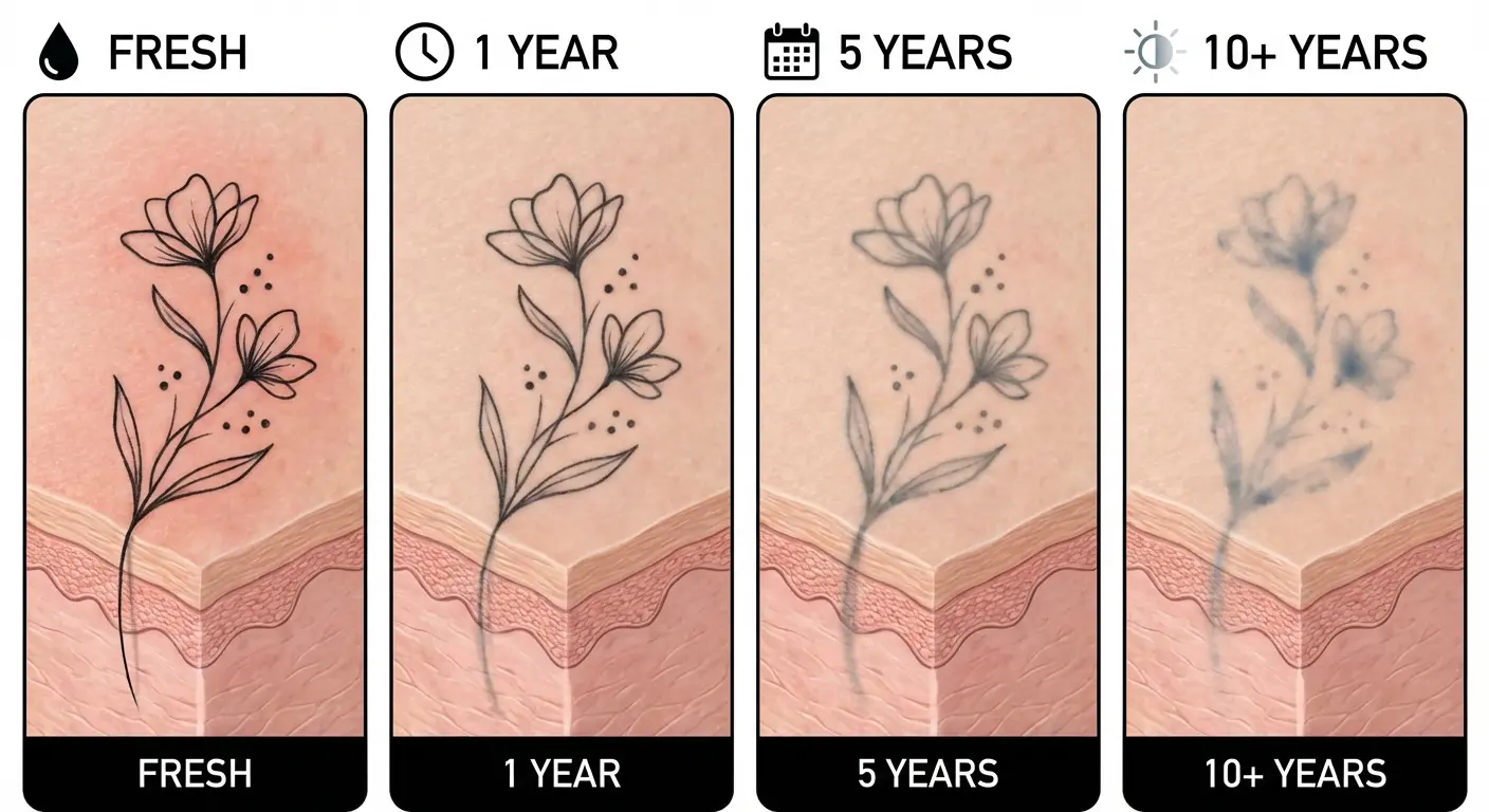
Here’s what your Instagram feed won’t tell you: fine line tattoos age differently than traditional work.
Thinner lines have less room for error as your skin changes texture, elasticity, and tone over decades. Look, fineline work can absolutely last. I’ve seen gorgeous pieces that are 30+ years old. But certain design choices set you up for better long-term results, and others pretty much guarantee you’ll need major touch-ups or end up with a blurry mess.
According to tattoo artist Jason Schroeder, also known as Mr. Incognito, “I have seen gorgeous fine line work that is over 30 years old. It is soft and gray but still has great definition and readability.” The key difference between pieces that maintain their integrity and those that don’t comes down to initial design choices that account for how ink naturally settles and spreads microscopically over decades.
You’re planning for fine line tattoos you’ll have at 60, not just the ones you’ll photograph next week.
6. Single-Weight Line Portrait
Portrait tattoos typically rely on shading gradients and multiple line weights to create dimension. Fine line tattoos featuring portraits flip that approach by using one consistent line weight throughout.
You’re essentially getting a continuous-line drawing etched into your skin.
This style ages better because there’s no shading to blur or fine detail to disappear. The portrait reads as an artistic interpretation from day one, which means it’ll still read that way in 20 years. Your artist traces the essential contours of a face: jawline, nose bridge, eye shape, without attempting photorealism.
As the lines naturally thicken slightly over time, the portrait maintains its integrity because it was never dependent on hairline details. It was always meant to look like a sketch, not a photograph.
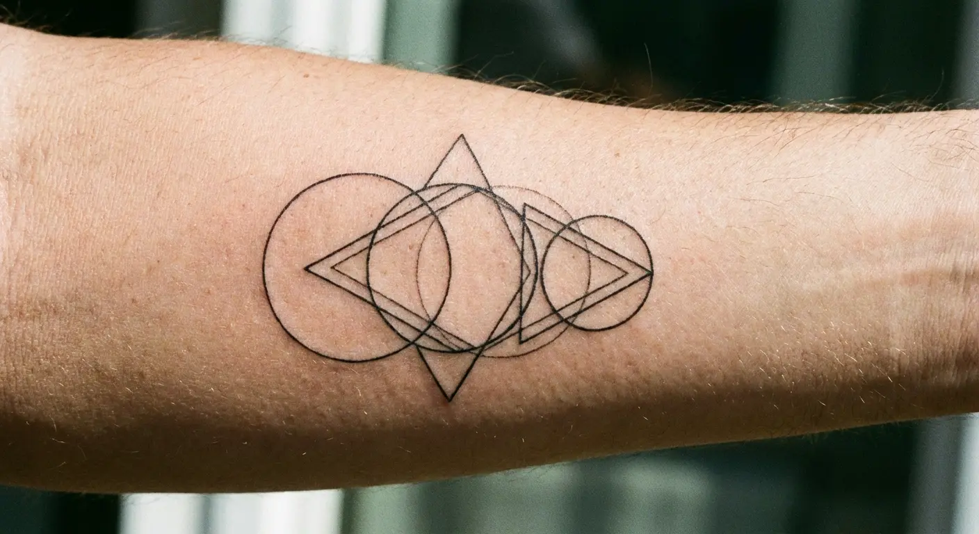
7. Geometric Shape Cluster
Simple geometric shapes in fineline weight have built-in longevity because their success doesn’t depend on intricate detail.
A cluster of overlapping circles or a pattern of triangles can blur slightly at the edges over time without losing their essential identity. You’ll still clearly see circles and triangles, just with softer edges.
The design reads from a distance, which matters as skin texture changes. Avoid geometric designs that rely on perfect symmetry or razor-sharp points. Instead, embrace slightly irregular shapes and varied spacing that look intentional now and will still look intentional when the lines have naturally spread by a fraction of a millimeter.
Want to test different shape combinations before committing? Mess around with a geometric tattoo generator to see how various configurations work together. It’s not a replacement for working with your artist, but it gives you both a clearer starting point.
8. Delicate Text in Sans Serif
Script fonts and elaborate lettering might look elegant fresh, but they’re aging nightmares in fineline weight. I’ve watched too many beautiful script pieces become illegible blurs.
Letters need internal space to remain legible as lines naturally thicken. Sans serif fonts (think Helvetica, Futura, or similar clean styles) maintain that internal space better than decorative options.
Keep text to single words or very short phrases. Each letter should be at least a quarter-inch tall for fineline work, and there should be clear space between each character. Your artist might push for larger sizing, and they’re right. Text that feels too big now will be perfectly readable in 15 years. Text that feels perfectly sized now might be illegible by then.
Skip the script font. I don’t care how much you love it.
9. Botanical Stem Study
Highly detailed flower tattoos with shaded petals and intricate stamens don’t translate well to fineline work long-term. Botanical line drawings that focus on stems, leaves, and basic flower outlines do.
You’re getting the suggestion of a plant rather than a photographic reproduction.
This approach ages gracefully because the design’s success depends on overall shape and flow rather than fine detail. A simple tulip outline will still read as a tulip even if the line has spread slightly. The organic nature of plant forms also means slight imperfections over time look natural rather than like deterioration.
Your skin’s aging process becomes part of the artwork’s character instead of working against it.
Before you commit to a specific botanical design, try playing with a flower tattoo generator to preview how different stem and leaf configurations will translate to fineline work on your specific placement. Some arrangements just work better than others.
Movement-Responsive Concepts
Your body doesn’t hold still. Even when you’re standing in neutral position, your muscles create subtle contours that shift with every gesture.
Fine line tattoos in high-movement areas need to account for this reality instead of pretending you’re a static canvas. These placements work with your body’s kinetic nature. The tattoo’s appearance changes based on your position, creating multiple “versions” of the same design depending on how you’re holding yourself.
This isn’t a flaw to work around. It’s a feature to exploit.
The right design in a high-movement area becomes interactive artwork that responds to your daily life.
10. Finger Side Micro Element
Let’s be real: finger tattoos fade faster than almost any other placement. Constant washing, friction, and sun exposure see to that.
But the side of your finger offers better longevity than the top or palm-side. A tiny fineline element here (a small symbol, single word, or minimal icon) changes appearance based on hand position. When your hand is relaxed, the tattoo faces outward. When you gesture or hold objects, it rotates with your finger movement.
The design needs to be simple because you’re working with maybe an inch of usable space.
Expect this to need touch-ups more frequently than other placements. I’m talking every 2-3 years if you want it to stay crisp. But the visibility control (completely hidden in a fist, visible when gesturing) makes it worth the maintenance for some people.
If you’re considering finger placement, try a hand tattoo generator to visualize how micro elements will appear from different angles and hand positions. It helps you understand what you’re actually signing up for.
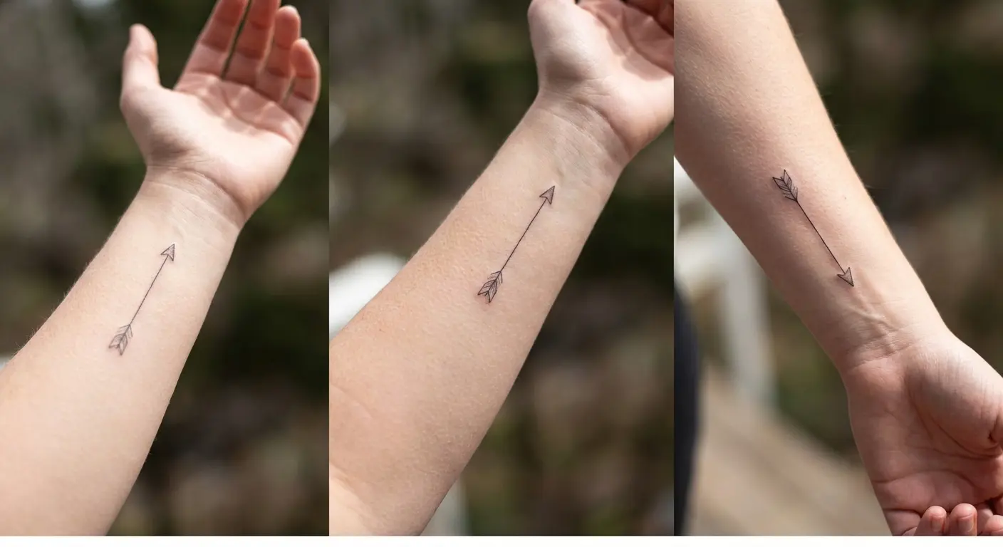
11. Forearm Directional Arrow
An arrow or linear design on your inner forearm points different directions based on arm position. It’s kinda trippy when you first notice it.
When your arm hangs at your side with palm facing back, the arrow points one way. Rotate your palm forward and the arrow shifts orientation. Extend your arm and the arrow points outward. This creates a design that’s never static.
The inner forearm offers good visibility and relatively low distortion during normal movement. The skin here is also more forgiving than areas with significant muscle bulk.
A simple directional element (arrow, line with endpoint, or abstract pointer) takes advantage of your arm’s natural rotation without requiring the design to be large or complex.
12. Shoulder Blade Asymmetric Design
Ever notice how your shoulder blade shifts when you reach? Your scapula moves independently from your spine, creating a shifting canvas whenever you reach, lift, or rotate your shoulder.
An asymmetric fineline tattoo here (something that’s intentionally off-balance or weighted to one side) looks different when your shoulder is relaxed versus when you’re reaching forward. The design appears to shift position even though it’s obviously stationary.
This works best with abstract line work, geometric shapes, or botanical elements that don’t have a “correct” orientation. Avoid symmetrical designs that will look off-center during movement. You want a piece that looks intentional in multiple positions rather than perfect in only one.
13. Spine Vertical Alignment
A fineline design running vertically along your spine follows your body’s central axis. When you stand straight, the design is perfectly vertical. Bend forward and it curves with your spine’s flexion. Arch backward and it follows that movement too.
This placement works for text, abstract lines, geometric patterns, or botanical stems. Keep the design narrow (no wider than your actual spine) so it moves as a unit rather than distorting across your back muscles.
Your spine provides a natural guideline that most artists can follow without a stencil for the initial placement. The tattoo becomes a visual extension of your skeletal structure.
Can’t see it yourself without mirrors, but it’s a power move.
For back placement designs that follow your spine’s natural alignment, a back tattoo generator can help you visualize how vertical elements will interact with your body’s central axis during movement.
14. Calf Muscle-Following Curve
Watch someone with a calf tattoo walk away. See how it shifts? That’s what I mean.
Your calf muscle creates a natural curve from behind your knee down to your Achilles tendon. Fine line tattoos that follow this curve appear to wrap around your leg even though they’re running straight down the muscle’s centerline.
When you flex your calf (standing on your toes), the muscle bulges and the tattoo’s curve becomes more pronounced. When you relax, the curve softens. This creates a subtle animation effect during normal walking.
Linear designs, flowing botanical elements, or abstract curved lines all work here. The design should follow the muscle’s natural path rather than trying to wrap around your leg circumference.
Visibility Control Options
Professional contexts, family situations, or personal preference might require tattoo visibility control. Yeah, workplace discrimination based on visible tattoos is still a thing in 2025. Some industries don’t care anymore. Others very much do.
These placements give you complete autonomy over who sees your ink and when. I’m not talking about spots that are “sort of” concealable with the right outfit. These are spots that remain completely hidden in standard clothing and only become visible when you choose to reveal them.
This level of control matters for people who want meaningful fine line tattoos without constant public commentary. You get the personal significance of the piece without making it everyone else’s conversation starter.
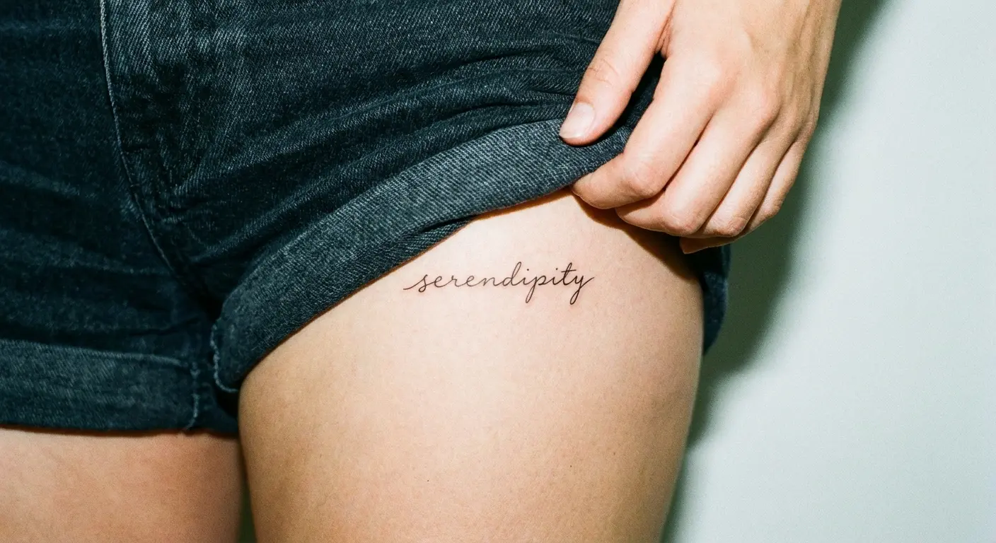
15. Upper Thigh Hidden Phrase
The upper thigh (high enough that standard shorts don’t reveal it) offers a large, flat canvas that’s completely concealed in professional clothing.
Fine line tattoos featuring text, quotes, or small illustrations here remain private unless you’re in a swimsuit or choosing to show someone. The skin on your upper thigh is relatively stable. Less prone to dramatic stretching than your lower abdomen. Good ink retention.
This placement works particularly well for text-based tattoos that carry personal meaning you don’t want to explain to strangers. The area is large enough for multiple lines of text or a palm-sized illustration while remaining completely hidden under standard pants, skirts, or dresses.
Your grandma might have opinions about tattoos. This placement means you control when she sees them.
16. Inner Bicep Concealed Image
The inner bicep (the part that faces your ribs when your arm hangs naturally) stays hidden in short sleeves and completely concealed in long sleeves.
A fineline tattoo here only becomes visible when you lift your arm or deliberately show someone. The placement offers good visibility control while remaining easily accessible for you to see (unlike your back or shoulder blade).
The skin here moves with your arm but doesn’t stretch dramatically during normal activity. Designs work best when oriented to read correctly when you lift your arm to look at them, not when your arm is hanging down.
This creates a tattoo that’s primarily for you rather than public display.
17. Underboob Centered Motif
The sternum area directly under your breasts (or pecs) remains completely hidden under any standard clothing. A fineline design here can be surprisingly large while maintaining total concealment.
The placement offers a flat, central canvas that’s ideal for symmetrical designs, centered text, or geometric patterns. The skin here is relatively protected from sun exposure, which helps with long-term ink retention.
Pain level varies significantly based on individual anatomy. I’m not gonna lie, it can be intense. But the privacy payoff makes it worthwhile for people who want meaningful work that’s never on public display.
This placement is entirely for you and whoever you choose to share it with.
18. Lower Back Waistband Design
Yes, I’m talking about the area that got unfairly stigmatized in the early 2000s.
The lower back offers a wide, relatively flat canvas that’s completely hidden under standard clothing waistbands. Modern fine line tattoos here look nothing like the tribal pieces that gave the placement a bad reputation. Let’s move past that, yeah?
Delicate botanical designs, geometric patterns, or abstract line work positioned just above your waistband remain concealed in professional settings and only appear in casual wear or swimwear.
The placement has practical advantages: minimal sun exposure, stable skin that doesn’t stretch dramatically with weight fluctuations, and easy visibility for you (with a mirror) if you want to check healing progress.
Working With Scars and Marks You Already Have
Your skin already tells a story. Surgical scars, stretch marks, birthmarks, and other features are part of your body’s history.
These approaches integrate existing skin characteristics into fineline designs rather than trying to cover or erase them. I’m talking about fine line tattoos that acknowledge your skin’s reality and work with it.
This perspective shift turns what some people see as “flaws” (problematic word, I know) into design opportunities. Your skin’s existing features can become compositional elements that make your tattoo more meaningful and structurally unique.
Nobody else will have the exact same design because nobody else has your exact skin.
The approach of working with your body’s existing features rather than against them is gaining recognition in the tattoo community. Our Culture Mag recently highlighted six fine line tattoo artists for 2026, including London-based Lauren Beck who specializes in elegant botanical work and minimalist abstract designs that prioritize working with the body’s natural contours, and Vancouver-based Pauline whose marine life pieces demonstrate how slightly bolder lines can still maintain fineline elegance while adapting to individual body characteristics.
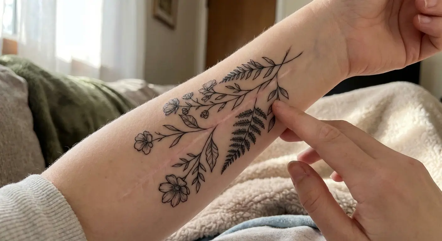
19. Surgical Scar Transformation
Surgical scars create lines that fine line tattoos can incorporate as design elements rather than obstacles.
A mastectomy scar becomes the stem of a botanical piece. A C-section scar transforms into the horizon line of a landscape. An appendectomy scar gets integrated into geometric line work as one of the structural elements.
You’re working with an artist who understands that you’re not trying to hide the scar but rather give it new context. The scar tissue takes ink differently than surrounding skin (sometimes darker, sometimes lighter), which creates natural variation in the design.
This approach acknowledges your body’s history while adding a layer of chosen meaning. You’re not erasing what happened. You’re deciding what it means going forward.
20. Stretch Mark Incorporation
Stretch marks create natural line patterns that fineline designs can echo or intersect with intentionally.
Abstract line work that follows the same direction as your stretch marks creates visual harmony. Botanical designs where individual leaves or petals align with stretch mark patterns make the marks look like part of the intended composition.
The texture difference between stretch marks and surrounding skin adds dimension to fineline work that flat skin can’t provide.
Your artist needs to understand that you’re embracing these marks as part of the design rather than trying to camouflage them. The stretch marks remain visible (tattooing over them doesn’t make them disappear), but they become integrated into artwork that you chose rather than changes that just happened to you.
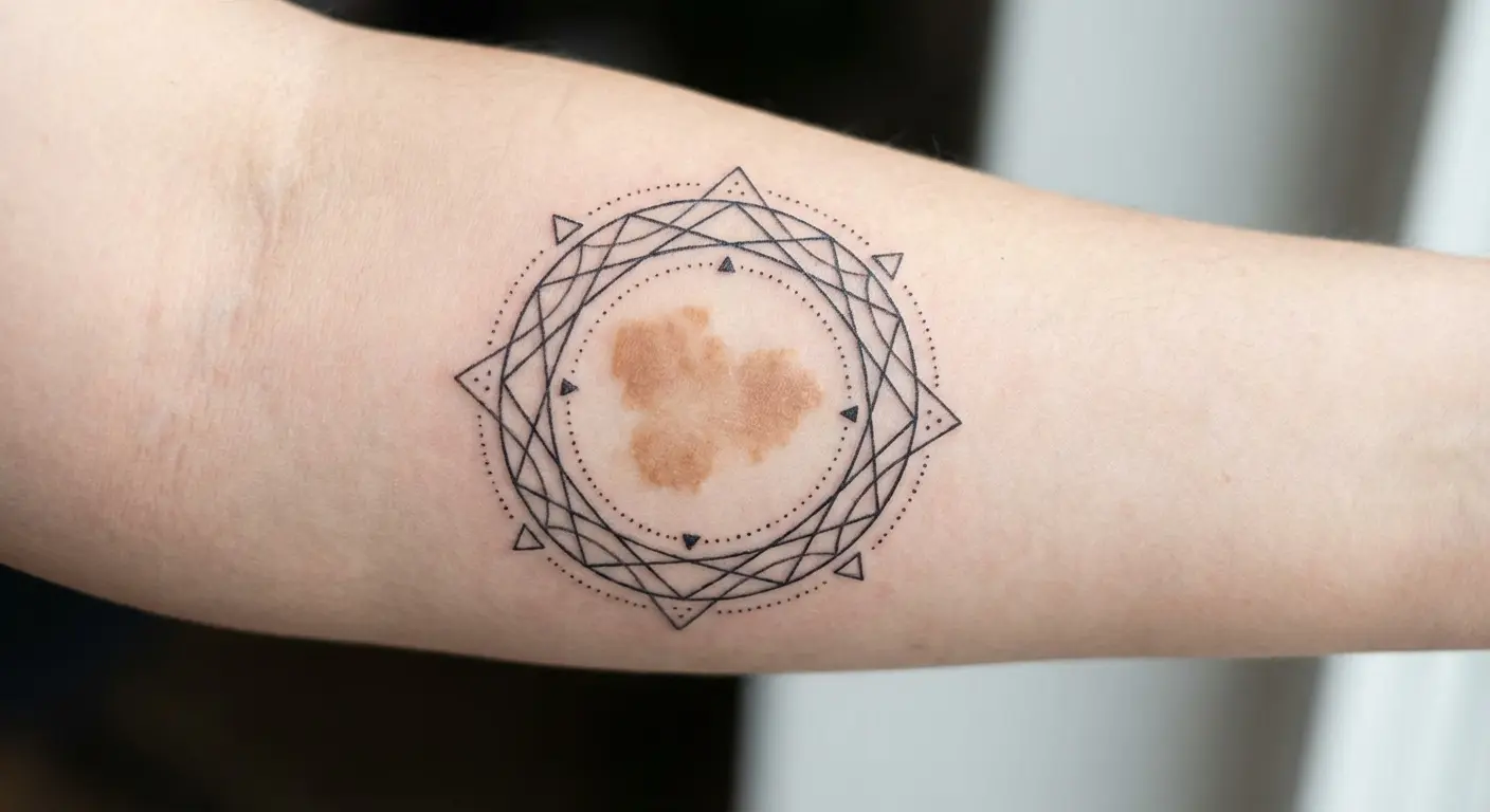
21. Birthmark Frame Design
Birthmarks offer natural focal points that fineline designs can frame or incorporate. A circular birthmark becomes the center of a geometric pattern. An irregular birthmark gets framed by delicate botanical elements that make it look like an intentional design choice.
Abstract line work can radiate from a birthmark or create a border around it.
This approach works particularly well for birthmarks you’ve always had mixed feelings about. You’re not covering them (which rarely works anyway since birthmarks often show through tattoo ink) but rather giving them a new visual context.
The birthmark becomes part of a larger composition that you controlled.
Some birthmarks affect how ink takes, so expect potential variation in line consistency where the tattoo crosses the mark. That’s part of the character.
22. Self-Harm Scar Reclamation
Self-harm scars represent a painful history that many people want to acknowledge without being defined by.
Fine line tattoos can integrate these scars into new imagery that represents recovery, growth, or simply moving forward. Delicate line work that incorporates scar lines as part of a larger pattern, text that spans across scars to create a unified message, or botanical growth imagery that uses scars as stems or branches all offer reclamation options.
This is deeply personal work that requires an artist who approaches the project with sensitivity and understanding. Not every artist is equipped for this, emotionally or technically. Choose carefully.
The scars remain visible (tattooing doesn’t erase them), but you’re adding chosen imagery that shifts the narrative. You’re deciding what this skin means now rather than letting the past have the final word.
The tattoo becomes a marker of survival and agency.
What to Ask Your Artist Before You Commit
You’ve probably seen fine line tattoos that looked incredible fresh but didn’t age well. The problem usually isn’t the artist’s skill but rather a mismatch between design ambition and placement reality.
Fineline work requires different planning than traditional tattooing. You can’t just shrink down a complex design and expect it to hold up. Line weight, spacing, and body placement all need to work together.
Here’s what actually matters when you’re sitting down for that consultation:
Ask to see healed work. Not just fresh photos. I want to see pieces that are 3-5 years old minimum. If they can’t show you any, that’s a red flag. Either they’re new to fineline (not necessarily bad, but you should know), or their work doesn’t age well (definitely bad).
Discuss your lifestyle honestly. If you’re a rock climber, your hands take constant abuse. If you’re a chef, you’re washing your hands 50 times a day. If you work construction, you’re in the sun constantly . Your artist needs this information to guide placement and design choices.
Talk about your pain tolerance. Some placements hurt more than others. Ribs? Yeah, it hurts. Anyone who says otherwise is lying or has a freakish pain tolerance. If you’re worried about pain, say so. A good artist will work with you on placement and maybe break the session into shorter appointments.
Budget for touch-ups. Fineline work isn’t one-and-done. Depending on placement and your skin, you might need a touch-up in 3-5 years. Sometimes sooner. Ask about their touch-up policy upfront.
Question size recommendations. If your artist is pushing you toward a bigger or bolder version, listen. They might know something about how it’ll age that you don’t. I’ve seen too many people insist on tiny, intricate designs that became blurry messes within a few years.
Don’t get fineline text smaller than a quarter inch tall. Your future self will thank me.
Understand the timeline. From consultation to fully healed, expect 2-4 months minimum. Good fineline artists are booked out. If they can see you next week, ask yourself why they’re not busy. Healing takes 2-3 weeks for the surface, 3-6 months for full settling.
Discuss cost realistically. Fineline work isn’t cheaper just because it uses less ink. You’re paying for skill and precision. Expect to pay $150-300/hour minimum for someone good. Small doesn’t mean cheap.
Finding the Right Artist
Not every good tattoo artist is good at fineline. It’s a specific skill set that requires a steady hand, an understanding of how ink spreads in skin over time, and experience with how different placements age.
Look for artists whose portfolio shows:
-
Healed fineline work, not just fresh pieces
-
Variety in placement (shows they understand body anatomy)
-
Clean, consistent line weight
-
Designs that work with the body rather than fighting it
Red flags:
-
Only fresh photos, no healed work
-
Pushing you toward designs that are too small or intricate
-
Can’t explain why they’re recommending certain placements
-
Dismissive when you ask about aging or touch-ups
-
Available immediately (good artists are booked out)
Some artists will tell you fineline work on fingers is pointless because it fades so fast. Others specialize in it. I’m somewhere in the middle. Just know what you’re signing up for.
If your artist says they can do photo-realistic fineline that’ll last forever, walk out.
Timing Your Tattoo
Don’t get a fineline piece right before beach season. Sun exposure during healing equals bad news. The UV damage can affect how the ink settles and cause premature fading.
Winter is actually ideal for healing tattoos in hidden spots. You’re covered up anyway, less sun exposure, and you’re not sweating as much (sweat and fresh tattoos don’t mix well).
If you’re getting married or have a major event, plan for 6+ months before. You want the tattoo fully healed and settled, plus time for a touch-up if needed.
The Real Talk on Skin Tone
Fineline work on darker skin tones requires an artist who knows what they’re doing. Not all do, and that’s a real problem in the industry.
Some placements show contrast better on lighter skin, others on darker. The “barely there” effect looks different depending on your skin tone. Make sure you and your artist are on the same page about visibility and how the design will read on your specific skin.
Don’t be afraid to ask if they have experience with your skin tone. If they get defensive, find someone else.
Still Not Sure?
If you’re torn between two placements, get temporary tattoos and live with them for a week. See which one you actually like having on your body versus which one just looked cool on Pinterest.
Still not sure after all this? That probably means you’re not ready. Sit with it longer. The right design and placement will click when you’re actually ready.
Consult with 2-3 artists and see whose perspective resonates. Different artists will have different takes, and that’s valuable information.
So yeah. That’s 22 options that won’t look like garbage in a decade. Pick the one that makes sense for your body, not the one that looks cool in someone else’s Instagram post.
Your body already has guidelines built in. Use them. Work with your anatomy instead of against it. Plan for the skin you’ll have at 60, not just the skin you have now.
The tattoos that last (both aesthetically and personally) are the ones that acknowledge your body’s reality from the start.