
Tattoo Meaning Starts Before You Step Into the Studio
Why Most People Get This Backwards
You’ve spent hours on tattoo symbolism websites. Lotus = rebirth. Phoenix = transformation. Anchor = stability. You know what all the symbols mean.
Here’s the problem: knowing what something symbolizes doesn’t tell you if you’ll actually want to look at it every day for the next fifty years.
Most people treat meaning like a checkbox. Decide what matters to you, pick a symbol that represents it, book an appointment, and hope for the best. This is backwards, and it causes real problems.
In America, 42% of adults have tattoos, yet about 5% end up getting cover-ups or laser removal. That’s thousands of dollars and hours of painful work that could’ve been avoided. We’re not talking about people who chose meaningless designs. We’re talking about people whose meaningful concepts didn’t translate into satisfying tattoos.
What you feel about a symbol changes when you see it rendered in different styles, sizes, and placements. That powerful phoenix might look overdone when you see it sketched on your forearm. The minimalist mountain range representing your love of nature could feel too sparse on your ribcage.
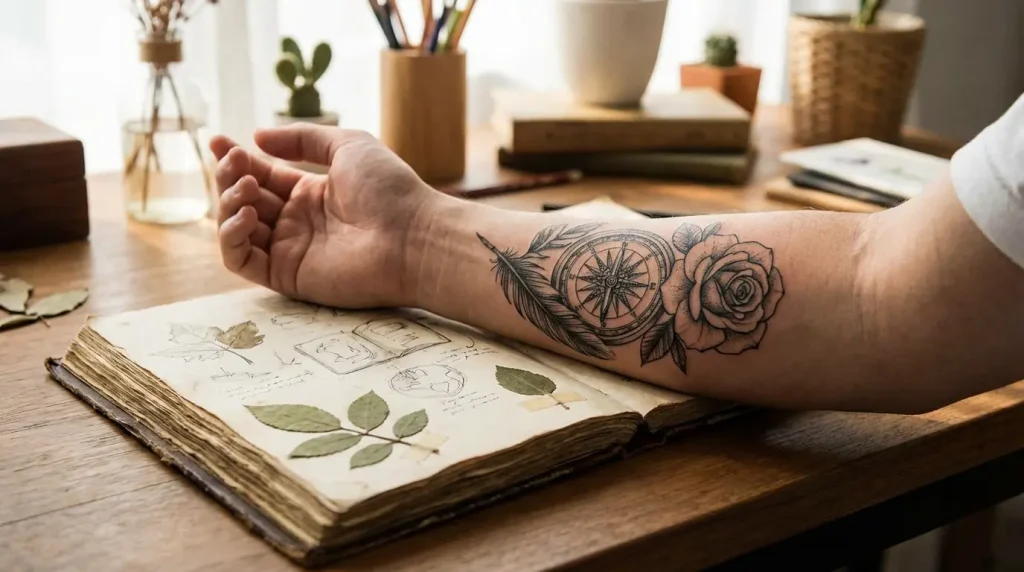
I know a guy who got a compass tattooed on his forearm after his divorce. The whole “finding direction” thing, you know? His artist did this gorgeous traditional sailor compass with thick lines, classic shading, the whole deal.
Six months later, he can’t stand looking at it. Not because the work is bad. It’s technically perfect. But the bold, old-school style feels completely wrong for what he was actually going through. He needed something quieter, more personal. Maybe a simple line-work compass. Maybe something abstract. He’ll never know because he never saw those options.
We’ve been taught to treat tattoo decisions as purely emotional choices. You feel something deeply, you find a visual representation, you make it permanent. But this ignores a crucial middle step: visual testing. Your emotional connection to a concept needs to survive the translation into imagery.
The gap between “this means something to me” and “I want to look at this every day” is where regret lives.
You can have a deeply personal reason for choosing a design and still end up disappointed with how it looks. Both things can be true simultaneously, and pretending otherwise sets people up for expensive mistakes.
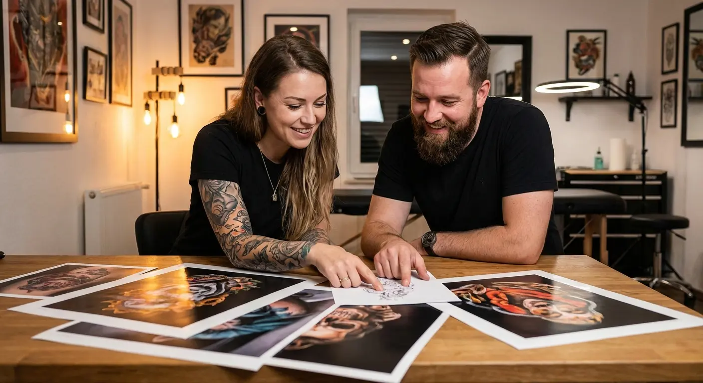
The Part Everyone Skips
Consultation appointments are supposed to solve the communication problem. You sit down with your artist, explain what you want and why it matters, and they sketch something based on your description. Except this process assumes artists are mind readers who can extract visual preferences from emotional explanations.
Research shows that 43% of tattooed people say meaning is the most important factor in their design choice, yet the communication gap between client and artist often undermines even the most heartfelt intentions. You walk in with clear emotional significance and walk out with a design that technically matches your words but doesn’t feel right.
Describing what something means to you verbally is completely different from visualizing it. You might say “I want something that represents my journey through depression” and have a clear feeling about what that means. Your artist hears those words and interprets them through their own visual vocabulary, their own style preferences, their own understanding of how to represent abstract concepts.
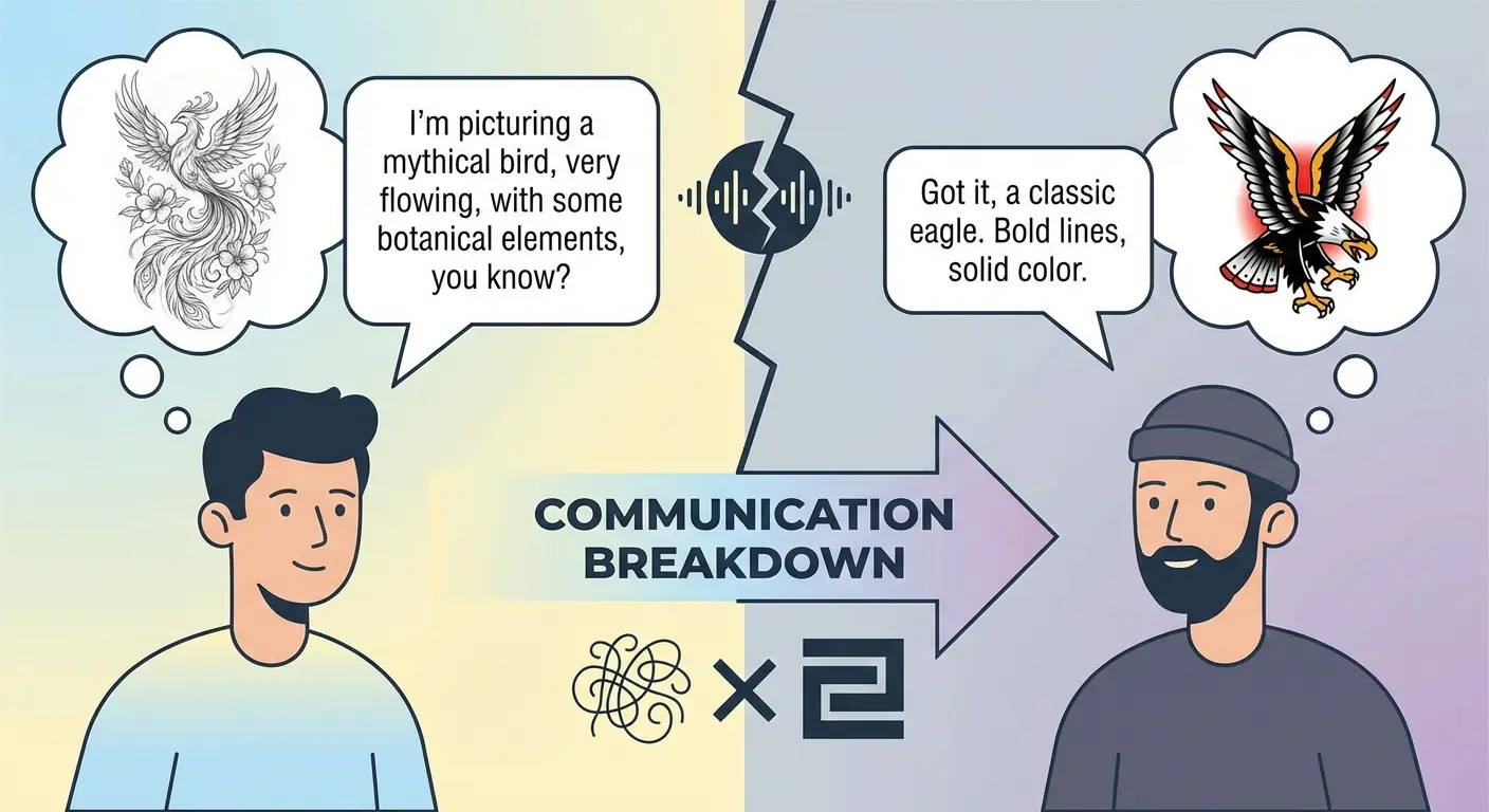
You tell your artist you want “something meaningful about your grandmother.” In your head, you’re seeing something delicate and abstract, maybe the way light looked in her kitchen, translated into soft lines. Your artist hears “memorial piece” and starts thinking portrait or traditional flowers with dates. Neither of you is wrong, but you’re having completely different conversations.
Or you say you want something that “represents strength and resilience.” You’re imagining a personal, subtle reminder of survival. They’re thinking bold imagery like a lion or warrior. You wanted introspective, they delivered confrontational.
The result? You get a design that technically matches what you asked for but doesn’t feel right. It’s not the artist’s fault. They did their job based on limited information. You gave them concepts without giving them visual direction, and those are not the same thing.
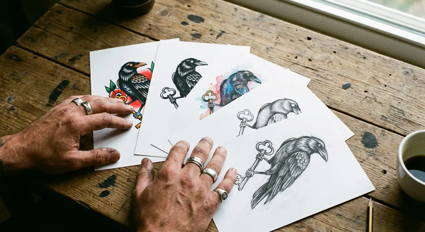
Most people show up to consultations with Pinterest boards full of other people’s tattoos. They point at elements they like (the shading here, the line weight there, the composition from this one) and hope the artist can Frankenstein those pieces into something cohesive.
What’s missing is iteration on your specific concept. Not other people’s finished tattoos, but multiple versions of your idea rendered in different ways. You need to see your meaningful symbol as a thick-lined traditional piece, as a delicate fine-line drawing, as a watercolor splash, as a geometric interpretation. Only then can you know which visual language actually works.
Before you even schedule that consultation, you should have:
Actually seen your idea in 3-4 different styles (not just imagined it)
Figured out what you DON’T want (this is just as important as what you do want)
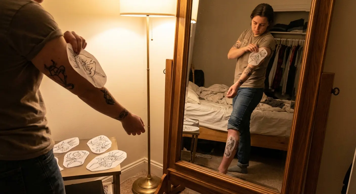
Tested the size at actual dimensions (print it out, hold it up to your arm)
Identified specific visual elements you’re drawn to (line weight, shading style, level of detail)
Written down your questions so you don’t freeze up and forget them
Set a realistic budget based on the size and complexity you’re actually pursuing
The pre-design gap exists because we’ve accepted that tattoo concepts live in your head until an artist draws them once. You get one shot at seeing your idea visualized, and you’re supposed to know immediately if it’s right.
That’s an unreasonable expectation that leads to settling for “close enough.”
Building Meaning (Not Finding It)
Here’s an uncomfortable truth: most traditional symbolism is generic. Roses for love, skulls for mortality, compasses for direction. These meanings are so broad they could apply to literally anyone. You’re not creating something personal by choosing a symbol that millions of other people have chosen for the same reason.
Real meaning comes from specificity. Not the specific symbol, but the specific execution. The way your rose is rendered, the elements surrounding it, the placement on your body, the style that frames it. These decisions create meaning that generic symbolism can’t touch.
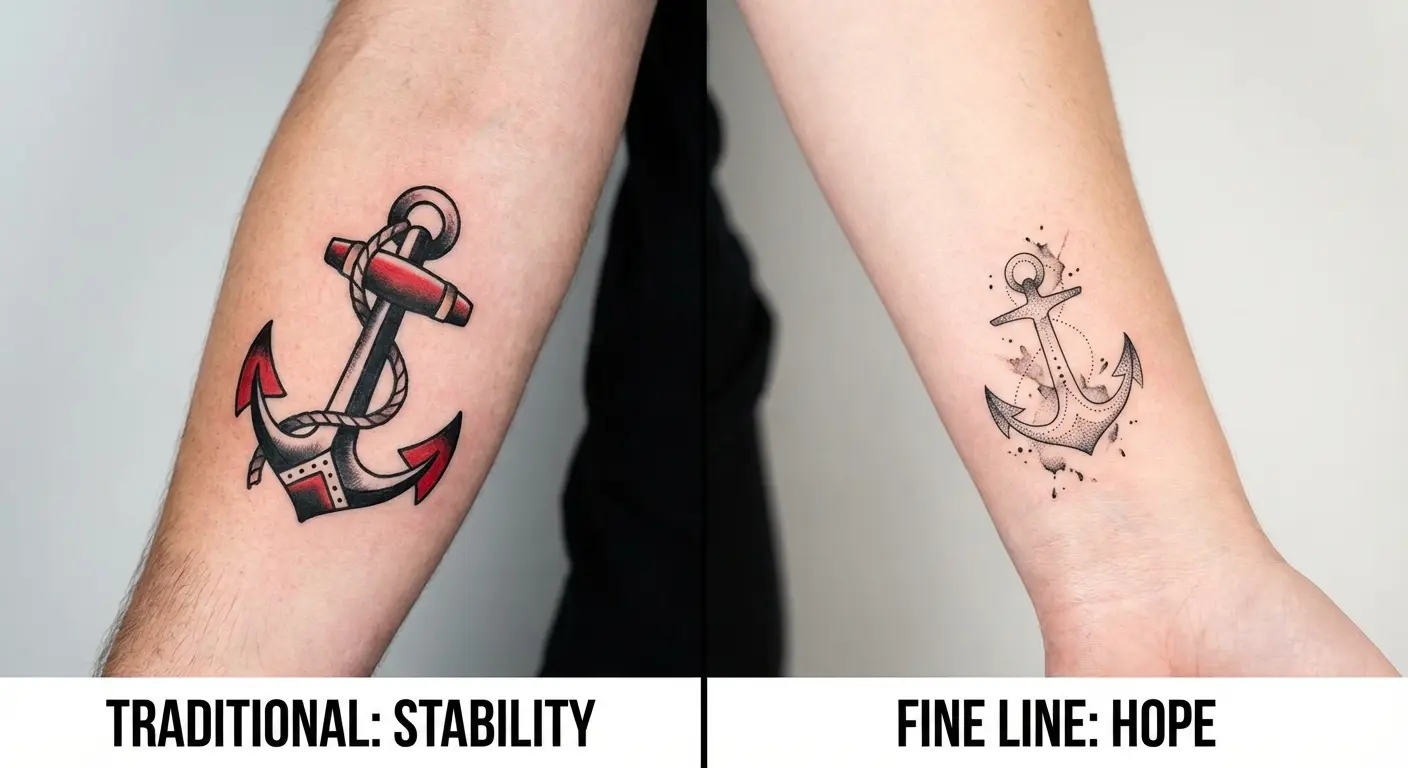
Think about it this way. Two people can get matching anchor tattoos to represent stability. One gets a photorealistic anchor with rope detail on their forearm. The other gets a minimalist line-work anchor behind their ear. Same symbol, same stated meaning, completely different tattoos. The meaning isn’t in the anchor. It’s in everything else.
This is why the design process itself is where meaning gets built.
You start with a concept (maybe that anchor, maybe something else) and you test it visually. You see it bold and see it delicate. You see it isolated and see it incorporated into a larger composition. Through this testing, you discover what resonates.
A client initially wanted a simple tree to represent personal growth after career burnout. During the visual testing phase, they tried versions ranging from a detailed oak tree to abstract geometric branches to a single minimalist sapling. What surprised them was that the detailed, realistic tree (their original vision) felt heavy and overwhelming when they saw it rendered. The minimalist sapling, which they’d only tested out of curiosity, captured the feeling of starting fresh far better than the mature tree ever could.
Sometimes you’ll find that the symbol you thought was perfect doesn’t work at all once you see it rendered. The tree you wanted to represent growth feels cliché when you see it sketched. The geometric pattern you thought would be meaningful just looks trendy. This isn’t failure. It’s information.
Other times, you’ll discover that a visual element you didn’t initially consider carries more weight than your original concept. You wanted a simple wave but seeing it paired with specific line work makes it feel more powerful. You planned a small symbol but seeing it scaled larger completely changes its impact.
Look, I know someone who did zero visual testing, walked into a shop, described a vague idea, and ended up with a tattoo she loves fifteen years later. So yeah, sometimes you get lucky. But “sometimes people get lucky” is a terrible strategy for permanent body modification.
Why Style Matters More Than You Think
Style isn’t decoration. It’s the language your tattoo speaks, and different styles say different things even when depicting the same subject.
A skull in American traditional style reads differently than a skull in realism, which reads differently than a skull in blackwork. The subject is identical. What it communicates shifts entirely based on visual treatment. Traditional feels bold and unapologetic. Realism feels intense and confrontational. Blackwork feels stark and modern. You can’t separate what something means from the style delivering it.
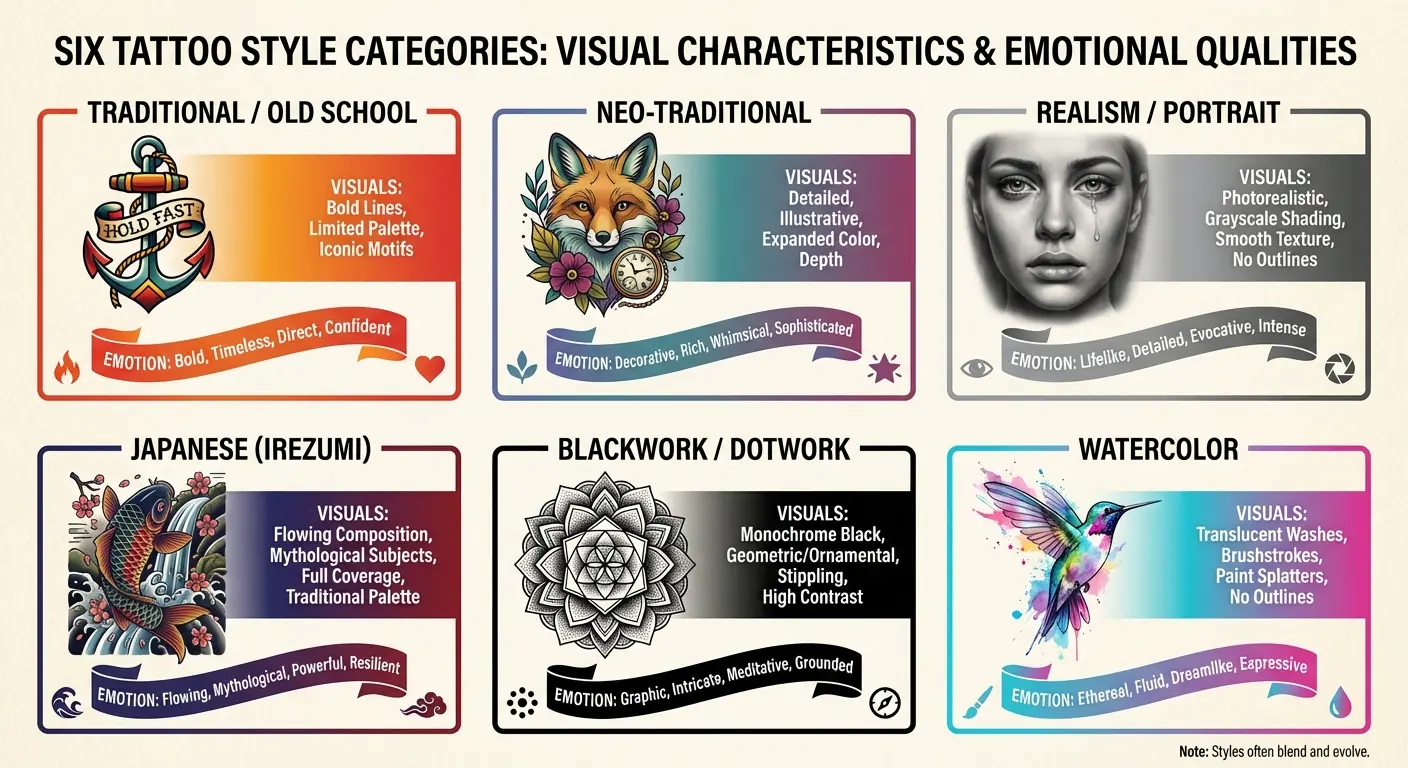
American Traditional with its bold lines and limited colors reads as timeless and confident. It’s not subtle. If you want a reminder that whispers, traditional is probably wrong for you. It shouts.
Fine line work is the opposite. It’s intimate. The kind of tattoo where people have to lean in to see what it is. If you want something that feels like a secret, fine line might be your language.
Blackwork with its solid black ink and geometric patterns feels modern and architectural. It’s bold without being loud, if that makes sense. Good for abstract concepts and strong visual statements.
Most people choose style based on what they’ve seen and liked on other people. They scroll through portfolios, find work that appeals to them aesthetically, and assume that style will work for their concept. This skips a critical question: does this visual language actually communicate what you’re trying to say?
Your meaningful quote about resilience might feel powerful in bold Gothic lettering. That same quote in delicate script could feel gentle and introspective. In minimalist sans-serif, it might feel modern and understated. The words are identical. What each visual treatment communicates is not.
Color choices function the same way. Black and grey reads as timeless and serious. Vibrant color reads as energetic and bold. Muted earth tones read as organic and grounded. These aren’t just aesthetic preferences. They’re meaning modifiers that change how your tattoo communicates.
You won’t know which visual language serves your concept until you see it translated into different styles. The phoenix you imagined might work better as a minimalist line drawing than a detailed traditional piece. The portrait you planned might carry more emotional weight in black and grey than in color.
When Khloé Kardashian revealed she had to laser off a tattoo after realizing it carried an unintended X-rated double meaning, it highlighted how visual execution affects what people actually see. Even celebrities with access to top artists can miss this when they skip the testing phase.
This is where most people get stuck. They commit to a style before testing whether it works for their specific concept. They book an artist known for a particular style and force their meaningful idea into that visual language, whether it fits or not.
Testing visual language isn’t about finding the “best” style. It’s about discovering which one makes your specific concept visible on skin. Some ideas demand bold lines and high contrast. Others need delicate detail and subtle shading. You can’t know which category yours falls into without seeing it both ways.
When Meaning Meets Reality
Your meaningful tattoo exists on a body that moves, ages, and takes up space in the world. Most people don’t think about this until it’s too late.
Placement isn’t just about visibility. It’s about how the design interacts with your body’s natural lines and movement. That meaningful phrase looks great on a flat piece of paper. On your ribcage, it distorts when you breathe. On your forearm, it reads upside down to you and right-side up to everyone else.
A fitness instructor got a detailed mandala on her shoulder blade to represent balance and centeredness in her yoga practice. The static design was beautiful in the stencil. What she didn’t anticipate was how her constant shoulder movement during classes would make the tattoo impossible for her to see without contorting in front of a mirror, and how sports bras would cover the top third during the hours she most wanted to connect with it. Had she tested the design on her body in various positions and clothing scenarios, she might have chosen her upper arm or forearm instead.
Size directly impacts detail retention. Your intricate design with multiple symbolic elements might be deeply meaningful in concept. At the size that fits your chosen placement, half those details become an unreadable blur. You’re left with a tattoo that you know means something but nobody (including you in the mirror) can actually see.
A few things to actually test before you commit:
Print it at real size. Hold it where it’s going. Can you even see the details you care about?
Think about what you wear. How often will this be covered?
Move around. Does the placement distort when you move your arm, bend, whatever?
Be honest about your job situation. I know people who say they don’t care, then freak out when they can’t hide it for interviews.
Consider how this area changes. Weight fluctuations, pregnancy, aging. These things happen.
Body changes over time affect different styles differently. Fine-line work that looks crisp now might blur together in ten years. Solid black shapes hold up better but might expand slightly. Color fades at different rates depending on pigment and placement.
You need to see your design at actual size, on a body (even if it’s just a reference image), before you can know if it works physically. That detailed mandala might be stunning at 8×10 inches on your screen. At the 3-inch diameter that fits your wrist, it’s visual noise.
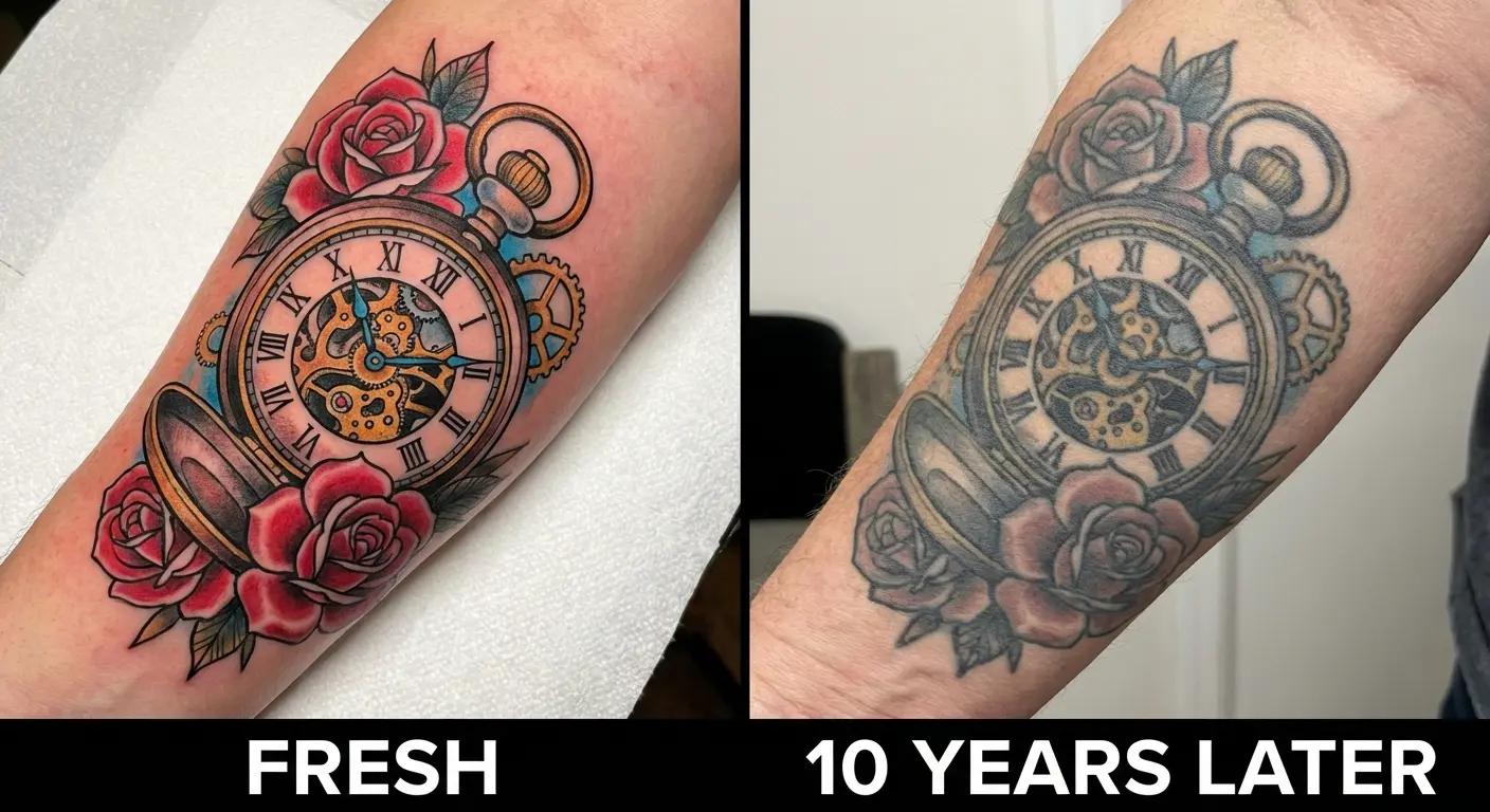
Movement matters more than static images suggest. Your shoulder blade tattoo looks perfect when you’re standing still. When you move your arm, it distorts. Your ankle tattoo might be positioned perfectly for photos but gets partially hidden by shoes in daily life.
The physical reality check happens too late for most people. They see the design on paper, love it, get it tattooed, then discover the practical issues. Prevention requires seeing your design in context before it’s permanent.
Using Tools to Bridge the Gap
The gap between meaningful concept and satisfying tattoo exists because visualization has traditionally been expensive and time-consuming. You’d need to commission multiple sketches from different artists, pay consultation fees, and still end up with limited options. Most people skip this step because it’s not feasible.
While 76% of employees feel tattoos and piercings hurt job interview chances, the bigger professional risk isn’t having a tattoo. It’s having one you regret and that doesn’t authentically represent you.
Technology changes this equation. You can now generate multiple visual interpretations of your concept without the traditional barriers. Want to see your meaningful symbol in five different styles? You can do that in minutes instead of weeks. Need
Technology changes this equation. You can now generate multiple visual interpretations of your concept without the traditional barriers. Want to see your meaningful symbol in five different styles? You can do that in minutes instead of weeks. Need to test different size and placement options? That’s suddenly practical instead of prohibitively expensive.
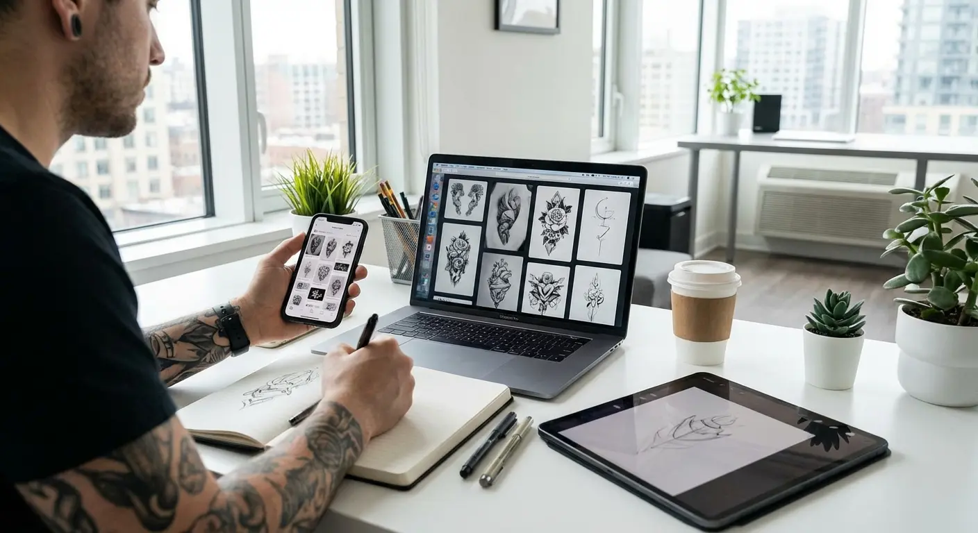
Look, I’m biased here. We built Tattoo Generator IQ specifically to solve this problem. But even if you don’t use our tool, the principle is the same: you need to see multiple versions of your idea before you commit.
The advantage of using something like our generator is speed and cost. You can test 10 different style variations in the time it would take to commission one custom sketch. The downside? It’s not going to replace a real artist’s eye for composition and technical execution. Think of it as the research phase, not the final product.
When singer Ethel Cain got a Hebrew hairline tattoo featuring “Ashmedai” (prince of demons) and “Gabriel” (archangel), the visual and cultural layers required careful consideration. Testing how text-based tattoos in unfamiliar scripts appear on your body becomes even more critical when cultural and linguistic significance intersect with personal meaning.
This isn’t about replacing tattoo artists. It’s about showing up to your consultation with clear visual direction instead of vague descriptions. You’re giving your artist a concrete reference that shows exactly how you want your concept rendered.
Testing your concept digitally before it’s permanent protects both what you want it to mean and your money. You discover what works visually without paying for multiple consultations or, worse, getting a tattoo that doesn’t match your expectations.
Each variation you generate gives you information. This style feels too aggressive. That composition feels unbalanced. This size loses the details you care about. That placement doesn’t work with your body’s natural lines. You’re making informed decisions instead of hoping your imagination matches reality.
The artists we work with have told us that clients who arrive with tested visual concepts are easier to work with and happier with their final tattoos. They know what they want because they’ve seen it. They can articulate specific preferences because they’ve compared options. The consultation becomes a refinement conversation instead of a translation exercise.
Now, some artists hate when clients come in with super specific reference images. They feel like it boxes them in creatively. I get that, but honestly? I’d rather have an artist turn me away than end up with a tattoo I regret.
Your concept deserves this level of preparation. You’re not being indecisive or overthinking it. You’re ensuring that the permanent mark on your body matches the significance you want it to carry.
Final Thoughts
Meaning doesn’t fail because people choose the wrong symbols. It fails because they commit to permanent ink without seeing whether their meaningful concept translates into satisfying visual reality.
You can do the research, understand the symbolism, feel deeply connected to your concept, and still end up with a tattoo that disappoints you. The missing piece isn’t more meaning. It’s visual testing that reveals whether what you want it to represent actually works as body art.
The permanence of tattoos should make you more careful, not less. And being careful doesn’t mean researching symbolism for three months. It means seeing what your idea actually looks like before it’s on your body forever.
Test it. See it in different styles. Make sure the visual matches the feeling. That’s not overthinking. That’s just thinking at the right time.
Before it’s permanent.