
Japanese Sleeve Tattoos: What Your Artist Might Not Tell You About Symbolism and Composition
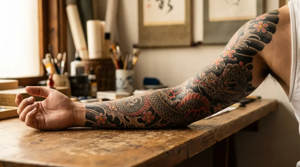
Table of Contents
-
Mythical Guardians: Power Through Protection
-
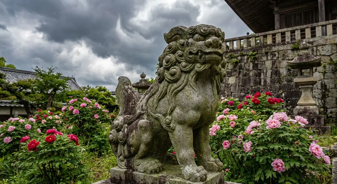
Foo Dog (Komainu) Sleeve with Peony Accents
-
Phoenix Rising from Cherry Blossoms
-
Dragon Coiling Around Maple Leaves
-
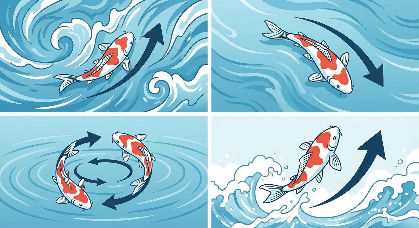
Koi Swimming Against Lotus Current
-
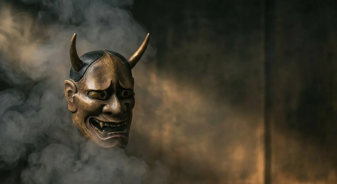
Hannya Mask Emerging from Smoke
-
-
Sacred Symbolism: The Language of Japanese Iconography
-
Full Sleeve Temple Architecture with Clouds
-
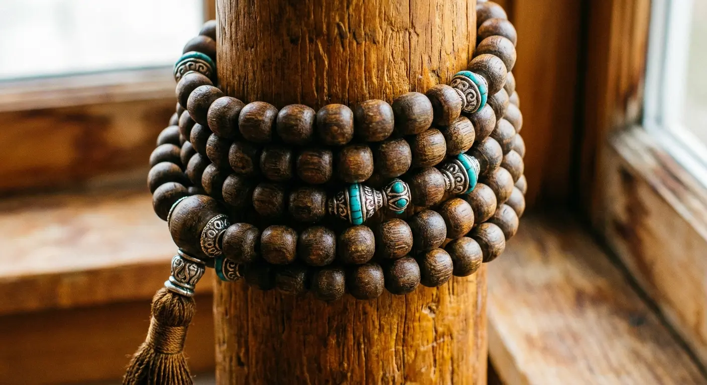
Buddhist Prayer Beads (Juzu) Wrapping Design
-
Sacred Crane with Pine and Bamboo
-
Samurai Helmet (Kabuto) with Chrysanthemums
-
Daruma Doll Surrounded by Waves
-
-
Nature’s Fury: Elements That Command Respect
-
Wind Bar (Kazaguruma) Full Sleeve
-
Lightning and Thunder God (Raijin) Composition
-
Ocean Wave Sleeve with Hidden Moon
-
Snow-Covered Mountain Range with Eagles
-
Autumn Leaves Cascading Down Arm
-
-
Warriors and Legends: Historical Figures Reimagined
-
Ronin Warrior in Battle Stance
-
Geisha Portrait with Traditional Backdrop
-
Oni Demon Warrior Full Coverage
-
Kabuki Actor in Dynamic Pose
-
Legendary Swordsman Miyamoto Musashi
-
-
Modern Fusion: Traditional Meets Contemporary
-
Geometric Patterns with Traditional Koi
-
Blackwork Japanese Clouds and Waves
-
Watercolor-Style Cherry Blossom Sleeve
-
Neo-Traditional Dragon with Bold Colors
-
Minimalist Line Art Japanese Garden
-
TL;DR
Here’s what you actually need to know: Japanese sleeve tattoos aren’t just pretty pictures. Every element means something specific, and how they’re arranged matters as much as what they are. That koi swimming up your arm? If it’s going the wrong direction, you’re telling the wrong story. Wind bars aren’t decoration, they’re representing actual wind. Your artist’s experience with Japanese composition is everything. And if you’re planning a full sleeve, you better understand how negative space works, because that’s what holds the whole thing together.
Also, you’re looking at 20 to 40 hours minimum, spread across multiple sessions. This isn’t a weekend project.
Before We Start
I’m not a tattoo artist. I’m someone who spent three years researching Japanese tattooing before getting my own sleeve, talked to a dozen Irezumi specialists, and learned that most online guides miss the actual compositional rules that make these designs work.
This isn’t a gallery of pretty pictures. It’s a breakdown of what actually matters when planning a Japanese sleeve. The symbolism most people miss, the compositional rules your artist might not explain, and the mistakes I’ve seen people make over and over.
Take what’s useful. Ignore what’s not. But don’t get permanent ink without understanding what you’re putting on your body.
Mythical Guardians: Power Through Protection
Let’s start with the creatures everyone wants but nobody understands.
Most people focus on what these mythical beings look like. Cool dragon, fierce foo dog, whatever. But the real depth? That comes from understanding how they’re positioned, what they’re interacting with, and why certain elements appear together.
These aren’t random decorative choices. Each guardian carries specific protective qualities, and when you combine them with particular flowers, natural elements, or background treatments, you’re basically writing a visual story about what you’re protecting yourself from or what strength you’re channeling.
This tradition goes back centuries. We’re talking about the original full-sleeve concept that established what comprehensive arm coverage actually means. Traditional Japanese sleeve tattoos represent the oldest pictorial form of tattooing in the world.
And yeah, you’re looking at multiple appointments over months, sometimes years, depending on your pain tolerance and schedule.
1. Foo Dog (Komainu) Sleeve with Peony Accents
Foo dogs are temple guardians. When you place one on your arm, you’re making a statement about protection that goes beyond physical strength.
And those peonies? They’re doing real work here, not just filling space. In Japanese symbolism, peonies represent bravery and honor. They’re called the “king of flowers” for a reason.
Put these together and you’re speaking to both external protection and internal courage. The composition usually places the foo dog on the upper arm or shoulder, with peonies flowing down toward the forearm. Background elements matter here: clouds suggest divine protection, while rock formations ground the guardian in earthly strength.
Here’s the thing your artist needs to nail: the foo dog’s mane has to flow with how your arm actually moves. That dynamic tension is what makes Irezumi feel alive rather than static. I’ve seen too many versions where the foo dog looks stiff, planted on the skin without any relationship to arm movement.
2. Phoenix Rising from Cherry Blossoms
Phoenixes mean rebirth, right? Everyone knows that. But the Japanese hou-ou is different. We’re talking imperial power, fire transformation, yin-yang balance. It’s not your Western firebird.
Understanding the distinction between Western and Japanese interpretations becomes crucial for your sleeve design. Check out this breakdown of phoenix tattoo meaning and symbolism if you want to dig deeper.
Throw in cherry blossoms and you’re adding mono no aware, this Japanese concept about the beauty of things that don’t last. So now your sleeve is saying something about transformation AND impermanence. Heavy stuff, but it works.
The hard part? Making those tail feathers flow down your forearm while the bird’s still clearly rising upward. I’ve seen versions where the phoenix looks like it’s just sitting there, feathers hanging limp. Defeats the whole point.
The best versions use wind bars or subtle cloud work to tie everything together. Without that connective tissue, the cherry blossoms just look scattered, pretty but pointless. The phoenix should feel like it’s genuinely rising, not posing for a photo.
3. Dragon Coiling Around Maple Leaves
Dragons in Japanese tradition are water deities, wisdom keepers, symbols of strength that’s controlled rather than wild. When you pair a dragon with maple leaves (momiji), you’re adding seasonal significance that most people completely miss.
Maple leaves represent autumn, the passage of time, and the wisdom that comes with change. This isn’t just pretty foliage.
The coiling composition works with your arm’s cylindrical shape. Skilled artists will position the dragon so it appears to wrap around your arm when viewed from different angles. The maple leaves can cascade down toward your wrist, creating natural flow lines that guide the viewer’s eye.
Color choices matter significantly here. Traditional palettes use blues and greens for the dragon with red and orange maple leaves, but you’ll see contemporary versions playing with black and grey or unexpected color combinations that still honor the compositional rules.
The dragon’s body should follow your arm’s contours, not fight against them. When it fights, it looks forced.
4. Koi Swimming Against Lotus Current
Here’s what most people get wrong about koi tattoos: the direction the fish swims completely changes the meaning.
Koi swimming upstream represents struggle, perseverance, the journey toward your goals. It references the legend of koi climbing waterfalls to become dragons. Koi swimming downstream suggests you’ve already achieved your transformation or you’re going with life’s flow.
Lotus flowers have their own deep symbolism (check out this lotus flower tattoo meaning guide). Pair them with koi and you’re stacking meaning on top of meaning. Lotus adds layers related to purity emerging from muddy waters and spiritual awakening.
The composition requires understanding how to create convincing water movement that wraps around your arm. You’ll see this executed with traditional wave patterns (seigaiha) or more naturalistic flowing water. The lotus usually anchors at your shoulder, elbow, or wrist. The koi’s body flows with your arm. Simple as that.
Background elements like water splashes, bubbles, or rocks aren’t filler. They create depth and movement that makes the entire sleeve feel dynamic. Your design should tell a clear story about where you’re headed or where you’ve been.
Because I’m tired of explaining this, here’s a chart breaking down what koi direction actually means:
|
Koi Direction |
Symbolic Meaning |
Best Paired With |
Composition Consideration |
|---|---|---|---|
|
Swimming Upstream |
Struggle, perseverance, ambition, overcoming obstacles |
Waterfalls, strong currents, rocks |
Position koi moving toward shoulder, emphasize water resistance |
|
Swimming Downstream |
Achievement, going with flow, completion of journey |
Calm water, lotus flowers, gentle waves |
Position koi moving toward wrist, softer water movement |
|
Circling/Rotating |
Balance, yin-yang, life cycles, transformation |
Multiple koi, circular water patterns |
Create circular composition around arm’s circumference |
|
Leaping Upward |
Aspiration, dragon transformation, breakthrough moments |
Waterfall crests, spray, dramatic waves |
Position at upper arm/shoulder for upward movement emphasis |
Use this when planning your design. Your artist should know this stuff, but double-check anyway.
5. Hannya Mask Emerging from Smoke
Hannya masks represent female demons born from jealousy and betrayal, but they’re more nuanced than “angry woman face.” They symbolize the destructive nature of unchecked emotions and the transformation that pain can trigger.
When you add smoke as the primary background element, you’re creating an emergence effect. The hannya is materializing from your own internal struggles.
This composition works particularly well for sleeves because smoke can fill negative space naturally while creating movement and mystery. Your artist better know how to make those smoke tendrils flow with your arm’s movement and how to use the smoke’s density to create depth.
You might see additional elements like spider lilies (associated with death and rebirth) or scattered maple leaves adding color and seasonal context. The placement usually positions the hannya on the upper arm or shoulder, with smoke cascading down. Though I’ve seen powerful versions where the mask sits at the forearm with smoke flowing upward, suggesting rising from darkness.
The hannya emerging from smoke is honestly my favorite composition in this list. The symbolism is dark, but the visual effect is stunning.
Sacred Symbolism: The Language of Japanese Iconography
The stuff that looks like background filler? It’s not. Here’s what it actually means.
These elements often get treated as secondary, but they’re primary storytelling devices. When you include temple architecture, prayer beads, or specific combinations of plants, you’re referencing centuries of Buddhist and Shinto symbolism that Japanese audiences would immediately recognize.
For Western wearers, understanding these references means your tattoo communicates intentionally rather than accidentally. The compositions here require different technical approaches because you’re working with geometric structures, detailed patterns, and symbolic arrangements that need to remain readable even as they wrap around your arm’s curves.
6. Full Sleeve Temple Architecture with Clouds
Temple structures (pagodas, torii gates, shrine buildings) create striking focal points that ground your sleeve in specific cultural context. The architectural precision required makes this technically challenging, but when done well, the geometric stability contrasts beautifully with organic elements like clouds, waves, or foliage.
Clouds in Japanese tattooing aren’t just sky filler. They represent the divine realm, transition between earthly and spiritual, and they’re compositional tools that help separate different elements or time periods within your sleeve.
You might see a temple emerging from clouds on your upper arm, suggesting sacred space, with the clouds flowing down to transition into other elements at the forearm.
What separates good from great here is maintaining the architecture’s straight lines and symmetry while adapting to your arm’s curves. Your artist needs to understand perspective and how to make the building feel three-dimensional rather than flat. I’ve seen versions where the temple looks pasted on rather than integrated. That’s what happens when your artist doesn’t understand how to work with cylindrical surfaces.
7. Buddhist Prayer Beads (Juzu) Wrapping Design
Prayer beads wrapping around your arm create a literal and metaphorical binding. Devotion, mindfulness, spiritual practice.
This composition works because it follows your arm’s natural cylindrical shape, and the repeating bead pattern creates rhythm and movement. Between the beads, you’ll typically see other elements: lotus flowers, Sanskrit characters, small Buddhas, protective symbols.
The wrapping design can stand alone as a minimalist statement or serve as a framework that holds together more complex imagery. I’ve seen versions where the beads wrap multiple times, creating a dense, almost armor-like coverage. Others where a single strand winds loosely, allowing more negative space and breathing room.
What matters is consistent bead sizing and spacing that accounts for how your arm tapers from shoulder to wrist. Color choices range from traditional wooden bead browns and golds to contemporary black and grey or even unexpected colors that maintain the form while updating the aesthetic.
8. Sacred Crane with Pine and Bamboo
Cranes represent longevity, good fortune, fidelity. They mate for life. When you combine them with pine and bamboo, you’re creating what’s called the “three friends of winter” in East Asian art. These three elements together represent resilience, steadfastness, endurance through difficult times.
Pine trees stay green through winter, bamboo bends without breaking, and cranes are believed to live a thousand years. This combination creates a
sleeve with deep symbolic weight that speaks to perseverance and lasting strength.
The composition usually features the crane as the primary focal point (often in flight or landing) with pine branches and bamboo stalks creating framework and flow throughout the sleeve. Background elements might include snow, mist, or traditional cloud patterns.
The hard part? Making the crane’s wings work with your arm’s movement, creating that sense of flight and grace while maintaining the structural elements of pine and bamboo that anchor the design.
9. Samurai Helmet (Kabuto) with Chrysanthemums
Samurai helmets represent warrior spirit, honor, the bushido code. But they also carry a sense of legacy and ancestral respect. Chrysanthemums are the imperial flower of Japan, representing longevity, loyalty, nobility.
Put these together and you’re speaking to honorable strength and refined power rather than brute force.
The helmet’s ornate details (the maedate front crest, the shikoro neck guard, the menpo face mask if included) provide intricate focal points that showcase your artist’s technical skill. Chrysanthemums can flow around the helmet, creating softness that contrasts with the armor’s hard edges.
You might see this composition include other elements: samurai crests (mon), rope bindings, battle-worn details that add character. The placement typically positions the helmet prominently on the upper arm or shoulder, with chrysanthemums cascading down.
Background treatments? Usually traditional clouds or more abstract negative space that lets the helmet’s details shine.
10. Daruma Doll Surrounded by Waves
Daruma dolls represent perseverance and goal achievement. You fill in one eye when setting a goal, the second when achieving it. They’re based on Bodhidharma, the founder of Zen Buddhism, and carry weight beyond their cute appearance.
Surrounding a daruma with waves creates interesting symbolic tension. The doll’s weighted bottom means it always rights itself when knocked over, and waves represent life’s challenges and changes. This pairing speaks to resilience and determination through turbulent times.
The composition works well because waves naturally flow and wrap around your arm, and the daruma’s round shape creates a strong focal point that contrasts with the waves’ movement. You’ll see versions that play with scale. A large daruma with waves crashing around it, or a smaller daruma riding atop a massive wave.
Background elements might include spray, foam, rocks, traditional wave patterns. Your artist needs to make waves feel powerful and dynamic while maintaining the daruma’s iconic simple form. When the waves look static, the whole piece falls flat.
Nature’s Fury: Elements That Command Respect
Japanese art does powerful nature better than anyone. Here’s why these elements hit different.
These aren’t gentle garden scenes but representations of wind, thunder, lightning, and water in their most powerful states. When you choose elemental designs for your sleeve, you’re acknowledging forces beyond human control and often suggesting your own connection to that raw power.
The compositions in this section require understanding how to depict movement, energy, and force in static imagery. Your artist needs to know how traditional Japanese art represents these elements (there are specific patterns and conventions) while adapting them to wrap convincingly around your arm.
11. Wind Bar (Kazaguruma) Full Sleeve
Wind bars are those distinctive curved bands you see in Japanese art, often in gold or bold colors, representing powerful wind. They’re not decorative ribbons but visual representations of air currents and unseen forces.
A full sleeve using wind bars as the primary element creates dynamic movement and allows for interesting negative space play. You can incorporate other elements within or between the wind bars: cherry blossoms being blown, leaves scattering, or even creatures riding the wind.
The composition requires careful planning because the bars need to flow with your arm’s natural lines while creating visual interest from every angle. I’ve seen versions that use traditional gold and red wind bars against black backgrounds, and contemporary interpretations that play with unexpected color combinations or gradient effects.
What’s tricky is making the bars feel like they’re moving through three-dimensional space rather than sitting flat on your skin. Your artist needs to understand how to use the bars to guide the viewer’s eye and create rhythm throughout the sleeve.
12. Lightning and Thunder God (Raijin) Composition
Raijin, the thunder god, is depicted as a fierce demon surrounded by drums, creating thunder and lightning. A Raijin sleeve makes a bold statement about power, chaos, natural forces.
The composition usually shows Raijin in dynamic pose, drums positioned around him, with lightning bolts radiating outward. The energy and movement inherent in this design work well for sleeves because lightning can naturally cascade down your arm while the drums create circular focal points.
Background elements might include storm clouds, rain, or wind bars that enhance the tempest atmosphere. You might pair Raijin with Fujin (wind god) for a complementary duality, or keep the focus solely on thunder and lightning.
This is where most tattooers screw up: making the lightning feel electric and dynamic rather than static, and ensuring Raijin’s muscular, demonic form works with your arm’s anatomy. Color choices typically emphasize dramatic contrasts: dark storm clouds against bright lightning, red demon skin against blue-grey skies.
13. Ocean Wave Sleeve with Hidden Moon
Ocean waves are foundational elements in Japanese art, from Hokusai’s famous “Great Wave” to countless tattoo interpretations. A wave-dominated sleeve can range from single massive wave to multiple waves at different scales creating rhythm and movement.
The “hidden moon” element adds subtlety and symbolism. A moon partially obscured by waves or spray suggests mystery, cycles, the interplay between celestial and earthly forces.
The composition requires understanding traditional wave patterns (seigaiha, araiso) and how to make water feel powerful and dynamic while wrapping around your arm’s curves. You might see foam, spray, rocks being battered, or sea creatures within the waves.
Your artist better know how to create depth (foreground waves versus background waves), movement that feels like it’s crashing rather than frozen, and the subtle integration of the moon so it enhances rather than distracts. Color palettes? Most artists use traditional blues and whites. Some go contemporary black and grey or unexpected color combinations.
14. Snow-Covered Mountain Range with Eagles
Mountain ranges, particularly Mt. Fuji, carry symbolic weight representing permanence, spiritual aspiration, natural majesty. Snow-covered peaks add seasonal specificity and visual drama with their stark contrast. Eagles soaring around or above the mountains introduce movement and represent freedom, perspective, power.
This combination balances static grandeur with dynamic movement. The composition typically positions mountains on the upper arm with peaks extending upward, while eagles can be positioned in flight across the forearm or circling the bicep.
Background elements might include clouds below the peaks (suggesting height) or pine trees at lower elevations providing scale. The technical challenge? Creating convincing mountain forms that work with your arm’s curves, rendering snow and rock textures that read clearly, and making eagles feel like they’re genuinely flying through three-dimensional space rather than pasted onto the landscape.
15. Autumn Leaves Cascading Down Arm
Maple and ginkgo leaves falling represent the passage of time, change, and the Japanese concept of mono no aware (the bittersweet beauty of impermanence). A sleeve dominated by cascading autumn leaves creates movement and seasonal specificity that’s both beautiful and philosophically rich.
The composition works naturally with gravity and your arm’s vertical orientation, with leaves appearing to fall from shoulder to wrist. You can add wind bars to suggest the leaves being blown, water to show them floating, or keep the background minimal to let the leaves’ colors and forms dominate.
What matters is varying leaf sizes, angles, and positions to create natural randomness while maintaining overall compositional balance. Your artist needs to understand how to layer leaves to create depth (some in sharp focus, others blurred or partial) and how to use color gradients within individual leaves to suggest light and dimension.
Traditional versions use reds, oranges, and yellows, but contemporary interpretations might play with unexpected color palettes or combine autumn leaves with non-seasonal elements for symbolic contrast. These showcase how seasonal imagery can carry profound meaning.
Warriors and Legends: Historical Figures Reimagined
Real people, real stories, permanent ink. Don’t screw this up.
Japanese history and theater provide rich source material for sleeve designs that tell specific stories or embody particular virtues. These aren’t generic warrior images but references to actual historical figures, legendary tales, or theatrical traditions that Japanese audiences would recognize immediately.
When you choose these designs, you’re essentially wearing a chapter from Japanese cultural heritage. The compositions require different approaches because you’re depicting human (or humanoid) figures that need correct anatomy and proportions while maintaining the stylized aesthetic of traditional Japanese art.
Your artist needs to understand both realistic figure drawing and the conventions of Japanese portraiture, theatrical makeup, and period-accurate costume details. Understanding the broader context of Irezumi tattoo history and techniques helps inform decisions about warrior and legend-themed sleeves.
Real talk: The cultural perception of tattoos in Japan continues to evolve, though challenges remain. As recently reported by The Asahi Shimbun, Japanese national soccer team player Yuki Kobayashi openly discusses living with extensive tattoos in Japan, where tattooed individuals still face restricted access to public facilities like swimming pools and onsen hot spas due to historical associations with yakuza. Despite being legal since 1948, tattoos carry societal stigma that even professional athletes must navigate carefully, covering their ink during official events and business meetings.
16. Ronin Warrior in Battle Stance
Ronin (masterless samurai) represent independence, honor despite hardship, and the complexity of living by a code when the structures that supported it have fallen away. A ronin in battle stance creates a sleeve with dramatic tension and movement. The figure’s posture, weapon position, and facial expression all contribute to the narrative you’re telling.
Traditional compositions might show the ronin with a katana drawn, wearing weathered armor or simple robes that suggest their fallen status. Background elements can include battlefields, cherry blossoms (suggesting the samurai’s acceptance of death), or stormy skies. You might incorporate the ronin’s family crest, rope bindings, or other details that add personal history.
Here’s where it gets tricky: making the human figure work with your arm’s anatomy. The ronin’s torso might wrap around your bicep, legs extending down your forearm. You need to maintain correct proportions and dynamic posing. Your artist needs to understand how fabric folds, armor sits on the body, and how to create the illusion of movement in a static image.
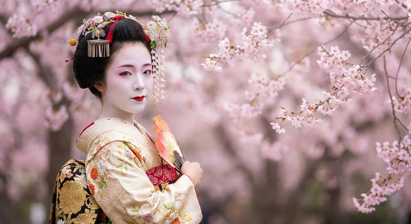
17. Geisha Portrait with Traditional Backdrop
Geisha represent refined artistry, cultural preservation, the aesthetic ideals of traditional Japan. A geisha portrait sleeve requires understanding that you’re depicting a skilled artist and cultural practitioner, not a stereotype.
The composition typically features the geisha’s face and upper body as the focal point, with elaborate hairstyle (kanzashi ornaments), white makeup (oshiroi), and kimono details that showcase your artist’s technical skill. Background elements might include cherry blossoms, paper lanterns, traditional architecture, or abstract patterns that suggest fabric or screens.
Some versions incorporate elements from specific geisha districts (Kyoto’s Gion, Tokyo’s Asakusa) for geographic specificity. Your artist needs portrait skills (capturing feminine beauty according to Japanese aesthetic standards), understanding of traditional costume construction (how kimono layers work, how obi are tied), and the ability to render fine details like hair ornaments and makeup.
Color choices often emphasize the contrast between the white face, red lips, and richly colored kimono, though black and grey versions can be equally striking.
18. Oni Demon Warrior Full Coverage
Oni are demon figures representing punishment of the wicked, protection against evil, or the darker aspects of human nature. An oni warrior sleeve creates an aggressive, powerful statement that’s unmistakably bold.
These aren’t subtle designs.
The composition typically features the oni’s face prominently (with characteristic horns, wild hair, fierce expression) along with muscular body, traditional weapons (often a kanabo club), and tiger-skin loincloth. Background elements might include flames, storm clouds, or skulls that reinforce the demonic theme. Some versions show the oni in active combat or destroying enemies.
The challenge? Making the oni’s exaggerated features (oversized mouth, prominent fangs, bulging eyes) read as powerful rather than cartoonish, and ensuring the muscular anatomy works with your arm’s actual muscle structure. Your artist needs to understand how to use color (traditional oni are red or blue) and shading to create dimension in the oni’s face and body.
Full coverage versions might extend onto your chest or back for maximum impact.
19. Kabuki Actor in Dynamic Pose
Kabuki theater provides dramatic imagery with bold makeup (kumadori), exaggerated poses (mie), and costume elements that translate beautifully to tattoo form. A kabuki actor sleeve references specific plays, character types, or theatrical traditions that carry their own stories.
The composition captures a moment of dramatic tension, with the actor frozen in a powerful pose. Makeup patterns indicate character type: red lines suggest heroic passion, blue suggests villainy or supernatural beings. Costume details can be elaborate and colorful.
Background elements might include stage curtains, cherry blossoms, or abstract patterns that suggest theatrical space. Some versions incorporate text (play titles or famous lines in Japanese calligraphy) for additional context.
Your artist needs to understand kabuki’s aesthetic conventions. Poses that would look awkward in real life work perfectly in theatrical context. How to render the distinctive makeup patterns, how to capture fabric movement in elaborate costumes. Balance the stylized theatrical elements with readable composition that works on your arm’s curves.
20. Legendary Swordsman Miyamoto Musashi
Miyamoto Musashi is Japan’s most famous swordsman, known for his two-sword technique, undefeated record, and philosophical writings. A Musashi sleeve references specific historical battles or depicts him in his characteristic dual-wielding stance.
The composition might show him in combat, in meditation, or in the famous duel at Ganryu Island. Details like his distinctive topknot, weathered features (he lived a hard life), and the two swords (typically a katana and wakizashi) make him recognizable to those familiar with Japanese history.
Background elements can include the locations of famous duels, cherry blossoms, or calligraphy from his writings (particularly from “The Book of Five Rings”).
What matters here is creating a historically grounded figure that still has the aesthetic appeal of traditional Japanese tattooing. Your artist needs to balance realism with stylization, ensure the swords and anatomy are proportionally correct, and create a composition that tells a story about this specific historical figure rather than a generic samurai.
Modern Fusion: Traditional Meets Contemporary
Traditional purists might hate this section. That’s fine.
You don’t have to choose between honoring traditional Irezumi and expressing contemporary aesthetics. Modern fusion approaches take the compositional wisdom, symbolic depth, and technical elements of Japanese tattooing and reinterpret them through current artistic lenses.
These aren’t about disrespecting tradition but about evolving it. The key is understanding what you’re blending and why. Random combinations of Japanese imagery with unrelated styles often feel disjointed, but thoughtful fusion that maintains compositional integrity while updating execution can create something genuinely fresh.
The artists who excel at this understand traditional Japanese tattooing deeply enough to know which rules can bend and which ones hold the entire composition together. Exploring Japanese traditional tattoo styles and conventions provides the foundation necessary for successful modern fusion designs.
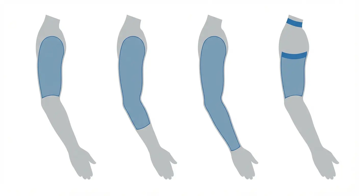
Here’s a quick reference for sleeve lengths because this matters for planning:
|
Sleeve Length |
Coverage Area |
Best For |
Concealment Level |
Traditional Use |
|---|---|---|---|---|
|
Half Sleeve |
Shoulder to just above elbow |
Most versatile option, easier to conceal |
High, easily covered by short sleeves |
Most common in both old Japan and modern America |
|
Three-Quarter Sleeve |
Shoulder to mid-forearm |
Optimal space for most Japanese imagery |
Medium, requires long sleeves |
Often considered the ultimate sleeve length |
|
Full Sleeve |
Shoulder to wrist (slightly raised from wrist) |
Bold, maximum coverage statement |
Low, visible in most situations |
Rare in traditional Japan, popular in American tattooing |
|
Choked Half Sleeve |
Slightly below shoulder to above elbow |
Extra conservatism when needed |
Very High, easily hidden |
Modified version for professional settings |
21. Geometric Patterns with Traditional Koi
Sacred geometry and traditional koi might seem like an odd pairing, but when executed thoughtfully, geometric elements can replace traditional water patterns while maintaining the composition’s flow and movement. The koi remains recognizable and symbolically intact, but instead of swimming through conventional wave patterns, it moves through geometric water representations: triangular ripples, hexagonal current lines, sacred geometry mandalas.
This fusion works because both approaches value pattern, repetition, mathematical harmony. The composition might use geometric shapes as background framework with the koi rendered in traditional style, or it might geometricize the koi itself while keeping water elements traditional.
What’s hard? Maintaining the koi’s organic curves and life-like quality while integrating angular geometric elements that could easily feel jarring. Your artist needs to understand both traditional Japanese composition and contemporary geometric tattooing to find the balance point where these styles enhance rather than fight each other.
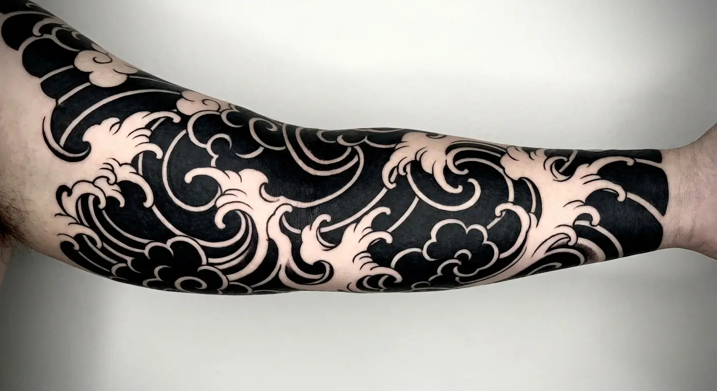
22. Blackwork Japanese Clouds and Waves
Blackwork (heavy black ink with minimal or no color) gives traditional Japanese elements a contemporary, graphic quality that feels both bold and modern. Clouds and waves rendered entirely in black create striking contrast and rely on negative space and line weight variation for depth rather than color gradients.
This approach strips away the color associations (blue water, white clouds) and forces you to appreciate the forms and patterns themselves. The composition might use traditional Japanese cloud and wave patterns but execute them with contemporary blackwork techniques: solid fills, bold outlines, strategic negative space.
Background elements become exercises in contrast management rather than color harmony. Your artist needs skills in both traditional Japanese pattern work and contemporary blackwork techniques to make this fusion feel intentional rather than like a traditional design that simply lacks color.
Side note: You need to understand how to create depth and dimension without color, how much black is too much (avoiding the “black blob” effect), and how to use negative space as an active design element.
23. Watercolor-Style Cherry Blossom Sleeve
Watercolor tattooing (soft edges, color bleeds, painterly effects) seems opposite to traditional Japanese tattooing’s bold outlines and solid color fills, but cherry blossoms lend themselves to this softer interpretation. The fusion maintains the symbolic weight of cherry blossoms (impermanence, beauty, renewal) while executing them with contemporary watercolor techniques.
You might see soft pink and white washes suggesting petals, with subtle color bleeds creating atmospheric effects. The composition can include traditional elements (branches, wind bars) rendered with harder edges to create contrast with the soft blossom treatment, or it might commit fully to the watercolor aesthetic.
Background elements might fade into abstract color washes rather than defined clouds or negative space. Here’s the thing: this style can blur over time. Your artist needs to create watercolor effects that will age well and maintain enough contrast and definition that the design remains readable. Understanding both watercolor painting techniques and how to adapt them to skin (which doesn’t behave like paper) is crucial.
24. Neo-Traditional Dragon with Bold Colors
Neo-traditional style takes traditional tattooing’s bold outlines and solid fills but updates them with contemporary color palettes, exaggerated proportions, and modern shading techniques. A neo-traditional dragon maintains the creature’s symbolic weight and recognizable form but might feature colors you’d never see in traditional Irezumi: purples, teals, unexpected gradients.
The composition follows Japanese structural rules (the dragon’s body coiling around the arm, appropriate background elements) but executes them with contemporary flair. You might see thicker outlines, more dramatic color contrasts, or stylized elements that push beyond traditional boundaries while remaining rooted in Japanese compositional wisdom.
Background elements can be traditional (clouds, waves) or more abstract. What’s tricky is knowing how far you can push the style before it stops reading as Japanese-inspired and becomes something else entirely. Your artist needs foundation in traditional Japanese tattooing and understanding of neo-traditional techniques to find that sweet spot where both styles are recognizable.
25. Minimalist Line Art Japanese Garden
Minimalism seems antithetical to traditional sleeves’ full coverage and horror vacui (fear of empty space), but Japanese gardens themselves embrace simplicity, negative space, and essential elements. A minimalist line art sleeve might depict a Japanese garden using only black outlines and strategic negative space: a simple bridge, suggested water through minimal wave lines, a few carefully placed rocks, sparse tree branches.
The composition relies on what’s not there as much as what is, trusting the viewer to complete the image mentally. This approach references traditional Japanese ink painting (sumi-e) which values suggestion over detailed rendering. Background is mostly skin, with elements floating in space or connected by minimal line work.
What this demands: extreme confidence in line work. Every line must be perfect because there’s nothing to hide behind. Understanding of Japanese garden design principles, compositional skills that make minimal elements feel intentional rather than unfinished. Your artist needs to resist the urge to add more and trust that less can communicate just as much meaning.
Personally? I think the minimalist Japanese garden approach misses what makes Irezumi powerful. But that’s just me.
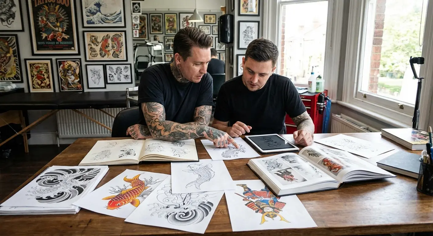
Bringing Your Vision to Life
You’ve probably noticed a pattern throughout these 25 designs: the technical execution and compositional understanding matter as much as the imagery itself. Japanese sleeve tattoos aren’t just about picking cool images and arranging them on your arm. They’re about understanding how elements relate symbolically, how compositions flow with your body’s anatomy, and how traditional rules create cohesion rather than chaos.
Finding an artist who genuinely understands Japanese tattooing (not just someone who can copy reference images) makes the difference between a sleeve that looks authentic and one that feels like Japanese-themed clip art. I’ve seen countless examples where technically skilled artists produce work that looks impressive but misses the deeper compositional logic that makes traditional sleeves work.
If you’re struggling to communicate your vision or want to explore how different elements might work together before committing to a specific artist, tools like Tattoo Generator IQ can help you visualize possibilities. You can experiment with different combinations: dragon with maple leaves versus cherry blossoms, foo dog with peonies versus chrysanthemums. See how various elements flow together, generate reference images that help you communicate with your tattoo artist.
It’s not about replacing your artist’s creativity but giving you a starting point that’s more specific than “I want a Japanese sleeve with a dragon or something.”
The planning phase for your full sleeve deserves as much attention as the execution itself.
The best sleeves come from collaboration between you (bringing personal meaning and aesthetic preferences) and your artist (bringing technical skill and cultural understanding). When you walk into that consultation with clear references, understanding of what different elements mean, and realistic expectations about how compositions work, you set up a partnership that produces something genuinely meaningful rather than just visually impressive.
Your sleeve will live on your body for decades. That permanence demands respect for both the tradition you’re drawing from and the personal story you’re telling.
Questions to Ask Your Potential Artist
Before you commit, here’s what you need to know:
How many full Japanese sleeves have you completed? If the answer is fewer than 5, keep looking.
Can I see healed photos of sleeves you’ve done? Fresh photos hide problems. You want to see how the work looks after a year or two.
How do you approach negative space in Japanese composition? If they look confused, walk away.
What’s your process for planning a full sleeve before we start? You want someone who maps the entire thing out, not someone who wings it session by session.
Do you specialize in Japanese tattooing or is it one of many styles you do? Specialists understand the compositional rules. Generalists often don’t.
How familiar are you with traditional Irezumi symbolism and compositional rules? They should be able to explain why certain elements pair together and others don’t.
What happens if we start the sleeve and I hate the direction it’s going? Know the exit strategy before you start.
If they can’t answer these confidently, walk away.
The Reality Check: What You’re Actually Signing Up For
Let’s talk about what this actually involves because most guides gloss over the hard parts.
Time: Plan on 6-10 sessions for a full sleeve, spaced 3-4 weeks apart for healing. You’re looking at 6-12 months minimum. First session is usually outlining. Subsequent sessions fill in color and shading. Don’t expect to see the final result for months.
Money: Quality Japanese work runs $150-$250/hour minimum in most cities. Full sleeve equals 30-40 hours equals $4,500-$10,000. Budget accordingly. Some artists charge by the piece instead of hourly. Get a clear quote in writing before you start. Touch-ups are normal, especially for color work. Ask if they’re included in the original price or extra. Tipping: 20% is standard. Yes, even on a $5,000 sleeve.
Pain: Here’s the pain map for sleeves:
-
Outer shoulder: 3/10 (easy)
-
Inner bicep: 7/10 (rough)
-
Elbow/ditch: 9/10 (hell)
-
Forearm: 4/10 (tolerable)
-
Inner forearm: 6/10 (annoying)
-
Wrist: 7/10 (bony and sensitive)
Everyone’s different, but this is typical. Sessions longer than 4 hours are diminishing returns. Your body stops producing endorphins, you start shaking, and the work quality suffers. Don’t be a hero.
Healing: First two weeks suck. Your arm will be swollen, itchy, and you’ll question your life choices. Normal. Keep it clean. Unscented soap, pat dry, thin layer of unscented lotion. Your artist will give you specific instructions. Follow them exactly. No sun exposure during healing. After healing, sunscreen always. UV fades tattoos faster than anything else. Expect peeling, flaking, weird scabbing. Don’t pick at it. Let it fall off naturally or you’ll pull out ink.
Touch-ups: Color tattoos need touch-ups. Period. Usually after a year or two, sometimes sooner. Some ink doesn’t take the first time, especially on areas that move a lot (inner elbow, armpit). Touch-ups fix this. Good artists include one round of touch-ups. Clarify this upfront.
Lifestyle Impact: You’ll get stared at. A lot. Especially if you’re in a conservative area. Random people will ask about your tattoos. Constantly. If you hate small talk, prepare yourself. Job interviews get weirder. Some interviewers won’t care. Others will judge you immediately. Welcome to visible tattoos. Full sleeves are hard to hide. If your job requires it, you’re wearing long sleeves year-round. Think about that before you commit.
Design Revisions: Your artist will probably sketch the design first. If you hate it, say so. Better to revise now than live with something you don’t love. Some back-and-forth is normal. If your artist gets defensive about feedback, red flag. That said: trust your artist’s compositional judgment. If they say an element won’t work where you want it, they’re probably right.
If Things Go Wrong: If your artist moves mid-sleeve, you’re in a tough spot. Another artist finishing someone else’s work is tricky. Styles differ, and some artists won’t do it. Don’t take your artist’s custom design to someone else. It’s like asking a chef to cook another chef’s recipe. Disrespectful and most good artists will refuse.
Common Mistakes That’ll Haunt You
Let me save you some regret:
-
Getting a koi swimming the wrong direction for what you meant
-
Not planning the full sleeve before starting (ending up with compositional chaos)
-
Choosing an artist based on general skill instead of Japanese specialization
-
Ignoring negative space (ending up with a crowded mess)
-
Mixing Japanese elements with incompatible styles (tribal, realistic portraits, etc.)
-
Not understanding that some elements require specific pairings
-
Rushing into color choices without understanding traditional palettes
-
Starting with the most painful area first and tapping out
-
Not budgeting for the full sleeve and running out of money halfway through
-
Getting work done while drunk or hungover (your body won’t heal right)
I’ve met people who wish they’d gone bigger, smaller, chosen different colors, or planned the composition better. Learn from their mistakes.
Final Thoughts
Look, Japanese sleeve tattoos aren’t casual. They take time, money, pain, and actual research. But if you do it right (if you understand what you’re putting on your body and why) you end up with something that means more as you age, not less.
Find an artist who actually gets Japanese composition. Not someone who can copy Pinterest images, but someone who understands why elements go where they go. Take your time planning. Ask questions. Understand the symbolism.
Hot take: If you’re getting a Japanese sleeve but refuse to learn anything about the culture or symbolism, you’re basically treating an art form like a costume. Don’t be that person.
Some people will say fusion styles bastardize tradition. Maybe they’re right. But art evolves, and some of the most compelling sleeves I’ve seen blend traditional composition with contemporary execution.
You don’t need to be Japanese to wear these designs respectfully, but you do need to understand what you’re wearing and why. Cultural appreciation requires education, not just admiration.
Your sleeve will age with you, and the meanings you attach to different elements might evolve. That’s part of the beauty. The phoenix that represented your career transformation at 25 might take on new meaning after you’ve survived a health crisis at 40. The koi swimming upstream might feel different once you’ve reached the goals you were striving
toward.
Good Japanese tattooing has enough symbolic depth to grow with you rather than feeling locked in a specific moment that no longer resonates.
Here’s the bottom line: Japanese sleeve tattoos aren’t for people who want something quick and pretty. They’re for people willing to do the research, find the right artist, and commit to the process.
You’re looking at months of work, thousands of dollars, and significant pain. The symbolism is deep enough that you’ll probably discover new meanings in your own sleeve years after you get it. That’s the point.
Don’t rush this. Don’t go to an artist who “does some Japanese work.” Find someone who specializes in Irezumi and understands why a koi swimming downstream means something completely different than one swimming up.
And for the love of god, plan the whole sleeve before you start. I’ve seen too many people get a dragon on their shoulder and then realize they have no idea how to fill the rest of the arm in a way that makes compositional sense.
Do it right or don’t do it at all.