
23 Shoulder Tattoos for Men That Actually Work With Your Body’s Natural Architecture
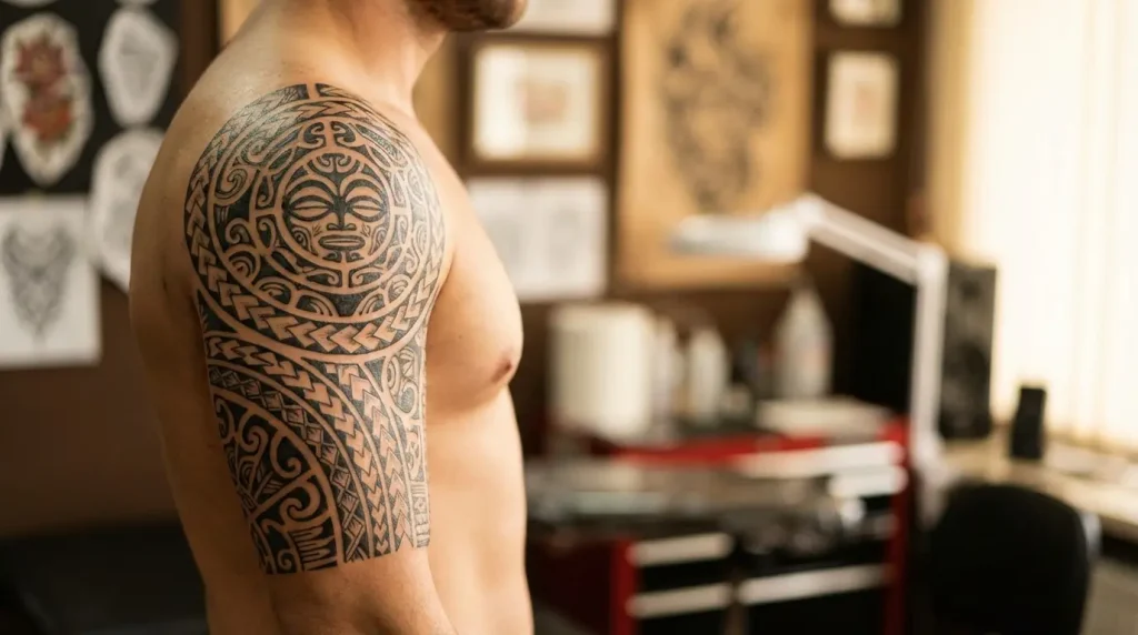
Table of Contents
-
Why Your Shoulder Placement Probably Sucks
-
Designs Built for Shoulder Anatomy (Not Against It)
-
Deltoid Cap Mandalas
-
Scapular Wing Extensions
-
Clavicle-to-Deltoid Biomechanical Flows
-
Anterior Shoulder Armor Plates
-
Rotator Wrap Geometric Patterns
-
Shoulder Joint Hinge Mechanisms
-
-
Tattoos That Change When You Move
-
Muscle Flexion Dragons
-
Kinetic Tribal Bands
-
Expansion-Contraction Sacred Geometry
-
Athletic Motion Blur Effects
-
Shoulder Roll Wave Sequences
-
Dynamic Predator Silhouettes
-
-
Going Asymmetric (One Shoulder Beats Two)
-
Lone Wolf Portraits
-
Unilateral Clock Towers
-
Single-Side Floral Cascades
-
Offset Celestial Maps
-
Standalone Quote Arcs
-
Isolated Phoenix Rises
-
-
Practical Stuff Nobody Tells You
-
Professional Collar Concealers
-
Gym-Friendly Minimal Linework
-
Beach-Ready Bold Graphics
-
Layering Foundation Pieces
-
Scar Integration Coverups
-
TL;DR
Your shoulder’s got three completely different zones. The deltoid cap, scapular blade, and clavicle ridge all behave differently under the needle and age differently over time.
Movement destroys bad placement. Your shoulder flexes, rotates, and shifts constantly. Designs need to account for that or they’ll look warped half the time.
One badass shoulder piece beats two matching ones. Asymmetry creates focal points. Symmetry feels safe and predictable.
Your actual lifestyle should drive placement more than aesthetics. Professional coverage needs, gym requirements, expansion plans – these matter more than what looks cool on Instagram.
Your shoulder blade is prime real estate most guys ignore. Flattest, most stable canvas on your upper body.
Small shoulder tattoos fail when they fight the muscle’s natural shape. Proper sizing and positioning matter way more than going tiny.
Why Your Shoulder Placement Probably Sucks
Every week, same thing. Guy walks in, shows me a sick design he found online, points to his shoulder, and says “right here.” Cool. Where on your shoulder? Because that thing’s not flat, brother.
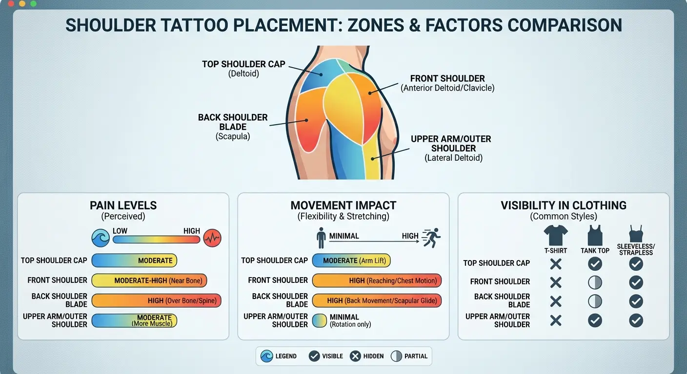
Your shoulder isn’t one surface. It’s three completely different zones that barely relate to each other. The deltoid cap wraps around the outer edge with this rounded, bulging shape. Your scapular blade sits flat against your back, offering stable space that hardly moves. The clavicle ridge creates a horizontal line across your front shoulder where bone sits close to skin.
Each zone takes ink differently and shows it in unique ways. A mens shoulder tattoo designed for your deltoid cap will look completely wrong if you try forcing it onto your scapular blade. The curves are different. Movement patterns are different. Pain levels are different.
Here’s what happens when you ignore anatomy: you raise your arm at the gym, and suddenly that perfectly circular design you loved in the stencil stretches into an oval. You roll your shoulder back, and the dragon that looked fierce when you were standing still now looks like it’s writhing awkwardly. You flex your deltoid, and the geometric pattern that seemed balanced compresses into visual chaos.
The shoulder cap placement is generally moderate pain-wise, as the pain level is generally moderate due to the ample muscle and flesh in this area, making it popular for both first-timers and guys with full collections. Understanding pain tolerance across different zones helps you make smarter decisions before committing.
Let me break down the three primary zones and what each one actually offers:
Anterior shoulder (front) sits between your clavicle and your arm socket. This area shifts when you raise your arm forward and rotates when you turn your shoulder inward. Designs here need to account for moderate movement and the natural shadow your pec creates. You’ll see this zone in V-necks and when you’re shirtless, making it semi-public space.
Lateral deltoid (outer cap) creates the rounded peak of your shoulder. Most visible in short sleeves and the area that flexes most dramatically when you work out. The curved surface here means circular or radial designs work better than linear patterns. This zone moves constantly – flexing, rotating, elevating – so your tattoo shoulder design needs to look good through all those positions.
Posterior shoulder (back) includes both the rear deltoid and the scapular blade. The rear deltoid rolls with your posture and shoulder movement, while the scapular blade stays relatively stable. This zone offers the most privacy and the largest flat canvas on your upper body. Most guys completely overlook this area, which is a mistake if you want detailed work that won’t distort.
|
Shoulder Zone |
Pain Level (1-10) |
Best For |
Movement Impact |
Visibility in Business Casual |
|---|---|---|---|---|
|
Deltoid Cap (Outer) |
3-4 |
Bold circular designs, mandalas |
High – flexes with arm movement |
Visible in short sleeves |
|
Anterior (Front) |
5-6 |
Personal imagery, flowing designs |
Moderate – shifts with arm raise |
Partially visible in V-necks |
|
Scapular Blade (Back) |
6 |
Large detailed pieces, wings |
Low – stable canvas |
Completely hidden |
|
Clavicle Ridge |
8 |
Linear text, delicate patterns |
Minimal – bone structure stable |
Visible in open collars |
|
Posterior (Back Shoulder) |
4-5 |
Privacy-focused art, portraits |
Moderate – rolls with posture |
Hidden in most clothing |
Most guys make placement decisions based on what looks cool in a reference photo. They don’t consider that the reference was probably taken with the person’s arm in a specific position, with specific lighting, at a specific angle. Your shoulder won’t always be in that position.
Think about your daily movements. How often do you raise your arms overhead? How much time do you spend with shoulders rolled forward at a desk? Do you carry a bag on one shoulder? Do you sleep on your side? All of these factors affect how your mens shoulder tattoo will look and age.
The difference between anterior, lateral, and posterior zones is huge. Each zone demands different artistic approaches because each zone has different structural characteristics. Your anterior shoulder has less muscle padding and more bone proximity. Your lateral deltoid has the most dramatic curve and the most movement. Your scapular blade has the flattest surface and the least distortion.
Stop asking “what looks cool?” Start asking “what works with my body’s actual structure?”
Designs Built for Shoulder Anatomy (Not Against It)
These designs don’t just sit on your shoulder. They’re built around shoulder-specific geometry. You couldn’t move these tattoos to your forearm or chest and have them work the same way because they rely on the deltoid’s rounded cap, the scapular blade’s flat expanse, and the clavicle’s linear ridge.
The shoulder’s physical structure drives every artistic decision. The curves dictate the composition. The planes determine detail density. The angles guide flow.
This flips traditional tattoo thinking. Instead of choosing a design you love and finding a place to put it, you start with your shoulder’s unique characteristics and build a design that maximizes those advantages while minimizing common distortion problems.
1. Deltoid Cap Mandalas
Circular patterns positioned at the apex of your deltoid create a bulls-eye effect that emphasizes shoulder width and muscle definition. The trick is centering the mandala at the exact peak of your deltoid cap – not offset toward your arm, not drifting toward your chest, but dead center where your shoulder reaches its highest point.
Why? Because your deltoid is already rounded. A mandala’s circular geometry complements that natural curve instead of fighting it. When you position the center point correctly, the mandala’s concentric rings follow your muscle’s contour, creating depth that enhances your shoulder’s three-dimensional shape.
Most mandala designs need a 6-8 inch diameter for proportional impact on a mens shoulder tattoo. Smaller than that, and the pattern gets lost in your shoulder’s curve. Larger than that, and the design bleeds awkwardly onto your arm or chest where the circular pattern no longer makes anatomical sense.
Line weight becomes critical here. Thick, bold lines maintain visibility when your deltoid flexes, but they can look heavy-handed when your muscle is relaxed. Thin, delicate lines create intricate beauty at rest but can blur together when your shoulder bulges. I typically recommend medium-weight primary lines (around 3-4mm) with finer detail work in the negative space.
Negative space matters more in shoulder mandalas than in the same designs placed on flatter body areas. Your shoulder’s curve creates natural shadows that can make solid black sections appear even darker. Strategic negative space prevents the design from feeling too heavy and allows your skin tone to provide contrast that enhances the pattern’s complexity.
Symmetrical mandala elements enhance rather than fight against shoulder rotation. When you roll your shoulder forward or back, a well-centered mandala appears to rotate in space while maintaining its balanced composition. This creates a mesmerizing kinetic effect that flat-surface mandalas can’t achieve.
2. Scapular Wing Extensions
Your shoulder blade? That’s prime real estate for wings. Flat, stable, barely moves – perfect canvas. I’m talking big wings too, 10-12 inches easy, spine to shoulder edge. Unlike your deltoid cap that’s flexing constantly, this area just sits there. Which is exactly what you want for detailed feather work.
The scapular blade’s movement mimics actual wing mechanics. When you roll your shoulders back, your scapular blades move apart and slightly upward – exactly how wings would move if you were spreading them. This anatomical parallel makes shoulder blade tattoo men designs feel more organic than wings placed anywhere else.
Single wings often create more dramatic visual impact than symmetrical pairs. A lone wing on one scapular blade makes a bold statement about independence or transformation without the visual weight of bilateral wings. Plus, single wings leave you room for different imagery on the opposite shoulder blade if you want asymmetrical composition.
Wing span width determines the design’s impact. Most effective designs stretch from your spine (or close to it) all the way to the point where your shoulder blade meets your lateral deltoid. This maximizes the scapular canvas without forcing the wing to wrap awkwardly around your shoulder’s curved edge.
According to professional tattoo placement research, the shoulder blade placement offers an incredibly stable and flat surface that acts as a perfect canvas for designs demanding precision and detail, with tattoos here being less susceptible to distortion from skin aging or weight fluctuations, ensuring the artwork remains crisp for years.
Feather detail density varies based on wing type. Angel wings typically feature individual feather definition with soft, layered textures. Raven or crow wings work better with bold, graphic feather shapes and higher contrast. Eagle wings need sharp, defined primary feathers with detailed barbs. Abstract or geometric wings can abandon realistic feather structure entirely in favor of stylized shapes that suggest flight without literal representation.
Scapular placement keeps wings visible in tanks and tees while remaining completely concealable in button-ups. This gives you control over when your ink is on display, which matters if you navigate different social or professional contexts.
Pain-wise? Your shoulder blade sits around a 6 out of 10. Higher than the deltoid cap but still manageable. You’re closer to bone here, and there’s less muscle padding, but most guys find the discomfort totally worth it for the stable canvas and dramatic visual impact.
3. Clavicle-to-Deltoid Biomechanical Flows
Biomechanical designs that follow the natural line from your clavicle ridge down across your anterior deltoid create the illusion of exposed machinery beneath your skin. These tattoo shoulder designs succeed when they mirror actual musculature and fail spectacularly when they ignore anatomical logic.
See your clavicle? That bone creates a perfect natural seam. Biomech artists love it – makes it look like your skin’s peeling back to reveal machinery underneath. Why does it work so well here? Because the bone’s actually prominent. You can see it, feel it. So when a tattoo uses it as a panel edge, your brain buys it. Try that same trick on your flat forearm? Looks fake as hell.
The flow from clavicle to deltoid follows your pectoralis-to-deltoid muscle connection. This is where your chest muscle meets your shoulder muscle, creating a natural valley and shadow zone. Smart biomechanical designs use this anatomical feature as a depth cue, placing darker mechanical elements in the shadow areas and lighter metallic highlights on the muscle peaks.
Shading technique matters more in biomechanical shoulder work than in other tattoo styles. The illusion of depth – making machinery appear to sit beneath your skin rather than on top of it – depends entirely on how your artist handles light source consistency and shadow placement. Your shoulder’s natural contours create real shadows that change as you move, so the tattooed shadows need to align with those real-world lighting conditions.
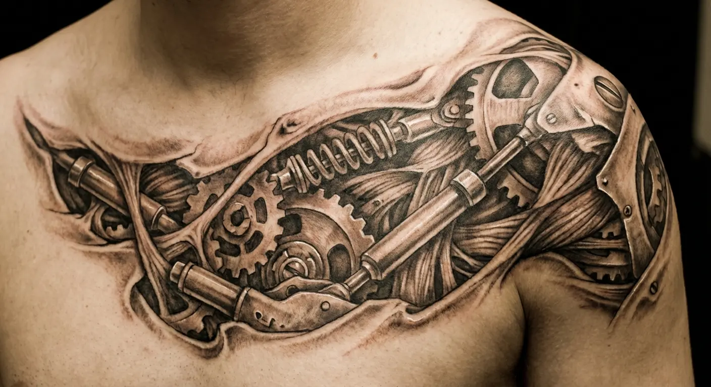
These tattoos photograph dramatically differently depending on lighting angle and arm position. Overhead lighting emphasizes the clavicle ridge and creates shadows in the deltoid valley. Side lighting brings out the three-dimensional curve of your shoulder cap. Front lighting flattens everything. Understanding this helps you position yourself for photos that showcase the design’s depth.
Common mistakes ruin biomechanical shoulder pieces. Gear placements that don’t align with actual joint mechanics look fake. Tubes or cables that lead nowhere anatomically break the illusion. Mechanical elements that ignore your muscle’s grain create visual confusion. The best biomechanical work respects your body’s actual structure while adding impossible machinery that somehow feels believable.
4. Anterior Shoulder Armor PlatesArmor-style tattoos on the front portion of your shoulder create a protective aesthetic while working with the deltoid’s natural muscle segmentation. Your deltoid has three distinct heads – anterior, lateral, and posterior – and armor plates that acknowledge these divisions look intentional rather than arbitrary. The space between your shoulder and chest creates a natural armor “seam.” This anatomical gap is where your deltoid muscle ends and your pectoral muscle begins. Armor designs use this real structural boundary as a logical place for plates to meet, buckles to attach, or straps to cross. Scale sizing determines whether your armor looks realistic or cartoonish. Individual plates typically measure 2-3 inches for proportional impact. Larger plates can work if they’re positioned to cover your entire deltoid cap, but multiple smaller plates usually create more visual interest and better follow your muscle’s natural segmentation. Matte black versus metallic shading changes the entire design’s impact. Matte black armor reads as leather, carbon fiber, or darkened steel – materials that absorb light and create a subdued, tactical appearance. Metallic shading with white highlights suggests polished steel, chrome, or futuristic alloys – materials that reflect light and demand attention. Front-shoulder placement makes these designs visible in your own field of vision. Unlike back-shoulder work that you never see without mirrors, anterior armor sits where you can glance down and see it throughout your day. This creates a different psychological relationship with the tattoo – it becomes a personal reminder or talisman rather than purely external decoration. Strap and buckle elements can connect shoulder armor to potential chest or arm expansions. If you’re planning future tattoo work, designing your shoulder armor with logical connection points gives you expansion options that feel cohesive rather than forced. Cultural armor styles translate differently to shoulder anatomy. Samurai armor features layered plates with visible cord lacing that works beautifully with shoulder curves. Medieval plate armor uses larger, smoother surfaces that require careful shading to avoid looking flat. Roman armor incorporates leather straps and metal studs that can follow your muscle’s natural lines. Sci-fi armor allows complete creative freedom since there’s no historical accuracy requirement.
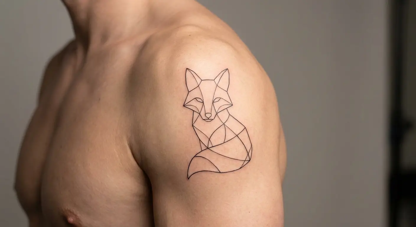
5. Rotator Wrap Geometric Patterns
Geometric patterns that wrap around your shoulder’s rotator axis create mesmerizing effects during arm movement. Shapes appear to rotate and shift as you move, turning your tattoo shoulder into kinetic art that changes based on your body’s position.
Hexagons, triangles, and linear patterns work better than circles for wrap-around designs. Circles positioned on a curved surface create distortion problems – they look circular from one angle but elliptical from another. Angular shapes maintain their geometric integrity across your shoulder’s curve because their straight edges create consistent visual rhythm regardless of viewing angle.
Pattern repetition needs careful calculation to avoid awkward breaks where the design meets itself. Your geometric pattern needs to wrap seamlessly, which requires mathematical precision in planning how many pattern repeats fit around your shoulder’s circumference at different points.
6. Shoulder Joint Hinge Mechanisms
Tattoos that treat your shoulder as a mechanical hinge point position gears, pistons, and joints at your actual rotator location for striking biomechanical realism. The illusion only works if the mechanical elements align with your real shoulder socket – place them too high or too low, and the entire design loses believability.
Your clavicle and scapular spine serve as structural anchor points in these designs. These bone structures create natural “mounting points” where mechanical elements can appear to attach to your skeletal system. The clavicle’s horizontal line works as a top bracket, while the scapular spine’s diagonal ridge creates a rear support structure.
Ball joints positioned at your shoulder socket create the most anatomically convincing mechanical replacements. Your shoulder is a ball-and-socket joint in reality, so depicting it as a mechanical ball joint requires minimal suspension of disbelief. Hydraulic pistons can extend from this central joint toward your arm or chest, following the lines where your deltoid connects to other muscle groups.
Arm position during tattooing affects final placement more than most guys realize. Your shoulder sits differently when your arm is raised versus resting at your side. Most artists tattoo with your arm in a neutral position, but you need to discuss which position you’ll have your arm in most often. If you’re a bodybuilder who spends hours with arms raised overhead, that should influence placement decisions.
Metal texture rendering changes based on shoulder curve. Flat surfaces can show detailed rivets, scratches, and wear patterns. Curved surfaces need simplified textures or the details become distorted. Your artist needs to adjust texture density based on how much your skin curves at each point in the design.
These designs often work best as foundation pieces for larger biomechanical sleeves. A shoulder hinge mechanism creates a logical starting point for mechanical elements that can extend down your arm, with tubes and cables following your arm’s natural taper and gears positioned at your elbow joint.
Tattoos That Change When You Move
These designs don’t just tolerate shoulder movement – they look boring as hell when you’re standing still. But raise your arm? Flex? That’s when they come alive.
Your shoulder moves through an incredible range of motion every single day. Forward flexion, backward extension, lateral raises, internal rotation, external rotation – each movement changes how your skin stretches and how your muscles bulge. Most tattoos try to minimize distortion from this movement. These designs weaponize it.
Think about your daily activities. How often do you reach overhead? How frequently do you flex in the mirror? Do you play sports that involve throwing or swinging? Movement-responsive designs turn these ordinary actions into opportunities for your ink to perform.
7. Muscle Flexion Dragons
Dragons are everywhere on shoulders. Most of them suck. Why? Because guys slap them on without thinking about how the body moves. Dragon designs positioned along your deltoid’s muscle fibers create the illusion of the creature expanding and contracting as you flex. The dragon’s body needs to follow your muscle’s grain – running from your shoulder’s peak down toward your arm – so that when your deltoid bulges, the dragon appears to swell with power.
Head placement at the anterior deltoid creates a “breathing” effect during shoulder rolls. When you roll your shoulder forward, the dragon’s head moves with it, creating the impression of the creature looking around or preparing to strike. Position the head at your shoulder’s front edge where this movement is most pronounced.
When exploring traditional Japanese dragon designs, remember that serpentine body positioning follows your muscle’s natural grain for maximum flexion impact.
Scale detail density affects readability during movement. Dense, intricate scales look stunning when your muscle is relaxed but can blur together when you flex. I recommend larger, bolder scale patterns in areas that experience the most muscle movement, with finer detail reserved for more stable zones near your clavicle or scapular blade.
Japanese-style dragons work better for this application than European dragons. Japanese dragons have long, serpentine bodies that can follow your muscle’s length and curve naturally around your shoulder. European dragons have stockier bodies with prominent legs that don’t adapt as well to the shoulder’s rounded surface.
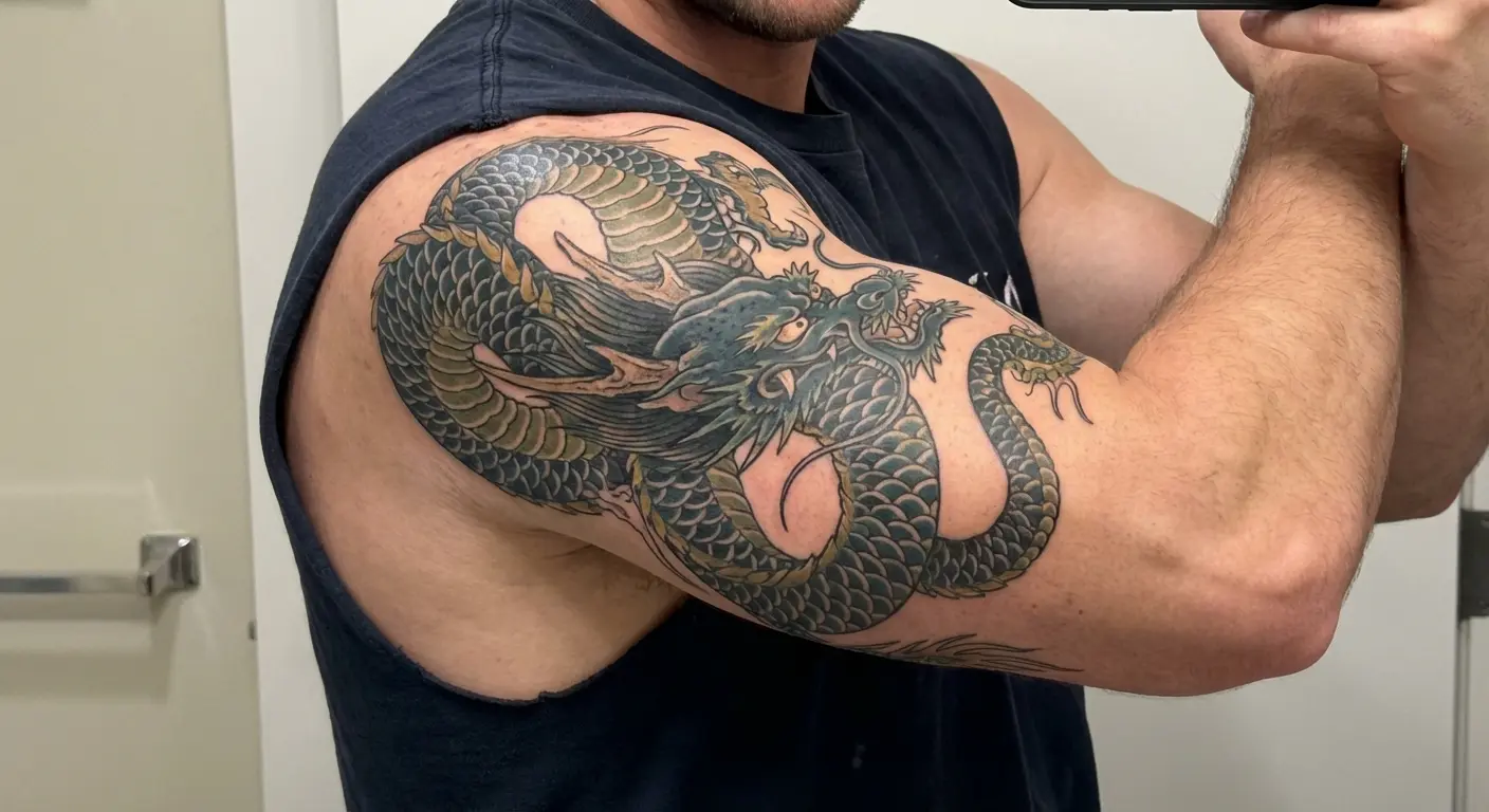
Wing positioning can extend the design across your scapular blade for multi-plane movement. Dragon wings that spread from your deltoid onto your shoulder blade create a two-zone design where different body parts move independently, adding complexity to the kinetic display.
Tail termination points need careful consideration. Tails that end abruptly look unfinished. Tails that wrap too far around your arm create awkward viewing angles. The best termination points usually sit at your bicep’s peak or fade into your upper arm’s inner surface where the design naturally disappears from view.
These tattoos need to be sized larger than you initially think. Muscle movement compresses visual space – when your deltoid flexes, the dragon’s body shortens and widens. Sizing the design for your flexed state ensures it doesn’t look stretched and thin when your muscle is relaxed.
8. Kinetic Tribal Bands
Tribal’s back. I said it. Not the solid black bands from 1998 – those are still trash. But modern geometric tribal with actual thought behind it? That works. Tribal bands that wrap your shoulder with intentional breaks and flows create shifting patterns as your arm rotates. Contemporary approaches use negative space as the primary design element – the gaps matter more than the filled areas.
Band width variation enhances movement perception. A tribal wrap that maintains consistent width around your entire shoulder looks static. Varying the width from 1 inch to 4 inches within the same design creates visual rhythm that becomes more apparent when your shoulder moves.
Asymmetrical tribal patterns create more interesting movement than symmetrical ones. Symmetrical patterns look the same from all angles, which means movement doesn’t reveal anything new. Asymmetrical patterns show different compositions as your shoulder rotates, rewarding viewers who see you from multiple angles.
Positioning tribal elements to align with muscle peaks and valleys makes the design feel integrated with your body rather than applied to it. When tribal shapes follow your deltoid’s natural contours, they appear to emerge from your muscle structure instead of sitting on top of your skin.
Terminating tribal patterns without awkward hard stops requires planning. The best tribal wraps either fade gradually into negative space or connect back to themselves in a continuous loop. Hard edges where the pattern suddenly ends break the flow and make the design feel incomplete.
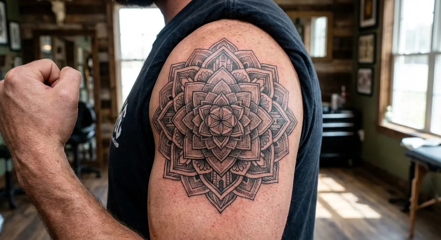
9. Expansion-Contraction Sacred Geometry
Sacred geometry patterns positioned at your shoulder’s center point create optical illusions of expansion when you raise your arm and contraction when you lower it. Metatron’s Cube, Flower of Life, and Sri Yantra patterns work particularly well because their concentric circular elements respond to your shoulder’s changing circumference.
Circle sizing needs to account for shoulder bulge variation. Your shoulder’s circumference changes by several inches between relaxed and flexed states. Sizing the outermost circles of your sacred geometry pattern for your shoulder’s expanded state ensures the design doesn’t feel cramped when you flex.
Line weight consistency matters more in geometric work than in organic designs. Inconsistent line weights look intentional in flowing, natural imagery but appear as mistakes in mathematical patterns. Every line in your sacred geometry should maintain the same thickness for visual coherence.
Pattern orientation affects how the design reads on your body. Aligning the pattern’s primary axis with your body’s vertical center creates intuitive reading – viewers immediately understand the design’s structure. Rotating the pattern 45 degrees creates visual tension that can be interesting but requires careful execution to avoid looking accidentally misaligned.
These tattoos often look “off” in photos but perfect in person. Cameras flatten three-dimensional movement effects. The expansion-contraction illusion that makes these designs special only works when someone sees your shoulder move through its full range of motion in real time.
Sacred geometry shoulder pieces can serve as spiritual focal points during meditation or yoga practices. Having a mandala or yantra positioned where you can see it during certain poses adds functional value beyond aesthetics. Some guys report that their shoulder geometry helps them maintain focus during breathwork or movement practices.
10. Athletic Motion Blur Effects
Motion blur tattoos suggest speed and movement even when you’re standing still. These designs work particularly well for athletes and fitness enthusiasts because they visually communicate the kinetic energy you embody during training or competition.
Blur direction needs to follow natural throwing or punching motion paths. If you’re a baseball player, the blur should trail behind a central image in the direction your arm moves during a pitch. If you’re a boxer, the blur should follow your jab trajectory. Arbitrary blur directions that don’t match real movement patterns look confused.
Color gradients enhance the blur effect better than black-and-gray approaches. A central image in solid black or bold color that gradually fades through lighter tones into bare skin creates convincing motion blur. Black-and-gray can achieve this but requires more subtle shading transitions that don’t always read clearly on shoulder curves.
These tattoos photograph dramatically in gym settings. The bright, direct lighting in most fitness facilities brings out the contrast between solid and blurred elements. Plus, the athletic context makes the motion blur concept feel thematically appropriate rather than arbitrary.
Bold central anchors prevent the entire tattoo from looking undefined. Motion blur only works if there’s a clear, solid subject that the blur emanates from. Without that anchor, the design just looks like a smudged mistake. The central element should be rendered in sharp detail with strong contrast before any blur effects are added.
Best subject matter includes animals in mid-sprint, abstract speed lines, or fragmenting geometric shapes. Animals work because everyone understands what a running wolf or leaping panther looks like, so the blur reads as motion rather than poor execution. Abstract speed lines give you maximum flexibility without requiring representational accuracy. Fragmenting shapes create a sense of explosive energy that complements athletic themes.
11. Shoulder Roll Wave Sequences
Wave patterns that follow your shoulder’s rotation axis create the illusion of water flowing around your arm as you move. Japanese wave styles translate better to shoulder curves than realistic ocean waves because they’re already stylized and graphic rather than attempting photorealism.
Positioning wave crests to align with your deltoid’s peak makes the design feel architecturally sound. The highest point of your wave should sit at the highest point of your shoulder, creating visual logic that viewers intuitively understand even if they don’t consciously notice the alignment.
Wave count affects visual clarity. Too many waves create visual clutter on your shoulder’s limited canvas. Too few waves waste the available space and make the design feel incomplete. I typically recommend 2-3 major waves for best impact – enough to establish the pattern without overwhelming the composition.
Blue-gray palettes work better than full-color approaches for shoulder waves. Realistic ocean colors (bright blues, turquoise, white foam) can look cartoonish on skin. Muted blue-gray tones with black outlines create a more sophisticated aesthetic that ages better and maintains visual clarity as the tattoo settles into your skin over time.
Foam and spray details can fill negative space without cluttering the design. Small dots and splashes of white ink in the areas between major wave forms add texture and movement without requiring additional bold elements that might compete with the primary waves.
Extending wave designs down the arm creates sleeve potential. Waves naturally flow and taper, making them ideal for transitioning from shoulder to arm. The wave pattern can gradually decrease in size as it moves down your arm, following your arm’s natural taper and creating a cohesive composition that spans multiple body zones.
12. Dynamic Predator Silhouettes
Predator animals positioned in action poses create powerful imagery that shifts as your shoulder moves. Profile poses work better than frontal views because they show the animal’s full body length, which can follow your shoulder’s curve from front to back.
Positioning the predator’s eye at your deltoid’s peak creates maximum impact. The eye becomes the focal point that draws viewer attention, and placing it at your shoulder’s highest point ensures it’s visible from the widest range of angles.
Silhouette approaches often create stronger designs than fully detailed realistic portraits. Solid black silhouettes maintain visual clarity during muscle movement and from various viewing distances. Detailed portraits can look muddy when your deltoid flexes or when viewed from more than a few feet away.
Predator orientation changes the design’s emotional tone. Forward-facing predators (wolves, lions, bears moving toward your chest) suggest aggression and confrontation. Upward-facing predators (eagles, hawks, sharks angled toward your neck) suggest aspiration and dominance. Backward-facing predators create visual tension by moving against the expected direction.
Negative space around the predator prevents the design from feeling cramped. Your shoulder’s curve already creates visual complexity. Adding a detailed background or filling every inch with ink can make the composition feel claustrophobic. Strategic negative space gives the predator room to breathe and makes the silhouette read more clearly.
Certain animals work better for specific shoulder zones. Wolves with their horizontal body orientation work beautifully across scapular blades. Sharks with their streamlined profiles fit perfectly on lateral deltoids. Bears standing upright can span from shoulder to upper arm. Matching animal anatomy to shoulder anatomy creates more convincing compositions.
Going Asymmetric (One Shoulder Beats Two)
Bilateral symmetry is overrated. One powerful shoulder piece often has more visual impact than matching tattoos on both shoulders. Asymmetry creates natural focal points that guide viewer attention and makes bolder statements than balanced designs.
Single-shoulder work offers more flexibility for future tattoo planning. You’re not locked into mirroring whatever you put on the first shoulder. You can develop each shoulder independently based on evolving interests, or you can leave one shoulder bare to maintain visual balance with a heavily tattooed opposite side.
Instagram aesthetics don’t pay your bills or navigate your actual social contexts. Your body already has natural asymmetries – you’re probably right or left-handed, one shoulder sits slightly higher than the other, you carry bags on one side. Embracing asymmetry in your ink acknowledges these realities instead of fighting them.
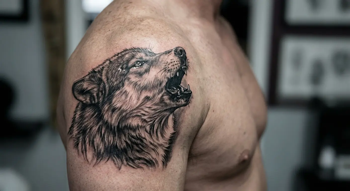
13. Lone Wolf Portraits
A single wolf portrait on one shoulder creates powerful symbolism about independence and individuality that matching wolves would dilute. The lone wolf concept only works if there’s actually one wolf – add a second, and you’ve got a pack, which communicates completely different meaning.
Portrait orientation changes the tattoo’s emotional tone. A wolf facing forward creates direct eye contact with viewers, suggesting confrontation or confidence. A wolf in profile shows the animal’s full body language and creates a more narrative composition. A wolf howling upward adds vertical drama and suggests communication or longing.
Positioning the wolf’s head to take advantage of your shoulder’s natural curve makes the portrait feel integrated with your body. The wolf’s snout can follow your anterior deltoid’s forward curve, or the back of the skull can nestle into the space where your shoulder meets your neck.
Realistic rendering works better than stylized approaches for lone wolf designs. The emotional impact of a wolf portrait comes from the animal’s expression – the intensity in its eyes, the tension in its jaw, the texture of its fur. Stylization can reduce these details to the point where the wolf loses its psychological presence.
Best sizing spans 5-7 inches for portrait impact. Smaller than that, and you lose the facial detail that makes wolf portraits compelling. Larger than that, and you’re forced to include more of the wolf’s body, which changes the composition from an intimate portrait to a full-body depiction.
Eye placement and expression matter more in wolf portraits than in other animal tattoos. The eyes need to be positioned where they catch light naturally and where viewers will make eye contact with them. A wolf with dead, expressionless eyes fails regardless of how technically perfect the execution is.
Background elements should be minimal. Moon silhouettes, forest suggestions, or mountain outlines can provide context, but detailed backgrounds compete with the wolf for attention. The wolf’s face should dominate the composition, with any background elements serving as subtle accent rather than co-equal focal points.
14. Unilateral Clock Towers
A clock tower rising up your shoulder creates vertical drama that bilateral designs can’t match. Vertical compositions work exceptionally well on shoulders despite the shoulder’s horizontal orientation because they draw the eye upward, creating the illusion of height and making you appear taller and more imposing.
Using your shoulder’s peak as the tower’s base creates architectural stability. The tower appears to be built on solid ground (your shoulder) rather than floating in space. This positioning makes structural sense that viewers intuitively understand, even if they don’t consciously analyze why the composition works.
Clock towers offer rich symbolic potential beyond pure aesthetics. You can set the clock face to a meaningful time – birth, death, marriage, sobriety date, deployment, graduation. That specificity transforms decorative architecture into personal narrative without requiring obvious explanation to casual observers.
Best tower heights typically extend 8-12 inches from shoulder to neck or upper arm. Shorter towers lose their vertical impact and read more as generic buildings. Taller towers risk awkward termination points where the design runs out of canvas or has to wrap onto your neck or arm in ways that break the architectural logic.
Gothic and Victorian architectural styles translate better to skin than modern minimalist towers. The ornate details, flying buttresses, and decorative elements of historical architecture create visual interest across the tower’s height. Modern towers with clean lines and minimal decoration can look boring when stretched across 10 inches of vertical space.
Handling the tower’s top termination point requires planning. Hard stops where the tower suddenly ends look unfinished. Fading the tower into clouds or mist creates a dreamy quality that might not match your aesthetic. Showing the complete tower top with a spire or dome provides closure but requires enough vertical space to include those elements without cramping them.
Stone texture rendering matters for architectural believability. Towers are built from stone, brick, or concrete – materials with specific visual textures. Your artist needs to render these textures convincingly or the tower looks flat and unconvincing. This is where black-and-gray shading really shines, creating depth through value contrast rather than color.
These tattoos serve as excellent foundation pieces for potential steampunk or urban-landscape chest expansions. A clock tower on your shoulder can logically connect to gears and machinery spreading across your chest, or to a cityscape that extends down your arm. The vertical tower creates a natural anchor point for horizontal expansion in multiple directions.
15. Single-Side Floral Cascades
Floral designs that cascade down from your shoulder across your upper arm create organic flow that works better as asymmetrical compositions than mirrored pairs. Flowers naturally grow in irregular, asymmetrical patterns – forcing them into bilateral symmetry fights their inherent nature.
Roses, peonies, and chrysanthemums each create different cascade effects based on their petal structure. Roses with their tight, layered petals create compact visual weight that works well for shorter cascades. Peonies with their loose, flowing petals create softer, more romantic cascades. Chrysanthemums with their spiky, radiating petals create dynamic, energetic cascades.
Positioning the primary bloom at your shoulder’s apex with supporting flowers flowing downward follows natural growth patterns. The largest, most detailed flower sits at the top where it commands attention, while smaller buds and blooms descend your arm in decreasing size, creating natural visual taper.
These designs challenge the misconception that floral work is feminine. Executed in bold black-and-gray with strong contrast and minimal soft shading, floral cascades read as powerful and masculine. The key is avoiding pastel colors and overly delicate rendering that codes as traditionally feminine.
Best cascade length runs 6-10 inches, creating natural flow without requiring full sleeve commitment. This gives you a substantial piece that makes a statement while leaving options open for future work. You can always extend the cascade later if you decide you want more coverage.
Leaf and stem placement guides the eye along your arm’s natural taper. Stems should follow the direction your arm narrows, with leaves positioned to fill negative space without cluttering the composition. This creates visual flow that feels intentional rather than random.
Black-and-gray floral work often reads more masculine than color approaches. Bold blacks with crisp highlights create graphic impact that color work can’t match. Color florals can be stunning, but they require careful palette selection to avoid looking too soft or decorative.
Negative space between blooms prevents the design from feeling cluttered on your shoulder’s curved surface. Flowers need room to breathe. Packing too many blooms into limited space creates visual chaos where individual flowers lose definition and the overall composition becomes muddy.
16. Offset Celestial Maps
A constellation map or celestial chart positioned on one shoulder creates personal astronomical significance without the visual heaviness of bilateral star coverage. Star charts work better than random star scatters because they reference actual astronomical configurations that carry meaning.
Selecting constellations based on personal meaning adds narrative depth. Your birth month’s zodiac constellation, the stars visible on a significant date, navigation stars that guided a meaningful journey – these choices transform generic star tattoos into specific personal statements.
Incorporating coordinate lines and astronomical notation adds depth beyond simple dot-to-dot stars. Latitude and longitude lines, right ascension markers, declination numbers – these technical elements create the appearance of an actual star chart rather than decorative sparkles.
Best chart sizing captures enough sky for recognizable constellations. An 8-10 inch diameter gives you room for major constellation patterns plus surrounding stars for context. Smaller charts force you to simplify constellations to the point where they’re no longer recognizable. Larger charts can include multiple constellations but risk overcrowding.
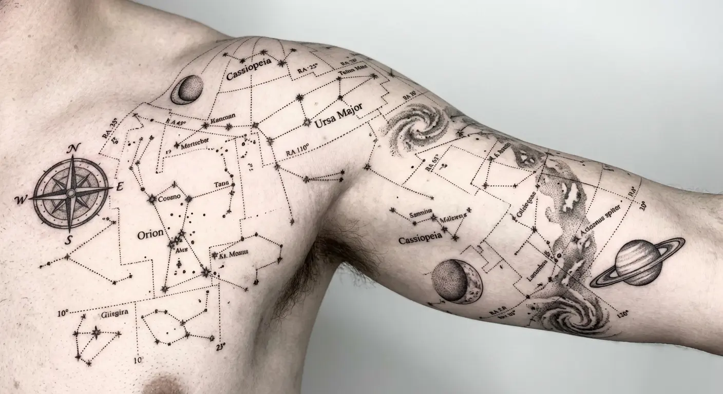
Orienting the map relative to your body’s axes creates intuitive reading. Aligning celestial north with your body’s vertical center means the chart reads correctly when you’re standing upright. This might seem like a minor detail, but it matters to anyone who actually knows astronomy and looks at your tattoo with informed eyes.
These designs photograph beautifully in both casual and formal contexts. The geometric precision and scientific aesthetic works in professional settings where more obviously decorative tattoos might feel out of place. The personal meaning remains private unless you choose to explain the specific constellations and their significance.
Integrating moon phases, planetary positions, or deep-sky objects adds complexity without overcrowding. A crescent moon, a planet at a specific position, or a nebula in the background can enhance the astronomical theme while filling negative space in visually interesting ways.
White ink accents can create subtle star-field effects in the background. Tiny white dots representing distant stars add depth and texture without competing with the primary constellation lines. This technique works particularly well on medium to darker skin tones where white ink shows up clearly.
17. Standalone Quote Arcs
Text that arcs across your shoulder following the deltoid’s curve creates powerful statement pieces that don’t require accompanying imagery. Shoulder placement works better for quotes than ribs or forearms because the text is visible to both you and others, and the natural reading curve follows your shoulder’s anatomy.
Font selection determines whether text remains legible across your shoulder’s three-dimensional surface. Script fonts often distort on shoulder curves – letters that look elegant on flat paper become stretched or compressed on your rounded deltoid. Sans-serif fonts maintain integrity better because their simple letterforms adapt to curves without losing readability.
Quote length matters more on shoulders than on flatter body areas. Too long, and you’re forced into awkward wrapping that breaks the arc’s flow. Too short, and you waste your shoulder’s canvas with a tiny phrase that doesn’t command the space. Sweet spot sits around 20-40 characters for single-line impact.
Positioning text so it reads correctly when your arm is in neutral position requires planning. Your shoulder looks different when your arm hangs at your side versus when it’s raised. Most guys want their text readable when they’re in normal standing position, which means tattooing with the arm in that same position.
Certain quote types work better than full sentences. Mantras, coordinates, dates, single powerful words – these condensed forms of meaning pack maximum impact into minimal space. Full sentences often require too many characters to fit comfortably on a shoulder arc, forcing compromises in font size or spacing that weaken the design.
Text size usually needs 1-2 inch letter height for readability. Smaller text might look delicate in the stencil but becomes illegible from any distance once healed. Larger text commands attention but can feel overwhelming if the quote is long.
Standalone text tattoos appeal to guys who want meaningful ink without committing to large-scale imagery. You get personal significance and visual impact without the time, pain, and expense of elaborate pictorial work. Text-only designs also tend to age well because they don’t rely on fine detail that can blur over time.
18. Isolated Phoenix Rises
A phoenix rising from your shoulder creates vertical drama and rebirth symbolism that loses impact when mirrored on both sides. The phoenix myth centers on singular transformation – one bird dying and one bird rising from those ashes. Bilateral phoenixes dilute that narrative into generic bird decoration.
For guys considering transformation symbolism, understanding phoenix tattoo meanings and mythology helps ensure your design carries the personal significance you’re seeking.
Upward-oriented phoenix poses work specifically well for shoulder placement because the bird appears to launch from your body. The phoenix’s head points toward your neck or face, wings spread wide across your shoulder and potentially onto your chest or back, tail feathers flowing down your arm – this composition uses your body’s vertical axis to enhance the rising motion.
Tail feather positioning determines whether the design flows naturally or terminates awkwardly. Tail feathers that follow your arm’s inner curve create graceful flow. Tail feathers that wrap around your arm’s outer edge can look forced. Tail feathers that extend onto your back create multi-plane visual interest.
Wing positioning determines whether the design feels confined or expansive. Wings tucked close to the phoenix’s body create a compact composition that stays contained on your shoulder. Wings spread wide can extend across your chest, back, or both, creating a larger piece that uses your shoulder as the anchor point for broader coverage.
Best phoenix sizing spans 6-8 inches for the body with wings extending another 4-6 inches. This creates substantial visual presence without overwhelming your shoulder or forcing the design to bleed onto body areas where it doesn’t make compositional sense.
Flame elements can integrate with your shoulder’s muscle definition. Flames rising from beneath the phoenix can follow your deltoid’s natural contours, with tongues of fire positioned in the valleys between muscle heads and highlights placed on the peaks. This integration makes the flames feel like they’re emerging from your body rather than painted on top of it.
Color choices dramatically affect the tattoo’s tone. Traditional red-orange flames suggest classical mythology and timeless symbolism. Blue-white flames suggest modern interpretation and supernatural power. Black-and-gray flames create sophisticated restraint that works in professional contexts.
Single phoenix tattoos carry stronger transformation narratives than paired birds. One phoenix tells a story of personal rebirth, of rising from your own ashes, of singular transformation. Two phoenixes become decorative symmetry without the same narrative punch.
Practical Stuff Nobody Tells You
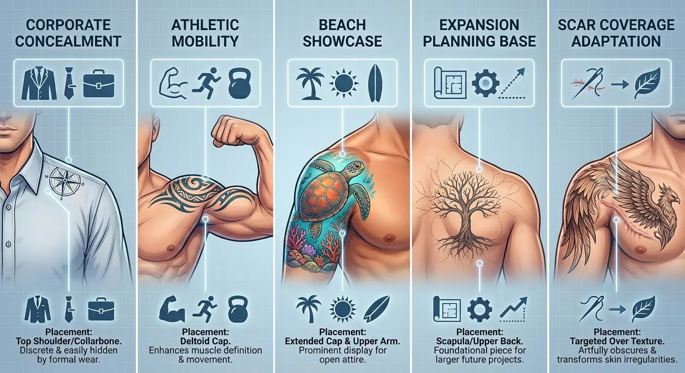
Most shoulder tattoo content focuses purely on aesthetics and completely ignores real-world practicality. Different approach here. These designs solve specific problems: maintaining professional appearance, accommodating athletic activities, maximizing visibility in social settings, planning for future expansion, or covering scars and marks.
Your shoulder placement strategy should change based on your actual daily life. A corporate attorney needs different placement than a personal trainer. A competitive swimmer has different requirements than a software developer who works from home. Instagram aesthetics don’t pay your bills or navigate your actual social contexts.
Each design in this section prioritizes function alongside form. You’re getting tattoos that work within specific constraints – dress codes, athletic requirements, coverage needs – while still delivering visual impact and personal meaning.
|
Lifestyle Need |
Recommended Placement |
Design Characteristics |
Healing Considerations |
Long-Term Maintenance |
|---|---|---|---|---|
|
Corporate Professional |
Scapular blade, posterior shoulder |
Conservative imagery, concealable under dress shirts |
Avoid bag strap friction for 2-3 weeks |
Minimal sun exposure = less fading |
|
Active Athlete |
Deltoid cap with bold lines |
High-contrast, minimal detail, sweat-resistant |
Plan around training schedule |
Requires frequent SPF application |
|
Beach/Pool Lifestyle |
Lateral deltoid, front shoulder |
Maximum visibility designs, bold graphics |
Extended sun avoidance during healing |
High fading risk = regular touch-ups needed |
|
Sleeve Expansion Planning |
Anterior or lateral shoulder |
Open-ended designs with flow potential |
Leave strategic negative space |
Color palette must integrate with future work |
|
Scar Coverage |
Depends on scar location |
Higher contrast, darker ink, texture-adaptive |
Wait 12-18 months post-injury |
May require multiple sessions for coverage |
19. Professional Collar Concealers
Shoulder tattoos positioned to remain hidden under dress shirt collars give you ink that exists in your personal life without affecting professional presentation. The specific zone that stays covered under standard collar styles typically includes the posterior shoulder and upper scapular area – basically anything that sits behind your shoulder’s lateral edge and above your shoulder blade’s midpoint.
Dude, bring your actual work shirt to the consultation. Seriously. I’ve had guys swear their collar will cover something, then show up to their corporate job and realize their boss can see it when they reach for the stapler. Try it on. Move around. Make sure.
This strategy matters more in conservative industries than in creative fields. If you’re in finance, law, medicine, or corporate management, visible tattoos can still create professional barriers regardless of changing social attitudes. If you’re in tech, creative services, or trades, coverage might matter less.
Best design sizes for concealed areas usually run 4-6 inches to maximize the hidden canvas. You’ve got limited real estate that stays consistently covered, so you want to use that space efficiently without forcing designs to extend into zones that might become visible.
Testing coverage with your actual work wardrobe before getting tattooed saves regret. Collars sit differently on different shirt styles. A standard dress shirt collar covers more than a polo collar. A button-down covers more than a henley. Know your wardrobe and plan accordingly.
Scapular blade placement offers the largest concealable area on your upper body. You can fit substantial designs – portraits, detailed scenes, large text blocks – in the zone that stays hidden under most collared shirts while remaining visible in casual wear.
Collar-concealed tattoos can still be visible in casual wear. T-shirts, tanks, and athletic wear all expose your posterior shoulder and scapular blade. You get the best of both worlds – professional concealment when needed, personal expression when appropriate.
These placements often hurt less than front-shoulder work. The scapular area has decent muscle padding, and while you’re closer to bone than on your deltoid cap, most guys find the pain totally manageable.
Planning for potential career changes that might relax dress code restrictions means designing with expansion potential toward visible areas. Your concealed shoulder piece can serve as the anchor for future work that extends onto your lateral deltoid or down your arm if your professional situation changes.
20. Gym-Friendly Minimal Linework
If you’re in the gym five days a week, forget intricate shading. Sweat’s gonna be running down that thing constantly while it heals. Salt, friction, moisture – terrible combo for fresh ink. Stick with bold lines. They’ll hold up when you’re doing shoulder presses and your deltoid’s flexing like crazy.
Athletes and fitness enthusiasts should explore fine line tattoo techniques that create clean, durable designs perfect for high-activity lifestyles.
Selecting designs that look intentionally minimal rather than incomplete requires understanding the aesthetic. Minimal doesn’t mean unfinished. It means deliberate simplicity where every line serves a purpose and nothing extraneous clutters the composition.
Shoulder placement specifically benefits from minimal approaches because the shoulder’s constant movement and sun exposure accelerates ink degradation. Simpler designs with fewer elements maintain their integrity longer than complex pieces with fine detail that can blur or fade unevenly.
Best line weights typically run 3-5mm for durability without looking heavy-handed. Thinner lines can break up or fade faster, especially in high-friction areas. Thicker lines maintain visibility but can look crude if not executed with precision.
Geometric shapes and symbolic icons translate well to minimal approaches. A single triangle, a simple compass, a clean wave, a basic mountain outline – these forms communicate meaning through shape alone without requiring elaborate detail or shading.
These tattoos often age better than complex pieces. There’s less detail to blur, fewer fine lines to thicken, less shading to fade unevenly. A well-executed minimal line tattoo can look nearly identical twenty years later, while detailed realistic work might need significant touch-ups.
Incorporating meaningful symbols in clean linework gives you personal significance without visual complexity. Runes, alchemical signs, simple animal outlines – these symbols carry deep meaning for those who understand them while reading as clean, sophisticated design to casual observers.
Minimal shoulder tattoos photograph exceptionally well in fitness contexts. The clean lines complement defined musculature without competing for attention. Your physique remains the primary focus, with the tattoo serving as accent rather than centerpiece.
The minimalist tattoo movement continues to gain momentum, with artists like Mo Ganji in Berlin gaining recognition for expert line technique that creates wildlife drawings with an indisputably consistent aesthetic using single, continuous lines – an approach that translates exceptionally well to shoulder placement for active individuals.
21. Beach-Ready Bold Graphics
High-contrast designs built for shirtless visibility create maximum impact in beach, pool, and summer settings. Bold black graphics read better from distance than detailed grayscale work. When someone sees you from across a beach or pool deck, intricate shading disappears into visual noise. Strong blacks against clean skin create shapes that register immediately, even from 50 feet away.
Selecting imagery that looks powerful without requiring close inspection means choosing designs with clear silhouettes and strong shapes. Tribal patterns, solid animal silhouettes, graphic icons – these read clearly from any distance. Realistic portraits with subtle shading require viewers to get close, which defeats the purpose of beach-ready visibility.
Shoulder placement makes these tattoos visible in your own peripheral vision, unlike back pieces you never see without mirrors. You can glance down and see your ink throughout the day, which creates a different psychological relationship with the design. It becomes part of your self-image rather than purely external decoration.
Best contrast ratios use solid blacks against clean skin for strongest impact. Half-tones and mid-grays can add dimension, but the foundation should be bold blacks that create unmistakable shapes. This approach also ages better – black ink maintains its intensity longer than gray shading that can fade into muddy mid-tones.
Strategic negative space prevents bold designs from looking muddy. Even with high-contrast work, you need breathing room. Solid black areas should be balanced with clean skin to create visual rhythm. Too much black without breaks creates a heavy, undefined mass that loses impact.
Certain imagery works better for beach visibility than realistic portraits or fine-line work. Polynesian tribal patterns, Japanese wave motifs, bold animal silhouettes, geometric mandalas – these styles were designed to be read from distance and maintain their power in bright outdoor lighting.
These designs photograph dramatically in outdoor lighting. Natural sunlight brings out contrast in ways that indoor lighting can’t match. The shadows created by your muscle definition combine with the tattooed blacks to create depth that looks flat in artificial light.
Balancing bold impact with artistic sophistication means avoiding the “bro tattoo” aesthetic while maintaining visual power. The difference comes down to composition, placement precision, and design originality. A well-executed bold graphic commands attention through confident simplicity rather than trying too hard.
22. Layering Foundation Pieces
Shoulder tattoos designed specifically to serve as anchor points for future expansion require different planning than standalone pieces. You’re not just getting a shoulder tattoo – you’re establishing the first element in a larger body art narrative that might unfold over years or decades.
When planning expansion potential, consider how your meaningful tattoo ideas for men can create cohesive narratives across multiple body zones.
Positioning initial shoulder work to allow for sleeve extensions, chest connections, or back piece integration means leaving strategic negative space and choosing imagery that flows naturally beyond your shoulder’s boundaries. A contained design with hard borders boxes you in. An open-ended design with directional flow creates expansion pathways.
Tell your artist explicitly if you want a sleeve eventually. Don’t assume they know. Show them reference images of complete sleeves you admire. Discuss how your shoulder piece should integrate with future work. Communication prevents you from boxing yourself in with a design that resists expansion.
Selecting imagery that works both as standalone art and as part of larger compositions requires careful consideration. Some designs feel complete on their own but resist integration with additional elements. Other designs feel slightly unfinished alone but become powerful when expanded.
Certain design styles lend themselves better to expansion than others. Japanese traditional work is built for expansion – dragons, waves, flowers, and clouds all flow naturally into adjacent body areas. Biomechanical designs can extend logically from shoulder to arm to chest. Geometric patterns can repeat and evolve across multiple zones. Realistic portraits and contained scenes are harder to expand without creating disjointed compositions.
Planning color palettes that will integrate with future work prevents clashing when you add new pieces. If your shoulder foundation uses warm tones, future additions should complement that warmth. If you start with black-and-gray, you can add color later, but going from color to black-and-gray creates visual inconsistency.
Foundation pieces should establish visual weight and flow direction for future additions. If your shoulder piece has strong downward flow, future arm work should continue that direction. If your shoulder piece has horizontal movement, chest or back expansions should follow that orientation.
Starting with shoulder work often makes more sense than beginning sleeves at the wrist. Your shoulder provides a natural anchor point with substantial canvas. Building from shoulder down to wrist creates logical progression. Starting at the wrist and working up can create awkward transitions when you reach the shoulder’s complex anatomy.
Common planning mistakes limit your expansion options. Boxing yourself in with borders or frames makes future integration difficult. Choosing imagery that doesn’t connect naturally to other body areas creates visual islands. Using all your available space without leaving negative space for transitions makes expansion feel cramped.
23. Scar Integration Coverups
Shoulder tattoos designed to incorporate or conceal existing scars from surgery, injury, or skin conditions require specialized approaches that most tattoo content never addresses. Scar tissue behaves differently than normal skin, and pretending otherwise leads to disappointing results.
Scar tissue takes ink differently than normal skin, often requiring multiple sessions and adjusted techniques. Scar tissue is denser and less porous than regular skin. Ink doesn’t penetrate as easily or as evenly. Your artist might need to go over scarred areas multiple times to achieve consistent color saturation.
Working with scar texture rather than fighting it often produces better results than trying to completely hide imperfections. Some scars have raised edges or irregular surfaces that won’t disappear under ink. Designs that incorporate these textures as intentional elements create more authentic results than designs that pretend the scars don’t exist.
Certain design styles camouflage scars more effectively than others. Higher contrast designs with bold blacks draw attention away from texture irregularities. Busy patterns with lots of visual information distract from underlying skin imperfections. Simple designs with large areas of single-color shading can highlight texture differences rather than hiding them.
Wait 12-18 months after injury or surgery for full healing before tattooing. Tattooing over fresh scars can cause additional scarring, uneven healing, and poor ink retention. Your skin needs time to complete its healing process before you add the trauma of tattooing.
Consult with both your doctor and an experienced tattoo artist about scar coverage. Your doctor can tell you when your scar is healed enough for tattooing. Your artist can tell you what’s realistically achievable given your scar’s characteristics.
Raised or keloid scars present different challenges than flat scars. Raised scars create three-dimensional texture that ink can’t flatten. Keloid scars can continue growing even after they seem healed, potentially distorting your tattoo over time. Some scars simply aren’t good candidates for coverage, and honest artists will tell you that upfront.
Design strategies that incorporate scars as intentional elements often work better than pure coverage attempts. A surgical scar becomes a lightning bolt in a storm scene. A burn scar becomes flames in a phoenix design. An injury scar becomes a crack in armor plating. This approach transforms reminders of trauma into empowering narratives.
Darker ink and higher contrast work better for coverage. Light colors and subtle shading don’t hide texture irregularities effectively. Bold blacks and strong contrasts create visual impact that draws attention away from underlying imperfections.
These tattoos often carry deeper personal significance than purely aesthetic pieces. You’re not just getting a tattoo – you’re reclaiming your body, transforming trauma into art, taking ownership of your physical narrative. That emotional weight makes the technical challenges worthwhile.
Set realistic expectations. Some scars won’t hold ink perfectly, and that’s okay. Your tattoo might have slight variations in color saturation or texture. It might need touch-ups more frequently than tattoos on unscarred skin. These imperfections don’t diminish the tattoo’s value or meaning.
The right artist can turn physical reminders of trauma into empowering body art. This requires technical skill with scar coverage, artistic vision to design around texture challenges, and emotional intelligence to understand what you’re trying to achieve beyond pure aesthetics.
Getting From Idea to Actual Ink
You’ve seen designs that work with shoulder anatomy, respond to movement, leverage asymmetry, and solve real-world problems. But here’s where most guys get stuck: translating the concept in your head into an actual design that a tattoo artist can execute.
Before your consultation, explore proper tattoo aftercare protocols to ensure your shoulder piece heals perfectly and maintains its visual impact for years.
You’re probably thinking about your shoulder tattoo constantly. Maybe you’re sketching rough ideas or saving reference images, but you’re struggling to communicate exactly what you want. That gap between vision and execution frustrates everyone.
Walking into a consultation with vague descriptions puts enormous pressure on your artist to read your mind. “I want something meaningful” or “I’m thinking maybe a dragon or something tribal” doesn’t give your artist enough information to create what you’re actually envisioning.
Look, if you’re struggling to explain what’s in your head, there are tools now that can help. I’ve had clients use Tattoo Generator IQ to mock stuff up before coming in. Does it replace the consultation? Hell no. But it helps bridge that gap between “I want a dragon” and showing me exactly what kind of dragon, what style, what vibe.
OR just bring references. Lots of them. Not just one Pinterest pic – bring 10 images that capture different elements you like. Style from this one, composition from that one, vibe from another. Give your artist something to work with.
This makes the collaboration process way more efficient. Your artist can see your vision immediately and offer informed feedback about what will work on your specific shoulder anatomy. You can iterate on designs before anyone picks up a tattoo machine. You can ensure the final result matches your expectations instead of hoping your artist interpreted your description correctly.
The technology bridges the communication gap that causes most tattoo regret. You see your idea rendered in actual tattoo style before committing to permanent ink. You can adjust elements, try different placements, explore variations – all without the permanence and expense of actual tattooing.
Final Thoughts
Your shoulder isn’t just another placement option. It’s a three-dimensional, constantly moving canvas that demands designs built specifically for its anatomy and mechanics.
The tattoos that work best aren’t the ones that look coolest in flash books or on Instagram. They’re the designs that account for how your deltoid curves, how your scapular blade moves, how your shoulder appears when you’re raising your arm at the gym versus sitting at your desk versus walking on the beach.
You now understand why placement zones matter. Anterior versus lateral versus posterior shoulder zones have completely different characteristics that affect pain, visibility, movement, and aging. You can’t treat your entire shoulder as one unified canvas.
Movement affects visual impact in ways that static reference photos never show. Flexion, rotation, elevation – your shoulder moves constantly, and your men shoulder tattoo needs to look good through all those positions. Designs that account for kinetic display create more interesting visual experiences than designs that only look good when you’re standing perfectly still.
Asymmetry often beats symmetry for creating powerful statements. A single top shoulder tattoo men design commands attention more effectively than diluted bilateral matching. One bold design creates a focal point. Two matching designs create balance that can feel safe and predictable.
Your actual lifestyle should drive design decisions more than aesthetic preferences. Professional coverage needs, athletic durability requirements, expansion planning, scar integration – these practical considerations matter as much as whether a design looks cool. A tattoo that doesn’t work with your real life creates ongoing frustration regardless of how beautiful it is.
The shoulder tattoos you’ll still love decades from now are the ones that work with your body’s natural architecture instead of fighting against it. Stop treating your shoulder as blank space to fill with whatever looks cool in the moment.
Start thinking about it as a unique canvas that offers specific advantages no other body area can match. Your shoulder’s curve creates opportunities for radial designs. Your shoulder’s movement creates opportunities for kinetic art. Your shoulder’s visibility creates opportunities for controlled disclosure.
Your top shoulder tattoo men piece should be as dynamic, powerful, and authentic as you are. It should move with you, age with you, and tell your story in ways that static decoration never could.