
23 Last Name Tattoos That Tell Your Actual Story
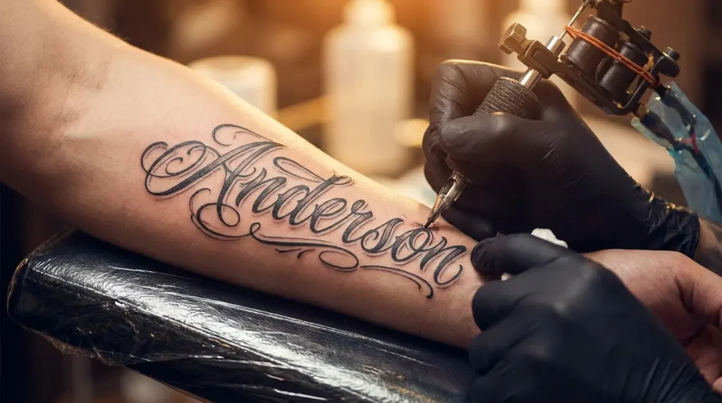
Table of Contents
-
Serif Last Name Tattoos That Feel Like Heirlooms
-
Script Last Name Forearm Tattoos That Flow With Your Body
-
Gothic Last Name Tattoos for Maximum Impact
-
Minimalist Sans-Serif Last Name Tattoos
-
Handwritten Last Name Tattoos That Capture Personality
-
Typewriter Font Last Name Tattoos
-
Forearm Last Name Tattoos That Command Attention
-
Ribcage Last Name Tattoos for Private Meaning
-
Collarbone Last Name Tattoos That Frame Your Identity
-
Spine Last Name Tattoos That Literally Have Your Back
-
Inner Bicep Last Name Tattoos You Control
-
Wrist Last Name Tattoos as Daily Reminders
-
Last Name Tattoos Woven Into Family Crests
-
Last Name Tattoos With Birth Flowers
-
Last Name Tattoos Anchored by Coordinates
-
Last Name Tattoos Framed by Ancestral Symbols
-
Last Name Tattoos With Occupation Icons
-
Last Name Tattoos Merged With Cultural Patterns
-
Negative Space Last Name Tattoos
-
Watercolor Last Name Tattoos That Break Convention
-
Geometric Last Name Tattoos With Hidden Meanings
-
Last Name Tattoos in Your Ancestor’s Language
-
Deconstructed Last Name Tattoos That Evolve
TL;DR
-
Skip the generic script-on-forearm unless you want to match everyone at the gym
-
Your font choice says as much as your name itself (serif = traditional, script = personal, gothic = powerful)
-
Where you put it matters more than you think. Forearm is a public declaration. Ribcage is private.
-
Adding symbols turns a label into a story, but only if they actually connect to your heritage
-
Longer surnames? Forearm placement gives you room to work with the natural flow of your arm.
-
Watercolor, negative space, and geometric approaches keep your surname from looking like everyone else’s
-
Ask yourself why this name matters to you, not just whether it looks cool
Why Last Name Tattoos Need More Than Just Letters
Walk into any tattoo shop and you’ll see the same last name tattoo five times: script font, forearm, maybe a date underneath. It’s not that these are bad. They’re just the default. And your family name deserves better than default.
Here are 23 ways to make your surname actually mean something on your skin. Your last name carries weight whether you asked for it or not. Family legacy, cultural identity, chosen family, reclaimed heritage. The tattoo should reflect your specific relationship with that weight, not just slap your family name on your forearm and call it meaningful.
Last name tattoos have become one of the most meaningful forms of body art because they represent connections and stories we hold close. These designs symbolize pride in one’s family name and serve as permanent tributes to ancestry, according to Tatship’s analysis of tattoo meanings. Yeah, Polynesian cultures were doing genealogy tattoos centuries before Instagram made surname ink trendy. But that’s not really the point here.
We’re covering typography that matches your energy, placement that controls your narrative, symbolic integration that adds layers of meaning, and unconventional design methods that make your surname unmistakably yours.
The goal? A tattoo people understand without needing explanation, but that reveals more depth the longer they look.
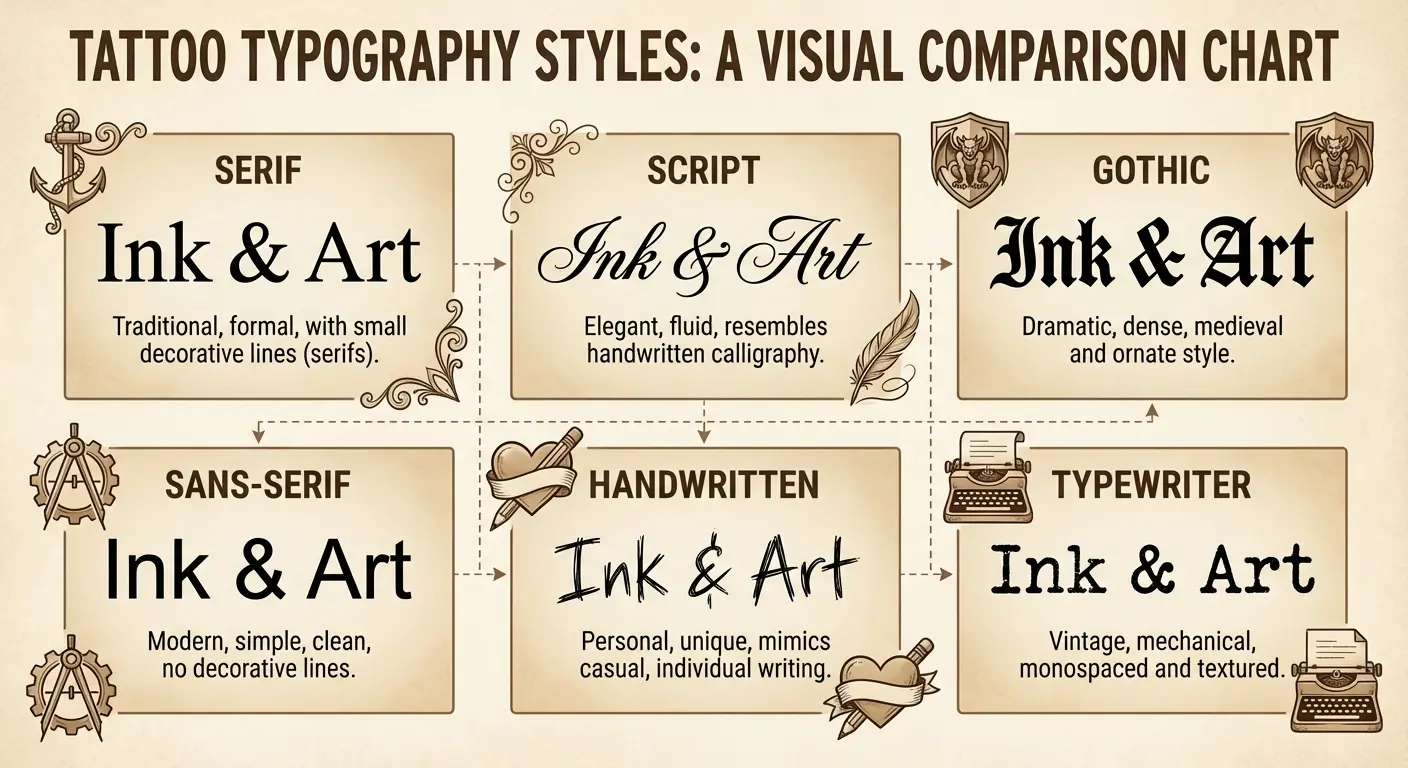
Typography Transformations
Font selection does more work than most people realize. The typeface you choose immediately communicates your relationship with your heritage. Reverent, rebellious, personal, proud.
Six typography approaches that each tell different stories. From serif fonts that connect you to tradition, to deconstructed letters that show how you’re rewriting your family narrative. Typography isn’t just about readability. It’s about emotional resonance.
|
Typography Style |
Emotional Message |
Best For |
Readability Over Time |
Typical Size Requirements |
|---|---|---|---|---|
|
Serif |
Traditional, formal, institutional |
Honoring elders, continuing traditions |
Excellent (bold strokes age well) |
Medium to large (serifs need space) |
|
Script |
Personal, intimate, signature-like |
Emotional connections, memorial pieces |
Good (requires skilled artist) |
Medium (detail gets lost when small) |
|
Gothic/Blackletter |
Powerful, historic, rebellious |
Reclaiming heritage, bold statements |
Fair (ornate details may blur) |
Large (complex letterforms) |
|
Sans-Serif |
Modern, clean, redefined identity |
Contemporary relationships with heritage |
Excellent (simple lines age best) |
Any (scalable to small sizes) |
|
Handwritten |
Irreplaceable, deeply personal |
Memorial tattoos, carrying someone’s presence |
Good (depends on line weight) |
Medium to large (preserves nuances) |
|
Typewriter |
Nostalgic, analog, mid-century |
Specific era connections, vintage aesthetic |
Very good (designed for imperfection) |
Small to medium (forgiving style) |
1. Serif Last Name Tattoos That Feel Like Heirlooms
Serif fonts (those little feet on letters) carry institutional weight. They reference old documents, family bibles, immigration papers, legal declarations.
When you ink your last name in a serif typeface, you’re connecting to formality and permanence. Good choice if you’re honoring elders, continuing traditions, or acknowledging the sacrifices previous generations made.
The specific serif matters. Garamond is what you use if you want people to think your family has a library. Baskerville is what’s on law firm letterhead. Bodoni feels elegant but modern. Think about where your family name appears in your history. Ships’ manifests? Military records? Business signs? Match the serif style to that context.
Serifs need space. Cram them onto your wrist and they’ll look like a smudge in five years. Upper arm, thigh, back. Anywhere you can give those little feet room to actually be visible.
2. Script Last Name Forearm Tattoos That Flow With Your Body
Script transforms your surname from a label into a signature. This is for when your relationship with your name feels deeply personal rather than institutional.
Script forearm last name tattoos have gotten popular, which means they’re also getting crowded. You need to be intentional about differentiation. The artistry of cursive script is undeniably captivating. Unlike block letters that stand stark and bold, cursive offers an intimate touch, mimicking beautiful handwriting that can evoke feelings of warmth and affection. Cursive tattoos often symbolize love for family members or partners, with names rendered in graceful loops and swirls creating an emotional connection that’s hard to ignore.
Copperplate script feels formal and controlled. Brush script feels spontaneous and artistic. Spencerian script feels vintage and deliberate. Match the script’s energy to your actual connection with the name.
Got letters from your grandmother? Use her actual handwriting. Not a font that looks like handwriting but her specific loops and slants. On the forearm, you can angle it to follow your arm instead of fighting against it.
Script requires a skilled artist who understands letter spacing and flow. Poorly executed script looks amateurish fast. Well-executed script becomes a flowing extension of your body’s natural lines.
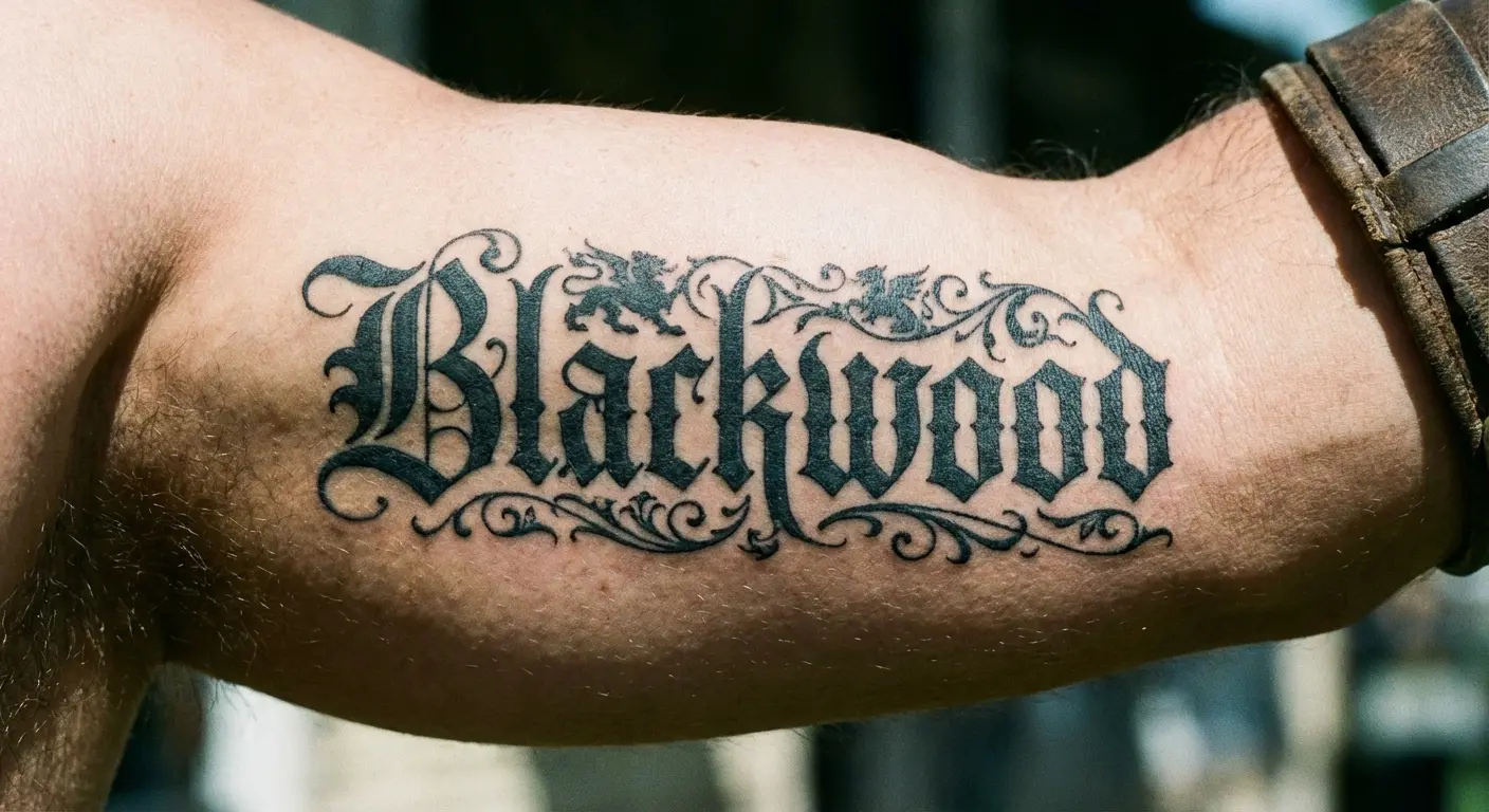
3. Gothic Last Name Tattoos for Maximum Impact
Gothic (or blackletter) typography immediately signals strength, tradition, and a bit of rebellion. These are the fonts you see on old German beer labels, medieval manuscripts, and certain motorcycle club patches.
Gothic works when you want to reclaim power in your family narrative or when your heritage connects to Northern European roots. The style is inherently bold, so it demands confident placement. Chest, upper back, outer forearm. You can’t really do subtle with gothic fonts. They command attention by design.
When looking at bold typography choices, exploring gothic font tattoo options can help you visualize how these powerful letterforms will translate to your specific surname.
Gothic fonts are hard to read. That’s not a bug, it’s a feature if you want people to have to look twice. But if your surname is Szczepanski or something, maybe pick a different style.
Gothic also pairs well with heraldic symbols, ravens, or architectural elements if you’re planning to expand the design later.
4. Minimalist Sans-Serif Last Name Tattoos
Sans-serif fonts strip away ornamentation and present your name as pure form. You want this when your surname should feel modern, clean, and unencumbered by historical baggage.
Helvetica, Futura, and Gotham are popular because they’re readable at any size and age beautifully. No fine details to blur over time.
Minimalist designs often appeal to people with complicated relationships with family legacy. The clean lines say “this is my name, but I’m defining what it means on my terms.” Sans-serif also works brilliantly for unconventional spots like side of finger, behind ear, along collarbone because the letters remain legible even when small.
The challenge? Making it feel intentional rather than default. Try subtle modifications: slightly increased letter spacing, mixing weights, aligning to a geometric grid. These add personality without sacrificing the clean aesthetic.
5. Handwritten Last Name Tattoos That Capture Personality
Using actual handwriting (yours, a parent’s, a grandparent’s) transforms a last name tattoo from generic to irreplaceable.
This isn’t about choosing a handwriting-style font. Scan or photograph someone’s actual penmanship and have your artist reproduce those exact letterforms, quirks and all. The slightly shaky line where your grandfather’s hand trembled, the way your mother loops her ‘g’, the distinctive way you cross your ‘t’. These imperfections are what make handwritten tattoos powerful.
Use actual handwriting, not a font. Someone use their dad’s signature from a birthday card. The ‘J’ was half-formed and the whole thing slanted up. Looked way better than any script font because it was actually his.
Your artist needs to understand which “mistakes” to preserve (because they add character) and which to correct (because they’ll read as errors rather than personality). Handwritten tattoos work best at medium to larger sizes where the nuances remain visible.
6. Typewriter Font Last Name Tattoos
Typewriter fonts carry nostalgia and a specific mid-century aesthetic that’s having a moment. The appeal here is the slight imperfection built into the design. Uneven baselines, varying ink density, that distinctive mechanical spacing.
For those drawn to vintage aesthetics, using a typewriter font tattoo generator lets you preview how your surname will look with that distinctive mechanical character.
Typewriter typography works when you want to evoke a specific era. Maybe when your family immigrated, or when a significant family event occurred. Or when you appreciate the analog, permanent nature of typewritten text, which parallels tattooing nicely.
Courier is the most recognized typewriter font, but there are dozens of variants that capture different typewriter models and eras. This style pairs well with other vintage elements like dates, coordinates, postal marks if you’re building a larger composition.
Typewriter fonts are forgiving because they’re designed to be readable even when imperfect. They work on curved surfaces or areas where skin texture might affect fine details.
Placement Strategies That Change Everything
Font matters, but where you put it matters more. Same surname in the same script feels totally different on your ribs versus your forearm. One’s a private anchor, one’s a public statement. Figure out which you actually want.
Six strategic placement options, each serving different psychological and practical purposes. The goal is choosing placement that aligns with why you’re getting the tattoo, not just where it might look cool.
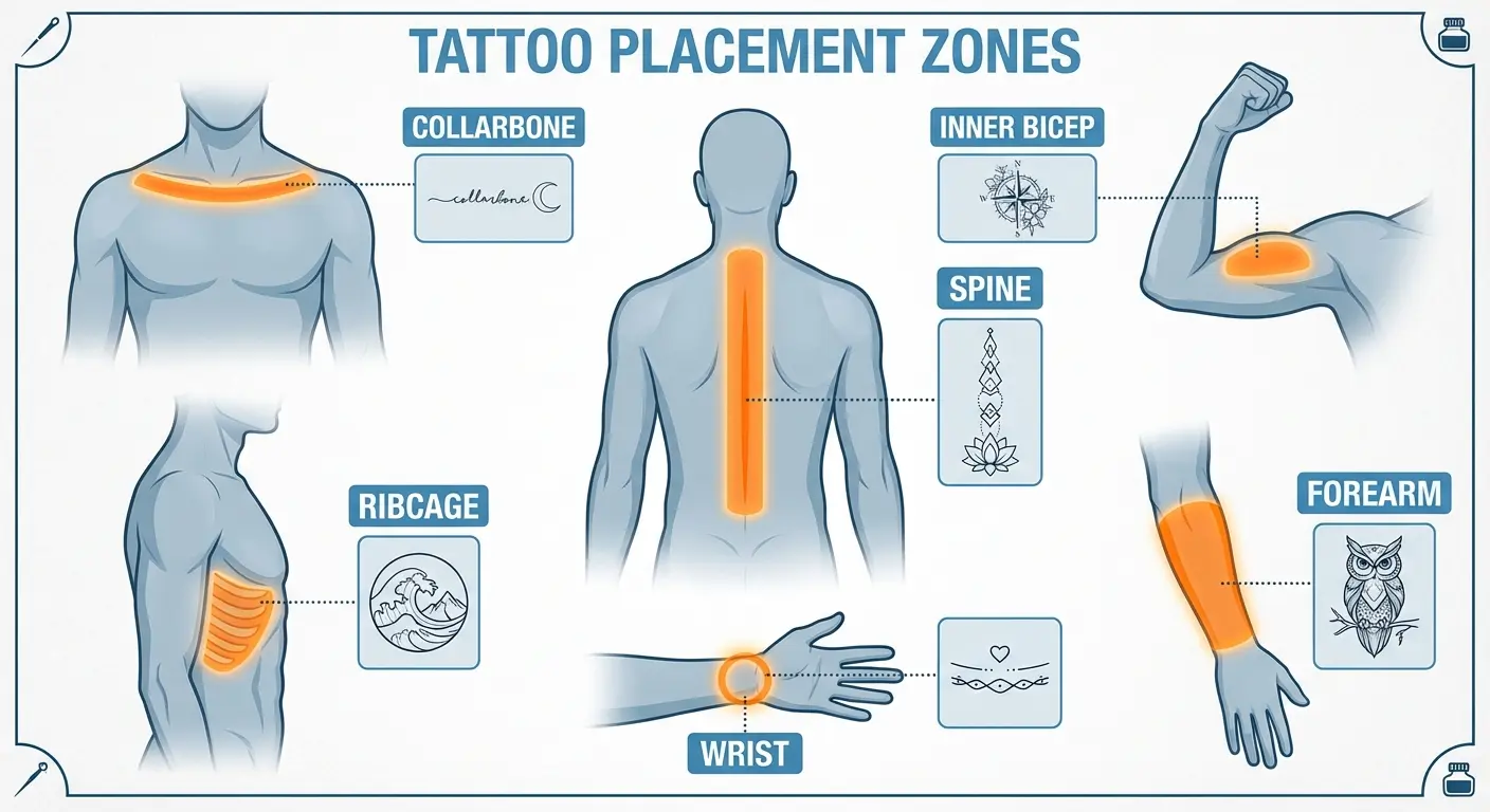
Placement Visibility Level Pain Level Professional Concealment Best Typography Styles Aging Considerations Forearm High (constant visibility) Low to moderate Difficult (long sleeves only) Script, serif, sans-serif Ages well (taut skin) Ribcage Low (private, your choice) High (bone proximity) Easy (clothing covers) Any style, room for expansion Good (minimal sun exposure) Collarbone Medium (partially visible) Moderate (bony, sensitive) Moderate (depends on neckline) Short names, minimalist Fair (thin skin, visible area) Spine Low (can’t see without mirror) High (nerve density) Easy (clothing covers) Vertical stacking, any style Good (protected area) Inner Bicep Medium (your control) Low (muscle padding) Easy (arms down conceals) All styles work well
Excellent (minimal sun, elastic skin) Wrist High (daily encounters) Moderate (thin skin) Difficult (always visible) Small, minimalist, abbreviated Fair (fades faster, frequent washing)
7. Forearm Last Name Tattoos That Command Attention
Your forearm is prime real estate because it’s visible to you constantly and to others frequently. Choose this when your surname is a source of pride you want to declare publicly, or when you need regular visual reminders of your family connection.
Forearms are having a moment, which means they’re also getting crowded. If you’re getting your surname here in 2024, you’re joining a very large club. Not a dealbreaker, just something to know.
Forearm gives you choices. Wrist to elbow for longer names, it follows the line your arm already makes. Or wrap it around like a band, which looks less like a label and more like part of your body.
Inner forearm keeps it more personal (you see it more than others do). Outer forearm broadcasts it outward.
Honestly, forearm tattoos are hard to hide in professional settings. This placement signals you’re past the point of concealing your ink. The forearm also ages relatively well for text because the skin stays fairly taut compared to other areas, meaning your letters will remain readable longer.
8. Ribcage Last Name Tattoos for Private Meaning
Ribcage placement turns your surname into something intensely personal. Nobody sees it unless you choose to show them, which fundamentally changes the tattoo’s purpose from declaration to anchor.
Good for when your relationship with your surname is complicated, when you’re honoring someone privately, or when you want the tattoo to serve as a personal touchstone rather than a public statement.
The ribcage offers significant space for longer names or for integrating additional elements. The natural curve of your ribs can complement flowing typography.
Ribcage tattoos hurt like hell. There’s no nice way to say it. Bone, skin, needle. That’s the whole equation. Some people want that for a heavy memorial piece. Some people just want numbing cream. Either’s fine.
The ribcage also allows for interesting orientations. Text can follow your ribs’ curve, run vertically along your side, or spread across your sternum area for surnames that are part of larger chest pieces.
9. Collarbone Last Name Tattoos That Frame Your Identity
Collarbone placement positions your surname right at your body’s frame, literally bordering your presence. You want this when your name should be visible but not aggressive, present but not dominating.
Text along the collarbone runs horizontally, following the bone’s line, which naturally limits length. Shorter surnames work better here, or you might use initials or abbreviated versions.
The collarbone area is partially visible with many necklines but easily covered when needed, giving you control over disclosure. This placement has become popular for last names that include dates or small symbolic elements positioned at either end of the text, creating a balanced composition.
The collarbone area is bony and sensitive, so expect moderate pain during the session. The skin here is also relatively thin, which means your artist needs solid line work skills because there’s little room for error. This area can show aging more than others, so keep that in mind.
10. Spine Last Name Tattoos That Literally Have Your Back
Placing your surname down your spine creates powerful symbolism. Your family name supporting you, being your backbone, or you carrying your heritage.
This placement works vertically, with letters stacked or running down your spine’s length. It suits longer surnames or allows for integration of each family member’s name in a vertical list.
Spine tattoos are deeply personal because you can’t see them yourself without mirrors. They exist more for your knowledge than your viewing. This changes the tattoo’s function entirely. It becomes something you carry rather than something you display.
The spine is another high-pain area due to bone proximity and nerve density. Spine t attoos are easy to conceal with clothing but create dramatic reveals in backless outfits or intimate settings.
The vertical orientation also allows for interesting design variations. You can incorporate your vertebrae into the design or use the spine as a central axis for symmetrical elements.
11. Inner Bicep Last Name Tattoos You Control
Inner bicep is the “I’ll show you if I feel like it” placement. Arms down, it’s hidden. Arms up, there it is. Good if you’re not ready to commit to everyone seeing it all the time.
The inner bicep provides a relatively flat canvas that’s forgiving for text. The area ages well because the skin maintains elasticity longer than areas with more sun exposure or movement. This placement has become popular for surnames that incorporate additional elements above or below the text (dates, symbols, portrait elements) because there’s room to expand the design without committing to a full sleeve.
The inner bicep is also less painful than many other placements because there’s more muscle and fat padding. If you’re getting your first tattoo and want your surname somewhere meaningful but not extreme, this placement offers a balanced option.
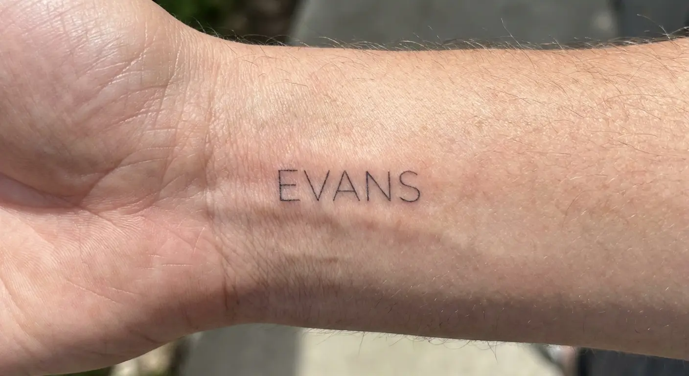
12. Wrist Last Name Tattoos as Daily Reminders
Wrist placement turns your last name into something you encounter constantly throughout your day. Every time you check your phone, type, drive, or gesture, you see your surname.
Get this if you need that regular reminder of who you are or who you’re honoring. Wrist tattoos are necessarily smaller, which means longer surnames might need to wrap around the wrist or use abbreviated versions.
The wrist offers several orientation options: text running parallel to your arm (readable when you rotate your wrist), text circling your wrist like a bracelet, or text on the inner wrist (more private) versus outer wrist (more visible to others).
Wrist tattoos have become common enough that they’re relatively accepted in professional settings, though they’re harder to hide than inner bicep or ribcage placements. The wrist is moderately painful (thin skin, proximity to bone and tendons) and requires an artist comfortable working on a curved, moving surface.
Wrist tattoos fade faster than many other placements due to constant sun exposure and hand washing. Expect to need touch-ups more frequently.
Symbolic Integration Methods
Text by itself is just text. Add symbols and you’ve got a story. Here’s how to do that without making it look like a Pinterest board exploded on your arm.
Six approaches for weaving your last name into larger compositions that tell richer stories. Choose symbols that genuinely connect to your family history or personal relationship with your heritage, not just generic imagery that looks good with text.
Each integration method serves different purposes, from honoring specific family members to representing your cultural background to marking significant family events.
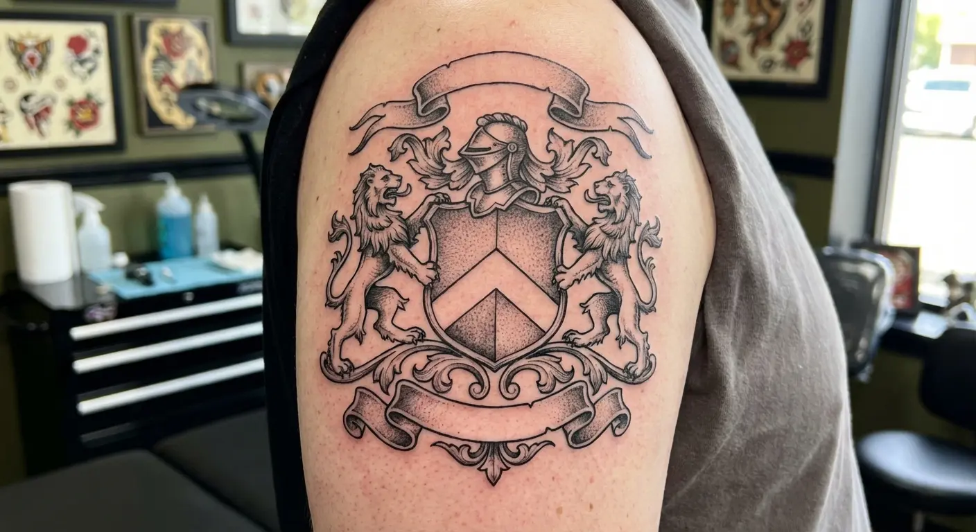
13. Last Name Tattoos Woven Into Family Crests
Family crests and coats of arms offer ready-made symbolic frameworks. If your family has a legitimate heraldic crest, incorporating your surname into or around that imagery creates a comprehensive identity piece.
The crest provides visual interest and historical context while your surname grounds it in your specific lineage. Perfect for families with European heritage where heraldic traditions are documented.
You can position your surname on a banner below the crest (traditional heraldic style), integrate it into the crest’s border, or use it as a foundation with the crest’s elements arranged above.
Here’s where you need to be careful: most “family crests” you find online are bullshit. Unless your family kept actual records, you’re probably looking at clip art that shares your surname. Which is fine if you know that’s what you’re getting, but don’t pretend it’s your ancestral coat of arms from 1347.
This integration method requires larger placement areas (upper arm, back, thigh) because crests have detailed elements that need space to remain readable.
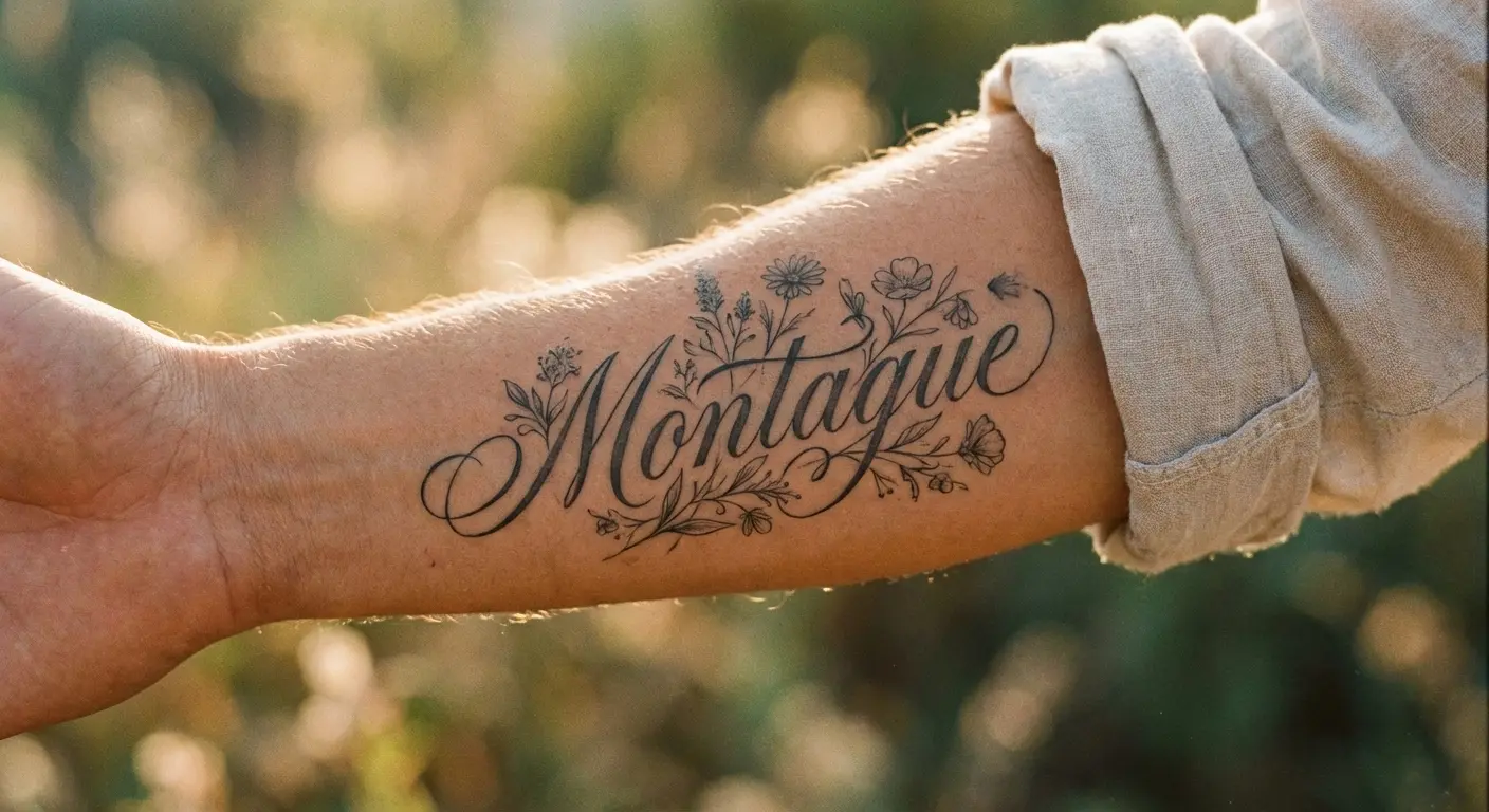
14. Last Name Tattoos With Birth Flowers
Birth flowers offer a way to personalize your surname while honoring specific family members. You can integrate the birth flowers of parents, grandparents, children, or siblings around your surname, creating a garden that represents your family tree.
Many people find that using a birth flower tattoo generator helps them visualize how botanical elements will complement their surname design.
Each flower adds color, organic movement, and individual meaning to what would otherwise be stark text. Choose this when you want your tattoo to feel alive and growing rather than fixed and historical.
The flowers can frame your surname (positioned above and below), weave through the letters themselves, or create a background that the text sits upon. Botanically accurate flowers versus stylized versions is a choice that affects the overall aesthetic. Realistic flowers feel more traditional, illustrative flowers feel more artistic.
Think about whether you want the flowers in color or black and grey. Color requires more maintenance over time but creates immediate visual impact. This integration method works across various placements but shines on areas with enough space for the flowers to feel lush rather than cramped (thigh, upper arm, back).
15. Last Name Tattoos Anchored by Coordinates
GPS coordinates add geographic specificity to your surname, answering “where does this name come from?” or “where did this family become important to me?”
Coordinates for where your family’s from, where something important happened, whatever geography matters to your story.
The coordinates provide context and precision, transforming your surname from a general identifier into a mapped point in space and time.
Coordinates work well positioned above or below your last name, creating a stacked composition, or integrated into a larger design where the coordinates form a baseline or border.
The numbers themselves can match your surname’s typography or contrast it (clean sans-serif coordinates with ornate script surname, for example).
This appeals to people who think spatially about identity or who’ve experienced immigration, relocation, or geographic displacement as central to their family story. Coordinates are also wonderfully subtle. Most people won’t immediately recognize what the numbers mean, which creates layers of privacy within a visible tattoo.
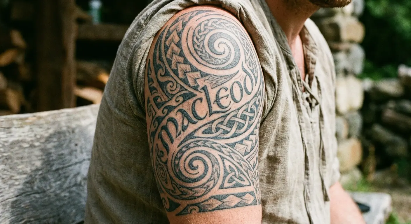
16. Last Name Tattoos Framed by Ancestral Symbols
Cultural symbols specific to your heritage provide visual language that complements your surname with meaning. Celtic knots for Irish heritage, Nordic runes for Scandinavian backgrounds, Adinkra symbols for West African roots, cherry blossoms for Japanese ancestry. These elements communicate cultural identity that your surname might not immediately convey, especially if it’s been anglicized or changed through immigration.
The symbols can frame your name, creating borders or corners that contain the text, or integrate directly with the letters themselves.
Here’s where you can really screw this up. Cultural symbols aren’t decorative. They have meanings, histories, and in some cases, you have zero right to use them. If your surname is O’Brien and you’re considering Maori patterns because they “look cool,” stop. Just stop. Stick to your actual heritage or find an artist who can explain why what you’re considering isn’t appropriation.
Work with artists familiar with your cultural tradition or consult with family members who can verify the appropriateness of specific symbols. Research is crucial here. This integration method often benefits from consulting multiple references to ensure the symbols are rendered accurately and respectfully.
17. Last Name Tattoos With Occupation Icons
If your family has a multi-generational trade or profession, incorporating tools or symbols of that work adds narrative depth to your surname.
Family of builders? Popular variations include carpenter’s squares worked into the letters, blueprints as background. Family of musicians? Someone did their surname with the notes spelling it out in musical notation. Corny if you don’t care about music, perfect if you do.
Good for when the occupation is central to your family’s identity or when you’re continuing a family tradition yourself. The occupation symbols ground your abstract surname in concrete, recognizable imagery that tells outsiders something about your family’s contribution and character.
These elements can be literal (actual tools) or stylized abstract representations, depending on the overall aesthetic you’re creating.
Think about whether the occupation is historical (honoring past generations) or ongoing (including yourself in the tradition). This might affect how you render the symbols (vintage versus modern styling). This integration method works across most placements but shines when there’s enough space for the occupational elements to be recognizable rather than reduced to unclear shapes.
18. Last Name Tattoos Merged With Cultural Patterns
Cultural patterns (Polynesian tribal, Indian mehndi, Mexican folk art, African textile patterns) can form the structure that holds your surname or create the background against which it appears.
Choose this when you want your tattoo to feel embedded in cultural tradition rather than floating separately from it. The pattern and text need to work together compositionally. Either the pattern flows around the letters, the letters are formed from the pattern itself, or the pattern creates negative space where the surname appears.
This integration requires an artist skilled in both the cultural pattern tradition and text composition. Poorly executed versions end up looking like two separate tattoos awkwardly combined.
The cultural pattern should connect authentically to your heritage rather than being chosen purely for aesthetics. This method often works best at larger scales (half sleeve, back piece, thigh) where the pattern has room to establish rhythm and the text has space to remain readable within it.
Color choices matter here. Traditional colors for the cultural pattern versus modern interpretations can completely change the tattoo’s feel.
Unexpected Design Approaches
Okay, now we’re getting weird. These aren’t the safe choices. They’re for people who’d rather have something interesting than something their mom will understand immediately.
Five approaches that break conventional formats entirely. Negative space techniques, watercolor aesthetics, geometric frameworks, linguistic translations, and deconstructed letterforms. Each method requires finding an artist with specific technical skills, and each creates a surname tattoo that reveals itself gradually rather than immediately.
These aren’t beginner tattoos. They require confidence in your concept and trust in your artist’s ability to execute unconventional ideas.
19. Negative Space Last Name Tattoos
Negative space tattoos create your surname through what’s not inked rather than what is. The surrounding area gets tattooed (often in solid black or heavy shading) and your name appears as skin-toned letters within that darkness.
Negative space means your name shows up as skin-color against black ink. It pops. Looks almost backlit.
The challenge is that negative space requires precise execution. The surrounding ink needs to be solid and even, and the letter shapes need to be perfectly formed because there’s no correcting them later.
Skip this unless you want bold, simple letterforms. Complex serifs or thin scripts don’t read well in negative space.
Placement considerations matter because negative space often requires significant surrounding area to establish the contrast that makes the technique effective. Upper arm, thigh, and back placements work well. Negative space also ages differently than traditional tattoos. The uninked letters stay crisp while the surrounding solid black may need occasional touch-ups to maintain density.
20. Watercolor Last Name Tattoos That Break Convention
Watercolor tattooing mimics the fluid, bleeding edges and color layering of watercolor painting. For surnames, this means your name appears with soft edges, color gradients, or paint-splatter effects rather than crisp lines.
You want this when your name should feel artistic and emotional rather than formal and permanent (even though it’s obviously still permanent).
Watercolor techniques can be applied to the letters themselves (making your surname appear painted) or used as background elements that the text sits upon. Solid letters with watercolor washes behind them create a different effect entirely.
Let’s be honest: watercolor tattoos are controversial because some age like crap. Find an artist with 10-year-old watercolor work in their portfolio, or accept that you’ll need touch-ups. Without strong black outlines, these can fade faster and lose definition. Some artists won’t do them. Others say they’re fine if you know you’ll need maintenance.
If you’re considering watercolor, find an artist with a strong watercolor portfolio and discuss aging and maintenance honestly. This style pairs well with surnames that have emotional weight you want to express visually. The soft, flowing aesthetic communicates feeling in ways that rigid typography can’t.
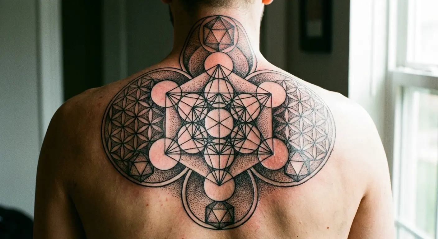
21. Geometric Last Name Tattoos With Hidden Meanings
Geometric designs use shapes, patterns, and mathematical precision to create frameworks that contain or form your surname. Your name might be integrated into sacred geometry (flower of life, Metatron’s cube), constructed from geometric letterforms, or positioned within geometric borders that add symbolic meaning.
Experimenting with a geometric tattoo generator can help you explore how sacred geometry and structured patterns might frame your surname.
Get this when you want your tattoo to feel structured and intentional, or when you’re drawn to the symbolic meanings within geometric patterns. Circles representing wholeness, triangles representing strength or trinity, hexagons representing balance.
Geometric surnames often incorporate dot work or line work techniques that require steady-handed artists comfortable with precision. The geometric elements can be subtle (light linework creating a barely-there framework) or dominant, with bold shapes that the surname nestles within.
Ask yourself whether the geometry serves your surname or your surname serves the geometry. Both are valid, but they create different visual hierarchies. This method works across various placements but shines on areas where the geometry can establish symmetry or follow body contours (centered on back, wrapped around arm, positioned on chest).
22. Last Name Tattoos in Your Ancestor’s Language
Translating your surname into the language or alphabet of your ancestral homeland creates a tattoo that’s both deeply personal and partially encrypted.
Your name in Cyrillic, Arabic, Hebrew, Hindi, Chinese characters, or other non-Latin scripts immediately signals cultural heritage while remaining unreadable to many observers. Choose this when you want to honor your roots in a way that feels authentic to your actual ancestry rather than translated for American convenience.
Getting heritage script can feel especially meaningful during times when your identity feels under threat, as explored in one writer’s account at Hey Alma about getting Hebrew letters permanently inked.
The technical challenge is ensuring accurate translation and proper rendering. Character-based languages especially require artists familiar with correct stroke order and proportion.
Using your ancestral language also opens questions about whether you include a Latin-alphabet version (perhaps smaller, positioned below) or let the original script stand alone. Some people appreciate the privacy this creates (your surname is visible but not immediately readable), while others want the accessibility of both versions.
This resonates with second or third-generation immigrants reclaiming linguistic heritage, or people with anglicized surnames choosing to restore original spellings. Work with native speakers or language experts to verify your translation before committing it to skin.
23. Deconstructed Last Name Tattoos That Evolve
Deconstructed typography breaks your surname apart. Letters scattered, fragmented, overlapped, or arranged in unconventional ways that require the viewer to piece them together.
This is the art school approach. It’s cool if you pull it off, but it can also read as trying too hard. Know the difference.
Good for when your relationship with your surname is complex or evolving, when you’re redefining what your family name means to you, or when you want to signal that identity is constructed rather than fixed.
Deconstructed designs might scatter letters across a body area with other elements between them, break letters into geometric fragments that form a larger pattern, or overlap letters in ways that create new shapes.
This is the most conceptual approach on this list, requiring viewers to engage actively with your tattoo rather than passively reading it. The risk is creating something so abstract that the name becomes unrecognizable, losing the point entirely.
The reward is a tattoo that feels like art rather than label, that invites questions rather than assumptions. This method requires an artist comfortable with experimental typography and composition.
Placement depends on your specific deconstruction approach. Scattered letters might work across a larger area like the back, while overlapped letters might concentrate on an arm or leg.
Bringing Your Last Name Tattoo to Life
You’ve seen 23 approaches across typography, placement, symbolic integration, and unconventional design. Now comes turning your concept into a design that works on your body.
Most people can clearly visualize what they don’t want (generic script on forearm, identical to everyone else’s) but struggle to articulate what they do want. You’re trying to communicate abstract ideas about heritage, identity, and family to an artist who needs concrete visual direction.
This is where many ideas stall out or compromise into something less than you envisioned.
This is where tools like Tattoo Generator IQ actually help. I’m not usually big on AI for tattoos, but for text-based designs, being able to see your actual surname in different fonts and placements before you commit? That’s useful.
You can experiment with different typography styles, placements, and integrated elements instantly. See your actual surname rendered in gothic versus script versus minimalist fonts, positioned on different body areas, combined with various symbols or patterns.
Instead of trying to describe your vision in consultation, you can show up with generated designs that communicate exactly what you’re after. The AI creates multiple variations, so you can compare serif with ancestral symbols versus geometric with negative space, making informed decisions rather than guessing.
You’re not locked into the generated design. You’re using it as a precise communication tool with your tattoo artist, who can then refine and customize it for your body. Think of it as bringing reference photos to a haircut, but for something far more permanent.
The generator handles the heavy lifting of visualizing ideas across different styles, letting you focus on the emotional and narrative aspects of why this name matters to you. You can test whether your longer surname works better horizontally across your collarbone or vertically down your spine. You can see if birth flowers overwhelm your text or complement it beautifully.
This experimentation phase is crucial because once ink hits skin, you’re committed. Having concrete visuals to react to (rather than trying to imagine possibilities) changes the entire design process. You’ll know immediately which approaches resonate and which fall flat.
Don’t just print the AI version and hand it to your artist like homework. Use it to figure out what you want, then let them improve it.
Final Thoughts
Your last name is already stuck with you. The tattoo version should at least be your choice, not just the first script font that came up in your artist’s book. Make it weird, make it personal, make it yours. Just don’t make it boring.
Whether you’re exploring surname concepts or other name tattoo designs, the difference between a tattoo that feels meaningful and one that feels like an afterthought comes down to how much thought you put into why those particular letters matter to you.
Your family name has been around longer than you and it’ll outlast you. The tattoo version is just your take on it. Make it count.