
18 Forest Tattoos That Work With Your Body’s Natural Architecture
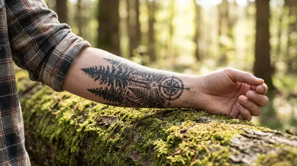
Table of Contents
-
The Vertical Canopy: Designs That Follow Your Spine
-
Root Systems That Wrap Around Joints
-
Treelines That Follow Your Collarbone
-
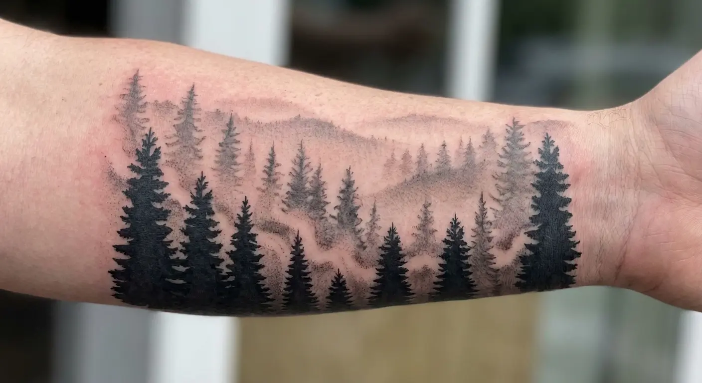
Pine Forests Running Down the Forearm
-
Circular Forest Clearings for Shoulders
-
Asymmetric Woodland Scenes for Ribcage Placement
-
Minimalist Single-Tree Statements
-
Geometric Forest Abstractions
-
Dotwork Woodland Textures
-
Fine-Line Birch Groves
-
Negative Space Forest Silhouettes
-
Micro Forest Scenes for Wrist or Ankle
-
Seasonal Forest Transitions
-
Forest Floor to Canopy Progressions
-
Day-to-Night Forest Gradients
-
Misty Forest Depth Layers
-
Wildlife Integration Within Tree Structures
-
Root-to-Branch Full Limb Coverage
Look, here’s what actually matters before you scroll
Your body isn’t flat. Sounds obvious, but I’ve watched too many people ignore this basic fact and end up with trees that look distorted every time they move.
Placement drives everything. A tiny, well-positioned forest piece will always beat a massive one shoved onto the wrong body part.
Vertical designs? Spine, forearm, legs. Horizontal? Collarbones and shoulders. Don’t fight your anatomy.
Minimalist stuff ages better. I know the hyper-detailed pieces look incredible fresh, but give them ten years and we’ll talk.
Transitional designs (seasons changing, day to night, that kind of thing) tell better stories without needing a million sessions.
Work with your body’s curves instead of pretending they don’t exist. The results speak for themselves.
Forests That Flow With Your Frame
Most people do this backward.
They scroll Instagram, save fifty forest designs, screenshot their favorites, and then try to figure out where to put them. I’ve done hundreds of consultations that start exactly this way. Someone shows me a gorgeous forest piece and asks if we can put it on their ribs. Sometimes yes. Usually no.
Your body moves. Curves. Stretches across joints. Muscles flex and relax. Skin changes. The best forest work acknowledges all of this from day one instead of treating your arm like it’s a flat piece of paper.
I’ve watched people force designs onto body parts where they just don’t flow naturally. Trees that look bizarre when you bend your elbow. Compositions fighting against bone structure. Designs that seemed perfect in the stencil but healed awkward. Modern man has come a long way from nomadic hunter-gatherer origins, and today over half of the world’s 7.8 billion people live in urban environments. Makes sense that forest tattoos have exploded in popularity. We’re desperate for that nature connection.
After years of seeing what works and what doesn’t, I’ve learned this: let placement drive your design choices, not the other way around. Consider how muscles move, where bones sit, how your natural body lines flow before you finalize your concept. You’ll save yourself from serious regret.
The 18 designs I’m covering prioritize anatomical alignment. Each one works with your body’s architecture. Some follow vertical lines. Others wrap around curves. A few use negative space to create depth.
But they all share one thing.
They’re designed for bodies that move, age, and change.
Think about how your chosen spot moves throughout your day. Your spine curves when you sit. Your forearm rotates constantly. Your shoulder blade shifts when you reach for something. These movements affect how your piece looks, and we need to plan for them from the start.
The Vertical Canopy: Designs That Follow Your Spine
1. Full-Back Sequential Tree Heights
Your spine is the longest uninterrupted canvas on your body. A forest that uses this vertical real estate intelligently creates visual drama that few other placements can match.
I’m talking about a forest that increases in tree height from your lower back to your shoulders, using your spine as the central axis. The tallest trees (redwoods work beautifully here) align with your shoulder blades, while younger growth sits at your lumbar region. Creates natural visual flow when you move, turning your back into a living landscape that shifts with your posture.
Most people miss this technical detail: your spinal curvature affects how tree trunks appear. A perfectly straight trunk in the stencil will curve when applied to your spine. An experienced artist accounts for this, adjusting the design so the trees appear straight when you’re standing naturally. The stencil might look slightly off when laid flat, but it corrects itself once applied to your body’s contours.
Sitting versus standing changes this design’s appearance significantly. When you sit, your spine curves forward, compressing the lower back section while stretching the upper back. Your artist needs to understand how this movement affects the composition, making sure trees don’t look distorted in either position.
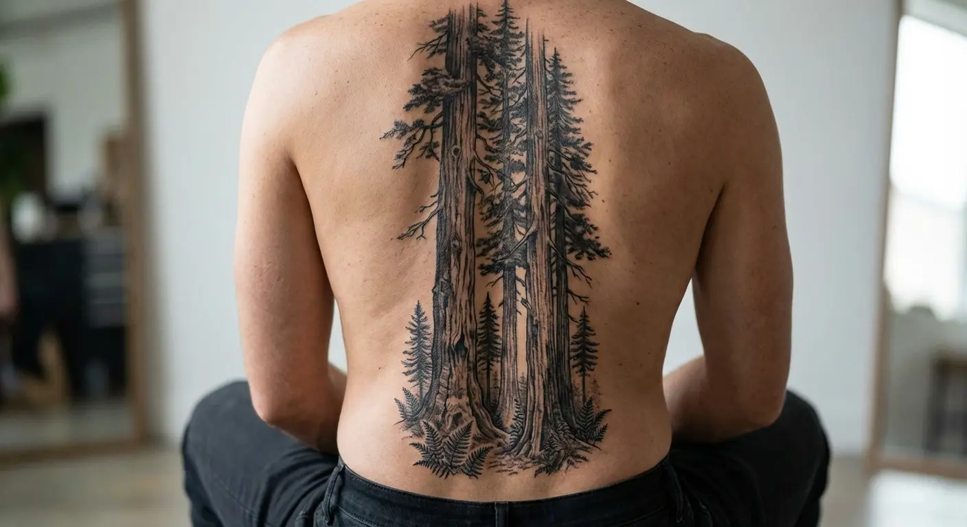
This placement takes multiple sessions and serious commitment. We’re talking 20-40 hours of work depending on detail level and size. But for those willing to invest the time and discomfort, a full-back forest offers unmatched visual impact. It transforms your entire back into a cohesive artwork.
2. Single Dominant Tree Along the Spine
Not everyone wants full-back coverage, and that’s where a single towering tree makes perfect sense.
This design runs from tailbone to neck (or any portion of that length), using your vertebrae as the tree’s central trunk line. Oak or pine work better than willows for this placement because their branch structure complements vertical orientation. Willows droop, which fights against the upward flow your spine naturally suggests.
I recommend this approach for people who want the visual impact of a spine piece without committing to full-back coverage immediately. The single tree can stand alone as a complete piece, or it can serve as the anchor for future additions. Want to add a forest around it later? The central tree provides the framework. Prefer to keep it minimal? The single tree makes a powerful statement on its own.
Pain levels deserve honest discussion here.
Yes, spine tattoos hurt more than most placements. The needle works directly over bone with minimal cushioning from muscle or fat. But the discomfort is temporary, lasting only during the session. The visual payoff lasts decades.
The piece along your spine moves with you, creating subtle shifts in perspective as you bend, stretch, or twist. This dynamic quality makes the design more interesting than static placements that look the same regardless of your position.
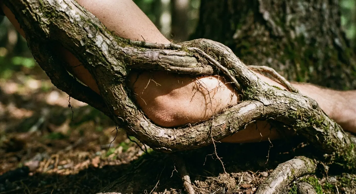
Root Systems That Wrap Around Joints
3. Ankle-Wrapping Root Networks
Your ankle’s circular structure is perfect for root systems that appear to emerge from the ground and wrap around your leg. Roots naturally curve and twist, matching your ankle’s bone structure in ways that straight tree trunks never could.
This placement ages well because ankles don’t typically experience dramatic size changes. Weight fluctuations affect your midsection more than your extremities, meaning your ankle piece will maintain its proportions over time. The design can extend up the calf or down onto the foot depending on your coverage goals, creating flexibility in how much skin you want to commit.
Tattooing around ankle bones presents practical challenges. The skin is thin, the surface is curved, and the bones sit close to the surface. You need an artist experienced with curved surfaces who understands how to adjust needle depth and hand positioning for this specific anatomy.
Workplace visibility comes up frequently with ankle work. Strategic root placement can keep the design concealable when needed. Roots that wrap around the back and sides of your ankle remain hidden with socks and shoes, while roots that extend onto the top of your foot will be visible in most footwear. Plan your root network’s path based on your concealment needs.
4. Elbow Root Cradles
Your elbow’s natural crease becomes the soil line in this design, with roots spreading across your forearm and upper arm. The beauty here is functional: when you bend your arm, the roots appear to grip and flex.
This placement needs careful planning around how much your skin stretches during arm movement. Your elbow skin can stretch up to 50% when you fully extend your arm, then compress when you bend it. Simple root structures handle this movement better than complex ones. Intricate root networks with fine details can blur together when your skin compresses, losing clarity.
Healing challenges make elbows tough. You need to keep the area still during the healing process, but elbows are involved in nearly every arm movement. Bending your arm stretches fresh ink. Keeping it straight for days becomes uncomfortable. This investment pays off with a design that literally moves with you, but you need to commit to careful healing.
Works as a standalone piece or as part of a larger arm composition. The roots can connect to trees on your forearm or upper arm, creating a cohesive ecosystem that spans your entire limb.
Treelines That Follow Your Collarbone
5. Horizontal Pine Treelines
Your collarbone provides a natural horizon line that’s perfect for distant treelines. This places a row of pine or fir silhouettes along your clavicle, creating the illusion of a distant forest ridge.
Horizontal orientation matters here. Vertical trees would fight against your bone structure, creating visual tension that feels uncomfortable. Horizontal treelines follow your clavicle’s natural path, creating harmony between anatomy and design.
This placement frames your chest or décolletage beautifully, drawing the eye across your collarbone and creating visual width across your upper body. Sizing becomes critical. Too large and the trees look disproportionate, dwarfing your frame. Too small and they’ll blur together as they age, losing individual tree definition.
Negative space is crucial for maintaining clarity. The gaps between trees need to be wide enough that they remain distinct as the ink spreads slightly over years. I recommend spacing trees at least as wide as the trees themselves, creating a 1:1 ratio of tree to sky.
Collarbone work ranks high on the discomfort scale. The needle works directly over bone with minimal padding. But this placement offers excellent visibility when you want to show it and easy concealment with most clothing.
6. Asymmetric Mountain Forest Collarbones
This design breaks from perfect symmetry, running a mountain forest scene across one collarbone and potentially extending onto your shoulder or chest.
I’m featuring this because perfectly symmetrical tattoos can look stiff, and your body isn’t symmetrical anyway. Your heart sits slightly left of center. Your shoulders probably sit at slightly different heights. One collarbone might be more prominent than the other. Working with this natural asymmetry creates more organic, natural-looking pieces.
Starting the treeline at your sternum and having it fade as it moves toward your shoulder creates more natural visual flow than trying to center everything. The design appears to emerge from your center and spread outward, following the way forests actually grow rather than conforming to artificial symmetry.
This design can balance other tattoos you might already have. If you have a shoulder piece on one side, an asymmetric collarbone forest on the opposite side creates visual equilibrium without mirroring. Asymmetry often photographs better than rigid symmetry, creating more interesting compositions from different angles.
This placement offers good concealment options with most clothing while remaining visible when you want to show it. Crew neck shirts hide it completely. V-necks reveal it partially. Tank tops display it fully. You control the visibility based on your clothing choices.
Simplified Forest Forms That Age Gracefully
Detailed forest work looks stunning when fresh. I’ve seen incredibly intricate pieces with individual bark textures, leaf patterns, and atmospheric shading that take your breath away.
But nobody mentions that they often muddy together as ink spreads over years.
I’m not saying detailed work is bad. It’s not. But simplified forms have practical advantages worth considering, especially when you’re thinking long-term about how your piece will age.
Reduction doesn’t mean boring. Strategic simplification can increase visual impact by removing visual noise and focusing attention on essential elements. The human eye processes simple shapes faster than complex ones, meaning minimalist work often registers more immediately than heavily detailed pieces.
Common misconception: “simple” doesn’t mean “easy.” These designs require precise execution. There’s nowhere to hide mistakes in minimalist work. A slightly wobbly line in a detailed piece gets lost among hundreds of other lines. A slightly wobbly line in a minimalist piece stands out immediately.
Finding an artist who excels at clean linework matters more here than in heavily detailed pieces. You need someone whose hand is steady, whose lines are confident, and who understands that restraint requires as much skill as complexity.
The six designs I’m covering in this section prove that restraint can be more powerful than complexity. Each one maintains visual clarity decades after application, aging gracefully while more detailed pieces might require significant touch-up work.
|
Tattoo Style |
How it ages |
Upkeep |
Where to put it |
|---|---|---|---|
|
Minimalist Single-Tree |
Excellent clarity retention over decades |
Minimal touch-ups needed |
Forearm, calf, shoulder blade |
|
Geometric Forest |
Clean lines maintain definition long-term |
Occasional line reinforcement |
Thigh, upper arm, back panel |
|
Dotwork Woodland |
Individual dots stay distinct longer than shading |
Touch-ups every 7-10 years |
Areas with minimal texture, less sun exposure |
|
Fine-Line Birch |
Needs careful sun protection |
More frequent touch-ups (5-7 years) |
Inner arm, ribcage, areas easily covered |
|
Negative Space |
Solid black ages exceptionally well |
Easy to touch up when needed |
Arm bands, chest pieces, back panels |
|
Micro Scenes |
Subject to faster fading at small scale |
Touch-ups every 3-5 years |
Wrist, ankle, behind ear, fingers |
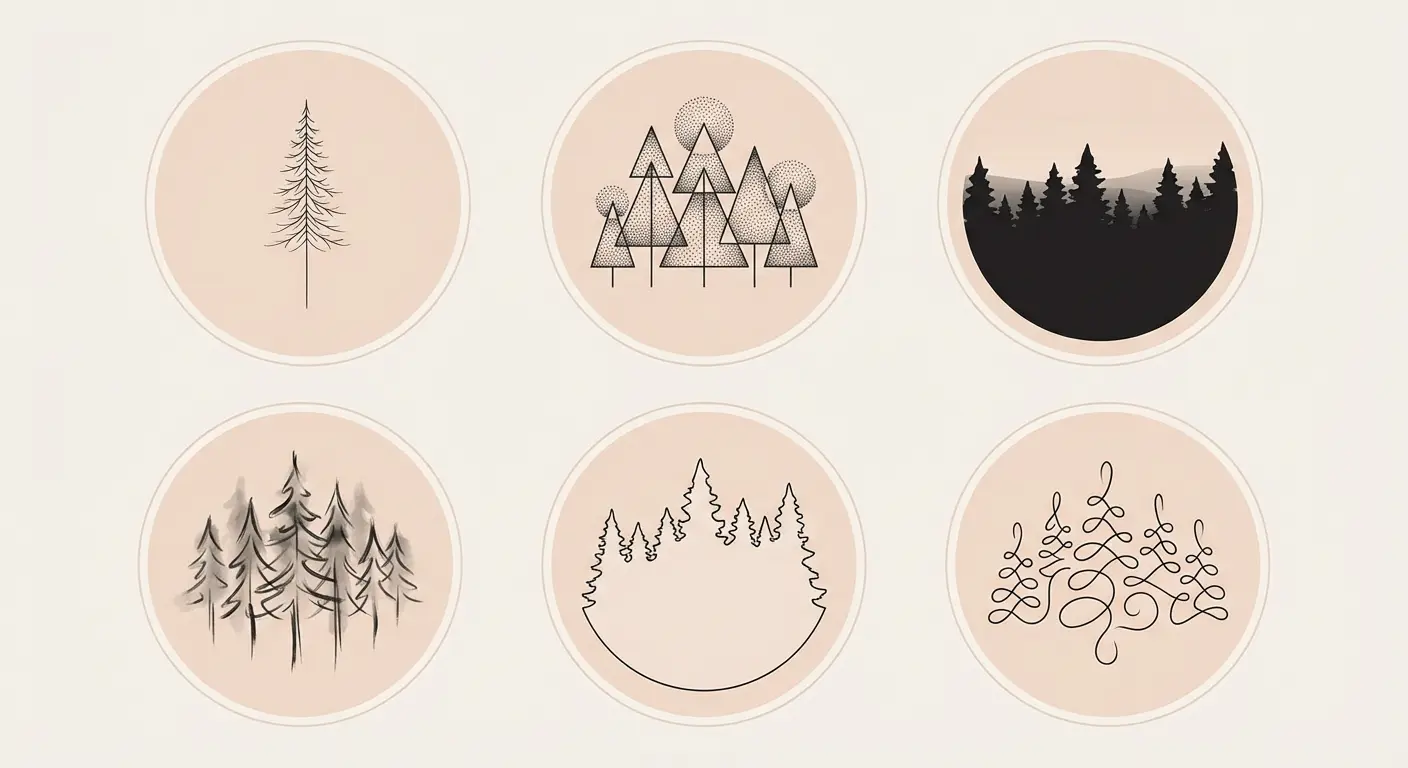
Minimalist Single-Tree Statements
7. Lone Pine Silhouettes
One perfectly placed pine tree can communicate “forest” without depicting an entire woodland. Your brain fills in the surrounding forest automatically, creating a complete scene from minimal information.
This design uses a single tree silhouette (usually black ink, sometimes with minimal shading) to create maximum impact with minimum complexity. Fewer lines mean less chance of bl
urring over time. The design maintains its readability for decades because there’s nothing to muddy together.
Ideal placements include forearm, calf, and shoulder blade. These areas provide flat or gently curved surfaces that showcase the tree’s silhouette clearly. The tree’s shape matters more than its detail level. A pine with distinctive triangular form reads as “pine” even without individual needle clusters. An oak with characteristic branching pattern reads as “oak” even without bark texture.
Choosing between pine, oak, or other tree species depends on your personal connection and the visual statement you want to make. Pines suggest resilience and evergreen persistence. Oaks suggest strength and longevity. Birches suggest adaptability and renewal. The species you choose carries symbolic weight beyond its visual form.
This approach works for people who want something meaningful without overwhelming their body with ink. The single tree makes a statement without demanding attention, creating a subtle presence that reveals itself gradually rather than shouting for immediate notice.
8. Geometric Forest Abstractions
This design reduces trees to their essential geometric shapes (triangles for pines, circles for deciduous canopies, rectangles for trunks) while maintaining recognizability as a forest.
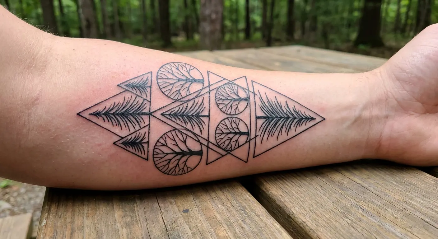
I’m including this because geometric work ages exceptionally well. Clean lines maintain their definition longer than soft shading or intricate detail. When touch-ups become necessary, reinforcing geometric shapes is straightforward compared to recreating complex realistic textures.
Geometric reduction works visually because your brain recognizes patterns and fills in missing information. Three triangles stacked vertically register as “pine trees” even though they’re abstract representations. This style pairs well with other geometric tattoos if you’re building a cohesive collection, creating visual continuity across multiple pieces.
The technical skill to execute clean geometric work is harder than it looks. Lines need to be perfectly straight or perfectly curved. Angles need to be precise. Spacing needs to be consistent. This demands an artist with steady hands and meticulous attention to detail.
This style works across various body placements from small ankle pieces to large thigh compositions. The scalability of geometric designs means they maintain their impact whether they’re two inches or two feet tall. Your piece can be as subtle or as bold as you want while maintaining the same visual language.
Dotwork Woodland Textures
9. Stippled Forest Depth
Dotwork creates forest depth through density variation rather than solid shading. This technique uses thousands of tiny dots to build up tree forms, with denser dotting in shadows and sparser work in highlights.
Individual dots remain distinct longer than shaded areas, which is why this method ages beautifully. As ink naturally spreads slightly over years, solid shading can become muddy or lose its gradient quality. Dots maintain their separation, preserving the texture and depth that makes the design work. This method is time-intensive. More sessions mean more expense. But I think it’s worth considering for its longevity and unique texture. Dotwork creates a softer, almost ethereal quality that differs dramatically from bold traditional or realistic styles. The stippled texture catches light differently than solid shading, creating subtle visual interest that changes based on viewing angle.
Pain-wise, repetitive dotting can feel different than line work or shading. Some people find the constant tapping more tolerable than dragging lines. Others find it more irritating. Your pain tolerance and preferences will determine whether dotwork feels better or worse than other techniques.
Finding an artist who specializes in dotwork matters for quality results. This isn’t a technique every artist excels at. You need someone who understands dot density, spacing consistency, and how to build gradients through stippling rather than shading.
10. Fine-Line Birch Groves
Birch trees are perfect for fine-line work because their distinctive bark patterns translate beautifully into delicate linework. The white bark creates natural negative space that makes these pieces feel lighter and more delicate than dense pine forests.
This design features multiple birch trunks rendered in thin, precise lines with minimal shading. The characteristic horizontal marks on birch bark become simple line details that add visual interest without overwhelming the composition. Fine-line style suits people wanting subtle, sophisticated work that doesn’t dominate their body.
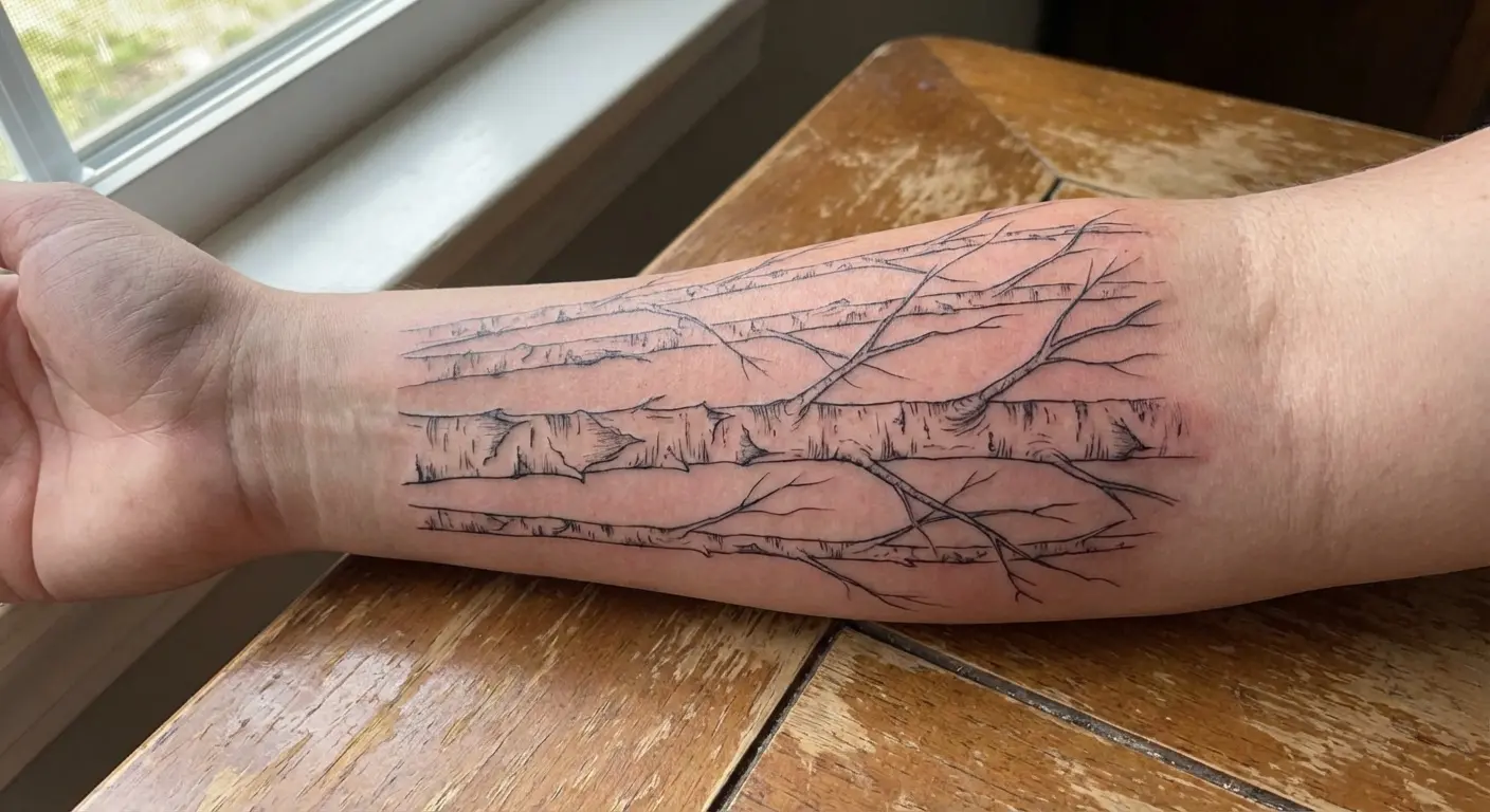
Placement becomes critical with fine-line work. These lines show best on areas with minimal skin texture and less sun exposure. Inner arms, ribcage, and areas easily covered by clothing work better than hands, feet, or other high-exposure zones. Sun damage accelerates fading in all tattoos, but fine lines are particularly vulnerable.
Color considerations matter for longevity. Black and grey are more durable than color for this concept. Colored fine lines fade faster than black ones, requiring more frequent touch-ups to maintain vibrancy. If you’re committed to color, be prepared for maintenance.
The concern that fine lines fade faster has some truth to it. They can lose definition more quickly than bold lines. But proper aftercare and sun protection help significantly. Daily sunscreen on exposed work, moisturizing to keep skin healthy, and avoiding excessive sun exposure all extend the life of fine-line work.
Negative Space Forest Silhouettes
11. Blackout Forest Windows
This design inverts the typical approach by using solid black ink as the primary element with forest scenes carved out in negative space. Your skin tone becomes the trees, sky, or clearings within a black frame.
I’m featuring this because it’s visually striking and highly durable. Solid black areas age well and are easy to touch up if needed. When black ink fades slightly, adding more black is straightforward. The piece maintains its impact because the contrast between black ink and skin tone remains strong even as it ages.
This style works particularly well for arm bands, chest pieces, or back panels where you have enough space for the black to frame the negative space effectively. Too small and the negative space details get lost. Too large and you’re committing to significant blackout coverage. Finding the right scale for your body and commitment level matters.
The commitment level deserves serious consideration. Blackout work is permanent and difficult to remove or cover. Laser removal of solid black takes many sessions and doesn’t always result in complete removal. Covering blackout work requires going even darker or using specialized techniques. This bold choice appeals to people who want something dramatically different from typical forest work and are certain about their decision.
Negative space designs require precise planning. The artist needs to map out exactly where skin tone will show through before applying any ink. There’s no room for improvisation once the black goes on. This demands collaboration between you and your artist to ensure the forest scene carved out in negative space matches your vision.
12. Micro Forest Scenes for Wrist or Ankle
Tiny forest scenes (we’re talking one to two inches) can work beautifully on wrists, ankles, behind ears, or on fingers when designed with negative space in mind. This approach uses your skin tone as a crucial design element, keeping ink minimal while maintaining readability.
Micro work requires specialized artists. Not everyone can work at this scale successfully. The precision needed to create recognizable imagery in such small dimensions demands steady hands, excellent vision, and experience with miniature work. Check your artist’s portfolio specifically for micro work before committing.
Simplification becomes essential at small sizes. Simple treelines work better than detailed individual trees. A row of three to five tree silhouettes reads clearly at micro scale. Attempting to include bark texture, individual branches, or complex shading results in a blurry mess once healed.
Placement on low-movement, flat areas helps these tiny designs age better. The inside of your wrist, the side of your ankle, or behind your ear experience less stretching and movement than knuckles or the top of your foot. This placement choice directly affects how long the design maintains its clarity.
Realistic expectations about how micro work ages matter here. Touch-ups might be needed more frequently than larger pieces. Every three to five years, you might need to have lines reinforced or details sharpened. This ongoing maintenance is part of the commitment to micro work.
Narrative Forests That Tell Stories Through Change
Static forest scenes are beautiful, but designs that depict change, transition, or progression add narrative depth that makes your piece more interesting over time.
Most guides ignore the storytelling potential of depicting transformation. They show you beautiful trees and leave it at that. I’m focusing on this angle because narrative complexity doesn’t require more ink or larger designs. It requires smarter composition.
Transitional designs can represent personal growth, life changes, or simply your appreciation for nature’s cycles. A forest moving from spring to winter tells a story about seasons and time. A forest transitioning from day to night suggests duality and balance. A forest progressing from floor to canopy invites the viewer to journey upward through the ecosystem.
These designs often spark more conversations than static scenes. People notice the progression and ask about it. The narrative element gives you something to explain, creating connection points that simple forest scenes don’t offer.
Planning is required to execute transitional work successfully. You need to think about how elements flow from one state to another, where transitions happen on your body, and how the overall composition maintains cohesion despite depicting change. Working with an artist who understands visual storytelling matters here.
According to a study published in the Breast Journal, 78% of women with breast cancer would prefer tattoo and mark-free treatment, demonstrating how permanent marks carry emotional weight and why thoughtful choices matter more than impulsive decisions.
Seasonal Forest Transitions
13. Four-Season Tree Progression
This design shows the same tree or treeline across four seasonal states, typically arranged linearly across a forearm, thigh, or ribcage. Spring buds transition to summer fullness, then autumn colors, and finally winter bareness.
This works narratively because it represents life cycles and change. The repetition with variation creates visual rhythm that guides the eye across your body. Technically, the progression needs to flow naturally, with each season distinct enough to be recognizable but similar enough to read as the same tree changing over time.
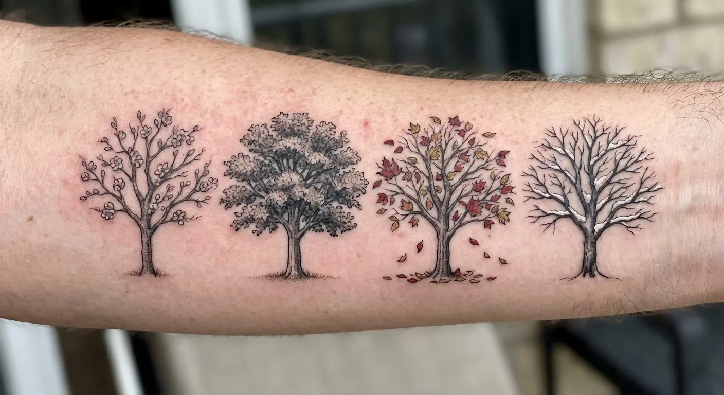
Color becomes important here. Autumn sections will age differently than winter sections. Reds and oranges fade faster than blacks and greys. If you choose color for the autumn portion, be prepared for more frequent touch-ups on that section while the winter portion maintains its clarity longer.
Placement options that allow the seasonal progression to flow naturally with your body’s contours work best. A forearm lets the seasons progress from wrist to elbow or vice versa. A thigh provides similar linear space. A ribcage allows vertical progression that follows your torso’s natural lines.
Some artists recommend starting with one or two seasons and adding others later if you want to spread the cost and time investment. This approach also lets you test how you feel about the piece before committing to the full four-season progression. You can always expand, but removing sections is much harder than adding them.
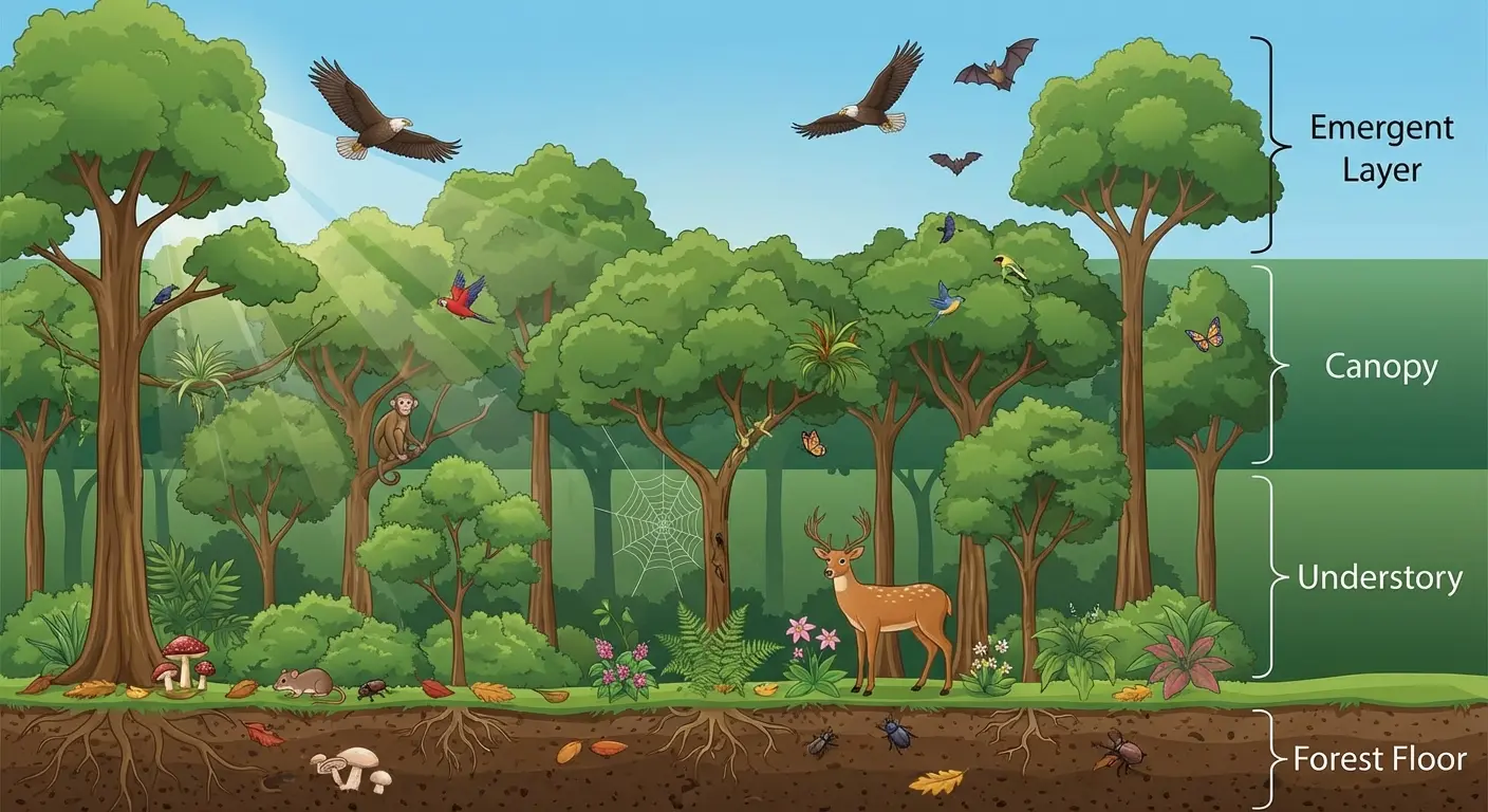
14. Forest Floor to Canopy Progressions
This vertical design starts with forest floor elements (roots, undergrowth, fallen leaves) at the bottom and progresses upward through tree trunks to canopy and sky. Your body’s vertical length becomes the forest’s elevation change.
This works brilliantly on legs (thigh to ankle) or arms (shoulder to wrist), creating a sense of being inside the forest rather than viewing it from outside. You’re not looking at a forest scene. You’re standing in it, surrounded by the ecosystem from ground to sky.
Element selection matters at each elevation level. What you include determines whether the progression feels natural or forced. Forest floor sections might feature mushrooms, ferns, or exposed roots. Mid-trunk sections focus on bark texture and branch structure. Canopy sections show leaves, sky, and filtered light.
This approach lets you add detail gradually if you’re building the piece over multiple sessions. Start with the forest floor and work your way up over time. Each session adds another layer of the ecosystem, creating a piece that grows with you rather than requiring completion in one marathon session.
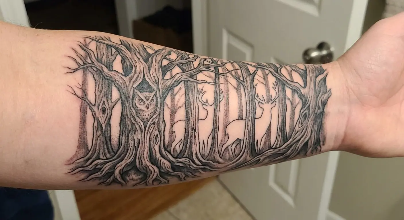
Wildlife can be incorporated at appropriate elevations. Ground-dwelling creatures like rabbits or foxes appear near the forest floor. Birds and squirrels inhabit the canopy. Deer might appear in the mid-story among the trunks. Ecological accuracy enhances the overall composition, making the forest feel like a real ecosystem rather than a random collection of nature elements.
|
Forest Layer |
Typical Elements |
Symbolic Meaning |
Wildlife Options |
|---|---|---|---|
|
Canopy (shoulder/upper thigh) |
Tree crowns, sky, clouds, sunlight filtering through leaves |
Aspirations, consciousness, spiritual connection |
Eagles, owls, songbirds, squirrels in upper branches |
|
Mid-Story (bicep/mid-thigh) |
Tree trunks, branches, climbing vines, moss |
Strength, stability, growth over time |
Woodpeckers, tree-dwelling mammals, climbing creatures |
|
Understory (forearm/lower leg) |
Saplings, shrubs, ferns, filtered light |
New growth, potential, hidden aspects |
Deer, smaller birds, rabbits |
|
Forest Floor (wrist-hand/ankle-foot) |
Roots, fallen leaves, mushrooms, rocks, soil |
Foundation, origins, decomposition and renewal |
Ground beetles, salamanders, mice, ground-nesting birds |
Day-to-Night Forest Gradients
15. Twilight Forest Transitions
This design shows a forest transitioning from daylight to darkness, typically using color gradients or shading density to indicate the time shift. One side features lighter tones suggesting dawn or day, gradually shifting to deeper blues and blacks indicating night.
Twilight has inherent mood and atmosphere that makes this emotionally resonant. The in-between time when day meets night carries symbolic weight: transition, change, the space between states. Artistically, gradients create visual interest without requiring complex detail. The shift from light to dark does the heavy lifting.
Placement works well on curved surfaces where the gradient can follow your body’s natural contours. Shoulders and hips provide ideal canvases for this transition. The curve helps the gradient feel more organic, wrapping around your body rather than sitting flat on it.
Color considerations matter for longevity. Different ink colors age at different rates. Blues might fade faster than blacks. If you choose color for the twilight transition, understand that touch-ups will be needed to maintain the gradient’s vibrancy. Black and grey approaches might be more durable, using shading density rather than color to indicate the time shift.
This design can incorporate nocturnal wildlife on the dark side and diurnal creatures in the light areas. Owls emerge in the night section while songbirds appear in the day section. This adds narrative depth without cluttering the composition, giving viewers details to discover upon closer inspection.
16. Misty Forest Depth Layers
Atmospheric perspective (the way distant objects appear lighter and less detailed) creates depth in this design through layers of increasingly faint tree silhouettes. The foreground features darker, more detailed trees that gradually fade to light grey silhouettes in the background, simulating morning mist or distance.
This technique creates impressive three-dimensional illusion on your two-dimensional skin. The layering tricks your eye into perceiving depth where none exists. Works across various placements, from small fore
arm pieces to large back panels.
Technical execution requires precise gradient work and understanding of value. Each layer needs to be distinctly lighter than the one in front of it, but the transitions need to be smooth enough that the progression feels natural. Too much contrast between layers and the effect looks choppy. Too little contrast and the layers blend together, losing the depth effect.
This design ages well because the intentional fading is part of the design, not a flaw. As ink ages and spreads slightly, the misty quality might even enhance. The soft edges and gradual transitions are forgiving of the natural aging process.
This approach can make smaller spaces feel larger. A forearm piece with depth layers feels more expansive than a flat forest of the same size. The perceived depth creates visual interest that extends beyond the physical dimensions.
I recommend this for people who want atmospheric, moody work rather than crisp, detailed pieces. The misty quality creates a dreamlike feeling that differs from sharp, realistic forest scenes. It’s evocative rather than literal, suggesting a forest rather than depicting every detail.
Wildlife Integration Within Tree Structures
17. Hidden Wildlife Forest Scenes
This design incorporates animals hidden within the tree structures (owls in hollows, deer between trunks, birds in branches) creating a “find the creature” element that reveals itself gradually.
Interactive pieces that reward closer inspection add lasting interest. People might notice your forest initially, then discover the hidden owl on second glance. This layered discovery makes the piece more engaging than designs that reveal everything immediately.
Scale considerations matter for wildlife longevity. Animals need to be large enough to remain recognizable as the piece ages. Tiny details blur together over time. A hidden owl that’s too small might become an unidentifiable blob in ten years. Size the wildlife appropriately for long-term clarity.
Placement planning determines where on your body the wildlife should appear for best visibility. An owl hidden in upper branches might sit on your shoulder blade. A deer between trunks might appear on your forearm. Think about how people will view your piece and position wildlife where they’ll be discovered naturally.
Balancing wildlife prominence requires careful consideration. Too hidden and people miss them entirely, defeating the purpose. Too obvious and you lose the discovery element that makes this approach special. The sweet spot is “noticeable upon closer inspection but not immediately apparent from a distance.”
This approach lets you personalize your piece with animals that have specific meaning to you. Choose creatures that resonate with your experience, values, or interests. The forest becomes a container for personal symbolism rather than just a nature scene.
The popularity of forest work, particularly on forearms, has become so prevalent in the Pacific Northwest that That Oregon Life satirically reported on “another guy” getting a forest forearm tattoo, with local tattoo artists noting they’re “booked solid for the next six months with similar requests.” The article’s not wrong. Out here, everyone and their dog has a Douglas Fir on their forearm.
18. Root-to-Branch Full Limb Coverage
This comprehensive design treats your entire arm or leg as a single tree, with roots at your hand or foot, trunk along your limb, and branches extending across your shoulder or hip. It’s the most committed option on this list, requiring multiple sessions and significant planning.
Your limb’s shape naturally suggests a tree trunk, which is why this works anatomically. The cylindrical form of your arm or leg becomes the tree’s main structure. Roots spread across your hand or foot where they would naturally emerge from soil. Branches extend onto your torso where they would naturally reach toward sky.
Creates a cohesive piece rather than disconnected elements. Everything flows together as one organism, one tree, one unified design. The visual impact is striking because it uses your entire limb as a canvas, transforming it completely.
Planning is required to account for joint movement, muscle shape changes, and future body changes. Your elbow or knee bends, stretching skin on one side while compressing it on the other. The design needs to accommodate this movement without looking distorted in either position. Muscle development can alter proportions over time. Weight changes affect limb circumference. An experienced artist factors all these variables into the initial design.
Time commitment is substantial. We’re talking about 30-50 hours of work spread across multiple sessions. Cost reflects this time investment. Yeah, it’s expensive. Budget accordingly. Pain varies across different limb areas. Hands and feet hurt more than forearms and calves, elbows and knees present their own challenges. You need to be prepared for the physical and financial commitment this demands.
Choosing an artist experienced with large-scale cohesive work is make-or-break here. You need someone who can envision how all the pieces fit together across multiple sessions, maintaining consistency in style and execution from first session to last. Review portfolios specifically for full-limb work before making your decision.
The payoff is one of the most striking options available. When executed well, a root-to-branch limb piece transforms your arm or leg into living art that commands attention and demonstrates serious commitment to the craft.
Turning Forest Concepts Into Tattoo Reality
You’ve seen 18 approaches that prioritize anatomical flow over arbitrary design choices. The challenge now is translating your preferred concept into actual ink on your body.
I get it. There’s a gap between inspiration and execution. This is where many people get stuck. You might love the idea of a seasonal progression but feel uncertain about how to communicate that vision to an artist. You’re drawn to negative space work but can’t visualize how it would look on your specific body shape.
Start by identifying which design category resonates most strongly. Are you drawn to vertical designs that follow your spine? Minimalist approaches that age gracefully? Narrative pieces that depict change? Narrowing your focus helps you communicate more clearly with potential artists.
Consider your lifestyle and how it affects placement decisions.
Do you need workplace concealment? How much sun exposure does your preferred placement get? How does that area of your body move throughout your day? These practical questions influence which of the 18 designs will work best for your specific situation.
Research artists whose style aligns with your chosen approach. A dotwork specialist might not be the right choice for geometric abstractions. A fine-line expert might not excel at bold negative space work. Match the artist’s strengths to your design needs rather than choosing based on proximity or price alone.
Schedule consultations before committing. Bring reference images, explain your vision, and ask how they would adapt the concept to your body. A good artist will assess your anatomy, discuss how the design will flow with your natural lines, and offer suggestions you might not have considered.
This isn’t about replacing your artist’s skill. You still need an experienced professional to execute the actual work. But bridging the communication gap between your vision and their execution leads to better results and fewer revision sessions.
Final Thoughts
Forest tattoos succeed or fail based on how well they work with your body’s architecture, not just how beautiful the trees look in isolation.
The 18 designs I’ve covered here prioritize anatomical awareness, long-term aging considerations, and narrative depth over generic forest imagery. Your body moves, curves, and changes. The best work acknowledges these realities from the design phase forward.
Whether you’re drawn to vertical canopy designs that follow your spine, minimalist approaches that age gracefully, or narrative pieces that depict seasonal change, the key is matching design to placement thoughtfully. Consider how your chosen piece will look when you move. Think about how it will age over decades. Ask yourself whether it complements or fights against your body’s natural lines.
Take time to visualize different options before committing to permanent ink. The piece that looks stunning on someone else might not work for your specific body shape, and that’s perfectly fine. Your anatomy is unique. Your design should be too.
Find the approach that honors both the forest aesthetic you love and the unique canvas you’re working with. A spine-following vertical forest might be perfect for someone with a long torso but awkward on someone with a shorter back. Root systems that wrap beautifully around one person’s ankle might not suit someone with different bone structure.
I’ve given you frameworks for thinking about forest work differently. Use them to have more informed conversations with artists. Ask better questions during consultations. Make decisions based on how designs interact with your body rather than how they look on flat paper.
Your piece should feel like it belongs on your body, not like it was forced onto it. When placement, design, and anatomy align, the result is something that looks natural even though it’s entirely artificial. That’s the goal. That’s what separates work that flows from work that fights.
The forest is waiting. Make sure it finds the right home on your body.