
17 Dark Mark Tattoos (That Won’t Get You Fired)
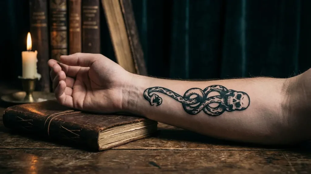
Table of Contents
-
Subtle Options (For People With Day Jobs)
-
Minimalist Serpent Coil
-
Constellation Dark Mark
-
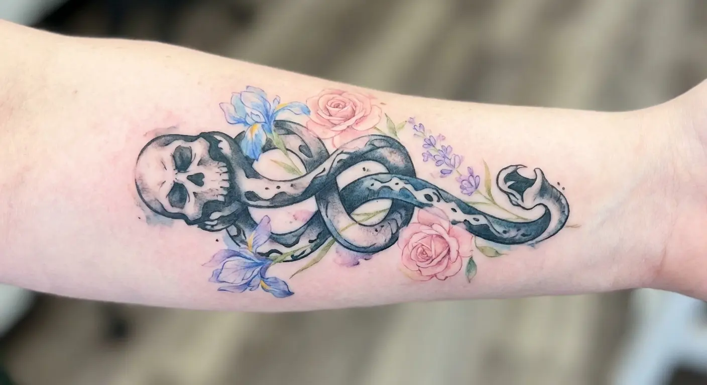
Watercolor Skull Fade
-
Geometric Skull Architecture
-
Negative Space Dark Mark
-
Single Line Death Eater Mark
-
-
Bold Versions (If You Don’t Give a Fuck)
-
Forearm Dark Mark Placement (Classic Voldemort Style)
-
3D Floating Skull Illusion
-
Blackwork Death Eater Mark
-
Neo-Traditional Dark Mark with Ornamental Frame
-
Biomechanical Dark Mark Integration
-
Full Sleeve Dark Mark Narrative
-
-
Making It Personal
-
Dark Mark with Birth Flowers
-
Protective Dark Mark (Inverted Meaning)
-
Dark Mark Merged with Patronus
-
Literary Quote Integration
-
Dark Mark Memorial Piece
-
TL;DR
Quick version: You can get a Dark Mark tattoo that doesn’t look like villain cosplay. Subtle options exist. Placement matters more than you think. Add personal elements to make it yours instead of just copying Voldemort’s branding. Work with reference designs or your artist will guess wrong and you’ll both waste hours trying to communicate. That’s it.
Subtle Options (For People With Day Jobs)
I got my Dark Mark tattoo in 2019, and I’ve regretted it exactly three times: once when a date asked if I was “into Nazi stuff,” once during a job interview where it peeked out from my sleeve, and once when my mom cried because she thought I’d joined a cult.
The other 1,095 days? No regrets.
Look, you want a Dark Mark tattoo, but you also want to keep your job. I get it. I’ve had this conversation probably fifty times at this point with clients who love the aesthetic but need it to fly under the radar in contexts where explaining villain iconography to a managing partner isn’t ideal.
The designs in this section are for people who want the look without broadcasting “I stan fictional fascists” to their Uber driver. What makes the Dark Mark work visually…the serpent coiling through the skull, that whole secret society vibe…you can keep all that. You just have to be smarter about it.
Here’s what matters: figure out which elements people actually recognize and how to soften or abstract them without losing what makes the design cool in the first place.
|
Design Approach |
Recognition Level |
Professional Setting Friendliness |
Best Placement |
Size Range |
|---|---|---|---|---|
|
Minimalist Serpent Coil |
High for fans / Low for public |
Excellent |
Wrist, behind ear, ankle |
1-3 inches |
|
Constellation Dark Mark |
Medium for fans / Very low for public |
Excellent |
Spine, forearm, ribcage |
4-8 inches |
|
Watercolor Skull Fade |
High for fans / Medium for public |
Good |
Upper arm, shoulder blade |
3-6 inches |
|
Geometric Skull Architecture |
Medium for fans / Low for public |
Excellent |
Forearm, shoulder blade |
4-7 inches |
|
Negative Space Dark Mark |
High for fans / Medium for public |
Good |
Forearm, upper arm |
5-8 inches |
|
Single Line Death Eater Mark |
Medium for fans / Very low for public |
Excellent |
Inner forearm, ankle |
2-4 inches |
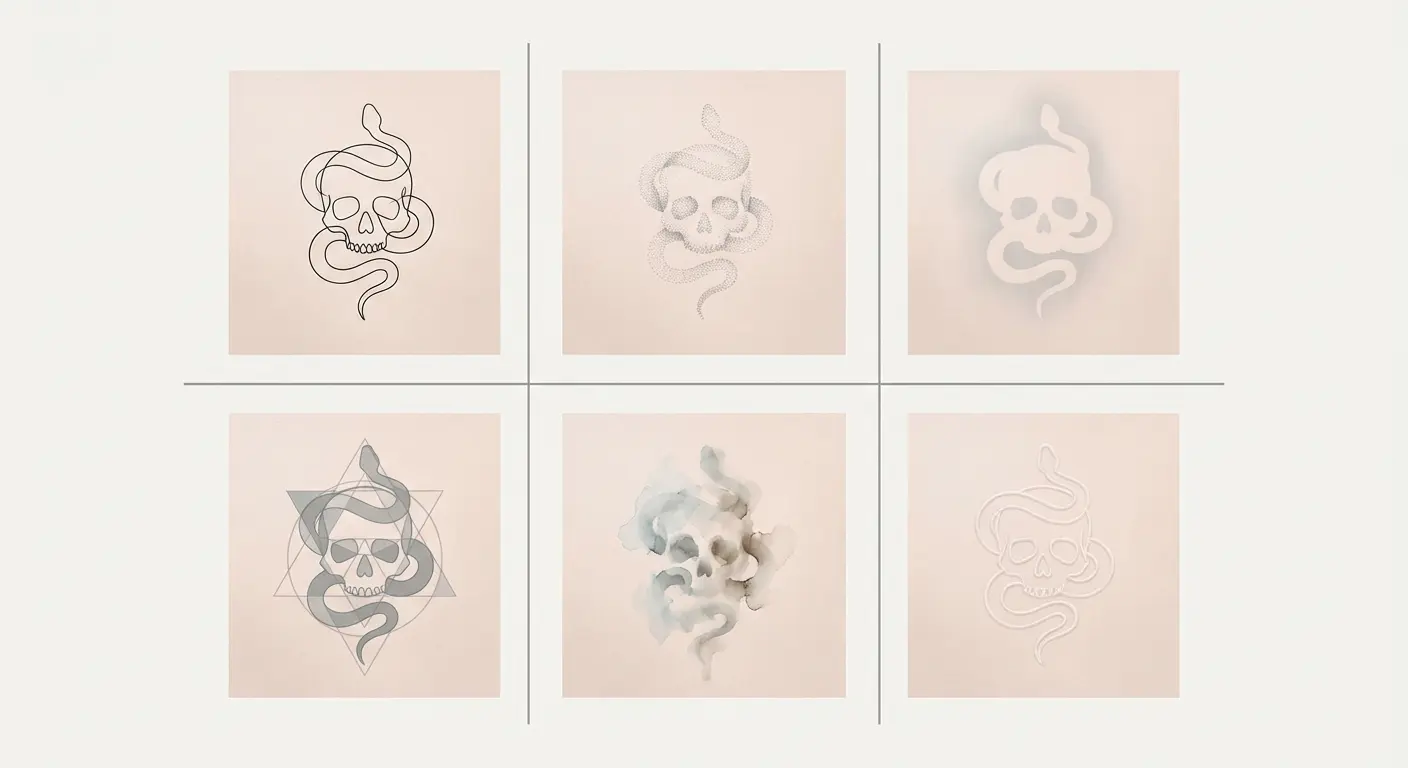
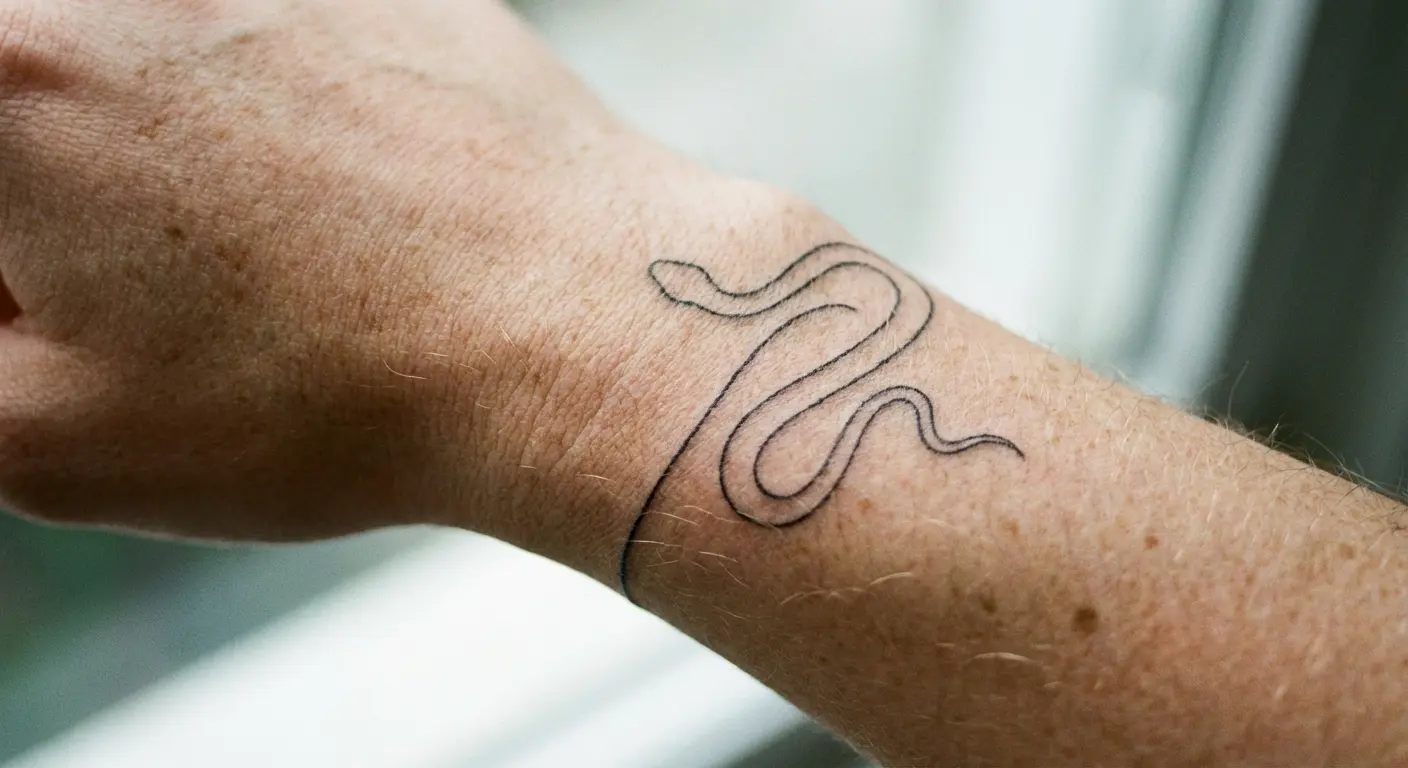
1. Minimalist Serpent Coil
The serpent alone? Enough.
You don’t need the skull at all, actually. The snake carries the whole reference by itself, especially if your artist knows what they’re doing with thin line work. This approach works for people who want the death eater tattoo aesthetic without the aggressive skull imagery that screams “dark wizard allegiance” to HR departments.
We’re talking single-needle work here, delicate enough to read as decorative jewelry from a distance but unmistakable to fellow fans who know what they’re looking at. The coil pattern mimics how the serpent emerges from the skull in the original design, but isolated, it becomes meditative instead of menacing.
Here’s why this works: you can scale it however you want depending on your comfort level. Placement options are nearly endless. Behind the ear gives you complete control over visibility. Your hair covers it when you need discretion, but you can show it off when you’re in friendly territory. Wrist, ankle, collarbone…all fair game.
2. Constellation Dark Mark
Okay, the constellation version is probably my favorite of the subtle options, so let me actually break this down properly.
Reimagine the death eater dark mark as a star map. The skull becomes Orion or another recognizable constellation, with the serpent traced in connecting lines between celestial points. This version gives you plausible deniability…it’s just astronomy, officer…while embedding the full symbol in a context that feels mystical instead of malevolent.
You can place this anywhere that benefits from the stretched vertical composition: spine, forearm, or along the ribcage. What’s cool about this approach is the dual meaning. To most people, you’re wearing your love of space. To Potter fans, you’re signaling something deeper about fate, destiny, and the marks we choose to bear.
The precision required for constellation work demands an artist who’s comfortable with fine lines and understands how to create designs that age well at small scales. For those drawn to subtle symbolic work, exploring fineline tattoo techniques can help you achieve that delicate celestial aesthetic.
I had a client last year, finance guy, corner office, the whole deal, who wanted this exact design. We spent an hour mapping out which constellations to use (he went with Draco, naturally) and how to position it so the serpent’s path felt intentional rather than random. The result reads as sophisticated astronomy ink to his colleagues, but every Potter fan who sees it does a double-take.
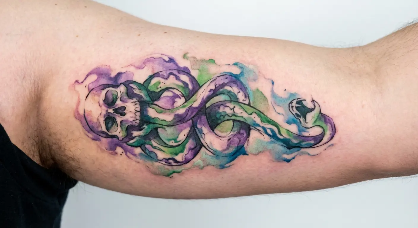
3. Watercolor Skull Fade
Watercolor techniques soften the death eater mark’s harsh edges by bleeding the skull into abstract color washes. Deep greens, purples, blacks that fade to grey. The serpent remains defined but the skull loses its crisp boundaries, creating something that feels more artistic interpretation than literal recreation.
This style works well for people who want the dark mark tattoo harry potter fans recognize but need the design to feel less aggressive, more gallery wall than Azkaban cell. Your artist can adjust opacity levels so the skull reads as suggestion rather than statement, which dramatically changes how non-fans perceive the piece.
Color choice matters a lot here. Traditional watercolor tattoos often incorporate bright, saturated hues, but keeping your palette darker and more muted maintains the death eater aesthetic while still benefiting from the watercolor technique’s softening effect.
Full disclosure though? I think watercolor Dark Marks are trendy right now but might look dated in five years. The style is having a moment, which means in half a decade it’ll scream “I got this in 2024.” But if you love it, you love it.
4. Geometric Skull Architecture
Break the skull down into polygons, triangles, and clean angles. The death eater aesthetic gets filtered through sacred geometry, transforming Voldemort’s brand into something that could hang in a modern art museum.
We’re removing the organic, threatening quality of bone and replacing it with mathematical precision. The serpent can remain fluid (creating nice contrast) or get the same geometric treatment for full cohesion. This approach appeals to people who love the dark mark’s symbolism but want their ink to reflect order and intentionality instead of chaos and destruction.
The mathematical precision of geometric tattoo designs transforms the harry potter dark mark into something that feels intentional and ordered. Placement on the forearm or shoulder blade gives you enough real estate for the geometric details to read clearly. Too small and the individual facets blur together, losing the architectural quality that makes this style work.
5. Negative Space Dark Mark
Instead of inking the skull and serpent, your artist inks everything around them, leaving your skin tone to form the actual death eater mark. This reversal creates a haunting effect where the symbol appears to glow from within your body rather than sitting on top of it.
Negative space work requires serious skill. Not every artist can pull this off convincingly. When executed well, it’s one of the smartest approaches to the dark mark tattoos available. The technique also ages differently than traditional ink, maintaining contrast as the surrounding blackwork settles into your skin over years.
You need to find an artist who specializes in blackwork and negative space specifically. This isn’t a design you want to trust to someone who’s “pretty sure they can figure it out.” The difference between amateur and expert execution is brutal, and since you’re committing significant skin real estate to solid black saturation, you want to get it right the first time.
Negative space work requires your artist to think in reverse. They’re tattooing the shadow, not the object. Most artists trained in traditional tattooing have to completely rewire their approach. Ask to see healed photos of their negative space work, specifically. Fresh negative space always looks good. Healed is where you see if they actually know what they’re doing.
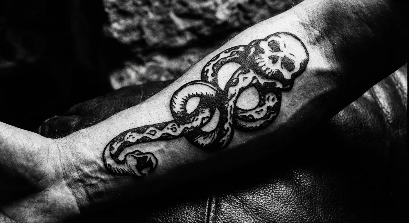
6. Single Line Death Eater Mark
Single line Dark Mark. You get it. Artist draws the whole thing without lifting the needle. Looks elegant, ages well, next.
Okay fine, a bit more detail: the death eater symbol translates surprisingly well to this style since the serpent naturally connects to the skull. You lose some detail (eye sockets become suggestions, teeth simplify) but you gain elegance and a design that reads clearly even at small scales.
Perfect for placement on the inner forearm, ankle, or behind the collarbone where subtlety serves you better than bold statements.
Bold Versions (If You Don’t Give a Fuck)
Some of you aren’t here for subtle.
You want the voldemort tattoo dark mark in its full, canonical glory because the design’s power comes from its uncompromising nature. These interpretations lean into the symbol’s dramatic visual language, embracing the skull, the serpent, and the entire aesthetic that made Death Eaters terrifying in the first place.
We’re talking larger scale, higher contrast, and placements that don’t hide. These designs work for people who’ve made peace with explaining their ink to curious strangers and who understand that a bold dark mark becomes a conversation starter whether you want it to or not.
The thing is, most people who come in wanting the bold version haven’t thought through what that actually means. You’ll field questions constantly. Certain professional contexts will require long sleeves year-round. Some people will judge you. That’s the trade-off.
The difference between “that’s a bold artistic choice” and “that’s a regrettable decision” often comes down to technical execution and the thought you’ve put into contextualizing the symbol.
So yeah, we need to talk about the elephant in the room. Someone got absolutely destroyed on Reddit for their Dark Mark tattoo a while back. The comments section was brutal, people comparing Death Eater ideology to actual hate groups, the whole thing. And honestly? They had a point. The pure-blood supremacy stuff is uncomfortable as hell when you think about it for more than five seconds.
Add in JK Rowling’s whole… gestures vaguely …thing with trans people, and suddenly your fun villain tattoo is carrying a lot more weight than you bargained for.
The conversation around Dark Mark tattoos has intensified in recent years, particularly after a Reddit user’s stylized Dark Mark tattoo sparked heated debate about whether Death Eater imagery crosses ethical lines. Critics drew parallels between the “pure blood” ideology and real-world hate groups, while defenders argued that engaging with fictional villain symbolism doesn’t equate to endorsing those values.
Here’s my take: I think you can get a Dark Mark tattoo without endorsing fascism, but you need to be ready to defend that choice. Not just to internet strangers, but to yourself. If you can’t articulate why you want this specific symbol and what it means to you beyond “it looks cool,” maybe sit with that for a while before committing.
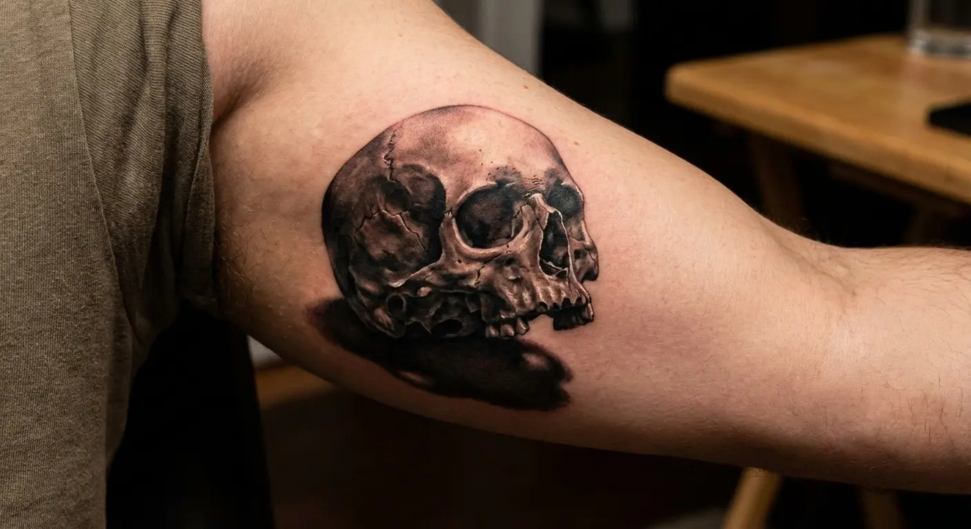
7. Forearm Dark Mark Placement (Classic Voldemort Style)
You knew this was coming.
The inner left forearm is where Voldemort branded his followers, and replicating that exact placement carries undeniable weight for Potter fans. This version stays true to the films’ design: crisp skull, serpent emerging from the mouth, rendered in black and grey with maybe a touch of green glow effect around the edges.
Let me be real with you: this placement will cost you job opportunities. Period. I don’t care how progressive your industry claims to be. Visible tattoos still matter in corporate America, and a skull with a snake coming out of its mouth on your forearm is about as visible as it gets.
But there’s something powerful about wearing the mark exactly where it appeared in the books, transforming a villain’s brand into your chosen symbol of fandom dedication. The dark mark tattoo harry potter fans immediately recognize in this placement carries canonical authority that no other location can match.
Make sure your artist understands the proportions matter here. Too large and it overwhelms the forearm’s real estate. Too small and it loses impact from any distance. The sweet spot is usually 4-6 inches in height, sized to fit comfortably on the inner forearm without wrapping around to the outer arm or extending past the wrist.
Fair warning: inner forearm hurts like hell. It’s thin skin over bone with minimal fat padding. Your first hour will be fine, then your body will start screaming. Bring headphones and something to squeeze.
Also, expect this to take 2-3 hours minimum for a decent-sized piece, longer if you’re going detailed. That’s $300-800 depending on your city and artist. In New York or LA, you’re looking at $500 minimum for quality work. Just so you know what you’re getting into.
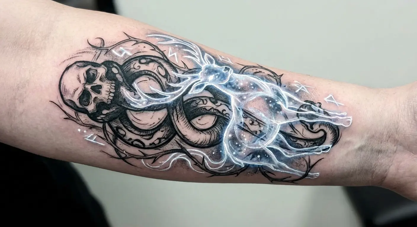
8. 3D Floating Skull Illusion
Modern tattoo techniques can make the dark mark’s skull appear to hover above your skin, casting shadows and creating genuine depth. This approach requires an artist skilled in hyperrealistic black and grey work who understands how light, shadow, and perspective create dimensional illusion on a flat surface.
The serpent can wrap around your arm (if you’re going forearm placement) or coil beneath the floating skull, enhancing the supernatural vibe. This death eater tattoo style works best at larger scales. Think upper arm or thigh, where your artist has room to build the gradients and highlights that sell the 3D effect.
The result is unsettling in the best way. A mark that seems to move when you do. When executed by a skilled artist, people will do double-takes trying to figure out how the skull appears to be levitating off your body.
9. Blackwork Death Eater Mark
Go full blackwork: solid black ink, heavy saturation, maximum contrast against your skin. The dark mark becomes a bold silhouette with zero grey shading, just pure black shapes that command attention.
This style strips away nuance in favor of graphic impact, turning the death eater mark into something that reads clearly from across a room. Blackwork ages exceptionally well. Solid black holds better than detailed shading over decades. Creates a striking visual that doesn’t rely on color or subtle gradients.
If you’re considering solid saturation, understanding blackout tattoo techniques and their aging properties will help you make an informed decision. You can incorporate additional blackwork elements around the core symbol (geometric patterns, ornamental flourishes, negative space designs) to build a larger piece that contextualizes the dark mark within your broader aesthetic.
10. Neo-Traditional Dark Mark with Ornamental Frame
Neo-traditional style brings bold lines, limited color palettes, and decorative framing to the death eater aesthetic. Picture the dark mark tattoo harry potter skull and serpent centered within an ornamental Victorian frame, maybe with banner scrollwork, roses (traditional symbols of secrecy), or other decorative elements that soften the symbol’s harsh associations.
This approach works for people who want the dark mark but need it to feel less isolated and aggressive on their body. The ornamental context suggests you’re collecting meaningful symbols rather than broadcasting singular allegiance.
Color choices matter here: deep greens and silvers nod to Slytherin house without being literal, while burgundy and gold create unexpected richness. The decorative frame gives your eye somewhere to rest and provides context that makes the central symbol feel curated rather than confrontational.
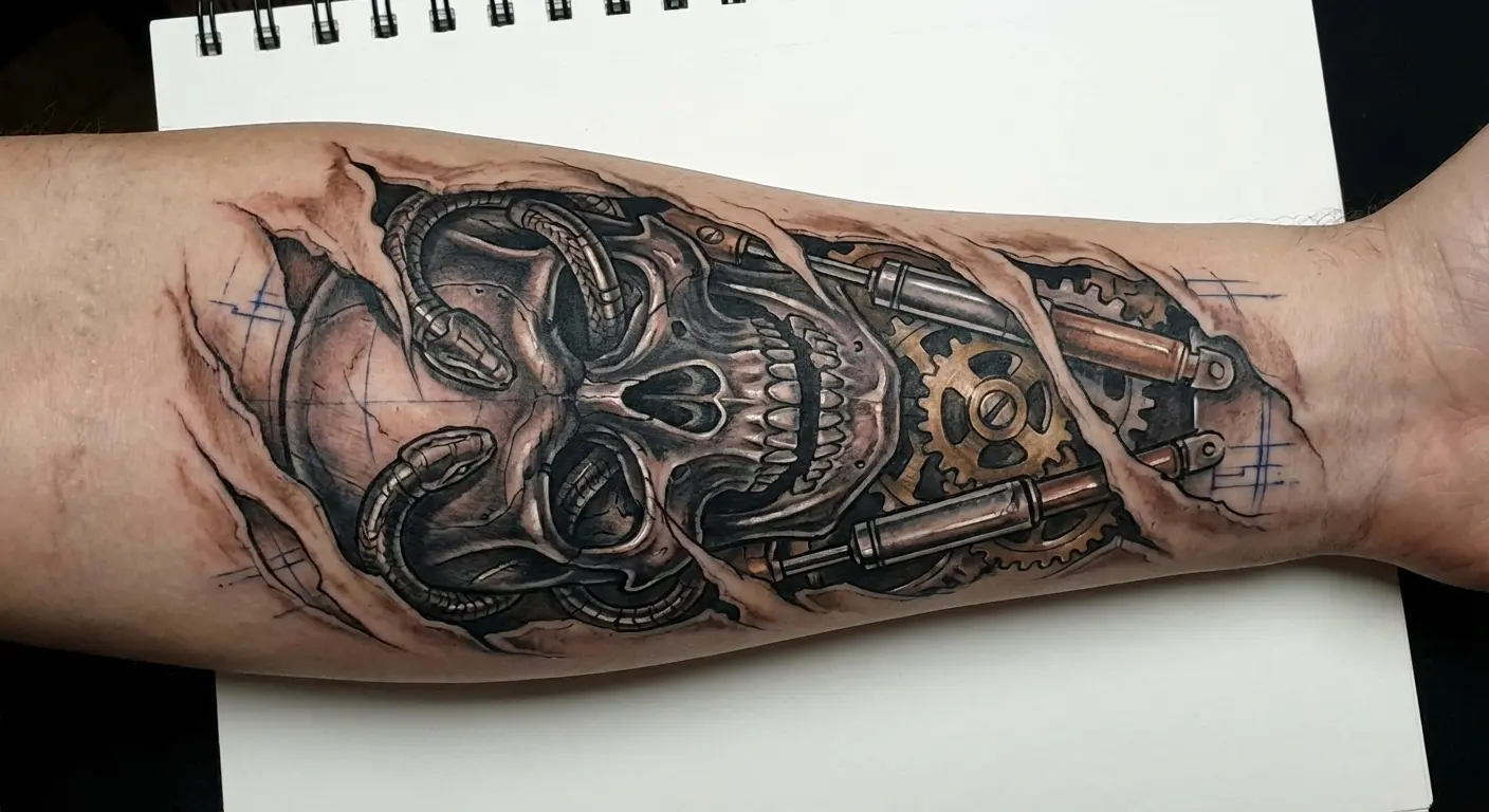
11. Biomechanical Dark Mark Integration
What if the death eater mark wasn’t just on your skin but integrated into your body’s machinery? Biomechanical tattoos blend organic and mechanical elements, creating the illusion that your skin is torn away to reveal gears, pistons, and in this case, the dark mark as part of your internal workings.
The biomechanical version… look, I know people love these, but I think they look dated within five years. That mid-2000s “torn skin revealing machinery” aesthetic had its moment. But hey, if you’re into it, you’re into it.
The skull might emerge from exposed mechanical components, with the serpent winding through pistons and cables. It’s aggressive, it’s technically demanding, and it requires an artist who specializes in biomechanical work to pull off convincingly. The best biomechanical pieces create seamless integration between the mechanical elements and your body’s natural contours, making the illusion feel organic despite the industrial imagery.
12. Full Sleeve Dark Mark Narrative
Use the death eater mark as the centerpiece of a larger sleeve that tells your Potter story. The dark mark might dominate the forearm, but surrounding elements (your house crest, significant quotes, other meaningful symbols from the series) create context and complexity.
This approach lets you honor the dark mark’s visual power while making clear you’re not endorsing Death Eater ideology. You’re building a comprehensive narrative about what the series means to you, and the villain’s symbol is part of that story, not the whole story.
Sleeve work requires serious planning and multiple sessions, but the result is a cohesive piece that rewards close examination and demonstrates thoughtful engagement with the source material. The dark mark tattoo harry potter fans recognize becomes one chapter in a larger visual novel that spans your entire arm.
Work with your artist to establish visual hierarchy. The dark mark should anchor the composition without dominating so completely that other elements feel like afterthoughts. Balance focal points, negative space, and transitional elements that guide the eye through the narrative you’re building.
Making It Personal
This is where we get interesting.
You can take the dark mark’s visual vocabulary and completely rewrite its meaning by merging it with personal elements that transform the symbol from Voldemort’s brand into your own mythology. These designs acknowledge the death eater aesthetic while rejecting its fictional ideology, creating something that’s uniquely yours.
We’re talking about inversions, combinations, and integrations that honor the original design’s power while bending it toward protection, memory, or personal values that have nothing to do with dark wizardry.
This category requires the most collaboration with your artist because you’re essentially creating new iconography rather than reproducing existing designs. You need someone who understands both the source material and how to blend disparate symbolic elements into compositions that actually work.
13. Dark Mark with Birth Flowers
Soften the death eater mark by weaving your birth month flowers through the serpent’s coils or emerging from the skull’s eye sockets. This combination creates tension between the dark mark’s aggressive symbolism and the gentle, personal meaning of birth flowers.
The result is something that feels reclaimed, transformed, domesticated. Your flowers can be rendered in color (creating pop against black and grey death eater elements) or kept monochromatic for cohesion. This approach works particularly well for people who want to honor the dark mark’s aesthetic but need the design to carry personal meaning that has nothing to do with fictional villainy.
Combining the harry potter dark mark with flower tattoo elements creates unexpected softness that transforms the symbol’s meaning entirely. Birth flowers carry individual significance: January’s carnation speaks to admiration, May’s lily of the valley represents sweetness, October’s marigold symbolizes creativity. Choose flowers that resonate with your personal narrative, not just your birth month if that feels more authentic.
14. Protective Dark Mark (Inverted Meaning)
What if the death eater dark mark wasn’t a symbol of allegiance to darkness but a ward against it? You can invert the symbol’s meaning by incorporating protective elements from various magical traditions: runes, evil eye imagery, or other apotropaic symbols that historically ward off harm.
Place these elements around or integrated with the dark mark, creating a design that uses the skull and serpent as guardians rather than threats. This reimagining appeals to people drawn to the dark mark’s power but uncomfortable with its associations.
You’re essentially saying: I see the darkness, I acknowledge it, and I’m using its own imagery to protect myself from it. The protective inversion transforms the voldemort tattoo dark mark from a symbol of submission to darkness into armor against it.
Honestly though? This one feels like mental gymnastics to me. If you need to add that much context to justify the symbol, maybe just get a different tattoo. But It has been work for people who genuinely connect with the protective inversion concept, so what do I know?
15. Dark Mark Merged with Patronus
Here’s the ultimate Harry Potter duality: the death eater mark merged with or opposed by your Patronus animal. The dark mark might occupy one side of your chest with your Patronus emerging from the other, or the two symbols could intertwine, creating visual dialogue between darkness and light, fear and hope, Voldemort’s brand and your protective magic.
This is probably the smartest version of this tattoo, full stop. The conversation between these opposing forces becomes the point. A permanent reminder that we all contain multitudes and that choosing light doesn’t mean pretending darkness doesn’t exist.
This design requires careful composition so neither element overwhelms the other. Consider placement carefully. Chest pieces allow for symmetrical opposition, with each symbol claiming its territory. Alternatively, a forearm design might show the Patronus charging toward or through the dark mark, suggesting active resistance rather than static balance. The narrative you’re building determines which compositional approach serves your story better.
16. Literary Quote Integration
Wrap the dark mark tattoo harry potter design in text from the series that provides context or counterpoint to the symbol’s meaning. Quotes about choice (“It is our choices, Harry, that show what we truly are”), love as protection, or the complexity of human nature can transform how people read the death eater imagery.
The text can circle the mark, emerge from it, or frame it, depending on your placement and composition preferences. This approach makes your interpretation explicit, ensuring viewers understand you’re engaging with the symbol critically rather than endorsing it literally.
Script choice matters here. Elegant, readable fonts work better than overly decorative options that sacrifice legibility. Your quote needs to remain readable as the tattoo ages, which means avoiding scripts that are too thin or ornate. Test how the text reads at distance. If you can’t make out the words from a few feet away in your reference design, it won’t improve once it’s inked on your body.
17. Dark Mark Memorial Piece
Transform the death eater mark into a memorial for someone you’ve lost, particularly if the Potter series connected you or if they identified with Slytherin house or complex characters who bore the dark mark. You might incorporate their initials into the serpent’s coils, add their birth and death dates, or merge the dark mark with other memorial elements (forget-me-nots, specific dates, personal symbols).
This recontextualization is profound because you’re taking a symbol of death and loss from fiction and making it carry your real grief and love. The dark mark becomes less about Voldemort’s followers and entirely about your personal mythology of remembrance.
I saw a memorial Dark Mark last year for someone’s dad who loved the books. Their initials hidden in the serpent’s coils, dates worked into the design so subtly you’d miss them if you weren’t looking. Made me tear up, honestly.
For many fans, Harry Potter tattoos represent more than fandom. They’re lifelines. As one transgender fan shared after getting a Sorcerer’s Stone cover tattoo, they reread the first book more than 175 times during suicidal episodes in high school, marking a tally each time. Even amid J.K. Rowling’s controversial statements, they refuse to cover the tattoo because “the beautiful feelings of acceptance and love that we get out of these books…isn’t necessarily something J.K. Rowling gave us but something we created for ourselves.” This perspective transforms even the Dark Mark from author’s creation into community reclamation. A symbol whose meaning belongs to those who wear it, not the one who wrote it.
Memorial pieces demand sensitivity from your artist. You’re trusting them with visual representation of your grief, which means finding someone who approaches the work with appropriate reverence. Consultations for memorial tattoos should feel different. More careful, more considered than standard fandom ink discussions.
Okay, quick commercial break: I keep mentioning “show your artist references” because that’s genuinely the hardest part of this process. Most people can’t draw, and describing what you want verbally is a nightmare.
That’s literally why we built Tattoo Generator IQ. I got tired of consultations where we spent an hour trying to figure out if “geometric but not too geometric” meant sacred geometry or just… triangles.
The tool lets you generate variations until you find the thing that makes you go “THAT. That’s it.” Then you bring that to your artist and everyone’s on the same page from minute one.
Anyway, end of pitch. Back to the tattoos.
Things That Will Make Your Dark Mark Look Terrible
Before we wrap up, let’s talk about what not to do:
Getting it too small. The details will blur into a blob within a few years. Popular variations include Dark Marks under 2 inches that look like weird birthmarks after they heal.
Choosing an artist based on price instead of portfolio. This is not the place to bargain hunt. A cheap Dark Mark is a bad Dark Mark, and laser removal costs way more than just paying for quality work upfront.
Getting it on your hand or neck as your first tattoo. Seriously, don’t. Those placements are job-killers, and if you’ve never been tattooed before, you don’t know how your body handles ink or how you’ll feel about visible work long-term.
Trying to combine too many elements. Some people try to add their house crest, their Patronus, three quotes, and their dog’s name. It’s a mess. Pick one or two additional elements max.
White ink Dark Marks. Cool concept, terrible execution. White ink fades within a year and often doesn’t show up well on most skin tones. Just don’t.
Tiny detailed versions behind your ear. Not enough space. The details get lost. The serpent becomes a squiggle and the skull becomes a smudge.
Final Thoughts
The death eater tattoo carries more complexity than most fandom ink because the symbol itself is morally loaded within its source material. You’re not getting a Deathly Hallows triangle or a house crest with straightforward positive associations. You’re choosing a villain’s brand, which means you need to be intentional about what that choice means to you and how you want it to read to others.
I said earlier that subtle versions are smarter, but honestly? Sometimes bold is the right choice. If you’re already heavily tattooed, if you work in creative fields, if you genuinely don’t care what strangers think, the full canonical forearm placement might be exactly what you want. Don’t let me talk you out of it if that’s your instinct.
Your skin is permanent. The dark mark harry potter fans recognize carries weight both within and outside fandom spaces. Choose a version that you’ll still defend and find meaningful in twenty years, not just one that looks cool in the Pinterest board you’re building tonight.
The seventeen designs I’ve covered give you starting points, not prescriptions. Your death eater tattoo should reflect your relationship with the series, your aesthetic preferences, and the level of visibility you’re comfortable with in different contexts. Some of you will go full forearm canonical placement. Others will hide a minimalist serpent coil where only you and intimate partners ever see it. Both choices are valid if they’re intentional.
Work with an artist who understands fandom tattoos and who won’t judge you for wanting villain iconography. Come prepared with references, be open to their technical suggestions about what will and won’t age well, and remember that the dark mark’s power comes from its clarity. Muddy execution turns iconic imagery into regrettable blobs.
That’s everything I know about Dark Mark tattoos that won’t make you look like you’re cosplaying a villain. Did I miss something? Probably. Do I have all the answers? Definitely not.
But if you use this guide to get a version that works for you (one you can defend when people ask, one that means something specific to you, one that doesn’t make your HR department nervous) then I did my job.
Now go find an artist whose portfolio you actually like and stop overthinking it.