
19 Red Tattoos (And Why You’ll Probably Regret Yours in 5 Years)
Before we dive into designs, let’s address something nobody wants to hear: most people who get red ink tattoos aren’t prepared for what comes after.
You see a gorgeous crimson rose on Instagram, perfectly lit and freshly done, and think “I need that.” What you don’t see is the same tattoo two years later after the owner forgot to wear sunscreen all summer. Spoiler: it looks like pink salmon, not the vibrant red they paid for.
Red ink is having a moment right now. But trends in tattooing come and go faster than the tattoos themselves fade. In five years, this red ink wave might be over, but your tattoo won’t be. So before you commit to red just because it’s everywhere on TikTok, let’s talk about what you’re actually signing up for.
Why People Choose Red Ink (And Why Most of Them Shouldn’t)
Wrong reasons to get red ink:
“It looks amazing on Instagram”
Filtered photos lie. That vibrant scarlet in perfect lighting looks different in fluorescent office lighting, different in natural sunlight, different when it’s healed six months. You’re choosing a color based on its best possible presentation, not its real-world appearance.
“I want something different”
Different for the sake of different is how you end up with regrets. Red ink is higher maintenance than black. If you’re choosing it just to stand out, you’re signing up for years of extra work for aesthetic novelty that’ll wear off in six months.
“My ex has a black tattoo”
Spite is a terrible reason for permanent decisions. Choose red ink because you love it, not because you’re making a point to someone else.
“Red will make this mediocre design look better”
Color doesn’t fix bad design. A poorly conceived tattoo in red ink is just a poorly conceived tattoo that’s harder to maintain.
“Everyone’s getting them right now”
See my point about trends above.
Right reasons to get red ink:
The design genuinely requires red (roses, cardinals, poppies). You’re already meticulous about sun protection. You budget for touch-ups every few years. You’ve done a test patch with no reaction. You understand it’ll fade and you’re okay with that reality.
If you’re still reading after all that, let’s look at designs.
TL;DR
Red ink fades faster than black and needs more maintenance than most artists admit upfront. It triggers stronger reactions, psychological and sometimes physical (allergies are real). Great for cover-ups because of how opaque it is. Skin tone matters more with red than other colors. Sun exposure kills red ink, so budget for touch-ups every 3-5 years. Test patch first if you have any doubts.
Bold Red Designs That Don’t Apologize
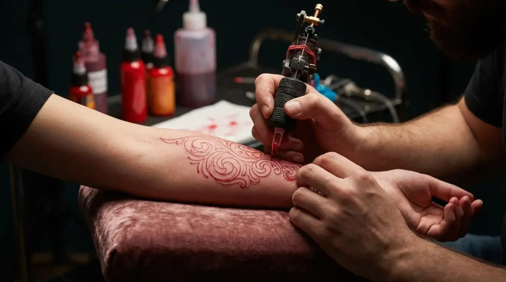
Let’s start with the red tattoos that don’t apologize for existing. These designs use red ink as the primary color, not an accent. They’re conversation starters, and they demand maintenance you need to budget for.
People jump into these bold pieces without understanding the commitment level required, both financially and time-wise. Red ink fades faster than black, particularly in sun-exposed areas, which means these statement pieces need touch-ups more frequently than you’d expect. The pigments in red tattoo ink are much more voluminous than other colors, making them more challenging for artists to bring under the skin and resulting in slower healing times, as reported by MyTattoo.
The designs in this category work because they embrace red ink’s natural vibrancy rather than fighting against its tendency to shift tone over time. On Instagram and Pinterest, red ink tattoos have become impossible to avoid, with celebrities like Kylie Jenner and Rita Ora proudly showcasing their red designs, according to MyTattoo’s analysis of the red ink trend.

Look, nobody tells you this part:
Red pigment molecules are chunky. They take forever to heal and your artist has to go over the same spot multiple times.
Sun turns red ink into pink ink. Fast. Hope you like applying SPF every single day.
That “extended aftercare period”? Translation: more time for something to go wrong.
Touch-ups every 3-5 years aren’t optional. They’re mandatory if you don’t want it looking like faded salmon.
If you have darker skin, demand a test patch first. Some reds just don’t show up right.
1. Full Red Rose Sleeve
A sleeve of nothing but red roses sounds redundant until you see it done right.
The trick is getting an artist who knows how to layer red without creating muddy patches where everything bleeds together into one indistinct blob. You need varying shades (crimson, scarlet, burgundy) to create any depth. Otherwise it’s just a red tube on your arm.
This isn’t a one-session deal. Building up red properly means multiple sessions with healing time between, or you’ll get blowouts that heal pink instead of red. And pink roses aren’t the vibe you’re going for.
Expect your artist to be conservative with how much they pack in during each session. If they’re not, find a different artist. Understanding proper tattoo aftercare protocols becomes even more critical when you’re dealing with red ink’s extended healing timeline.

2. Blood Moon with Geometric Framing
This design takes advantage of how intense red ink looks by pairing it with black geometric elements. The blood moon sits as the focal point, rendered in gradient red tones that shift from deep crimson at the edges to lighter scarlet at the center.
Geometric shapes (triangles, hexagons, sacred geometry patterns) frame the moon in solid black, creating contrast that makes the red pop even more. Upper arm or thigh locations work best because they’re easier to protect from sun exposure.
The geometric framing also serves a practical purpose: it gives your artist clear boundaries to work within, reducing the risk of red ink bleeding into surrounding skin as it heals.
3. Red Dragon Spine Piece
A red dragon down your spine is commitment with a capital C.
Spine tattoos are already brutal. Thin skin over bone, every nerve ending screaming at you. Add red ink’s tendency to inflame more during healing, and you’re in for a rough couple of weeks. Sleeping on your stomach only. No leaning back in chairs. No second-guessing halfway through because you can’t exactly hide a spine piece.
But if you’re sure? The visual impact is insane.
Eastern dragons work best here. The red connects to all that cultural symbolism around power and fortune, plus the serpentine body follows your spine’s natural curve. Head between the shoulder blades, tail at your lower back.
Just make sure you’re absolutely certain before you start. This isn’t a placement you test-drive.

4. Poppy Field Forearm Band
Poppy field forearm bands look amazing. They’re also a terrible idea if you’re not committed to daily sunscreen.
Forearms get constant sun exposure. Your red poppies will fade to pink coral faster than almost any other placement. You’ll need touch-ups every 2-3 years instead of 3-5, and that’s if you’re religious about SPF 50+.
Most people aren’t. Which is why you see so many sad, faded forearm tattoos that used to be vibrant red.
If you want this design, get it on your upper arm or thigh instead, somewhere you can actually protect from sun. If you’re absolutely committed to the forearm placement, understand you’re signing up for high-maintenance upkeep and budget accordingly.
The stems and leaves in black or dark green provide necessary contrast. Poppies have natural variation in their red tones, so as your tattoo fades over time, it can look more realistic rather than less. Still doesn’t make the constant sunscreen application any less annoying.
5. Cardinal in Flight Chest Piece
Cardinals are naturally red, which makes them perfect subjects for red ink. Placing one in flight across your chest creates movement and takes advantage of the broad canvas.
The wings span from collarbone to collarbone, with the body positioned slightly off-center for visual interest. Red ink on chest skin can be tricky because the skin is thinner and more sensitive than other areas. Your artist needs to work carefully to avoid overworking the skin, which causes red to heal patchy.
The upside? Chest pieces are easier to protect from sun damage since you control when they’re exposed. Unless you’re someone who wears V-necks or tank tops constantly, in which case that cardinal spanning your collarbone isn’t exactly protected.
6. Red Lotus Mandala
Mandalas require precision. Executing one primarily in red ink adds another layer of difficulty.
The lotus sits at the center, rendered in gradient red tones that get lighter toward the petals’ edges. Surrounding mandala patterns in black create the structure, while red accents throughout tie the design together.
This works best as a back piece or thigh piece where you have enough space for intricate details to read clearly. Red can blur slightly as it heals, so your artist needs to leave adequate spacing between fine lines.
The symbolism behind lotus flower tattoo designs adds layers of meaning when rendered in red ink. Red lotuses are associated with love and compassion, adding depth beyond the aesthetic.

7. Japanese Oni Mask
Traditional Japanese oni masks are often depicted in red, representing demons or protective spirits depending on context. A red oni mask makes a powerful shoulder or upper arm piece.
Find an artist experienced in Japanese traditional style who understands how to use red ink to create the mask’s fierce expression. The horns, teeth, and eyes get rendered in black or white to create contrast against the red skin of the mask.
This design requires bold, solid red fills rather than subtle shading. Japanese traditional tattoos are meant to be read from a distance, so the red needs to be vibrant and saturated. Touch-ups every few years are non-negotiable if you want to maintain the design’s impact.
Subtle Red: When Less Is More
Not everything needs to scream. Sometimes a tiny hit of red does more than a whole sleeve of it.
These designs prove that restraint can be just as powerful as going all-in. Plus they age better because the design doesn’t live or die by the red ink staying perfect. The red is supporting the design rather than carrying it entirely.
They’re also more workplace-friendly in most industries, since small pops of red read as artistic rather than aggressive. The psychological effect is different too. Subtle red draws people in rather than stopping them in their tracks.
Before you commit to any of these designs, make sure you can actually picture it on your body. Not on some Pinterest model with different skin tone and body type. On you specifically.
I’d recommend using something like Tattoo Generator IQ to test different red shades on your actual skin tone before you book an appointment. You can adjust placement, try burgundy versus scarlet versus crimson, see if that wrist piece actually looks good on your wrist or if it’s better suited somewhere else. Way cheaper than paying for laser removal or a cover-up because you couldn’t visualize it properly. Plus you can show your artist exactly what you want instead of pointing at random Instagram photos and hoping they get it.
8. Single Red String of Fate Wrist Tattoo
The red string of fate concept comes from East Asian mythology, representing the invisible thread connecting people destined to meet. Rendered as a simple red line wrapping around your wrist, this design is delicate and meaningful.
The challenge? Keeping the line consistent in width and color as it heals. Red on wrist skin can fade quickly because of constant hand washing and sun exposure. You’ll need touch-ups more frequently than you’d expect for such a small piece.
Some people extend the string to connect to another tattoo or wrap it around a finger, creating a more complex design. The simplicity is the appeal, but it requires finding an artist who can execute clean, fine lines in red without blowout.
9. Red Accent Line Work on Black Ink
Adding red accent lines to an existing black tattoo can completely transform its appearance. This works well for geometric designs, traditional Japanese pieces, or blackwork tattoos that feel too monochromatic.
The red lines should be strategic, highlighting specific elements rather than scattered randomly throughout. Think of red as punctuation rather than the main text.
Your artist needs to consider how the red will age against the black. Red tends to fade faster, so the contrast will diminish over time. Planning for this means using red in areas where slight fading won’t ruin the design’s readability.
This approach is also useful if you’re testing how your skin takes red ink before committing to a larger piece.

10. Minimalist Red Heart Outline
Simple doesn’t mean easy to execute well. A minimalist red heart outline requires perfect line weight consistency and precise placement.
The design works best small (under two inches) and positioned somewhere with tight skin like the wrist, ankle, or behind the ear. Red ink’s vibrancy makes even a tiny design visible, which is why this style has become popular.
The downside is that small red tattoos can blur together as they age, turning your crisp outline into a red smudge. Your artist should use a slightly thicker line weight than they would for black ink to account for this. Exploring different heart tattoo design variations in red ink can help you find the perfect minimalist approach for your style.
Placement on areas with less sun exposure helps maintain the design’s clarity longer.
11. Tiny Red Constellation Behind the Ear
Behind-the-ear tattoos are trendy for good reason (they’re easy to hide when needed) and using red ink for constellation dots creates a subtle pop of color.
The dots should be small but not so tiny they blur together immediately. Red behind the ear can be more painful than other locations because of the proximity to bone and the thinness of the skin.
The healing process requires careful attention because you can’t easily see the area yourself. Hair can also interfere with healing if you’re not careful about keeping it clean and away from the fresh tattoo.
This placement works well for people who want red ink but aren’t
This placement works well for people who want red ink but aren’t ready for something highly visible.
12. Red Watercolor Splash on Grayscale Portrait
Grayscale portrait tattoos are stunning on their own, but adding a strategic red watercolor splash element creates visual interest and breaks up the monochrome palette.
The red should be intentional, perhaps highlighting a meaningful object in the portrait or creating an abstract background element. This technique requires an artist skilled in both realism and watercolor styles.
The red watercolor effect needs to look deliberately painted, not like a mistake or afterthought. Over time, the red will fade while the black and gray portrait remains crisp, which can enhance the watercolor effect if planned correctly.
The key is using red in a way that complements rather than competes with the portrait’s focal point.

13. Fine Line Red Script
Red script tattoos are risky because red doesn’t hold fine details as well as black. The words need to be large enough that individual letters remain readable as the ink settles and potentially spreads slightly.
Red script works best for single words or short phrases rather than lengthy quotes. Font choice matters. Avoid overly decorative fonts with thin serifs or elaborate flourishes. Simple, bold fonts maintain their readability longer.
Placement should be on flat areas with tight skin like the forearm, ribs, or collarbone. Red script on areas with loose skin or frequent movement (like the inner arm) will blur faster.
The emotional impact of red text is different from black. Red reads as more urgent, passionate, or important, which can enhance your chosen words’ meaning.
Red Ink for Cover-Ups and Corrections
Here’s the part that matters if you’re covering up old work: red ink is incredibly valuable for cover-up work and corrections. Its opacity and vibrancy make it effective at concealing older, faded tattoos or incorporating scars into new designs.
Cover-up work requires different considerations than fresh tattoos on blank skin. Your artist needs to assess what they’re working with and determine whether red ink will effectively mask the old work or if additional colors are needed.

Not every old tattoo can be covered with red ink. Here’s the reality check:
Red ink CAN cover:
– Faded black or gray work (at least 5+ years old)
– Blue ink that’s lightened significantly
– Green ink (with proper color theory planning)
– Blown-out lines that have spread to gray
– Scarring with relatively smooth texture
Red ink CANNOT effectively cover:
– Fresh, dark black ink (you’ll see it through the red)
– Solid black tribal that’s still saturated
– Very dark blue or purple ink
– Extremely raised or textured scars
– White ink (creates weird pink tones)
If your old tattoo is too dark for red ink to cover, you have three options: laser fading sessions first (3-5 sessions to lighten it enough), incorporate black into your new design to neutralize the old dark areas, or choose a different placement and leave the old tattoo alone.
A good cover-up artist will tell you honestly if red ink will work. If they promise it’ll be fine without discussing these limitations, find someone else.
14. Red Peony Over Faded Black Work
Peonies have enough visual density to cover substantial areas of faded black work. The layered petals create opportunities to strategically place the darkest red tones over the most visible parts of the old tattoo.
Red peonies work better for cover-ups than lighter colored flowers because red ink’s opacity helps block out what’s underneath. Your artist will likely need to incorporate some black shading into the new design to fully neutralize the old tattoo.
The result should look intentional, not like you’re hiding something (even though you are). Peonies also carry positive symbolism around prosperity and honor, which can help you reframe the narrative around your cover-up.
15. Scarlet Geometric Patterns for Scar Coverage
Scars hold ink differently than regular skin, which makes tattooing over them challenging. Red ink can be effective for scar coverage because its vibrancy draws the eye away from textural irregularities.
Geometric patterns work well because they don’t require perfect smoothness to look intentional. The angles and shapes can be adjusted to work with your scar’s shape rather than against it. When planning scar coverage, exploring geometric tattoo design options can help you find patterns that work with red ink’s unique properties.
Your artist needs experience tattooing scar tissue because the technique differs from tattooing normal skin. Multiple sessions are often necessary because scarred skin doesn’t take red ink as readily on the first pass.
The psychological benefit of transforming a scar into intentional art shouldn’t be underestimated.

16. Red and Black Biomechanical Rework
Biomechanical tattoos create the illusion of machinery or robotics beneath your skin. Adding red ink elements (wires, lights, mechanical details) to an existing black biomechanical piece can modernize it and cover areas where the original work has faded poorly.
Red works within the biomechanical aesthetic because it suggests energy, heat, or power. This approach is less invasive than a full cover-up because you’re enhancing rather than completely replacing the original tattoo.
Your artist can strategically place red elements to draw attention away from problematic areas while maintaining the overall design’s integrity. This works well for older biomechanical pieces that feel dated or were never finished properly.
17. Red Phoenix Rising from Old Tribal
Tribal tattoos from the 90s and early 2000s are among the most commonly covered designs. A red phoenix rising from or incorporating the old tribal work creates a meaningful transformation narrative.
The phoenix’s body can be primarily red with black detailing, while the tribal elements get reworked into flames or background elements. The powerful symbolism of phoenix tattoo meanings makes this design particularly meaningful for transformative cover-ups.
This type of cover-up requires significant planning because tribal tattoos are typically solid black, which is harder to cover than faded work. Your artist might recommend laser fading sessions before attempting the cover-up, depending on how dark the tribal is.
The phoenix symbolism (rebirth and transformation) makes this particularly meaningful for people moving past a regrettable decision.

18. Ruby Jewel Tones Over Blown-Out Lines
Blown-out tattoo lines (where ink has spread beyond the intended line) are frustrating but fixable. Incorporating ruby and garnet red tones into a jewel-themed design can disguise blown-out areas by making them look intentional.
The design might include gemstones, crystals, or ornate jewelry rendered primarily in red tones. The key is creating enough visual complexity that the eye doesn’t focus on where the old lines were.
Your artist can use varying shades of red to create depth and dimension, with the darkest red strategically placed over the most problematic areas. This approach works best when the blown-out tattoo is relatively small or confined to a specific area rather than spread across a large piece.
19. Red Smoke Effect for Laser Removal Transitions
Laser removal doesn’t always completely erase a tattoo. Sometimes it leaves ghosting or uneven fading. Red smoke or mist effects can bridge the gap between partially removed tattoos and new work.
The smoke can appear to be rising from or obscuring the remaining traces of the old tattoo. This technique requires an artist who understands how to create realistic smoke effects in red ink. The smoke should have natural movement and variation in opacity.
This approach is useful when you’ve invested in laser removal but don’t want to complete the full removal process. Red smoke works well because it’s visually striking enough to stand on its own while serving the practical purpose of concealing imperfections.
The design can incorporate other elements (flowers emerging from the smoke, abstract shapes, complementary imagery) to create a cohesive final piece that feels intentional rather than corrective.
Why Your Red Tattoo Needs More Planning Than You Think
Before we address the nightmare scenario, let’s be clear about red ink allergies: they’re real and they can be severe. Not “a little itchy” severe. More like “lost all my body hair and needed surgery” severe.
That actually happened to a guy in Poland who got a red forearm tattoo. Years of immune system chaos, multiple surgeries to remove every fragment of red ink, permanent damage to his sweat glands. The medical team noted that patients with autoimmune conditions like Hashimoto’s thyroiditis should be particularly cautious when deciding to get a red tattoo, especially with red ink, according to Science Alert.
Is this common? No. Should you be aware it’s possible? Absolutely.
Even though red ink tattoos have become incredibly popular, red is the color that most often triggers allergies, with symptoms including inflammation, redness, and burning that can appear immediately or even years after getting inked, according to MyTattoo.
If you have any autoimmune conditions (Hashimoto’s, lupus, whatever), talk to your doctor before getting red ink. Not your tattoo artist. Your actual doctor.

The vibrancy that makes red ink so appealing initially is also what makes it more challenging to maintain long-term. You’ve seen the designs, but here’s the reality check: red tattoos require more maintenance, more careful sun protection, and more realistic expectations about longevity than black tattoos.
A test patch means your artist tattoos a small amount of red ink (usually a dot or tiny line) in a discreet area (inner arm, behind ear, somewhere you can monitor but easily hide). Then you wait.
Wait at least 2-4 weeks, ideally longer. You’re watching for excessive redness that doesn’t go down, raised bumpy texture that persists, itching that gets worse instead of better, any signs of allergic reaction.
Some artists include test patches in their consultation fee, others charge $50-100. Worth every penny if it prevents you from discovering you’re allergic after they’ve finished half your sleeve.
If you have any autoimmune conditions, stretch that waiting period to 6-8 weeks. Allergic reactions can show up months or even years later, but most acute reactions appear within the first month.
Red ink shows up differently depending on your skin tone, and this isn’t something you can ignore.
On very light skin, red ink is extremely vibrant, almost neon when fresh. You have the most flexibility with red shades, but you also show every imperfection (blowouts, uneven saturation, everything is visible).
On medium skin tones, red still pops but with more subtlety. You might need slightly more saturated reds to get the same impact. Orange-based reds can look muddy. Stick with true reds or slightly cool-toned crimsons.
On darker skin, red ink requires careful planning. Some reds barely show up at all. Deep burgundy and crimson work better than bright scarlet. Your artist needs to pack more pigment in, which means longer sessions and potentially more inflammation during healing.
The test patch isn’t optional if you have medium to dark skin. You need to see how that specific red ink heals on your specific skin tone before committing to a large piece.
Aftercare for red ink isn’t radically different from black ink, but the stakes are higher because healing problems are more visible.
First two weeks: fragrance-free, dye-free moisturizer (Aquaphor, Hustle Butter, whatever your artist recommends), wash 2-3 times daily with unscented antibacterial soap, pat dry (don’t rub), no soaking (no pools, hot tubs, baths, showers only).
Weeks 2-4: switch to lighter lotion once scabbing is done, start introducing SPF once the skin is fully closed, keep it moisturized (red can look dry and dull if your skin is dehydrated).
Forever after: SPF 50+ anytime it’s exposed to sun (yes, even through car windows), moisturize regularly to keep colors vibrant, avoid tanning beds entirely (they’ll destroy red ink faster than anything).
The artists who say “just use whatever lotion” aren’t the ones you want working on your red ink.
So Is Red Ink Actually Worth It?
Depends on who you are.
Get red ink if:
– You’re already meticulous about skincare and sun protection
– You have the budget for touch-ups every 3-5 years
– The design genuinely calls for red (not just “would look cool in red”)
– You’ve done a test patch and had no reaction
– You understand it’ll fade and you’re okay with that reality
Skip red ink if:
– You forget to wear sunscreen regularly
– You’re on a tight budget and can’t afford maintenance
– You’re impulsive about tattoos and might regret the high-maintenance choice
– You work outdoors or in high-sun-exposure situations
– You have autoimmune issues or a history of allergic reactions
– You want something low-maintenance
The honest truth? Most people would be happier with black ink. It lasts longer, costs less to maintain, has fewer health risks, and ages more predictably. Red ink is for people who specifically want red ink badly enough to deal with everything that comes with it.
If you’re on the fence, that’s your answer. Get black ink. You can always add red accents later if you still want them.
Final Thoughts
Look, I’m not going to tell you red tattoos aren’t worth it. When they’re done right and maintained properly, they’re stunning. But “maintained properly” is doing a lot of heavy lifting in that sentence.
If you’re the type who forgets to wear sunscreen, skips moisturizing, and thinks “I’ll get it touched up eventually” means never, pick a different color. Red ink doesn’t forgive neglect.
But if you’re committed to the upkeep? If you’re okay with being that person who reapplies SPF 50 like it’s your religion? Then go for it. Just find an artist who’ll show you healed photos of their red work, not just fresh-off-
But if you’re committed to the upkeep? If you’re okay with being that person who reapplies SPF 50 like it’s your religion? Then go for it. Just find an artist who’ll show you healed photos of their red work, not just fresh-off-the-needle shots that make everything look perfect.
And maybe start with something small. Test how your skin handles red ink before you commit to that full sleeve you’ve been planning. Your future self will thank you.