
16 Attack on Titan Tattoos That Honor Your Favorite Anime Without Looking Like Every Other Fan
Let me guess: you love Attack on Titan, you want a tattoo, and you’re tired of seeing the same Wings of Freedom logo on every other fan’s shoulder.
Same.
Look, there’s nothing wrong with getting the Survey Corps emblem. It’s iconic. Everyone recognizes it. But that’s also kind of the problem, right? You want something that shows you actually engaged with the series beyond surface-level “titans are cool” stuff.
After watching this fandom for years and talking to probably too many tattoo artists about anime ink, I’ve got some designs that pull from AOT’s deeper visual language. Some are subtle enough for corporate jobs. Others are bold statements that announce your fandom to anyone within 10 feet. All of them skip the obvious stuff everyone else is getting.
Quick version if you’re skipping ahead:
Most AOT tattoos default to character portraits or the Wings logo, but the series offers way deeper symbolic material. Object-focused designs (ODM gear, Eren’s key, the basement door) carry the story’s weight without announcing your fandom to everyone who glances at your arm. Abstract interpretations of pivotal moments create conversation pieces that reward close examination. Scale matters tremendously because tiny details that look crisp in screenshots blur into muddy shapes on skin. And your artist needs reference material that translates animation style into actual tattoo-appropriate work.
Symbolic Stuff That Isn’t the Wings Logo (Thank God)
The Wings of Freedom. God, that logo is everywhere. Every convention, every tattoo shop’s Instagram, every “here’s my first anime tattoo” post. We’re not doing that.
Not because it’s bad, but because you’re reading an article about unique AOT tattoos, which means you already know you want something different. So let’s get into it.
The Survey Corps emblem basically announces “I watched Attack on Titan” to anyone who recognizes it. Which is fine, but the show gave us way deeper symbols to work with. Stuff that actually mattered to the plot instead of just looking cool on a cape.
After nearly a decade of Hajime Isayama’s grotesquely barbaric titans, fans have undergone visceral experiences of betrayal, horror, sentimentality, and heartbreak. Experiences that deserve more thoughtful permanent tributes than the standard logo everyone recognizes.
Symbolic designs do this cool thing where fans immediately recognize them, but everyone else just thinks you have good taste. Your coworker sees abstract geometric lines. You know it’s ODM gear. Everyone wins.
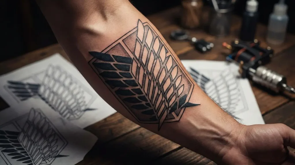
1. Wings of Freedom Reimagined as Negative Space
Okay, so you do want the wings, but you don’t want to look like everyone else who got the wings. Fair.
Try negative space. Instead of filling in the wings themselves, you fill in everything around them. Your skin becomes the wings, the ink becomes the background. It’s the same symbol, completely different vibe. More artistic, less “I got the logo.”
You’re working with the same symbol but transforming its presentation entirely. Placement works best on areas with consistent skin tone like inner forearm, upper back, or side ribs where the negative space can breathe. This technique requires an artist skilled in blackwork saturation because uneven application destroys the illusion.
Size-wise, you can go anywhere from 3×3 inches to a full back piece. Just know that if you go small, those feather details will blur together eventually. Probably in like 10-15 years, but still. Keep it simple if you’re keeping it tiny.
I’ve seen this concept executed brilliantly and I’ve seen it done badly, and the difference always comes down to the artist’s understanding of how negative space functions on skin versus paper. When you’re looking at minimalist options, this negative space approach delivers maximum impact with refined execution.
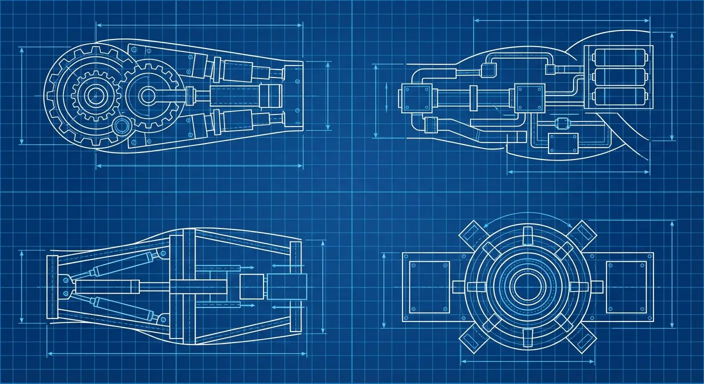
2. ODM Gear Mechanics as Geometric Line Work
ODM gear defined the series’ combat style, but most fans don’t consider its mechanical components as standalone tattoo material. Breaking down the gas canisters, blade housings, and cable systems into clean geometric linework creates something that reads as industrial design rather than obvious anime reference.
Think blueprint-style rendering with precise angles and technical cross-sections. When considering geometric tattoo designs for anime-inspired pieces, the technical precision of ODM gear components translates exceptionally well to clean linework. This works great as a forearm piece where the natural lines of your arm mimic the equipment’s vertical orientation.
You can incorporate subtle motion lines or gas vapor trails in fine gray wash to suggest the gear’s function without turning it into an action scene. The beauty here is specificity: only people who’ve studied the show’s mechanics will recognize what they’re seeing, while others appreciate it as abstract tech-inspired body art.
Here’s what works from the different ODM components:
Gas canisters: Pretty foolproof. They’re just cylinders, and bold shapes like that age great. Forearm or calf, you’re good.
Blade housings: Also solid. Clean angles, minimal shading needed, stays crisp for decades. Anywhere you want, honestly.
Cable systems: This is where people get into trouble. Those thin lines will thicken over time. Not immediately, we’re talking 10+ years, but it happens. Make sure your artist actually specializes in fine-line work. Ask to see healed photos of their fine-line tattoos, not just fresh ones.
Motion lines: The little gas vapor effects can look amazing, but only if your artist can do smooth gradients. Patchy gray wash looks like dirt smudges. Not cute.
The variations I’ve documented range from hyper-detailed technical drawings to stripped-down essentials. Your choice depends on how much visual complexity you can handle long-term. These interpretations focus on the mechanical beauty of humanity’s weapons.
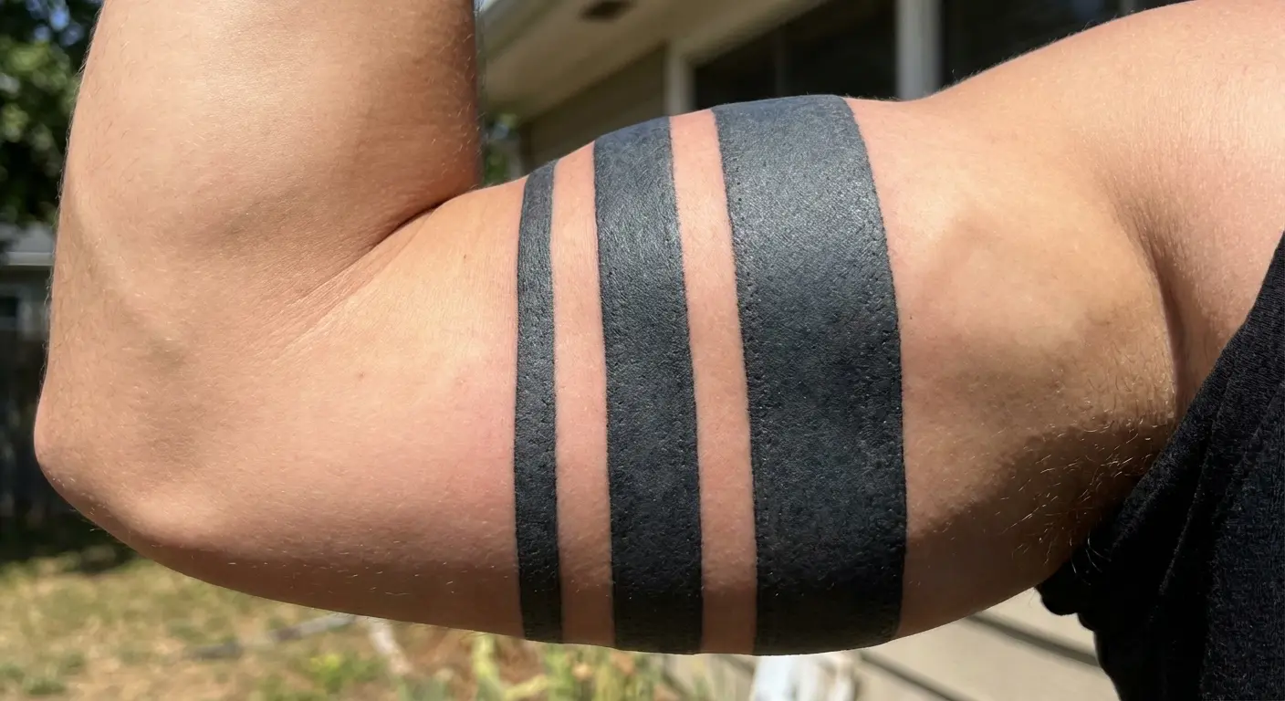
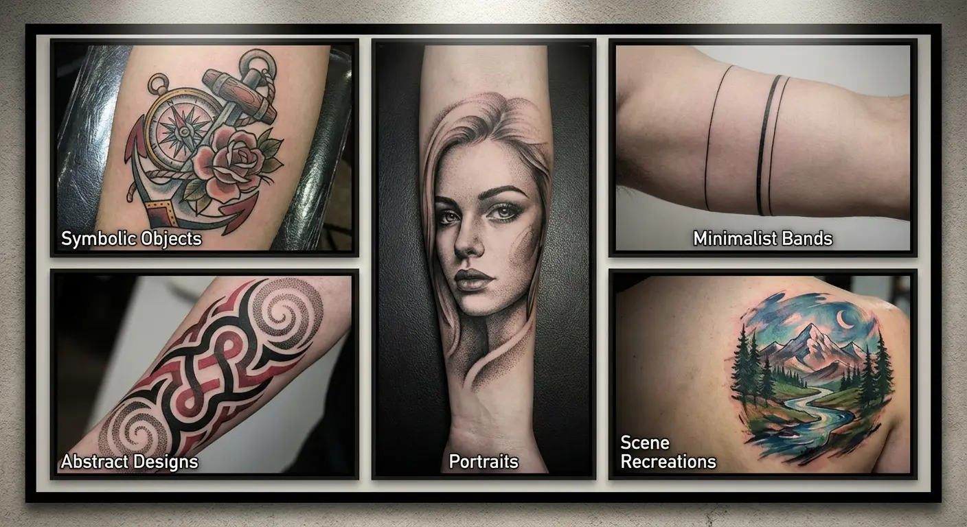
3. Walls Maria, Rose, and Sina as Minimalist Bands
The walls are the entire show’s premise, right? The false security, the lie everyone lived inside. That’s heavy symbolism packed into a super simple design: three bands around your arm or leg.
Translating them into three simple bands around your bicep, thigh, or ribcage captures that layered deception through minimal design. Each band can vary slightly in thickness or texture: smooth, slightly distressed, heavily cracked, representing their chronological breach. Some people add tiny structural details like the wall’s top edge or embedded titans as subtle texture within the bands, visible only up close.
Bold bands like this are basically tattoo-proof. They’ll look the same in 30 years, which is more than you can say for most designs. This is probably the safest option on the entire list if you’re worried about aging.
Placement on cylindrical body parts (arms, legs, fingers even) reinforces the enclosure concept. You’re literally wearing the walls that both protected and imprisoned humanity. The simplicity here is deceptive. These bands carry the weight of the entire premise without requiring a single recognizable character or scene.
4. The Nine Titans’ Eyes in Micro Realism
Each of the Nine Titans has distinct eye design, from the Attack Titan’s intense green to the Founding Titan’s glowing whites. Collecting these as a small-scale series, maybe along your spine, down your forearm, or as a hidden ribcage piece, creates a catalog of power without requiring massive space or obvious imagery.
Micro realism demands an artist with steady hands and experience in eye detail because the slightest wobble in a pupil edge reads as sloppy work. These work best at roughly quarter-size (about the size of an actual eyeball), large enough to capture iris detail and the distinctive glow effect but small enough to collect multiple without dominating your body.
Eyes are just cool to look at. That’s it. Doesn’t matter if someone knows what titan those pupils belong to, they’re still going to stare. Non-fans see striking eye work; fans recognize the specific titans you’ve chosen to honor.
Never Have I Ever star Maitreyi Ramakrishnan recently made headlines (Teen Vogue) for her tattoo featuring Eren Yeager’s eyes when he changes back from his titan form, positioned on her upper leg where it can be covered for acting jobs while serving as a permanent reminder of one of her favorite anime series. Smart placement if you need that flexibility.
But the concept works anywhere. Down your spine, across your forearm, hidden on your ribs. Collect all nine or just pick your favorite titan. Up to you.
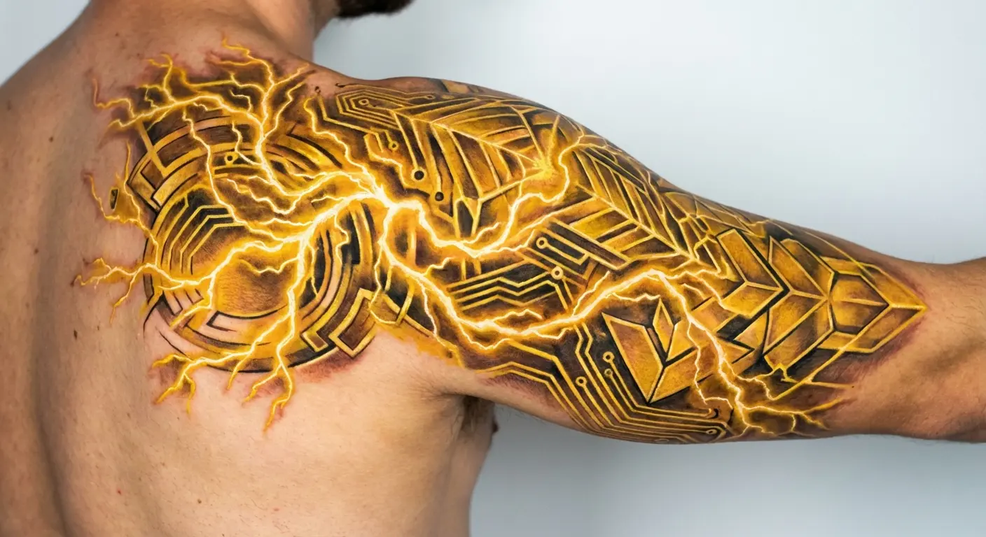
5. Titan Transformation Lightning as Abstract Energy
That yellow lightning strike when someone transforms carries more visual punch than almost any character design in the series. Abstracting it into flowing energy patterns, geometric lightning bolts, or even electrical circuit-style pathways gives you dynamic movement without literal representation.
This design type thrives in areas where your body’s natural curves can enhance the lightning’s direction: wrapping around a shoulder, shooting down a forearm, or crackling across your chest. Color matters here. The show’s yellow-gold lightning is the obvious choice, energetic and warm. But I’ve seen people do white-hot lightning or even black lightning, and honestly? Sometimes those look cooler. Depends on your overall aesthetic.
You can incorporate subtle titan silhouettes within the lightning branches if you want that extra layer of meaning, though the design stands strong without it. Placement along muscle groups lets the lightning appear to activate when you flex, adding an interactive element to the piece.
Random aside: this design looks insane when it follows your muscle groups. Like, you flex and the lightning activates. It’s dramatic as hell. Do with that information what you will.
The potential here is massive because lightning translates beautifully across different tattoo styles and artist specialties.
Character Tattoos Without the Portrait Gamble
Portrait tattoos are risky.
I don’t care how good your artist is, anime faces are weird to translate onto skin. The proportions that work in 2D look uncanny in tattoo form like 40% of the time. Sometimes you get lucky and it’s perfect. Sometimes you get unlucky and it’s in that weird valley where something’s just… off. Forever.
So here are five character tributes that skip the face entirely.
The emotional connection to a character doesn’t require their face. Sometimes a teacup or a key carries more weight than any portrait could. I’ve talked to probably two dozen artists who do anime tattoos, and they all say the same thing: objects age better than portraits. Less risk, better longevity, fewer clients coming back five years later asking if the portrait can be “fixed” because it doesn’t look quite right anymore.
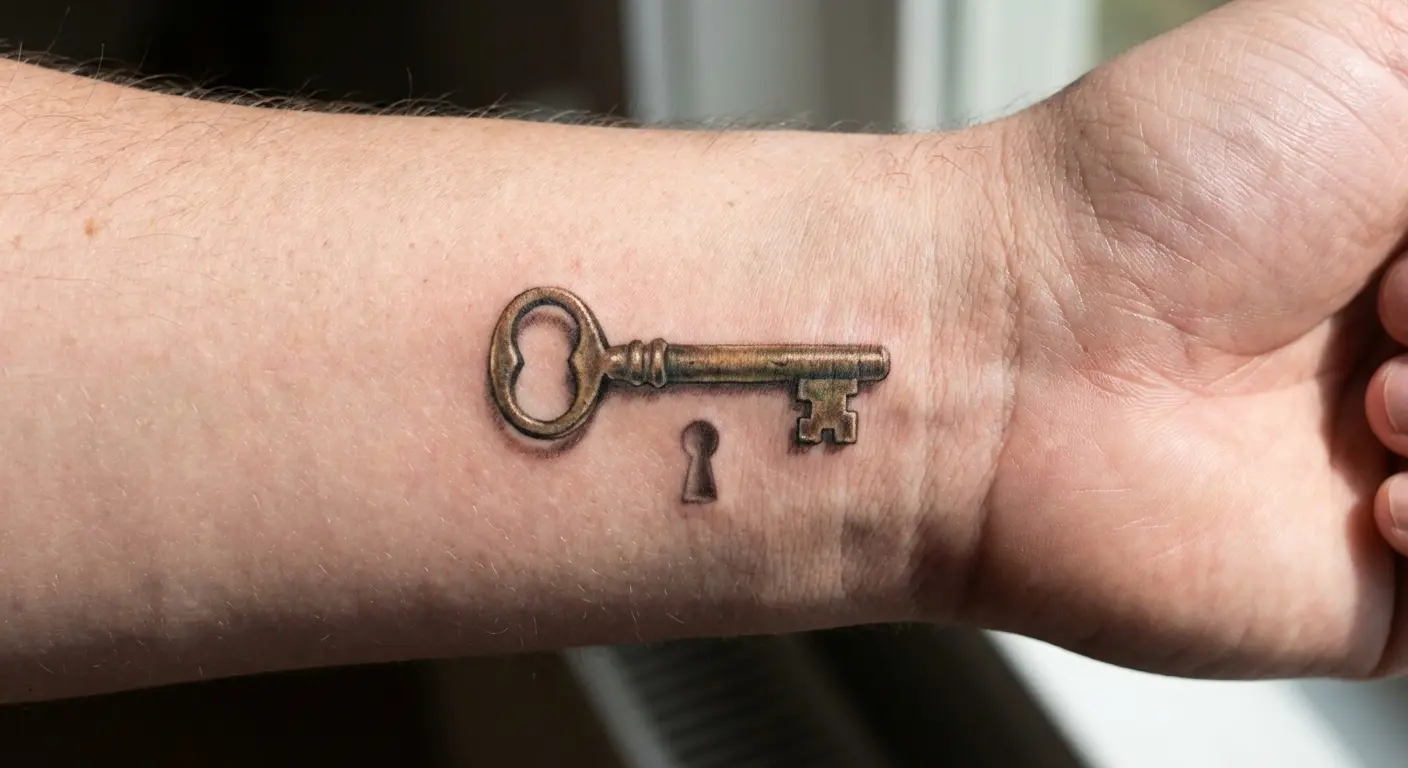
6. Eren’s Key as a Subtle Wrist Piece
The basement key drove the first half of the series, representing forbidden knowledge and Eren’s inherited burden. For those seeking small tattoo ideas with deep meaning, object-based designs like Eren’s basement key offer maximum symbolism in minimal space.
It’s discrete enough for placement on your inner wrist, behind your ear, or along the side of your finger while carrying massive narrative weight for those who recognize it. The key’s design is simple enough that it won’t blur into mush over time, unlike more complex imagery.
You can render it in pure black traditional style, add slight dimensional shading for realism, or even incorporate a tiny keyhole shadow beneath it to suggest unlocking. Some people add Grisha’s handwriting (in German, as shown in the series) as a subtle background element, though this adds complexity that requires more space.
Its simplicity is its strength. You’re wearing the literal key to the truth that changed everything. According to The Mary Sue’s analysis of Attack on Titan tattoo trends, the basement key represents “a turning point in season 3” where “the information in Eren’s basement was worth the deaths of many Survey Corps scouts.”
That key cost lives. A lot of lives. Every scout who died before they reached the basement died for what was behind that door. That’s a lot of weight for a tiny piece of metal, which is exactly why it works as a tattoo.
Small enough to hide, heavy enough to mean something.
7. Levi’s Tea Cup with Steam Detail
Levi drinks tea. Humanity’s strongest soldier, the guy who can take down titans solo, drinks tea from delicate little cups. That juxtaposition is his entire character in one image.
A delicate teacup rendered in fine-line style with rising steam in gray wash captures that contradiction perfectly. The steam gives your artist room to show technical skill through soft gradients and dissipating edges, while the cup itself can be as detailed or simplified as your aesthetic preference demands.
This works beautifully as a small piece (2-3 inches) on the inner forearm, behind the shoulder, or even as a matching set with someone else: you take the cup, they take the steam, for instance.
Also, let’s be real, a teacup tattoo just looks elegant. Even if someone has no idea who Levi is, they’re not going to think your tattoo is weird. Unlike, say, a giant screaming titan face. Context matters.
Some designs incorporate the cup’s reflection showing a subtle titan silhouette or Levi’s distinctive undercut, adding a hidden layer that rewards closer inspection. I saw one where the tea’s reflection showed a tiny Attack Titan silhouette. Barely visible unless you looked close, but once you saw it, you couldn’t unsee it. Very cool.
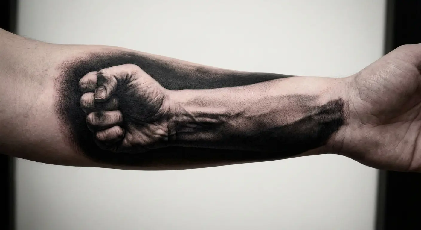
8. Erwin’s Salute Through Shadow and Light
Erwin’s final salute before the suicide charge.
If you watched that scene without feeling something break inside you, we watched different shows. That moment, knowing you’re leading everyone to their deaths, doing it anyway because someone has to, is devastating in a way that stays with you.
Rather than tattooing Erwin’s face or full figure, capturing just the raised fist and forearm emerging from shadow creates powerful negative space work. You render the raised fist in detail, everything else fades to shadow. The darkness does double duty: it’s the approaching titans, it’s the weight of his choice, it’s the certainty of death. Heavy symbolism that actually works visually.
This design demands significant space to work properly, at least 5×7 inches, because the shadow-to-light transition needs room to develop gradually. Placement on the outer thigh, upper back, or ribcage gives your artist the canvas needed for proper dramatic impact.
Some versions incorporate falling Survey Corps members as faint silhouettes in the background shadow, though this risks overcrowding the composition. The sal ute itself, that raised fist against impossible odds, carries enough emotional weight without additional elements.
The concept here is about capturing a feeling. That moment when you know you’re leading people to their deaths but you do it anyway because someone has to. That’s heavy stuff to carry on your skin, and it deserves execution that matches its gravity.
9. Mikasa’s Scarf Flowing into Watercolor
Mikasa’s red scarf represents protection, devotion, and the complicated knot of her relationship with Eren. Designing it as a flowing fabric piece that transitions into watercolor red washes creates movement and emotion without requiring Mikasa’s face.
The flowing fabric technique works particularly well when combined with fineline tattoo methods for delicate shading, creating that ethereal watercolor transition Mikasa’s scarf deserves. The scarf can wrap around your arm, leg, or torso, following your body’s natural contours while the watercolor elements bleed outward in controlled chaos.
Watercolor tattoos used to be sketchy, they’d fade fast, the colors would muddy together. That’s gotten better as artists figured out the technique, but you still need someone who specializes in it. Don’t let a traditional artist try watercolor for the first time on your body. Bad idea.
The scarf’s fabric folds give your artist opportunities to show technical skill through shading and depth, while the watercolor sections add that emotional, almost painful beauty that defined Mikasa’s arc. You can keep the red pure and vibrant or let it fade into pinks and oranges at the edges, suggesting memory and loss. The scarf works as a standalone piece or as part of a larger sleeve composition.
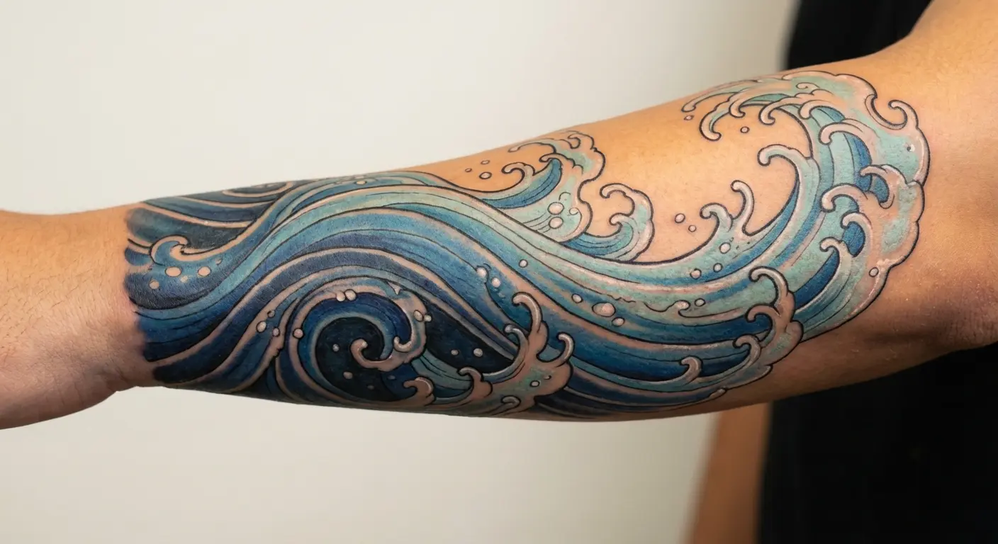
10. Armin’s Ocean Dream in Blue Gradient Waves
Armin’s obsession with the ocean drove his curiosity and ultimately his survival. Translating that dream into flowing water rendered in blue gradient waves creates a peaceful, hopeful piece that contrasts with Attack on Titan’s typical brutality.
This design works as a partial sleeve, wrapping around the forearm or calf with waves that seem to move as you do. The gradient technique, dark navy at the deepest points fading to pale blue-white at the wave crests, requires an artist skilled in smooth color transitions because banding or patchy application ruins the effect.
Some versions incorporate Armin’s book about the outside world as a small element within the waves, or add subtle titan footprints in the sand where water meets shore, grounding the hopeful imagery in the series’ harsher reality. The ocean piece reads as serene and contemplative to anyone who sees it, but fans recognize it as Armin’s defining dream, the vision that kept him alive through hell.
Most AOT tattoos are all violence and horror, which, fair, that’s the show. But this one’s different. It’s about hope. Armin’s whole thing was just wanting to see the ocean, to know what was beyond the walls. That simple dream kept him alive through hell.
So yeah, you can get a peaceful water tattoo and still have it be deeply connected to the series. Not everything has to be titans eating people.
Story Moments Captured in Ink
The best moments in AOT weren’t always the big titan fights. Sometimes it was a door. Or a key. Or footprints in the dirt.
These six designs pull from those specific story beats, the moments that changed everything. I’ve found that people who choose these designs tend to have deeper, more personal connections to specific plot points. They’re not just fans of the show, they’re fans of particular narrative choices that resonated on a personal level.
That specificity translates into tattoos with staying power because they’re tied to emotional experiences rather than surface-level aesthetics.
11. Basement Door Handle Close-Up
That basement door represented forbidden truth for 50+ episodes. Focusing on just the door handle in extreme close-up, maybe with Eren’s hand reaching for it or just the worn metal itself, creates tension and anticipation frozen in ink.
This works as a small to medium piece (3-4 inches) with tight, realistic detail on the metal’s texture, scratches, and patina. Placement on the forearm lets you position it so you’re reaching toward the handle when you extend your arm, adding an interactive element.
Some designs show the handle mid-turn with motion blur, that exact moment of revelation, while others keep it static and waiting. The surrounding area can fade to black, suggesting the dark stairway, or include subtle wood grain texture from the door itself.
You’re wearing the moment right before everything changed. That door handle separated ignorance from truth, devastating, world-ending truth, and now it’s on your skin forever.
That’s heavy. Make sure you actually want to carry that weight.
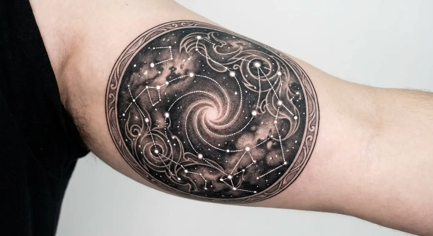
12. Coordinate Point as Constellation Map
The Coordinate, the Founding Titan’s power to control all other titans, gets visualized through Paths and connections. Translating this into a constellation-style map with connected points and lines creates a mystical, almost astronomical piece that non-fans read as star mapping while fans recognize the deeper meaning.
This design scales beautifully from small (wrist, ankle) to large (full back piece) because you can add or reduce the number of connection points based on available space. Fine white ink for the connecting lines against black space creates a striking effect, though white ink requires touch-ups over time.
Some versions place a small Founding Titan symbol or Ymir’s silhouette at the central convergence point, making it the hub from which all connections radiate. You can also sneak personal meaning into this one, position the constellation points to match important dates or coordinates from your own life. Your story layered with the show’s mythology. Very poetic, if you’re into that.
This works because it’s simultaneously personal and referential. The tattoo becomes a hybrid of your narrative and Isayama’s.
13. Thunder Spears Mid-Flight with Motion Blur
Thunder Spears represented humanity’s technological evolution and desperate escalation. Capturing them mid-flight with motion blur and trailing smoke creates dynamic movement frozen in time.
Honestly, Thunder Spears are underrated as tattoo material. Everyone focuses on the titans or the ODM gear, but these weapons represented humanity finally fighting back effectively. That shift from defense to offense matters.
When designing weapons in motion, techniques borrowed from Japanese traditional tattoo composition help create that sense of dynamic movement and energy flow. This design works best as a longer piece (6-8 inches minimum) across the forearm, outer thigh, or ribcage where the horizontal trajectory has room to develop.
The motion blur technique requires an artist comfortable with gray wash gradients because the effect depends on smooth transitions from sharp spear detail to blurred trailing edges. Some designs show multiple spears at different distances and blur levels, creating depth and the sense of a full volley.
You can include the detonation point as a burst of light and debris at one end, or leave the spears in flight with their outcome uncertain. The piece reads as aggressive and militaristic, capturing the series’ shift from defensive survival to active warfare.
The Thunder Spears marked a turning point where humans stopped running and started fighting back with genuine effectiveness.
14. Rumbling Footprints as Textured Trail
The Rumbling is where the show went from dark to “are we the baddies now?” dark.
Those footprints crushing everything, cities, people, entire civilizations, into the dirt. It’s a lot. Maybe too much for some people to want permanently on their body, which, I get it.
Rather than showing the Colossal Titans themselves, focusing on a trail of their footprints creates haunting negative space. This works as a path design running up your leg, across your back, or down your arm, with each footprint rendered in detailed texture showing crushed earth, debris, and depth.
The footprints can gradually fade or shrink as they trail off, suggesting distance and the enormity of destruction. Some versions incorporate tiny environmental details within the prints, crushed buildings, scattered belongings, broken trees, that are only visible up close, rewarding inspection with horrifying specificity.
The design’s power comes from implication rather than explicit imagery. You’re showing the evidence of catastrophe, the permanent marks left behind, without depicting the violence itself. This approach creates something that works as abstract textured art while carrying the weight of the series’ most controversial act.
This is probably the most controversial design on the list. You’re commemorating genocide. Even if it’s fictional genocide, that’s… a choice. Make sure you’ve thought through what you’re saying with this one.
These tattoos force viewers to imagine what created those prints, which is often more effective than showing the titans directly.

15. Paths Tree Roots Wrapping Around Limb
The Paths dimension, that strange desert with the massive tree where all Eldians connect, provided the series’ most surreal imagery. Taking the tree’s root system and having it wrap around your arm, leg, or torso creates organic flowing lines that follow your body’s natural form.
For those planning an extensive sleeve composition with organic flowing elements, the Paths tree roots provide perfect structural foundation that can wrap naturally around the arm. This works in pure black linework for a bold graphic look, or with subtle shading and texture for more realism.
The roots can emerge from a central point, maybe placed over your heart, spine, or another symbolically significant location, and spread outward, or they can appear to wrap completely around a limb with no clear origin point, suggesting the Paths’ timeless, placeless nature.
Some versions incorporate small memory fragments or ancestor silhouettes within the root structure, though this adds complexity that requires more space and detail work. The roots design reads as nature-inspired body art to casual observers while representing the invisible connections binding all Subjects of Ymir for those who know.
The sleeve potential here is enormous because roots naturally flow and branch, making them perfect for filling awkward spaces or connecting disparate design elements.
16. Titan Marks as Scarification-Style Lines
Okay, real talk: these are face tattoos.
You can put them elsewhere, cheekbones, temples, jaw on your arm or leg if you want the reference without the face commitment. But the actual titan marks are facial tattoos, and facial tattoos are permanent life decisions that affect employment, relationships, how strangers treat you, everything.
I’m not saying don’t do it. I’m saying make sure you’re ready for what comes with it.
The marks that appear on titan shifters’ faces when they transform are simple but distinctive. Rendering these as scarification-style lines, bold, slightly raised-looking black work that mimics actual scarification without the physical process, creates an edgy, almost tribal effect.
The lines themselves are deceptively simple, which means they need to be executed with perfect precision because any wobble or inconsistency is immediately obvious. Some people choose specific titan marks (Eren’s, Annie’s, Reiner’s) based on which character they connect with, while others create hybrid versions combining elements from multiple titans.
This design type is bold and unmistakable. You’re wearing the physical evidence of transformation, the marks that separate human from titan, permanently marked by power and burden. While different from a logo, these marks serve as equally recognizable symbols to fellow fans.
The commitment level here is maximum.
Finding Your Design
If you’re struggling to visualize how abstract concepts like “Paths roots” or “Rumbling footprints” actually look as tattoos, AI generators can help you test ideas before committing. Better to find out your concept doesn’t work on paper than after it’s already on your skin.
Before committing to your design, understanding how much tattoos cost based on size and complexity helps you budget appropriately. (Side note: size and complexity matter a lot for cost. A tiny key is cheap. A full Paths sleeve is not.)
Proper healing is crucial for maintaining the crisp details these designs require, so familiarize yourself with professional tattoo aftercare techniques before your appointment. The difference between a well-healed tattoo and one that’s been picked at or exposed to sun damage is stark.
Final Thoughts
Here’s the thing about Attack on Titan tattoos that nobody tells you: the show ended. Your tattoo won’t.
That sounds obvious, but think about it. In five years, will you still want to explain the Rumbling to your coworkers? In ten years, will those titan marks on your face still feel like a good decision? (Spoiler: maybe not.)
The designs that age best aren’t the ones that look coolest in screenshots. They’re the ones connected to something specific you felt when you watched the show. Maybe it’s Armin’s hope. Maybe it’s Erwin’s sacrifice. Maybe it’s the gut-punch realization that the basement key represented all those deaths for a single truth.
Whatever it is, make sure it’s yours. Not just recognizable to other fans, but meaningful to you specifically.
Scale and placement aren’t afterthoughts. A design that looks incredible at 8×10 inches might lose all its impact when shrunk to fit your wrist, while a simple concept that seems too basic in your mind could be exactly what works long-term on skin. Your tattoo artist needs reference material that accounts for how ink spreads over time, how details blur, and how your body’s movement will interact with the design.
Your skin tells your story. Make sure Attack on Titan’s chapter in that story is as deliberate as Isayama’s plotting. Well, maybe more deliberate than the ending. (We can all agree that got weird.)
Pick something that means something specific to you, not just what looks coolest in screenshots. In 10 years, you won’t care if other fans recognize your tattoo. You’ll care if you still connect with what it represents.