
19 Black Tattoos That Show What Happens When You Can’t Hide Behind Color
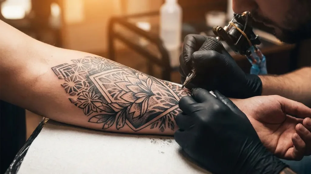
Table of Contents
-
The Power of Pure Contrast
-
The Art of Depth Without Color
-
When Darkness Tells the Story
-
Minimalism’s Boldest Expression
-
The Experimental Edge
TL;DR
Black tattoos age better than color. No weird fading, no pigments turning muddy.
The constraint forces you to think about composition and negative space instead of hiding behind color gradients.
Techniques range from traditional Japanese to contemporary abstract chaos. Way more variety than “just black ink” suggests.
Cover-ups? Black works better than trying to layer new colors over old mistakes.
Fine-line black work shows every imperfection, which is why it’s impressive when done right.
Also: 32% of Americans have tattoos now (according to Pew Research Center), so artists can experiment with weirder stuff than they could 20 years ago.
The Power of Pure Contrast
Let’s start with the obvious: black ink against skin creates contrast that color can’t match. But that’s not the interesting part. The interesting part is what happens when you design around that constraint instead of treating it like a limitation.
The precision here is brutal. One mistake and everyone sees it. That’s part of the appeal.
Work in black only and suddenly every decision matters. Put ink here or leave it bare? There’s no gradient to smooth over mistakes. You nail the composition or everyone sees you didn’t. According to Pew Research Center, 32% of U.S. adults now have at least one tattoo, with 22% having more than one. That mainstream acceptance means artists can take bigger risks with experimental work that would’ve been too weird a decade ago.
Negative space stops being an afterthought and becomes half the design itself.
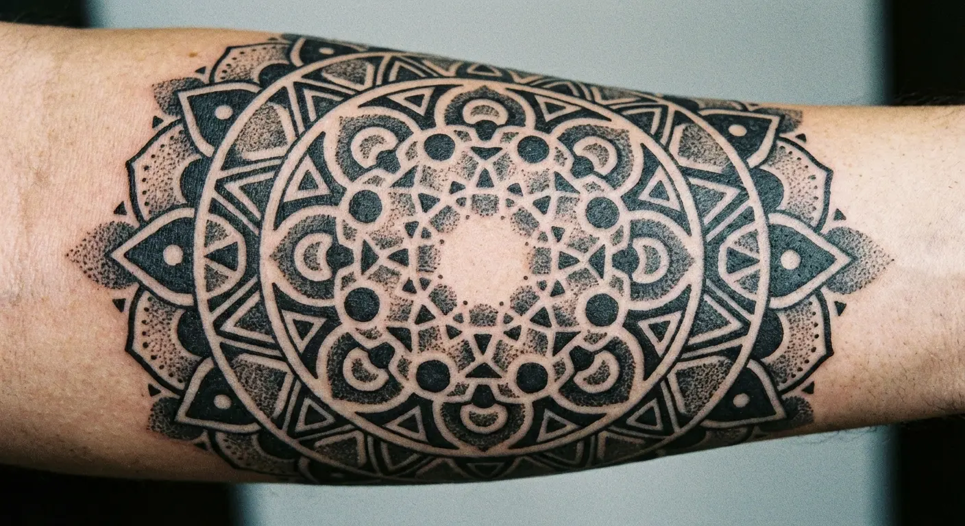
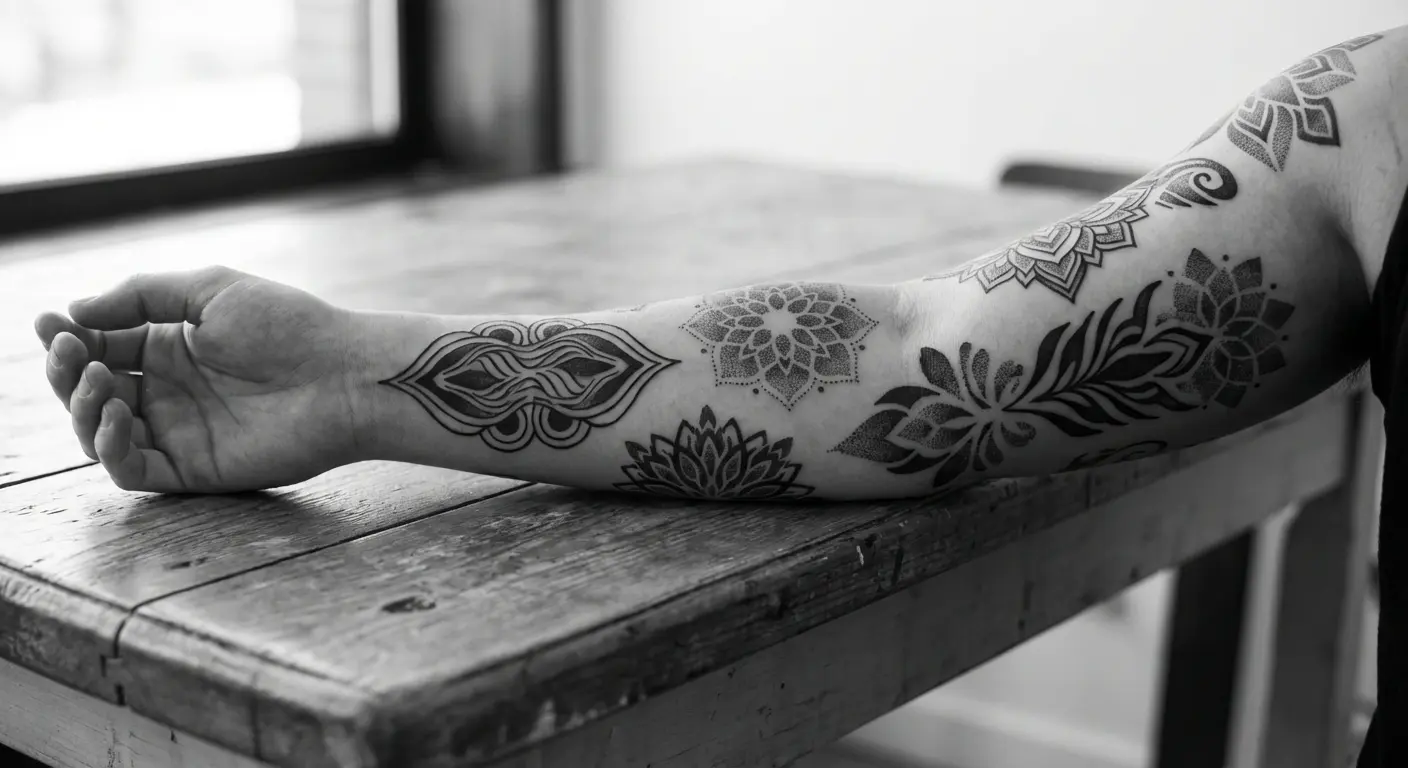
1. Geometric Mandala with Negative Space Architecture
Traditional mandalas get rendered in color all the time, but the black-only versions force a different kind of discipline. Every line has to justify its existence because you can’t rely on color transitions to guide the eye through the pattern.
The negative space between elements becomes as carefully planned as the inked portions. We’re seeing artists treat the skin itself as a design material rather than just a canvas. This works best for larger pieces (think upper back or chest) where you have enough real estate to let the pattern breathe. If you’re trying to visualize how a mandala wraps around your shoulder, tools like geometric tattoo design generators let you preview placements before committing.
Here’s the thing about aging: these maintain their visual impact in ways that colored versions sometimes struggle with. I’ve watched black mandalas age for years, and they stay sharp even as the lines slightly soften over time. Color versions? Different pigments fade at different rates, and the whole thing can look muddy after a decade.
2. Dotwork Portrait Study
I watched an artist spend 18 hours stippling a portrait last year. Eighteen hours of individual dots. Your hand cramps just thinking about it, but the finished piece has this quality (like an old engraving) that you can’t get any other way.
From across the room it reads as a face. Up close you see it’s thousands of tiny marks that somehow add up to a person.
The technique originated in engraving and printmaking, which explains why these portraits often have that etched, permanent quality.
Healing can be tricky since you’re essentially creating thousands of tiny wounds. Artists who specialize in this style know how to cluster dots for better healing while maintaining tonal range. The time investment is substantial (we’re talking multiple sessions just to build up the density needed for darker values), but the finished piece looks good decades later.
3. Blackwork Sleeve with Strategic Skin Breaks
Full blackwork sleeves could easily become monotonous blocks of ink, but the better versions use carefully planned gaps to create rhythm and visual interest. We’re talking about deliberate channels of bare skin that might follow the arm’s musculature or create abstract patterns through the solid black.
These breaks serve multiple purposes: they reduce the total ink load (which matters for healing), they create definition between sections, and they give the eye somewhere to rest.
The planning phase for these pieces is extensive because you can’t easily add skin breaks later. You’re creating a wearable graphic design where positive and negative space have equal weight.
I’ve seen collectors try to rush this planning phase, and it shows in the final result. The difference between a well-planned blackwork sleeve and a hastily executed one is immediately obvious to anyone who knows what to look for.
The Art of Depth Without Color
Color’s a cheat code for depth. Warm forward, cool back, done. Black? You’ve got value and texture and that’s it. Which means you better understand form or everyone’s gonna see you don’t.
You’d think one color means simple. It doesn’t.
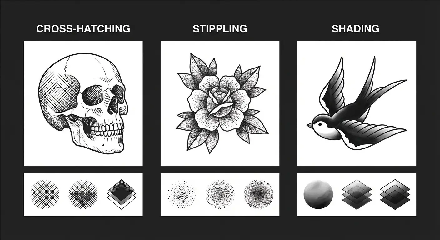
These tattoos demonstrate how much visual complexity you can achieve within a monochromatic palette. The techniques here draw heavily from traditional art practices like chiaroscuro and cross-hatching. What makes them interesting is how they translate three-dimensional subjects onto skin that’s constantly moving and changing shape.
Working with black means you’re thinking about light and shadow in fundamental ways. There’s nowhere to hide weak understanding of form or value structure. The skin becomes your white point, the saturated black becomes your darkest dark, and everything in between needs to be carefully controlled.
4. Japanese Irezumi Dragon in Pure Black
I prefer black-only irezumi to the colored versions. There, I said it. You lose the red scales and blue waves, sure, but what you gain is focus on the linework (each individual scale rendered separately, no color to distract from whether the artist nailed the dragon’s anatomy). Plus it ages uniformly. I’ve seen 20-year-old colored irezumi where the red faded to pink and the blue went muddy, but the black versions still look sharp.
This taps into older Japanese work anyway, before colored pigments became standard. The composition has to work harder (can’t use color to separate foreground from background), which separates the good artists from the great ones. The Japanese tattoo style generator can help you experiment with how classic irezumi motifs translate when rendered entirely in black ink.
There’s something powerful about seeing these mythological creatures rendered in pure black. The drama comes from the composition and linework rather than color contrast, which puts the emphasis squarely on the artist’s technical ability.
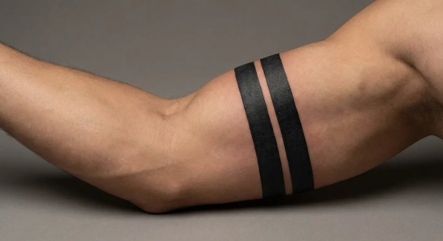
5. Solid Black Armbands with Cultural Weight
Armbands look easy. They’re not. Try keeping a line perfectly parallel as it wraps around a bicep that’s, you know, round. Then try packing black ink evenly so it doesn’t heal patchy. Now do it while the client’s arm is swelling from the earlier passes.
Width and placement mean things. Two thin bands on the bicep? Polynesian mourning tradition. Thick black band on the forearm? Could be Celtic, could be modern minimalism, could be someone covering a name tattoo. The meaning’s loaded, which is why you should probably know what you’re referencing before you get one.
Some people use these as visual separators between other tattoos, creating natural breaks in a collection. I’ve seen armbands serve as anchors for larger compositions, providing visual weight that grounds more complex surrounding elements.
6. Engraving-Style Botanical Illustration
Scientific illustration techniques from old botanical texts translate beautifully to black tattoo work. You get these incredibly detailed plant studies rendered entirely through line weight variation and cross-hatching.
The style has built-in credibility because it references a specific historical art form rather than trying to look “realistic” in a photographic sense. Fine-line work requires an artist with a steady hand and deep understanding of how lines will spread slightly as they age. The detail level means these work best at a larger scale than you might initially think (palm-sized minimum for most subjects).
This style’s having a moment in smaller tattoo scenes. Karina Schreur opened Neon Moon in Grinnell, Iowa last year (The Scarlet & Black) doing exactly this: vintage botanical illustrations that look like drawings instead of photos. It’s spreading.
7. Stippled Animal Portrait
Same as the portrait stippling but for animals. I saw a wolf piece where the fur was entirely dots (they bunched up for the dense undercoat, spread out for the longer guard hairs). Took probably 15 hours. Looked insane.
Birds work even better because you can suggest feathers without outlining every single one, which would drive both you and your artist to madness.
The time investment is substantial (we’re talking multiple long sessions for a single subject), but you end up with something that looks good years later. The technique allows for very gradual tonal transitions, which matters for creating form on animal subjects. You can build up density slowly, adjusting as you go to ensure the values are reading correctly. This level of control is harder to achieve with solid shading techniques where you’re committed once the ink goes in.
When Darkness Tells the Story
Some concepts just demand black ink because they’re dealing with heavy themes, dramatic subjects, or aesthetic approaches that would be undermined by color.
These aren’t dark for shock value. They’re dark because that’s what the subject matter requires. You’ll notice how black ink can convey mood and atmosphere in ways that feel more immediate and less decorative than colored alternatives. The emotional weight of these pieces comes partly from the subject but also from the visual density of pure black ink.
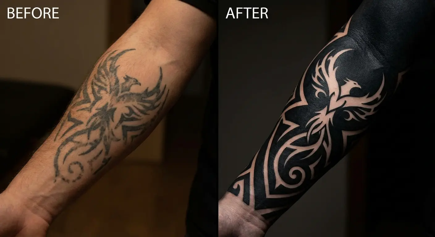
8. Blackout Cover-Up Transformation
Covering an old tattoo with solid black and then using negative space to create a new design is becoming increasingly sophisticated. You’re not trying to hide the old tattoo by putting something on top of it (which often fails). You’re obliterating it completely and starting fresh.
The new design emerges from strategic gaps in the blackout, which means you need to plan carefully because you can’t add more bare skin later. This approach works well for transforming dated tribal work or regrettable text tattoos. If you want the technical deep-dive on blackout techniques, I covered that here.
Fair warning: blackout cover-ups hurt. You’re going over already-tattooed skin with solid black saturation. It’s not pleasant. Budget 2-4 sessions and don’t schedule them back-to-back.
There’s also the psychological thing. You’re literally covering something dark to move forward. Every client I’ve talked to about blackout cover-ups uses the word “cathartic.” They’re not just hiding a bad tattoo; they’re closing a chapter. Sounds dramatic, but watch someone see their ex’s name disappear under solid black and tell me it’s not emotional.
9. Abstract Brushstroke Composition
These pieces borrow from abstract expressionism and calligraphy, capturing the gesture and energy of a brushstroke in permanent ink.
The spontaneous look is completely planned, obviously. You can’t wing a tattoo. But good artists can fake that immediate, decisive brushstroke energy. It’s all choreographed to look unchoreographed.
The compositions play with balance and negative space in ways that feel more like contemporary art than traditional tattooing. They work well for people who want something visually striking but not representational. These work best when they follow the body’s lines (wrapping around a forearm, flowing across ribs). The movement in the design matches actual movement.
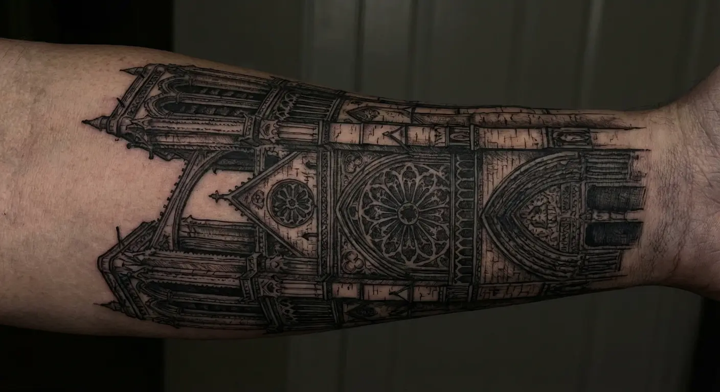
10. Gothic Architecture Fragment
Sections of cathedral windows, flying buttresses, or ornate stonework rendered in black ink have this dramatic, romantic quality that suits the subject matter perfectly.
You’re capturing something that’s already monochromatic in its material (stone, iron), so the translation to black ink feels natural. I’ve seen pieces with individual stones rendered, each one with different weathering patterns and cracks. Takes 20+ hours just for a 6-inch section of cathedral wall.
These work best as vertical compositions (forearm, shin, side of torso) that echo the upward thrust of Gothic architecture itself.
Gothic architecture means something beyond just looking cool. Ambition, spirituality, time, mortality (it’s all baked into those soaring arches and crumbling stone). Walk around with a cathedral fragment on your arm and you’re referencing all of that whether you mean to or not.
11. Silhouette Narrative Scene
Entire scenes rendered as solid black silhouettes against bare skin create this storybook illustration quality. You might see a forest treeline with hidden elements in the negative space, or a cityscape that reveals details only when you look closely.
The technique forces you to think about recognizable shapes and how much detail you can remove while still communicating the subject. What’s the minimum information needed for the viewer to understand what they’re looking at?
These age beautifully because the simple shapes remain readable even as the edges soften slightly over time.
These mess with your head in a good way. Your brain fills in the missing details automatically. You’re not just looking at the tattoo; you’re completing it.
12. Black Realism Nature Study
Photorealistic nature scenes (think forest paths, mountain ranges, ocean waves) in pure black and white have this dramatic, fine-art photography quality.
You’re working with the full tonal range from pure white (skin) to pure black (saturated ink) with every gray value in between. The technical skill required is substantial because you’re translating a photograph into a different medium while accounting for how it sits on a curved, mobile surface.
These pieces benefit from larger placements (back, thigh, ribs) where you have enough space to establish the full scene and depth of field. The challenge is maintaining the illusion of three-dimensional space on a surface that moves, flexes, and changes with the body’s position.
Minimalism’s Boldest Expression
Minimalist tattoos take guts. There’s nowhere to hide if the line wobbles or the composition’s off.
These designs prove that impact doesn’t require coverage or complexity. What they do require is perfect execution because there’s nowhere to hide mistakes or weak composition. The minimalist black tattoo has become its own aesthetic category, but the best examples look good years later and tap into something more fundamental about mark-making and visual communication.
Research from Pew Research Center shows that 38% of women have at least one tattoo compared to 27% of men, with younger women drawn to these styles. 56% of women ages 18 to 29 are tattooed. Makes sense. Easier to hide for work, less commitment than a full sleeve, and you can always add more later.
There’s something powerful about reducing an idea to its most essential visual form. When you strip away everything unnecessary, what remains carries more weight.
13. Single-Line Continuous Drawing
The entire image created without lifting the needle. These pieces have a playful, puzzle-like quality. You’re watching the line travel across the skin, creating a subject through one unbroken path.
This started as a drawing exercise (keep your pencil on the paper, improve hand-eye coordination). Now it’s its own tattoo style.
The line weight needs to be consistent throughout, which is technically challenging over longer distances.
Subjects that work well include faces, animals, and abstract shapes. The style has a modern, illustration-forward aesthetic that appeals to people who want something recognizable but not realistic. There’s an elegance to seeing a complex subject reduced to a single flowing line that somehow captures the essence of the thing without getting bogged down in details.
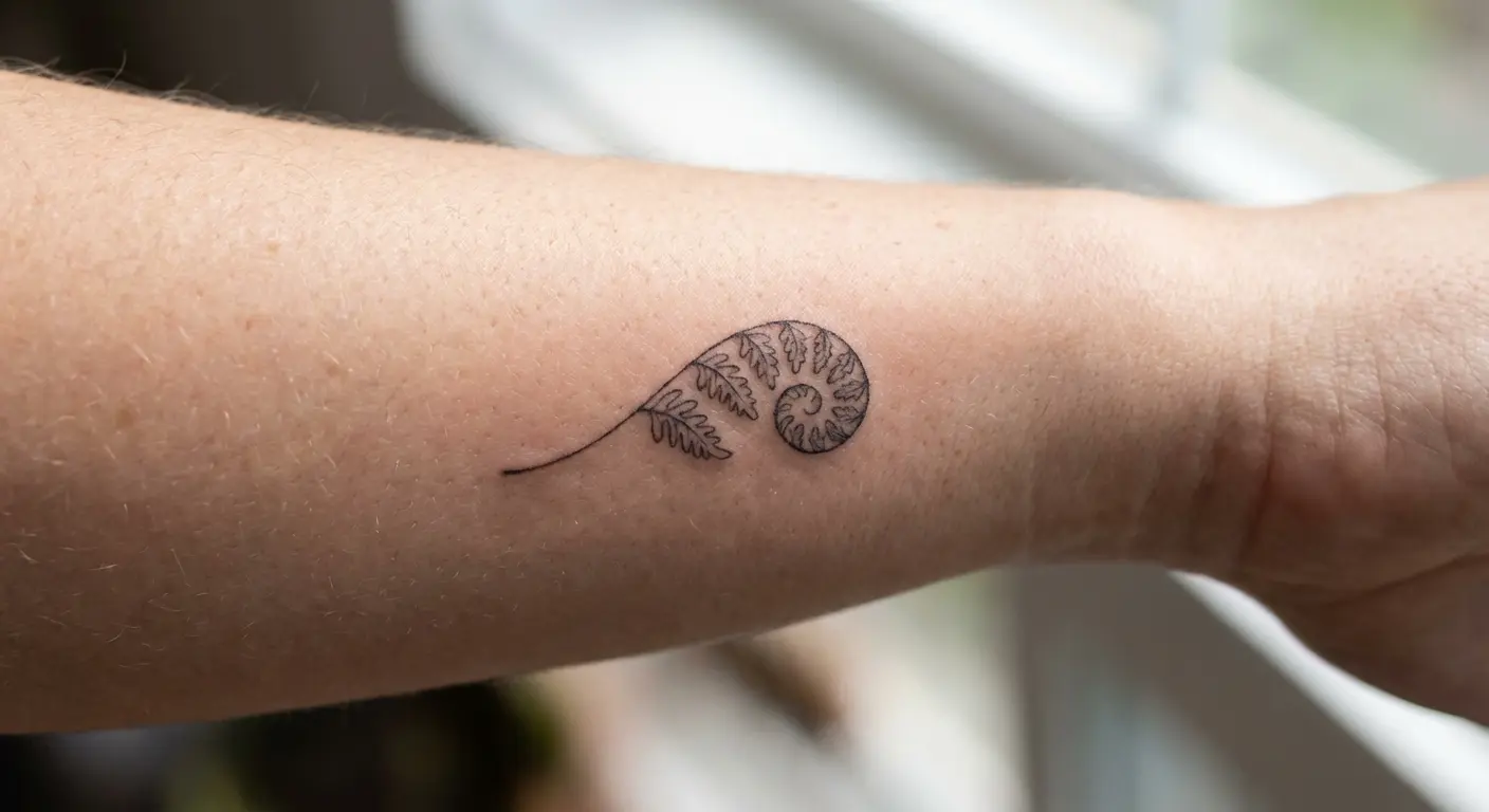
14. Micro Fine-Line Symbol
We’re talking truly tiny tattoos, often under an inch, rendered with the finest needles available.
These require exceptional precision because any wobble or blow out is magnified by the small scale. The appeal is partly about discretion (easy to hide for professional settings), but also about the challenge of creating something meaningful in a minimal footprint. Common subjects include small symbols, single words, coordinates, or simplified icons.
Everyone asks if these age well. Fine lines spread over time, yeah. Put them on low-movement areas (behind your ear, inner wrist, ankle) and they’ll last longer. But “longer” still means they’ll blur eventually. Just slower. Fine-line aging is its own topic; this breaks down the longevity factors, but short version: expect some spreading.
I’ve seen collectors build entire collections of micro pieces, each one tiny but collectively creating a personal visual language across their body. The restraint required to keep each piece small and simple is part of the appeal.
15. Negative Space Letterform
Text created by the absence of ink rather than the presence of it flips the usual approach to lettering tattoos.
You might have a solid black geometric shape with letters cut out, or a design where the negative space between elements spells out words. This requires careful planning because legibility can be tricky when you’re working in reverse.
The style works well for people who want text tattoos but are concerned about the typical aging issues with fine lettering. The surrounding black ink frames and protects the letter shapes, helping them remain readable longer. I’ve watched traditional text tattoos blur and lose definition over the years, while negative space versions maintain their clarity because the black border prevents the letters from spreading into each other.
16. Minimalist Wave Pattern
Simple curved lines suggesting water, sound waves, or abstract flow have become popular for good reason: they’re visually clean, symbolically flexible, and age well.
The execution needs to be precise because any inconsistency in the curves becomes immediately obvious. These work across various placements and can be sized up or down effectively. Some versions incorporate dotwork or line weight variation to add subtle complexity without abandoning the minimalist aesthetic.
They serve as visual representations of concepts (change, rhythm, journey) rather than literal depictions. The abstraction allows the wearer to project their own meaning onto the design, which is part of why these resonate with so many people.
The Experimental Edge
These last few are weird. They’re doing things with black ink that don’t fit normal tattoo categories. Not for everyone, but that’s the point.
You’ll see approaches that borrow from contemporary art movements, graphic design, or pure experimentation. These aren’t for everyone, but they show how much room for innovation still exists within tattooing, even when you’re limiting yourself to a single color.
17. Organic Blackwork Patchwork
Instead of planning a cohesive sleeve or back piece from the start, this approach embraces spontaneous addition of separate blackwork elements that gradually fill an area.
Each piece stands alone but contributes to an overall aesthetic through shared use of solid black and negative space. The style has roots in how traditional collectors built their tattoo collections over time, but it’s become a deliberate aesthetic choice. You need a good eye for balance and spacing because you’re making compositional decisions across multiple sessions.
The result feels more like a curated collection than a single designed piece. I’ve watched collectors develop these over years, adding elements as they encounter designs that speak to them. It ends up looking like how you actually live (not planned out, just accumulated over time as you find things that matter to you).
18. Trash Polka Chaos in Monochrome
This German-originated style combines realistic elements with abstract brushstrokes, geometric shapes, and intentional “mistakes” to create controlled chaos.
The color version uses red and black, but the pure black versions have a different energy entirely. You’re looking at collage-like compositions that might include portraits, text, organic shapes, and graphic elements all competing for attention. The style deliberately breaks rules about composition and cohesion, which makes it polarizing but visually arresting.
Trash polka divides people. Half the artists I know think it’s brilliant. The other half think it’s a mess trying to pass as intentional. I’m somewhere in the middle. When it works, it really works, but the failure rate is high.
It requires an artist who can balance the chaotic elements so the piece feels intentional rather than messy. When done well, trash polka has this raw, urgent quality that feels more like street art or punk aesthetics than traditional tattooing. When done poorly, it just looks confused.
19. Textural Skin Simulation
These pieces use black ink to create the illusion of different skin textures: scales, bark, stone, or even mechanical components as if the skin has been removed to reveal something underneath.
The biomechanical subcategory is well-known, but artists are expanding the concept to include organic textures and more abstract interpretations. The shading work needs to account for the body’s actual contours to sell the illusion that the texture is part of the skin rather than on top of it.
Placement matters because areas with natural shadows and highlights (shoulder caps, knees, knuckles) enhance the three-dimensional effect. The best ones look different when you move. Flex your shoulder and the scales shift, bend your knee and the mechanical parts seem to articulate. It’s trippy.
Describing a dotwork portrait to an artist and having them understand the specific density, pattern, and tonal range you’re imagining can feel like trying to explain a dream. When you’re planning something complex, bring references (photos, sketches, AI-generated mockups from tools like Tattoo Generator IQ, whatever helps you communicate the concept). Your artist will thank you for bringing something concrete instead of “like this but different.”
Whether you’re drawn to minimalist designs or bold statements, checking out small tattoo ideas and placement options can help you understand how scale affects the impact of black ink work.
Final Thoughts
Black ink isn’t a fallback option. It’s a choice that comes with specific advantages: better aging, forced focus on composition, nowhere to hide weak technique.
The nineteen styles here barely scratch the surface. You could spend years just exploring dotwork variations or geometric patterns. But the through-line is the same: working with one color means you’re thinking about form, value, and negative space instead of color theory.
That constraint makes you better. Strip away the variables and what’s left is whether you understand design. The tattoos that work in pure black would work in any medium. The ones that don’t? Color wasn’t going to save them anyway.