
17 Butterfly Tattoo Ideas That Break Every Rule You’ve Been Told
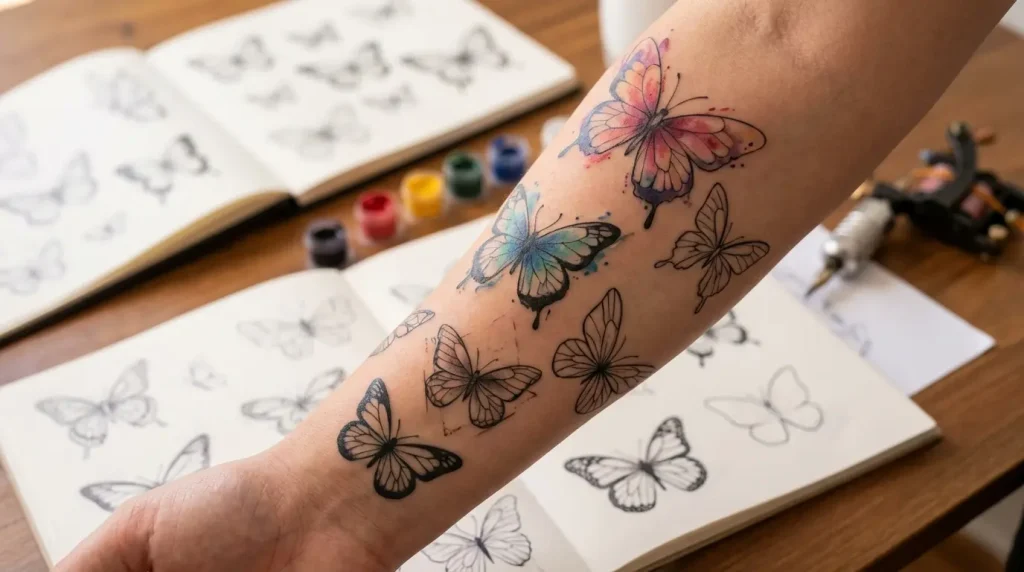
Look, everyone and their sister has a butterfly tattoo. But most of them? Boring as hell. The same Pinterest-perfect wings you’ve seen a thousand times, usually in the exact same spots. Butterflies are having their moment right now, with people claiming they represent transformation and freedom and all that. Which is fine, I guess. But why does everyone’s “personal transformation” look identical?
The best butterfly tattoos aren’t the prettiest ones. They’re the ones that mean something specific to you, not just “transformation” in some vague way everyone claims. I’m talking about designs that reference actual species, life stages that most people ignore, or combinations so unexpected they make people look twice.
I’ve been tattooing for over a decade, and I’ve done more butterflies than I can count. Some were incredible. Most were… fine. Here’s what separates the memorable ones from the forgettable ones.
Table of Contents
Butterflies That Actually Mean Something
-
The Metamorphosis Timeline
-
Species-Specific Symbolism
-
Botanical Butterfly Pairings
-
Weather-Worn Wings
-
Ancestral Migration Maps
Where to Put This Thing
-
The Spine Emergence
-
Behind-the-Ear Micro Swarms
-
Sternum Symmetry Breaks
-
Finger-to-Wrist Flight Paths
Techniques Your Artist Probably Isn’t Suggesting
-
Negative Space Wing Construction
-
Single-Line Continuous Designs
-
Watercolor Without Black Outlines
-
Blackwork Geometric Hybrids
Weird Combinations That Somehow Work
-
Clock Mechanisms and Chrysalis
-
Anatomical Heart Wings
-
Constellation Wing Patterns
-
Architectural Fragment Perches
TL;DR
-
Most butterfly tattoos are boring. Stop defaulting to generic flash art.
-
Where you put it matters more than what it looks like (spine placements suggest emergence, finger-to-wrist implies motion)
-
Technical execution beats subject matter every time. Negative space, single-line work, and style mixing separate good from great.
-
Pair your butterfly with weird stuff like clocks, anatomical hearts, or crumbling buildings. Creates tension people actually remember.
-
Small can be better than big if you’re not an idiot about detail density and composition.
Butterflies That Actually Mean Something
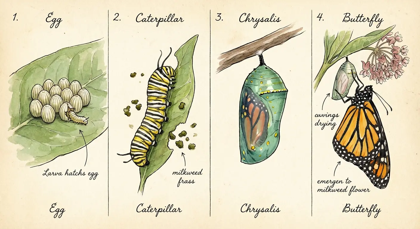
1. The Metamorphosis Timeline
Here’s what drives me nuts: butterflies transform. That’s literally their whole deal. Yet 95% of butterfly tattoos only show the final stage. Where’s the messy middle? Where’s the actual transformation part?
A metamorphosis timeline captures egg, larva, pupa, and adult butterfly in sequence. Usually works best along your forearm or ribcage where you’ve got the real estate for it.
This hits different for people marking major life changes. Got sober? Changed careers? Came out? Real transformation isn’t instant, so why should your tattoo pretend it is? You’re documenting the uncomfortable in-between stages that actually contain the growth.
The visual progression creates natural flow across your body. Plus it gives your artist room to play with different techniques for each stage. I usually do stippling for the egg, bold lines for the caterpillar, delicate shading for emerging wings. When you’re thinking about tattoo ideas with meaning, this gives you way more depth than just pretty wings.
Even small designs can work if you’re strategic about placement. Had one client do a tiny timeline behind her ear that extended down her neck. Took three sessions but looked sick.
|
Life Stage |
What It Actually Means |
How I’d Ink It |
How Long It Takes IRL |
|---|---|---|---|
|
Egg |
Potential, the beginning of something |
Fine stippling, keep it minimal |
3-5 days |
|
Larva (Caterpillar) |
Growth phase, consuming everything, getting ready |
Bold linework, textured shading |
2-4 weeks |
|
Pupa (Chrysalis) |
The weird middle part nobody talks about |
Geometric patterns, enclosed forms |
10-14 days |
|
Adult Butterfly |
The Instagram-worthy finale |
Detailed realism, color work |
2-6 weeks |
2. Species-Specific Symbolism
Okay, real talk: different butterfly species mean different things. But most people just pick whatever looks pretty and call it a day.
A Monarch isn’t just orange and black. It represents endurance because of their insane multi-generational migration patterns. No single Monarch completes the full journey. Think about that for a second.
Blue Morpho wings aren’t even actually blue. The color comes from light manipulation, not pigment. So if you’re into the whole “perception vs reality” thing, there’s your metaphor.
Swallowtails have those tail extensions as predator decoys. The butterfly literally sacrifices part of itself to survive. That hits different than generic butterfly #47.
Do the research. Find the species that actually connects to your story. Bring real reference photos to your artist showing accurate wing patterns and body structure. This turns your tattoo from “a butterfly” to “the exact butterfly that matters.”
I had a client spend three weeks researching lepidopterology. Sounds excessive, but that level of intention shows in the final piece.
|
Species |
What It Actually Symbolizes |
What It Looks Like |
Where It Works Best |
|---|---|---|---|
|
Monarch |
Endurance, ancestral journeys, resilience |
Orange and black patterns, distinctive veining |
Back, forearm, shoulder |
|
Blue Morpho |
Illusion, transformation through perception |
Iridescent blue (but not really blue) |
Upper arm, thigh, ribcage |
|
Swallowtail |
Grace under pressure, strategic sacrifice |
Elongated tail extensions, varied colors |
Spine, calf, side body |
|
Luna Moth |
Mystery, nocturnal wisdom, the hidden stuff |
Pale green, eye spots, long tails |
Chest, back, upper thigh |
|
Painted Lady |
Adaptability, they’re literally everywhere |
Orange-brown with white spots |
Wrist, ankle, behind ear |
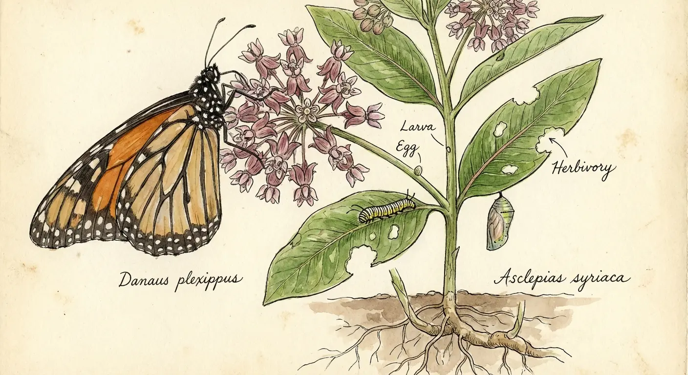
3. Botanical Butterfly Pairings
Butterflies don’t just float around looking pretty. They co-evolved with specific plants. Pairing your butterfly with its actual host plant? That’s the kind of detail that separates you from people who just grabbed something off the wall.
Monarchs need milkweed. Not roses. Not random pretty flowers. Milkweed. Painted Ladies work with thistles or hollyhocks. These pairings ground your design in actual ecology instead of fantasy.
The composition possibilities here are endless. Wings emerging from behind leaves. Butterflies feeding from accurate flower structures. Chrysalises hanging from botanically correct stems. Your artist can weave the botanical elements around your body’s curves in ways that feel organic instead of stamped on.
I’m probably overthinking this, but when someone gets a Monarch with a rose, it bothers me the same way a penguin in the desert would. Just… wrong.
Similar to flower tattoo designs that emphasize botanical accuracy, these pairings create way more depth than single-element designs.
4. Weather-Worn Wings
Perfect wings are boring. Real butterflies get caught in rain, battered by wind. Their scales wear away as they age.
Weather-worn wing tattoos acknowledge that imperfection is part of the story. Torn edges. Missing scale sections. Asymmetrical patterns. One wing pristine, one damaged. This resonates with people who’ve been through shit and came out changed but still flying.
Takes a skilled artist to balance the worn elements without making the whole thing look muddy. Strategic placement of tears and wear can follow your body’s natural stress points (joints, areas that fold), making it feel like it grew with you.
Had a client named Rachel who initially wanted flawless wings. Then she realized incorporating imperfection told a truer story. We added a small tear in the wing exactly where her recovery journey got hardest. She cried during the session but loves it now.
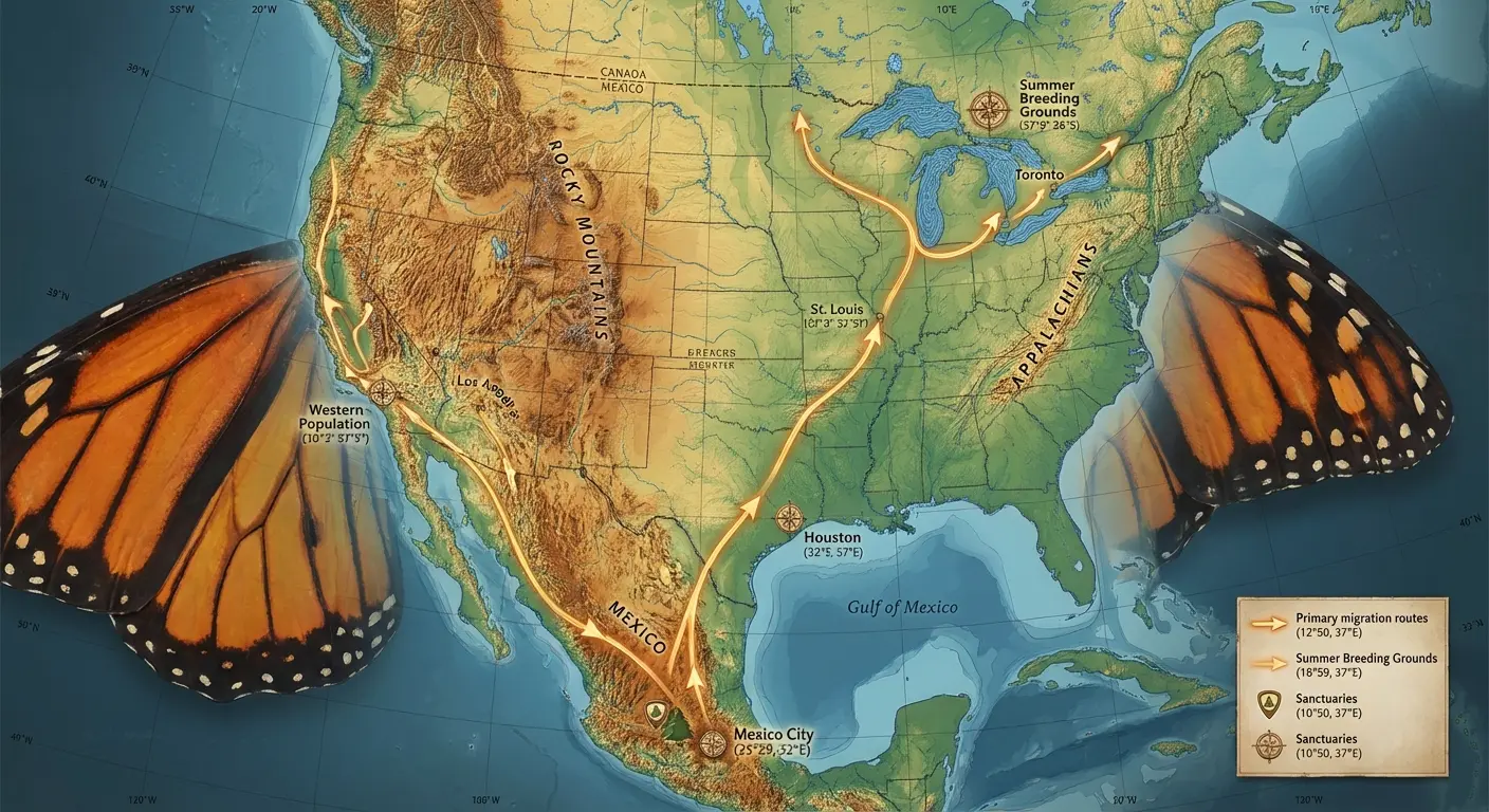
5. Ancestral Migration Maps
This one’s my personal obsession. Monarch butterflies migrate across generations. No single butterfly completes the journey. Their wings can incorporate map elements like topographic lines, coordinate markers, geographical features that trace migration routes or places that matter to your family.
Works powerfully for people with immigrant backgrounds, military families, anyone whose identity spans multiple locations.
The map elements get rendered in fine-line work beneath the wing patterns. Beautiful from a distance, meaningful up close. The technical challenge? Integrating cartographic precision with organic butterfly anatomy without making it look like a middle school geography project.
I saw one where the wing veins were actual roads from the client’s hometown. Sounds cheesy but it was actually sick.
Even small designs can incorporate map coordinates if you work with an artist skilled in micro-detail.
Where to Put This Thing
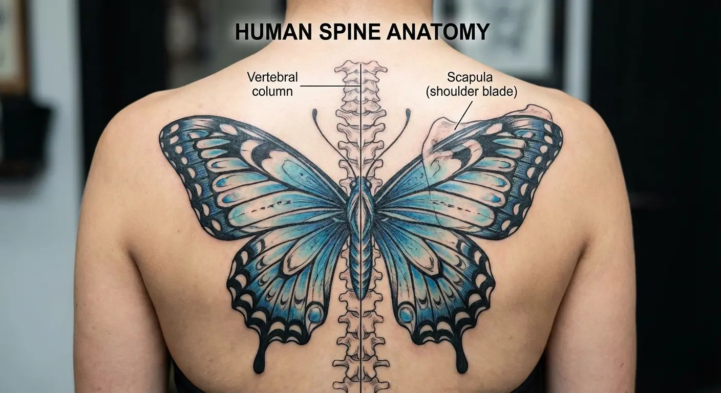
6. The Spine Emergence
Your spine is basically a built-in centerline. Most people don’t think about it until they’re face-down getting tattooed.
The most effective approach positions the butterfly’s body directly on your spine with wings spreading across your back muscles. When you move, the wings appear to flutter. Not a small commitment (significant back real estate), but the payoff is a design that interacts with your body’s architecture.
The technical consideration? Your spine curves. Your shoulder blades move. An experienced artist accounts for how the wings distort when you reach, twist, or bend. The result is a living design that changes with your movement.
Spine placements hurt like hell. Thin skin over bone. But clients consistently report the final result justifies the discomfort. Fair warning though: bring snacks and plan to tap out at least once.
7. Behind-the-Ear Micro Swarms
Single butterflies are everywhere. A small cluster of three to five micro butterflies behind your ear creates the impression of movement in a space most people leave blank.
Behind-the-ear placement works professionally (easily covered by hair) while offering the option to display when you want. The challenge is scale. These need to be small enough to fit but detailed enough to read as butterflies instead of blobs. Find an artist skilled in micro-realism or fine-line work.
The swarm can trail down toward your neck or up into your hairline. I recommend this for first-timers testing their pain tolerance and commitment level. You can always expand later.
For those exploring small tattoo ideas, behind-the-ear micro swarms offer maximum impact in minimal space. Three butterflies work better than two or four. The odd number creates visual interest that even numbers can’t match.
8. Sternum Symmetry Breaks
Sternum tattoos usually emphasize perfect bilateral symmetry. Breaking that expectation with an asymmetrical butterfly (one wing folded, caught mid-flight, positioned off-center) makes people look twice.
The sternum’s central location makes it prime real estate for deeply personal designs. An asymmetrical butterfly here can represent imbalance you’ve learned to navigate, beauty in imperfection, motion instead of static display.
Sternum tattoos hurt. A lot. Thin skin over bone. Your artist needs to understand how the design interacts with your body’s natural centerline and breast tissue, ensuring the asymmetry reads as intentional instead of poorly planned.
Had clients report the asymmetry bothered them for the first week, then became the element they loved most. Your brain adjusts.
9. Finger-to-Wrist Flight Paths
Most hand tattoos exist in isolation. A butterfly design that starts on your finger and appears to fly up toward your wrist creates narrative motion across multiple joints and skin textures.
Could be a single large butterfly spanning from fingertip to forearm, or a series of smaller butterflies in decreasing sizes for forced perspective. The technical complexity is substantial. Hand tattoos fade faster, require more frequent touch-ups, and need to account for how your hand’s movement affects readability.
According to some Allure article I found, “the skin at the top of your finger, near your nail, retains ink better than other parts of your finger” due to the stable nail bed tissue and reduced friction exposure. Makes sense.
This placement works best for people comfortable with visible tattoos and committed to maintenance. Before you commit to a hand tattoo, make sure you’re okay with certain professional limitations. I’m not judging, just being real.
Those considering finger tattoo ideas should understand the unique maintenance requirements. Had a client ignore my advice about finger tattoos. Came back three months later, completely faded. I didn’t say “I told you so” but I was thinking it real loud.
Techniques Your Artist Probably Isn’t Suggesting
10. Negative Space Wing Construction
Okay, negative space wings are my shit. I could do these all day.
Instead of filling wings with color or shading, negative space designs use your skin tone as the primary visual element. Ink defines only the outlines and structural details. Creates ethereal, ghostly butterflies that appear made of light instead of matter.
Requires precise linework and strategic placement of solid elements (body, antennae, wing veins) to anchor the design. Negative space tattoos age differently than traditional work. The contrast between skin and ink can sharpen over time instead of blur. Smart long-term choice.
This style suits people who want subtle, sophisticated designs that don’t scream for attention but reward close observation. The restraint required to make these work separates good artists from great ones.
11. Single-Line Continuous Designs
A single-line butterfly challenges your artist to create the entire design without lifting the needle. One continuous flowing line forms wings, body, and antennae in one unbroken path.
This minimalist approach has exploded in popularity, but execution separates amateur attempts from masterful work. The line weight, curve quality, and compositional balance must be perfect because there’s nowhere to hide mistakes.
Single-line designs work particularly well for small placements (ankle, wrist, behind ear) where detail density would muddy things. They also age gracefully. A single clean line maintains clarity better than complex shading.
Similar to fineline tattoo techniques, single-line continuous designs demand exceptional precision. Find an artist who specializes in this instead of someone who dabbles. The difference in aging quality is dramatic.
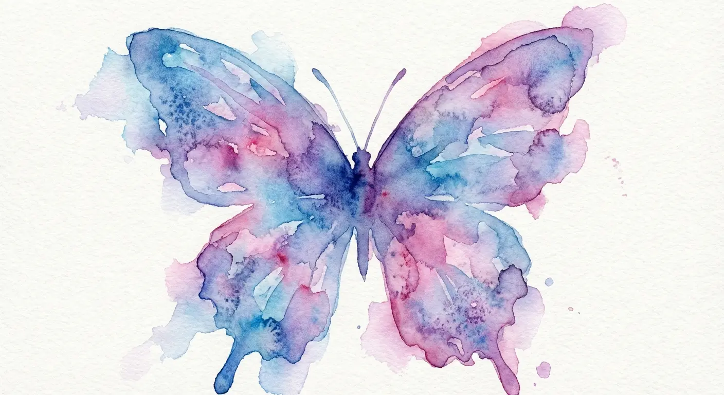
12. Watercolor Without Black Outlines
Watercolor without outlines? Most artists will tell you it’s a terrible idea. They’re half right.
Traditional tattoo wisdom says you need black outlines to prevent watercolor elements from becoming undefined blobs as they age. Skilled artists are proving that wrong with outline-free watercolor butterflies that rely on color saturation and strategic contrast to maintain definition.
Wings become pure color fields with soft edges that blend into your skin. Almost painted-on effect. But this requires an artist experienced in color theory and understanding how different pigments age in skin. Not all watercolor artists can pull this off successfully.
Instagram is full of butterfly tattoos that look amazing in photos and like shit in person. That perfect watercolor? Give it two years. Find an artist with a portfolio showing healed work, not just fresh ink.
Works best for people with lighter skin tones where color contrast remains strong. Just being honest about that.
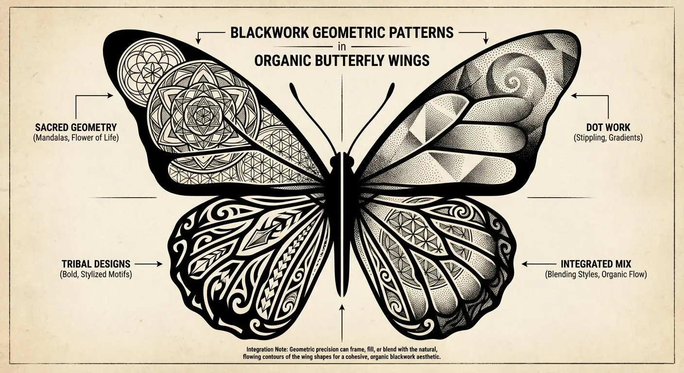
13. Blackwork Geometric Hybrids
Blackwork uses solid black ink and geometric patterns to create bold, high-contrast designs. Hybridizing this style with organic butterfly forms creates visual tension between natural curves and angular geometry.
You might have realistic butterfly wings filled with geometric patterns, or a geometric framework that suggests a butterfly’s shape without literally depicting one. This appeals to people who want transformation symbolism without the traditionally feminine aesthetic most butterfly tattoos carry.
The solid black elements age exceptionally well, maintaining crisp contrast even decades later. Your artist needs to balance the organic and geometric elements so neither overwhelms the other. Creating something that reads as intentionally hybrid instead of confused.
These push boundaries in ways that appeal to clients seeking something edgier. The butterfly becomes architectural, almost mechanical, while retaining its core symbolism. I’ve worked with several clients who wanted transformation imagery but rejected typical representations. Blackwork geometric hybrids solved that problem perfectly.
Weird Combinations That Somehow Work
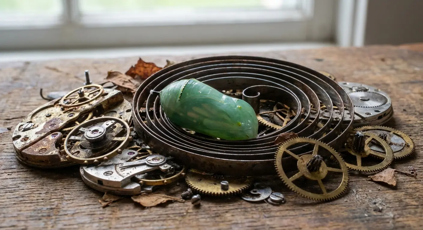
14. Clock Mechanisms and Chrysalis
Pairing a chrysalis with exposed clock gears and mechanisms creates a powerful metaphor about transformation’s timing. You can’t rush a butterfly’s emergence, yet we’re obsessed with measuring and controlling time.
This design works particularly well for people who’ve learned patience through difficult circumstances or who want to mark the specific timing of a life change. The technical execution involves integrating mechanical precision (accurate gear teeth, spring coils, watch hands) with organic chrysalis texture.
The contrast between hard metal elements and soft biological forms creates visual interest that purely natural or purely mechanical designs lack.
Placement on the forearm or shoulder allows the design to wrap around muscle, with gears appearing to drive the transformation process. These resonate with engineers, watchmakers, and anyone who appreciates the intersection of nature and machinery.
15. Anatomical Heart Wings
Replace traditional butterfly wings with anatomically accurate heart chambers, valves, and vessels rendered in medical illustration style. This creates a striking hybrid that speaks to emotional transformation, recovery from heartbreak, or medical experiences related to cardiac health.
Requires an artist comfortable with both biological accuracy and aesthetic composition. Anatomical hearts aren’t automatically beautiful. They need artistic interpretation. The heart’s natural symmetry maps well onto butterfly wing structure, but the color palette shifts from bright wing patterns to deep reds, purples, and blues of oxygenated and deoxygenated blood.
This resonates with medical professionals, cardiac patients, or people marking emotional healing that felt as physical as any surgery. I’ve tattooed several nurses and doctors who wanted butterfly imagery that acknowledged their profession while maintaining personal meaning.
A small design incorporating simplified anatomical elements can work for minimalist approaches, though this concept really shines at larger scales where detail matters.
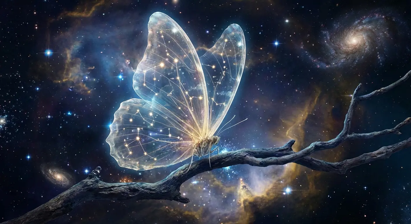
16. Constellation Wing Patterns
Map actual constellations onto butterfly wing patterns, replacing or supplementing natural wing spots with stars connected by delicate lines. You can choose constellations meaningful to you: your zodiac sign, the night sky on a significant date, or constellations visible from a place that matters.
This grounds the ethereal butterfly symbolism in specific astronomical reality.
The technical challenge? Scaling constellations to fit wing shapes while maintaining accurate star positions and magnitudes. Some artists incorporate subtle galaxy elements or nebula clouds within the wing space, creating depth beyond flat star mapping.
This works for people who connect transformation with cosmic perspective, seeing their personal changes as part of larger universal patterns. Had one client map the constellation visible the night her daughter was born onto Monarch wings. The specificity transformed a common symbol into something irreplaceable.
17. Architectural Fragment Perches
Position your butterfly on crumbling architectural elements: broken columns, weathered cornices, fragmented arches rendered in realistic detail. This juxtaposition between delicate natural life and decaying human construction creates commentary about impermanence, nature reclaiming space, or beauty emerging from ruins.
The architectural style you choose adds another meaning layer. Classical Greek suggests philosophical transformation, Gothic implies spiritual change, modernist fragments speak to contemporary identity shifts. Your artist needs skills in both architectural rendering and natural forms, maintaining accurate perspective and scale relationships.
This suits people drawn to urban exploration, historical preservation, or anyone who’s built something beautiful from broken pieces.
Full disclosure: I built Tattoo Generator IQ because I got tired of clients showing me blurry Pinterest screenshots and saying “something like this but different.” It’s a tool that turns your half-baked idea into something your artist can actually work with. You can experiment with different styles, adjust specific elements, and walk into your artist’s shop with exactly what you want instead of hoping they’ll interpret your vision correctly. Shameless plug over.
Final Thoughts
Look, you’re going to do what you want. But if you walk into a shop and just point at flash art on the wall, don’t be surprised when you end up with the same butterfly as everyone else.
The difference between a $200 butterfly and a $1000 butterfly is the difference between explaining your tattoo for the rest of your life versus people asking where you got it done. Good tattoos are expensive. They take time. They hurt. Plan accordingly.
Put in the work. Research species that actually mean something to you. Think about placement and how it interacts with your body. Find an artist whose technical skills match your vision’s complexity. Don’t settle for merely pretty when you could have something both beautiful and deeply yours.
A full spine butterfly? You’re looking at 6-8 hours minimum, probably split across multiple sessions. Spine pieces like this run $800-2000+ depending on size and detail. Yeah, it’s expensive. Your back will hate you. But clients consistently say it’s worth it.
And for the love of god, follow aftercare instructions. I’ve seen too many beautiful pieces get infected because someone went swimming two days after getting inked. Don’t be that person.
The difference between a forgettable butterfly and one that stops people in their tracks comes down to intentionality. Choosing elements that matter to you specifically instead of copying what’s trending on social media. Small doesn’t mean simple. Large doesn’t guarantee impact. It’s about the thought behind your design decisions.
I’ve covered up more butterfly tattoos than I can count. Don’t be a statistic. Think it through. Find the right artist. Make choices that reflect your actual story instead of what’s popular this month.
Or don’t, and join the ranks of people with generic ink they explain away as “I was young.”
Your call.