
Chrysanthemum Tattoos That Actually Mean Something (Besides ‘Longevity’)
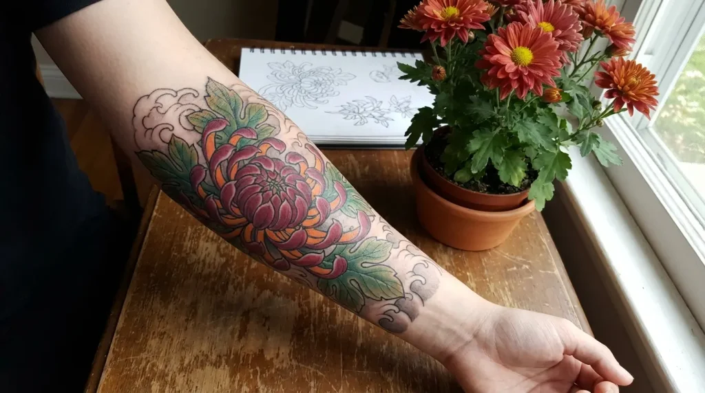
Table of Contents
-
Chrysanthemums Through Cultural Filters You Haven’t Considered
-
1. Full Bloom Japanese Chrysanthemum with Falling Petals
-
2. Skeletal Chrysanthemum Revealing Inner Structure
-
3. Chrysanthemum Clock Face Integration
-
4. Monochrome Chrysanthemum with Negative Space Mastery
-
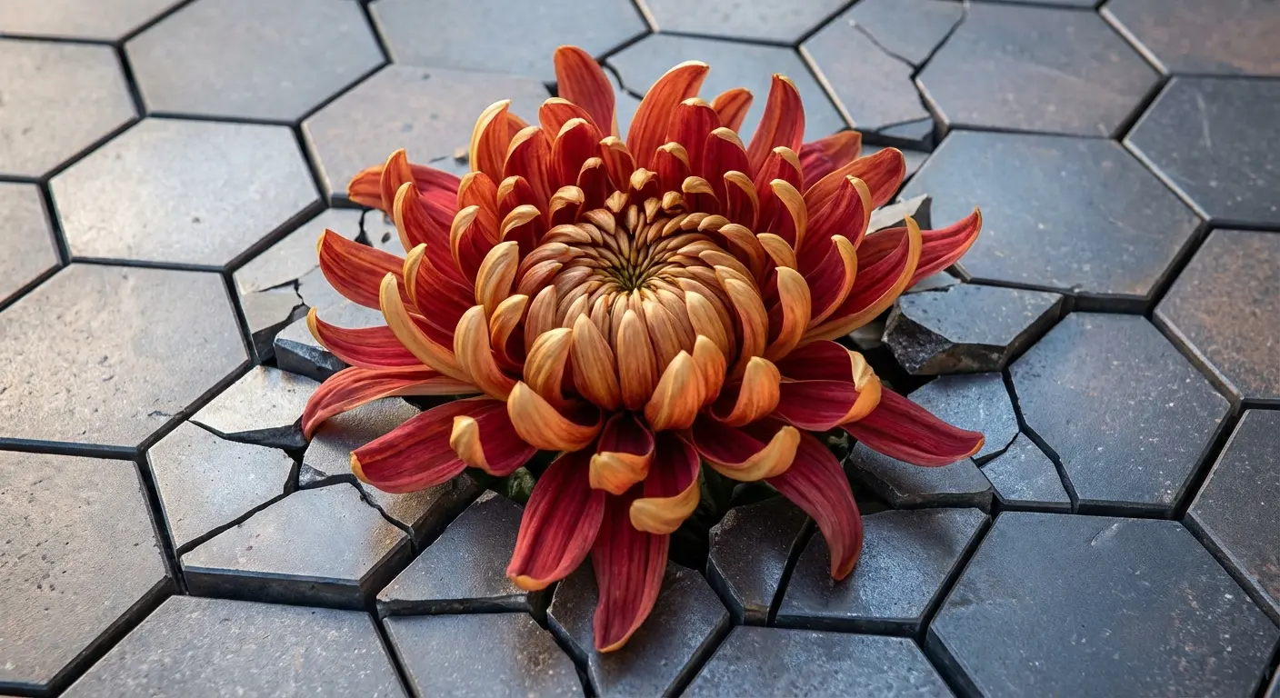
5. Chrysanthemum Emerging from Geometric Fracture
-
Chrysanthemums as Time Markers (Not Just Symbols)
-
6. Birth Month Chrysanthemum with Personal Date Elements
-
7. Seasonal Transition Chrysanthemum Gradient
-
8. Anniversary Chrysanthemum Cluster
-
9. Memorial Chrysanthemum with Wilting Realism
-
10. Growth Stage Chrysanthemum Sequence
-
11. Harvest Moon Chrysanthemum Pairing
-
Chrysanthemums Breaking Traditional Color Rules
-
12. Black Chrysanthemum with White Ink Highlights
-
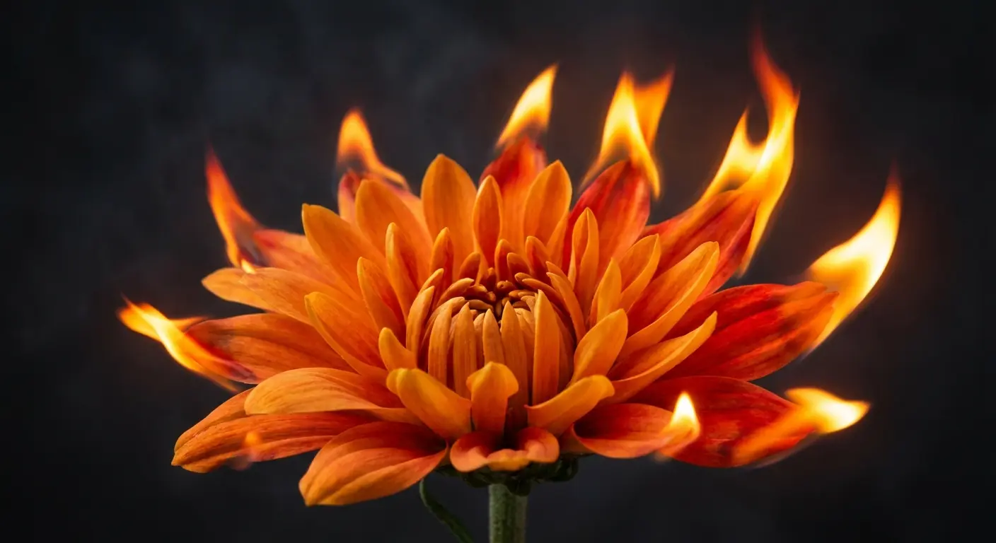
13. Orange Chrysanthemum Flame Fusion
-
14. White Chrysanthemum on Darker Skin Tones
-
15. Inverted Color Chrysanthemum Outline
-
16. Dual-Tone Chrysanthemum Split Design
-
Chrysanthemums in Unexpected Placements
-
17. Spine-Following Chrysanthemum Stem
-
18. Finger-Spanning Miniature Chrysanthemum
-
19. Behind-the-Ear Chrysanthemum Stencil Approach
-
Final Thoughts
Quick version: Chrysanthemum tattoos work better as timestamps than symbols. Color rules are meant to be broken. Placement matters more than you think. And most floral tattoos ignore basic botany, which is a missed opportunity.
Chrysanthemums Through Cultural Filters You Haven’t Considered
Everyone talks about Japanese imperial symbolism. Or rebirth. Or longevity.
Cool, but also… boring?
When you think of a chrysanthemum, you probably picture that burst of color in a late-season garden. A cheerful, hardy bloom that seems to defy the coming chill. But beyond their visual appeal, these flowers carry a surprising depth of meaning, especially when translated into permanent art, as noted by Oreate AI’s exploration of chrysanthemum symbolism.
Look, chrysanthemums bloom in fall, die back in winter, and return the following year. They’re basically calendars. Which means you can use them to mark actual moments (birth dates, sobriety anniversaries, the night everything changed) instead of vague concepts like “eternal life.”
I’m focusing on how these flowers function as botanical specimens first and cultural symbols second. This opens up design possibilities that traditional Japanese approaches don’t typically explore. The emphasis sits on structural integrity and scientific accuracy, showing how petals grow and decay rather than how they’re stylistically represented in ukiyo-e prints.
Similar to how lotus flower tattoos carry layered meanings across different cultures, chrysanthemums require understanding beyond surface symbolism. The difference? Chrysanthemums offer something most floral tattoos ignore: a built-in calendar. This cyclical nature creates opportunities for designs that mark specific moments in time rather than abstract concepts.
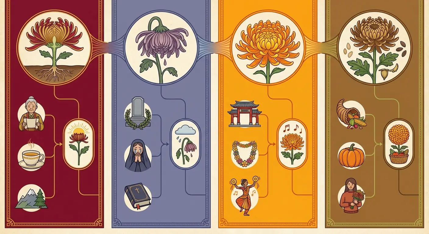
Most people approach these tattoos through one cultural lens, missing how different perspectives reveal different design possibilities:
|
Cultural View |
What They Usually Say |
What’s Actually Interesting |
|---|---|---|
|
Japanese Imperial |
Throne symbol, perfection |
The specific autumn bloom cycle |
|
Western |
Death and mourning (yawn) |
How the petals actually wilt |
|
Chinese Medicine |
Balance, healing |
The structural anatomy |
|
Tattoo Flash Art |
Static decorative element |
Time-marked specimen with temporal significance |
This table’s not comprehensive. Just the patterns I see most often.
The botanical reality approach opens up territory that traditional interpretations completely miss. You’re working with how the flower functions in nature, which gives you structural complexity and temporal specificity that symbolic approaches can’t match.
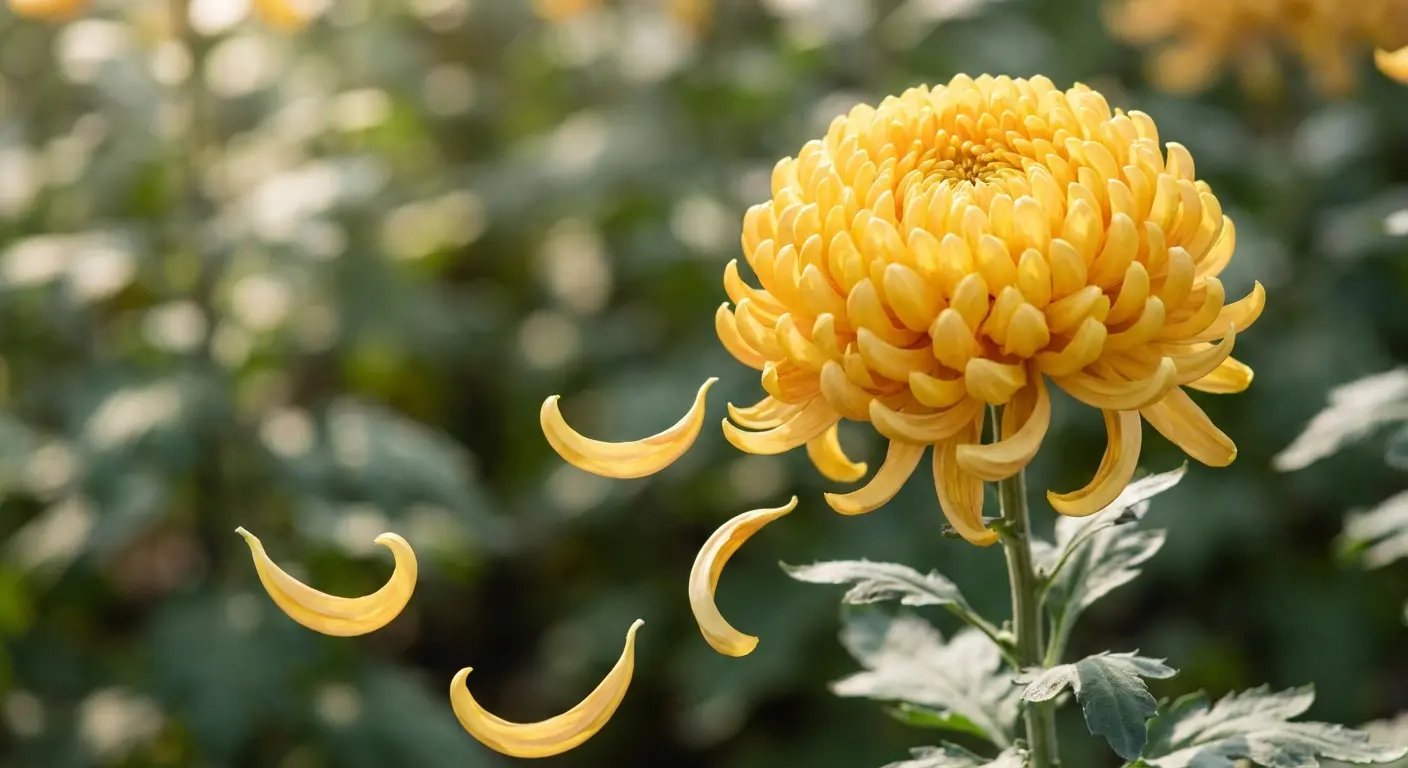
1. Full Bloom Japanese Chrysanthemum with Falling Petals
This design captures chrysanthemums at peak bloom while incorporating falling petals that trace natural descent patterns.
The falling elements aren’t decorative afterthoughts. They follow gravitational flow and air resistance patterns.
Your artist needs reference images showing real petal fall (not artistic interpretation) to nail the physics. I’ve seen too many designs where the petals scatter randomly, ignoring how they’d actually move through air. Real petals tumble, rotate, and drift based on their weight distribution and surface area.
The contrast between the tight, controlled bloom center and the chaotic scatter of fallen petals creates visual tension that static designs miss entirely. Placement matters here because you want the petals to fall with your body’s natural lines, not against them.
This works exceptionally well on forearms where the petals can follow the arm’s length. On ribcage placements, they can scatter across the torso’s curve. The design tells a story about impermanence without requiring additional symbolic elements. The falling petals do that work themselves.
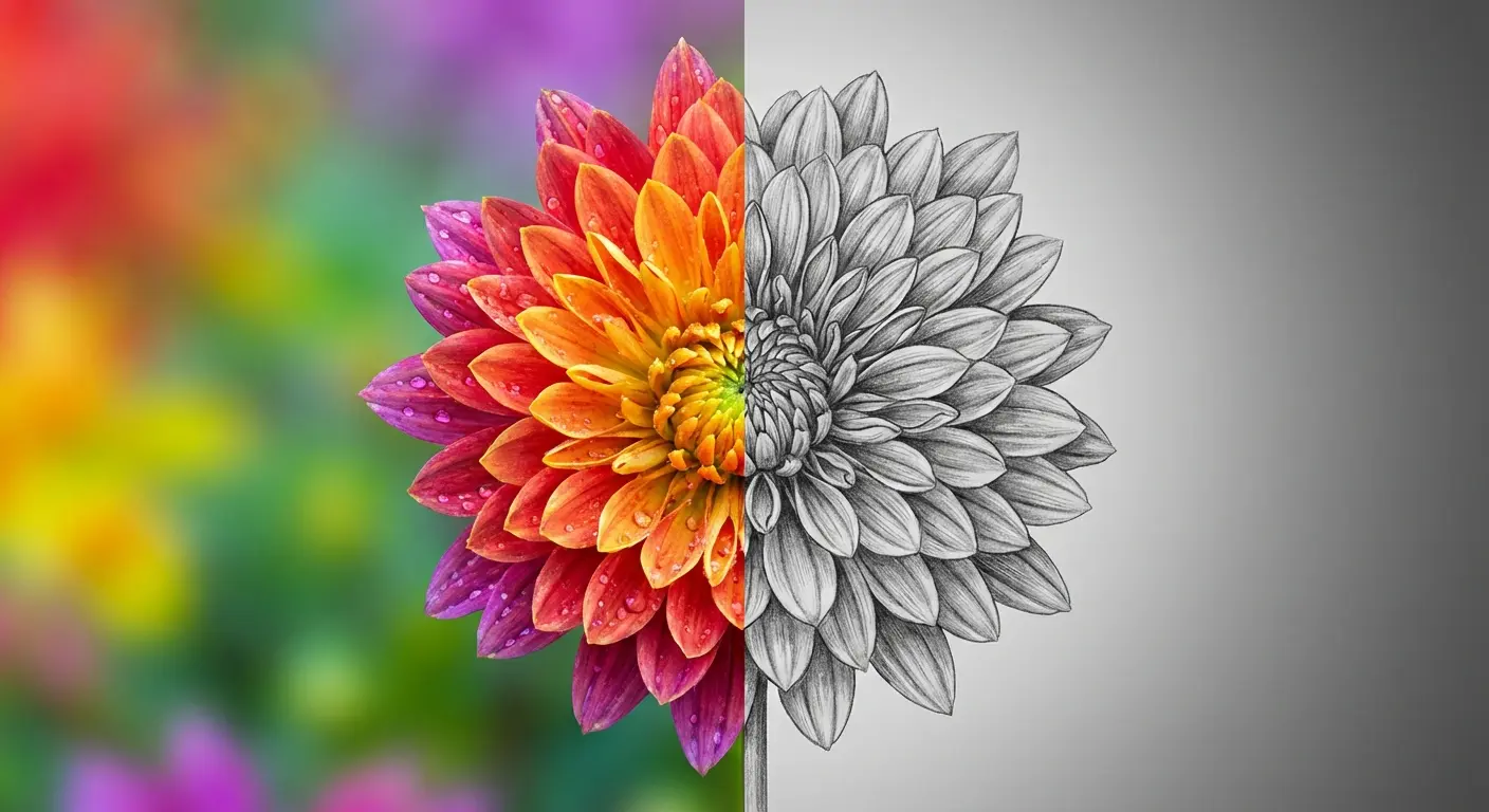
2. Skeletal Chrysanthemum Revealing Inner Structure
The involucre. The receptacle. The vascular system.
Nobody gets these parts tattooed, which is weird because they’re the actual architecture holding the flower together. It’s like tattooing a building’s facade and ignoring the steel frame.
Strip away the ornamental petals and you’re left with the flower’s architectural skeleton. The involucre (those small leaf-like structures at the base) supports the entire bloom. The receptacle connects everything to the stem. The vascular system delivers nutrients to each petal.
The linework needs to be precise because you’re depicting plant anatomy, not stylized interpretation. This works in black ink exclusively since color would obscure the structural details you’re trying to highlight.
This appeals to the botanically obsessed. Biology majors, gardeners, people who actually know what a receptacle is. I’ve tattooed three of these skeletal designs, all for people in STEM fields. They wanted something that satisfied their need for functional understanding.
You need an artist who can do technical illustration, not just pretty flowers. That’s maybe 1 in 50 tattoo artists.
3. Chrysanthemum Clock Face Integration
Chrysanthemum petals radiate from a central point, making them natural candidates for clock face integration.
But instead of simply overlaying a flower onto a clock (which feels gimmicky), this design uses individual petals as hour markers while maintaining the flower’s organic growth pattern. The center houses the clock mechanism, and petals extend outward at positions corresponding to specific times that matter to you.
You could mark birth times, death times, wedding hours, or any temporal moment worth permanently recording.
This requires careful planning because you need exactly twelve primary petals (or multiples thereof) positioned at mathematically correct intervals. This isn’t a standard stencil you’ll find in flash books. You need exactly twelve petals for this to work. Not eleven, not thirteen. Your artist will need to map this out like an architect because if the spacing’s off by even a few degrees, the whole clock concept falls apart.
I’ve worked with clients who’ve integrated multiple significant times into a single clock face. 3:47 AM when their child was born. 11:23 PM when they got sober. 6:15 PM when they got married. Each petal becomes a memorial to a specific moment, creating a personal timeline disguised as a flower.
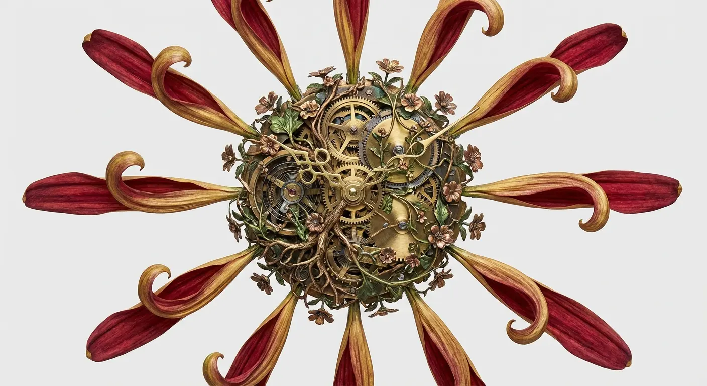
The clock face integration is clever but reads as gimmicky to anyone who knows tattoos. I say this with love. I’ve tattooed seven of them.
4. Monochrome Chrysanthemum with Negative Space Mastery
Negative space in tattoos typically means “areas we left blank.”
This design flips that by making the negative space carry equal visual weight to the inked portions.
Your skin becomes the highlight color on petals, with black ink defining shadows and depth. The effect creates a flower that appears to glow from within, which is particularly striking on medium to darker skin tones where the contrast between skin and ink creates natural dimension.
Your artist needs to understand light source consistency because every shadow and highlight must originate from the same directional light, or the whole thing falls apart visually. This technique demands more skill than standard outline approaches. I’m talking about artists who understand how light behaves on three-dimensional surfaces and can translate that onto skin.
The design works best when you commit fully to the negative space approach rather than hedging with partial fills. Either your skin is the light source or it isn’t. There’s no middle ground that doesn’t look indecisive.
5. Chrysanthemum Emerging from Geometric Fracture
Organic forms breaking through geometric constraints creates visual storytelling about personal breakthrough moments without being heavy-handed about it.
The geometric element (hexagons, triangles, or sacred geometry patterns) appears fractured, with growth pushing through the cracks. The challenge lies in making the transition between geometric precision and organic chaos feel intentional rather than awkward.
You want the flower’s curves to directly respond to the geometric breaks, with petals following fracture lines and stems weaving through geometric negative space. The style blending here requires an artist comfortable with both technical geometric work and flowing botanical illustration.
Good luck finding an artist who can do both. They exist, but you’ll wait 6+ months for an appointment.
The geometric approach shares similarities with geometric tattoo designs that balance precision with organic elements. The key difference? The chrysanthemum isn’t contained by the geometry. It’s actively destroying it. This creates a narrative of growth overcoming structure, nature reclaiming order, or personal evolution breaking through limitations.
Chrysanthemums as Time Markers (Not Just Symbols)
Chrysanthemums bloom in fall, die back in winter, and return the following year. They’re inherently temporal, yet most tattoo ideas ignore this cyclical nature in favor of static representation.
I’m exploring designs that incorporate specific dates, seasonal transitions, or growth stages to create tattoos that function as permanent calendars or memorial markers. You’re moving beyond “chrysanthemums mean longevity” into “this specific flower marks when my daughter was born” territory.
The designs here require personalization that generic flash can’t provide, which means more collaboration with your artist but results in genuinely unique work. I’ve seen people use these flowers to mark sobriety anniversaries, cancer remission dates, immigration dates, and transition milestones. The tattoo becomes a timestamp rather than a symbol.
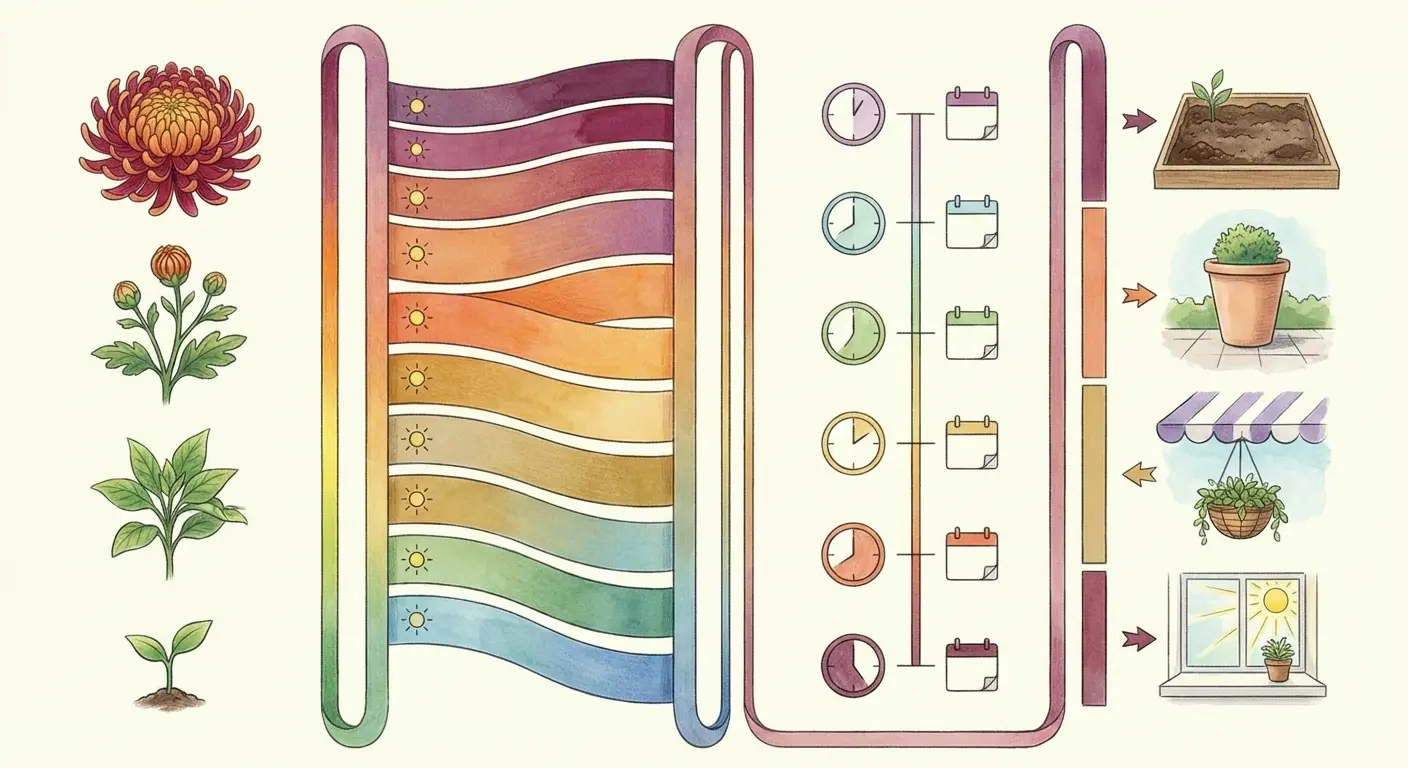
Different time markers translate into specific design elements:
|
Time Marker Type |
Design Element |
Personalization Method |
Best Placement |
|---|---|---|---|
|
Birth Date |
Bloom stage corresponding to date |
Petal count matches day/month |
Forearm, shoulder |
|
Memorial |
Wilting petals, decay patterns |
Specific deterioration stage |
Ribcage, back |
|
Anniversary |
Multiple blooms in cluster |
One flower per year |
Thigh, calf |
|
Seasonal Transition |
Color gradient from warm to cool |
Actual color changes |
Vertical surfaces (spine, leg) |
|
Growth Cycle |
Seed to bloom sequence |
Life stage progression |
Arm band, wrap-around designs |
6. Birth Month Chrysanthemum with Personal Date Elements
Chrysanthemums are November’s birth flower, but this design works for any birth month by incorporating the specific bloom stage that corresponds to your birth date.
Early November births get tight buds. Mid-month births get half-open blooms. Late November births get full flowers. You can integrate date numerals into the stem structure or petal count, making the tattoo a botanical birth certificate. This gives you something immediately personal without requiring additional symbolic elements.
The color choice can reflect birthstone colors or stay true to natural varieties that bloom during your birth period. As Thursd’s November birth flower feature notes, the Chrysanthemum earned pride of place as November’s birth flower for its endurance, clarity of form, and long vase life (exactly when many gardens wind down). This November birth flower is prized for its colored and ruffled petals, thriving in conditions that would wilt lesser blooms.
I’ve designed tattoos where the petal count matches the birth date. 23 petals for someone born on the 23rd. Or where the bloom’s opening percentage corresponds to how far through the month the birth occurred. These mathematical integrations create designs that look organic but carry hidden numerical significance.
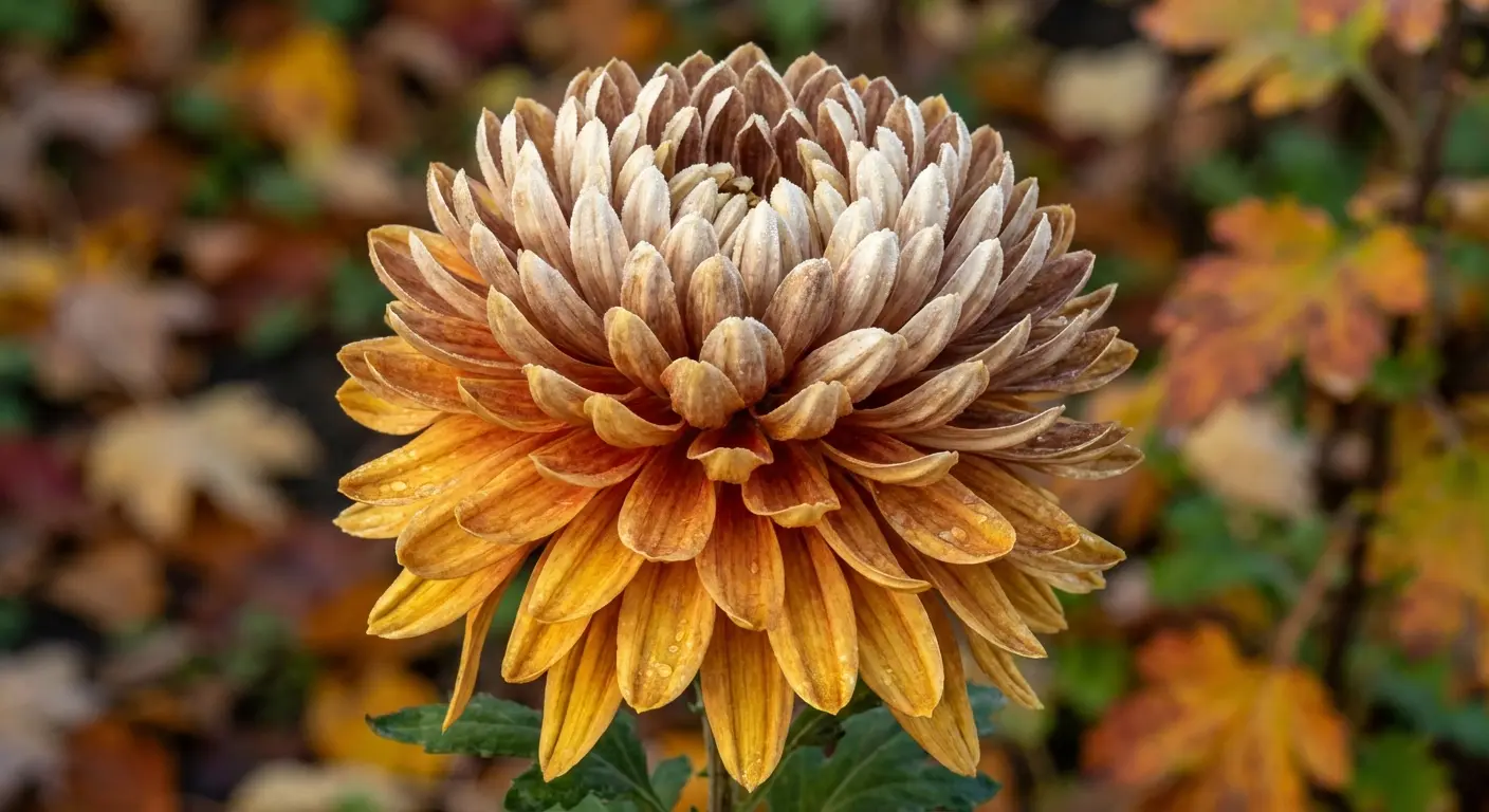
7. Seasonal Transition Chrysanthemum Gradient
Chrysanthemums bridge summer and winter, making them perfect for gradient designs that show seasonal shift.
The bottom petals display summer warmth (yellows, oranges, reds) while upper petals transition into winter dormancy with browns, grays, whites. This isn’t pretty color blending but represents the color changes chrysanthemums undergo as temperatures drop and they prepare for dormancy.
The gradient needs to follow botanical reality, which means consulting photographs of flowers in various stages of seasonal decline. An orange chrysanthemum could serve as the starting point, gradually shifting through the color spectrum as petals ascend.
This works exceptionally well on vertical placements where the gradient can follow the body’s length. Thighs and calves are ideal because you get enough vertical space for a smooth color transition. The design becomes a wearable record of seasonal change, capturing the exact color progression that happens in nature over weeks compressed into a single image.
Five years ago, everyone wanted watercolor chrysanthemums. Now that trend’s dead, thank god.
8. Anniversary Chrysanthemum Cluster
Instead of a single bloom, you get multiple chrysanthemums representing years together, years sober, years cancer-free, or any anniversary worth marking.
Each flower can be slightly different in size or bloom stage to represent different years, with the largest or most prominent marking the most significant year. The cluster arrangement needs to feel organic rather than regimented, which means varying stem heights and bloom orientations.
You could add one new flower each anniversary, building the piece over years, though this requires planning the overall composition to accommodate future additions. This transforms your tattoo into a living document that grows with your timeline. I’ve seen people start with three chrysanthemums and add one annually, creating a garden that expands with their journey.
The technical challenge? Making sure each addition matches the original artist’s style and ink saturation.
Different artists equal different ink saturation, which means your tattoo will look patchy when you add to it years later. You’ll want to return to the same artist for consistency, or at minimum, bring detailed photos of the existing work to any new artist.
9. Memorial Chrysanthemum with Wilting Realism
Most memorial tattoos depict flowers in perfect bloom, which feels dishonest when you’re marking a death.
This design shows a chrysanthemum in active decay: browning petal edges, drooping stems, and the specific deterioration pattern these flowers display as they die. It’s honest, acknowledging that death is a process, not a moment frozen in time.
The wilting needs botanical accuracy because chrysanthemums deteriorate in specific ways. Petals curl inward, colors fade from edges to center, stems bend at nodes. A white chrysanthemum works particularly well for this since white flowers show decay more visibly than colored varieties.
This requires an artist comfortable with depicting imperfection, which is harder than you’d think. Most tattoo artists are trained to create idealized versions of subjects. Finding someone who can render decay beautifully takes research.
One woman got a wilting chrysanthemum for her cancer diagnosis date, then added a new bloom for each year of remission. By year five, she had a garden.
The result creates a memorial that honors the reality of loss rather than sanitizing it.
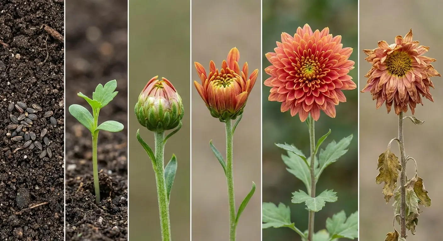
10. Growth Stage Chrysanthemum Sequence
Show a chrysanthemum’s entire life cycle from seed to bloom to decay in a sequential design.
This works as a linear progression across a limb or circular arrangement around a joint. Each stage needs equal visual weight so the piece doesn’t feel front-loaded toward the bloom stage. The seed and sprout stages are particularly challenging because they’re visually simple compared to full bloom, but proper sizing and detail work can balance the composition.
This appeals to people who value process over outcome, showing that the bloom is one phase in a longer journey. You’re getting a botanical illustration that doubles as a meditation on impermanence.
The seed stage can be surprisingly detailed when you examine actual chrysanthemum seeds. They’re elongated with subtle ridges, not the generic oval most people imagine.
The sprout stage shows the first true leaves emerging, which look nothing like the mature foliage. Then comes the vegetative growth phase where the plant builds structure. The budding stage follows, then partial bloom, full bloom, and finally seed head formation as the cycle completes. Each stage deserves equal attention in the design, creating a comprehensive biological record.
11. Harvest Moon Chrysanthemum Pairing
Chrysanthemums and harvest moons share autumn timing, making them natural companions in design.
But instead of simply placing a chrysanthemum in front of a moon (compositionally lazy), this design uses the moon’s light to illuminate the flower, creating dramatic shadows and highlights that wouldn’t exist in flat lighting. The moon phase should correspond to a specific date that matters to you, whether that’s a full moon, crescent, or anything between.
The flower’s position relative to the moon determines shadow placement, which your artist needs to calculate based on light physics. This creates a snapshot of a specific night sky moment, making your tattoo astronomically accurate as well as botanically detailed.
I’ve worked with clients who’ve researched the exact moon phase on their wedding night, the night they lost someone, or the night they made a life-changing decision. The moon becomes a timestamp as specific as any date numeral, but more poetic. The chrysanthemum catches that moonlight, creating depth and dimension that transforms both elements into something more powerful than either would be alone.
Chrysanthemums Breaking Traditional Color Rules
Traditional Japanese designs follow established color conventions: reds for passion, whites for mourning, yellows for imperial connections.
I’m ignoring those rules.
This section explores color choices based on technical tattooing considerations, skin tone interactions, and personal preference rather than cultural prescription. You’ll see how black designs require different approaches than colored versions, why white ink on darker skin creates opportunities most artists miss, and how color inversions can make familiar designs feel completely fresh.
The focus here is on what works visually on skin, not what tradition dictates. Understanding Japanese traditional tattoo conventions helps you know which rules to break intentionally versus accidentally. There’s a difference between ignorance and informed rebellion.
If you’re not Japanese, the imperial chrysanthemum might raise eyebrows in tattoo circles. Not forbidden, but be aware. Some traditional Japanese artists won’t do these “botanical accuracy” versions. They consider it disrespectful to the style. Find an artist who’s into the concept.
12. Black Chrysanthemum with White Ink Highlights
A black chrysanthemum typically means black outlines with shading, but this design goes full black with strategic white ink highlights for dimension.
The white ink catches light on petal edges and bloom centers, creating a three-dimensional effect that pure black work can’t achieve. This only works if you understand white ink’s limitations: it fades faster than black, shows differently on various skin tones, and requires touch-ups more frequently.
The white shouldn’t outline the entire flower but should hit specific high points where light would naturally strike. Think of adding metallic highlights to a matte surface. Your artist needs experience with white ink specifically because it behaves differently during healing.
White ink also raises slightly more than other colors, creating subtle texture you can feel with your fingertips. The raised texture is divisive as hell. Either you’ll love tracing it with your fingers, or it’ll bug you every time you touch it. There’s no middle ground here.
Test your reaction to white ink with a small piece before committing to a large design with extensive white highlighting.
White ink on dark skin used to be considered impossible. Better ink formulations changed that around 2018.
13. Orange Chrysanthemum Flame Fusion
Orange chrysanthemums already suggest fire through color, so this design makes that connection explicit by merging petals with flame elements.
The outer petals transition into flames, blurring the line between flower and fire until you can’t tell where one ends and the other begins. This works as a visual representation of passion, destruction, or transformation without requiring additional symbolic elements.
The color gradient needs to move from true chrysanthemum orange (which has yellow undertones) through flame orange (which has red undertones) to flame tips (yellow-white). The transition points are critical because clumsy color shifts will make this look like two separate elements poorly combined.
Your artist needs to understand how flames move and taper. Real flames don’t just point upward. They curl, twist, and respond to air currents. The petals should follow these same movement patterns as they transform into fire, creating continuity between the organic and the elemental.
14. White Chrysanthemum on Darker Skin Tones
White ink on darker skin creates a raised, scarified effect that most tattoo discussions ignore.
Instead of fighting this, this design embraces it by using white ink to create a bas-relief chrysanthemum that you can feel as much as see.
The design needs bolder lines than you’d use on lighter skin because subtle white details disappear entirely. The outline becomes the primary design element, with selective shading in the negative space (your natural skin tone) providing depth.
This inverts the typical approach where ink provides the image and skin provides the background. You’re getting a sculptural piece that changes appearance based on lighting angles and skin texture. In direct light, it appears bright and prominent. In dim light, it becomes subtle, almost hidden.
The raised texture develops over time as the tattoo heals. Some artists can control this effect by adjusting needle depth and ink saturation, creating varying levels of relief within the same piece. The result is a chrysanthemum you can trace with your fingers, adding a sensory dimension most tattoos lack.
White ink on dark skin is specialist territory. Don’t let a general practitioner attempt this.
15. Inverted Color Chrysanthemum Outline
Take a standard outline and invert the expected colors: dark petals with light centers instead of light petals with dark centers.
This creates a negative image effect that makes viewers do a double-take because something feels off but they can’t immediately identify what. The inversion needs to be consistent across the entire flower, including stems and leaves, or it looks like a coloring mistake.
This works particularly well in black and gray because the contrast is more dramatic than with color inversions. The design challenges viewer expectations without being so abstract that it’s unrecognizable as a chrysanthemum. You’re playing with perception, creating a familiar form that behaves unfamiliarly.
The technical execution requires careful value planning. Your artist needs to map out which areas would normally be light and make them dark, and vice versa, while maintaining enough contrast for the outline to read clearly. Too much midtone and the inversion effect disappears.
Honestly, inverted color schemes look cool in drawings but confusing on skin. Most people regret this one.
16. Dual-Tone Chrysanthemum Split Design
Split the chrysanthemum down the center with two completely different color treatments on each half.
One side could be full color while the other stays black and gray, or one side could be warm tones while the other is cool. The split needs to follow the flower’s natural symmetry, running through the center of the bloom and down the stem.
This creates a before/after effect, a duality representation, or simply visual interest through contrast. The technical challenge is making both halves feel equally complete so neither side looks unfinished. Each half needs full detail work appropriate to its color treatment, which essentially means your artist is tattooing two different designs that happen to share the same outline.
I’ve seen this used to represent life before and after sobriety, pre and post transition, or the contrast between public and private selves. A trans client marked their transition anniversary with a growth-stage sequence (seed to bloom). Corny? Maybe. But it meant something to them.
The split becomes a visual metaphor without requiring explanatory text or additional imagery.
Chrysanthemums in Unexpected Placements
Placement affects how tattoos move with your body, how petals flow across curves, and how the design interacts with your daily movements.
I’m moving beyond standard shoulder or forearm placements into positions that create unique challenges and opportunities. You’ll see how spine placements can follow vertebral curves, how finger tattoos require simplified approaches, and how behind-the-ear positions create intimate designs that aren’t constantly visible.
These placements require modified designs because what works on a flat forearm won’t translate to a curved ribcage or tiny finger space. For those considering visible locations, reviewing first tattoo ideas and placement strategies can help you make informed decisions about visibility, pain levels, and professional considerations.
17. Spine-Following Chrysanthemum Stem
A single chrysanthemum stem runs the length of your spine with the bloom at the base of your neck and roots at your tailbone.
The stem needs to follow your vertebral curve exactly, which means the design can’t be finalized until you’re in the tattooing position because spine curves change with posture. Leaves and smaller blooms can branch off at vertebrae points, creating a design that maps to your skeletal structure.
Pain-wise? Spine tattoos are brutal. You’re tattooing directly over bone. But the result creates a design that’s architecturally integrated with your body. The bloom size needs careful consideration because too large and it won’t fit in the neck area, too small and your tattoo loses impact.
The stem can incorporate subtle vertebral references, with nodes positioned at each vertebra or slight thickness variations that correspond to spinal anatomy. This adds a layer of biological accuracy that transforms the chrysanthemum from decoration into an anatomical illustration that happens to be beautiful.
Spine tattoos make your eyes water involuntarily. Not from pain exactly, just nerve proximity.
18. Finger-Spanning Miniature Chrysanthemum
Chrysanthemums shrunk to finger size require radical simplification.
You can’t include every petal and detail that works in larger pieces, so the design needs to capture the flower’s essence with minimal linework. Think five to seven primary petals maximum, a simplified center, and no stem complexity.
The stencil for finger placement needs to account for how fingers swell, how skin stretches when you bend your finger, and how quickly fine details blur on hands due to constant sun exposure and friction. This placement fades faster than almost anywhere else on your body, so you’re committing to touch-ups every few years.
The finger placement fades so fast it’s basically a waste of money unless you’re committed to annual touch-ups.
The payoff is a design you see constantly (unlike back or ribcage pieces) that creates visual interest on hands without covering large areas. Finger tattoos also carry professional implications depending on your field, so consider visibility carefully before committing.
Finger tattoos: for when you want to explain your life choices to every TSA agent forever.
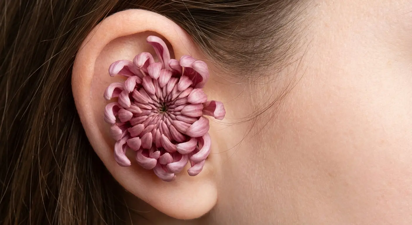
19. Behind-the-Ear Chrysanthemum Stencil Approach
The curved space behind your ear accommodates a single chrysanthemum bloom without stem or leaves, creating an intimate design that’s only visible when your hair is up or pulled back.
The flower needs to curve with your ear’s shape, which means the petals on one side will be more compressed than the other to follow the natural contour. This placement works for people who need professional flexibility (easily hidden) but want something more detailed than typical behind-the-ear designs.
The size limitation means you’re working with a bloom roughly the diameter of a quarter, which still allows for petal detail if your artist has steady hands. Pain level here varies wildly between people because of how close you are to bone and cartilage. Some people find it barely noticeable; others find it excruciating. The behind-the-ear spot is weirdly painful for some people, barely noticeable for others.
The behind-the-ear placement also affects how the tattoo ages. This area gets less sun exposure than hands or arms, which means better color retention over time. However, the skin is thin and delicate, requiring a lighter hand during application to avoid blowouts or excessive scarring.
Why I Use Tattoo Generator IQ (And Why You Might Want To)
You’ve probably spent hours scrolling through chrysanthemum tattoo ideas online, trying to communicate what’s in your head to an artist who might not fully grasp your vision.
That gap between imagination and execution is where most tattoo disappointments originate.
I got tired of clients showing me Pinterest screenshots and saying “something like this but different.” Different how? More petals? Different color? Different placement?
Tattoo Generator IQ lets you test variations before committing. Want to see how that black chrysanthemum with white highlights looks on YOUR skin tone? Generate it. Wondering if the spine placement will look weird with your body proportions? Check before you book six hours with an artist.
It’s not replacing your tattoo artist. It’s giving them a clear starting point instead of “I want a flower… but not like that.”
The AI generates artist-ready references that give your tattoo artist a concrete visual foundation to work from, which typically results in fewer revision rounds and designs that match your initial vision more closely. The technology bridges the communication gap that causes so many tattoo regrets, turning abstract ideas into specific visual proposals you can refine before any needle touches your skin.
The AI sometimes makes petals too symmetrical (real chrysanthemums are messier), but it’s still better than showing up with a vague idea and hoping your artist reads your mind.
Full disclosure: I use this for client consultations now. Cuts the back-and-forth by half.
Final Thoughts
Look, you can get a chrysanthemum because it means “longevity” in some ancient text. Or you can get one because it bloomed the week your daughter was born, and you want to remember that specific October.
The botanical approach (focusing on growth stages, decay patterns, actual autumn timing) gives you more to work with than symbolic interpretations. You’re marking time, not illustrating a dictionary definition.
Chrysanthemum tattoos carry more temporal and structural possibility than the standard symbolic interpretations suggest. When you treat them as botanical specimens first and cultural symbols second, you open up design approaches that most flash collections completely ignore.
Your tattoo becomes more personally meaningful when it marks a specific time, represents an actual growth stage, or incorporates colors and placements that challenge conventional expectations. The key is understanding that chrysanthemums offer structural complexity that rewards close observation.
Those layered petals, the way light interacts with different bloom stages, and how the flowers physically respond to environmental changes all provide design material that goes deeper than “longevity” or “rebirth” symbolism. You’re getting a tattoo that functions as a time capsule, a botanical illustration, or a personal memorial depending on how you approach the design process.
The flower’s natural architecture gives you enough visual complexity to create something genuinely unique without requiring additional decorative elements that might dilute the core design. Whether you’re drawn to the skeletal structure revealing how the flower functions, the temporal markers that transform blooms into calendars, or the color inversions that challenge traditional conventions, you’re working with a flower that offers more design flexibility than most people realize.
I’ve seen chrysanthemums mark cancer remission dates, immigration anniversaries, transition milestones, and sobriety journeys. I’ve seen them function as birth certificates, memorial markers, and seasonal calendars. The flower’s inherent connection to autumn and its cyclical nature make it perfect for marking time in ways that abstract symbols can’t match.
Most tattoo flash treats chrysanthemums like decorative clip art. But they’re seasonal, cyclical, structurally complex flowers that change throughout their life cycle. Use that.
The design possibilities extend far beyond the imperial symbolism or funeral associations most people default to. When you dig into the botanical reality (the actual growth patterns, decay sequences, and structural anatomy), you discover a subject rich enough to support deeply personal, scientifically accurate, and visually striking work that stands apart from generic flash interpretations.
Your tattoo can be as simple as a behind-the-ear bloom or as complex as a full spine stem with branching growth. The outline can follow traditional Japanese conventions or invert every color rule in the book. The choice depends on what you want the tattoo to do: mark a moment, honor a person, celebrate a transition, or simply exist as beautiful botanical art