
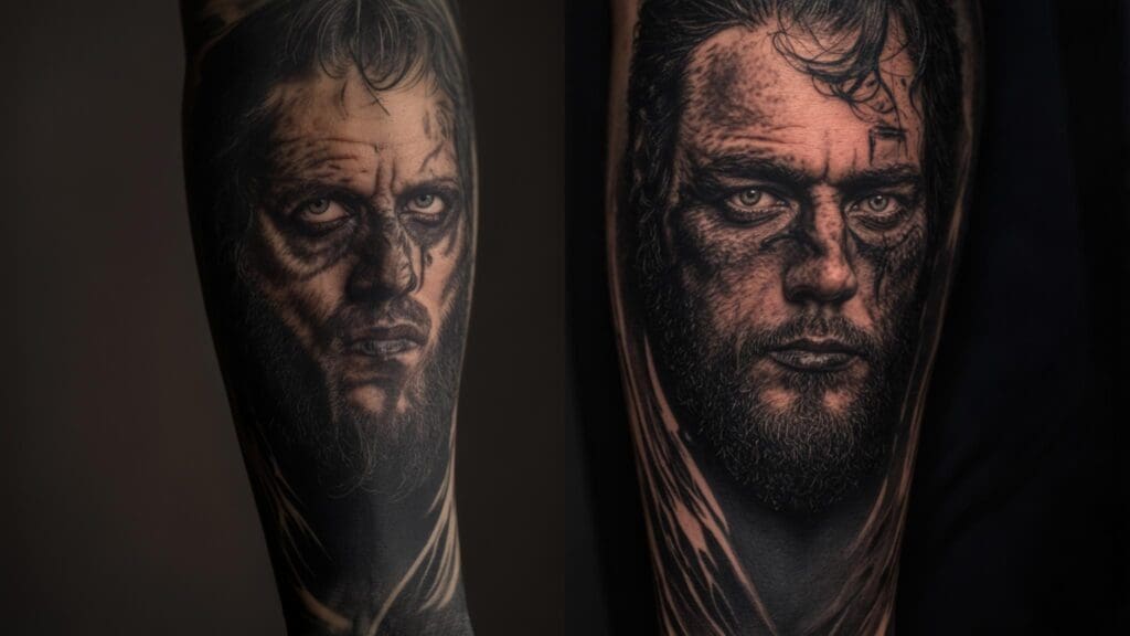
25 Fortis Fortuna Adiuvat Tattoo Ideas That’ll Make You Want to Book Your Next Session
Introduction
I’ve been seeing “Fortis Fortuna Adiuvat” tattoos everywhere lately – and honestly, I get it. Recent data from BlackInk AI shows that Latin phrase tattoos have surged in popularity, with “Fortis Fortuna Adiuvat” ranking among the most requested designs. I still remember walking into my first tattoo consultation feeling completely overwhelmed – should I go classic or modern? Simple text or elaborate artwork? The phrase “Fortune Favors the Bold” deserves a design that matches its powerful meaning, but let’s be real, choosing the right approach can feel scary as hell.
Whether you’re drawn to minimalist approaches or considering placement options like shoulder designs, understanding your options is crucial before committing to this meaningful body art.
You’re about to discover 25 stunning fortis fortuna adiuvat tattoo ideas that transform this timeless Latin phrase into meaningful body art. From minimalist typography to elaborate Roman-inspired compositions, each option addresses different personalities, lifestyles, and aesthetic preferences while honoring the phrase’s rich historical heritage. Trust me, by the end of this, you’ll know exactly which direction feels right for you.
Table of Contents
- Essential Considerations Before Getting Your Fortis Fortuna Adiuvat Tattoo
- Classic Typography Designs (5 Variations)
- Decorative and Symbolic Additions (5 Variations)
- Placement-Specific Designs (4 Variations)
- Artistic and Stylized Versions (4 Variations)
- Extended Phrases and Variations (4 Variations)
- Modern Interpretations and Pop Culture References (3 Variations)
- Design Quality Assessment and Lifestyle Compatibility
- How Tattoo Generator IQ Transforms Your Vision Into Reality
TL;DR
- Pick something that actually means something to you – this isn’t just decoration, it’s your life philosophy on display
- Don’t get cute with fancy fonts – bold, simple lettering ages way better than that ornate script you’re eyeing
- Think about your job situation – forearms get noticed, ribs stay private
- This phrase has serious Roman military history – maybe learn what it actually means before you ink it
- Simple beats complex when you’re talking about something permanent
- Use design tools so you don’t end up with regret ink
Essential Considerations Before Getting Your Fortis Fortuna Adiuvat Tattoo
Before you fall in love with any specific design, we need to talk about the stuff that actually matters for long-term happiness with your fortis fortuna adiuvat tattoo. Your connection to what “Fortune Favors the Bold” means in your life should drive everything else, but there are some practical realities we can’t ignore.
Here’s the thing – your relationship with “Fortis Fortuna Adiuvat” needs to run deeper than “it sounds cool in Latin.” This phrase is about courage, taking calculated risks, and embracing bold action. What does that actually look like in your story? Maybe you’re marking a major career change, celebrating beating an illness, or committing to stop playing it safe. The design should reflect your specific version of how fortune has (or will) favor your bold moves.
Now, let’s talk fonts because this is where I see people mess up constantly. Since this is basically a text tattoo, typography becomes everything. Pick a font you won’t hate in five years – seriously, it matters more than you think. I’ve seen people regret going too fancy with ornate scripts (trust me, that delicate lettering might look amazing now, but tattoo ink spreads over time, and those thin lines turn into blurry messes).
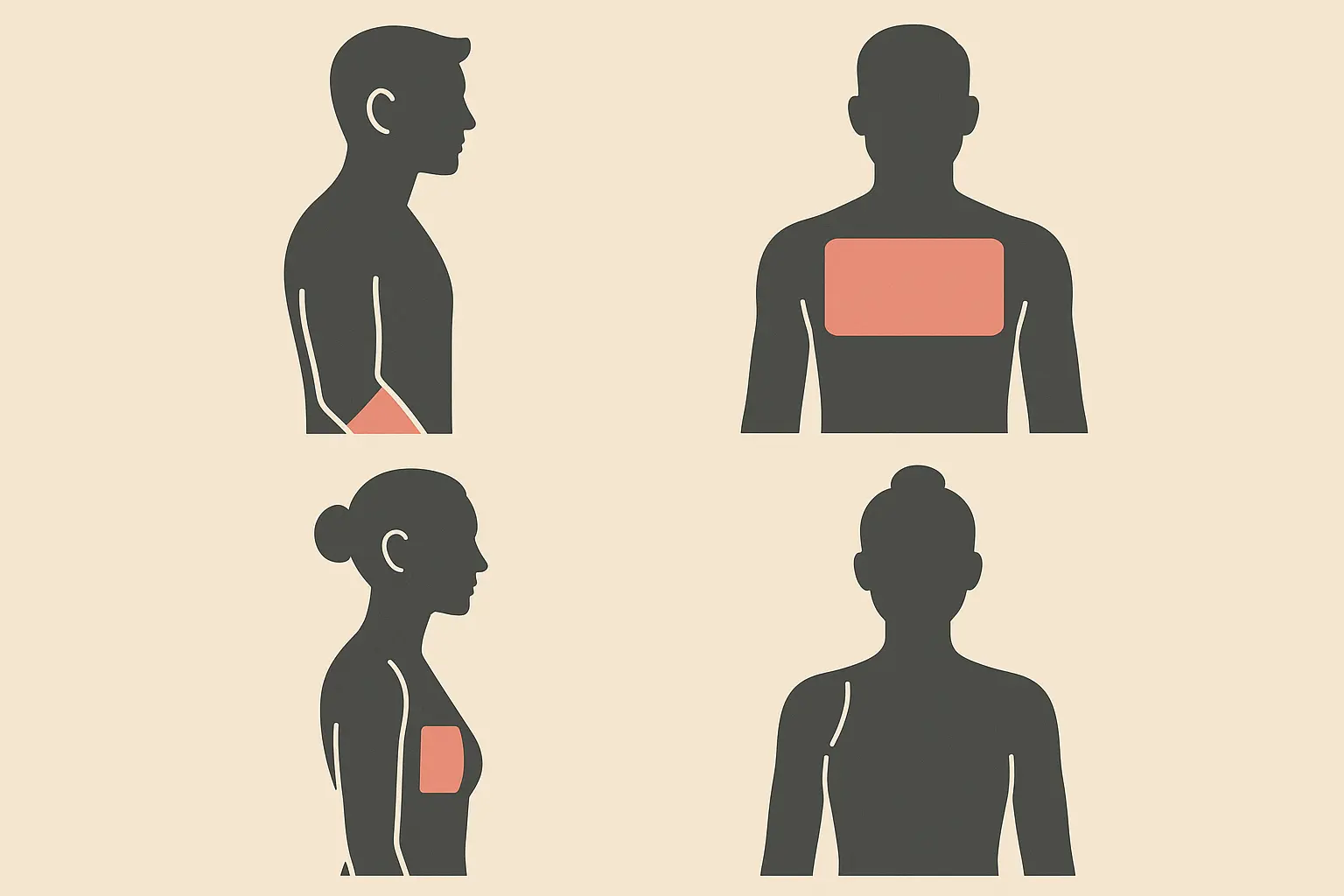
Understanding tattoo pain levels for different placements can help you make smarter decisions about where to put this thing.
Here’s what I wish someone had told me about different considerations:
Font choices that won’t make you cry later:
- Bold sans-serif or Roman serif = Your future self will thank you
- Script lettering = Looks pretty, might get fuzzy
- Ornate decorative fonts = Just don’t. Please.
Aging reality check:
- Simple lines and solid blacks = Age like fine wine
- Medium detail work = Might need a touch-up someday
- Fine line details = Will probably need work
Job situation (be honest with yourself):
- Ribcage, upper arm = Your boss will never know
- Shoulder, back = Controllable visibility
- Forearm, hand = Everyone’s going to see it and have opinions
Placement strategy is where you need to get real about your life. Do you want this reminder staring at you every day, or does your career suggest keeping it on the down-low? Forearms are conversation starters whether you want them to be or not, while ribcage tattoos stay your little secret until you decide otherwise.
Different spots also age differently because of sun exposure and how your skin changes over time. Can we talk about cultural respect for a second? Look, this isn’t just some random Latin you found on Pinterest. Roman soldiers actually lived by this motto – it appears in Pliny the Elder’s works and has real military history. Maybe do a quick Google search so you can tell people what it actually means when they inevitably ask.
Long-term maintenance is something nobody wants to think about when they’re excited about new ink. Simple, bold lettering ages more gracefully than complex decorative stuff. Factor in how much sun that spot gets, natural skin changes, and whether you’re willing to pay for touch-ups down the road.
My friend Sarah got “Fortis Fortuna Adiuvat” on her ribs in clean sans-serif lettering. Smart move – she works in corporate but wanted the daily reminder of her bold career switch from finance to marketing. Five years later, it still looks perfect and she’s never had to explain it in a board meeting.
Classic Typography Designs
Look, sometimes the words themselves are powerful enough without getting fancy. These five typography approaches focus on letting “Fortis Fortuna Adiuvat” speak for itself through different font choices. Fortis fortuna adiuvat tattoo designs that stick to typography usually need less babysitting over the years and work pretty much anywhere on your body while keeping the Latin phrase as the star of the show.
1. Traditional Roman Serif
This is the real deal – lettering that looks like it came straight off ancient Roman stone carvings. We’re talking 4-6 inches horizontally, perfect for your forearm or chest. The serif details give you that authentic historical vibe while staying readable for decades.
Here’s why this works: it connects directly to where this phrase actually came from. The carved-stone look has serious gravitas that matches the weight of “Fortune Favors the Bold.” If you’re someone who values getting the history right and wants something timeless instead of trendy, this is your move.
2. Bold Sans-Serif Block Letters
Clean, modern, no-nonsense lettering that creates serious visual impact. Usually runs 3-5 inches depending on where you put it. This appeals to people who want contemporary aesthetics while honoring the phrase’s power.
The streamlined approach cuts out decorative flourishes and focuses purely on readability and bold presence. Perfect for professionals who want their philosophical reminder to feel current and sophisticated rather than overly classical or ornate. Your coworkers might ask about it, but they’ll respect the clean look.
3. Elegant Script Lettering
Flowing cursive that softens the message while keeping it dignified and readable. This usually needs 5-7 inches to accommodate all those flowing letterforms properly.
Script transforms this martial phrase into something more graceful and artistic. But here’s the reality check – those thin connecting strokes might blur over time, potentially meaning touch-ups in 10-15 years. If you love the look and don’t mind some maintenance, go for it.
4. Military Stencil Font
Bold, utilitarian lettering that screams military heritage and tactical vibes. This style hits different if you’re a veteran, active military, or just drawn to the warrior philosophy. The blocky, high-contrast letters age incredibly well and stay clear at any size.
Stencil fonts connect powerfully to the phrase’s martial roots while giving you superior durability. The functional design matches the no-nonsense philosophy of taking bold action and dealing with whatever fortune brings your way.
5. Hand-Lettered Calligraphy
Custom calligraphy creates unique, personalized lettering that feels intimate and artistic. This requires finding a skilled artist, but you end up with one-of-a-kind letterforms that reflect your personality while honoring the classical heritage.
Working with a calligraphy specialist means your tattoo becomes truly yours – nobody else will have identical letters. The artistic investment becomes part of your bold action story, and honestly, that’s pretty cool.
Decorative and Symbolic Additions
Sometimes you want more than just words. These five designs add classical Roman symbols, military imagery, and other meaningful elements that complement the phrase without overwhelming it. Success with decorative fortis fortuna adiuvat tattoo additions comes down to proper scaling, skilled artist execution, and understanding how different symbols age over time.
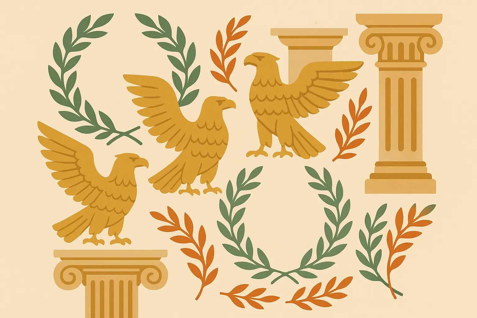
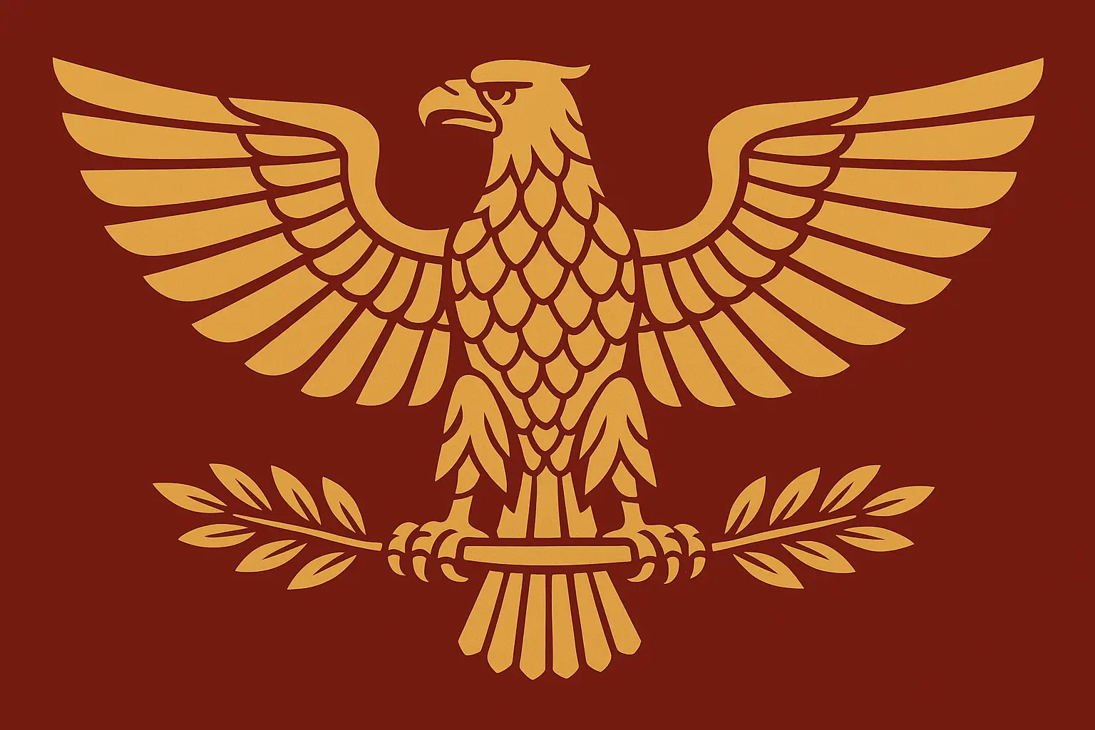
6. Roman Eagle Integration
The Roman eagle represents imperial power and divine protection – perfect companions to “Fortune Favors the Bold.” The eagle can sit above, below, or weave into the lettering, symbolizing strength, courage, and protection.
Here’s the key: the eagle needs to support your text, not compete with it. Successful designs match the eagle’s wingspan to the phrase length for visual harmony. Don’t let the bird steal the show from your words.
7. Laurel Wreath Framing
Traditional victory symbols that circle or underline your text, representing triumph earned through courage. This classical element reinforces the whole concept of fortune rewarding brave people, creating visual harmony with the Latin text.
Laurel wreaths work best when the botanical elements enhance rather than fight with text readability. The most successful designs use simplified leaf shapes that age well and stay visually clear over decades. Skip the intricate botanical details that’ll blur into green blobs.
8. Crossed Swords or Weapons
Military imagery that emphasizes the warrior aspect of boldness directly. Swords, spears, or modern tactical elements can frame the text, hitting especially hard if you interpret the phrase through a martial lens or have military experience.
Weapon details usually stay clear over time since metal objects translate well into tattoo line work. The framing approach lets weapons support rather than interfere with text readability. Plus, they just look badass.
9. Compass Rose Design
Navigation symbolism for finding direction through bold choices and adventurous spirit. The compass can integrate with lettering or serve as background, perfect for travelers, explorers, or anyone navigating major life changes.
Geometric compass elements age exceptionally well due to their structured, mathematical nature. The circular design works particularly well on shoulders or chest where the round format complements your natural body contours.
10. Classical Column Framework
Architectural elements from ancient Rome create structural framing with impressive grandeur. Ionic or Corinthian columns can bracket the phrase, adding historical authenticity while creating larger-scale compositions that demand attention.
Column designs need significant space for proper execution – think back or chest placements. The architectural lines stay clear well, though complex capital details might need periodic touch-ups. It’s dramatic, but you need the real estate to pull it off.
My buddy Marcus, a history professor, went all-in with “Fortis Fortuna Adiuvat” and detailed Corinthian columns across his upper back. The 8-inch wide design uses authentic architectural proportions he researched from actual Roman ruins. Three years later, the bold column lines still look crisp, though the intricate capitals needed one small touch-up to maintain their classical elegance.
Placement-Specific Designs
Where you put this thing matters more than you might think. These four designs are optimized for specific body locations, taking advantage of natural anatomy and considering practical factors. Each spot offers different advantages for your fortis fortuna adiuvat tattoo – forearms give you daily motivation and conversation potential, chest placements make bold statements, ribcage stays completely private, and shoulders follow your muscle contours for dynamic visual flow.
11. Forearm Banner Style
Horizontal orientation across your forearm, typically 6-8 inches long, gives you excellent daily visibility and natural conversation starter potential. The banner format allows for decorative scrollwork at the ends while keeping text prominent and readable.
When considering forearm placement, it’s helpful to understand forearm tattoo costs and what factors influence pricing for this popular location.
Here’s the reality: forearm placement means you’ll see your reminder constantly throughout daily activities, and the horizontal reading feels natural when your arms are at rest. Your coworkers are going to ask about it. A lot. Are you ready for that conversation?
12. Chest Proclamation
Large-scale placement across your upper chest creates a bold statement piece with maximum visual impact. This positioning allows for elaborate decorative elements and larger text sizes, perfect if you want your philosophy prominently displayed yet easily concealed when needed.
Chest placement provides the most dramatic canvas for your “Fortune Favors the Bold” declaration. The protected location minimizes sun damage and aging effects while offering impressive revelation potential in appropriate social situations. It’s your choice when people see it.
13. Ribcage Vertical Column
Vertical text along your ribcage provides complete privacy while allowing for extensive decorative elements. This placement works well for detailed artistic interpretations while maintaining professional discretion and creating intimate personal connection with the message.
Let’s be honest about ribs though – they hurt like a mother during the tattoo process. But ribcage tattoos remain deeply personal. You control exactly when and with whom you share this philosophical reminder. The protected location ensures minimal aging and fading issues over decades.
14. Shoulder Cap Curved Text
Following the natural curve of your shoulder creates dynamic visual flow that works with your body’s anatomy. This placement allows text to wrap naturally around your deltoid muscle, creating impressive display when revealed while remaining easily concealed when needed.
Curved text requires careful spacing for optimal readability, but the results follow your natural muscle contours beautifully. The shoulder location connects symbolically to warrior armor and protection themes. Plus, it’s one of the less painful spots.
Here’s what I wish someone had told me about different placements:
Forearm: Everyone sees it, sun hits it regularly, medium ouch factor, great for daily motivation
Chest: Your choice when to show it, stays protected from sun, decent pain level, maximum impact
Ribs: Your little secret, hurts like hell, looks amazing, perfect aging conditions
Shoulder: Best of both worlds, follows muscle nicely, moderate pain, good professional flexibility
Artistic and Stylized Versions
If you want your tattoo to showcase artistic sophistication and current tattoo culture trends, these four designs elevate the phrase beyond simple text into contemporary art forms. Fortis fortuna adiuvat tattoos in these styles typically require more skilled execution and might need periodic touch-ups to maintain optimal appearance, but they’re definitely conversation pieces.
15. Watercolor Splash Background
Modern watercolor techniques create colorful splashes behind or around your text for contemporary artistic appeal. This transforms your tattoo into wearable art while expressing the timeless message through vibrant, flowing color.
Here’s the reality check though: watercolor effects require careful contrast management to ensure text readability stays strong. And that background? It’s going to fade. A lot. Budget for touch-ups if you go this route. The artistic technique appeals to people who want their tattoo to look modern rather than traditional.
16. Geometric Pattern Integration
Clean geometric shapes, lines, and mathematical patterns create modern contrast with the classical phrase. Sacred geometry elements can frame or intersect with the lettering, appealing to those who appreciate structured, contemporary design principles.
Geometric elements age exceptionally well due to their precise, mathematical nature. The structured approach creates interesting visual tension between ancient wisdom and modern design sensibilities. Plus, clean lines and angles hold up way better than organic flourishes over time.
17. Blackwork Tribal Style
Bold black patterns in tribal or neo-tribal styles create striking visual impact through high contrast and flowing organic shapes. This approach transforms the classical text into a modern artistic statement while maintaining the strong, bold aesthetic that matches the phrase’s powerful meaning.
Solid black work ages very well with minimal touch-up requirements over time. The bold approach appeals to people who want their courage philosophy expressed through visually striking, contemporary tattoo culture aesthetics. It’s dramatic and ages like a champ.
18. Neo-Traditional Illustration
Combining traditional tattoo elements with modern techniques creates rich, detailed compositions with artistic sophistication. This style allows for elaborate decorative elements, bold colors, and artistic flourishes while maintaining the classic appeal of traditional tattooing.
Neo-traditional work showcases serious artistic skill and tattoo culture knowledge. The complex details may require periodic touch-ups for optimal appearance, but the artistic investment creates truly impressive body art. Just make sure you find an artist who actually knows what they’re doing with this style.
Extended Phrases and Variations
Sometimes you want to go bigger than just “Fortis Fortuna Adiuvat.” These four fortis fortuna adiuvat tattoo ideas expand beyond the basic phrase to include additional Latin context, multilingual translations, personal motto integration, or commemorative dates and locations. You’ll need larger placement areas and careful text hierarchy planning, but the personalization potential is massive.
19. Full Latin Quote Context
Incorporating complete historical context or additional Latin phrases creates comprehensive philosophical statements. This might include related quotes from Pliny or other classical sources that expand on the fortune and boldness theme for deeper meaning.
Extended Latin text hits different if you’re a classical scholar or philosophy enthusiast who wants to demonstrate deeper knowledge of ancient wisdom. The comprehensive approach requires substantial space but creates impressive intellectual depth. Just make sure you actually understand what all those Latin words mean.
20. Multilingual Translation
Featuring the phrase in multiple languages represents universal understanding of courage and fortune across cultures. This approach works well for people with multicultural backgrounds or international perspectives on the boldness philosophy.
Multiple languages require careful font consistency and spacing to maintain visual harmony. The universal approach honors the phrase’s global appeal while reflecting your personal cultural connections. It’s a cool way to acknowledge your heritage or worldview.
21. Personal Motto Integration
Combining “Fortis Fortuna Adiuvat” with personal mottos or family sayings creates unique, individualized designs. This customization ensures your tattoo remains uniquely meaningful to your specific life journey and values.
Personal integration creates maximum relevance to your individual story. The custom approach requires careful text hierarchy planning but results in truly one-of-a-kind meaningful body art. Nobody else will have your exact combination of life philosophy.
22. Date and Context Addition
Including significant dates, coordinates, or contextual information personalizes the classical phrase. This might commemorate specific moments when fortune favored your bold actions, creating lasting memorial to personal courage.
Commemorative elements maintain lifelong relevance through meaningful life connections. The personal context ensures your tattoo tells your specific story of boldness and fortune rather than just being a generic philosophical statement.
David combined “Fortis Fortuna Adiuvat” with the coordinates of his marathon finish line and completion date. The design spans his shoulder blade, with the Latin phrase in bold Roman serif above the GPS coordinates in smaller, clean sans-serif font. This personal touch commemorates his bold decision to run his first marathon at age 45, creating a meaningful reminder of how fortune favored his courageous health transformation.
Modern Interpretations and Pop Culture References
Contemporary interpretations connect the classical phrase to modern cultural references, military service customization, and minimalist design trends. These three designs bridge ancient wisdom with current cultural touchstones, appealing to people who want their tattoo to reflect both historical significance and contemporary relevance.
23. John Wick Inspired Design
Drawing from the popular film franchise, this style incorporates elements from the character’s tattoos while maintaining authenticity to the phrase’s meaning. For those wondering what do john wick’s tattoos mean, the design might include religious imagery, ornate framing, or specific typography that references the films while standing alone as meaningful body art.
Film-inspired designs appeal to action movie enthusiasts while honoring the phrase’s deeper meaning. The ornate framing requires balance with text readability, and the pop culture connection adds contemporary relevance to classical wisdom. Yes, everyone will ask if you know what it means. Prepare your elevator pitch.
24. Military Unit Customization
Incorporating specific military unit insignia, branch symbols, or service-related imagery personalizes the phrase for veterans and active service members. This approach honors both personal service and the phrase’s military heritage.
Military customization creates exceptional meaning for service members through genuine connection to martial tradition. Unit symbols typically age well and provide authentic personal significance that transcends trends. If you served, this connection runs deep.
25. Minimalist Line Art
Ultra-clean, single-line interpretations appeal to modern minimalist aesthetics. This approach strips away decorative elements to focus entirely on the power of the words themselves, perfect for people who prefer subtle, sophisticated body art.
Those interested in simple tattoo approaches will find minimalist line art particularly appealing for its clean, timeless aesthetic.
Minimalist execution requires expert technique for clarity but creates timeless appeal. The clean approach works well at any size or placement while focusing attention on the phrase’s essential meaning. Sometimes less really is more.
Design Quality Assessment and Lifestyle Compatibility
Let’s get real about what actually matters long-term. Evaluating design quality means looking at aging characteristics, maintenance requirements, professional visibility options, and personal meaning alignment across all these variations. Professional typography designs consistently score highest for durability and readability retention, while artistic interpretations offer maximum visual impact but might need some TLC down the road.
Here’s what I’ve learned from watching people’s fortis fortuna adiuvat tattoos age over the years: simple typography designs (variations 1-5) consistently perform best for aging and readability retention over decades. Bold, simple lettering maintains clarity as tattoo ink naturally spreads, while providing strong visual impact without requiring frequent maintenance. These work well if you’re prioritizing long-term satisfaction over immediate visual complexity.
Here’s the honest breakdown of what you’re getting into:
Typography Designs: Age beautifully (9/10), low maintenance, high professional flexibility, medium artistic impact
Decorative Additions: Pretty good aging (7/10), medium maintenance, decent professional flexibility, high artistic impact
Placement-Specific: Good aging (8/10), low-medium maintenance, flexibility varies, medium artistic impact
Artistic Versions: Fair aging (6/10), high maintenance, low-medium professional flexibility, very high artistic impact
Extended Phrases: Good aging (8/10), medium maintenance, medium professional flexibility, high artistic impact
Modern Interpretations: Pretty good aging (7/10), medium maintenance, flexibility varies, high artistic impact
Decorative additions (variations 6-10) offer medium complexity that requires skilled execution but adds significant personal meaning through symbolic elements. Success depends heavily on your artist’s skill level and proper sizing relationships between text and decorative components. Roman eagles and laurel wreaths age better than intricate architectural details.
Artistic interpretations (variations 15-18) provide the highest visual impact and showcase serious tattoo culture sophistication, but may require periodic touch-ups for optimal appearance. That watercolor background? It’ll soften over time. Geometric patterns and solid blackwork maintain clarity exceptionally well though.
Lifestyle compatibility varies dramatically across design categories. Forearm and shoulder placements (variations 11, 14) offer controllable visibility for professional environments, while ribcage positioning (variation 13) provides complete discretion. Think about your career trajectory when selecting placement and size – what flies in creative industries might not work in corporate environments.
Understanding small tattoo pricing can help budget-conscious individuals make informed decisions about size and complexity.
Maintenance requirements differ dramatically between simple text designs and complex artistic interpretations. Typography-focused variations require minimal upkeep over decades, while watercolor and neo-traditional styles may need refreshing every 10-15 years to maintain color vibrancy and detail clarity.
Personal meaning alignment should drive your final decision. Extended phrase designs (variations 19-22) offer maximum personalization potential through additional context, dates, or multilingual elements. Military customization (variation 24) provides authentic significance for service members, while minimalist approaches (variation 25) appeal to contemporary aesthetic preferences.
How Tattoo Generator IQ Transforms Your Vision Into Reality
Look, choosing among these 25 diverse “Fortis Fortuna Adiuvat” designs shows exactly why professional design tools make such a difference. Instead of spending months sketching variations or struggling to explain your vision to artists, Tattoo Generator IQ’s AI-powered platform addresses every consideration we’ve discussed – and then some.
Tattoo Generator IQ’s AI-powered platform eliminates the guesswork involved in choosing and designing your perfect “Fortis Fortuna Adiuvat” tattoo by providing professional-quality design generation, comprehensive educational resources, and artist collaboration tools. The platform addresses common challenges while offering unique features that ensure your tattoo honors both classical heritage and personal meaning.
Our platform generates designs that consistently impress tattoo artists, ensuring your “Fortune Favors the Bold” tattoo translates beautifully from digital concept to skin. Whether you prefer minimalist typography or elaborate Roman eagle compositions, our AI understands tattoo-specific design principles including proper line weight, contrast ratios, and aging characteristics.
Beyond generation, we provide comprehensive resources about Latin phrase meanings, historical context, and cultural significance. This ensures your tattoo choice honors both classical heritage and personal meaning while avoiding common cultural appropriation concerns that can arise with historical phrases.
Our unique style blending feature allows you to combine elements from multiple design categories – perhaps merging Roman architectural framing with modern geometric patterns, or integrating military stencil fonts with watercolor backgrounds. This creates truly personalized designs that reflect your individual interpretation of courage and fortune.
Placement optimization tools help you understand how different designs work across various body areas, considering factors including professional visibility, aging characteristics, and anatomical compatibility. This prevents common sizing and positioning mistakes that affect long-term satisfaction.
Our platform also connects with resources on tattoo aftercare to ensure your investment maintains its quality over time.
Generate professional-quality references with technical specifications that clearly communicate your vision to tattoo artists, eliminating miscommunication and ensuring accurate execution of your intended design. Ready to transform your “Fortis Fortuna Adiuvat” vision into reality? Start creating your perfect design today.
Final Thoughts
At the end of the day, you’re going to overthink this no matter what I say. That’s normal. The “Fortis Fortuna Adiuvat” philosophy reminds us that fortune truly does favor the bold – and selecting the right design approach represents your first bold decision in this meaningful tattoo journey.
Your perfect design balances personal connection with practical considerations including aging characteristics, professional requirements, and maintenance preferences. Whether you choose classical typography that emphasizes the words themselves, decorative elements that add cultural depth, or artistic interpretations that showcase contemporary tattoo culture, the most important factor remains authentic connection to the phrase’s meaning in your life.
Worried about how it’ll look when you’re 60? Fair question, but remember that this tattoo will accompany you through decades of bold decisions and fortunate outcomes. Thinking your mom might have opinions? She probably will. Second-guessing the whole thing? That’s completely normal.
Just pick something that makes you feel badass when
Just pick something that makes you feel badass when you look in the mirror, find an artist whose work doesn’t make you cringe, and go for it. Fortune really does favor the bold – even when you’re scared out of your mind at the tattoo shop.