
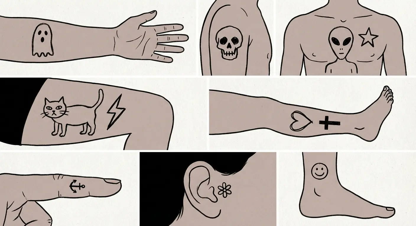
19 Ignorant Style Tattoos That Prove Bad Drawing Is Actually Good Art
These tattoos look like shit. That’s the point. What started as deliberately crude doodles has somehow become a legitimate art movement, with everyone from Miley Cyrus to your local stick-and-poke artist getting in on it. Ignorant tattoos split tattoo enthusiasts right down the middle. Some people see raw, unpolished authenticity. Others see an insult to everything traditional tattoo artists spend years mastering. These deliberately imperfect designs reject every rule in the book, proving that sometimes the most powerful art comes from embracing mistakes rather than avoiding them.
Table of Contents
-
Why Ignorant Style Tattoos Look “Wrong” on Purpose
-
Stick Figures With Soul
-
1. The Classic Smiley Face
-
2. Wobbly Heart Outline
-
3. Kindergarten Sun
-
4. Stick Figure Self-Portrait
-
5. Crooked Star
-
6. Simple House Sketch
-
7. Balloon Dog
-
Everyday Objects That Shouldn’t Work (But Do)
-
8. Coffee Cup Doodle
-
9. Bent Cigarette
-
10. Squiggly Snake
-
11. Lopsided Mushroom
-
12. Wonky Flower
-
13. Melting Candle
-
14. Scribbled Lightning Bolt
-
Words and Phrases That Embrace the Mess
-
15. Hand-Scrawled “Whatever”
-
16. Misspelled Word (Intentionally)
-
17. Chicken Scratch Quote
-
18. Drippy Letter Design
-
19. Childlike Handwriting Message
-
Final Thoughts
TL;DR
-
These tattoos celebrate wonky lines and crooked shapes, the stuff traditional artists spend years learning to avoid
-
The aesthetic works because it embraces wobbles, asymmetry, and “mistakes” as features, not flaws
-
Simple shapes like smiley faces become powerful statements when executed with deliberate carelessness
-
Everyday objects gain unexpected charm through imperfect proportions that mirror how we actually doodle
-
Text-based designs turn messy handwriting into art, celebrating imperfection as a design choice
-
This approach requires understanding what makes “bad” drawing feel intentional versus just poorly executed
-
They age differently than technical work; rough edges stay part of the design rather than becoming flaws over time
Why Ignorant Style Tattoos Look “Wrong” on Purpose
Talk to traditional tattoo artists about this trend and watch them try not to roll their eyes.
Some see it as a refreshing rejection of pretension. Others view it as a threat to the technical standards they’ve worked years to master. Both are right. But here’s what makes this movement genuinely interesting: it’s not about lacking skill. Creating work that looks this deliberately crude requires understanding composition, placement, and visual weight just as much as traditional tattooing does.
The philosophy centers on choosing rawness over refinement. These designs mirror childhood drawings, margin doodles, and bathroom stall art, capturing an energy that technical precision can’t replicate. According to tattoo artist Andrea from Stories & Ink, the style represents “a more loose and free way of drawing and doing tattoos without the constraints of what shading, shapes or proportions ‘should’ look like, that comes from the traditional sense of tattooing.”
Wobbly lines aren’t mistakes here. They’re essential features that make the design feel human and immediate rather than mass-produced. While old school tattoo designs emphasize technical mastery and clean execution, this style deliberately rejects those polished standards.
Not everyone can pull this off successfully. Creating intentionally “bad” art that resonates requires understanding what makes certain imperfections charming versus what makes them genuinely poorly executed. The difference between a successful piece and a bad tattoo someone’s trying to pass off as intentional comes down to composition, placement, and confidence in the execution.
Think about the last time you doodled during a phone call. Your hand moved freely without overthinking each line. You weren’t trying to impress anyone or demonstrate technical skill. That spontaneous energy is what these tattoos capture and preserve permanently.
|
Traditional Tattoo Approach |
Ignorant Style Approach |
|---|---|
|
Perfectly straight, consistent lines |
Wobbly, varying line weights |
|
Symmetrical proportions |
Intentionally asymmetrical elements |
|
Smooth curves and clean connections |
Rough edges and imperfect joins |
|
Years of technical training emphasized |
Raw, untrained aesthetic prioritized |
|
Polished, professional finish |
Hand-drawn, spontaneous appearance |
|
Corrections made to fix “mistakes” |
“Mistakes” embraced as features |
This movement challenges our assumptions about what makes art valuable. We’ve been conditioned to believe that technical mastery equals artistic worth, but this style proves that emotional resonance can come from embracing imperfection instead. When you see one of these pieces, you’re not admiring the artist’s steady hand or precise linework. You’re connecting with the raw, unfiltered expression that comes from abandoning those concerns entirely.
This approach has roots in various art movements that rejected academic training and polished aesthetics. The difference is that this work exists on your body permanently, which makes the choice to embrace imperfection even more significant. You’re committing to wearing something that looks unfinished or crude by conventional standards, and that takes confidence.
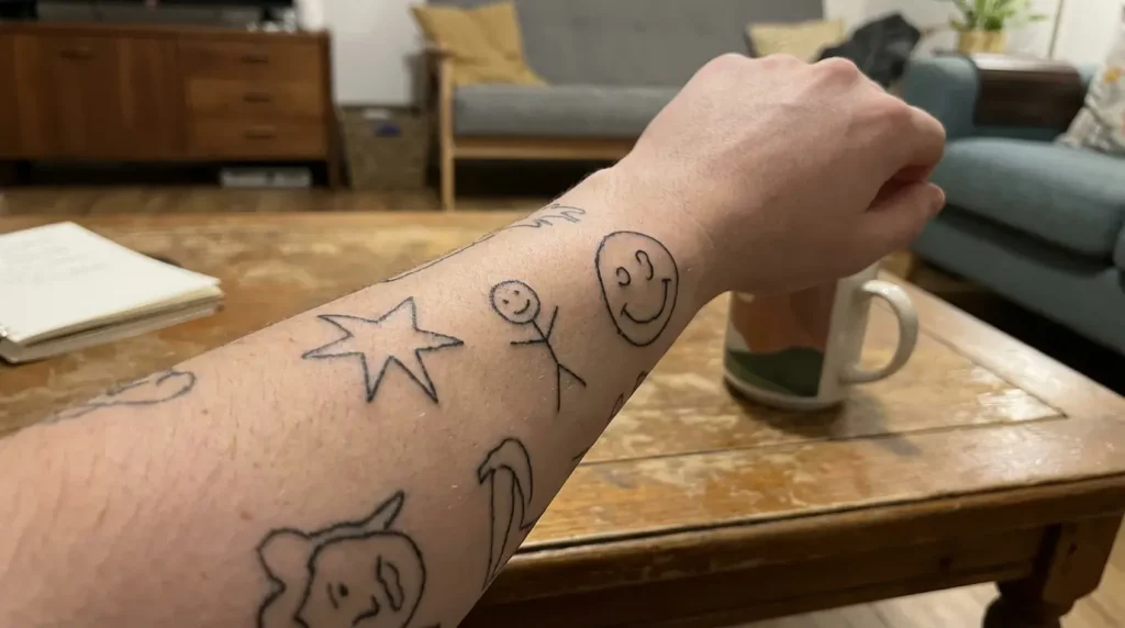
Stick Figures With Soul
Basic visual elements we all learned to draw as kids carry surprising emotional weight when translated into permanent ink.
These designs tap into universal visual language that everyone recognizes instantly. You’re not distracted by shading techniques or realistic proportions because there aren’t any. The wobbliness and imperfection make them feel personal rather than generic.
Stick figures and simple shapes strip away everything except the core idea. We’ve all doodled these exact images mindlessly throughout our lives, but when permanently inked, they transform into statements about embracing simplicity. These aren’t random scribbles. They’re carefully considered compositions that use minimal elements to maximum effect.
1. The Classic Smiley Face
The smiley face might be the most recognizable symbol on earth, but rendering it with deliberate imperfection changes everything.
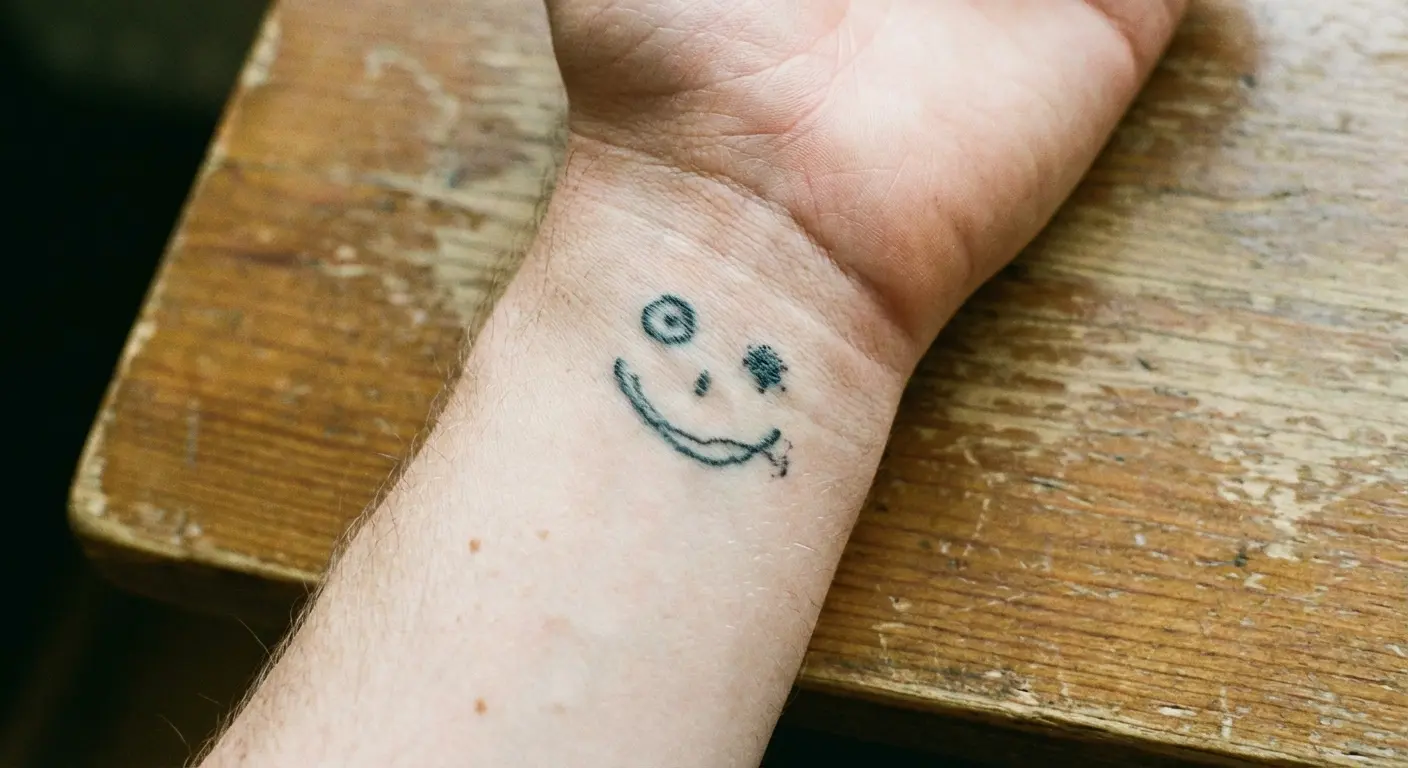
You’re looking at a circle that’s not quite round, dots for eyes that don’t match in size, and a smile that curves unevenly. This imperfection makes it feel hand-drawn in the moment rather than traced from a template. The beauty lies in how the wonky proportions create character that a perfect circle and symmetrical features never could.
When placed on a wrist or ankle, it reads as both ironic and genuine. It acknowledges that happiness isn’t perfect or symmetrical either.
The line weight varies naturally, thick in some spots and thin in others, which happens when you draw quickly without overthinking. This captures the energy of doodling a smiley during a boring meeting, that spontaneous gesture now permanently preserved. The simplicity means it reads clearly at any size, from fingers to forearms.
2. Wobbly Heart Outline
Hearts are tattooed thousands of times daily, but this version rejects the smooth curves and perfect symmetry you’d see in traditional work.
One side bulges slightly larger than the other. The point at the bottom veers left instead of centering perfectly. These “flaws” make it feel more authentic because real emotions aren’t balanced or tidy. You’ve probably drawn this exact heart in margins throughout your life, never measuring or planning, just letting your hand create the shape from muscle memory.
The outline wavers slightly, showing the human hand behind it rather than the steady precision of a skilled artist. Unlike the precise symmetry found in heart tattoo designs from traditional styles, this wobbly outline celebrates asymmetry. The wobbliness doesn’t diminish the symbol’s meaning. If anything, it enhances it by admitting that love itself is imperfect and unsteady.
3. Kindergarten Sun
Circle in the center, straight lines radiating outward. You know this image.
The rays don’t space evenly around the circle. Some stick out longer than others. Maybe one or two curve slightly instead of going perfectly straight. The center circle isn’t quite circular, more of an organic blob that suggests roundness without achieving it.
This works because it taps into something primal in our visual memory. We all drew suns this way before anyone taught us about proper shading or realistic light representation. Getting this tattooed is preserving that innocent, pre-art-class way of seeing the world.
The simplicity also means it reads clearly from any distance, and the wonky execution prevents it from looking like generic flash everyone else has. This has become one of the most popular choices because it’s immediately recognizable yet feels deeply personal.
4. Stick Figure Self-Portrait
Taking the stick figure concept and making it personal creates something unexpectedly meaningful.
You’re getting a representation of yourself that’s circles and lines, but you add one identifying detail: glasses, a specific hairstyle, or a piece of clothing rendered just as simply. The proportions don’t matter. The head might be too large for the body, or the arms could extend at weird angles. What matters is the gesture toward self-representation using the most basic visual vocabulary possible.
This becomes a statement about not taking yourself too seriously while still claiming space on your own body. The rough execution prevents it from reading as narcissistic, it’s too humble and silly for that. When someone asks about your tattoo, you can just say “that’s me” and let them absorb the humor and honesty of reducing yourself to essential lines.
|
Small Tattoo Ideas |
Typical Placement |
Why It Works |
|---|---|---|
|
Stick figures or cartoons |
Fingers, ankles, behind ear |
Minimal space needed, maximum personality |
|
Wine glass |
Wrist, forearm |
Relatable everyday object, instantly recognizable |
|
Smiley faces |
Anywhere visible |
Universal symbol, works at tiny scale |
|
Dogs like dobermans |
Calf, upper arm |
Simple silhouette reads clearly |
|
Knives or daggers |
Hand, forearm |
Bold shape, traditional subject with casual execution |
5. Crooked Star
Five-pointed stars are deceptively hard to draw freehand, which is exactly why this version works so well.
The points don’t align properly. One is noticeably longer or shorter than the others. The angles where lines meet don’t quite connect cleanly, leaving small gaps or overlaps. This creates a star that clearly represents the symbol but refuses to conform to geometric precision.
The wonkiness makes it feel hand-drawn rather than stenciled, which adds personality that a perfect star lacks entirely. You might place this on your hand or behind your ear, somewhere visible where its simplicity becomes a statement.
While star tattoo designs traditionally emphasize geometric precision, the crooked version embraces imperfection. The design acknowledges that trying to draw a perfect star without tools or guidelines results in this exact kind of charming failure, and that failure is worth celebrating rather than correcting.
6. Simple House Sketch
Square base, triangle roof, maybe a door and window. Everyone’s drawn this.
In this form, the walls aren’t perfectly vertical. The roof triangle sits slightly askew on top of the square. The door and window are just rectangles placed without careful measurement, possibly different sizes when they should match.
This creates a house that’s clearly a house but feels like it was sketched from memory rather than observed from life. The imperfection makes it more emotionally resonant because it represents the idea of home rather than any specific building. You’re not getting architectural accuracy, you’re getting the feeling of home reduced to its most basic visual components.
The rough lines suggest warmth and personality that a technically perfect rendering would sterilize away completely. These tend to hold deep personal meaning, often representing childhood homes or the concept of belonging.
7. Balloon Dog
Balloon animals translate surprisingly well to this style because they’re already simplified forms.
Your tattoo shows a dog made of connected ovals and circles, with the proportions slightly off and the connections between segments not quite smooth. The tail might be too long or too short. The legs could be uneven lengths. These imperfections mirror how actual balloon animals never look quite right either, they’re always a bit wonky and temporary.
Getting this as a permanent tattoo creates an interesting tension between the ephemeral nature of balloon art and the permanence of ink. The rough execution emphasizes the playful, temporary feeling even though it’ll be on your skin forever.
The design works because it doesn’t try to make the balloon dog look more sophisticated than it is, it celebrates the goofy simplicity of the concept. This has become one of our favorite examples of how these tattoos can be simultaneously humorous and meaningful.
Everyday Objects That Shouldn’t Work (But Do)
Objects we interact with daily but rarely consider as tattoo subjects gain unexpected depth when rendered with careless energy.
These aren’t photorealistic representations or stylized illustrations. They’re quick sketches that capture the essence of an object without fussing over details. What makes them effective is how the rough execution suits the subject matter better than technical perfection would.
A wonky coffee cup feels more relatable than a perfectly rendered one because that’s how we perceive these objects in daily life, as functional things we barely notice. The approach strips away pretension and presents these items as they exist in our mental shorthand rather than in precise reality.
8. Coffee Cup Doodle
Coffee cups are so ordinary they’re almost invisible, which makes them fascinating tattoo subjects.
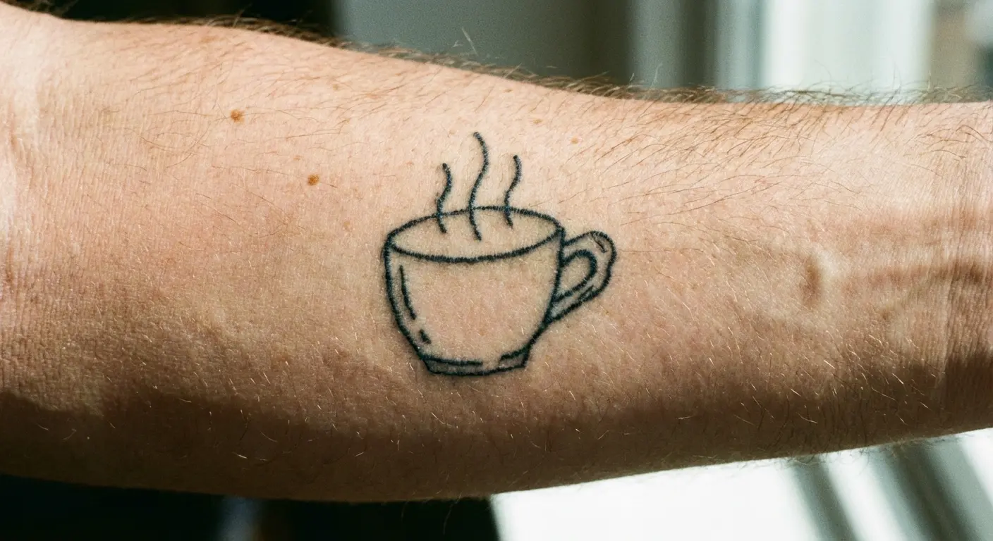
Your design shows a simple cup shape, maybe with a handle that attaches at a weird angle. The rim might be an oval that’s not quite symmetrical. Perhaps there are three wavy lines above it suggesting steam, each line a different length and curve.
The proportions don’t match any real cup, but everyone instantly recognizes what it represents. This works for people who’ve spent countless hours in cafes or who need coffee to function (which is most of us). The rough execution prevents it from being precious or pretentious.
We’re just putting a cup on skin, drawn quickly, permanently inked. That casualness is the entire point, taking something utterly mundane and giving it permanent space on your body without dressing it up or making it more important than it is.
9. Bent Cigarette
Cigarettes carry cultural weight as symbols of rebellion, vice, or vintage cool, but this approach strips away that baggage.
You’re getting a simple cylinder with a filter end (maybe colored differently or just separated by a line) and possibly some smoke squiggles rising from the lit end. The cigarette itself might bend or curve slightly instead of being perfectly straight. The smoke doesn’t follow any realistic physics, just random curvy lines that suggest upward movement.
This design works whether you smoke or not because it’s become such a loaded cultural symbol. The rough execution keeps it from looking like you’re trying too hard to seem edgy or cool. We’re just showing a quick sketch of a cigarette, which somehow makes it more honest than a technically perfect version that would feel like a statement requiring justification.
These have become increasingly popular as the symbol itself becomes more nostalgic and less contemporary.
10. Squiggly Snake
Snakes are traditional tattoo subjects, but this form transforms them into something entirely different from the detailed serpents you’d see in Japanese or American traditional work.
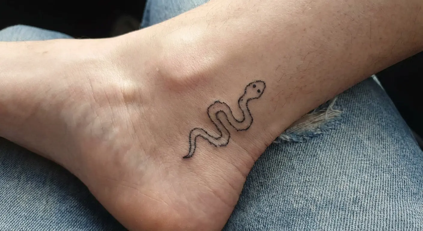
Your snake is just a wavy line, maybe with a simple triangle or oval for a head and a pointed tail. The curves don’t follow any natural snake movement, they’re just random squiggles that read as snake-like. Perhaps there are two dots for eyes and a line for a mouth, all placed somewhat carelessly.
The thickness of the line might vary unintentionally as it winds. This simplification removes all the threat or symbolism usually associated with snake tattoos. You’re left with something that’s almost cute in its crudeness, a snake that couldn’t intimidate anyone because it looks like it was drawn by someone who’s never seen one, just heard them described.
11. Lopsided Mushroom
Mushrooms have become trendy tattoo subjects, but this version rejects the detailed gills and careful shading you’d see in botanical illustrations.
You’re getting a simple dome shape for the cap sitting on a cylindrical stem, with the proportions slightly off. The cap overhangs too far on one side. The stem is thicker at the top than the bottom, or curves slightly when it should be straight. Maybe there are a few spots on the cap, just circles placed randomly without pattern.
This taps into the current fascination with mushrooms (both culinary and psychedelic) without being too obvious about which interpretation you mean. The wonky execution makes it feel more like a field sketch than a scientific illustration, which suits the natural subject matter.
The imperfection suggests organic growth rather than human precision. These resonate particularly well with people who appreciate the outdoors or foraging culture.
12. Wonky Flower
Flowers are probably the most common tattoo subject across all styles, but these versions reject everything that makes traditional floral tattoos appealing.
Your flower has a center circle with petals radiating outward, but the petals are different sizes and shapes. They don’t space evenly around the center. Some might be rounder while others are more pointed. The stem goes down at a slight angle instead of straight vertical, with maybe one or two leaves attached at random points.
The leaves don’t match each other in size or shape. This creates a flower that’s clearly a flower but couldn’t exist in nature with these proportions and asymmetry. The charm lies in how it looks like a child’s drawing, capturing the platonic ideal of “flower” rather than any specific species.
That universality makes it more emotionally accessible than a technically perfect rose or lily. These work beautifully as small pieces on fingers or wrists, where their simplicity becomes a strength rather than a limitation.
13. Melting Candle
Candles offer interesting visual possibilities because they’re already about transformation and impermanence.
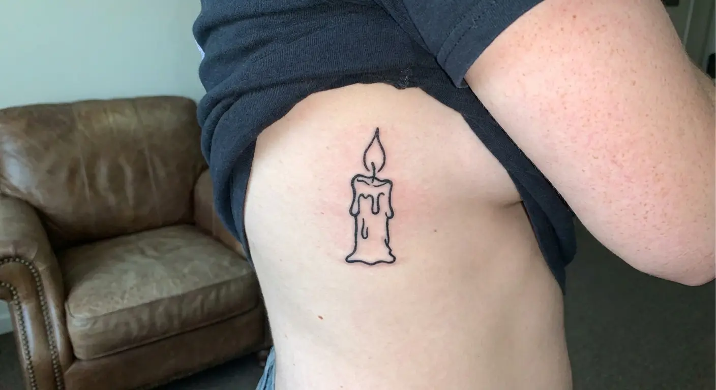
Your candle is a simple rectangle or cylinder with a flame on top, but the sides might not be parallel. The flame is just a teardrop shape, maybe with a smaller shape inside suggesting the wick. The interesting part is the drips: wavy lines running down the sides at irregular intervals and lengths.
These drips don’t follow physics or gravity consistently, they’re just squiggly lines that suggest melting wax. The rough execution emphasizes the temporary nature of candles, they exist to be consumed and destroyed. Getting this as a permanent tattoo creates that same tension we saw with the balloon dog: something temporary and changing, frozen in ink forever.
The wonky lines make it feel more authentic than a carefully rendered candle would. These carry particular meaning for people dealing with grief or change, the dripping suggesting emotion that can’t be contained within clean lines.
14. Scribbled Lightning Bolt
Lightning bolts are powerful symbols that appear across tattoo styles from traditional to geometric, but this version reduces them to pure energy.
You’re getting a zigzag line, probably with uneven angles and segments of different lengths. The lines might not connect perfectly at each point, leaving small gaps or overlaps. There’s no shading or dimension, just the flat outline of the bolt shape.
This simplification makes it more effective as a symbol because it’s immediately readable and doesn’t compete for attention with complex details. The rough execution suggests electricity’s chaotic nature better than a perfectly geometric version could.
You might place this on your finger or behind your ear, somewhere that its small size and simple shape work perfectly. The design proves that sometimes the most basic version of a symbol carries the most impact.
These have become particularly popular as matching pieces between friends or partners, the shared imperfection creating connection.
Words and Phrases That Embrace the Mess
Text tattoos are incredibly common, but this approach to lettering is completely different than traditional script or font-based designs.
We’re talking about handwriting that doesn’t try to be beautiful, words that look like they were scrawled quickly without planning or measuring. The letters might slant different directions, vary in size, or connect awkwardly. When words look hand-scrawled rather than typeset, they feel more personal and immediate, like you wrote them yourself in the moment.
The rough execution makes these more emotionally honest than perfectly executed lettering. The key is making the messiness feel intentional rather than accidental, which requires understanding composition even while deliberately breaking rules.
According to Collater.al’s coverage of artist Woozy Machine, many of these tattoos now “represent tattoo artists or people who have decided to get tattooed, all accompanied by short phrases” like “Excuse me, Sir. Is this your tattoo?” This trend shows how the movement has become sophisticated enough to comment on its own existence while maintaining its deliberately crude aesthetic.
15. Hand-Scrawled “Whatever”
Single-word tattoos need to carry weight, and “whatever” in messy handwriting perfectly captures apathetic defiance.
The letters don’t line up on an invisible baseline. Some tilt forward while others lean back. The ‘e’s are different sizes, and the ‘v’ is wider or narrower than it should be. This isn’t calligraphy or a carefully chosen font, it’s how you’d write the word quickly in a notebook margin.
The rough execution reinforces the word’s meaning because “whatever” is inherently about not caring too much. Making it look too polished would contradict the sentiment entirely. You’re getting a word that dismisses perfectionism through its own imperfect execution.
The placement matters too: on your wrist or forearm, this becomes a visible reminder not to sweat the small stuff, delivered in handwriting that clearly didn’t sweat its own execution. These resonate particularly well with people recovering from anxiety or perfectionism, the messy lettering serving as permission to let go.
16. Misspelled Word (Intentionally)
Deliberately misspelling a word and tattooing it permanently might sound insane, but it works because the mistake becomes the point.
You might get “beautifull” with an extra ‘l’ or “tommorow” with two m’s. The misspelling has to be obvious enough that people recognize it’s wrong but common enough that it feels human rather than random.
This creates an interesting reaction: people notice the error and have to decide if it’s intentional or not. The rough handwriting style supports the misspelling, making it clear that perfection was never the goal. This becomes a statement about embracing flaws and mistakes as part of your identity rather than something to hide or fix.
It’s provocative without being aggressive, and it separates people who get the joke from those who just see an error. The wonky lettering makes the whole thing feel cohesive rather than like a mistake you’re stuck with. These represent some of the most daring pieces we’ve seen, requiring real confidence to wear permanently.
17. Chicken Scratch Quote
Taking a meaningful quote and rendering it in barely legible handwriting seems counterintuitive, but it works because the rough execution makes the words feel more personal.
You might choose a short phrase like “this too shall pass” or “not all who wander” and have it written in scratchy, inconsistent handwriting that’s just barely readable. The letters crowd together in some spots and space out awkwardly in others. Some words might slant upward while others drift down.
This makes the quote feel like something you scribbled for yourself rather than a polished statement for others to read and admire. The difficulty in reading it means people have to look closer and engage more actively with your tattoo.
The rough handwriting also prevents the quote from feeling too precious or self-important, which is a constant risk with text tattoos. You’re wearing words that matter to you, but you’re not making them easy or pretty for anyone else. This approach to text has become increasingly popular as people seek more personal alternatives to standard script fonts.
18. Drippy Letter Design
Adding drips to letters creates a melting or bleeding effect that works perfectly because the drips don’t need to be technically accurate.
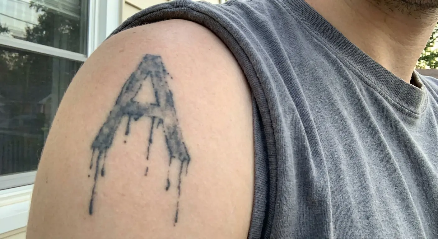
You might get a single letter (your initial or someone else’s) with drip lines extending downward from various points. These drips are just wavy or straight lines of different lengths, not carefully rendered to look like liquid. Some might be thick while others are thin.
They don’t all start from logical points like the bottom of the letter, they might drip from the middle of a stroke or from random spots. This creates a letter that feels like it’s dissolving or transforming, which adds emotional weight to what could otherwise be a simple initial.
The rough execution of both the letter and the drips makes the whole design feel organic and spontaneous rather than planned and measured. These work particularly well as memorial pieces or representations of relationships, the dripping suggesting emotion or change that can’t be contained within clean lines.
19. Childlike Handwriting Message
Writing a short message in handwriting that mimics how kids write creates something unexpectedly touching.
You might get “love you” or “be nice” in letters that are carefully formed but clearly inexperienced, the way a seven-year-old writes when they’re trying their best. The letters are blocky and uneven. Some are too large while others are too small. The spacing is inconsistent, and the baseline wanders up and down.
This works because it taps into the sincerity and honesty we associate with childhood before self-consciousness sets in. The message becomes more emotionally direct because the execution is so unpretentious and vulnerable.
You’re not trying to impress anyone with beautiful handwriting or profound words. You’re just putting a simple message on your skin in the most humble way possible. The childlike quality makes even common phrases feel fresh because they’re stripped of the cynicism and irony that usually accompanies adult communication.
These often serve as reminders of simpler times or connections to children in people’s lives, the innocent handwriting preserving something pure.
Before you commit to permanent wonkiness, maybe test it out. Tools like Tattoo Generator IQ let you describe the exact kind of wonky, hand-drawn aesthetic you want and generate variations that show how different levels of “imperfection” read visually. This helps you find the sweet spot where the design looks intentionally rough rather than accidentally bad, which is crucial for this work to succeed.
This is particularly helpful for text-based designs where the line between charmingly messy and genuinely illegible can be thin. The flash options let you experiment with placement and sizing to ensure your deliberately imperfect design translates well to your chosen body location.
Final Thoughts
Your tattoo artist spent a decade learning to draw perfect lines. And you’re about to ask them to draw like a kid with a crayon.
The look on their face will tell you everything you need to know about whether they understand this style or not.
These tattoos challenge everything we’ve been taught about what makes art valuable or tattoos worth getting. The movement proves that technical mastery isn’t the only path to meaningful body art. Sometimes the most powerful designs come from embracing wobbles, asymmetry, and the human imperfection that traditional tattooing works so hard to eliminate.
Whether you’re drawn to the deliberately crude aesthetic or prefer exploring fineline tattoo precision, understanding different approaches helps you choose what resonates most. This movement has evolved from a niche rebellion into a legitimate artistic force that’s changed how people think about permanent body art.
The 19 examples we’ve covered represent just a fraction of what’s possible within this style. From stick figures with surprising emotional depth to everyday objects rendered with charming wonkiness to text that celebrates messy handwriting as art, these designs prove that “bad” drawing can be incredibly good when executed with intention and understanding.
What makes them work isn’t the absence of skill but the presence of confidence. You’re choosing to wear something that looks unfinished or crude by conventional standards, and that choice says something about your relationship with perfection and authenticity.
These age differently than technical work too. The rough edges can’t really get rougher, so they kind of stay the same while everything else on your body changes. I’m not sure if that’s good or bad, but it’s different.
If you’re considering one of these, spend time understanding what makes certain imperfections charming versus what makes them genuinely poorly executed. Find an artist who understands the philosophy rather than someone who’ll just copy your doodle without considering composition or placement.
The best pieces look effortless but require careful thought about what makes “bad” drawing feel intentional. Not every wobbly line is intentional. Some artists hide behind this style when they just can’t draw. The difference between charming and just bad? Harder to define than you’d think.
These designs aren’t for everyone, and that’s part of their appeal. They divide opinion, spark conversation, and refuse to apologize for rejecting polish in favor of rawness. In a world that increasingly values authenticity over perfection, they offer a way to wear your imperfections proudly, permanently, and without explanation.