
22 Lighthouse Tattoos That Capture the Symbolism Most Designs Miss

Table of Contents
-
Beacons of Personal Guidance
-
Storm-Weathered Lighthouse with Crashing Waves
-
Lighthouse Beam Cutting Through Fog
-
Twin Lighthouses Representing Duality
-
Lighthouse on Rocky Cliff Edge
-
Lighthouse with North Star Alignment
-
Abandoned Lighthouse Reclaimed by Nature
-
Lighthouse Keeper’s Silhouette in Window
-
Lighthouse with Ship’s Wheel Integration
-
-
Architectural & Stylistic Interpretations
-
American Traditional Bold-Line Lighthouse
-
Blackwork Geometric Lighthouse Structure
-
Realistic Brick-by-Brick Detail Work
-
Art Deco Streamlined Lighthouse Design
-
Celtic Knotwork Lighthouse Tower
-
Watercolor Splash Lighthouse Silhouette
-
Dotwork Stippled Lighthouse Portrait
-
Neo-Traditional Lighthouse with Ornamental Frame
-
-
Narrative & Scene-Based Compositions
-
Lighthouse at Dawn with Rising Sun
-
Stormy Night Scene with Lightning Strike
-
Lighthouse Reflected in Calm Waters
-
Seasonal Lighthouse (Winter Snow-Capped)
-
Lighthouse with Maritime Flora and Fauna
-
Coordinates and Lighthouse Combination
-
TL;DR
-
Storm vs. calm water completely changes the meaning, so choose carefully
-
Forearm placement is popular for a reason (visible, points forward, actually looks good)
-
Realistic styles need brick-by-brick precision and a patient artist with a big canvas
-
Black and white designs emphasize that light/darkness contrast without distraction
-
Weathered vs. pristine tells different stories about your resilience
-
Scene-based stuff lets you capture that specific moment when everything changed
-
Your lighthouse’s condition matters more than you think
-
Sketch phase is crucial for architectural accuracy, don’t skip it
Beacons of Personal Guidance
Look, most lighthouse tattoos miss the entire point. People slap them on because they look cool, but the best ones? They’re about that specific moment when everything finally made sense. When someone or something helped you find your way through absolute chaos.
Lighthouse tattoos have gotten crazy popular lately, but here’s what I’ve noticed after looking at hundreds of them: the ones that actually resonate aren’t about “I like the ocean.” They’re about “this is how I found my path forward.” Big difference.
First up: designs where the guidance thing isn’t subtle. It’s the whole damn point.
The Pharos of Alexandria was basically the OG lighthouse, built under Ptolemy II in the 3rd century BC and standing at about 130 meters tall. One of the tallest structures of its time, according to Certified Tattoo Studios. That ancient structure guided countless ships to safety, and modern lighthouse designs continue that tradition.
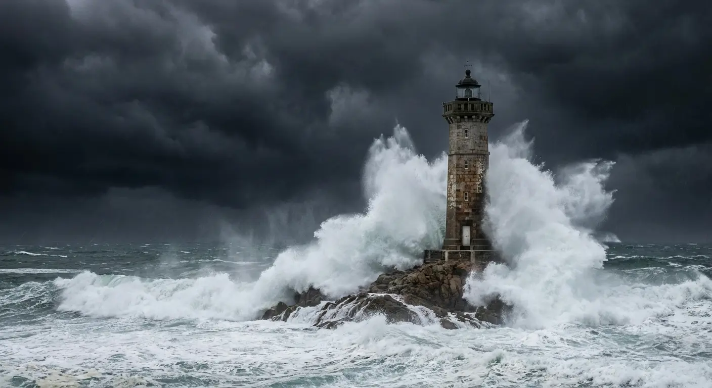
1. Storm-Weathered Lighthouse with Crashing Waves
You’ve seen calm lighthouse tattoos everywhere. They’re pretty, sure, but they completely miss the point.
Here’s the thing about storms: that’s when lighthouses actually matter. Clear day? Who cares. But when waves are trying to rip the thing off its foundation and the beam’s still cutting through? That’s the whole point right there.
This design captures that truth by showing violent waves battering the structure while its beam stays steady. The weathering on the tower (cracked paint, worn stones, rust on the railings) shows it’s been through hell but still works. We’re talking about resilience that’s earned, not assumed.
The wave composition matters here. You want them dynamic enough to show real threat without burying the lighthouse itself. I’ve watched artists struggle with this balance for hours because getting that “about to crash” movement while keeping the lighthouse stable is stupidly hard.
Forearm placement kills for this because you can orient the lighthouse vertically along your arm’s natural line, with waves wrapping around. The realistic approach serves this best since you need that textural contrast between smooth water, rough stone, and piercing light.
|
Storm Element |
Symbolic Meaning |
Technical Consideration |
|---|---|---|
|
Crashing Waves |
Overwhelming challenges, life’s chaos |
Dynamic shading to show movement (not easy) |
|
Weathered Tower |
Earned resilience, battle scars |
Detail work on cracks, rust, worn surfaces takes time |
|
Steady Beam |
Unwavering purpose despite adversity |
High contrast between light and darkness |
|
Dark Clouds |
Uncertainty, approaching difficulty |
Gradient work to create atmospheric depth |
|
Spray/Mist |
Confusion, obscured vision |
Negative space and soft shading techniques |
2. Lighthouse Beam Cutting Through Fog
Fog’s weird. It’s not dramatic like a storm. It just… confuses everything. Makes the familiar feel dangerous.
This design shows the beam as the primary focus, rendered as strong rays that punch through thick fog banks. You’re emphasizing the light itself, not the structure. The fog gives your artist room to play with negative space and gradients in ways that solid backgrounds don’t allow.
Black and white? Perfect choice here because you’re working entirely with value shifts rather than color. The beam should have that volumetric quality where you can see the light scattering through moisture in the air. Some people add subtle elements half-hidden in the fog (distant rocks, other vessels, shoreline hints) to reinforce that sense of hidden dangers the lighthouse helps you avoid.
When planning your design, consider how small tattoo ideas can work with atmospheric fog elements to create impact even in compact spaces. This reads as more introspective than the storm version. You’re not showcasing survival through dramatic conflict but rather clarity in moments of uncertainty.
It becomes a beacon of hope when everything around you feels obscured and uncertain.
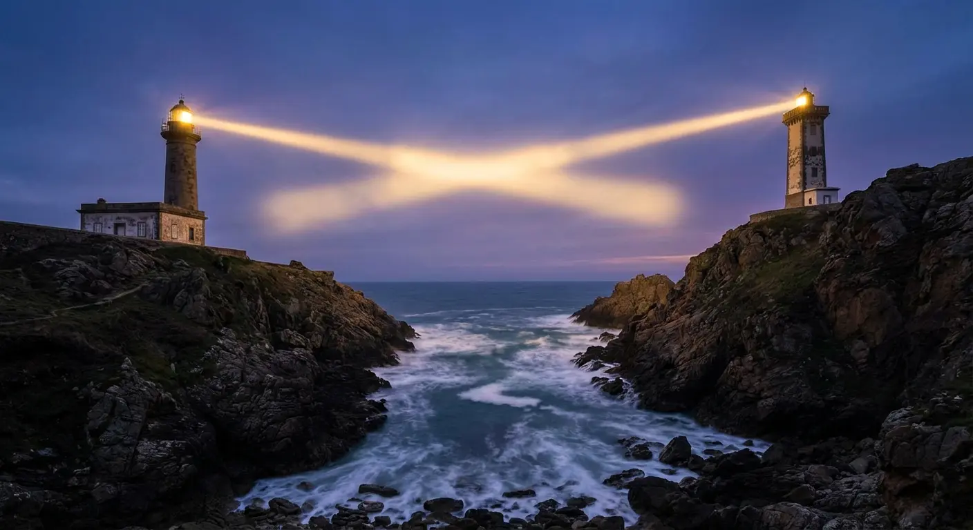
3. Twin Lighthouses Representing Duality
Twin lighthouses. I’ve seen maybe three of these in ten years, which is honestly a shame because the concept’s solid.
This acknowledges that we’re rarely guided by a single influence or principle. Maybe you’ve got two people who shaped your direction, or you’re honoring the balance between two aspects of yourself. The lighthouses can be identical (equal importance) or different in style, height, or condition (contrasting influences).
Their beams might cross, creating an X pattern that marks a specific point of convergence, or they might shine in opposite directions, protecting different approaches to the same shore. The space between the towers becomes symbolically loaded. You can fill it with ocean, sky, or leave it deliberately empty to emphasize the separation.
My friend got twin lighthouses for her parents (both died within a year of each other, both kept her from completely falling apart in different ways). One’s pristine, one’s weathered. You get it.
This works across multiple styles but benefits from symmetrical composition planning. Your artist needs to ensure both structures get equal visual weight unless you specifically want one dominant and one supporting.
4. Lighthouse on Rocky Cliff Edge
Placement tells a story. A lighthouse on a gentle beach suggests easy access and calm waters. A lighthouse perched on a dramatic cliff edge, barely maintaining its position above crashing surf far below? Something entirely different.
You’re depicting precarious stability, the idea that guidance itself requires courage and risk. The cliff composition allows you to play with vertical drama, especially effective on forearm or outer arm placements where it can follow your limb’s length.
The rocks should look genuinely threatening, with sharp edges and unstable formations that make you wonder how the lighthouse hasn’t toppled yet. Some designs include a narrow stairway carved into the cliff face, adding human determination to reach that guiding light despite obvious danger.
Realistic rendering because you need that geological detail to sell the precariousness. The color palette (if you’re not going black and white) should emphasize the harshness: grey stone, dark water, maybe stormy skies to reinforce the hostile environment.
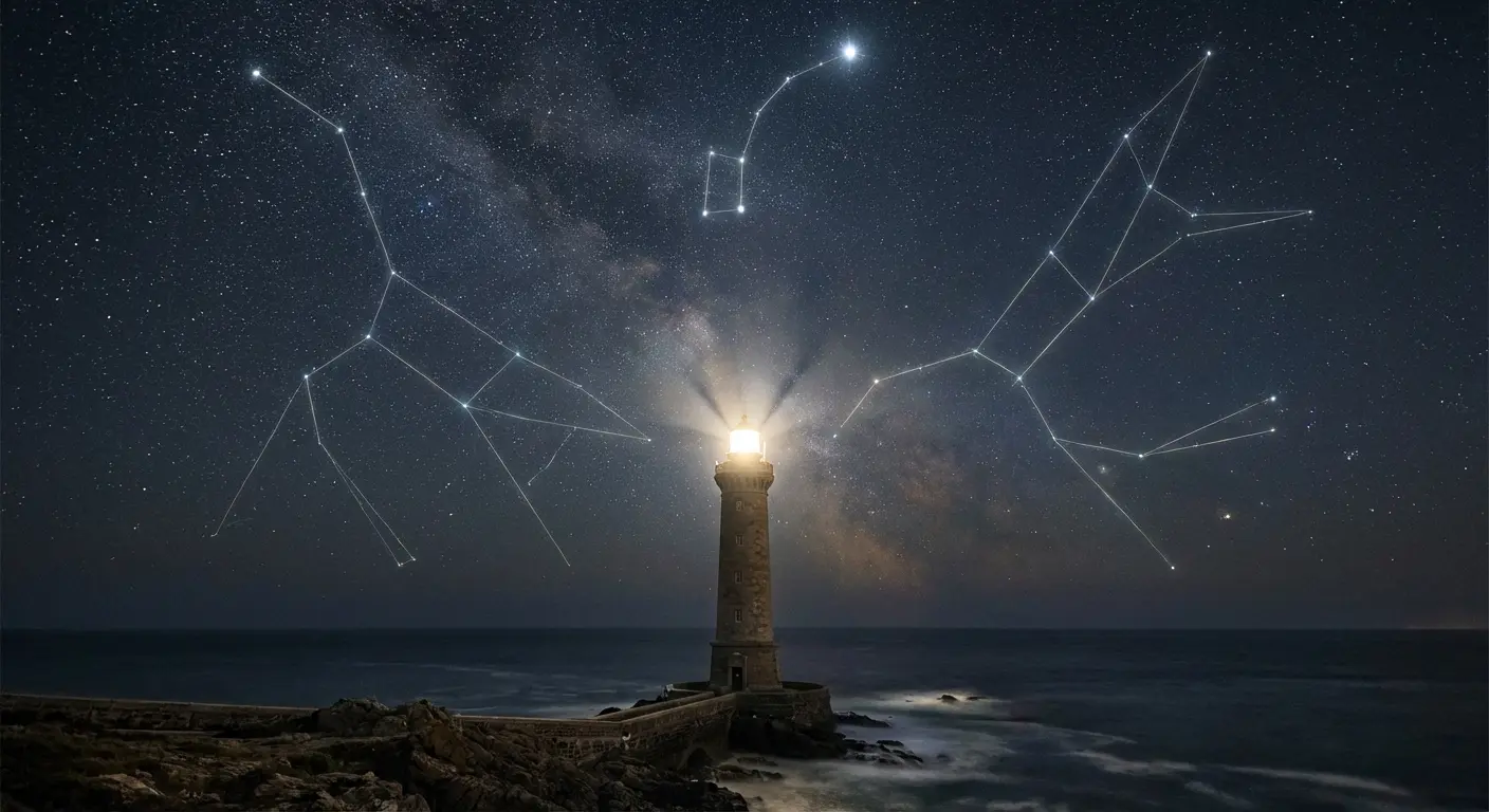
5. Lighthouse with North Star Alignment
This layers navigation systems by positioning the North Star directly above the lighthouse in perfect vertical alignment.
You’re combining celestial and terrestrial guidance, ancient and modern wayfinding. The composition creates a strong central axis. Other stars can populate the sky, but the North Star should be distinctly brighter or larger, possibly with subtle rays extending from it.
Some variations include constellation lines connecting to the North Star, or a compass rose integrated at the base. This works well when you want to honor both traditional wisdom and structured systems. The North Star represents unchanging truth while the lighthouse represents human effort to illuminate that truth for others.
Yeah, this gets philosophical fast in ways that pure lighthouse designs don’t quite reach. The style can flex between traditional (with bold star shapes) and realistic (with accurate astronomical rendering), depending on whether you want iconic or authentic.
6. Abandoned Lighthouse Reclaimed by Nature
Sometimes the lighthouse needs to be dead. Sounds dark, but hear me out.
An abandoned lighthouse with vines crawling up its sides, birds nesting in broken windows, and wildflowers growing from cracks in the foundation tells a story about guidance that served its purpose and passed. The light is dark. The paint is peeling. Nature is taking back what humans built.
This resonates if you’ve moved beyond needing the guidance that once saved you, or if you’re honoring someone whose influence shaped you but is no longer present. The decay should look organic, not tragic. This isn’t about destruction but transformation.
Your artist can incorporate specific plants that hold meaning for you, turning the piece into a memorial or marker of personal growth. The style here benefits from realistic detail because you need that texture of aged wood, rusted metal, and living plants interweaving. Some people add a sunrise or sunset behind the structure, suggesting that even without its light, the lighthouse still marks something important.
7. Lighthouse Keeper’s Silhouette in Window
Why does everyone forget about the lighthouse keeper? There’s literally a person in there keeping the thing running.
Adding a silhouette in the lighthouse window changes the entire meaning from abstract symbol to personal commitment. You’re acknowledging that guidance requires a guide, that light doesn’t maintain itself. The keeper can be historically accurate (period clothing, lantern in hand) or contemporary, even stylized to represent a specific person.
The silhouette approach works better than detailed portraiture because it maintains the design’s graphic strength while adding human presence. You can position the keeper looking outward (watching for ships in need) or tending the light mechanism (maintaining the guidance system).
This detail transforms the piece from “I value guidance” to “I value the work of providing guidance” or “I honor someone who guided me.” It’s a subtle shift that completely reframes the symbolism. Pairs especially well with traditional or neo-traditional approaches where silhouettes have strong visual impact.
8. Lighthouse with Ship’s Wheel Integration
Combining a lighthouse with a ship’s wheel creates interesting symbolic tension. The lighthouse guides, but the wheel steers.
You’re depicting both the external guidance you receive and your own agency in following (or ignoring) that guidance. The wheel can be positioned behind the lighthouse as a framing element, at its base as a foundation, or even integrated into the lighthouse structure itself (replacing a level of the tower or serving as the light housing).
If you’re in a position where you both seek guidance and provide it to others, you’ll get this. The wheel adds nautical context without resorting to generic anchor or compass additions. You can customize the wheel’s spoke count or add specific details (rope wrapping, weathering, initials carved into handles) to personalize it further.
American traditional style embraces this combination naturally since both elements fit the maritime vocabulary, but realistic approaches can emphasize the mechanical beauty of an actual ship’s wheel alongside architectural lighthouse detail.
Architectural & Stylistic Interpretations
Okay, switching gears. Some people care more about the architecture than the symbolism, and honestly? Valid.
Lighthouses are buildings first, symbols second. You might be drawn to the geometric precision of these structures, the way they’re engineered to withstand impossible conditions, or simply the aesthetic beauty of their forms.
Now we’re exploring how different tattoo styles transform the same subject into completely different visual experiences.
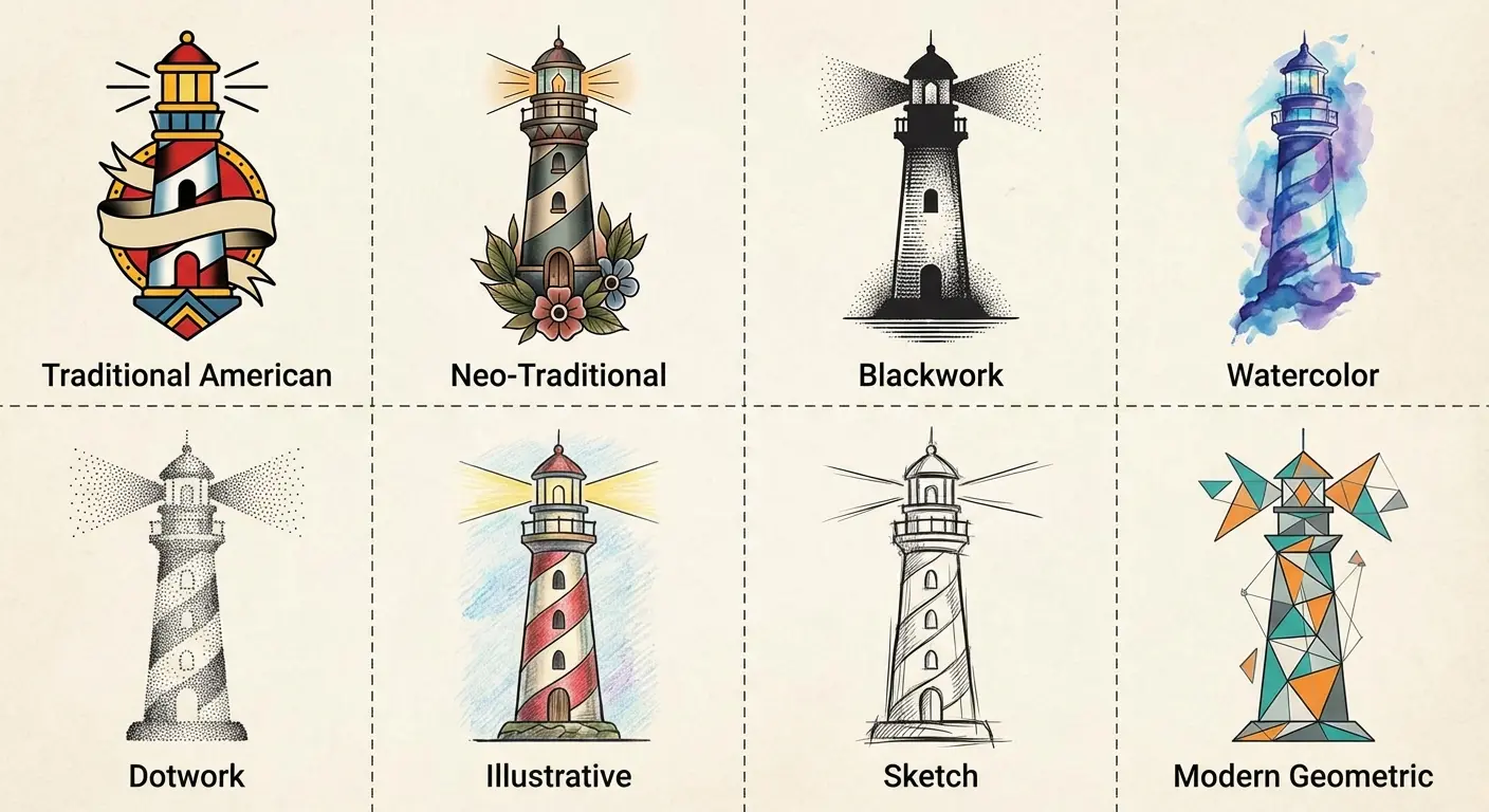
|
Tattoo Style |
Best For |
Technical Requirements |
Aging Characteristics |
|---|---|---|---|
|
American Traditional |
Bold, timeless aesthetic |
Thick outlines, limited color palette |
Ages like iron, lines hold forever |
|
Blackwork Geometric |
Modern, abstract interpretation |
Precise geometric construction |
High contrast maintains clarity |
|
Photorealistic |
Architectural accuracy |
Brick-by-brick detail, proper shading |
Needs larger canvas, may soften over time |
|
Art Deco |
Elegant, vintage sophistication |
Clean lines, symmetrical ornamentation |
Sharp details need skilled execution |
|
Celtic Knotwork |
Cultural connection, endless patterns |
Understanding of traditional knotwork rules |
Intricate areas may blur without spacing |
|
Watercolor |
Artistic, emotional expression |
Color saturation techniques |
Fades faster, needs touch-ups |
|
Dotwork/Stippling |
Textured, engraved quality |
Individual dot placement, patience |
Unique texture maintains visual interest |
|
Neo-Traditional |
Balance of classic and contemporary |
Traditional foundations with expanded palette |
Combines traditional durability with modern appeal |
9. American Traditional Bold-Line Lighthouse
American traditional style strips lighthouses down to their essential forms: thick black outlines, limited color palette (red, yellow, blue, green, black), solid fills, and minimal shading.
This isn’t about realism but about creating an iconic, instantly readable image. The lighthouse becomes a graphic element as recognizable as a rose or dagger. Traditional approach works brilliantly for lighthouses because these structures are already geometric and simple in form.
Your artist will emphasize the cylindrical tower with bold black bands, a simplified light housing at the top, and maybe a few waves or rocks at the base rendered in equally bold style. The limited shading (usually just black for shadows) creates strong contrast.
This ages exceptionally well since those thick lines hold their integrity over decades. You’re getting a tattoo that looks as solid and permanent as the lighthouse it depicts. Also pairs easily with other traditional maritime elements if you want to build a larger composition over time.
The bold aesthetic of old school tattoo techniques perfectly complements american traditional lighthouse designs, creating timeless pieces with exceptional longevity.
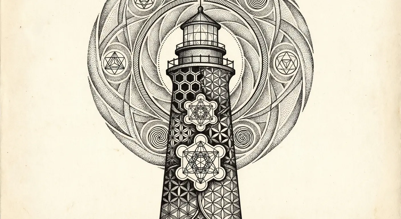
10. Blackwork Geometric Lighthouse Structure
Blackwork takes the lighthouse’s inherent geometry and pushes it into abstract territory.
You’re working entirely in black ink, often incorporating geometric patterns, sacred geometry, or architectural line work that emphasizes the lighthouse’s structure while stylizing it beyond realism. The tower might be rendered as a series of precise geometric shapes (hexagons, triangles, perfect circles) rather than organic stone.
Patterns can fill the negative space around the lighthouse or even comprise the lighthouse itself. This appeals to people who want something visually striking that reads as modern and artistic rather than traditional or nautical.
The precision required is intense. One shaky line in geometric work and the whole thing looks amateur. It’s unforgiving. Your artist needs a steady hand and strong understanding of geometric composition. Blackwork designs often incorporate mandala-like elements, dot work, or line work that extends beyond the lighthouse itself, creating a larger geometric field that the lighthouse anchors.
11. Realistic Brick-by-Brick Detail Work
Realistic lighthouse designs succeed or fail based on architectural accuracy. You’re committing to a design that requires your artist to render individual bricks or stones, mortar lines, weathering patterns, and structural details that make the lighthouse look touchable.
The light housing needs accurate metalwork, the windows need proper reflections or transparency, and the foundation needs geological accuracy. This demands significant skin real estate because you can’t show that level of detail in a tiny space.
Forearm pieces work well because you’ve got the length to show the full tower with proper proportions. The realistic approach also means considering light source carefully since the shading needs to be consistent and logical. Some designs include specific, actual lighthouses (Portland Head Light, Cape Hatteras, Peggy’s Cove) which adds personal connection if you’ve visited them.
Your artist needs reference photos and the technical skill to translate photographic detail into tattoo application. This isn’t a style for artists who specialize in other approaches.
Actor Josh Brolin recently made headlines when he debuted a massive lighthouse back tattoo featuring a lighthouse rising from waves with topless mermaids framing the scene and the ancient Greek word “aretê” (meaning fulfillment and virtue) between his shoulder blades, as reported by TMZ. The stunning art piece demonstrates the growing trend of large-scale, detailed lighthouse tattoos among those seeking meaningful body art.
Understanding tattoo meaning helps you choose realistic elements that align with your personal journey and the specific guidance you want to commemorate.
Side note: realistic brick-by-brick detail isn’t cheap. You’re looking at $200+/hour and multiple sessions. Just being real with you.
12. Art Deco Streamlined Lighthouse Design
Art Deco style transforms lighthouses into elegant, streamlined forms with emphasis on vertical lines, geometric ornamentation, and sophisticated symmetry.
You’re pulling from 1920s-30s design aesthetics, creating something that feels both vintage and timeless. The lighthouse tower gets rendered with clean, parallel lines suggesting fluting or architectural details typical of the era. The light housing might incorporate sunburst patterns or geometric rays.
The overall composition emphasizes height and elegance rather than ruggedness. This appeals to people who want maritime symbolism but prefer refined, sophisticated aesthetics over rough nautical imagery. The Art Deco approach pairs well with limited color palettes (black, gold, silver tones if you’re adding color) and benefits from precise line work similar to geometric blackwork but with more ornamental detail.
You can incorporate typical Art Deco elements (chevrons, stepped forms, or stylized waves that echo the period’s design language). This is less common than traditional or realistic approaches, which means your piece will stand out as something thoughtfully designed rather than pulled from standard flash.
13. Celtic Knotwork Lighthouse Tower
Celtic knotwork integration transforms the lighthouse tower itself into interwoven patterns, with the structure composed of continuous knots rather than solid stone.
If you’ve got Celtic heritage or connection to Irish, Scottish, or Welsh coastal regions known for their lighthouses, this makes sense. The knotwork can comprise the entire tower or accent specific sections, with the light housing remaining more recognizable to anchor the design.
The endless, interwoven nature of Celtic knots adds symbolism about eternal guidance or unbreakable connections to the lighthouse’s existing meaning. Your artist needs genuine understanding of Celtic knotwork construction. Celtic knots have actual rules (the over-under pattern can’t just be random or it looks wrong to anyone who knows). Poorly executed knotwork looks amateurish quickly.
Pure black or limited color in traditional Celtic palette (greens, blues). Some designs place a traditional lighthouse within a Celtic knot border rather than making the lighthouse itself from knots, which is less ambitious but still creates cultural connection.
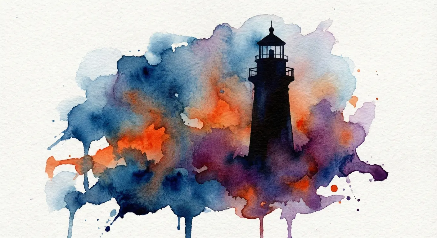
14. Watercolor Splash Lighthouse Silhouette
Watercolor technique in tattoos remains controversial. It ages differently than traditional approaches. But when executed well, it creates stunning visual impact.
This design renders the lighthouse as a solid black silhouette while surrounding it with watercolor splashes suggesting sky, sea, and light in loose, flowing color application. You’re getting the structural clarity of the silhouette with the emotional, atmospheric quality of watercolor.
The colors can be realistic (blues for water, yellows and oranges for light) or abstract (whatever palette resonates with you). The key is ensuring the silhouette remains strong and readable since it anchors the entire composition. The watercolor elements should enhance, not overwhelm.
You need an artist who specializes in watercolor tattoo technique since the application differs from traditional tattooing. Watercolor looks incredible fresh but I’m not gonna lie, it fades weird. You’ll need touch-ups. Some people are fine with that, others feel ripped off.
The black and white silhouette provides lasting structure even as colors shift, making this a hybrid approach that balances permanence with artistic fluidity.
15. Dotwork Stippled Lighthouse Portrait
Dotwork (stippling) creates images entirely through dots rather than lines or solid fills. Density and spacing of dots determines value and shading.
This technique produces lighthouses with a distinctive, almost etched or engraved quality. The texture appeals to people who want something detailed and intricate without the boldness of traditional styles or the photorealism of contemporary approaches.
Each dot is individually placed, which means the process takes forever. Like, you’ll be in that chair for hours listening to the machine tap-tap-tap individual dots. Bring snacks. But the result has a unique tactile quality that photographs beautifully.
The stippled approach kills for showing texture in lighthouse materials (rough stone, weathered wood, metallic elements) because the dot density naturally suggests surface variation.
You can incorporate dotwork into the entire design or use it selectively (stippled lighthouse with solid black background, for instance). This pairs well with geometric elements since both rely on precision and patience. Your artist needs steady hands and significant experience with the technique since inconsistent dot placement becomes obvious.
The style has historical resonance too, echoing engraving and etching techniques used in maritime illustrations and maps.
16. Neo-Traditional Lighthouse with Ornamental Frame
Neo-traditional style takes the bold foundations of American traditional and adds contemporary elements: expanded color palettes, more complex shading, illustrative detail, and ornamental framing.
Your lighthouse gets rendered with traditional strong outlines but enhanced with gradient shading, additional colors, and decorative elements surrounding it. The ornamental frame might include rope borders, floral elements, banners with text, or geometric patterns that create a complete composition rather than a standalone image.
If you appreciate traditional tattoo aesthetics but want more visual complexity and personalization options, this is your lane. You can incorporate specific flowers, add meaningful text in banner scrolls, or include symbolic elements in the frame that contextualize the lighthouse’s meaning for you.
The expanded color palette means you’re not limited to traditional primaries. Your artist can use teals, purples, oranges, and other hues while maintaining the bold, readable quality that makes traditional work age well.
Neo-traditional has become increasingly popular because it bridges classic tattoo heritage with contemporary artistic sensibilities. The style requires artists who understand both traditional fundamentals and illustrative techniques.
Narrative & Scene-Based Compositions
Now we’re getting into the storytelling stuff. Specific moments, specific weather, specific meaning.
These designs move beyond depicting a lighthouse to capturing a specific moment or story. You’re creating a scene that places the lighthouse in temporal and environmental context.
If you want your lighthouse to tell a story or capture a particular memory, mood, or transformation, this is where it gets interesting. Scene-based compositions require more planning and often more space, but they deliver emotional impact that standalone lighthouse images can’t match.
Time of day, weather conditions, seasonal changes, and environmental details transform the same structure into completely different narratives.
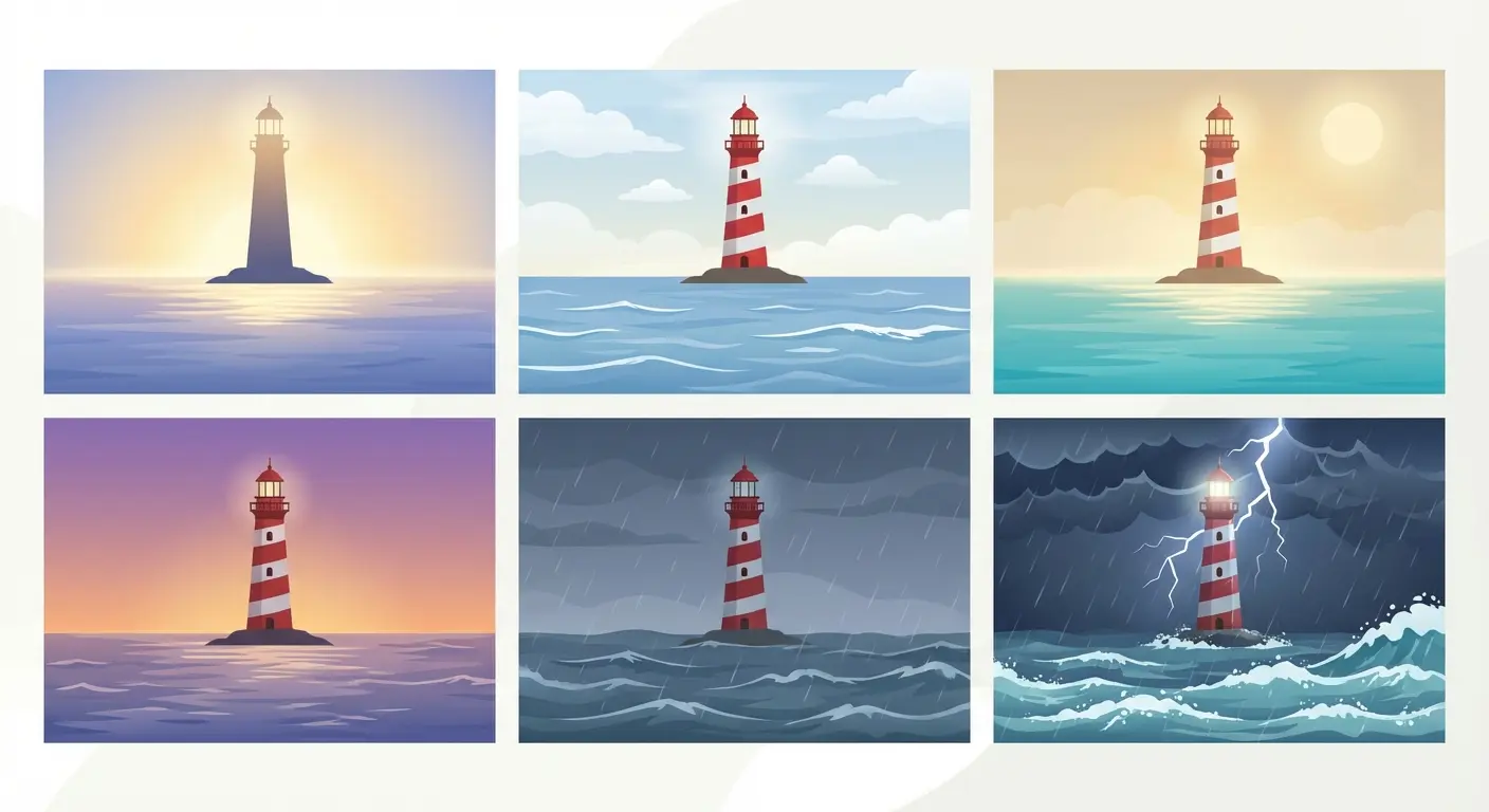
17. Lighthouse at Dawn with Rising Sun
Dawn represents new beginnings, and positioning your lighthouse against a rising sun creates a hopeful, forward-looking composition.
The sun can be partially visible on the horizon, casting long shadows and painting the sky in gradients of orange, pink, and gold. The lighthouse beam becomes less prominent (it’s less needed as natural light returns) or is shown just extinguishing, having completed its night’s work.
This timing matters symbolically. You’re capturing the transition from darkness to light, from danger to safety, from uncertainty to clarity. The color palette shifts the entire mood compared to stormy or nighttime scenes. You’re working with warm tones and soft light rather than dramatic contrast.
This resonates with people marking new chapters, recovery, or emerging from difficult periods. The composition works beautifully with realistic or illustrative styles that can handle subtle color gradations.
Your artist needs to nail the atmospheric perspective (which is a fancy way of saying distant stuff looks hazier and lighter). Some designs include the lighthouse keeper extinguishing the lamp, adding human acknowledgment of the transition.
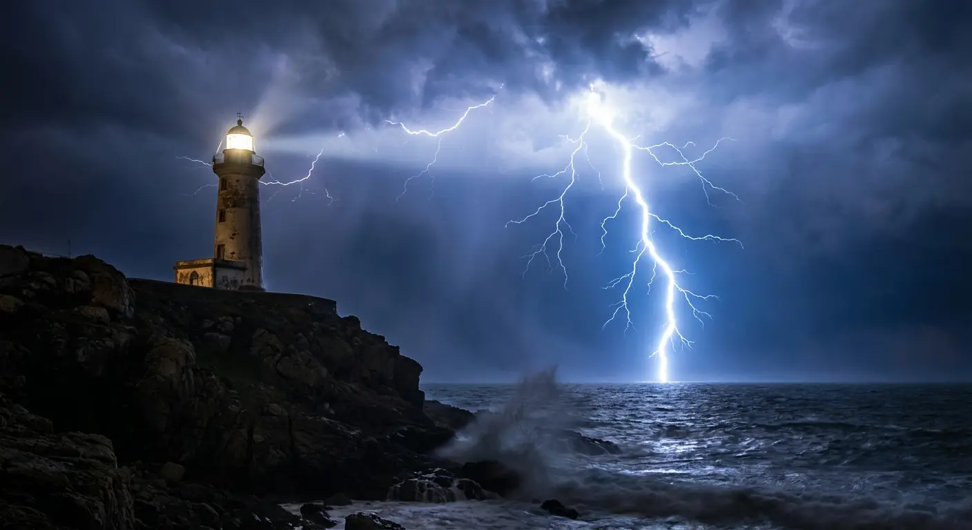
18. Stormy Night Scene with Lightning Strike
Maximum drama comes from capturing a lightning strike illuminating a lighthouse during a violent storm.
You’ve got multiple light sources competing: the lighthouse beam, the lightning flash, maybe distant ship lights or moonlight breaking through clouds. The composition becomes about contrast and energy. Lightning offers a jagged, chaotic counterpoint to the lighthouse’s steady vertical line.
The momentary illumination from the strike can reveal details otherwise hidden in darkness (threatening rocks, massive waves, the lighthouse’s weathered condition). Black and white? Perfect choice here because you’re working entirely with dramatic value contrasts.
The lightning gives your artist permission to use pure white highlights in ways other compositions don’t support. You’re capturing a split-second moment of maximum peril when the lighthouse’s purpose is most critical.
If you’ve experienced genuine crisis and the guidance that helped you survive it, this one hits different. The energy and movement in this composition requires skilled handling of dynamic elements. Your artist needs to balance chaos and structure so the lighthouse remains the anchor point despite the surrounding violence.
19. Lighthouse Reflected in Calm Waters
Perfect reflection designs create symmetry and serenity that contrasts sharply with storm-based compositions.
The lighthouse stands on the shore, and its mirror image appears in completely still water below, creating a vertical axis of symmetry. This works best during twilight or night when the lighthouse beam is active and also reflects in the water, doubling the light’s presence.
The calm water suggests peace, stability, and clear vision. You can see what’s below the surface as well as what’s above. This resonates with people who value clarity, self-reflection, and honest self-assessment.
The reflection doesn’t have to be photographically perfect. Some designs slightly distort or stylize it to add visual interest or suggest that reflection (self-examination) isn’t always a perfect mirror of reality. The composition works across multiple styles but benefits from realistic or illustrative approaches that can handle the subtle gradations in water and sky.
You’re creating a contemplative piece rather than an action-oriented one. The stillness is the point.
20. Seasonal Lighthouse (Winter Snow-Capped)
Most lighthouse tattoos default to generic or summer settings. Depicting your lighthouse in a specific season adds temporal specificity and opens new symbolic territory.
A winter lighthouse with snow accumulating on the tower, icicles hanging from the railings, and frozen spray coating the rocks tells a story about endurance through harsh conditions. The light becomes even more critical when visibility is reduced by snow and darkness comes earlier.
The color palette shifts to whites, greys, and blues, creating a completely different mood than warm-season compositions. If you’ve got winter connections (born in winter, significant events during that season) or identify with the quiet perseverance winter requires, this resonates.
Your artist can show the lighthouse actively operating in the storm or standing silent in peaceful snowfall, depending on the energy you want. Other seasonal variations work too (autumn lighthouse with changing leaves, spring with blooming coastal plants), but winter offers the most dramatic transformation of the structure’s appearance and the strongest metaphor about maintaining guidance through the harshest conditions.
21. Lighthouse with Maritime Flora and Fauna
Integrating specific coastal plants and animals transforms a lighthouse from isolated structure to part of a living ecosystem.
You might include seabirds (gulls, puffins, terns) circling the tower or perched on the railings, seals on nearby rocks, whales breaching in the background, or coastal vegetation (beach roses, sea grass, dune plants) growing around the base. Each element you add carries its own symbolism and creates a more complete scene.
The flora and fauna can be regionally specific, connecting the design to a particular coastline that matters to you. East Coast lighthouses look different from West Coast ones (different architecture, different conditions, different vibe). If you’re from New England, you probably have a specific lighthouse in mind already. Cape Cod? Portland Head? Pemaquid Point?
The composition requires careful planning so the additional elements enhance rather than clutter the design. Your artist needs to understand how to create depth and layering so the lighthouse remains the focal point while the surrounding life adds context.
Pairs well with illustrative or neo-traditional styles that can handle multiple elements with clarity. You’re creating a vignette rather than a portrait, a slice of coastal life with the lighthouse as the anchoring presence.

22. Coordinates and Lighthouse Combination
Adding geographic coordinates to your lighthouse design creates specific, personal meaning that generic lighthouse imagery can’t provide.
The coordinates might mark where you found your direction, where someone important to you lived, where a significant event occurred, or simply a place that shaped you. The numbers can be integrated into the composition in several ways: as a banner beneath the lighthouse, worked into the horizon line, incorporated into the lighthouse structure itself, or placed as a separate element that frames the design.
This transforms the piece from symbolic to memorial or commemorative. You’re not saying “guidance matters” but “this specific place provided guidance.” The coordinates add a puzzle element too since most people won’t immediately recognize what location they reference, making the meaning more private.
Works across all styles since coordinates are simple text elements that adapt to any aesthetic approach. Just make sure your artist uses a readable font at the size you’re working with. Do not get tiny coordinates in a script font. They’ll blur into illegible lines in ten years. Some people add the date beneath the coordinates, creating a complete spatial and temporal marker.
Bringing Your Vision to Focus
You’ve probably noticed that lighthouse tattoos require more planning than you initially thought. The architectural precision, the symbolic layering, the stylistic choices, they all compound into decisions that significantly impact your final piece.
Here’s where we need to talk about the gap between imagination and execution. You can picture your perfect lighthouse, but translating that vision into clear direction for your artist (or even finding the right artist) presents real challenges.
Look, I’m gonna be straight with you. Describing this stuff to an artist is hard. I spent an hour trying to explain “atmospheric fog but not too thick” and my artist was like, what? Describing atmospheric effects, explaining the specific emotional quality you want, or articulating why you want storm elements versus calm water isn’t always straightforward, especially if you’re not visually trained.
This is exactly the problem Tattoo Generator IQ solves.
You can explore different compositions, test various styles from American traditional to photorealistic, adjust elements such as weather conditions or time of day, and see multiple variations before committing to anything permanent on your skin. The AI generates high-resolution designs that serve as crystal-clear references for your tattoo artist, eliminating the miscommunication that often happens when you’re trying to describe your vision verbally.
You’re not replacing your tattoo artist’s skill but giving them a precise starting point that captures exactly what you’re after. Your artist can then use these references to create the final design with confidence that they’re delivering what you actually want.
Before committing to your design, review proper tattoo aftercare practices to ensure your lighthouse heals properly and maintains its architectural details for years to come. The sketch you develop now will become a permanent part of your story, so getting the preparation right matters.
When you’re ready to move forward, working with a skilled artist at a reputable shop becomes essential. Research options in your area, review their portfolios for similar work, and don’t settle for someone who can’t demonstrate expertise with the technical demands your design requires. If your artist hasn’t done architectural work before, this is not the piece to let them practice on.
Final Thoughts
Lighthouse tattoos work because they tap into something fundamental about the human experience: we all need guidance at some point, and we all (hopefully) become guides for others eventually.
The designs we’ve covered here move beyond the surface-level “I like nautical stuff” approach and dig into the specific ways lighthouses can represent your particular story. Whether you’re drawn to the architectural beauty, the symbolic weight, or a specific narrative moment, the key is making intentional choices about every element in your composition.
The difference between a forgettable lighthouse and one that genuinely resonates comes down to specificity. What condition is your lighthouse in? What’s happening around it? What time of day are you capturing? What style serves your vision best?
These aren’t aesthetic questions but meaning-making decisions that transform a generic symbol into something personally significant. Your lighthouse should reflect not that you value guidance but what kind of guidance shaped you, under what conditions you needed it, and how you’ve internalized those lessons.
That level of intentionality shows in the final piece and creates something you’ll value for decades rather than eventually regret as a generic choice you made without fully considering the possibilities.
The sketch phase allows you to experiment with different approaches before making your final decision. Multiple drawing variations help you understand what resonates most deeply. Whether you choose a forearm placement for its visibility and symbolic forward-facing orientation, or opt for a larger canvas that allows for intricate realistic details, the planning process ensures your final piece captures exactly what you envision.
Traditional styles offer timeless appeal, while modern interpretations push creative boundaries. Your storm design might commemorate survival through crisis, while a calm reflection scene celebrates hard-won peace. Each one tells a different story, and yours should tell the truth about your journey.
Working with quality stencil materials and taking time to refine your drawing before the needle touches skin prevents regret and ensures the architectural elements maintain their integrity. It becomes not just body art but a permanent reminder of the guidance that shaped your path and the light you now carry forward for others.
Bottom line? Your