
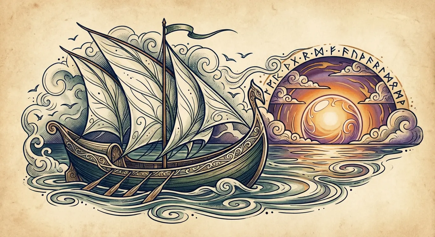
18 Lord of the Rings Tattoos That Capture the Mythology Behind the Story

Table of Contents
Linguistic Legacy
- Elvish Script That Tells Your Story
- Tengwar Calligraphy as Wearable Poetry
- Black Speech for the Bold
- Dwarvish Runes Beyond Tolkien Tourism
Philosophical Symbols
- The White Tree as Resilience Metaphor
- Sauron’s Eye Reimagined
- The Phial of Galadriel for Hope Carriers
- Doors of Durin and the Power of Friendship
- The Evenstar for Sacrifice and Choice
Character Archetypes (Not Fan Service)
- Gandalf’s Staff as Wisdom Marker
- Aragorn’s Sword Representing Earned Authority
- Sam’s Journey as Everyday Heroism
- Éowyn’s Defiance Against Limitation
Cosmological Elements
- The Two Trees of Valinor
- Silmaril Symbolism for Creative Fire
- Map Fragments That Ground You
- The Undying Lands as Life Transition
- Melian’s Girdle for Boundary Setting
TL;DR
Quick version:
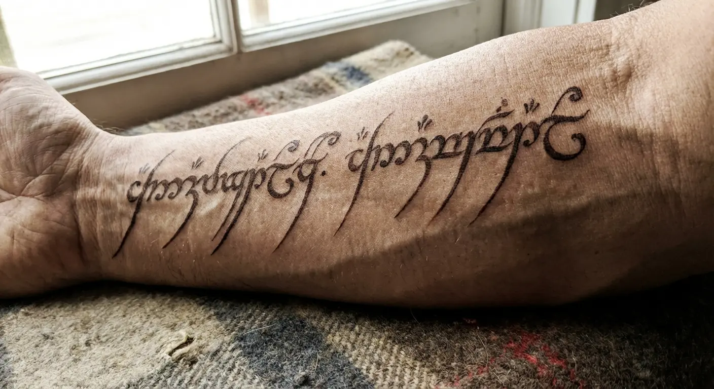
- Stop getting the Ring inscription. Please. I’m begging you.
- Elvish looks gorgeous but online translators will screw you over
- Character tattoos only work if they represent something about YOU, not just your favorite character
- The Silmarillion has way better imagery than the movies and nobody’s seen it a million times already
- Size and placement matter more than you think
- Bring your artist actual references, not Pinterest screenshots you saved at 2am
- This whole guide is basically “think deeper than surface-level fandom”
- Yes I know that sounds pretentious
- Read it anyway
Most LOTR tattoos are trying too hard to prove something. Look, I get it. You love the books. But slapping the One Ring on your arm because you thought it looked cool in the theater? That’s how you end up with regrets at 45.
Here’s what actually works: tattoos that mean something even if you’d never read Tolkien. Resilience. Sacrifice. The kind of everyday heroism that doesn’t get you a medal. That stuff lasts.
While Lord of the Rings tattoos capture characters and locations from the books, movies, and series, the most meaningful designs go deeper than that. You’re not decorating your skin with movie references. You’re marking yourself with imagery that represents something real in your life.
I’ve been tattooing since 2012. The Return of the King came out when I was in high school. I’ve done probably 200+ LOTR pieces at this point, and I can tell you exactly which ones people come back loving and which ones they want covered up five years later. The difference? Whether they chose symbols with genuine personal weight or just picked something that looked cool.
Linguistic Legacy
Look, Tolkien built entire languages. That’s what makes them so personal for tattoos. We’re not talking about slapping some generic quote on your ribs. These are complete writing systems with their own rules, their own aesthetic logic, their own way of existing on skin.
Even if nobody can read it, the script itself is gorgeous. That matters when it’s on you forever.
Here’s the thing about practical stuff though. Script accuracy isn’t optional. One wrong curve or joining mark changes meaning entirely. And placement affects readability in ways that matter way more with constructed scripts than with English text. The common pitfall of getting machine-translated gibberish permanently inked? I’ve seen it happen too many times to count.
Sindarin works for emotional stuff, but good luck finding accurate translations. Quenya’s even worse. Tolkien didn’t finish developing it. Want to write English in elvish script? Use Tengwar. Just make sure you pick the right mode or it’ll look wrong to anyone who actually knows this stuff. Black Speech is limited but those angular letters age like iron. Dwarvish runes? Honestly the most practical choice if you want something readable in 20 years.
The curved letterforms in Elvish blur if you go too small. The geometric structure of runes just holds up better. Ask me how I know this? I’ve fixed enough blurred Elvish to have opinions.
1. Elvish Script (When You Can Actually Read It)
You’ve probably seen dozens of Elvish tattoos that look gorgeous but translate to absolute nonsense. The script is visually stunning, which is exactly why accuracy becomes non-negotiable.
Sindarin’s your best bet for most common phrases because Tolkien developed it more fully than Quenya. If you’re translating something personal (a family motto, a value statement), you need someone who actually studies these languages to verify your translation before it touches your skin. Online converters are wildly unreliable. I’ve watched people discover years later that their profound statement is grammatically broken or means something completely different.
The curved letterforms flow naturally along ribs, forearms, and collarbones. Your artist needs to understand that Elvish isn’t decorative. It has specific joining rules and directional flow that affect legibility. An Elvish script tattoo only works if those rules are respected.
Finding trustworthy translation sources is frustrating, I know. Start with academic Tolkien language communities rather than random websites. The extra verification step saves you from permanent regret.
2. Tengwar: The Writing System Everyone Gets Wrong
Tengwar is the writing system, not the language itself. That distinction confuses most people researching LOTR tattoos, but once you get it, you’ve got way more options.
You can write English phrases in Tengwar script. This gives you more freedom than working within Sindarin’s vocabulary limitations. Want to commemorate something deeply personal that doesn’t have a Sindarin equivalent? Tengwar solves that problem.
The mode matters. There are different Tengwar modes for different languages. Most tattoos use the mode for Sindarin or the Classical mode, but if you’re writing English, you’ll want the mode specifically designed for that. Your artist might not know this, so you’ll need to provide accurate references.
Fine-line Tengwar looks elegant fresh but think about how those delicate marks will blur over twenty years. Slightly bolder strokes preserve readability without sacrificing the script’s inherent grace. I’ve seen too many beautiful pieces become illegible because the execution was too delicate for long-term wear.
3. Black Speech (For When You’ve Faced Your Darkness)
The language Sauron created sounds harsh because Tolkien designed it that way. That guttural quality translates to angular, aggressive letterforms that create visual impact.
Most people avoid Black Speech because of its association with evil in the books. But there’s something powerful about reclaiming dark imagery for personal meaning. Black Speech tattoos work when you’re embracing your shadow side, marking difficult periods you’ve survived, or simply appreciating the harsh beauty of the language.
This choice will read as deliberately provocative. Does that serve your goals? If you’re marking survival through depression, addiction recovery, or trauma, there’s real power in using a “dark” language to commemorate your emergence. The darkness becomes proof of what you’ve overcome.
Your artist should lean into the sharp angles rather than trying to soften them. The aesthetic works because it’s unapologetically severe. Any attempt to make Black Speech pretty misses the entire point.
4. Dwarvish Runes (The Smart Choice Nobody Talks About)
Cirth runes often get dismissed as the “basic” choice. That’s a mistake. They offer practical advantages for tattoos that Elvish doesn’t.
The geometric structure of runes holds up better at small sizes and over time. Where Elvish might blur into illegibility after a decade, properly executed runes maintain their structure. These are fundamental differences in how the scripts age on skin.
Perfect for single words or names. The angular construction creates natural spacing that prevents the muddiness you sometimes get with cursive scripts. If you need maximum impact in minimal space, runes deliver.
Consider runes for knuckles, fingers, or behind the ear. The readability holds even at tiny scales. This isn’t the less sophisticated choice. It’s the pragmatic one. Your tattoo will still be legible when you’re sixty.
Philosophical Symbols
Okay, symbols. The philosophical stuff.
Skip the surface-level iconography. We’re talking about images that carry actual weight within Tolkien’s mythology. These represent complex ideas (resilience, hope, sacrifice, earned authority) rather than simple fandom markers.
The concern that fan tattoos might feel dated or embarrassing later? Valid. I’ve watched people’s relationships with source material evolve over decades. The designs that continue resonating are the ones rooted in universal human experiences rather than specific plot points or character moments.
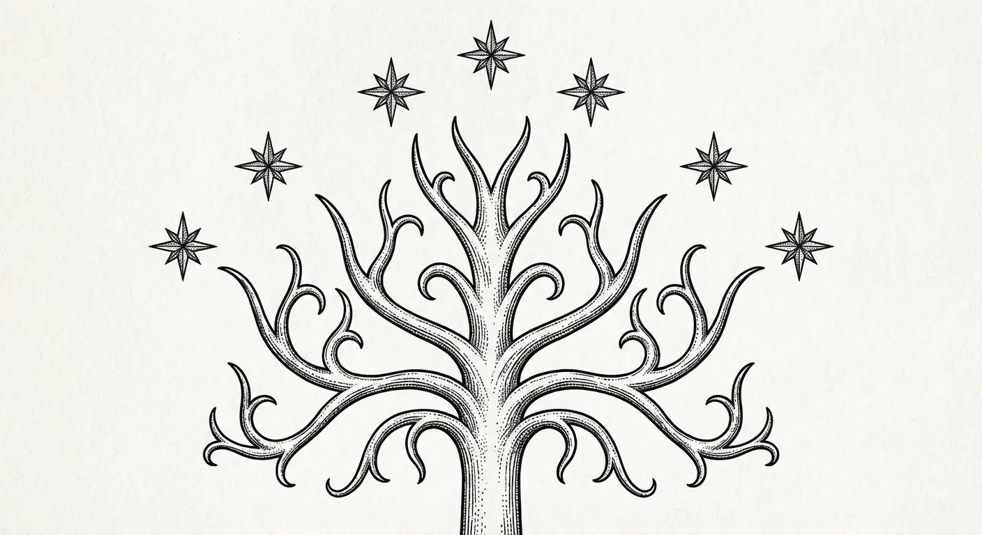
The White Tree of Gondor is known in the Lord of the Rings trilogy as a symbol of renewal and hope, which gives it depth that transcends simple fandom recognition. That depth is what separates meaningful tattoos from regrettable ones.
Choose symbols that will still matter when you haven’t thought about the movies in years. Your tattoo should connect to your actual life, not just your entertainment preferences.
5. The White Tree (Or: How to Symbolize Resilience Without Being Obvious)
The White Tree of Gondor died and returned multiple times throughout Middle-earth’s history. That cycle of death and renewal gives the symbol depth beyond its role in the story.
You can approach this botanically or abstractly. Tolkien based it on specific tree species, so there’s precedent for botanical accuracy if that appeals to you. The bare-branches version emphasizes the “enduring through hardship” angle. A flowering version celebrates emergence and renewal.
Go with bare branches if you’re marking survival. Flowers feel too optimistic for that.
Vertical placements emphasize the tree’s natural upward growth. Spine, forearm, side of calf. These locations let the design breathe and grow. Adding stars above references the original imagery without requiring the full Gondor heraldry treatment.
I’ve seen people incorporate personal elements into White Tree designs. A specific number of branches for family members. Roots that extend into other imagery. The symbol is flexible enough to hold additional meaning without becoming cluttered.
6. Sauron’s Eye (When Being Watched Is Your Reality)
The Eye of Sauron is visually striking but carries baggage as an evil symbol. I’m not shying away from the darkness. I’m examining when that darkness serves a purpose.
The Eye works when you’re making a statement about observation, judgment, or the feeling of being constantly watched. In our surveillance-saturated world, it’s taken on meanings Tolkien never intended. That evolution makes it more relevant, not less.
Realistic interpretations feel more powerful than cartoon versions. Your artist should focus on the flame and depth rather than just the pupil outline. The piece should feel genuinely unsettling or powerful, not decorative.
Placement matters significantly here. An Eye on your chest or back creates a “watching” effect that plays with viewer perspective. On your arm, it becomes more of a personal talisman. Think about whether you want others to feel watched or whether you’re carrying the symbol for yourself.
7. The Phial of Galadriel (For People Who Carry the Light)
“A light when all other lights go out” hits differently when you’ve been in that darkness.
I know a crisis counselor who has the Phial on her wrist. She sees it during the calls where someone’s deciding whether to live or die. “A light when all other lights go out” isn’t poetic to her. It’s her job description. Some nights it’s the only thing that reminds her why she keeps doing this work.
That’s what this symbol is for. Not decoration. Not fandom. For people who have to be the light when there isn’t any.
Therapists, nurses, crisis workers. Anyone whose job involves maintaining light for others. So do people dealing with chronic illness, supporting loved ones through addiction, or simply surviving circumstances that would break most people.
Depicting light in tattoo form is tricky. You can’t make skin glow, so your artist needs to use negative space, white ink highlights, or surrounding darkness to create the impression of luminescence. The technical execution makes or breaks this design.
The vessel itself is simple. A small crystal vial. The design lives or dies on the light effect. If your artist isn’t confident with that technique, consider a more stylized approach that suggests light through linework rather than attempting realism. I’d rather see a successful stylized version than a failed realistic attempt.
8. Doors of Durin (When Friendship Was the Answer All Along)
“Speak friend and enter” is about recognizing that the answer was simple all along. The Doors wouldn’t open through force or cleverness, only through friendship.
The full door design is intricate. Trees, stars, Elvish script, architectural detail. It’s a lot. At smaller sizes, you’ll need to simplify or risk a muddy result. Consider focusing on just the tree motif or the central star.
This works beautifully as part of a matching or complementary set with a friend or partner. Each person can carry half the door design, which only “completes” when you’re together. I’ve seen this executed in ways that feel meaningful rather than cheesy, but it requires thoughtful design work.
The symbolism extends beyond romantic relationships. Chosen family, recovery partnerships, creative collaborations. Any relationship where vulnerability and mutual support matter can be represented through the Doors. The key is that you’re marking something real, not just something you think sounds nice.
9. The Evenstar (For Life-Altering Choices)
The Evenstar isn’t really about romance, though that’s how the movies framed it. It’s about choosing a mortal, finite life full of meaning over an infinite but ultimately empty existence.
That choice resonates with anyone who’s given up security for authenticity, or traded comfort for purpose. Career sacrifices, choosing to live openly despite consequences, leaving relationships or situations that looked perfect but felt hollow. These are Evenstar moments. The sacrifice is what gives the symbol weight.
Design-wise, you can go delicate and jewelry-like or more abstract and geometric. The star itself is simple enough to work at any scale, which makes it versatile for placement anywhere on the body. I’ve seen effective Evenstar designs ranging from tiny behind-the-ear pieces to large chest centerpieces.
Avoid the “girly LOTR tattoo” trap by focusing on the weight of the choice rather than the romance angle. The design should feel significant, not decorative. Your artist’s approach to the piece will communicate whether you understand what you’re wearing or whether you just thought it looked pretty.
Character Archetypes (Not Fan Service)
Character tattoos often feel more about fandom declarations than meaningful personal symbols. I’m approaching these differently by focusing on what each character represents as an archetype rather than their role in the story.
Choose character imagery that reflects who you are or aspire to be, not just who you liked watching. There’s a significant difference between “I love this character” and “this character represents something I embody or am working toward.” That distinction matters for whether your tattoo will still resonate in twenty years.
The cast’s commitment to their roles extended beyond filming. Brett Beattie, who spent 189 days or 2,300 hours playing Gimli as John Rhys-Davies’ stunt double, scale double, and photo double, considers the tattoo he got with the Lord of the Rings cast members an honor. The cast famously got matching hobbit tattoos of the number 9 written in Elvish Tengwar script to commemorate the nine members of the Fellowship. If the guy in the dwarf suit for 189 days thinks the mythology is worth marking permanently, maybe there’s something there.
Gandalf’s staff if you’re carrying knowledge that isolates you. Aragorn’s sword if you’ve literally rebuilt yourself from broken pieces (and I mean literally, not “I had a bad breakup”). Sam’s tools if you’re the person everyone calls and nobody thanks. Éowyn’s armor if you’ve had to fight for space people didn’t want to give you.
Don’t get these because you liked the character. Get them because you ARE the archetype.
10. Gandalf’s Staff (The Weight of Seeing Clearly)
Gandalf carried knowledge that isolated him. He saw what was coming and bore the weight of guiding others through darkness they couldn’t yet perceive.
This resonates with educators, therapists, sponsors, or anyone who carries wisdom they didn’t ask for. The staff represents the tool of that burden. The thing you lean on while carrying others. It’s not about looking wise. It’s about the exhaustion of seeing clearly when others don’t.
Avoid literal movie-replica designs. The staff’s power is symbolic, not decorative. Your artist should emphasize the worn, weight-bearing quality rather than ornamental detail. I’ve seen designs that capture the staff as a burden rather than a prop, and those are the ones that age well. The wisdom Gandalf carried wasn’t a gift. It was a responsibility that separated him from simpler joys. If that resonates with your experience, the staff becomes a marker of what you’ve had to carry. If it doesn’t, pick a different symbol.
11. Aragorn’s Sword (Reforged From Broken Pieces)
Andúril was reforged from a broken sword. Aragorn didn’t inherit power. He rebuilt it from fragments and earned the right to wield it.
Get this when you’ve done that rebuilding work. If you’ve reconstructed yourself after addiction, divorce, career failure, or identity crisis, the reforged sword represents that earned authority over your own life. The brokenness and repair are what give it meaning.
The blade should show the reforging somehow. Visible seam lines where it was rejoined, contrasting styles between hilt and blade, or even incorporating the shattered pieces into the design. These elements tell the story. A pristine sword misses the point entirely.
I’ve watched people get Andúril designs who haven’t done the work of rebuilding, and those tattoos ring hollow. The symbol only carries weight if you’ve lived the metaphor. Otherwise you’re just wearing someone else’s story.
12. Sam (For People Who Show Up When Nobody’s Watching)
Sam carried Frodo when Frodo couldn’t walk. He showed up every day without glory, recognition, or even certainty that it mattered.
Caregivers, nurses, teachers, parents, sponsors. Anyone whose heroism is daily and unglamorous understands Sam. You show up when no one’s watching and do what needs doing. The world doesn’t celebrate that kind of service, but it’s what holds everything together.
Skip Sam’s face. Focus on his tools: the rope that saved them, the lembas bread he rationed, the cooking pot he carried. These objects tell the story of practical, persistent service better than any portrait. The tattoo should emphasize the work, not the character.
I’ve seen Sam-inspired designs that capture the quiet heroism without becoming cutesy or diminishing the real weight of service. The key is treating the imagery with the seriousness it deserves rather than making it whimsical.
13. Éowyn’s Armor (Righteous Anger and Refusal)
Éowyn’s fury at being left behind, at being told her courage didn’t matter because of her gender, is the core of her power. The “I am no man” moment is about the rage of being underestimated.
Anyone who’s had to prove they belong, who’s been told they’re too much or not enough, or who’s fought for space in places that didn’t want them understands this. The anger in this symbol is important to preserve. Sanitizing it into something palatable defeats the purpose.
Focus on her armor and sword rather than her face or figure. The armor itself tells the story. She disguised herself to fight because she was forbidden. The reveal is in the defiance, not the femininity.
I’ve seen tattoos of Éowyn that capture her rage and others that turn her into cheesecake fan art. The difference is whether the artist understands that her power comes from refusing to be diminished. Your tattoo should honor that refusal.
Cosmological Elements
The Silmarillion and Tolkien’s broader mythology offer rich imagery that most people haven’t seen a thousand times already. These deeper cosmological symbols carry weight within Middle-earth’s creation story and ancient history.
If you’re still reading after “cosmological elements,” you’re my people. Most folks tapped out around the Silmarillion stuff. That’s fine. This is for the deep nerds who care about the difference between Sindarin and Quenya.
Depicting cosmic-scale concepts in tattoo form presents challenges. How do you represent the creation of the world, the end of an age, or the light that existed before the sun? These lesser-known symbols often age better than obvious references because they’re not tied to specific movie imagery or cultural moments.
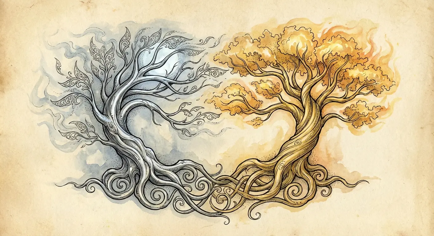
14. The Two Trees of Valinor (What Cannot Be Reclaimed)
Telperion and Laurelin gave light before the sun existed, and their destruction marked the end of the world’s first age. They represent beauty that can’t be restored, only remembered.
Get these when you’re marking the end of something significant. A relationship, a career, a version of yourself that no longer exists. The Trees aren’t about moving on but about honoring what was lost. That distinction matters.
One tree bore silver light, the other gold. Your artist can use color to distinguish them or rely on different leaf patterns and branch structures. Placing them on opposite limbs creates a balanced relationship across your body. I’ve seen this executed as complementary pieces that feel cohesive without being matchy.
The Trees represent irretrievable loss, which is heavy. Make sure that weight serves your purpose rather than dragging you down. Some losses deserve to be marked permanently. Others need to be released.
15. Silmarils (The Double Edge of Creative Obsession)
The Silmarils contained captured light, and everyone who possessed them was destroyed by that possession. They’re about the double edge of creative ambition.
If you’re an artist who’s sacrificed relationships, health, or stability for your work, the Silmaril represents that complicated relationship with creation. The beauty and the cost are inseparable. This isn’t a symbol for people with healthy work-life balance.
Visually, they’re jewels emanating light. Your artist faces the same challenge as with the Phial (depicting luminescence). The difference is that Silmarils should feel more dangerous, less comforting. The light should be intense rather than gentle.
I’ve seen designs of Silmarils that capture their destructive beauty and others that just look pretty. The ones that work acknowledge the darkness inherent in creative obsession.
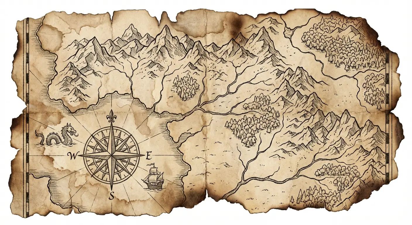
16. Map Fragments (Geography as Personal Mythology)
Maps of Middle-earth are works of art in themselves. You don’t need the entire continent when a meaningful fragment tells a better story.
Choose locations that resonate with your journey. The Shire for people who value home and simple pleasures. Rivendell for those who’ve found sanctuary. Mordor for darkness survived. The geography becomes personal mythology rather than just reference material.
Stylistic choices matter here. Antique map aesthetics with weathered edges and aged paper tones create different meaning than clean, modern cartography. Consider whether you want Tolkien’s map style or an artist’s interpretation.
Text legibility is a concern with map tattoos. Place names and geographic labels need to be large enough to remain readable as the tattoo ages. I’ve seen gorgeous designs become illegible blurs because the text was too small. Your artist needs to be realistic about what will hold up.
A sleeve can incorporate map elements as background or connecting tissue between other imagery. The cartography provides context and grounds more symbolic elements in Middle-earth’s actual geography.
17. The Undying Lands (Intentional Transformation)
The Undying Lands are where the elves sail when their time in Middle-earth ends. It’s not death but transition to a different kind of existence.
Perfect for marking retirement, completing treatment, finishing a major life chapter, or any transition where you’re not ending but transforming. The ships sailing west become symbols of intentional change rather than forced endings.
You have flexibility here because Tolkien never detailed what the Undying Lands look like. Ships, western horizons, stylized shores, or simply the Grey Havens where the ships depart all work. The emphasis is on the journey toward rather than the destination itself.
I’ve seen designs of the Undying Lands that capture the bittersweet quality of necessary transitions. There’s loss in leaving Middle-earth, even when what you’re moving toward is better. That complexity makes the symbol richer than simple “new beginnings” imagery.
18. Melian’s Girdle (Boundaries as Protection)
Melian’s Girdle was an invisible barrier of protection that nothing evil could cross. She maintained it through pure will for thousands of years.
Anyone who’s had to become their own protection, who’s learned that boundaries aren’t mean but necessary, or who’s built safety where none existed understands this symbol. It’s about the strength required to maintain protection over time, not just establish it once.
Depicting an invisible barrier is conceptually challenging. Your artist might approach this through geometric patterns suggesting containment, through imagery of Melian herself, or through abstract representations of energy and boundary. The key is capturing the sense of intentional separation.
This obscure reference works better than obvious protective symbols because it requires explanation. Your tattoo becomes a conversation about boundaries rather than a generic statement about protection. I’ve seen people use Melian’s Girdle to mark recovery from boundary violations or the decision to prioritize their own peace.
The concepts around Melian’s Girdle are still developing because fewer people know the reference. That gives you more creative freedom to interpret the concept in ways that serve your specific meaning.
Bringing Your Vision to Reality
You’ve identified the symbol that resonates. You understand what it means to you beyond surface-level fandom. Now you’re facing the gap between concept and visual reference.
Okay, real talk. You’ve figured out you want the White Tree. You know what it means to you. Now you have to explain this to your artist.
“So like, a tree, but make it feel like resilience? Kind of botanical but also abstract? And can the roots do this thing…”
Your artist is nodding but they’re guessing. I’ve been on both sides of this conversation. It sucks.
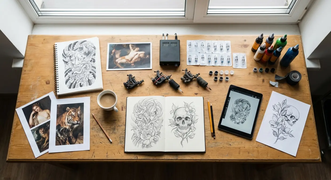
This is where having actual visual references matters. Not Pinterest screenshots. Not vague descriptions. Actual design mockups you can point to and say “this, but adjust that.”
I use Tattoo Generator IQ for this because, look, I can’t draw. Most people can’t. The tool lets you generate variations until you’ve got something that matches what’s in your head. Then your artist refines it instead of starting from scratch based on your hand-waving.
You don’t need it. You could commission custom art, or spend hours finding the perfect reference image, or hope your artist is a mind reader. But it’s faster than all of those and costs less than one consultation session where you both realize you weren’t on the same page.
Not sponsored, just practical. The worst tattoos I’ve gotten were the ones where I couldn’t articulate what I wanted.
Think of it as translation work. You’re translating your internal concept into visual language your artist can understand and execute. The clearer your reference, the better your final tattoo. This matters especially for minimalist designs where every line needs to be intentional.
Whether you’re planning linguistic elements, philosophical symbols, character archetypes, or cosmological concepts, having concrete references prevents miscommunication. Your artist can’t read your mind, but they can work from clear visual direction.
Final Thoughts
Look, you’re going to do what you want. But in 20 years, you know what’ll matter? Not whether other fans recognize your tattoo. Whether it still means something to YOU.
I’ve covered up so many Rings of Power. So many Aragorn portraits that looked cool at 23 and embarrassing at 40. The tattoos that last? They’re the ones that would still matter even if you’d never read Tolkien.
Get something that represents resilience, or sacrifice, or the kind of quiet heroism nobody notices. The fact that it comes from Middle-earth is almost beside the point. The mythology just happens to express these things beautifully.
Test: imagine explaining your tattoo to someone who’s never heard of Lord of the Rings. If you can do that and it still sounds meaningful, you’ve found something worth keeping. If you can’t explain it without referencing the movies, keep thinking.
It’s been 20+ years since Fellowship came out. The people who got Ring inscriptions opening weekend are now in their 40s. I know because they come in asking about cover-ups.
Tolkien died in 1973. His mythology has outlived him by 50 years and will outlive all of us. That’s the kind of staying power you want in a tattoo symbol.
Choose symbols that transcend their source. That’s the difference between a tattoo you love at 70 and one you’re trying to incorporate into a cover-up.
Or don’t. Get the Ring inscription. See you in 15 years for a cover-up consultation.