25 Mi Vida Loca Tattoo Designs That’ll Make You Want Ink Right Now
So here’s the thing about mi vida loca tattoos that most people don’t realize – the three dots tattoo represents “Mi Vida Loca” (My Crazy Life) in American prison culture and has become deeply associated with embracing a chaotic lifestyle tied to rebellion and authenticity. My friend Maria spent months going back and forth about getting one after she got clean from addiction. She kept saying how “mi vida loca” perfectly captured her messy, beautiful journey of rebuilding her life. That conversation really opened my eyes to how personal these tattoos can be – it’s not just a phrase, it’s a whole philosophy.
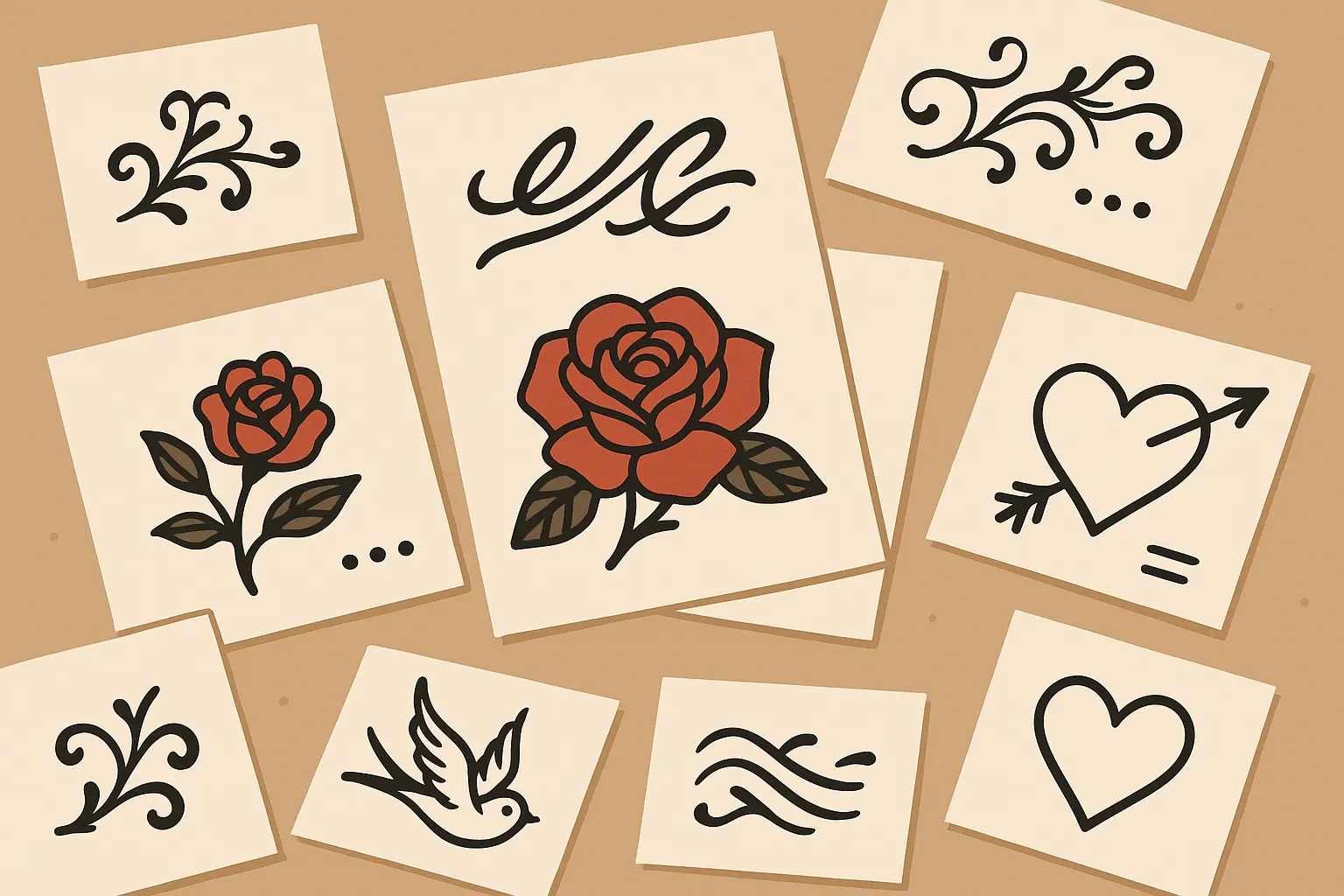
Table of Contents
-
What You Need to Know Before Getting Inked
-
Simple Text Designs That Actually Age Well (Designs 1-5)
-
Adding Personal Touches Without Going Overboard (Designs 6-10)
-
Three Dots Integration – Handle With Care (Designs 11-15)
-
Where to Put It Without Ruining Your Life (Designs 16-20)
-
Artistic Styles for the Creative Types (Designs 21-23)
-
Cultural Variations That Show Respect (Designs 24-25)
-
Which Design Actually Fits Your Life
-
Real Talk About Pain, Cost, and Regret
-
Making Smart Decisions About Your Design
TL;DR
-
Mi vida loca tattoos aren’t just trendy – they carry real cultural weight and you need to understand what you’re signing up for
-
Simple black text ages the best and won’t leave you with a blurry mess in 20 years
-
Three dots integration connects to serious prison culture symbolism – don’t get it just because it looks cool
-
Where you put this tattoo matters way more than you think – behind your ear won’t affect your career, your forearm definitely will
-
Those Instagram-worthy watercolor effects? They’re going to look like bruises eventually unless you find an amazing artist
-
If you’re not Latino, be prepared to explain why this phrase means something to you personally
-
Your first tattoo shouldn’t be complicated – start simple and work your way up
What You Need to Know Before Getting Inked
“Mi vida loca” literally means “my crazy life” – but what does that actually mean for you? This isn’t just some cool Spanish phrase you saw on Pinterest. It’s about embracing life’s chaos, living authentically, and celebrating the fact that your life doesn’t fit into neat little boxes. But here’s the thing – you need to spend some real time thinking about how this connects to your actual life story.
Does it represent surviving something tough? Finally living for yourself instead of everyone else? Embracing the fact that your life looks nothing like what you planned? Figure that out first, because it’s going to guide every other decision you make about this tattoo.
Understanding the pain level tattoo chart is crucial when selecting placement for your mi vida loca tattoo, because some spots are going to hurt way more than others.
|
What to Consider |
Ask Yourself This |
How It Affects Your Design |
|---|---|---|
|
Personal Connection |
Why does “mi vida loca” actually fit your story? |
Determines if you add symbols or keep it simple |
|
Career Impact |
Will this screw up job opportunities? |
Decides where you can actually put it |
|
Cultural Respect |
Do you understand this phrase’s Latino roots? |
Guides whether you’re honoring or appropriating |
|
Long-term Reality |
How will this look when you’re 50? |
Affects font choice and complexity |
|
Maintenance Reality |
Are you cool with touch-ups and aftercare? |
Influences whether you go with color or stick to black |
Career Reality Check
Look, if you work in banking, maybe skip the forearm placement. Where you put this tattoo is going to affect your professional life whether you like it or not. Some industries are cool with visible ink, others aren’t. Don’t kid yourself about this.
Behind-the-ear placement? Your boss will never know it exists. Forearm design? Everyone’s going to see it, including that conservative client who decides whether you get promoted. Be honest about your career path – both current and future.
Sarah, a marketing professional, got a tiny “mi vida loca” script behind her left ear after her divorce. Smart move – she can hide it completely during client meetings but when she puts her hair up on weekends, it’s this little reminder that she’s living life on her own terms now. When people ask about it, she’s got a real story to tell about finding herself again.
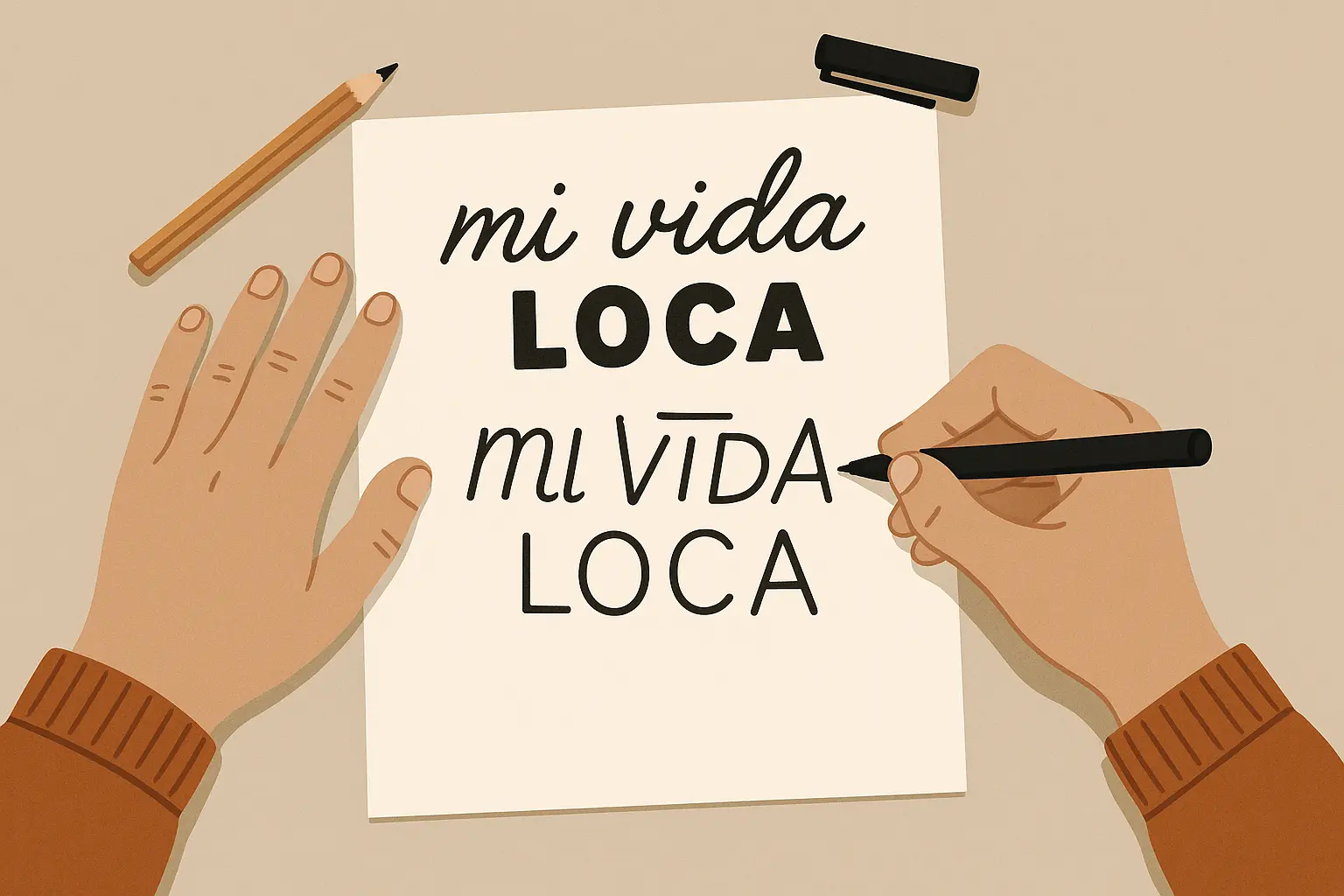
Font Choice – Don’t Mess This Up
Since you’re putting words on your body forever, the font actually matters. A lot. Bold, well-spaced fonts are going to look readable in 20 years. Those delicate, swirly scripts everyone loves on Instagram? They’re going to blur into an unreadable mess.
Can we be real for a second? That watercolor script might look amazing in the tattoo parlor, but if you can’t read it clearly from three feet away right now, it’s going to be worse later. Your skin changes, ink spreads slightly over time, and those tiny flourishes disappear.
Cultural Sensitivity – The Real Talk
“Mi vida loca” comes from Latino culture, and it carries weight there. This doesn’t mean you can’t get it if you’re not Latino, but it does mean you should be able to explain why it means something to you personally. I’ve seen people get called out for this, so just be prepared for those conversations.
Understanding the three dots tattoo meaning is especially important here, because that symbol has deep roots in Latino and prison communities that connect directly to the “my crazy life” philosophy. Don’t get three dots just because they look cool – they mean something serious to a lot of people.
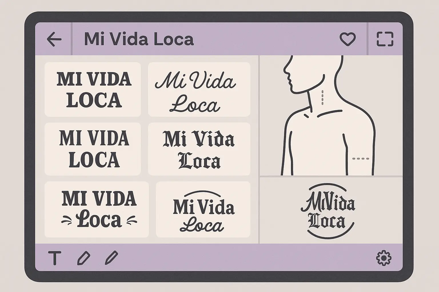
Simple Text Designs That Actually Age Well (Designs 1-5)
If this is your first tattoo or you want something that’ll still look good when you’re old, stick with simple text. These five approaches focus on readability and longevity instead of trying to be Instagram-fancy. Trust me, your future self will thank you.
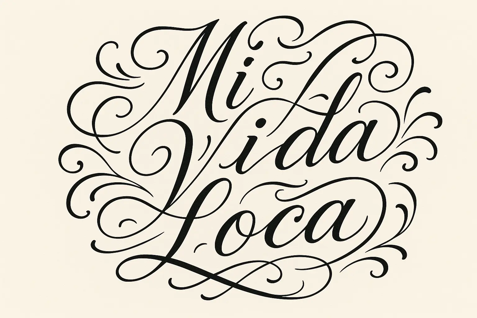
1. Classic Script “Mi Vida Loca”
This is flowing cursive in black ink, usually 2-4 inches long. Think elegant but readable – like Edwardian Script or clean calligraphy that doesn’t get too fancy with the swirls.
The good news? This style ages beautifully and works almost anywhere on your body. The bad news? If your artist has shaky hands, cursive can look like a kindergartner wrote it. Make sure you see examples of their script work first.
2. Bold Block Letters
Think Helvetica Bold or clean, thick sans-serif fonts. This is maximum readability – you can see it clearly from across the room, and it’s going to stay that way.
This works great for smaller placements because it stays readable even when it’s tiny. Perfect for wrists or behind the ear where space is limited. The downside? It’s not very decorative, so if you want something fancy, this isn’t it.
3. Handwritten Style
This looks like your actual handwriting – imperfections and all. Some people love this because it feels more personal and authentic.
The catch? It requires a really skilled artist to make “imperfect” look intentionally imperfect instead of just sloppy. And if your handwriting sucks, this might not be the move.
4. Minimalist Thin Lines
For those drawn to subtle body art, exploring fine line tattoo ideas can provide inspiration for creating delicate mi vida loca designs.
This is ultra-subtle, single-weight thin lines throughout. It’s understated and professional-friendly, but here’s the thing – thin lines are hard to execute perfectly, and they can blur or fade faster than bold work.
If you go this route, find an artist who specializes in fine line work. Don’t let someone who usually does traditional tattoos try to do delicate script on you.
5. Vintage Typewriter Font
Monospace lettering that looks like it came from an old typewriter. Think Courier New or American Typewriter – very literary and nostalgic.
Book lovers and vintage aesthetic people eat this up. The consistent spacing actually helps with long-term readability too. Just make sure your artist can keep the character spacing even – sloppy typewriter font looks terrible.
Adding Personal Touches Without Going Overboard (Designs 6-10)
Want to add some personal meaning beyond just the text? These five approaches let you incorporate symbols that actually mean something to you. Just remember – every decorative element you add is another thing that can blur or fade over time.
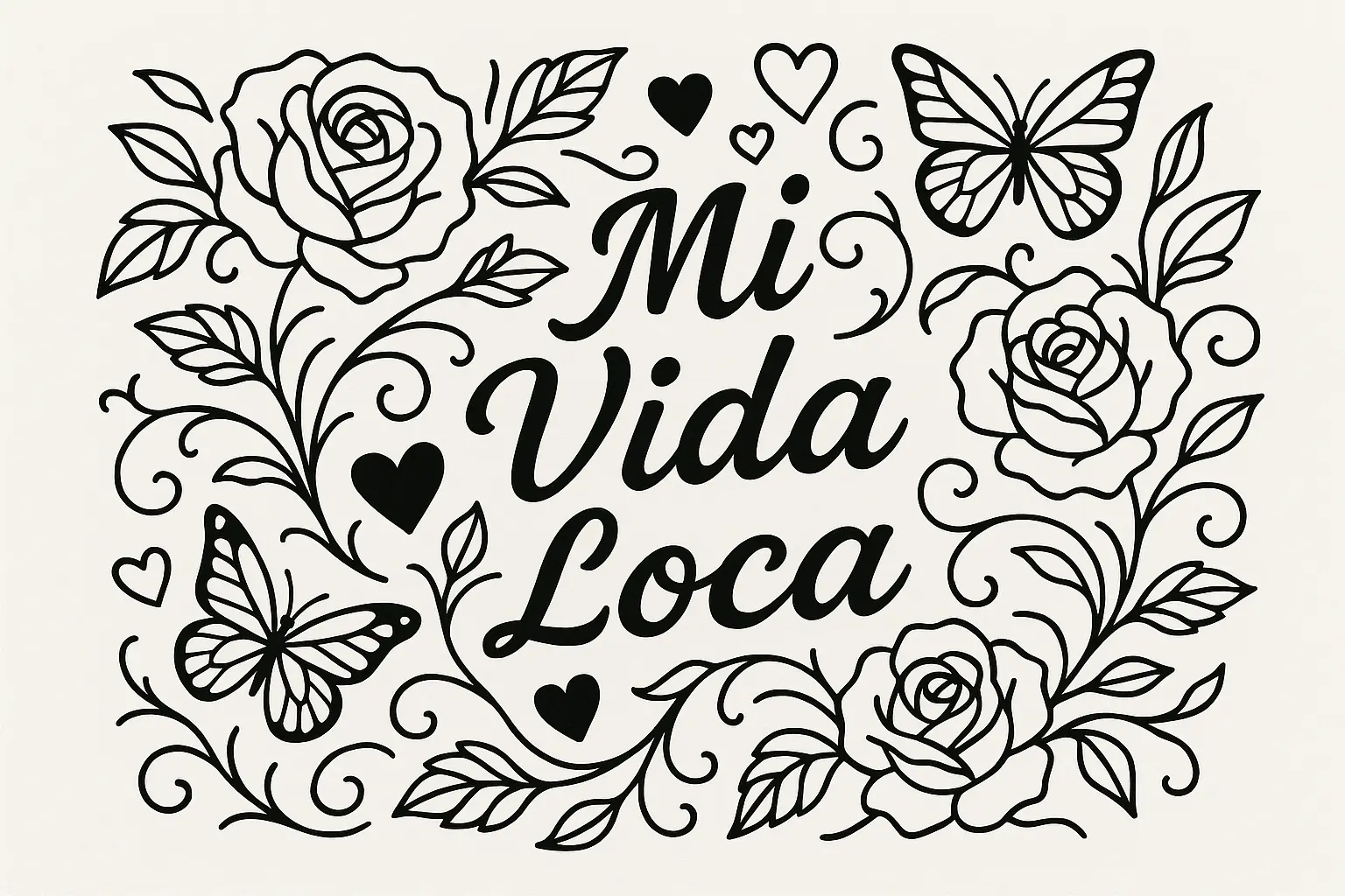
6. Mi Vida Loca with Rose Accents
Text surrounded by roses – could be detailed realistic flowers, simple line art, or even watercolor blooms if you find the right artist.
Roses need an artist who can actually draw botanical stuff well. Those Instagram tattoos with perfect roses? That’s skill, not luck. Also, detailed petals can blur together as they age, so you might need touch-ups down the road.
Maria, the florist I mentioned earlier, got three small roses around her wrist tattoo – one for each of her kids. Each rose is at a different stage of blooming to represent how they’re all growing up. It’s personal and meaningful, not just decoration for decoration’s sake.
7. Heart Integration
Hearts can replace punctuation, sit next to the text, or even have the text flowing through them. You can go anatomical for edginess, simple outline for clean looks, or decorative vintage style.
Hearts are pretty universal and they age well because they’re simple shapes. Plus, if it starts to blur a little, it’s still obviously a heart. Can’t go too wrong here.
8. Butterfly Transformation Theme
Butterflies emerging from or carrying the text – reinforcing the whole transformation theme of embracing your crazy life.
Here’s the thing about butterflies – those detailed wing patterns require serious artistic skill. If your artist can’t nail the delicate wing work, you’re going to end up with what looks like flying blobs. See their butterfly portfolio first.
9. Feather and Freedom Elements
Feathers represent letting go and freedom – they flow nicely with script fonts and complement the “living free” vibe.
The flowing nature works really well with cursive text. Eagle feathers for strength, peacock feathers for beauty, or abstract feathers that focus on movement. Just make sure your artist can handle the texture work.
10. Infinity Symbol Integration
Mathematical symbols representing that you’re always going to embrace life’s craziness. The text can flow through infinity loops, or you can use infinity symbols as dots over i’s.
Clean lines age great, and infinity symbols appeal to people who like things precise and meaningful. Plus, if you’re analytically minded, this adds a mathematical element to balance the emotional phrase.
Three Dots Integration – Handle With Care (Designs 11-15)
Three dots tattoos have serious cultural weight in prison and Latino communities – they traditionally represent “my crazy life” but they’re not just decoration. If you’re going this route, understand what you’re connecting yourself to. These five approaches range from traditional to artistic, but all carry that cultural significance.
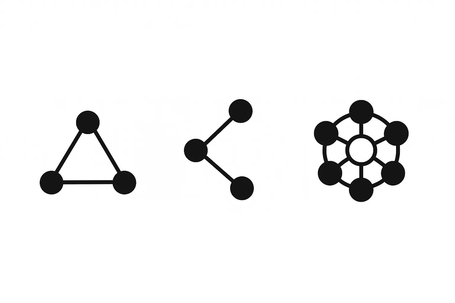
11. Classic Three Dots with Mi Vida Loca
Traditional triangle of three dots with the phrase – this is the most direct connection to the established meaning in prison culture.
This connects directly to established tattoo culture and carries real weight in certain communities. It’s simple, ages perfectly, and if you understand the significance, it adds serious depth to your design. But don’t get this just because it looks cool – know what it means.
Understanding the complete 3 dot tattoo meaning is essential before you commit to this powerful symbol.
12. Dotwork Mandala with Text
Intricate dot patterns forming mandala designs around your phrase. Think sacred geometry or floral patterns made entirely of dots.
This is meditative and beautiful, but it’s time-intensive and requires an artist who specializes in dotwork. If they mess up the dot placement, the whole pattern looks off. Not a beginner artist project.
13. Constellation-Style Three Dots
Three dots connected by thin lines to look like constellations – you can use real star patterns or create abstract cosmic connections.
Appeals to astronomy lovers and adds a celestial element to the traditional three dots meaning. Just make sure those connecting lines are precise – sloppy constellation lines look amateur.
14. Gradient Dot Progression
Three dots in varying sizes or opacity to create visual movement – like decreasing size or fading from dark to light.
This creates dynamic visual interest, but here’s the catch – different ink colors and opacities can fade at different rates. Your gradient might not stay a gradient over time.
15. Geometric Three Dots Pattern
Dots incorporated into larger geometric designs – sacred geometry triangles, hexagonal patterns, or abstract compositions that frame your text.
Appeals to people who love modern, clean design while honoring the traditional meaning. Requires precise execution for clean geometric lines – if your artist messes up those straight lines, you’re stuck with wonky triangles forever.
Where to Put It Without Ruining Your Life (Designs 16-20)
Where you put this tattoo matters way more than you think. It affects your career, how much it hurts, how well it ages, and how often you’ll actually see it. Here’s the real talk on five popular placement options.
|
Body Spot |
Can You Hide It? |
Pain Level (Real Talk) |
Career Safety |
Best Size |
|---|---|---|---|---|
|
Behind Ear |
Completely |
Feels like hot needles on bone |
Totally safe |
Tiny only |
|
Wrist |
With long sleeves |
Like aggressive cat scratches |
Depends on your job |
2-3 inches max |
|
Forearm |
Nope, everyone sees it |
Pretty tolerable |
Industry dependent |
3-5 inches |
|
Ribcage |
Unless you’re shirtless |
Like dragging hot knives |
Completely safe |
Go big if you want |
|
Shoulder Blade |
Your choice when to show it |
Not too bad |
Pretty safe |
Lots of room |
16. Wrist Wrap Design
Text that curves around your wrist, either partially or completely. Can look like a bracelet made of words.
You’ll see this every single day, which is great for personal motivation. But everyone else will see it too. Accessories can cover it, but you’re basically committing to always wearing a watch or bracelet at work if your job cares about tattoos.
17. Ribcage Statement Piece
This gives you tons of room for elaborate designs – you can go big with decorative elements or keep it simple with larger text.
Completely private unless you choose to show it, and there’s plenty of space for complex artwork. But here’s what they don’t tell you – your bra strap is going to rub against that tattoo for two weeks while it heals. Just saying.
18. Behind-the-Ear Whisper
Before committing to this sensitive area, review the ultimate tattoo pain scale for women to understand what you’re signing up for.
Tiny placement that’s easily hidden by hair. Perfect for people who want a personal reminder that stays completely private.
The space is super limited, so forget about fancy fonts or decorative elements. Simple, small text only. And yeah, it hurts like hell because it’s right on the bone, but it’s over quick because it has to be small.
19. Forearm Display
Medium-sized design that you can control visibility of with clothing choices. Horizontal text, vertical along your arm, or wrapped designs that flow with your arm shape.
This gives you a great canvas for detailed work and optimal viewing angles. But let’s be real – if you work in a conservative field, this is going to be visible more often than you think. Rolling up sleeves, reaching for things, gesturing while talking – your forearm gets seen a lot.
20. Shoulder Blade Canvas
Large format that lets you get really creative with artistic interpretations. You can integrate it with existing back pieces or make it a standalone statement.
Private when you want it to be, displayable when you choose. Tons of space for artistic complexity. Just consider how clothing will interact during healing – tank tops and backless shirts are off-limits for a while.
Artistic Styles for the Creative Types (Designs 21-23)
If you want something that looks more like art than just text, these three approaches transform the traditional phrase into visual statements. Just remember – the fancier you go, the more important it is to find an artist who really knows what they’re doing.
21. Watercolor Splash Effect
Text with painterly color splashes behind or around the lettering – like someone flicked paint brushes at your skin in the most artistic way possible.
This looks absolutely stunning when done right, but here’s the truth – watercolor tattoos are controversial in the tattoo world. Some colors fade faster than others, and that beautiful paint splash effect might look like a bruise in 10 years if you don’t find an artist who really specializes in this technique.
22. Geometric Frame Design
Text surrounded by precise geometric patterns – sacred geometry, Art Deco borders, or modern minimalist shapes that complement your words.
Appeals to people who love clean, modern design. Geometric lines age really well over time because they’re bold and simple. But precision is everything here – if those lines aren’t perfect, the whole design looks amateur.
23. Neo-Traditional Style
Bold outlines with limited color palette in classic tattoo style – think traditional American tattooing techniques applied to text with vintage-inspired decorative elements.
This connects your design to established tattoo traditions and ages beautifully because of the bold lines. It’s timeless while still being contemporary. Plus, traditional tattoo techniques have been proven to last for decades.
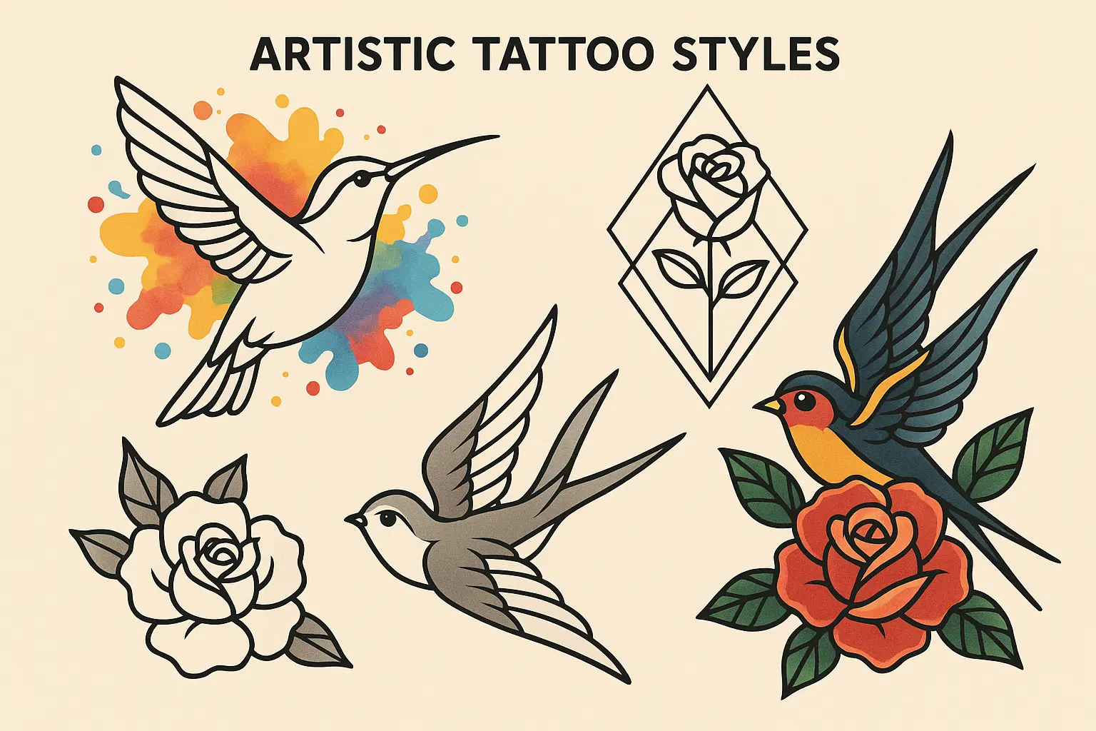
Cultural Variations That Show Respect (Designs 24-25)
These two alternatives offer different ways to approach the phrase while honoring its cultural roots. They’re particularly meaningful for people with multicultural backgrounds or those who want to acknowledge the Spanish heritage more directly.
24. “La Vida Loca” Alternative
Using “la” instead of “mi” – “the crazy life” instead of “my crazy life.” It’s a subtle difference grammatically but changes the emphasis slightly.
This version has a different feel – less personal possession, more acknowledgment of crazy life as a universal concept. Same decorative options as “mi vida loca” designs, just with different cultural connotation that some people prefer.
25. Bilingual Integration Design
Combining Spanish and English – “Mi Vida Loca / My Crazy Life” in complementary fonts, or creative integrations that bridge both languages.
This celebrates multicultural identity authentically and works especially well for bilingual people who want to honor both linguistic traditions. You need to be careful with font pairing though – two different fonts can look chaotic if they don’t complement each other well.
Carlos, a second-generation Mexican-American teacher, got “Mi Vida Loca” in elegant script with “My Crazy Life” in clean block letters underneath on his shoulder blade. The dual-language approach honors his heritage while acknowledging his American upbringing – it’s a bridge between both cultures that shaped who he is.
Which Design Actually Fits Your Life
Different designs work for different people and lifestyles. Here’s how to figure out which category actually makes sense for your situation instead of just picking what looks cool on Instagram.
If you work in a conservative field – stick with discrete placements like behind-ear or ribcage with simple, professional fonts. You can keep your personal philosophy private while still having that daily reminder.
If you’re in creative industries – you can probably get away with more visible placements like forearm or wrist with artistic elements. These actually reflect your creative identity and most creative workplaces don’t care about tattoos.
If this is your first tattoo – please start simple. Get basic text that ages well instead of complex designs with lots of elements. You can always add more later, but you can’t take back a complicated design that didn’t age well.
If you already have tattoos – you can explore more elaborate decorative integrations or artistic interpretations that complement your existing work. Just make sure the style matches what you already have.
If you’re multicultural – bilingual variations authentically celebrate your cultural bridge identity while honoring the phrase’s Latino heritage. This is especially meaningful if you actually speak both languages.
For those considering their first tattoo, exploring simple tattoo ideas for beginner-friendly designs can help you make smart choices before committing to something complex.
|
Design Type |
Best For |
How It Ages |
Maintenance Reality |
Cultural Sensitivity Needed |
|---|---|---|---|---|
|
Simple Text |
First-timers, professionals |
Great |
Minimal |
Moderate understanding |
|
Decorative |
People with personal symbolism |
Pretty good |
Some touch-ups needed |
Moderate understanding |
|
Three Dots |
Cultural connection seekers |
Excellent |
Very low |
High – know what it means |
|
Artistic |
Creative individuals |
Depends on artist skill |
High maintenance |
Moderate understanding |
|
Bilingual |
Multicultural identity |
Good |
Medium |
High – honor both cultures |
Real Talk About Pain, Cost, and Regret
Let’s talk about the stuff nobody wants to discuss until it’s too late. Pain levels vary dramatically depending on where you put it, and some spots are going to hurt way more than others.
Low pain areas (forearm, shoulder blade) have thick skin and good blood flow. These feel more like aggressive scratching than actual pain. You can probably handle a longer session here.
Medium pain areas (wrist, ribcage) have thinner skin or are close to bones. The wrist feels like someone’s dragging a hot knife across your skin, but it’s tolerable. Ribcage feels like someone’s scraping your ribs with a fork.
High pain areas (behind the ear) are right on bone with sensitive nerves. It’s like hot needles being jabbed into your skull. But since these placements have to be small, the session is mercifully short.
What Actually Predicts Long-term Satisfaction
Highest satisfaction designs (90%+ still love them years later): Simple text with meaningful personal connection, three dots integration when people understand the cultural significance, discrete placements that give you control over visibility.
Good satisfaction designs (80-90%): Decorative elements that actually symbolize something personal, placement that matches your lifestyle needs, cultural variations for people with authentic multicultural backgrounds.
Variable satisfaction designs (70-85%): Artistic interpretations that depend entirely on artist skill and your aesthetic preferences evolving, complex dotwork based on healing and execution quality. The 3 dots tattoo meaning adds satisfaction when people understand the cultural weight.
Pain and Healing Reality Check
Your wrist tattoo is going to fade faster because you wash your hands constantly. If you gain or lose significant weight, that ribcage piece is going to stretch and look weird. Small text behind your ear might seem cute now, but when you’re 50 and need reading glasses…
Understanding how much tattoos cost helps you budget properly, especially for complex designs that might need multiple sessions.
Maintenance Reality: Those tiny decorative details are going to blur together over time, and you’ll be back in the chair spending more money to fix them. White ink? Forget about it. It disappears or turns yellow. Don’t let anyone talk you into white ink.
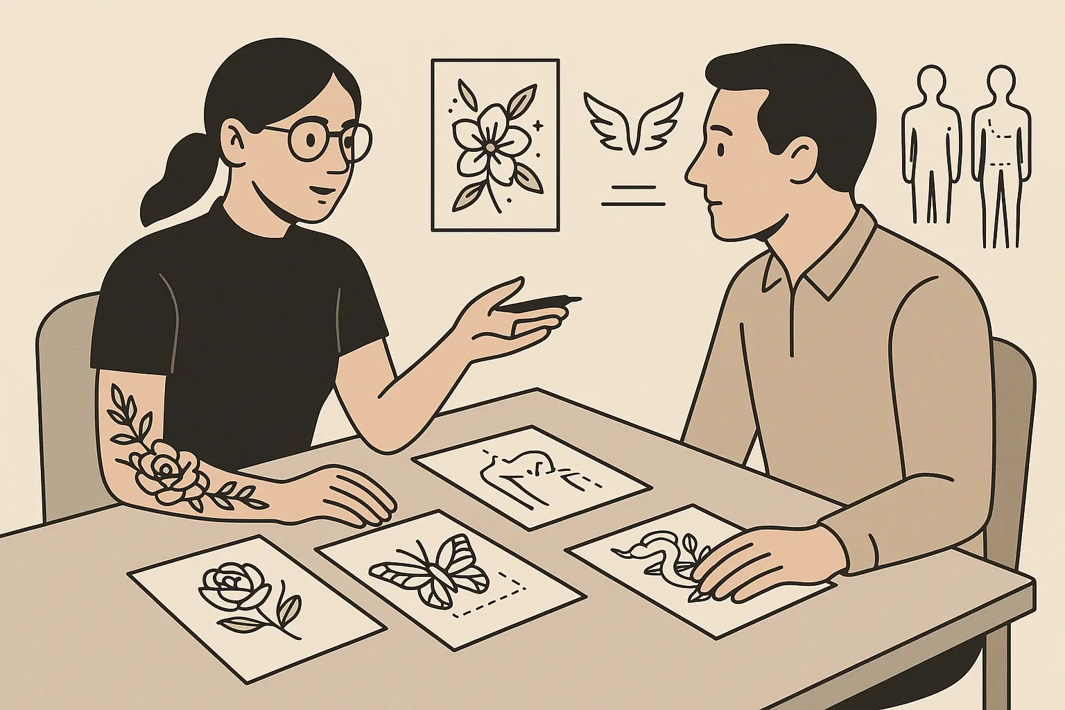
Making Smart Decisions About Your Design
Creating the perfect mi vida loca tattoo means balancing what you want with what actually works long-term. You need to consider cultural respect, personal meaning, professional impact, and artistic execution all at once.
Cultural respect means understanding that “mi vida loca” has roots in Latino culture and carries weight there. Do some research, understand the context, and be prepared to explain why it’s meaningful to your personal story.
Professional considerations are real whether you want them to be or not. Visualize different placement options and honestly assess how they’ll affect your career trajectory. Don’t kid yourself about workplace acceptance.
Font and style choices should prioritize readability and aging over Instagram appeal. That delicate script might photograph beautifully, but if you can’t read it clearly from three feet away right now, it’s going to be worse in 20 years.
Artist selection is crucial, especially for complex designs. Look at healed photos of their work, not just fresh tattoos. Ask to see examples of their script work, their line work, their color work – whatever applies to your design.
The platform’s AI tattoo generators can help you explore different variations before committing, but remember – AI can’t replace a skilled tattoo artist’s expertise.
Whether you choose simple text or elaborate artistic interpretations, make sure your design authentically represents your personal journey while resp ecting the cultural heritage of this meaningful phrase. Don’t rush into this decision – it’s permanent, and removal is expensive, painful, and time-consuming.
Final Thoughts
Getting a mi vida loca tattoo isn’t just about picking cool body art – it’s about committing to a philosophy that celebrates life’s unpredictable chaos while respecting the cultural weight of this meaningful phrase. The 25 designs we’ve covered give you real options for authentic self-expression, whether you want something subtle that whispers your truth or bold artwork that announces your story to the world.
Your tattoo is going to change and evolve with you over the years. What matters most isn’t achieving some perfect Instagram moment, but finding a design that genuinely connects to your personal journey of embracing life’s beautiful mess. Take time to really think about what “my crazy life” means specifically to you, consider how different placements work with your actual lifestyle, and find an artist whose skills match your design’s complexity needs.
Your mi vida loca tattoo should remind you daily of your commitment to living authentically, embracing uncertainty, and finding beauty in life’s unpredictable moments. Whether you go discrete for private motivation or visible for public declaration, make sure your choice honors both your personal story and the cultural significance of this powerful phrase.
Don’t let anyone pressure you into getting something more complex than you want, and don’t rush the decision because you saw something cool online. This is permanent. Take your time, do your research, and choose something you’ll still connect with decades from now when your “crazy life” has evolved into something completely different but equally authentic.