
25 Script Tattoo Ideas That Will Transform Your Body Into a Masterpiece

Script tattoos have exploded in popularity, with text-based designs representing over 40% of all new tattoos in 2024 according to Vean Tattoo. Three years ago, I walked into my first tattoo consultation clutching a crumpled piece of paper with my grandmother’s handwritten apple pie recipe. The artist just smiled – she’d seen it all before. Turns out, half her clients show up with meaningful words they want permanently etched into their skin.
Here’s the thing about script tattoos – they’re trickier than they look. You’re not just picking pretty words; you’re making decisions that’ll affect how readable your tattoo is when you’re 60. And trust me, “Live Laugh Love” in a fancy script font might look cute now, but if it turns into an illegible blob in 10 years, that’s not so cute anymore.
Whether you’re drawn to minimalist single words or elaborate decorated phrases, this guide explores 25 script tattoo ideas that balance looking good now AND in 20 years. Because nobody wants their meaningful quote to become an unreadable mess.
Table of Contents
-
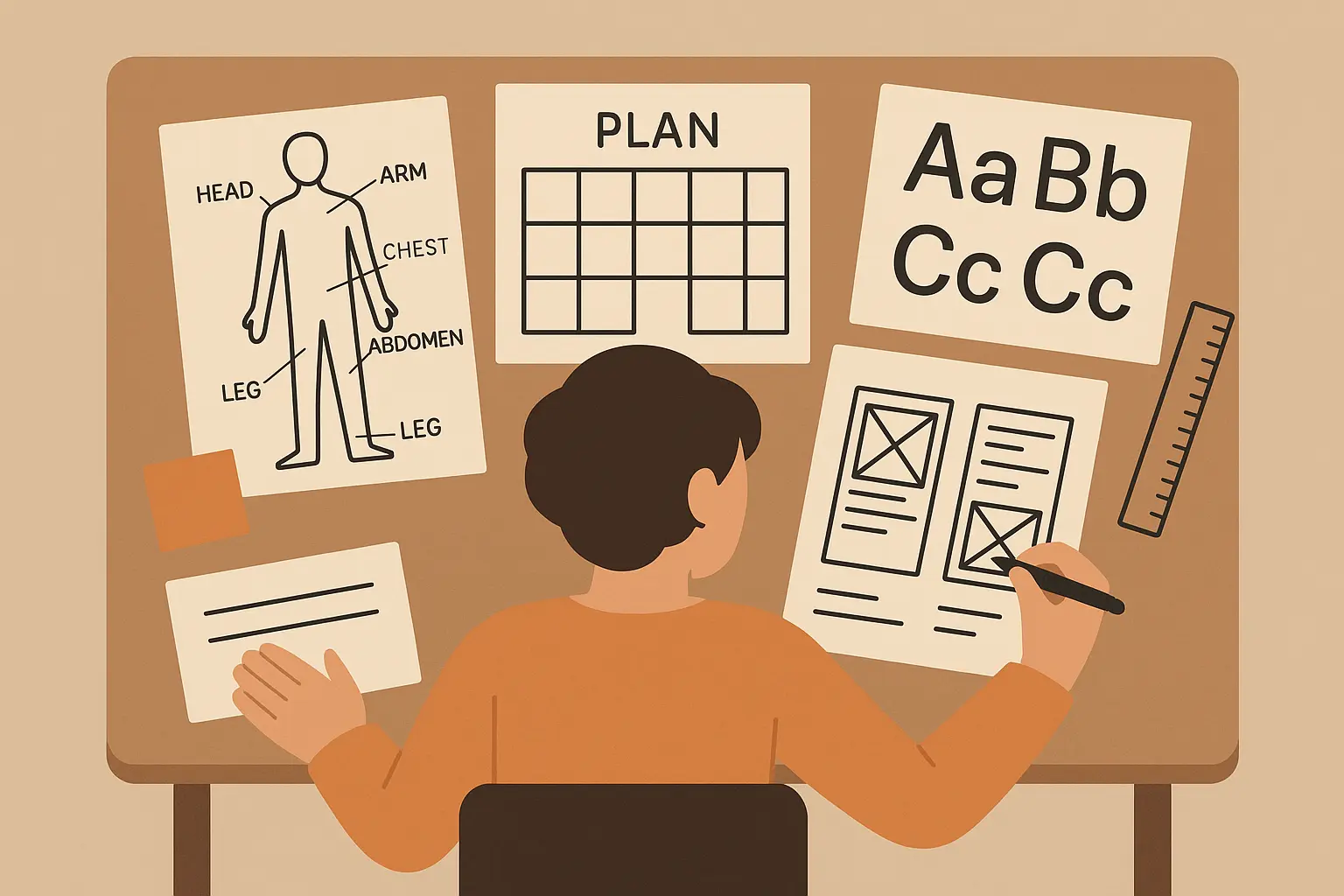
Essential Planning for Your Script Tattoo Journey
-
Getting Your Fonts Right (Because This Actually Matters)
-
Where to Put It (And Why It Matters More Than You Think)
-
Size Guidelines That Ensure Lasting Readability
-
Colors: Black is Beautiful (And Practical)
-
Finding an Artist Who Actually Gets Lettering
-
1. Single Word Power Statement
-
2. Flowing Script Phrase
-
3. Handwritten Style Text
-
4. Thin Line Typography
-
5. Block Letter Statement
-
6. Literary Quote
-
7. Song Lyrics
-
8. Personal Mantra
-
9. Foreign Language Phrases
-
10. Inspirational Affirmations
-
11. Children’s Names
-
12. Memorial Tributes
-
13. Significant Dates
-
14. Couple Names/Initials
-
15. Coordinates
-
16. Script with Floral Elements
-
17. Script with Geometric Accents
-
18. Script with Symbol Integration
-
19. Script with Watercolor Effects
-
20. Script with Mandala Elements
-
21. Spine Text
-
22. Wraparound Arm Text
-
23. Ribcage Script
-
24. Finger Text
-
25. Collar Bone Script
-
Design Psychology: Why These Styles Work
-
Matching Your Tattoo to Your Lifestyle
-
How Technology Simplifies Script Tattoo Design
-
Final Thoughts
TL;DR
-
Bold, simple fonts age way better than delicate, intricate designs
-
Where you put it affects both what your boss will think and how it’ll look in 20 years
-
Go bigger than you think – 12-point font minimum or it might become unreadable
-
Black ink is your friend – colored inks look pretty but need way more touch-ups
-
Not all tattoo artists are good at lettering – do your homework on their script work specifically
-
Simple designs work everywhere and won’t shock your grandmother
-
Memorial and family tattoos hit different – they’re always meaningful regardless of trends
-
Decorative combinations look amazing but need more skill and maintenance
-
Vertical placements give you more room for longer text
-
Your tattoo should work with your life, not against it
Essential Planning for Your Script Tattoo Journey
Look, before you rush into getting words permanently etched into your skin, let’s talk about the stuff nobody warns you about. I’ve seen too many people walk out of tattoo shops with regret already setting in, and it’s usually because they didn’t think through the basics.
Script tattoos are sneaky – they look simple, but they’re actually way more complicated than that traditional rose your friend got. You’re not just picking pretty words; you’re making decisions that’ll affect how readable your tattoo is when you’re 60. And trust me, “Live Laugh Love” in a fancy script font might look cute now, but if it turns into an illegible blob in 10 years, that’s not so cute anymore.
The permanence thing hits different with text. I mean, all tattoos are permanent, but when your tribal design gets a little blurry, it’s still recognizably a tribal design. When your meaningful quote becomes unreadable? That’s just sad.
Understanding the complete tattoo cost breakdown helps you budget appropriately for quality script work that requires specialized lettering expertise.
And here’s something nobody talks about – people WILL try to read your tattoo. Unlike that abstract geometric piece on your shoulder that people just admire, text makes people lean in and squint. They want to know what it says. So if you’re getting “F*ck the System” tattooed somewhere visible, just know that your coworkers, your kid’s teachers, and your grandmother are all gonna see it eventually.
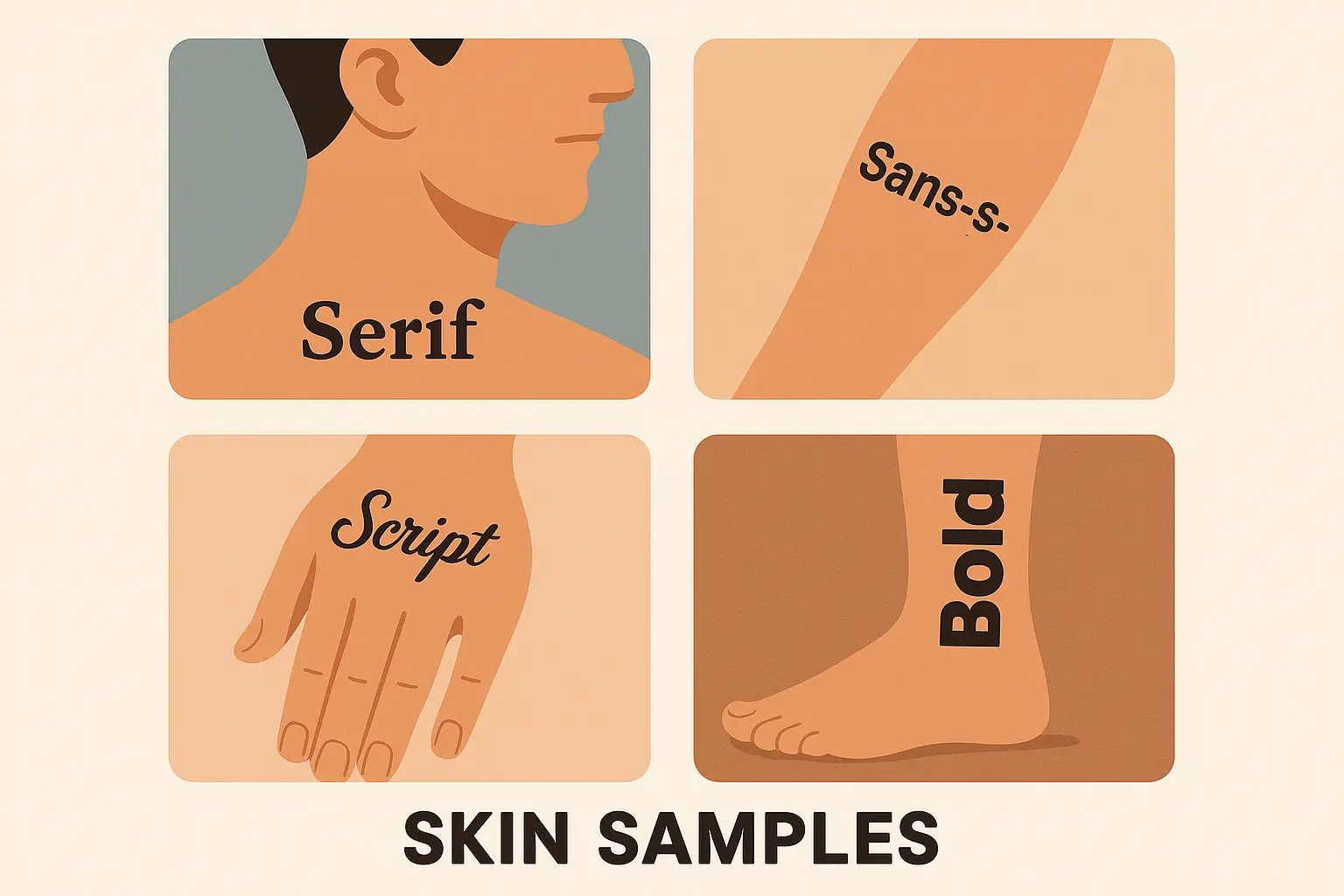
Getting Your Fonts Right (Because This Actually Matters)
Okay, font talk might sound boring, but this is where people mess up the most. I’ve seen beautiful, meaningful quotes turn into illegible messes because someone picked a “pretty” font over a practical one.
Here’s the deal: sans-serif fonts (the clean, simple ones without the little decorative feet) are your best friends. Think Arial, Helvetica – boring but bulletproof. They age like fine wine while fancy scripts age like milk left in the sun.
Now, I get it. You want something that looks elegant and feminine, not like a corporate memo. Script fonts can be gorgeous, but they’re high-maintenance girlfriends – beautiful but demanding. Those delicate flourishes and thin connecting lines? They’re gonna blur together as your skin changes over time.
|
Font Category |
How Well It Ages |
Best For |
Professional Acceptance |
How Often You’ll Need Touch-ups |
|---|---|---|---|---|
|
Sans-Serif |
⭐⭐⭐⭐⭐ |
Corporate environments, clean looks |
Excellent |
Almost never |
|
Script/Cursive |
⭐⭐⭐ |
Feminine designs, romantic quotes |
Pretty good |
Every 10-15 years |
|
Bold Block |
⭐⭐⭐⭐⭐ |
Power statements, single words |
Good |
Rarely |
|
Thin Line |
⭐⭐ |
Minimalist looks, hidden spots |
Excellent |
Every 5-8 years |
|
Decorative |
⭐⭐ |
Artistic statements, special occasions |
Depends |
Every 3-5 years |
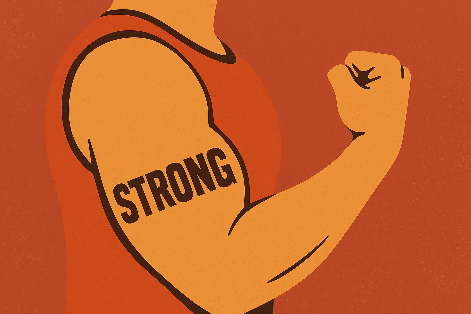
My friend Sarah got “Nevertheless, she persisted” in this gorgeous flowing script five years ago. It looked like calligraphy art. Now? You kinda have to squint and guess at a few letters. Meanwhile, her husband’s “STRENGTH” in bold block letters still looks like it was done yesterday.
Bold lettering is basically insurance against time. Yeah, it might not be as delicate and pretty, but thick lines stay thick lines. Thin lines become… suggestions.
Here’s my three-foot rule (totally made this up, but it works): if you can’t read your chosen text clearly from three feet away, it’s probably gonna age poorly. This isn’t about your eyesight – it’s about accounting for how ink spreads and skin changes over decades.
Where to Put It (And Why It Matters More Than You Think)
Placement is where things get real. Where you put your script tattoo affects everything – how much it hurts, how it ages, whether you can get promoted, and how often you’ll actually see it.
Wrist and forearm placements are like having a daily sticky note reminder, which is awesome if your tattoo says something motivational. Not so awesome if you get tired of explaining what “Memento Mori” means to every barista and Uber driver.
Consider the forearm tattoo cost factors when planning your script design, as lettering work often requires premium pricing for skilled execution.
I love ribcage and thigh spots for longer quotes. They’re private real estate – you control who sees them. Plus, you’ve got room to make the text big enough to age well. The downside? Ribcage tattoos hurt like a mother. I’m talking “why did I do this to myself” levels of pain.
Behind the ear is trendy right now, but let’s be honest – it’s basically millennial tramp stamp territory. Cute for small words, but don’t try to fit your life philosophy back there.
Sarah’s Career-Smart Placement Decision: Sarah, a marketing executive, chose to place her motivational script “Fearless” on her upper thigh rather than her forearm. This allowed her to maintain professional appearance in client meetings while still having daily access to her personal reminder during workouts and private moments. When she received a promotion to director level, she was grateful for the discretion this placement provided.
Here’s a real talk moment: think about your career. I don’t care how progressive your workplace claims to be, visible tattoos can still be career speed bumps. My buddy Mike is a brilliant software engineer, but he covers his forearm script for client meetings because, quote, “some old-school clients still think tattoos mean you’re unreliable.” Fair? No. Reality? Unfortunately, yes.
Understanding tattoo pain levels by location helps you prepare mentally and physically for your script tattoo session, especially for sensitive areas like ribs or ankles.
And pain – let’s talk about pain. Ribs, spine, ankles? These spots hurt. A lot. If you’re planning a long quote in a painful spot, you might end up rushing through it just to make the pain stop, which never leads to good results.
Size Guidelines That Ensure Lasting Readability
This is where people get stubborn and make mistakes. Everyone wants delicate, tiny script because it looks elegant in photos. But Instagram photos don’t show you what happens to tiny text after a few years of living on human skin.
12-point font minimum – that’s about the size of normal book text. Smaller than that and you’re gambling with readability. I know it sounds big when you’re thinking about putting it on your body, but trust me, it’s not.
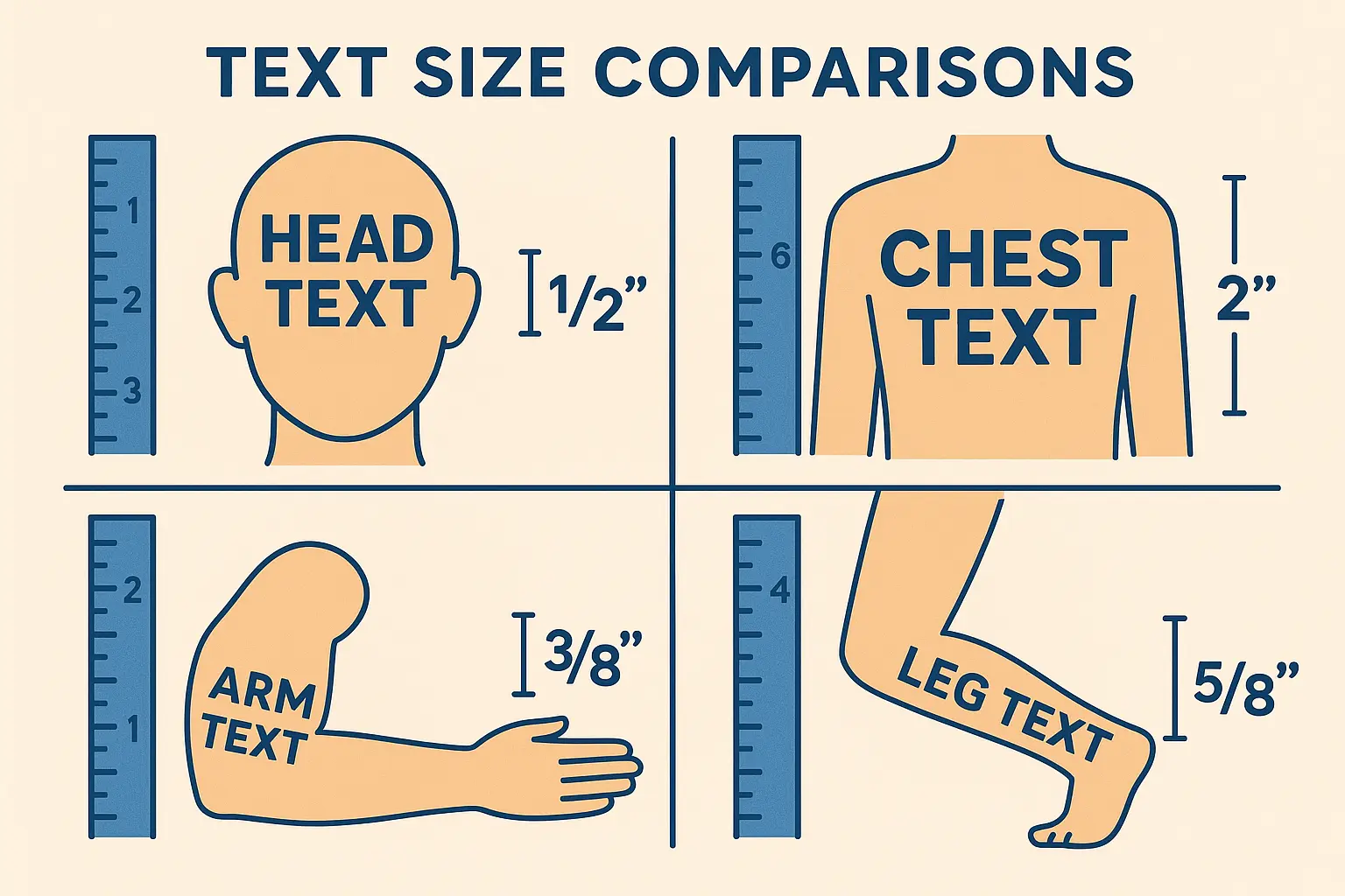
Your skin isn’t paper. It moves, stretches, ages, and changes. Ink doesn’t just sit on top – it spreads slightly over time. That delicate little script that looks perfect on day one might be a blurry mess by year five.
I see people trying to cram entire Shakespeare quotes into the space of a Post-it note. Don’t. Either pick a shorter quote or find more real estate on your body. Breaking longer passages into multiple lines isn’t giving up – it’s being smart about readability.
Larger text ages more gracefully across all skin types and body locations. While you might prefer delicate, tiny script for aesthetic reasons, remember that your tattoo needs to function as readable text throughout your lifetime. Investing in adequate sizing pays dividends in long-term satisfaction.
Colors: Black is Beautiful (And Practical)
Everyone wants to know about colored script, and I get it. Color is fun, color is personal, color makes things pop. But here’s the thing about colored text tattoos – they’re high maintenance.
Black ink is the reliable friend who shows up on time and never lets you down. It stays dark, stays clear, and works on every skin tone. It’s not exciting, but it’s smart.
Colored inks are like that fun friend who’s amazing to hang out with but always needs something. Red fades fast. Yellow disappears. Blue and purple do better but still need touch-ups way more often than black.
|
Ink Color |
How Long It Lasts |
Works On All Skin Tones? |
Touch-up Frequency |
20-Year Cost |
|---|---|---|---|---|
|
Black |
20+ years |
Yes |
Almost never |
$200-400 |
|
Dark Blue |
15-18 years |
Yes |
Every 10-15 years |
$400-600 |
|
Red |
8-12 years |
Mostly |
Every 5-8 years |
$600-900 |
|
Yellow |
5-8 years |
Hit or miss |
Every 3-5 years |
$800-1200 |
|
White |
3-5 years |
Only on dark skin |
Every 2-3 years |
$1000-1500 |
And let’s talk money – because colored script tattoos cost more over time
And let’s talk money – because colored script tattoos cost more over time. Sure, the initial price might be the same, but when you’re getting touch-ups every few years to keep your red lyrics readable, those costs add up fast.
White ink is trendy right now, especially for script, but it’s basically the drama queen of tattoo inks. It looks cool initially, then fades to this weird yellowish color that might not have enough contrast to keep your text readable.
Finding an Artist Who Actually Gets Lettering
This is huge, and people mess it up constantly. Not all tattoo artists are good at lettering. I don’t care how amazing their portrait work is or how perfect their traditional pieces look – script is a different skill set.
When you’re looking at portfolios, ignore everything except their lettering work. Look for consistent line weights, proper spacing, and clean execution. If their script looks shaky, uneven, or poorly spaced, keep looking.
Typography isn’t just about making letters – it’s about understanding how letters work together, how spacing affects readability, and how text flows with body contours. A good script artist gets this. A mediocre one just traces fonts.
Mark’s Artist Research Success: Mark spent three months researching artists for his memorial tattoo honoring his father. Instead of choosing based on general portfolio quality, he specifically looked for artists with extensive lettering experience. He found an artist whose portfolio showed 50+ script tattoos with consistent line weights and perfect spacing. The extra research paid off – his “Always in my heart” memorial tattoo remained crisp and readable five years later, while his friend’s similar tattoo from a general artist had already begun to blur.
Ask specifically about their lettering experience. How many script tattoos do they do per month? Do they enjoy doing text work? Some artists hate doing script because it’s technically demanding and less creative than other styles. You want someone who’s excited about making your words look perfect.
Don’t go cheap on script work. This isn’t the place to find a deal. Good lettering artists charge premium prices because they have specialized skills. Think of it as insurance for something you’ll see every day for the rest of your life.
1. Single Word Power Statement
Sometimes one word says everything. “Breathe.” “Strength.” “Enough.” These hit different because there’s nowhere to hide – the word either matters to you or it doesn’t.
Single word tattoos are like the little black dress of the tattoo world – they work everywhere and never go out of style. Stick them on your wrist, behind your ear, on your ankle. They’re small enough to be professional but meaningful enough to matter.
The font choice here is everything since you don’t have other words to create context. Bold sans-serif fonts work great – they age well and project confidence. Script can work too, but keep it simple and readable.
These are perfect for people who want meaningful ink without a lot of explanation. Most single-word tattoos are positive and universal enough that they don’t create workplace drama or awkward conversations with strangers.
Professional acceptance rates stay high for single word tattoos, especially when placed discretely. The minimal nature and positive messaging typically don’t create workplace issues, making them ideal for career-focused individuals.
My Rating:
-
Font flexibility: ⭐⭐⭐⭐⭐ (Bold fonts age like champions)
-
Works anywhere: ⭐⭐⭐⭐⭐ (Fits on any body part)
-
Boss-friendly: ⭐⭐⭐⭐⭐ (Easy to hide, positive vibes)
-
Stays readable: ⭐⭐⭐⭐⭐ (Short and sweet ages well)
2. Flowing Script Phrase
Okay, this is where people get seduced by beautiful lettering and sometimes make impractical choices. Flowing script is gorgeous when done right, but it requires the right artist and realistic expectations about aging.
The movement in script fonts adds emotion to your words in ways that rigid fonts can’t match. “This too shall pass” hits different in elegant cursive than it does in block letters. There’s something about the flow that makes the words feel more personal, more intimate.
But here’s where people mess up – they choose script that’s too delicate or too complex. Those gorgeous Instagram script tattoos with ultra-thin lines and elaborate flourishes? They often don’t age well. The connections between letters can blur, making words hard to read.
If you’re set on script, go for styles with adequate line weight and not too many decorative elements. Save the elaborate calligraphy for wedding invitations, not skin that’s going to change over decades.
My Rating:
-
Font flexibility: ⭐⭐⭐⭐ (Beautiful but choose wisely)
-
Works anywhere: ⭐⭐⭐⭐ (Best on flatter areas)
-
Boss-friendly: ⭐⭐⭐⭐ (Generally fine, depends on placement)
-
Stays readable: ⭐⭐⭐ (Script can get blurry over time)
3. Handwritten Style Text
This one gets me emotional because it’s so personal. Using your own handwriting, or someone else’s, creates something completely unique that no one else will ever have.
I know a guy who has his late father’s signature tattooed on his forearm. It’s not fancy, it’s not perfect, but it’s real and it’s his. That kind of meaning can’t be replicated with any font, no matter how beautiful.
The tricky part is adapting handwriting for tattooing. Natural pen strokes often include very thin lines that might not translate well to skin. A good artist can thicken certain elements while keeping the character of the original writing.
Sizing becomes super important with handwritten styles because you’re working with someone’s natural writing proportions, which might not be ideal for tattooing. Don’t be afraid to go bigger than the original to ensure it ages well.
My Rating:
-
Font flexibility: ⭐⭐⭐⭐ (Unique but needs skilled artist)
-
Works anywhere: ⭐⭐⭐⭐ (Pretty versatile)
-
Boss-friendly: ⭐⭐⭐⭐ (Personal nature is usually accepted)
-
Stays readable: ⭐⭐⭐ (Depends on original handwriting)
4. Thin Line Typography
This is minimalist heaven and aging nightmare territory. Ultra-thin line tattoos look incredibly elegant and sophisticated, but they’re playing with fire in terms of longevity.
The appeal is obvious – thin line script looks delicate, refined, and modern. It’s the kind of tattoo that photographs beautifully and fits the current minimalist aesthetic trend. Words like “Let them” or “Still I rise” become whispered affirmations rather than bold declarations.
But here’s the reality check: thin lines are vulnerable. They can blow out during healing, blur faster than thicker lines, and become illegible sooner than you’d like. If long-term readability is your priority, thin line might not be your friend.
That said, if you love the aesthetic and understand the trade-offs, go for it. Just choose your artist carefully – thin line work requires exceptional skill and steady hands.
My Rating:
-
Font flexibility: ⭐⭐⭐ (Limited to simple fonts)
-
Works anywhere: ⭐⭐⭐⭐ (Good on most spots)
-
Boss-friendly: ⭐⭐⭐⭐⭐ (Super subtle)
-
Stays readable: ⭐⭐ (Thin lines blur faster)
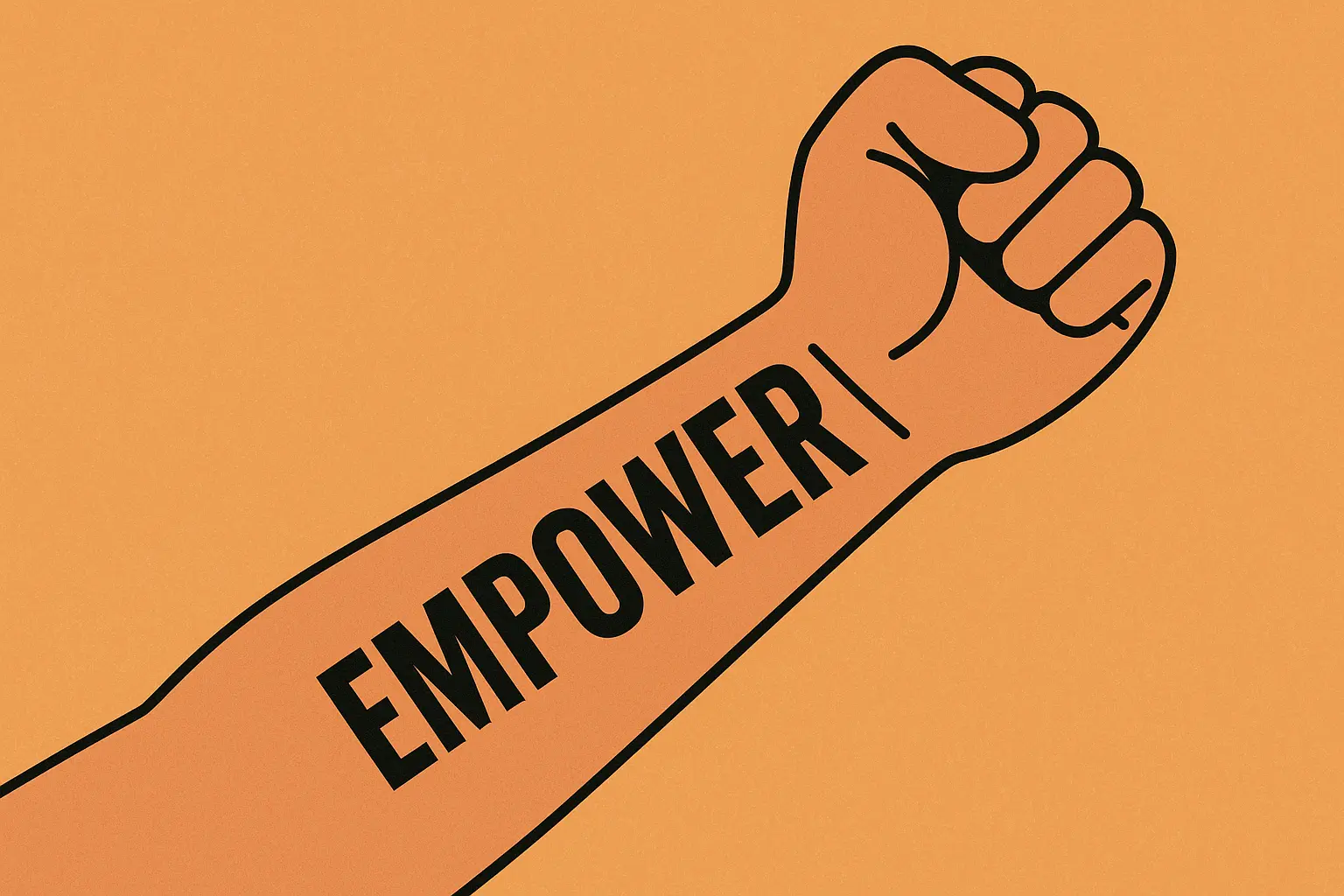
5. Block Letter Statement
Bold, all-caps, no-nonsense lettering that basically screams “I MEAN BUSINESS.” Block letters are the pickup trucks of the font world – not fancy, but they’ll still be running strong when everything else has broken down.
Words like “FEARLESS,” “UNBROKEN,” or “RESILIENT” gain extra power through bold letterforms that match their meaning. There’s something about thick, strong letters that projects confidence and strength.
These age like champions because thick lines stay thick lines. Your block letter tattoo will probably look almost identical in 20 years, which is more than you can say for most other font choices.
The downside? They’re not subtle. Block letters demand attention and take up space. They’re not for people who want delicate, hidden tattoos. These are statement pieces that own their space on your body.
My Rating:
-
Font flexibility: ⭐⭐⭐⭐⭐ (Ages like fine wine)
-
Works anywhere: ⭐⭐⭐⭐ (Need adequate space)
-
Boss-friendly: ⭐⭐⭐ (Bold nature draws attention)
-
Stays readable: ⭐⭐⭐⭐⭐ (Will outlast everything else)
6. Literary Quote
Ah, the intellectual tattoo choice. Getting lines from your favorite author permanently inked shows you’re cultured, well-read, and probably own more books than the average person.
Literary quotes carry weight beyond their words because they connect you to something bigger – centuries of human thought and creativity. “We are all in the gutter, but some of us are looking at the stars” isn’t just a nice sentiment; it’s Oscar Wilde’s wisdom living on your skin.
The challenge with literary quotes is length. Famous passages are often longer than ideal tattoo text, so you might need to excerpt the most powerful part. Sometimes the essence matters more than getting every word exactly right.
Consider whether you want to include attribution. Some people love having “- Maya Angelou” as part of their tattoo, others prefer letting the words stand alone. There’s no wrong choice, just personal preference.
My Rating:
-
Font flexibility: ⭐⭐⭐⭐ (Elegant fonts work great)
-
Works anywhere: ⭐⭐⭐ (Longer quotes need space)
-
Boss-friendly: ⭐⭐⭐⭐⭐ (Literary content is respected)
-
Stays readable: ⭐⭐⭐⭐ (Depends on font choice)
7. Song Lyrics
Music tattoos hit different because songs soundtrack our lives in ways that quotes from books don’t. That line that got you through your breakup or helped you celebrate your wedding becomes part of your permanent story.
The emotional connection to lyrics often runs deeper than other text choices because music triggers memory and emotion simultaneously. Every time you see those words, you’re not just reading them – you’re remembering how they made you feel.
Be careful about choosing lyrics that are too tied to a specific time period or relationship. “Our song” from your college relationship might not feel the same when you’re married to someone else 10 years later.
Also consider the song’s longevity. That pop hit that’s everywhere right now might feel dated eventually, while classic rock or timeless folk lyrics tend to age better culturally.
My Rating:
-
Font flexibility: ⭐⭐⭐⭐ (Script fonts work well with lyrics)
-
Works anywhere: ⭐⭐⭐ (Length varies by song)
-
Boss-friendly: ⭐⭐⭐⭐ (Usually positive, depends on content)
-
Stays readable: ⭐⭐⭐⭐ (Depends on font and sizing)
8. Personal Mantra
These are the words you’ve created for yourself through your own life experience and growth. Personal mantras carry unique power because they emerge from your specific journey and challenges.
“Progress over perfection.” “Courage over comfort.” “I am not my mistakes.” These phrases become daily reminders of lessons learned and values developed through real experience.
The creation process for personal mantras often involves distilling complex life experiences into simple, powerful phrases. This refinement ensures the words carry maximum meaning for your specific situation.
Since these are your own words, they’re less likely to lose relevance over time. They reflect core values that are likely to remain constant even as other aspects of your life change.
My Rating:
-
Font flexibility: ⭐⭐⭐⭐⭐ (Your choice completely)
-
Works anywhere: ⭐⭐⭐⭐⭐ (Usually short enough)
-
Boss-friendly: ⭐⭐⭐⭐⭐ (Positive personal messages)
-
Stays readable: ⭐⭐⭐⭐⭐ (Short phrases age great)
9. Foreign Language Phrases
Latin, Spanish, French, Sanskrit – foreign language tattoos add cultural depth and a bit of mystery to your ink. Plus, they offer privacy since not everyone can read them.
“Carpe Diem,” “La Vida es Bella,” “Tout Va Bien” – these phrases carry both meaning and cultural weight that English translations might not capture as elegantly.
But please, PLEASE get your translation verified by native speakers or professional translators. Foreign language tattoo fails are legendary for good reason. That beautiful Sanskrit phrase you found online might actually be gibberish or, worse, something offensive.
Cultural sensitivity matters here too. Make sure you’re honoring rather than appropriating when you choose languages from cultures you’re not connected to.
My Rating:
-
Font flexibility: ⭐⭐⭐⭐ (Some languages need specific fonts)
-
Works anywhere: ⭐⭐⭐⭐ (Varies by phrase length)
-
Boss-friendly: ⭐⭐⭐⭐ (Usually adds sophistication)
-
Stays readable: ⭐⭐⭐⭐ (Depends on font choice)
10. Inspirational Affirmations
Positive psychology made permanent. These tattoos serve as 24/7 therapy reminders, helping rewire negative thought patterns through constant visual reinforcement.
“I am enough.” “I choose joy.” “This is my time.” Affirmations work by repetition, and having them permanently visible creates countless opportunities for positive self-talk throughout your day.
The psychological research actually supports this – visual reminders of positive affirmations can help build self-esteem and maintain better mental health. Your tattoo becomes a therapeutic tool that’s always with you.
The universal appeal of positive messaging means these tattoos rarely create negative reactions from others. They often inspire people who see them, creating opportunities for meaningful conversations.
My Rating:
-
Font flexibility: ⭐⭐⭐⭐⭐ (All fonts work)
-
Works anywhere: ⭐⭐⭐⭐⭐ (Usually brief)
-
Boss-friendly: ⭐⭐⭐⭐⭐ (Positive messaging universally accepted)
-
Stays readable: ⭐⭐⭐⭐⭐ (Short and sweet)
11. Children’s Names
Parent tattoos are in a category of their own because the love is unconditional and permanent. Having your kid’s name tattooed demonstrates a level of commitment that resonates with other parents.
These tattoos often evolve into more complex tributes over time – adding birth dates, handprints, or meaningful symbols that represent each child’s personality. Planning for potential expansion is smart if your family might grow.
The emotional weight of children’s names means these tattoos rarely lose their meaning, even if your relationship with the child becomes complicated. The love remains, even through difficult periods.
Consider how you’ll handle spacing and design if you have multiple children or plan to have more. Some parents create cohesive designs that accommodate additions, others treat each child as a separate tribute.
My Rating:
-
Font flexibility: ⭐⭐⭐⭐ (Elegant fonts honor the tribute)
-
Works anywhere: ⭐⭐⭐⭐ (Names are usually short)
-
Boss-friendly: ⭐⭐⭐⭐⭐ (Family tributes are universally respected)
-
Stays readable: ⭐⭐⭐⭐⭐ (Names always matter)
12. Memorial Tributes
These are sacred tattoos that serve as permanent memorials for people who shaped your life. The therapeutic value often outweighs aesthetic considerations because they provide comfort and connection to lost loved ones.
“Always with me,” dates of birth and death, favorite sayings of the deceased – memorial tattoos keep precious memories alive in tangible ways. They become conversation pieces about important people rather than just decorative art.
Consider waiting at least six months after a loss before getting memorial tattoos. This allows for initial grief processing and ensures your tribute reflects long-term feelings rather than acute grief reactions.
Memorial tattoos typically receive respectful reception from others, even in conservative environments. The sacred nature of honoring the dead transcends most cultural barriers about body art.
My Rating:
-
Font flexibility: ⭐⭐⭐⭐⭐ (Elegant fonts honor the memory)
-
Works anywhere: ⭐⭐⭐⭐ (Varies by tribute complexity)
-
Boss-friendly: ⭐⭐⭐⭐⭐ (Memorial tattoos are universally respected)
-
Stays readable: ⭐⭐⭐⭐⭐ (Memorial meaning never fades)
13. Significant Dates
Numbers are simple, clean, and age beautifully. Important dates capture specific moments when your life changed forever – weddings, births, achievements, or transformative experiences.
“06.15.2018” might mark your wedding day. “03.22.2020” could commemorate surviving a major challenge. These numbers become shorthand for complex emotional experiences and personal growth.
Roman numerals add elegance to date tattoos while standard numbers ensure universal readability. Consider your audience and how important it is that others can easily interpret your dates.
Multiple date designs need careful hierarchy – which dates deserve emphasis and how to arrange them for visual flow. Some people create timelines, others stack dates by importance.
My Rating:
-
Font flexibility: ⭐⭐⭐⭐⭐ (Numbers age perfectly)
-
Works anywhere: ⭐⭐⭐⭐⭐ (Compact size fits anywhere)
-
Boss-friendly: ⭐⭐⭐⭐⭐ (Dates rarely cause issues)
-
Stays readable: ⭐⭐⭐⭐⭐ (Simple numbers stay clear)
14. Couple Names/Initials
Okay, real talk time. Couple tattoos are either the most romantic thing ever or a future laser removal appointment waiting to happen. I’m not trying to be cynical, but relationships can end while tattoos are forever.
That said, if you’re married or in a long-term committed relationship, having your partner’s name or shared initials can be a beautiful declaration of love. “Sarah & Michael” or intertwined initials create visible proof of your commitment.
Just… be really, really sure. I’ve seen too many people trying to turn “Jennifer” into “Jeremy” or getting creative cover-ups that never quite work. Consider your relationship’s stability and your own comfort level with permanent romantic declarations.
Some couples go for matching symbols or complementary phrases instead of specific names – less risky if things go south, but still meaningful while you’re together.
My Rating:
-
Font flexibility: ⭐⭐⭐⭐ (Romantic fonts work well)
-
Works anywhere: ⭐⭐⭐⭐ (Names/initials are compact)
-
Boss-friendly: ⭐⭐⭐⭐ (Generally fine, depends on placement)
-
Stays readable: ⭐⭐⭐⭐ (Names stay clear with proper sizing)
15. Coordinates
Geographic coordinates are perfect for people who want meaningful tattoos that look mysterious to everyone else. Most people can’t identify locations from numbers, so your meaningful place stays private.
“40.7589° N, 73.9851° W” might be where you met your spouse, where you were born, or where you had a life-changing experience. The precision creates intimate connections to specific moments in specific places.
Just double-check those numbers before you tattoo them. Small decimal errors can shift your location by miles, which kind of defeats the purpose of commemorating an exact spot.
Format choices affect both aesthetics and space requirements. Full coordinates take up more room than abbreviated versions, but abbreviated coordinates might not be precise enough for your purposes.
My Rating:
-
Font flexibility: ⭐⭐⭐⭐⭐ (Simple numbers work best)
-
Works anywhere: ⭐⭐⭐⭐ (Length varies by format)
-
Boss-friendly: ⭐⭐⭐⭐⭐ (Numbers rarely cause workplace issues)
-
Stays readable: ⭐⭐⭐⭐⭐ (Numbers maintain excellent clarity)
16. Script with Floral Elements
Combining text with flowers creates feminine, artistic designs that soften the stark nature of pure lettering. Roses with “Bloom where you are planted” or delicate vines framing “She flies with her own wings” turn words into art pieces.
The integration has to be seamless – flowers and text should flow together naturally rather than looking like two separate tattoos awkwardly combined. This requires artists skilled in both typography and botanical illustration.
Aging gets complicated with decorative elements. While your text might age predictably, fine floral details can blur or lose definition faster. Plan for potential touch-ups to maintain the artistic integrity.
These designs typically need more space than simple text, so placement becomes more limited. They work great on thighs, ribs, or shoulders where you have room for the full composition.
My Rating:
-
Font flexibility: ⭐⭐⭐⭐ (Script fonts work well with flowers)
-
Works anywhere: ⭐⭐⭐ (Need adequate space for complex designs)
-
Boss-friendly: ⭐⭐⭐⭐ (Feminine appeal, generally positive)
-
Stays readable: ⭐⭐⭐ (Decorative elements may blur)
17. Script with Geometric Accents
Modern geometric shapes paired with clean typography appeal to people who want something contemporary and structured. Simple triangles, circles, or line work can frame words without overwhelming them.
The clean, modern aesthetic works well in professional environments because geometric elements look intentional and artistic rather than impulsive. “Balance” framed by geometric shapes projects sophistication.
Design balance is crucial – the shapes should enhance the text, not compete with it. The geometry works best when it supports the text’s meaning rather than just adding decoration for decoration’s sake.
These combinations typically age well since both text and geometric elements use clean lines that maintain definition over time.
My Rating:
-
Font flexibility: ⭐⭐⭐⭐⭐ (Clean fonts work perfectly)
-
Works anywhere: ⭐⭐⭐⭐ (Depends on design complexity)
-
Boss-friendly: ⭐⭐⭐⭐⭐ (Modern, clean aesthetic)
-
Stays readable: ⭐⭐⭐⭐ (Geometric elements age well)
18. Script with Symbol Integration
Meaningful symbols woven into text create layered storytelling that pure words can’t achieve. An anchor with “Stay grounded” or infinity symbol within “Forever grateful” adds visual depth to the message.
Symbol choice should complement your text’s meaning rather than just looking cool. The connection between symbol and words should be obvious and meaningful, not forced or arbitrary.
Cultural sensitivity matters when borrowing symbols from traditions outside your heritage. Research symbol meanings thoroughly to avoid accidentally offensive or inappropriate combinations.
Integration can be subtle – incorporating symbols within letterforms – or bold – using symbols to frame or interrupt text. The approach should serve the overall message.
My Rating:
-
Font flexibility: ⭐⭐⭐⭐ (Must work with symbol integration)
-
Works anywhere: ⭐⭐⭐ (Complex designs need space)
-
Boss-friendly: ⭐⭐⭐⭐ (Depends on symbol choices)
-
Stays readable: ⭐⭐⭐⭐ (Symbols can enhance text clarity)
19. Script with Watercolor Effects
Watercolor backgrounds transform simple text into fine art pieces, but they’re high-maintenance tattoos that require specialized techniques and ongoing care.
The artistic appeal is undeniable – soft color washes behind “Create your own sunshine” or rainbow effects around “Love wins” create emotional impact through color psychology and painterly beauty.
Technical execution demands artists specifically skilled in watercolor techniques, which differ significantly from traditional tattooing. Not all artists can pull off the soft blending and color transitions effectively.
Maintenance requirements increase significantly since watercolor elements may blur or fade faster than solid applications. Budget for periodic touch-ups to keep the artistic effect intact.
My Rating:
-
Font flexibility: ⭐⭐⭐⭐ (Bold fonts work best with color backgrounds)
-
Works anywhere: ⭐⭐⭐ (Watercolor needs canvas space)
-
Boss-friendly: ⭐⭐⭐ (Colorful designs may limit options)
-
Stays readable: ⭐⭐⭐ (Color elements blur faster)
20. Script with Mandala Elements
Combining Western typography with Eastern sacred geometry creates spiritual designs that honor both traditions while serving meditative purposes.
Mandala patterns surrounding words like “Find your center” or “Inner peace” add spiritual depth and visual complexity that enhances the text’s meaning through symbolic reinforcement.
Cultural respect is essential since mandalas carry sacred meaning in Hindu and Buddhist traditions. Approach these designs with reverence and understanding rather than purely aesthetic appreciation.
Complexity affects both execution time and maintenance needs. Intricate mandala details may require multiple sessions and periodic touch-ups as fine lines blur over time.
My Rating:
-
Font flexibility: ⭐⭐⭐⭐ (Simple fonts work with complex backgrounds)
-
Works anywhere: ⭐⭐⭐ (Mandala designs need substantial space)
-
Boss-friendly: ⭐⭐⭐⭐ (Spiritual designs generally accepted)
-
Stays readable: ⭐⭐⭐ (Complex details may blur)
21. Spine Text
Spine placement offers dramatic vertical canvas that accommodates longer phrases while maintaining letter size and readability. The natural line of your spine guides text flow beautifully.
“She believed she could, so she did” flows perfectly along spine length while remaining easily readable. The vertical orientation works especially well for inspirational phrases or personal mantras.
Pain levels reach their peak with spine tattoos due to proximity to bone and nerve endings. Plan for longer sessions with breaks and prepare mentally for significant discomfort.
Professional implications stay minimal since spine tattoos are easily concealed with most clothing while still being displayable when desired. This flexibility makes spine placement ideal for meaningful text.
My Rating:
-
Font flexibility: ⭐⭐⭐⭐ (Bold fonts work best for spine)
-
Works anywhere: ⭐⭐⭐⭐⭐ (Perfect for longer text)
-
Boss-friendly: ⭐⭐⭐⭐⭐ (Easy to hide when needed)
-
Stays readable: ⭐⭐⭐⭐ (Vertical text ages well)
22. Wraparound Arm Text
Text that curves around your arm creates dynamic visual movement while maximizing space for longer phrases. The wraparound effect adds interest that straight-line text can’t match.
“What doesn’t kill you makes you stronger” can curve naturally around your forearm while maintaining proper spacing and readability from multiple viewing angles.
Technical challenges increase with curved text since letters must be adjusted to maintain proportions on cylindrical surfaces. Skilled artists understand how to compensate for arm curvature while preserving legibility.
Consider how the text appears from different angles and ensure the most important words remain visible from front-facing positions where people will see them most often.
My Rating:
-
Font flexibility: ⭐⭐⭐⭐ (Simple fonts adapt better to curves)
Works anywhere:
-
Works anywhere: ⭐⭐⭐ (Needs adequate arm circumference)
-
Boss-friendly: ⭐⭐⭐ (Visibility depends on clothing)
-
Stays readable: ⭐⭐⭐⭐ (Curves can help hide minor aging)
23. Ribcage Script
Ribcage placement provides intimate canvas for deeply personal text that stays private unless deliberately revealed. Perfect for personal mantras, memorial tributes, or meaningful quotes.
“I am stronger than my struggles” feels appropriately placed in this protected, personal space. The flat surface accommodates longer phrases without curvature challenges.
Pain levels are intense due to thin skin and proximity to bone. Plan for multiple sessions if choosing extensive text and prepare for significant discomfort in this sensitive area.
The natural breathing movement can add subtle animation to the text, creating living art that moves with your body’s rhythm.
My Rating:
-
Font flexibility: ⭐⭐⭐⭐⭐ (All fonts work on flat surface)
-
Works anywhere: ⭐⭐⭐⭐ (Good space for medium text)
-
Boss-friendly: ⭐⭐⭐⭐⭐ (Completely private)
-
Stays readable: ⭐⭐⭐⭐⭐ (Protected area ages well)
24. Finger Text
Maximum visibility meets maximum maintenance. Finger tattoos create constant visual reminders while demanding frequent touch-ups due to hand use and skin turnover.
“Love” across knuckles or “Stay strong” along fingers become part of your daily visual field while making statements to everyone you interact with.
Professional implications are serious since finger tattoos can’t be concealed in most work environments. Consider your career path carefully before choosing highly visible finger placement.
Maintenance requirements are significant – plan for annual touch-ups to keep finger text clear and defined as hands experience more wear than other body areas.
My Rating:
-
Font flexibility: ⭐⭐⭐ (Limited to bold, simple fonts)
-
Works anywhere: ⭐⭐ (Very limited space)
-
Boss-friendly: ⭐⭐ (Highly visible, may limit opportunities)
-
Stays readable: ⭐⭐ (Needs frequent touch-ups)
25. Collar Bone Script
Elegant horizontal canvas that balances visibility with sophistication. Collar bone placement works well for meaningful phrases you want to display selectively.
“Nevertheless, she persisted” or “Choose joy” create sophisticated statements that can be shown or hidden based on clothing choices and social situations.
The natural bone structure provides attractive framing for horizontal text while offering clear boundaries for design planning. Most professional attire conceals this area while allowing selective display.
Professional versatility makes collar bone script ideal for career-focused individuals who want meaningful tattoos without workplace limitations or social complications.
My Rating:
-
Font flexibility: ⭐⭐⭐⭐⭐ (All font styles work well)
-
Works anywhere: ⭐⭐⭐⭐ (Good for medium phrases)
-
Boss-friendly: ⭐⭐⭐⭐⭐ (Easy to conceal, sophisticated)
-
Stays readable: ⭐⭐⭐⭐⭐ (Flat surface ages excellently)
Design Psychology: Why These Styles Work
Understanding why certain script tattoo combinations create lasting satisfaction while others lead to regret comes down to psychological principles about visual hierarchy, personal connection, and social perception.
Visual hierarchy ensures your eye flows naturally to the most important elements first. Good script tattoos guide attention to key words through size, weight, or placement while supporting elements enhance rather than compete.
Personal connection depth matters more than aesthetic appeal for long-term satisfaction. Tattoos with deep personal meaning maintain relevance through life changes while purely aesthetic choices may lose appeal as tastes evolve.
Social perception affects how your tattoo functions in various environments. Understanding how different design elements influence others’ reactions helps you make choices that serve your goals.
Matching Your Tattoo to Your Lifestyle
Successful script tattoos align with your current life while accommodating future changes in career, family, and personal growth. Strategic thinking prevents common regrets by ensuring long-term appropriateness.
Career trajectory planning affects placement and content since professional requirements often change as you advance. Entry-level flexibility might disappear in executive roles requiring conservative appearance.
Family considerations include how your tattoo will be perceived by future children and how it might affect parental or grandparental roles throughout your lifetime.
Lifestyle evolution naturally occurs as priorities and values shift over decades. Choose script reflecting core values likely to remain constant rather than temporary interests or situational beliefs.
How Technology Simplifies Script Tattoo Design
Modern technology streamlines the design process through digital tools that allow typography testing, placement simulation, and improved artist collaboration before permanent application.
Font testing applications let you experiment with different typography styles using your chosen text, helping visualize how various fonts affect your message’s impact and readability.
Augmented reality apps enable placement testing by overlaying potential designs onto body photos, helping you understand how different locations will look and function in real situations.
Digital collaboration tools facilitate clear communication with tattoo artists through shared reference images, font preferences, and placement ideas, leading to better results and fewer misunderstandings.
Final Thoughts
Script tattoos represent powerful intersections of personal meaning, artistic expression, and permanent commitment requiring thoughtful planning and expert execution. Success balances aesthetic appeal with practical considerations like aging, professional acceptance, and long-term relevance.
The permanence demands respect for the decision-making process. Unlike other self-expression forms that change easily, your tattoo remains through decades of personal growth, career changes, and life transitions. This permanence should inspire careful consideration rather than impulsive choices.
Quality investment in both design planning and artistic execution proves worthwhile since text-based designs either succeed completely or fail obviously. There’s little middle ground with lettering work – it’s either readable and beautiful or problematic and regrettable.
Personal meaning ultimately determines long-term success more than aesthetic trends or social acceptance. Choose words resonating with your deepest values and experiences, ensuring your script tattoo remains meaningful regardless of changing circumstances or evolving personal style.
The journey from concept to completion offers opportunities for personal reflection and artistic collaboration that extend the tattoo’s value beyond the final result. Embrace the planning process as part of the meaningful experience your script tattoo represents.