
18 Star Tattoos That Work With Your Body’s Natural Movement (Not Against It)
You’re standing in front of the mirror, arm extended, imagining that perfect star tattoo. Looks great, right?
Now move your arm. Bend it. Twist. That tattoo you’re picturing? It’s going to move with you, or against you.
Your body doesn’t freeze in one position. You breathe, bend, reach, turn your head, shift your weight constantly. That star you’re planning will move through all of those motions. The question is whether it’ll keep looking good or start warping into something awkward.
I’ve watched three clients regret centered collarbone stars. The off-center ones? Never gotten a complaint.
For centuries, stars have served as navigational aids for humanity. Ancient mariners and travelers used the night sky as a map and compass to find their way home or to new lands. That same principle applies to modern star placement. Understanding how your body moves through space helps you choose designs that maintain their integrity regardless of position or motion.

Stellar Designs That Bend and Flex
1. Shooting Star Along the Ribcage
Your ribcage expands and contracts with every breath. This constant motion happens about 20,000 times a day, and it will interact with your tattoo whether you plan for it or not.
A shooting star works here because its directional flow follows your natural breathing pattern. But most people make the tail too long.
Shorter tails prevent distortion. When your ribcage expands during a deep breath, a long tail stretches and warps. A compact tail keeps its shape through the full range of motion. Keep the tail length to about 1.5 times the star’s width. Any longer and you’re asking for problems.
Line weight matters more on ribcage tattoos than almost anywhere else. Thin, delicate lines look beautiful when you’re standing still, but they can appear to break or fade when the skin stretches. Medium-weight lines hold their integrity better.
Place the star’s point toward your spine rather than away from it. Creates better visual flow when you’re seated or bending. When you sit down and your torso compresses, the star flows inward instead of bunching awkwardly.
Yes, this placement hurts like hell. The ribcage is bony with thin skin. Anyone who tells you otherwise is lying or has a superhuman pain tolerance. But it often heals cleaner than you’d expect. The constant movement from breathing keeps the area from getting too stiff during healing.
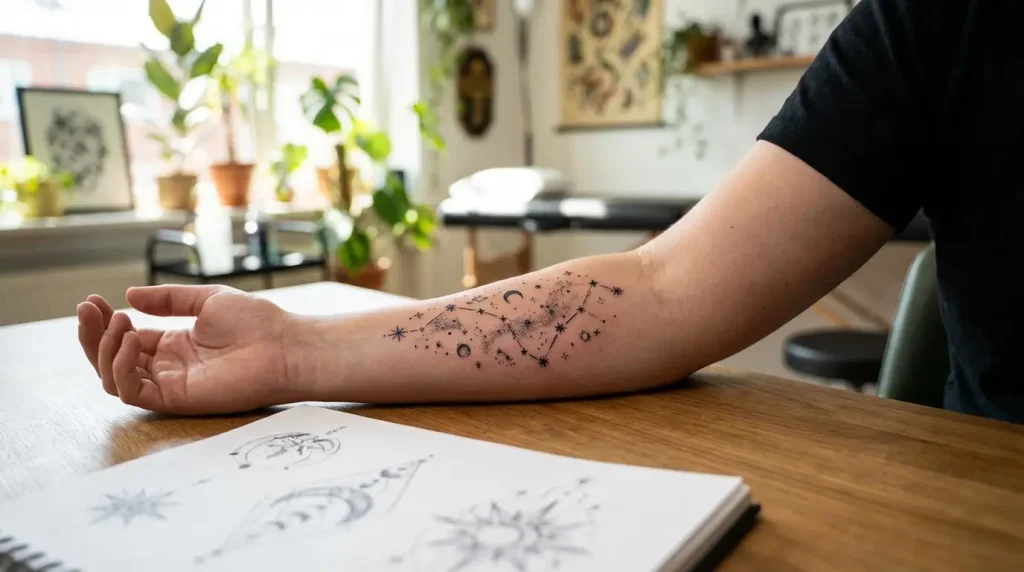
2. Constellation Wrap on the Forearm
Your forearm rotates constantly. Typing, driving, gesturing while you talk, reaching for your coffee. It pronates and supinates dozens of times every hour.
A constellation that wraps around this cylindrical surface needs strategic placement so it reads correctly from multiple viewing angles. The biggest mistake? Designing the constellation while your arm is in one static position, then wondering why it looks weird when you move.
Map constellations on forearms by having you rotate your arm through its full range of motion during the design phase. Stars that cluster beautifully when your palm faces up might look scattered and random when your palm faces down. The connecting lines between stars should follow the muscle’s natural curve, specifically the path of your flexor muscles when they’re engaged.
Position your primary stars (the brightest or largest ones) on the outer forearm where they’re visible from the most angles. Place secondary stars on the inner forearm to create the wrap effect. The connecting lines should angle slightly forward toward your wrist rather than straight across.
Test the wrap before committing. Have your artist place the stencil, then spend five minutes moving your arm through normal daily motions. Take photos from different angles. If something looks off when you rotate your arm, it’s going to bother you every single day.
3. Nautical Star at the Elbow Joint
Elbow tattoos are brutal. The skin bunches when bent and stretches when straight. Extreme distortion, more than almost any other body part.
A nautical star works here because its symmetrical structure can absorb some distortion without losing its recognizable shape. Those bold lines and sharp edges aren’t just aesthetic choices. They’re structural elements that help the design maintain integrity through constant movement.
The nautical star’s enduring appeal comes from its historical function. Sailors who could see the stars, even without a compass, could navigate by them, making this five-pointed design with bold lines and sharp edges a symbol of guidance and protection. That same structural integrity that helped sailors find their way home makes the nautical star particularly suited for challenging placements like the elbow joint.
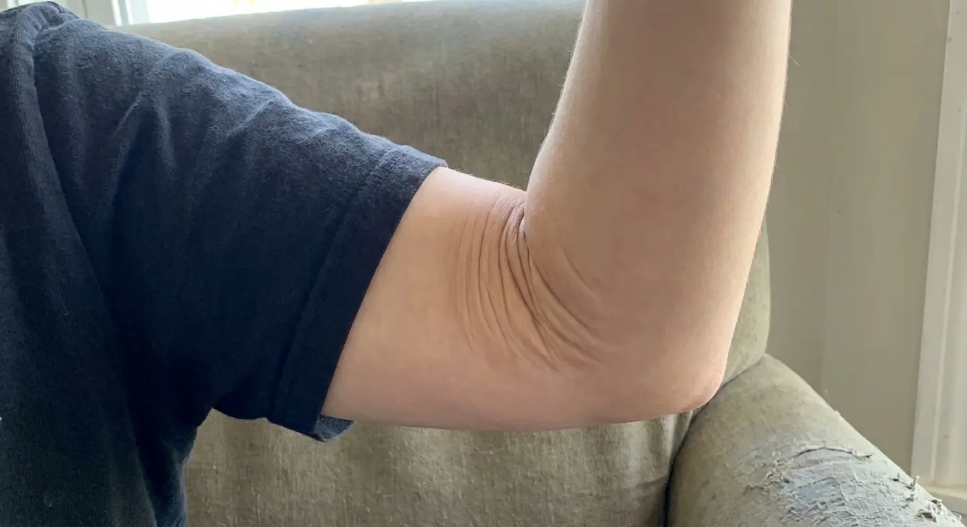
The exact placement sweet spot is slightly above the point of the elbow, about half an inch up. Directly on the elbow point means the center of your star sits right where the skin bunches most dramatically. Moving it up just slightly means the star straddles the high-movement zone rather than centering on it.
Bold lines matter more here than anywhere else. I’m talking about line weights that might look too heavy on other body parts. Thin lines on elbows blur and spread faster because of the constant friction and movement. Go bold or go home.
Position the star so it looks intentional in both bent and straight arm positions. Bend your arm fully, straighten it completely, check every position in between. The star should look like it belongs in all positions, not just one.
Healing expectations for elbow tattoos need to be realistic. This area takes longer to heal because you can’t stop bending your elbow. You’ll probably need a touch-up. Plan for it, budget for it, don’t be surprised when your artist recommends one after six months.
4. Cascading Stars Down the Spine
Your spine curves in three dimensions. Front to back, side to side, and it rotates. A star placed along this complex curve needs graduated sizing and spacing to account for that reality.
Scale stars from largest at the top to smallest at the base (or vice versa) so they don’t look randomly scattered. The graduation creates intentional flow that guides the eye along your spine’s natural line. Equal-sized stars can look like they’re floating without purpose.
Most people don’t realize this: your spine isn’t perfectly centered on your back. Everyone has slight asymmetries. Some people’s spines curve slightly to one side. If you center your design based on the midpoint between your shoulder blades, it might not align with your actual spine.
Your artist needs to actually feel your spine. Not guess at center based on your shoulder blades. Not eyeball it. Actually touch each vertebra and mark from there. Most people’s spines curve slightly to one side. Mine does, yours probably does too.
Forward bending versus backward arching affects the design’s appearance significantly. When you bend forward, the stars spread apart. When you arch backward, they compress together. Spacing needs to account for this. Stars that look perfectly spaced when you’re standing straight might look too close together when you arch back.
Test the stencil while moving through different positions. Stand straight, bend forward, arch back, twist to each side. The design should maintain its visual flow through all of these movements.
5. Single Star Behind the Ear
Behind-the-ear tattoos sit on a surface that’s almost always in motion. Turning your head, looking down at your phone, sleeping on your side. This area never stays still for long.
A single star works here because simplicity prevents the design from getting lost in the constant movement. Complex designs with multiple elements or fine details tend to blur together visually on this small, high-movement area.
Go bigger than you think. Seriously.
People want tiny, delicate stars behind their ears, but those blur and lose definition quickly. I recommend a star that’s at least the size of a quarter. Yes, that feels large when you’re looking at the stencil, but it’s what holds up over time.
Line weight needs to be bolder than delicate. The skin behind your ear is thin and experiences constant friction from hair, pillows, and the natural oils your skin produces. Thin lines fade faster here than almost anywhere else.
Hair coverage affects long-term visibility in ways you need to think about upfront. If you have thick hair that covers your ears, your star will be hidden most of the time. That might be exactly what you want, a secret tattoo that only shows when you tuck your hair back. Or it might be frustrating if you wanted something more visible.
Glasses or earbuds during healing can be problematic. If you wear glasses, the arms rest right where your tattoo is. If you use earbuds regularly, they sit directly on the healing tattoo. You’ll need to modify your routine for at least two weeks. Over-ear headphones during healing, and be extra careful with glasses placement.
Behind the ear? Yeah, you’re getting a touch-up. Not maybe. Not if you’re unlucky. You’re getting one. That area gets constant friction from hair, pillows, glasses, everything. Plan for it now and you won’t be disappointed later.
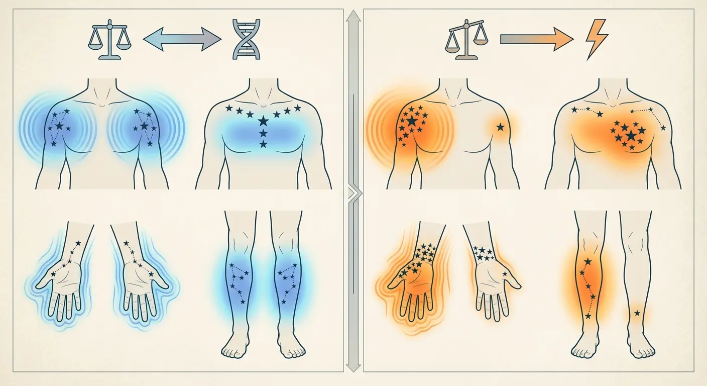
Stars That Honor Symmetry and Asymmetry
Symmetrical stars require mathematical precision during placement. Measurements down to the millimeter, careful attention to anatomical landmarks, extensive testing before the stencil goes on.
Asymmetric designs offer more forgiveness but need intentional composition. You can’t just slap stars randomly on your body and call it asymmetric design. There’s a difference between deliberately breaking symmetry for artistic effect and having a poorly planned tattoo.
Why are symmetrical designs harder to execute than they look? Because your body isn’t symmetrical. Your right side differs from your left side in subtle but measurable ways. One shoulder sits slightly higher. One hip tilts forward. One wrist is thicker than the other. When you try to place identical stars on both sides of your body, these natural asymmetries become glaringly obvious.
Breaking symmetry can strengthen a design when done intentionally. An off-center star draws the eye and creates visual interest that perfectly centered designs sometimes lack. But this only works when the asymmetry is deliberate and well-planned, not accidental.
6. Mirrored Stars on Both Wrists
Matching wrist tattoos sound simple until you realize your wrists are different sizes. Your dominant hand’s wrist is typically slightly larger than your non-dominant hand’s wrist because the muscles and tendons are more developed.
Measure and mark for true visual symmetry, which differs from measured symmetry. If you place identical stars at the exact same measured distance from your wrist bone on both sides, they might not look symmetrical when you hold your hands together. Visual symmetry accounts for the size difference and adjusts accordingly.
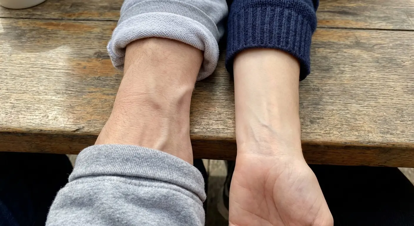
Identical stencils need slight adjustments between wrists. Scale one star 5-10% smaller to account for wrist size differences. Adjust the angle slightly to account for how your hands naturally hang at different angles. These micro-adjustments are what make mirrored stars look truly symmetrical.
Your dominant versus non-dominant hand will heal differently and age differently. Your dominant hand experiences more friction, more sun exposure, more washing, and more general wear and tear. The star on your dominant wrist will likely fade slightly faster and might need touch-ups more frequently.
Should you tattoo both wrists in one session or split them? There are arguments for both. One session ensures the ink saturation and technique are identical because they’re done back-to-back. But it also means you can’t use either hand properly during the first few days of healing, which can be genuinely difficult. Splitting the sessions means you always have one functional hand, but there’s a slight risk of minor variations in ink saturation or technique between sessions.
The inevitable minor differences that emerge during healing are normal. One star might scab slightly differently than the other. One might have a tiny spot that needs touching up while the other heals perfectly. This doesn’t mean anything went wrong. It means you have two different hands that healed two different tattoos.
7. Off-Center Star on the Collarbone
Deliberately placing a star off-center on your collarbone creates visual interest that centered designs can’t match. The asymmetry draws attention and creates a focal point that guides the eye.
Choose which side based on your natural asymmetries. One of your collarbones is likely more prominent than the other. Most people have one side that’s slightly more defined or sits at a slightly different angle. Place the star on whichever side has the more prominent bone structure because it enhances the design’s visibility and creates better integration with your body’s existing features.
Off-center doesn’t mean random placement. Measure carefully from anatomical landmarks: the notch at the base of your throat, the point where your collarbone meets your shoulder, the distance from your neck’s centerline. These measurements ensure the asymmetry looks intentional rather than like a placement mistake.
Balance an asymmetric star with your body’s existing features by looking at the bigger picture. What jewelry do you wear? Do you have other tattoos nearby? Does your hair fall on one side more than the other? All of these elements interact with your off-center star. The design should complement these features, not compete with them.
This placement photographs exceptionally well. The collarbone creates natural shadows and highlights that add dimension to stars. The angle of the bone catches light in ways that make even simple designs look more dynamic in photos. This spot is Instagram gold, which matters if we’re being honest.
Clothing necklines interact with different positioning choices in ways worth considering. A star placed closer to your shoulder will show with most necklines. One placed closer to your throat’s center will be more hidden with crew necks but visible with V-necks. Think about your wardrobe and how much visibility you want in different contexts.
8. Triple Star Cluster on the Shoulder Blade
Three stars arranged on your shoulder blade can follow the bone’s natural triangular shape or deliberately contrast it. Both approaches work, but they create completely different visual effects.
Clustering stars to echo your scapula’s geometry creates harmonious integration. The triangular bone structure of your shoulder blade provides a natural framework. When you arrange three stars to mirror this triangle, the design feels like it belongs there, like it’s enhancing your body’s existing architecture rather than sitting on top of it.
Arranging stars to create visual tension against your bone structure produces bold, statement-making designs. When the star cluster’s geometry contrasts with your scapula’s shape, it creates dynamic interest. The design feels more like art placed on your body rather than art integrated with your body. Neither approach is better. They’re just different aesthetic choices.
Shoulder movement affects which arrangements hold their composition best. When you reach forward, your shoulder blade rotates and the skin stretches. When you pull back, the blade retracts and the skin compresses. Arrangements that maintain visual cohesion through these movements are the ones that work long-term.
Odd numbers work better. Visual weight distribution. Three, five, or seven stars create natural focal points and allow for asymmetric arrangements that feel balanced. Four or six stars tend to pair off visually, which can feel static or forced.
Scaling each star relative to the others creates balanced visual weight. I recommend one larger star as the focal point with two smaller supporting stars. Equal sizing can work, but it requires more careful spacing to avoid looking repetitive.
9. Asymmetric Star Trail Across the Chest
A star trail that sweeps asymmetrically across your chest works with your body’s existing asymmetries rather than fighting them. Starting from one side and flowing toward the center or diagonally from shoulder to sternum creates movement that feels natural.
Map this trail to complement your natural muscle definition. Your pectoral muscles create natural lines and curves. When your star trail follows these contours, the design appears to flow with your body’s structure. Ignoring muscle definition makes the trail look arbitrary.
Start larger and taper smaller. The eye naturally follows the progression from large to small, which guides attention along the trail’s path. Uniform-sized stars feel static. They don’t create the sense of movement that a star trail should convey.
Chest hair growth patterns matter if applicable. Hair grows in specific directions and densities across your chest. A star trail that cuts across the grain of hair growth can look awkward as the hair grows back during healing and beyond. Map hair growth patterns during the design phase and adjust the trail’s path accordingly.
How does this placement look in different clothing styles? V-necks will show the upper portion of most chest trails. Crew necks will hide everything. Button-up shirts reveal different amounts depending on how many buttons you leave open. Think about your typical clothing choices and whether you want the flexibility to show or hide your tattoo depending on context.
Chest pieces are serious. You’re showing that off or hiding it forever. Make sure you’re ready.
Dimensional Stars That Play With Depth
Flat star outlines serve their purpose, but dimensional techniques transform them into designs that appear to lift off your skin or recede into it. Shading, negative space, geometric patterns, dotwork. Techniques that create depth perception.
Which dimensional techniques work best on different body parts? The answer depends on how much that area moves and how close viewers typically get to it. Fine dotwork looks incredible up close but can read as solid gray from conversation distance. Bold 3D effects work from far away but might look heavy-handed when examined closely.
10. 3D Star on the Inner Bicep
A 3D star on your inner bicep uses shading and highlights to create the illusion that it’s floating above or carved into your skin. The effect can be striking when executed well, but it requires specific conditions to work.
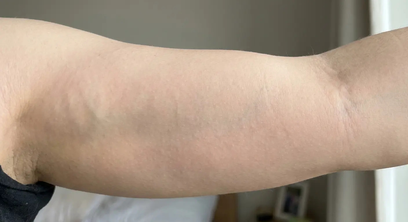
The inner bicep’s relatively flat surface when your arm is extended makes it ideal for 3D effects. Curved surfaces distort the illusion because the shading that creates depth perception only works from certain viewing angles. The inner bicep provides enough flat real estate for the 3D effect to read correctly from most angles.
Light source direction in the design should match real-world lighting for maximum impact. Most indoor and outdoor lighting comes from above. If your 3D star has shadows cast as if the light source is below, your brain registers something as “off” even if you can’t articulate why. Design 3D stars with light sources from above and slightly to one side, the most natural lighting scenario.
This technique requires an artist specifically skilled in realism. Not every talented tattoo artist can execute convincing 3D effects. The shading needs to be precise, the highlights need to be placed exactly right, and the overall composition needs to account for how light and shadow work in three-dimensional space. Check your artist’s portfolio specifically for 3D work before booking.
How does the 3D effect hold up as the tattoo ages and your skin changes? Honestly, it softens. The crisp contrast between highlights and shadows that creates the illusion will blur slightly over years. This doesn’t mean the tattoo looks bad, it just means the 3D effect becomes more subtle. Touch-ups can restore the crispness if you want to maintain the full effect.
11. Geometric Star With Shadow Work on the Calf
Adding geometric patterns within a star and casting shadows beneath it creates architectural depth on your calf. The combination of internal detail and external shadow work gives the design multiple layers of visual interest.
The calf’s muscle curve enhances geometric designs rather than fighting them. The natural contour of your gastrocnemius muscle adds another dimension to geometric stars. When you flex your calf, the muscle definition interacts with the geometric patterns in ways that flat surfaces can’t replicate.
Shadow placement needs to account for how you typically stand and walk. If the shadow is cast as if you’re standing straight but you have a natural tendency to stand with your weight shifted to one side, the shadow will look off whenever you’re in your natural stance. Observe your natural posture during the design phase and adjust shadow direction accordingly.
Line weight variations between the star itself and its geometric interior create hierarchy. Bolder lines for the star’s outer edges establish the primary shape. Finer lines for the internal geometric patterns create detail without overwhelming the overall design. This hierarchy helps the eye process the design. You see the star first, then discover the geometric details upon closer inspection.
Should geometric patterns extend beyond the star’s boundaries? Sometimes yes, sometimes no. Extending patterns beyond the star creates integration with the surrounding skin and can make the design feel less contained. Keeping patterns strictly within the star’s boundaries creates a more defined, self-contained composition. Both look good. This is personal preference, not technique.
12. Celestial Star With Negative Space on the Thigh
Using your natural skin tone as part of the design creates a star that breathes and feels less heavy than solid ink. Negative space isn’t empty space. It’s intentional use of your skin as a design element.
Plan negative space so it reads as intentional rather than unfinished. The negative space needs clear boundaries and purpose. Random gaps in ink look like mistakes. Deliberate negative space shaped into recognizable forms or patterns looks like sophisticated art.
This technique works particularly well on larger body parts like thighs where there’s room for the eye to process the design. Small negative space elements on small body parts can be hard to read. The thigh provides enough canvas for negative space to make visual sense from normal viewing distances.
How does negative space age compared to filled areas? Interestingly, it often ages better. Filled areas can blur and spread slightly over time as ink migrates microscopically in the skin. Negative space stays crisp because there’s no ink to migrate. The contrast between inked and non-inked areas might soften slightly, but the overall composition typically holds up well.
Balance negative space with filled elements so neither dominates. Too much negative space and the tattoo feels incomplete. Too much filled area and you lose the breathing room that makes negative space designs special. Aim for roughly 40-60% negative space, though this varies based on the specific design.
Touch-ups for negative space stars are needed less frequently than you’d expect. Since there’s less ink overall, there’s less ink to fade or blur. When touch-ups are needed, they’re usually to re-establish the crisp edges between inked and non-inked areas rather than to fill in faded sections.
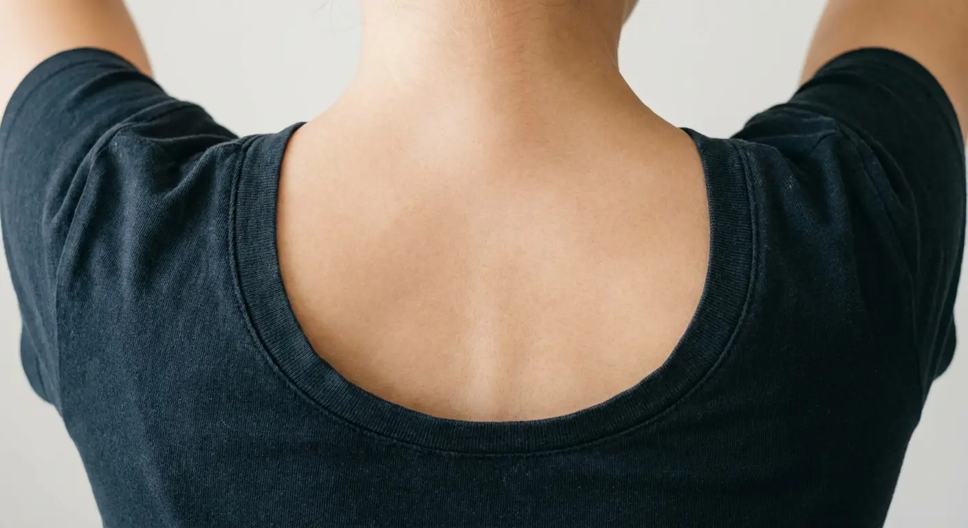
13. Mandala-Infused Star on the Upper Back
Combining mandala patterns with star geometry on your upper back creates depth through layered detail rather than shading. The intricate patterns within and around the star create visual complexity that draws the eye inward.
Integrate mandala elements into star points without losing the star’s recognizable shape. Dots, petals, and geometric divisions can enhance the star’s points or they can obscure them entirely. Maintain the star’s basic silhouette while adding mandala details within that framework.
The upper back’s flat, stable surface is ideal for intricate detail work. This area doesn’t experience the constant movement of joints or the stretching of areas like the ribcage. The skin stays relatively stable, which means fine details hold their definition better over time.
Scale the design so it’s readable from conversation distance. Mandala-infused stars can become so detailed that they read as a gray blob from a few feet away. Design with multiple viewing distances in mind. The overall star shape should be clear from across a room, while the mandala details reveal themselves upon closer inspection.
How much detail is too much? When the design becomes so dense that individual elements can’t be distinguished, you’ve crossed into too much. Aim for detail that creates richness without creating visual noise. Strategic use of negative space within the mandala elements and varying the density of patterns across different areas of the star.
Look, I’m giving you 18 examples because that’s a good number for an article. Could’ve been 15, could’ve been 20. These are just the ones that illustrate different principles.
Mandala-infused stars take longer than simple stars. A large, detailed mandala star on your upper back might require 6-10 hours of work. Breaking this into multiple sessions is common and often advisable, both for your comfort and for the artist’s ability to maintain precision throughout the detailed work. Bring snacks.
Last month someone came in wanting a symmetrical wrist piece. Both wrists measured differently by almost a centimeter. She didn’t believe me until I showed her with calipers.
At the 2026 Milano-Cortina Winter Olympics, Team USA snowboarder Jake Pates drew attention not just for his 8th place finish in the Men’s Halfpipe Final, but for his massive Star of David tattoo prominently featured in his viral TikTok content from the Olympic Village. His tattoo tour video, where he pointed to the unfilled Star of David on his upper right pec and dedicated it “for my Jewish baddies,” demonstrates how stars continue to serve as deeply personal symbols of identity and cultural connection, even on the world’s biggest athletic stage.
14. Dotwork Star on the Ankle
Building a star entirely from dots creates subtle dimension through density variation. Stippling uses thousands of individual dots placed at varying densities to create the illusion of shading and form.
Ankles work for dotwork despite being bony and painful because the technique requires less machine time than lining and shading. Each dot is a quick tap rather than a dragged line. The cumulative effect still hurts, but the pain comes in brief bursts rather than sustained pressure. Some people find this more tolerable.
Dot density creates the illusion of shading without actual gradients. Areas with dots placed close together appear darker. Areas with dots spaced farther apart appear lighter. This creates dimension and form through optical mixing. Your eye blends the dots together from normal viewing distances.
This approach ages gracefully on areas prone to sun exposure. Ankles get significant sun exposure if you wear shorts, skirts, or cropped pants. Solid black shading can fade unevenly with sun exposure, creating patchy appearances. Dotwork fades more uniformly because each dot fades at roughly the same rate, maintaining the overall composition even as it lightens.
Dotwork takes forever. I’m not exaggerating. A piece that would take an hour with regular shading might take three hours in dots.
Dotwork hurts differently than traditional tattooing. Instead of the sustained burning sensation of lining or the dragging pressure of shading, dotwork feels like repeated sharp pinpricks. Neither is objectively worse, but they’re different sensations. Some people strongly prefer one over the other.
Choose dot size based on your skin tone and the viewing distance you want to optimize for. Larger dots are more visible from farther away and show up better on darker skin tones. Smaller dots create finer detail but require closer viewing to appreciate and can be harder to see on darker skin. Use a mix of dot sizes. Larger dots for the star’s outline and primary structure, smaller dots for subtle shading and detail.
Stars Designed for Skin Tone and Texture
Your skin isn’t a blank white canvas. Pretending it is leads to disappointing results.
Which ink colors and techniques work best for different skin tones? The answer goes beyond “black works on everyone.” Black does work on all skin tones, but how it appears, how it ages, and what other colors complement it vary significantly based on your specific skin tone and undertones.
Stretch marks don’t disqualify you from fine line tattoos. Placement strategy and design integration determine whether the combination works beautifully or looks awkward.
Testing ink saturation on your specific skin is worth the extra consultation time. Some skin holds ink easily. Some skin requires multiple passes to achieve the same saturation. Some skin heals lighter than expected. A small test spot (usually hidden somewhere inconspicuous) can reveal how your skin responds to ink before you commit to a full design.
15. White Ink Star on Darker Skin
White ink on darker skin tones creates a subtle, almost scarification-like effect that’s completely different from white ink on pale skin. The contrast is softer, the effect is more textural than color-based, and the overall aesthetic is unique.
Realistic expectations matter here: it won’t be bright white. On darker skin, white ink typically heals to a lighter tone than your natural skin, more of a raised, highlighted effect than a stark white star. The exact result depends on your specific skin tone, with darker tones producing more subtle contrast.
White ink requires an artist experienced with darker skin specifically. The technique differs from working with darker inks. White ink needs to be packed more densely into the skin to show up, and the artist needs to understand how it will heal on your particular skin tone. Check portfolios for white ink work on skin tones similar to yours before committing.
How does white ink age on darker skin? It often fades to a soft highlight rather than disappearing entirely. The raised texture of the tattoo remains even as the color softens. Some people love this aged effect, it becomes even more subtle and integrated with the skin. Others prefer to get touch-ups every few years to maintain more visible contrast.
White ink stars work best as accents within larger pieces rather than standalone designs. A small white ink star on its own can be difficult to see from any distance. White ink stars incorporated into a larger color or black piece create highlights and dimension that enhance the overall composition.
Test whether your skin will accept white ink before committing to a full design. Some skin types reject white ink or heal it out almost completely. A small test spot on an inconspicuous area (inner arm, behind the ear) shows you exactly how white ink will look on your specific skin after healing.
16. Bold Outlined Star for Textured Skin
Textured skin from scarring, keratosis pilaris, or other conditions needs bold outlines that won’t get lost in surface variations. Thicker lines maintain visibility across different skin textures better than fine line work.
Bold lines work better on textured skin because surface irregularities can interrupt fine lines visually, making them appear broken or inconsistent. Bold lines create enough visual weight to read clearly across texture variations. The line remains the dominant visual element rather than competing with the skin’s texture.
Position stars so they work with texture rather than fighting it. If you have a scar, place the star so one point follows the scar’s direction, making the scar part of the design. If you have keratosis pilaris on your upper arms, position the star where the texture is less pronounced or use the texture as part of the design’s aesthetic. Both work better than trying to pretend the texture doesn’t exist.
Solid fills often look cleaner on textured skin than gradient shading. Gradients require smooth transitions that textured skin can interrupt. Solid fills create consistent color saturation that reads clearly regardless of minor surface variations. If you want dimension on textured skin, consider using bold outlines with solid fills in different values rather than gradient shading.
Communicate your skin concerns to artists during consultations. Many artists have experience working with various skin textures and can show you examples from their portfolios. Be specific about your concerns and ask to see healed photos of work they’ve done on similar skin types.
Textured skin sometimes holds ink better than smooth skin in unexpected ways. Scar tissue can be unpredictable, some scars hold ink beautifully while others reject it. Keratosis pil aris bumps don’t typically affect ink retention. Stretch marks often hold ink differently than surrounding skin but not necessarily worse. The only way to know for certain is through test spots or accepting that minor variations are part of your unique tattoo.
17. Watercolor Star Adjusted for Undertones
Watercolor-style stars need color adjustments based on your skin’s undertones to prevent muddy or washed-out results. Cool, warm, or neutral undertones affect how every color appears on your skin.
Choose watercolor hues that complement rather than clash with your undertones. Cool undertones (pink, red, or bluish) work beautifully with purples, blues, and cool-toned greens. Warm undertones (yellow, peachy, or golden) enhance oranges, warm reds, and warm greens. Neutral undertones have the most flexibility but still benefit from strategic color selection.
Some colors disappear on certain skin tones while others pop. Yellows and light blues often wash out on pale skin with cool undertones. They simply don’t have enough contrast to read clearly. Those same colors can look stunning on deeper skin tones or warm undertones where the contrast is stronger. Purples and teals tend to show up well across most skin tones, though the exact shade needs adjustment.
Work with your artist to test color saturation before the full session. Many artists will place small color samples on your skin (without actually tattooing) to show you how different hues look against your specific tone. Some will do small test tattoos in inconspicuous areas. Both approaches help you make informed color choices.
Watercolor stars often need stronger outlines than you see in reference photos. Those beautiful, ethereal watercolor stars you see on Pinterest? Many of them have been freshly tattooed on pale skin and photographed in perfect lighting. In real-world conditions, on real bodies, in motion, watercolor elements can blur together without structural outlines to define the star’s shape. I recommend at least a medium-weight outline to maintain the star’s recognizability as the watercolor elements soften over time.
Watercolor tattoos fade faster than traditional bold work regardless of skin tone. That’s the nature of the technique. On darker skin tones, the fading can be more pronounced because there’s less contrast to begin with. Plan for touch-ups every 3-5 years if you want to maintain the vibrant watercolor effect, or embrace the softer, more vintage look that develops naturally.
18. Fine Line Star Placement for Stretch Marks
Stretch marks don’t disqualify you from fine line tattoos. Placement strategy and design integration determine whether the combination works beautifully or looks awkward.
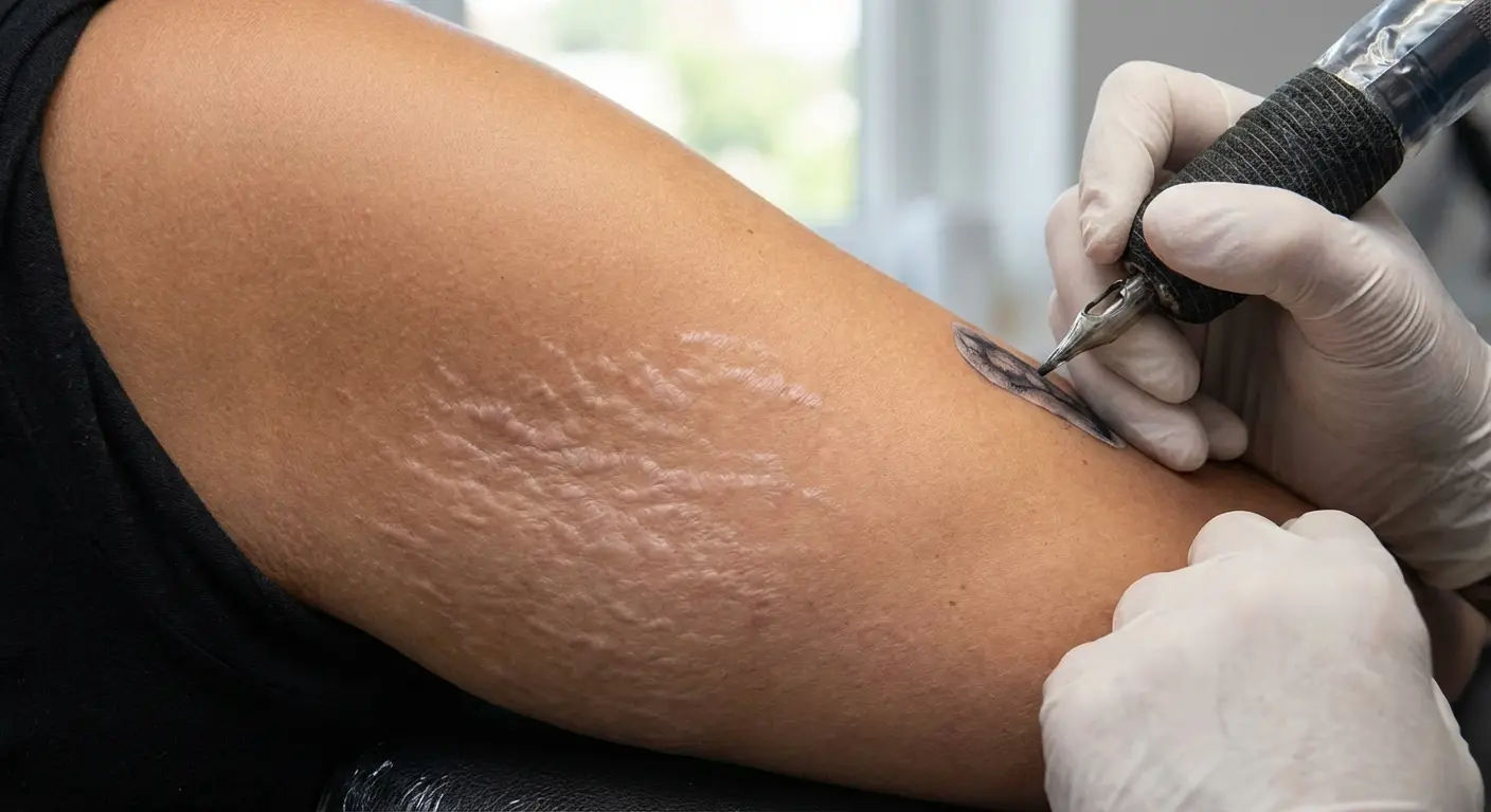
Position fine line stars so they intersect with stretch marks intentionally. When a star’s points follow stretch mark lines or when fine line details incorporate the stretch mark texture, the marks become part of the design rather than something the design tries to hide. This approach requires confidence and an artist who sees stretch marks as design opportunities.
Trying to avoid stretch marks entirely often looks more obvious than incorporating them. Bodies have stretch marks in specific patterns: hips, thighs, breasts, shoulders, lower back. Trying to place a star in these areas while avoiding all stretch marks severely limits your placement options and can result in awkward positioning that doesn’t work with your body’s natural lines.
Some stretch mark textures hold fine lines better than smooth skin. The slightly raised or textured surface of healed stretch marks can actually grip ink well. The main difference is that ink may appear slightly different on stretch mark tissue versus surrounding skin, sometimes lighter, sometimes with slightly different undertones. This variation can add visual interest rather than detracting from the design.
Should you tattoo newer stretch marks (still purple or red) versus older ones (silvery white)? Older stretch marks are generally safer. Newer stretch marks are still healing and changing. Tattooing over them can affect how they heal and how the tattoo heals. Wait until stretch marks have fully matured to their final silvery color before tattooing over them, usually at least a year after they first appeared.
Have productive conversations with your artist about designing with your stretch marks rather than around them. Show them the area you want tattooed. Point out the stretch marks. Ask how they’d approach incorporating them into the design. Artists experienced with diverse bodies will have ideas and examples to share. If an artist seems uncomfortable or dismissive about working with stretch marks, find a different artist.
What Actually Matters
Star tattoos succeed when they’re designed for your specific body rather than copied from someone else’s. Movement, symmetry, dimension, and skin characteristics aren’t obstacles to work around. They’re design opportunities that make your tattoo genuinely yours.
The tattoos that age best and maintain their visual impact are the ones that were planned with your body’s realities in mind from the beginning. These eighteen approaches address specific challenges and opportunities that different placements and body types present.
You don’t need to become a tattoo expert to make informed decisions. You just need to ask better questions during consultations. How will this look when I’m moving, not just standing still? How does my skin tone affect color choices? What happens to this placement as I age and my body changes? How do we account for my stretch marks, scars, or skin texture in the design?
Test placements before committing. Digital mockups, temporary stencils worn for a few days, even drawing on yourself with marker. All of these help you see how a star will look in real-world conditions rather than in the perfect lighting and positioning of a consultation room.
Work with artists who view your body’s unique features as design elements rather than limitations. The right artist gets excited about designing a constellation that wraps your specific forearm, or figuring out how to make a 3D star work with your particular muscle definition, or incorporating your stretch marks into a fine line design.
Your tattoo will move with you, age with you, and exist on your actual skin in real-world conditions. Design for that reality from the start.
That’s the difference between a star that works with your body and one that fights against it.