
17 Sugar Skull Tattoos That Challenge Everything You Think You Know About Día de los Muertos Ink
What’s in This Ridiculously Long Post
The Modern Takes
-
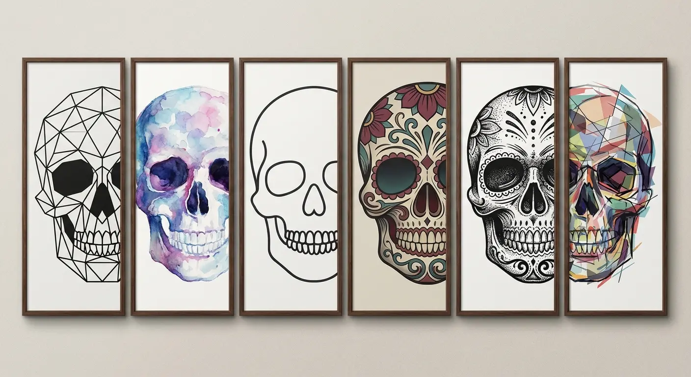
Geometric Sugar Skull with Sacred Symmetry
-
Watercolor Candy Skull Dissolving Into Color
-
Minimalist Line-Work Calavera
-
Neo-Traditional Sugar Skull with Exaggerated Features
-
Blackwork Sugar Skull Using Negative Space
-
Abstract Fragmented Skull Design
The Cultural Deep Dives
-
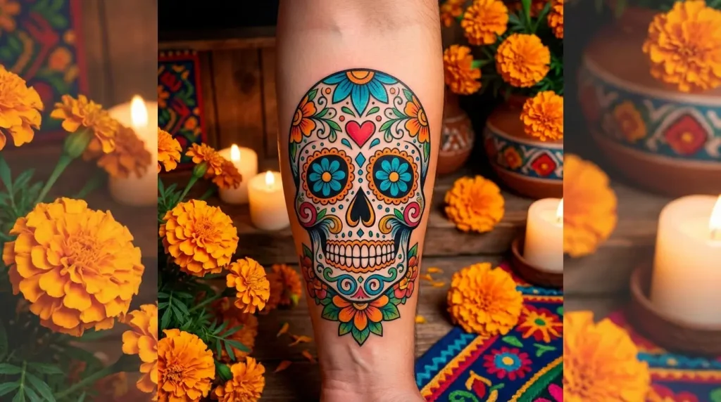
Mexican Candy Skull with Regional Marigold Patterns
-
Lady Sugar Skull Portrait Honoring Catrina
-
Sugar Skull Paired with Personal Heritage Symbols
-
Black and White Sugar Skull with Documentary Realism
-
Day of the Dead Altar Scene Composition
The Personal Meaning
-
Memorial Sugar Skull Portrait of a Loved One
-
Candy Skull Incorporating Hobby or Passion Imagery
-
Matching Sugar Skull Designs for Family Bonds
-
Sugar Skull Tattoo Marking Life Transitions
-
Micro Sugar Skull as Subtle Remembrance
Or just scroll and see what catches your eye. I’m not your boss.
TL;DR (Because This Got Out of Hand)
Sugar skulls aren’t Halloween decorations. Size matters more than you think. Black and white ages better than color. Understand what you’re wearing or you’ll regret it. Tiny ones will blur into nothing. La Catrina has actual history behind her. Don’t copy Pinterest blindly.
That’s it. That’s the whole thing.
Everything else is details, but here are the big ones: The most meaningful pieces blend Día de los Muertos symbolism with your personal story rather than copying flash art. Placement and scale dramatically affect how readable the intricate details remain over time. Full-color versions look stunning fresh but need more maintenance than black and white work.
Let’s Get the Awkward Part Out of the Way First
Yeah, that headline is peak clickbait. But after seeing the same five designs recycled across Pinterest for the thousandth time, all while the cultural appropriation discourse gets louder every October, I figured someone should actually break down what makes these tattoos work (or fail spectacularly).
Look, I’m going to piss some people off here, but we need to talk about something before we dive into beautiful designs. Sugar skull tattoos sit at the intersection of “absolutely stunning artwork” and “oh god, are we doing cultural appropriation again?”
I’m not here to tell you what you can or can’t put on your body. You’re an adult. But the difference between a piece you’re proud of in 20 years and one that makes you cringe? Usually comes down to whether you engaged with what these symbols actually mean, or just thought they looked cool on Instagram.
Every fall, like clockwork, the discourse explodes. Someone gets a sugar skull tattoo. Someone else calls it appropriation. Someone else says “let people enjoy things.” Round and round we go.
Here’s where I land after months of research: you don’t need Mexican heritage to get one. But you do need to understand that these aren’t generic “spooky skull” decorations. They’re specific cultural symbols from Día de los Muertos, a holiday about celebrating and remembering the dead, not about scary Halloween vibes.
The conversation around these designs intensifies every fall as Day of the Dead approaches from October 31st to November 2nd, bringing renewed attention to how they’re used and understood. Unlike Halloween’s dark and scary aesthetic, Día de los Muertos involves music, dancing, parades and delicious feasts. It’s a celebration of life and memory rather than fear of death.
Mixing those up is like getting a cross tattoo because you think it looks edgy without knowing anything about Christianity. Technically you can do it. But why would you want to?
Each component of a traditional design carries specific meaning. Candles stand for remembrance and guidance for spirits returning home, while bright colours express happiness and celebration rather than mourning. When you grasp these layers of symbolism, you’re equipped to make design decisions that honor the tradition while creating something genuinely personal.
The reality? You can create a piece that respects its origins while making it personally meaningful. The most powerful designs aren’t just copied flash art. They’re thoughtfully adapted to tell your story.
That’s what the rest of this article is about.
The Unexpected Modernists
Think these designs must look traditional to be authentic?
Think again.
Contemporary tattoo styles can honor the core symbolism while speaking to modern aesthetic sensibilities. Geometric, watercolor, minimalist, neo-traditional, blackwork, and abstract approaches that innovate without abandoning meaning.
When exploring modern interpretations, consider how geometric tattoo designs can transform traditional elements into contemporary art. The question isn’t whether these styles work. It’s which one matches your vision and how you execute it properly.
Will watercolor age well? Does minimalism lose too much detail?
We’re answering all of that.
Here’s the breakdown nobody gives you straight:
|
Modern Style |
Best For |
Aging Characteristics |
Minimum Size |
Key Consideration |
|---|---|---|---|---|
|
Geometric |
Precision lovers, architectural aesthetic |
Excellent (clean lines hold well) |
4-6 inches |
Requires artist skilled in both geometry and symbolism |
|
Watercolor |
Vibrant, dynamic expression |
Moderate (needs strong black framework) |
5-7 inches |
Must have solid linework foundation, plan for touch-ups |
|
Minimalist |
Understated collections, first-timers |
Excellent (less detail to blur) |
3-4 inches |
Balance simplicity with recognizability |
|
Neo-Traditional |
Bold statement pieces |
Excellent (built for longevity) |
6-8 inches |
Needs adequate space for thick lines and color blocking |
|
Blackwork |
High-contrast lovers, blackwork collectors |
Excellent (no color fade) |
5-7 inches |
Requires even black packing and negative space expertise |
|
Abstract |
Artistic interpretation, unique vision |
Variable (depends on design complexity) |
4-8 inches |
Must maintain core recognizable elements |
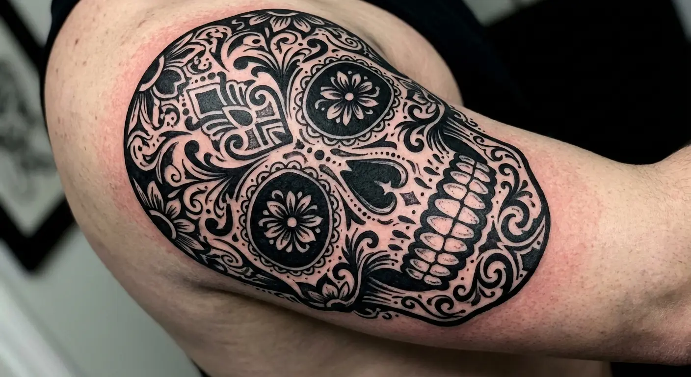
1. Geometric Sugar Skull with Sacred Symmetry
Take everything ornate and flowery about traditional designs and run it through a sacred geometry filter.
Marigolds become geometric flowers, swirls become tessellated patterns, and suddenly you’ve got something that looks like it belongs in both a Día de los Muertos celebration and a modern art museum.
I’m biased toward these because the aging is fantastic. Clean lines hold up way better than delicate shading. But they only work if your artist actually understands both geometric tattooing AND the symbolism. Otherwise you end up with generic sacred geometry that happens to have a skull in it, and that’s not the same thing.
Best placement? Anywhere flat. Forearms, back, shoulder blades. The symmetry needs space to breathe, and curved surfaces mess with the geometry.
The real challenge: making sure the design still feels celebratory and not just mathematically cool. Día de los Muertos is joyful, even when it’s about death. Your geometric piece should capture that somehow, even if it’s through color choices or the specific symbols you incorporate into the framework.
You want someone who can maintain the celebratory spirit even with angular execution. That means incorporating recognizable elements (the decorated eye sockets, floral references, ornamental details) while translating them into geometric language.
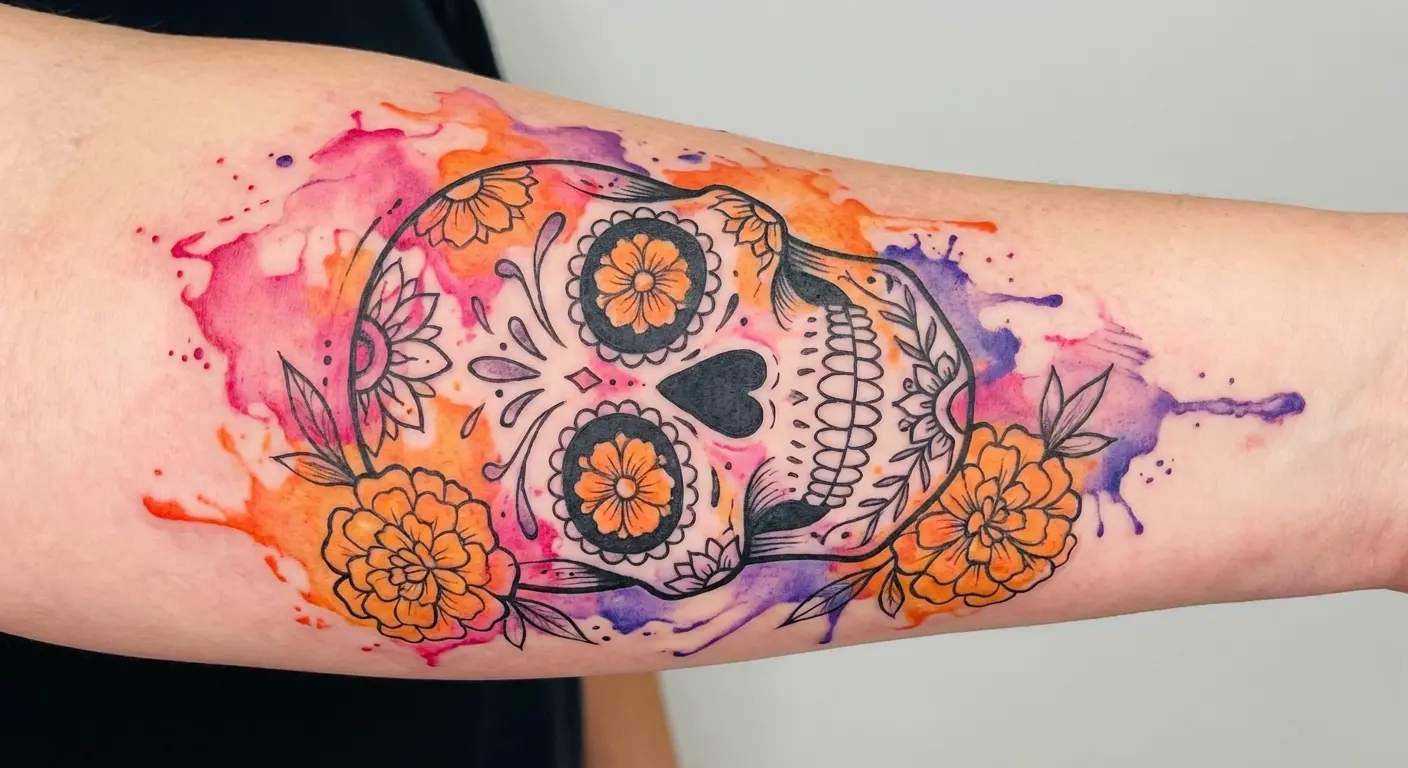
2. Watercolor Candy Skull Dissolving Into Color
Watercolor designs are gorgeous. Like, stop-you-in-your-tracks gorgeous when they’re fresh.
They’re also controversial as hell in tattoo circles, and for good reason. Done wrong (without solid black framework), they age like milk. The colors muddy together, the edges blur, and five years later you’ve got a blob where your design used to be.
But done right? With strong black linework holding everything together and strategic color placement? They capture the vibrant, celebratory energy of Día de los Muertos better than any other style.
This style particularly appeals to people who want their piece to feel alive and dynamic rather than static. The emotional payoff is significant because the style mirrors the joyful celebration of life that these symbols represent.
What “done right” looks like:
-
Black outline and key details that would work as a standalone tattoo
-
Color used as enhancement, not structure
-
Realistic expectations about touch-ups (every 3-5 years to keep it vibrant)
-
An artist whose portfolio includes watercolor pieces that are actually several years old and still look good
Don’t let an artist talk you into watercolor without that black framework just because “it’ll look more painterly.” It’ll look like a mistake in a few years.
(If you’re trying to visualize how watercolor would actually look with solid black structure, Tattoo Generator IQ can render that in about 30 seconds. Way faster than sketching or trying to explain it to an artist. Just saying.)
3. Minimalist Line-Work Calavera
Minimalist designs strip away ornate detail to focus on essential forms and carefully chosen symbolic elements.
You’re not getting the elaborate floral crowns and intricate face patterns. Instead, clean lines, strategic negative space, and perhaps two or three key decorative elements that carry personal meaning. This solves a specific problem: you want the symbolism and recognition without the visual weight of a heavily detailed piece.
Minimalist versions work beautifully as smaller pieces (though not tiny, we’ll get to that) and age exceptionally well because there’s less information to blur over time. The design challenge is maintaining enough characteristic elements that the tattoo reads correctly.
Which features are non-negotiable? The distinctive eye decorations and some floral reference. Which can you simplify or eliminate? Complex patterns within the skull, elaborate crowns, excessive ornamentation.
Your artist needs to understand the balance between simplification and recognition. The restraint is the point.
This style particularly suits people who prefer understated tattoos or are building a cohesive minimalist collection.
4. Neo-Traditional Sugar Skull with Exaggerated Features
Neo-traditional style amplifies these designs through bold outlines, exaggerated proportions, and a color palette that pops without trying to be photorealistic.
You get the ornate detail that makes them recognizable but executed with the graphic punch of contemporary tattooing. Think thicker lines, strategic use of black space, and colors that maintain their vibrancy because they’re applied with modern techniques and pigments.
This approach works brilliantly for people who want a piece that commands attention and holds up as a strong visual statement over decades. Neo-traditional tattoos are built to age well. The style’s boldness means details stay readable even as skin changes.
The difference between neo-traditional and traditional American style matters here. Neo-traditional maintains the bold approach but allows for more intricate detail, varied color palettes, and contemporary subject matter. Your design can have elaborate floral work and decorative patterns while still benefiting from that structural boldness.
Key consideration: size. Neo-traditional pieces need enough real estate for the bold linework and color blocking to work properly. We’re typically talking medium to large pieces, at least six to eight inches, to do the style justice.
5. Blackwork Sugar Skull Using Negative Space
Blackwork designs use solid black ink and strategic negative space to create striking contrast and visual impact.
Instead of coloring in decorative elements, your artist leaves skin tone to form the patterns, flowers, and ornamental details. This creates a dramatic, high-contrast piece that feels both modern and timeless.
The technical execution matters enormously. Blackwork requires artists who understand how to pack solid black that heals evenly and how to design negative space that reads clearly. You don’t want patchy black or negative space elements that are too small to remain distinct as the piece ages.
Here’s a common concern: won’t solid black look harsh?
The answer depends entirely on design sophistication and how your artist balances the black-to-skin ratio. These pieces often incorporate dotwork, geometric patterns, or ornamental elements within the black areas to add texture without introducing color.
This style ages exceptionally well because there’s no color to fade, just bold black and your skin tone creating the design. Decades from now, when colorful pieces have dulled, your blackwork will still have that crisp contrast.
6. Abstract Fragmented Skull Design
Abstract designs break the traditional form into fragments, overlapping elements, or deconstructed components that suggest the skull rather than rendering it literally.
You might see half the skull dissolving into flowers, geometric shards that form the overall shape, or a composition where traditional elements float in artistic arrangement rather than sitting in expected positions. This works for people who want the symbolism and cultural reference without literal representation.
The creative freedom here is significant, but so is the risk.
Abstract designs require artists who can balance recognizability with artistic interpretation. You need certain iconic elements (the decorated eye sockets, floral crown, or distinctive patterning) to remain identifiable even if repositioned or fragmented.
How do you ensure your abstract piece still reads correctly? Work with an artist who shows you multiple sketch variations and test how the design reads from different distances. If the elements aren’t recognizable when you step back , the abstraction has gone too far.
Abstract pieces often work well as part of larger compositions or sleeve work where the fragmented nature connects with surrounding elements. The style lets you incorporate personal symbolism more freely because you’re already breaking traditional structure.
The Cultural Translators
Okay, the part everyone’s nervous about: cultural appropriation.
I’m not going to tell you that you need Mexican heritage to get one of these. I’m also not going to pretend that slapping Día de los Muertos imagery on your body without understanding what it means is totally fine because “it’s just art, man.”
The real question isn’t “can I get this tattoo?” It’s “do I understand what I’m wearing?”
Because every October, these designs get lumped in with Halloween, spooky scary skeleton stuff. But Día de los Muertos isn’t Halloween. It’s not about fear or death being scary. It’s a joyful celebration of dead loved ones coming back to visit. Music and food and laughter and remembrance. Treating these symbols like generic goth decoration misses the entire point.
These designs show specific ways to engage with the actual cultural context instead of just copying pretty pictures. You’ll learn about La Catrina’s satirical origins, regional marigold patterns, pre-Columbian death symbolism, and how to blend your own heritage respectfully.
The thread here: showing you’ve done more than scroll through Google Images.
That’s it. That’s the bar.
7. Mexican Candy Skull with Regional Marigold Patterns
Most designs get this wrong: they just slap generic orange flowers around the skull and call it a day.
But marigolds (cempasúchil) in Día de los Muertos traditions aren’t just “pretty orange flowers.” They’re specific. Different regions of Mexico have distinct ways of arranging them. Oaxaca does dense marigold carpets. Michoacán does elaborate floral arches. These aren’t interchangeable.
Why does this matter for your tattoo?
Because if you’re going to wear symbols from a specific cultural tradition, the details are what separate “I did my homework” from “I copied something off Pinterest.”
Understanding the symbolic language of these elements elevates your design from decoration to meaningful tribute. According to tattoo artists who specialize in cultural designs, marigold petals serve as a symbol of the path between life and death, while candles represent remembrance and guidance. When you incorporate these elements with intention (choosing regional marigold patterns from specific Mexican states or adding candles in traditional arrangements), you’re creating a piece that demonstrates cultural engagement rather than surface-level appropriation.
Talk to your artist about incorporating actual regional patterns, not just “flowers.” Bring reference photos from real Día de los Muertos celebrations, not other people’s tattoos.
The difference shows.
Fair warning: regionally accurate marigolds need enough size and detail to actually read as marigolds and not just “orange flower shapes.” We’re talking at least 4-5 inches of space for the flowers alone.
8. Lady Sugar Skull Portrait Honoring Catrina
Everyone loves La Catrina. The elegant lady skull in the fancy hat. She shows up on everything during Día de los Muertos, and she’s become the face of the holiday for a lot of people outside Mexico.
But here’s what most people don’t know: she started as political satire.
Mexican artist José Guadalupe Posada created her in the early 1900s to mock wealthy Mexicans who were so busy imitating European aristocracy that they forgot their own culture. The whole point was “death doesn’t care how fancy you are—we all become skeletons.” Diego Rivera later popularized her in his murals, and now she’s everywhere.
Why does this matter for your tattoo?
Because La Catrina isn’t just “pretty lady skull.” She’s carrying centuries of class commentary and cultural identity. You don’t need to explain all that to everyone who asks about your ink. But knowing it changes how you approach the design.
Real Catrina portraits work best as larger pieces because the elaborate costume details and facial decorations need space to remain readable. We’re talking thigh panels, back pieces, upper arms. Placements that give you at least six to eight inches of working space.
How do you work with your artist to capture the elegance and subtle satire of the original concept? Bring historical references, not just other tattoos. Show them Posada’s original illustrations and Rivera’s murals. Discuss the balance between beauty and social commentary.
This isn’t a design for everyone. If you’re drawn to the elegance without connecting to the class critique embedded in the imagery, consider whether a different approach serves your intentions better. There’s no wrong answer, but it’s worth thinking about.
9. Sugar Skull Paired with Personal Heritage Symbols
You can create a piece that honors Día de los Muertos traditions while acknowledging your own cultural background by thoughtfully combining imagery.
This works when you’re not Mexican but feel connected to the universal themes of remembering and celebrating deceased loved ones (which exist across cultures) and want to create a design that bridges your heritage with this symbolism.
The key is avoiding a random collision of cultural symbols. Find meaningful connections instead.
Examples: incorporating Celtic knots if you’re Irish, cherry blossoms if you’re Japanese, specific flowers or patterns from your background. The design challenge is creating visual cohesion so the elements feel integrated rather than awkwardly mashed together.
If you’re exploring how to blend meaningful tattoo symbolism from different cultures, focus on finding thematic connections rather than random juxtaposition.
How do you approach this with your artist? Bring references from both traditions. Discuss the symbolic meaning you want to convey. Most importantly, let the artist suggest compositional solutions rather than dictating exact placement. They understand how to make disparate elements flow together visually.
This approach requires more design time and collaboration than standard flash art. The result is a genuinely personal piece that tells your specific story about memory, heritage, and honoring the dead.
10. Black and White Sugar Skull with Documentary Realism
Black and white pieces executed in realistic style reference the documentary photography and historical images of actual Día de los Muertos celebrations rather than stylized artistic interpretations.
You’re aiming for the texture and depth of a black and white photograph, capturing the way real sugar skulls look (actual decorated skulls made from sugar, not illustrated versions) or how face paint appears in traditional celebrations.
This approach creates a piece that feels grounded in the actual cultural practice rather than commercialized imagery. The connection to the real tradition comes through in every detail.
The technical requirements are significant. Realistic black and white work requires artists skilled in creating depth, texture, and tonal range using only black ink and skin tone. What should you look for in artist portfolios? Smooth gradations, realistic texture rendering, ability to create depth without color. Their black and white work should show range from deep blacks to subtle grays.
The practical advantage is that these pieces age more predictably than color work, though they require touch-ups to maintain the tonal depth that makes them work. Without that full range of values, realistic pieces can flatten over time.
This style particularly suits people who want their piece to reference the real tradition rather than the commercialized version that’s everywhere during October.
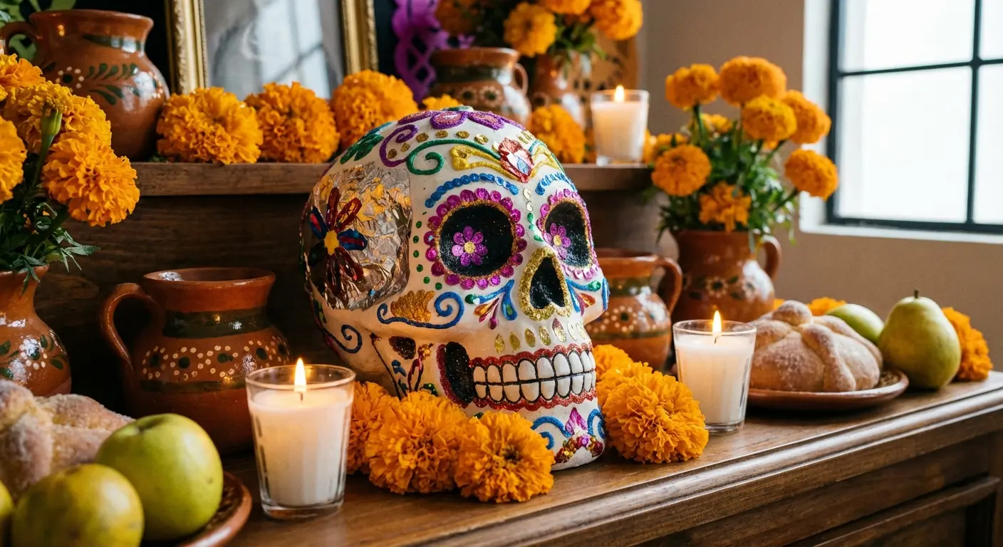
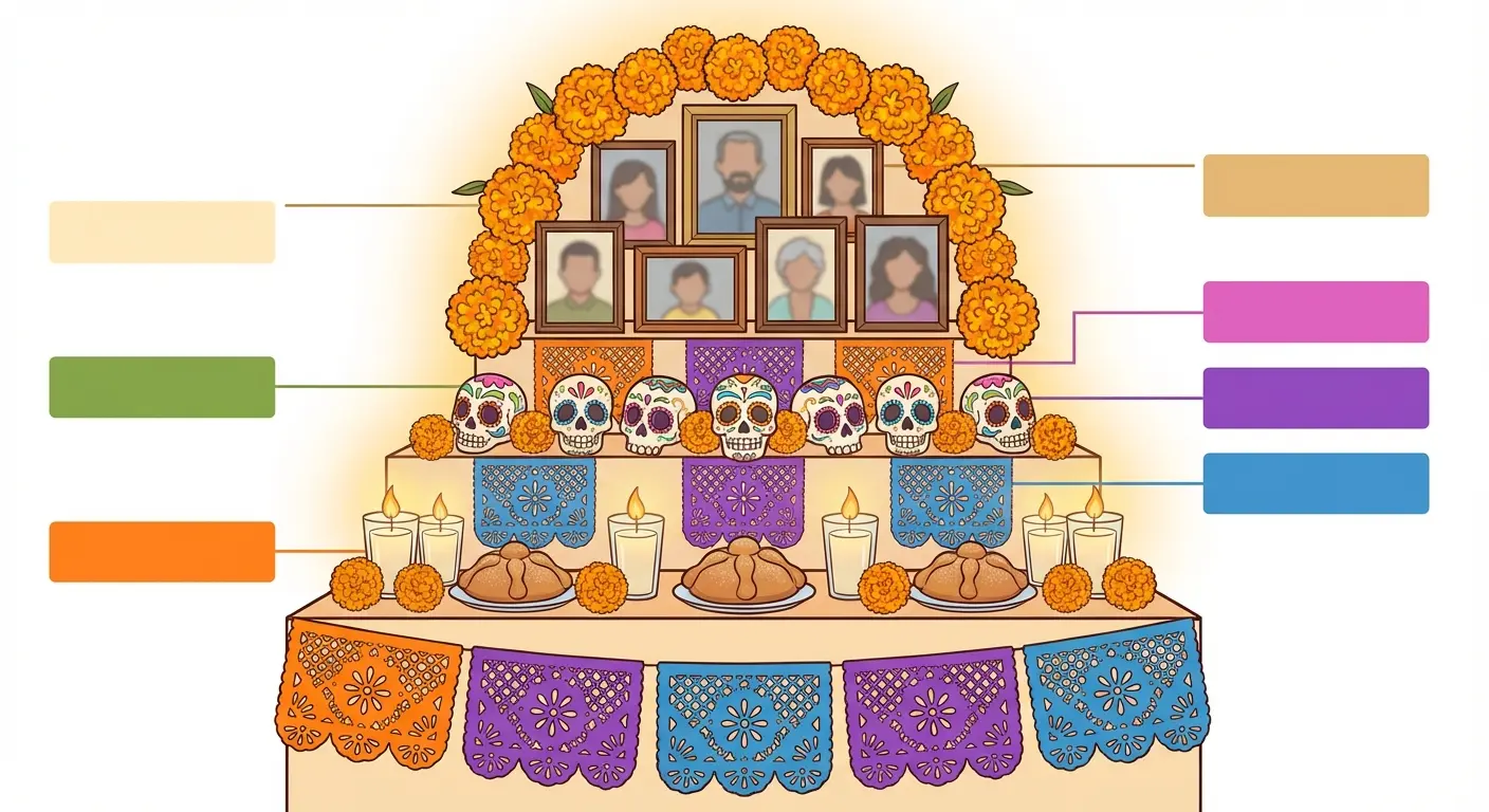
11. Day of the Dead Altar Scene Composition
Instead of an isolated skull, you can create a tattoo that depicts an ofrenda (Day of the Dead altar) scene with the skull as one element among candles, marigolds, photographs, food offerings, and other traditional altar components.
This compositional approach tells a fuller story about Día de los Muertos traditions and creates space to incorporate specific personal elements. You might include items your loved one enjoyed, for example.
The design works as a larger piece (typically a half-sleeve, thigh panel, or back piece) because you need room for multiple elements to read clearly. We’re talking about narrative scene composition, not a single iconic image.
If you’re going full ofrenda scene instead of just a skull, you need to understand what each element actually means. Otherwise you’re just drawing random stuff around a skull.
Here’s the breakdown of traditional altar components and how they translate to tattoo decisions:
|
Ofrenda Element |
Traditional Meaning |
Tattoo Consideration |
Placement in Composition |
|---|---|---|---|
|
Sugar Skull |
Sweetness of life, remembrance of specific person |
Central focal point, needs adequate detail |
Center or upper third of design |
|
Marigolds (Cempasúchil) |
Guide spirits home with color and scent |
Need to be actually orange/yellow, not generic “flowers”—minimum 2-3 inches or they blur |
Frame or border elements |
|
Candles |
Light the way for returning spirits |
Work well in black/white or with flame color |
Foreground or scattered throughout |
|
Photographs |
Direct connection to deceased loved one |
Can be realistic portraits or suggested frames |
Background or integrated into altar structure |
|
Pan de Muerto (bread) |
Traditional food offering, sustenance for journey |
Recognizable shape matters, needs warm tones |
Lower portion, altar surface level |
|
Papel Picado (cut paper) |
Festive decoration, represents wind/fragility of life |
Intricate detail, works well in background |
Upper portion, banner-style across top |
|
Personal Items |
Loved one’s favorite objects, hobbies, passions |
Highly customizable, tells specific story |
Integrated throughout based on significance |
Mix and match based on what matters to you, but don’t just throw everything in because it’s traditional. Crowded compositions read as muddy. Pick 4-5 elements maximum and give them room to breathe.
Understanding the traditional components of an ofrenda helps you make informed choices about what to include in your design. The collaborative design process here is crucial. You’re essentially creating a narrative scene rather than a single iconic image, which requires more back-and-forth with your artist.
This approach particularly suits people who want their piece to be explicitly about remembrance and who have space for a larger, more complex composition.
The Personal Storytellers
These final five designs center on using these symbols as memorial and personal narrative devices.
While the previous sections dealt with style and cultural context, these focus on making the imagery tell your specific story, honor particular people, or mark significant life moments. The connecting thread is personalization. These aren’t generic designs but templates for creating something uniquely yours.
We’re acknowledging that memorial pieces carry emotional complexity and providing concrete ways to navigate that while creating something visually strong.
12. Memorial Sugar Skull Portrait of a Loved One
This one’s hard to write about because memorial tattoos aren’t like other tattoos.
The stakes are different. You’re not decorating your body. You’re carrying someone with you.
These portraits transform the face of someone you’ve lost into a design, blending their features with traditional Día de los Muertos decorative elements. This creates something more personal than a standard portrait (which can be difficult to execute well and age poorly) while honoring both the person and the celebratory spirit of remembering the dead.
The design challenge is balancing recognizability with stylization. You want people who knew your loved one to see them in the piece, but you’re also working within the aesthetic framework.
How do you approach this with your artist? Bring clear reference photos. Discuss which facial features were most distinctive. Decide how much realistic portraiture versus how much decoration you want. Some designs lean heavily realistic with elements added as face paint or decorative overlay. Others stylize the features more dramatically while maintaining enough recognizable characteristics.
Placement matters significantly because faces need enough space to remain recognizable as they age. We’re talking at least five to seven inches, preferably larger.
When planning a memorial piece, understanding proper tattoo aftercare becomes especially important for preserving the detail that makes portraits recognizable.
The emotional weight here is real.
I’m not going to pretend to be objective. Watching someone sit for a portrait of their dead kid, dead parent, dead partner, it’s heavy. You’re going to sit there for hours while someone draws your person’s face on you. You might cry. You probably will cry. The artist might tear up too if they’re any good at their job.
It’s intense.
And here’s what nobody tells you: it might not feel the way you expect. Some people feel closer to their person after. Some people feel weird about it for months. Both are normal. There’s no right way to feel about turning grief into ink.
You want an artist who handles that sensitivity well, who understands they’re not just creating pretty art but helping you honor someone who mattered deeply. Check reviews specifically about their memorial work. How they treat clients who are grieving matters as much as their technical skill.
These portraits often feel more celebratory and less heavy than traditional memorial portraits because they’re rooted in a tradition that views death as a transition rather than an ending.
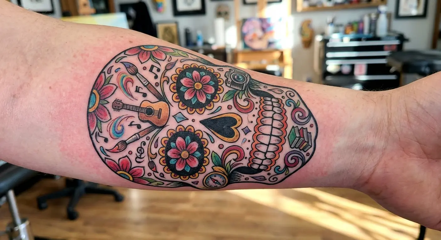
13. Candy Skull Incorporating Hobby or Passion Imagery
These designs can incorporate imagery from your hobbies, passions, or profession into the decorative elements, creating a piece that celebrates what makes life worth living.
Instead of traditional flowers and swirls, you might have musical notes, paintbrushes, sports equipment, books, or other symbols woven into the skull’s ornamentation. This approach works because Día de los Muertos is fundamentally about celebrating life, not mourning death, so incorporating what brings you joy aligns with the tradition’s spirit.
The design execution requires an artist who can stylize your chosen imagery to match the aesthetic rather than just slapping random objects onto a skull. Everything needs to feel integrated.
How do you choose which elements to include? Less is more. Pick two or three meaningful symbols rather than cramming everything in. Consider how they’ll translate visually at tattoo scale. Some objects read clearly when simplified; others lose their identity.
This design path particularly suits people getting their first piece who want it to feel personal but aren’t necessarily memorializing a specific person. You’re creating a celebration of your life and what matters to you.
The design becomes a visual representation of what you’d want remembered about how you lived, which captures the Día de los Muertos philosophy beautifully.
14. Matching Sugar Skull Designs for Family Bonds
Matching pieces for family members, partners, or close friends create permanent bonds while allowing individual variation.
The key is designing pieces that clearly relate to each other without being identical, giving each person a unique design that’s part of a larger set. You might share the same skull structure but different decorative elements, use complementary color schemes, or create designs that connect visually when placed side by side.
Different approaches to matching tattoos exist: identical, complementary, or thematically linked. These designs work particularly well for this because the decorative elements offer so much room for personalization. The skull structure provides unity while individual ornamental choices let each person’s personality show.
The practical consideration: everyone needs to commit to the same artist or at least artists who can work from a cohesive design plan. You need to schedule sessions that allow for adjustments based on how each piece turns out. Sometimes seeing the first person’s finished work sparks ideas for improvements on subsequent designs.
This approach works for families honoring shared heritage, partners celebrating their relationship, or friends marking significant shared experiences. The framework provides structure while personal decorative choices maintain individuality.
What makes matching pieces successful? Clear communication upfront about the level of matching you want, flexibility to adjust as designs develop, and understanding that small variations between pieces (due to different body placements or skin tones) are inevitable and often enhance rather than detract from the overall concept.
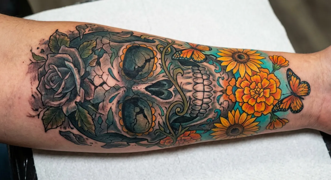
15. Sugar Skull Tattoo Marking Life Transitions
These designs work powerfully as markers for major life transitions because they embody the concept of death and rebirth, endings and new beginnings.
You might get one after surviving serious illness, leaving a toxic relationship, completing addiction recovery, or any moment where your old self died and you emerged transformed. The design can incorporate symbols of both what you left behind and what you’re moving toward, using the skull as the transitional element between them.
How do you visually represent this narrative? Half the skull showing old life elements, half showing new. Flowers blooming from the skull representing growth from difficulty. Cracks in the skull with light or new imagery emerging. The compositional possibilities are extensive.
Why does this symbolic framework resonate emotionally? Because these symbols are already about transformation. The tradition celebrates death as a transition rather than an ending. Using that imagery to mark your personal rebirth aligns perfectly with the underlying philosophy.
The personal meaning here runs deep. These pieces often carry private significance you may not explain to everyone who asks about your ink. That’s perfectly valid. You don’t owe strangers your story.
Work with your artist to encode personal meaning in ways that matter to you without requiring the design to be an obvious visual autobiography. Sometimes the most powerful symbols are the ones only you fully understand.
16. Micro Sugar Skull as Subtle Remembrance
I’m going to be straight with you: micro versions are a bad idea most of the time.
These designs are detail-heavy. The intricate patterns, the floral crowns, the decorative eye sockets—that’s what makes them recognizable. Shrink all that down to 1-2 inches and you lose everything that makes it what it is. In five years it’ll just be a blob that vaguely looks like a skull.
But. (There’s always a but.)
If you’re willing to sacrifice almost all the detail and work with an artist who specializes in fine-line work, you can get a simplified micro version that maintains just enough characteristic elements to read correctly. We’re talking absolute bare minimum: simplified eye decorations, maybe one small flower, clean skull structure. That’s it.
Before committing to a micro design, review our guide on small tattoo ideas to understand the limitations and possibilities of miniature ink.
Where this actually works:
-
You’re adding to an existing collection and a large piece won’t fit
-
You want something private and subtle, not a statement piece
-
You understand it’ll simplify even more as it ages and you’re okay with that
Where it doesn’t work:
-
As your first or only piece
-
If you want any of the elaborate detail that makes these designs beautiful
-
On body parts with a lot of movement (hands, feet) where it’ll blur faster
Placement is critical. Micro tattoos need flat, stable skin: inner wrist, behind the ear, ankle. Even then, expect the details to soften significantly over time.
Honestly? If you want a small memorial piece, consider a single marigold or a simple candle with a date instead. They’ll age better and you won’t lose the meaning in a blur of faded ink.
Turning Your Vision Into Reality
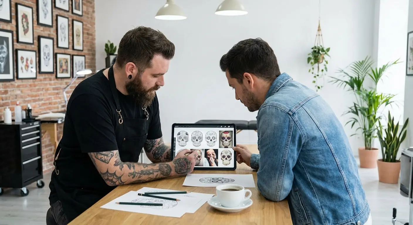
So you’ve made it through 5,000 words about skull tattoos (I told you this got out of hand), you’ve got opinions about geometric vs. watercolor, and you’re probably thinking “cool, but how do I actually communicate this vision in my head to a tattoo artist without just pointing at Pinterest and hoping for the best?”
Yeah, that’s the hard part.
The usual process: You save 47 images that you like for different reasons. You bring them to your artist. They look at your collection of completely different styles, sizes, and color schemes, and they have to somehow guess what you actually want. Or they just copy one of the Pinterest images and you end up with the same flash art as everyone else.
What actually helps: having something visual that captures YOUR specific vision (your style preference, your personal elements, your color scheme) before you walk into a shop.
That’s what we built Tattoo Generator IQ for. You tell it what you want (geometric design with marigolds and a specific color palette, memorial portrait blended with traditional elements, whatever), and it generates actual design options in seconds. Not random skull images. Designs that work as real tattoos.
Then you take those to your artist as a starting point. Not as “copy this exactly” but as “this is the direction I’m thinking.” It solves the communication gap and gives you both something concrete to refine.
The irony of using AI to design something meant to feel human isn’t lost on me. But the difference is you’re using it as a tool to clarify your vision, not as a replacement for the collaboration with your artist. Think of it like using a reference photo—it’s a starting point, not the finished piece.
Plus you can test ideas without commitment. Wonder if that watercolor style actually works for you when you see it rendered? Generate it. Think geometric might be too cold? See it before you decide. Want to compare how different marigold arrangements look? Make three versions.
You can adjust colors, test different decorative elements, refine details until you’ve got something that genuinely represents your vision. The AI understands both tattoo styles and the symbolism, so you’re not getting random skull imagery but designs that work as actual tattoos.
This solves the communication gap and gives both you and your artist a clear foundation to build from. You’re not struggling to describe what’s in your head or hoping they interpret your Pinterest board correctly. You’re showing them designs that capture your vision, which they can then refine and adapt for your specific placement and skin.
Final Thoughts (For Real This Time)
Look, these tattoos are beautiful. They’re also loaded with cultural meaning, technical challenges, and potential for regret if you rush in without thinking.
You don’t need Mexican heritage to get one. But you do need to understand that these aren’t generic skull decorations. They come from a specific tradition about celebrating dead loved ones with joy instead of mourning them with sadness. Treating them like Halloween decor misses the entire point and honestly makes for a worse tattoo.
The designs I covered (okay, maybe sixteen was overkill) show different ways to approach this: modern styles that honor tradition, culturally engaged designs that show you’ve done your homework, and personal storytelling approaches that make the symbolism yours.
What matters most:
-
Size bigger than you think (seriously, those details need space)
-
An artist who understands both the technical execution AND the cultural context
-
Honest thinking about whether you’re capturing the joyful celebration aspect or just getting a pretty skull
-
Realistic expectations about aging, especially with color and watercolor styles
Don’t rush this. Don’t pick something off the wall because it looks cool. Don’t copy someone else’s memorial piece (that’s weird). And for the love of god, don’t get a tiny one because “I want to keep it subtle.” It’ll blur into nothing.
Research artists. Look at their healed work, not just fresh photos. Ask about their experience with these designs specifically. Bring references from actual Día de los Muertos celebrations, not just other tattoos.
And if you’re still not sure? That’s okay. Sit with it. A tattoo you wait a year for is better than one you regret in six months.
The best pieces come from informed choices, not impulsive ones. You’re wearing a symbol that means something to real people and real traditions, so treat that with the respect it deserves while making it genuinely yours.
We’ve walked you through modern interpretations that honor tradition through contemporary styles. We’ve explored ways to engage with the cultural origins thoughtfully rather than treating Día de los Muertos imagery as decoration. We’ve shown you how to make designs deeply personal through memorial elements, passion imagery, and life transition markers.
Now the decision is yours. Which approach resonates? What story do you want your piece to tell? How will you balance aesthetic preference with cultural awareness and personal meaning?
Take your time. Do your research. Find the right artist.
And when you’re ready, create something that you’ll be proud to wear for the rest of your life. A piece that reflects both the joyful celebration of life that defines Día de los Muertos and your own unique story.
Whatever you decide, make it mean something. That’s what separates ink you’re proud of from ink you’re stuck with.