
23 $uicideboy$ Tattoos That Channel Raw Energy Into Permanent Art
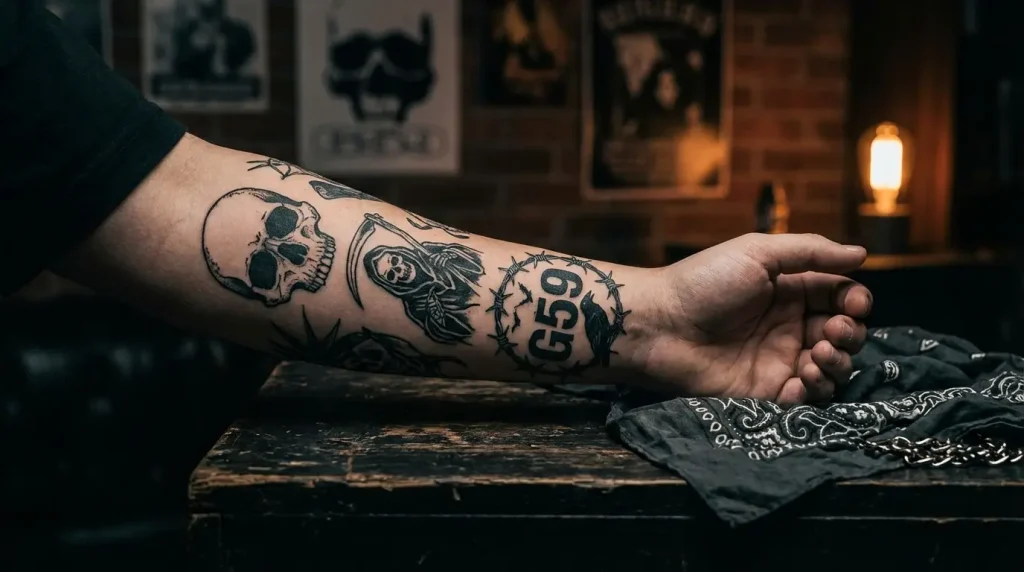
Table of Contents
Symbolic Rebellion: Tattoos That Reject the Mainstream
-
The G*59 Records Logo
-
Grey Sheep Imagery
-
Razor Blade Motifs
-
The Eternal Grey Cloud
-
Barbed Wire Crowns
-
Broken Cross Designs
-
“Kill Yourself” Typography (Reclaimed)
-
FTP (F*** The Population) Integration
Underground Iconography: Visual Elements From Their Catalog
-
Ruby da Cherry Portrait Work
-
$crim Face Tattoos
-
Paris Album Cover Art
-
Stop Staring at the Shadows Artwork
-
Now the Moon’s Rising Lyrics
-
Antarctica Track Imagery
-
Champion of Death Symbols
-
Mount Sinai Hospital References
Personal Darkness: Tattoos About Mental Health Struggle
-
Depression Cherry Blossoms
-
Pill Bottle Outlines
-
“I Want to Die in New Orleans” Text
-
Noose Imagery (Reclaimed)
-
Skeleton Hand Reaching
-
Third Eye Awakening
-
Phoenix Rising From Ashes
TL;DR
G*59 tattoos only work if you actually get it. Don’t be a poser.
Ruby and $crim portraits? You need a GOOD artist. Like, top-tier. Otherwise don’t bother.
The mental health stuff… wait until you’re stable. Seriously. This should mark survival, not document active struggle.
Combining lyrics with symbols creates something way more personal than just copying the G*59 logo you saw on TikTok.
Black and grey realism dominates this style. Color can work but it needs to be subtle as hell.
Face and hand tattoos will close professional doors. Be ready for that.
Talk to your therapist if you’re in treatment. Some of this imagery can mess with your head if you’re not in the right place.
Most importantly? Make it yours. The whole point of $uicideboy$ is rejecting fake mainstream bullshit and being brutally honest. Your tattoo should have that same energy.
Symbolic Rebellion: Tattoos That Reject the Mainstream
G*59 stopped being just their label name years ago. Now it’s basically a whole philosophy. Make your own shit, fuck the industry gatekeepers, stay independent. When you get this tattooed, you’re not repping a brand. You’re saying you get it.
Each symbol here carries weight beyond just looking cool on Instagram. I’ve seen too many people get these designs without understanding what they mean, and that’s how you end up with regret. Or worse, you become walking proof that you missed the entire point of what Ruby and $crim stand for.
Look, if you’re thinking about your first $uicideboy$ tattoo, don’t just screenshot something from someone else’s feed. The power behind these symbols comes from their rejection of mainstream acceptance. Your approach should mirror that authenticity.
Here’s the thing about visibility: The G*59 logo? Everyone recognizes it now. Medium skill level needed from your artist, looks solid on forearms or chest. Grey sheep imagery though, that’s a deeper cut. You need someone who can handle realism, and most people won’t get the reference without explanation. Which is kind of the point.
Razor blades are tricky as hell. People WILL judge, and the meaning gets misunderstood constantly. Same with broken crosses. You’re making a statement about religion that not everyone’s ready to hear, especially your grandmother at Thanksgiving.
The “Kill Yourself” text? That’s expert-level commitment. You need to really understand what you’re doing because that’s permanent shock value on your body. FTP gives you plausible deniability… three letters that could mean anything unless you know.
1. The G*59 Records Logo
You’ll see variations from simple text to elaborate skull integrations, but the core message stays the same. The best versions I’ve seen incorporate personal elements. Your discovery date, a lyric that changed your perspective, something that makes it YOURS rather than a carbon copy of what’s trending.
Forearms make sense here. You’ll see it daily as a reminder of why you chose this path. Chest pieces make bold statements when you’re ready to commit to that visibility. Behind the ear offers subtlety for those who want control over when they reveal their connection.
Black ink dominates because it’s clean and direct. Some people add grey shading to create depth, which works when your artist understands that clean lines matter here. Any blowout will compromise the readability, turning a powerful symbol into a muddy mess. And trust me, I’ve seen that happen more times than I can count.
This isn’t the most original choice anymore. The G*59 logo is everywhere now. But if you do something unique with it, add your own twist, it still carries meaning.
2. Grey Sheep Imagery
The grey sheep concept flips the “black sheep” metaphor entirely. You’re not different from your family or social circle in a binary way. You exist in a space between defined categories, refusing to fit into either extreme.
Real talk? These work beautifully when rendered in detailed realism or stark traditional style. Consider adding environmental elements that reinforce the isolation theme without being heavy-handed. Thorns, dead grass, storm clouds. These build context without explaining everything to casual observers.

Rib cage and thigh placements give you room to develop the scene properly. I know someone who incorporated prescription bottles near their grey sheep, broken chains, wilted flowers. Each addition told part of their story without spelling it out.
The grey color palette feels obvious but it’s harder to execute than you think. Your artist needs to understand how to create dimension using only shades of grey. Flat grey looks unfinished and amateur. Period.
3. Razor Blade Motifs
Razor blades show up in their imagery a lot, and yeah, it’s about self-harm. Not glorifying it, acknowledging it. If you’ve been there, you know. If you haven’t, maybe this isn’t your symbol to claim.
Your design can take multiple directions. Single blade with dripping elements creates stark impact. Multiple blades forming patterns builds visual interest while keeping the edge. Integration into larger compositions lets you contextualize the symbol within your broader story.
Wrist placement feels too literal for most people. Almost performative in its obviousness. Shoulder blades, ankles, or incorporation into sleeve work where the blade becomes one element among many? That works better. The sharpness of the blade edges needs precision tattooing because soft lines destroy the impact entirely.
You might add text like “Grey” or combine with other symbols. Pills, crosses, clouds, whatever speaks to your experience. This isn’t a design you get on impulse though. Sit with the idea for months. If it still resonates after that waiting period, you’re probably ready.
4. The Eternal Grey Cloud
Storm clouds represent the persistent nature of depression and darkness that Ruby and $crim discuss openly in their music. These capture that hovering presence without being explicitly morbid, which matters when you’re wearing this imagery permanently.
Realistic cloud rendering with dramatic shading creates movement and depth. Your artist’s ability to create soft edges while maintaining form makes or breaks this design. I’ve seen minimalist outline versions that offer subtlety for those who want the symbol without the full dramatic rendering.
Upper arm and back pieces provide canvas space for proper cloud formation. Clouds need room to breathe and develop their shape naturally. Cramming them into small spaces makes them look more like blobs than weather systems, and nobody wants that.
Some designs incorporate rain, lightning, or breaking sunlight to show the complexity of mental states rather than static darkness. We’re not one-dimensional in our struggles. Your tattoo shouldn’t be either.
Pure black and grey maintains cohesion with the “grey” theme that runs through all their work. Subtle purple or blue undertones can add dimension without breaking the monochromatic aesthetic, but be careful. Too much color and you’ve lost the plot.
5. Barbed Wire Crowns
Crowns made of barbed wire subvert traditional power symbols in ways that resonate with the $uicideboy$ aesthetic. You’re royalty of your own damaged kingdom, wearing pain as a badge rather than hiding it under false positivity.
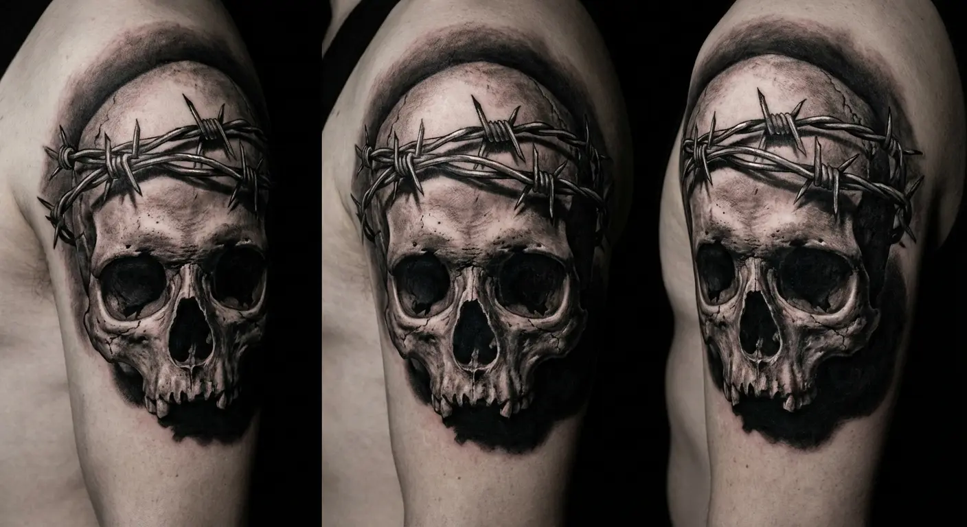
These work exceptionally well as head crowns around the scalp line for the bold among us. Arm bands create continuous loops of barbed wire that catch the eye. Integration into larger chest pieces allows the crown to sit above other symbolic elements, creating hierarchy in your visual narrative.
The barbs need consistent sizing and spacing to maintain visual rhythm. Sloppy execution makes the wire look tangled rather than intentional. I’ve seen people add dripping blood elements, though that can push the design toward cliché if not executed thoughtfully.
Think about wrapping the wire around other meaningful symbols. Skulls, roses, crosses. Each combination creates different narrative depth. Forearms make a visible statement about refusing to hide your damage. Ribs or thighs keep it more personal, revealed only when you choose.
6. Broken Cross Designs
Religious imagery appears frequently in $uicideboy$ work, but always fractured or inverted. Broken crosses represent disillusionment with organized religion while not necessarily rejecting spirituality entirely. That distinction matters.
Your design might show a cross split down the middle, crumbling at the base, or wrapped in thorns that slowly destroy it. Chest placement over the heart carries obvious symbolism that most people will understand even without knowing the $uicideboy$ connection. Hands, neck, or behind the ear offer alternative statements with varying degrees of visibility.
The break pattern matters more than you might think. Clean geometric splits create different energy than jagged destruction. One suggests intentional rejection, the other implies violent disillusionment. Both are valid. You need to know which represents your experience.
Black ink with heavy shading emphasizes the weight of the symbol, making it feel substantial rather than decorative. Some incorporate Latin phrases or specific lyrics that address their complicated relationship with faith.
7. “Kill Yourself” Typography (Reclaimed)
Let’s be clear: getting “Kill Yourself” tattooed on your body is going to shock people. That’s partly the point. The whole Kill Yourself series is dark humor and reclamation, taking the worst thoughts and making art from them.
But your grandma won’t get that. Your boss definitely won’t.
And if you’re currently in a bad place mentally, this is NOT the time to get this tattoo. Wait. I’m serious. This should mark survival, not document struggle. If you’re currently fucked up and thinking about offing yourself, do NOT get “Kill Yourself” tattooed on your body. Get stable first. Then decide.
Typography style dramatically changes the message. Aggressive death metal fonts scream confrontation. Elegant script creates unsettling contrast between form and content. Handwritten styles feel personal and intimate. Each approach communicates differently, so choose based on what you’re trying to say.
Many people add “Part” and their meaningful number from the series, or incorporate it into larger designs where context becomes clearer. Ribs, thighs, upper arms give you control over visibility. You decide who sees this and when.
This isn’t recommended as a first tattoo. Period.
8. FTP (F*** The Population) Integration
FTP represents rejection of societal expectations and mainstream culture in three simple letters. The acronym offers plausible deniability in professional settings while carrying full meaning for those who know. That dual nature makes it versatile as hell.
Simple text treatments work fine, but more interesting versions incorporate the letters into larger rebellion-themed pieces. Burning buildings, raised fists, broken chains. These elements contextualize the acronym within broader anti-establishment imagery.

Finger tattoos spell it out literally, though those fade quickly and hurt considerably. We’re talking bone-on-needle pain that makes most other placements feel mild. Consider integrating FTP into existing sleeve work or as part of a larger anti-establishment collage instead.
You control who gets the full explanation. Font selection matters because aggressive typography reinforces the message while cleaner fonts create interesting contrast between form and meaning.
Underground Iconography: Visual Elements From Their Catalog
Album artwork and visual branding from $uicideboy$ releases provide rich tattoo material because they’re already designed as cohesive imagery. Some covers work better than others for tattoo adaptation though. It comes down to how the imagery was originally composed.
Portrait work gets special attention here because capturing Ruby and $crim’s heavily tattooed faces demands exceptional artist skill. These aren’t simple portraits. You’re rendering faces that are themselves canvases of tattoo art, creating layers of complexity that most artists can’t handle.
Why do certain album covers translate better to skin? The ones created with merchandise in mind naturally suit reproduction. Others were photographic or heavily digital, needing significant modification to work as tattoos.
These designs let you wear specific eras of their music that resonated during particular life phases. You’re creating a permanent timestamp of when their art intersected with your experience.
Random aside: In early 2025, a stray dog in New Orleans kept escaping shelters and someone named it Scrim. People actually started getting tattoos of this dog overlaid on the New Orleans skyline. The story gained national attention when NOLA.com reported on it. I don’t know if that’s beautiful or ridiculous, but it’s very on-brand for how deep $uicideboy$ runs in NOLA culture.
9. Ruby da Cherry Portrait Work
Ruby’s face tattoos and distinctive features make him recognizable, but portrait tattoos fail spectacularly when done poorly. You need an artist specializing in realism with a strong portfolio of facial work. Don’t compromise on this. Check their healed work, not just fresh tattoos that look good under perfect lighting.
Reference photos matter enormously. Choose images with clear lighting and detail rather than grainy concert shots or screenshots from music videos. Most successful Ruby portraits I’ve seen capture specific expressions that convey emotion beyond just likeness. A blank stare doesn’t capture his energy.
Upper arms, thighs, or calves work best because you have smooth, relatively flat canvas. Curved surfaces distort facial features, and you don’t want Ruby’s face looking warped because you chose a difficult placement.
Some people incorporate flames, pills, or other symbolic elements around the portrait to add context. This helps viewers understand you’re not just getting a random face tattooed. There’s meaning here.
Black and grey realism dominates, though subtle color in the eyes can add striking detail that draws focus.
Budget significantly more than standard tattoos. You’re looking at $500 minimum, probably more like $800-1200 for something good. Good portrait artists charge premium rates, and they should. You’re trusting them to permanently render a human face on your body.
10. $crim Face Tattoos
$crim’s face tattoos create a map of personal symbolism that fans often want to replicate or reference. Rather than copying his exact tattoos, which carries its own meaning for him, consider getting inspired by the placement and style while incorporating your own symbols.
His cross, text, and symbolic elements demonstrate how face real estate can tell a story. Each placement was chosen deliberately. Your choices should be equally intentional.
For those not ready for face tattoos, these designs can be adapted to hands, neck, or forearms.
Real talk about visible tattoos though. Face tattoos will severely limit most professional fields. Hand tattoos? Almost as bad. You’ll get judged, doors will close, and yeah, they hurt like hell because it’s basically bone-on-needle action. Forearms you can hide with sleeves. Ribs and thighs, nobody sees unless you want them to.
If you’re determined to go this route, start with one smaller piece and sit with it before adding more. Quality artists will often refuse face tattoos for first-timers, and that’s protecting you from decisions you might regret when your perspective shifts.
11. Paris Album Cover Art
The Paris cover imagery offers gothic, dark aesthetic perfect for tattoo adaptation. Architectural elements, religious symbols, and moody atmosphere can be extracted and reimagined into something uniquely yours.
Rather than copying the cover exactly, pull specific elements that resonate. The building silhouette, the color palette translated to grey scale, the overall mood. These become building blocks for original work.
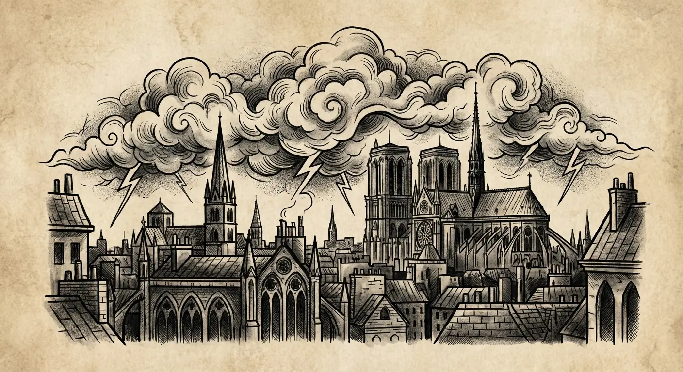
Back pieces provide space for architectural detail work where your artist can really showcase their technical ability. Smaller elements work on forearms or calves without losing impact.
Consider adding personal touches. Your city’s skyline rendered in the same dark style, or combining Paris imagery with lyrics from the track that hit hardest. The key is capturing the feeling rather than literal reproduction.
12. Stop Staring at the Shadows Artwork
Shadow imagery creates powerful tattoo concepts because shadows represent the parts of ourselves we hide or struggle to face. Designs might show figures consumed by shadows, shadow hands reaching, or abstract shadow forms that suggest presence without defining it completely.
These work beautifully in black and grey with strong contrast between light and dark areas. Your artist needs solid understanding of value and shading to make shadows read correctly rather than looking like muddy blobs.
Areas where natural body shadows fall create interesting visual play. Under collarbones, along ribs, behind knees. I’ve seen people incorporate mirrors or reflective surfaces to show the disconnect between public presentation and internal darkness. That metaphorical layer adds depth without requiring explanation to everyone who sees it.
13. Now the Moon’s Rising Lyrics
Specific lyrics carry personal meaning that generalizes poorly. “Now the Moon’s Rising” contains lines about darkness, isolation, and finding beauty in night rather than day. Your chosen lyric should be something you’ve lived with for years, not just currently vibing with.
Script selection dramatically impacts the feel. Elegant cursive versus typewriter font versus handwritten style each communicate differently. Along ribs, collarbones, or forearms works for longer phrases that need room to breathe.
Think about breaking the lyric across multiple lines or incorporating it into larger imagery. Actual moon rising, night sky, shadows that give context to the words.
Spelling and punctuation need to be perfect because lyric tattoos get scrutinized by people who know the songs. Bring printed references to your appointment. Seriously.
14. Antarctica Track Imagery
Antarctica represents isolation, coldness, and beautiful desolation. Tattoo interpretations might show literal icebergs and frozen landscapes or capture the emotional isolation the track conveys without being geographically literal.
Realistic ice rendering demands skilled shading to capture translucency and depth. Ice isn’t just white. It’s layers of value that create the illusion of frozen water. Minimalist versions using simple line work and negative space can be equally powerful when executed with intention.
Upper arms, thighs, and back provide canvas for landscape work that needs space to establish scale. Some people add penguins or polar bears, though that risks looking generic unless your artist brings unique perspective.
The color question matters here. Pure black and grey maintains cohesion with overall $uicideboy$ aesthetic. Subtle blues can enhance the cold feeling without being cartoonish, but they need to be handled carefully.
15. Champion of Death Symbols
Championship imagery inverted with death themes creates interesting visual tension. Trophy designs incorporating skulls, death figures holding victory laurels, or crowns made of bones all explore this concept of winning at losing, succeeding at destruction.
These work as standalone pieces or integrated into larger sleeve work where they become one chapter in a bigger story. Chest pieces make bold statements that command attention.
Traditional tattoo style suits this imagery well because it already has established death symbolism vocabulary. Bold lines, limited color palette, classic compositions. These elements make the design readable and timeless.
Some people add specific achievement dates or personal victories over struggles. Sobriety dates, survival milestones, treatment completion. These markers personalize the champion concept beyond generic imagery. The irony of being a “champion of death” resonates with those who’ve survived suicidal ideation and come out stronger.
16. Mount Sinai Hospital References
Hospital imagery appears in their work as a reference to mental health treatment and medical intervention. These designs acknowledge that sometimes professional help is necessary, not weakness. That message matters in communities where seeking help gets stigmatized.
Designs might incorporate hospital bracelets with meaningful dates, medical symbols reimagined, or architectural elements from treatment facilities that marked turning points. Wrist placement for hospital band designs feels natural, though some prefer less literal locations that don’t immediately signal medical history.
The challenge is creating something that reads as intentional art rather than looking like medical instruction tattoos. Adding surrounding elements helps establish the narrative. Flowers growing from the bracelet, chains breaking, light emerging. These additions contextualize the medical imagery within recovery narrative.
This works best for people who’ve been through treatment and want to mark that journey. If you’re currently in crisis or early treatment, wait until you have perspective on what that experience meant before permanently marking it.
Personal Darkness: Tattoos About Mental Health Struggle
Here’s where things get heavy. These are the most personal designs you can get. Tattoos directly representing mental health struggles, suicidal ideation, and the journey through darkness. $uicideboy$ built their entire artistic identity on unflinching honesty about these experiences, which is why their fanbase connects so deeply.
But listen. These designs need the most careful thought because they’re permanent reminders of difficult periods. Some of these should only be considered after significant time in recovery. Your mental health professional’s input matters here. We’re talking about permanent body modification related to trauma and mental illness.
I know someone who got a noose tattoo during recovery and ended up covering it two years later because seeing it daily made things worse. That’s real. That happens.
The goal is acknowledging pain without glorifying it, representing struggle without triggering yourself, and marking survival without toxic positivity.
17. Depression Cherry Blossoms
Cherry blossoms traditionally represent life’s temporary nature, but rendered in dark styles they can represent depression’s cyclical nature. These work beautifully because they’re recognizable enough to read as floral work to casual observers while carrying deeper meaning for you.
Black and grey cherry blossoms with dead or dying petals create the right tone. Along forearms, shoulders, or as part of larger Japanese-inspired sleeve work provides context that elevates the design beyond simple flowers.

Some people add falling petals to show the passage of time or seasonal nature of depressive episodes. The contrast between traditional beauty and dark execution mirrors the experience of depression obscuring life’s beauty.
Your artist needs understanding of botanical forms and Japanese tattoo principles to execute this properly. Learning about Japanese traditional tattoo techniques helps understand how to properly execute cherry blossom imagery with the right cultural context and technical skill.
18. Pill Bottle Outlines
Medication imagery acknowledges that mental health treatment often involves pharmaceutical intervention. Pill bottle tattoos can show empty bottles representing before treatment, full bottles representing current management, or spilled pills representing complicated relationships with medication.
Simple outline work keeps these subtle enough for professional environments. Detailed rendering with labels, shadows, and surrounding elements makes them statement pieces that invite conversation.
Some incorporate specific medication names that saved their lives, though consider using scientific names rather than brand names. Others add flowers growing from bottles to show growth through treatment.
The key is avoiding imagery that could be misread as glorifying drug abuse versus managing mental illness. That distinction matters.
19. “I Want to Die in New Orleans” Text
This album title hits different depending on your relationship with suicidal ideation. Getting it tattooed means being far enough into recovery that it won’t trigger you daily.
Typography and placement control how confrontational the message feels. Chest pieces make bold statements that you see every time you look in the mirror. Ribs or thighs keep it more personal, revealed only in intimate settings.

Some people get just “New Orleans” with the full context understood privately. Others incorporate Louisiana imagery like fleur-de-lis, swamp scenes, French Quarter architecture to shift focus toward the location rather than the death wish.
Think about adding surrounding elements that represent survival or recovery to balance the darkness.
This absolutely isn’t appropriate for everyone, and good artists will have conversations about your mental state before tattooing this. If they don’t ask questions, find a different artist who takes this responsibility seriously.
20. Noose Imagery (Reclaimed)
Noose tattoos represent the most extreme reclamation of suicidal imagery. These should only be considered by people significantly far into recovery who want to mark their survival.
Designs might show cut nooses representing choosing life, nooses transformed into other objects like flowers or snakes, or broken rope imagery.
Neck placement reads as threatening or attention-seeking. Arms, ribs, or legs allow for more controlled visibility. The execution needs to clearly communicate reclamation rather than ideation.
Many artists will refuse these outright or require proof of therapeutic support, which is responsible practice.
Ask yourself honestly: will seeing this daily support your recovery or potentially trigger regression? Understanding the deeper semicolon tattoo meaning and mental health symbolism provides context for how recovery-focused imagery differs from potentially triggering designs like nooses.
Wait at least two years post-crisis before committing. If the idea still resonates after that time and your therapist agrees it serves your recovery, then proceed with an artist who specializes in sensitive subject matter.
21. Skeleton Hand Reaching
Skeleton hands reaching upward, outward, or grasping objects create powerful imagery about death’s presence in life. These work in traditional tattoo style, realistic rendering, or minimalist line work depending on your aesthetic preference.
The hand can be reaching for help, pulling you down, or grasping at life. Each tells different stories.
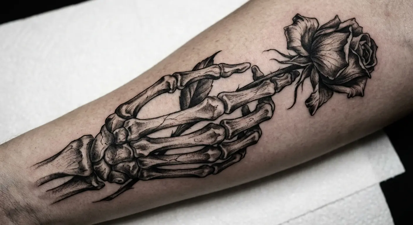
Placement on your actual hands creates interesting visual overlap between your living hand and the skeletal one. Forearms, chest, or incorporated into larger sleeve work offer alternatives that don’t require the commitment of hand tattoos.
Some add objects in the skeleton’s grasp. Roses, pills, crosses, hearts. These build narrative complexity.
The beauty of skeleton imagery is its established tattoo tradition, so it reads as classic tattoo work while carrying personal $uicideboy$ connection for you. That dual nature gives you flexibility in how much you explain to different audiences.
22. Third Eye Awakening
Third eye imagery in $uicideboy$ context represents seeing through bullshit and facing reality’s darkness rather than spiritual enlightenment clichés. Designs show eyes opening in foreheads, eyes surrounded by flames or thorns, or crying eyes with symbolic tears.
Forehead placement is extremely bold and career-limiting, so most opt for chest, hands, or traditional third eye position rendered on arms or legs.
Realistic eye rendering demands serious artist skill because poorly done eyes look creepy in the wrong way.
Some incorporate surrounding elements. Breaking chains represent freedom from delusion. Dark clouds show seeing through false positivity. Geometric patterns add visual interest without diluting the core symbol.
The goal is representing awakening to harsh truths rather than new age spirituality that contradicts the duo’s aesthetic entirely. Your artist needs to understand that distinction to execute the design with appropriate tone.
23. Phoenix Rising From Ashes
Phoenix imagery risks feeling cliché, but it genuinely represents rising from the destruction of suicidal depression. The key is executing it in a style that aligns with $uicideboy$ darkness rather than colorful traditional phoenix work.
Black and grey phoenix with aggressive, sharp feather work and prominent ash elements maintains the right tone. Back pieces provide space for full wing spans and rising motion that needs room to develop properly.

Some incorporate Grey*59 symbols in the ashes or flames to make the $uicideboy$ connection explicit. Others add specific dates in the ash. Suicide attempt survival, sobriety start, treatment beginning. These personalize the rebirth narrative.
Your artist needs strong understanding of bird anatomy and motion to make the rising movement feel dynamic rather than static. Learning about phoenix tattoo meaning and symbolism helps distinguish between generic rebirth imagery and designs that authentically represent survival through mental health struggles.
This works best as a marking of significant recovery milestones rather than early-stage hope.
Bringing Your Vision to Life
You’ve spent time considering which $uicideboy$ imagery resonates with your experience, but translating mental concepts into actual tattoo designs presents its own challenges.
Most people struggle to communicate their vision effectively to artists, especially when trying to combine multiple elements or capture specific emotional tones. Sketching isn’t your strong suit. That’s why you’re hiring an artist. But you need something more concrete than “I want a $uicideboy$ tattoo that feels dark but hopeful.”

Bring reference photos. Multiple angles if you’re thinking portraits. Print out lyrics with correct spelling. Show examples of styles you like even if they’re not $uicideboy$ related. Good artists can translate your vision better when they understand what you’re going for.
And be ready to pay. Portrait work? You’re looking at $500 minimum, probably $800-1200 for something good. A full back piece with Paris architecture? That’s multiple sessions, probably 15-20 hours total. Budget accordingly.
Pain-wise, ribs are fucking brutal. Just know that going in. Hands and feet hurt like hell too because of all the nerve endings. Forearms and upper arms are generally more manageable.
This will take 2-3 weeks to heal. Keep it out of the sun. Follow your artist’s aftercare instructions exactly.
Final Thoughts
Look, I’ve been into $uicideboy$ for years. I’ve watched their imagery go from underground to everywhere. And I’ve seen a lot of bad tattoos. People copying designs they don’t understand, getting “Kill Yourself” during active mental health crises, choosing cheap artists for complex portraits.
Don’t be that person.
If you’re gonna permanently mark yourself with this imagery, make it count. Wait until you’re ready. Find an artist who can actually execute what you want. And make it personal, not just another copy of what’s trending.
Ruby and $crim built their whole thing on brutal honesty and rejecting fake shit. Your tattoo should have that same energy.
Real talk about visible tattoos one more time. Some people are gonna think your $uicideboy$ tattoos are edgy try-hard bullshit. Especially the “Kill Yourself” stuff. You need to be okay with that judgment before you commit.
What’s your connection to their music? What moment, what song, what lyric actually changed something for you?
Start there. That’s your tattoo.