
19 Suminagashi Tattoos That Reveal How Ancient Ink Techniques Mirror Your Inner Chaos
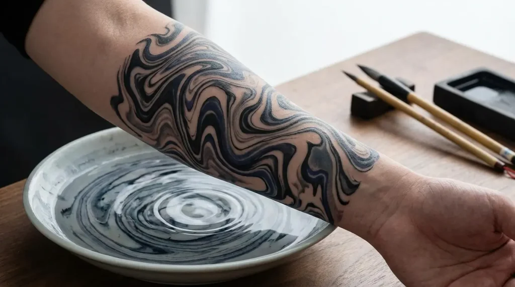
Table of Contents
-
The Philosophy Behind Fluid Permanence
-
Suminagashi Tattoos That Embrace Natural Imperfection
-
Shoulder Placements Where Movement Meets Stillness
-
Color-Infused Designs That Break Traditional Boundaries
-
Minimalist Interpretations for the Modern Wearer
-
Hybrid Compositions That Merge East and West
TL;DR
-
Suminagashi means “floating ink,” a 12th-century Japanese marbling technique that creates unrepeatable patterns
-
The whole point is impermanence, so making it permanent is kind of beautifully strange
-
Works best on shoulders, backs, and ribs where your body’s movement adds to the effect
-
Find an artist who gets the difference between random swirls and intentional chaos
The Philosophy Behind Fluid Permanence
You’re asking your body to hold something that was never meant to be held.
That’s what keeps me up at night about suminagashi tattoos. Not the technical stuff (whether the artist can nail the gradations or whatever). The weird philosophical thing underneath it all.
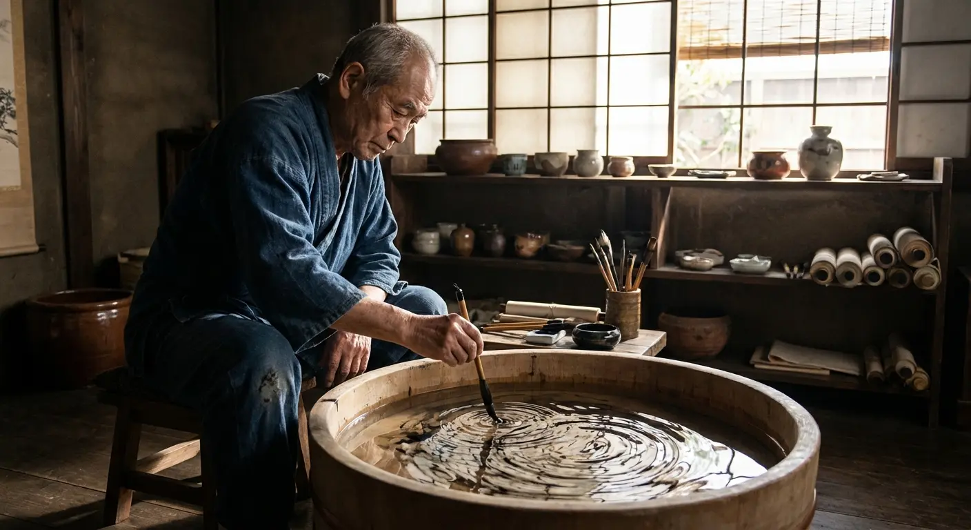
Back in 12th century Japan, monks would drop ink onto water, blow on it or mess with it using tools, then press paper down to catch the pattern. One moment, one print, then it’s gone. The earliest documentation of Suminagashi can be traced to the Heian period (794-1185), when Japanese culture flourished in art and literature. Monks and aristocrats practiced this to create decorative papers for calligraphy and poetry, but really, they were documenting chaos.
They weren’t trying to create repeatable designs. That came later with other marbling techniques.
And now we’re taking that and making it permanent. Freezing water mid-flow. It’s philosophically backwards in a way that makes these tattoos more interesting than most traditional work, where a dragon means wisdom and a koi means perseverance and everything has a neat little dictionary definition.
When you look at how Japanese traditional tattoo elements rely on established symbolism, the contrast becomes obvious. Traditional Japanese work has a vocabulary. Everything translates to something specific.
People drawn to suminagashi are usually going through something. Last month alone I saw consultations for one divorce, two career changes, and someone who just came out to their family. There’s something about the technique’s focus on impermanence that speaks to people in transition.
The patterns themselves resist interpretation. You can’t point to a specific swirl and assign it meaning the way you might with a lotus or a phoenix. That ambiguity is the point. These pieces work best when you stop trying to control what they represent and let them exist as visual records of a moment you chose to preserve.
Suminagashi Tattoos That Embrace Natural Imperfection
1. Full Back Water Meditation
The back gives you enough real estate to let the technique breathe without forcing it into uncomfortable compromises. Patterns that flow from shoulder blade to lower back, following your body’s natural topography rather than fighting against it.
Most people assume bigger automatically means better, but with this work, scale matters for different reasons. The technique relies on gradual transitions and subtle variations that get lost when compressed into small spaces. Your back provides the canvas size that honors the original water-based process.
The spine becomes a natural dividing line without requiring perfect symmetry. Ink patterns can drift across it or stop at its edge. You’re not doing the mirror-image thing, which would feel forced and contrary to the technique’s nature. The design acknowledges your body’s central axis while flowing around it organically.
This is going to take multiple sessions, probably 3-4 if you’re doing a full back. Any artist who says they can knock it out in one sitting doesn’t understand suminagashi, or they’re lying to get your deposit. The whole thing depends on building up these layers of gray wash and black ink slowly, the way ink actually spreads through water at different densities. Rush it and you just get muddy nonsense.
2. Ribcage Cascade With Intentional Gaps
Ribs hurt like absolute hell. Not “oh this is uncomfortable” hurt. More like “I need to tap out every twenty minutes and my artist is probably judging me” hurt.
But here’s the thing: the ribcage’s curved surface creates this natural movement that flat placements can’t touch. And the pain kind of makes sense for suminagashi when you think about it. The original technique was about controlled discomfort too, in a way. Monks sitting there, breathing carefully over water, trying to direct something that doesn’t want to be directed.
What makes this design different from typical ribcage pieces is the intentional use of empty space. You’re not covering every inch of skin. The gaps between ink patterns serve the same function as the water’s surface in traditional suminagashi: they provide context and contrast that makes the ink more visible and meaningful.
Your breath changes how this looks. When you inhale deeply, the skin stretches and patterns elongate slightly. Exhale, and they compress. That subtle movement reinforces the connection to impermanence in a way that arm or leg placements can’t match.
I watched someone get a ribcage piece last month and they tapped out four times in an hour. Their back piece the year before? Sailed through three-hour sessions. Plan accordingly. Your artist should be willing to work in shorter bursts rather than pushing through, because tension and shallow breathing will affect how your skin receives the ink.
The concealability factor matters to some people and doesn’t to others. This placement gives you options. You can reveal or hide it depending on clothing choices, which aligns nicely with the themes of revelation and concealment.
3. Forearm Flow Study
Your forearm rotates constantly throughout the day, which means a piece here reveals different aspects depending on how you’re holding your arm. You’re not seeing the same view repeatedly.
This placement works particularly well if you’re uncertain about committing to larger coverage. The forearm provides enough space for meaningful expression (roughly 6-8 inches of workable length for most people) without requiring the time and financial investment of back or leg pieces.
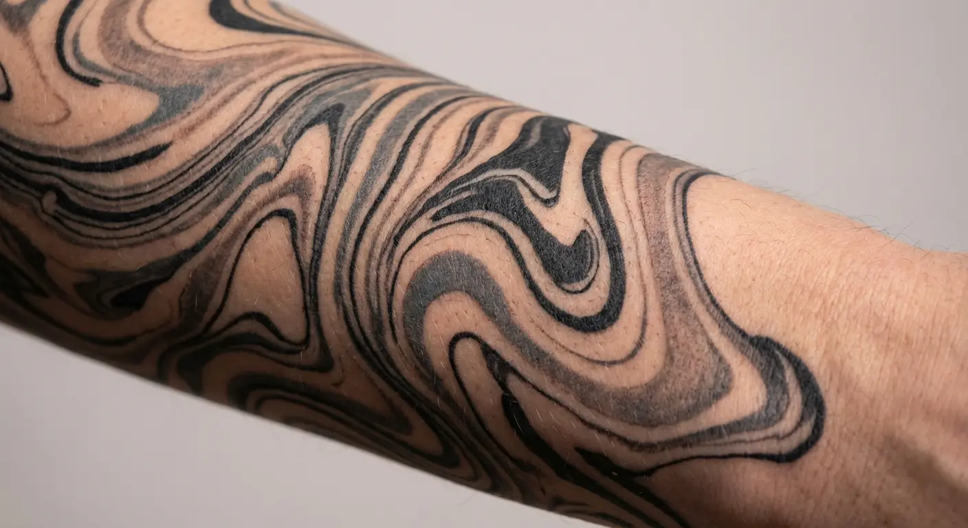
If you work in conservative fields where visible tattoos still create career obstacles, abstract patterns tend to raise fewer eyebrows than imagery-heavy work. Suminagashi reads as artistic rather than symbolic, which can make conversations easier. Though honestly, some industries still don’t care how artistic it looks. Know your professional landscape.
The cylindrical shape presents interesting challenges. Your artist needs to consider how patterns transition as they wrap around your arm’s circumference. Done well, this creates a sense of continuous flow. Done poorly, it looks like disconnected panels that don’t relate to each other.
You’ll see this more than anyone else will. That might sound obvious, but it changes the design considerations. Unlike back pieces or shoulder placements that you primarily experience through photos or mirrors, forearm tattoos stay in your peripheral vision throughout the day. That constant presence makes them particularly suitable for designs with personal or meditative significance.
4. Thigh Composition With Organic Boundaries
Thighs give you privacy and space in equal measure. One of the body’s largest relatively flat surfaces, but it’s not on display unless you choose to reveal it.
The boundaries matter here. Instead of framing the design with hard edges or geometric borders, patterns fade gradually into bare skin. This approach mirrors how ink disperses in water, becoming less concentrated at the edges until it disappears entirely.
Clothing friction is real. Jeans, tights, and fitted pants will rub against this area constantly. That doesn’t mean thigh tattoos are a bad idea, but it does mean you need to be realistic about healing time and long-term care. Loose patterns with gradual shading tend to age more gracefully than designs dependent on crisp details.
Some people specifically choose thighs because they want the psychological experience of having a large piece without the social experience of constantly explaining it. You know it’s there. It affects how you see yourself. But you control when and whether others see it.
The muscle’s movement beneath the skin adds another dimension. When you walk, climb stairs, or shift position, the tattoo moves with you. That kinetic quality reinforces the connection to flow and change in ways that more static placements don’t capture.
Shoulder Placements Where Movement Meets Stillness
5. Single Shoulder Cap With Downward Flow
Shoulders move through three-dimensional space more than almost any other body part you’re likely to tattoo. That constant rotation makes them perfect for designs that benefit from shifting perspectives.
The rounded cap provides a natural focal point where patterns can concentrate before flowing downward toward your upper arm. Working with gravity visually, even though the tattoo itself obviously isn’t moving. That downward pull creates intuitive flow that viewers’ eyes follow naturally.
This shoulder placement has blown up in the past few years. Part of that comes from the shoulder’s versatility (you can go sleeveless or covered depending on the situation), but there’s also something about how the joint’s movement animates the design that appeals to people drawn to this technique’s fluid nature.
Tank tops and off-shoulder clothing create natural frames that reveal portions of the design without exposing the whole thing. Partial reveals that change depending on what you’re wearing and how you’re moving. That selective visibility aligns with themes of concealment and revelation.
First tattoo or addition to existing work? Both scenarios work here. The shoulder cap functions well as a standalone piece, but it also serves as a strong anchor point if you decide to expand into a sleeve or back piece later.
6. Cross-Shoulder Drift
Diagonal movement creates visual energy that horizontal and vertical compositions can’t match. Drawing the eye across the body’s landscape rather than following its natural vertical axis.
This piece typically starts at one shoulder’s peak and drifts across the upper back, crossing the spine at an angle before reaching toward the opposite shoulder blade. The diagonal orientation breaks traditional symmetry in ways that feel intentional rather than accidental.
Necklines matter more with this placement than you might expect. Crew necks will hide most of it. V-necks might reveal portions. Off-shoulder or boat neck styles will expose the full composition. Think about your wardrobe habits before committing to this placement, because it’s large enough to be a significant investment but positioned where clothing choices dramatically affect visibility.
The spine crossing presents a technical challenge. Your artist needs to maintain the pattern’s flow as it transitions across your back’s central axis without making it look like two separate designs that happen to touch in the middle. That requires planning and skill that goes beyond simply drawing swirls.
Substantial coverage (typically 12-18 inches of length) without the commitment level of a full back piece. That middle ground appeals to people who want something significant but aren’t ready to dedicate their entire back to a single design.
7. Shoulder Blade Concentration
Containment and flow aren’t opposites. This placement proves you can concentrate patterns in a defined area without betraying the technique’s essential character.
The shoulder blade provides a naturally bordered space (roughly 6-8 inches square for most people) where patterns can intensify and layer without needing to extend across your entire back. Creating density rather than coverage.
Every time you move your arm, your shoulder blade shifts beneath the skin. That subtle movement animates the piece in ways you’ll notice but others might not. It’s a private kinetic experience that reinforces the design’s connection to impermanence.
8. Dual Shoulder Asymmetry
Matching shoulders feels safe. I get why people gravitate toward symmetry. But the entire philosophy pushes against that kind of controlled repetition.
This approach places patterns on both shoulders while intentionally making them different. Not opposite (that’s just another form of controlled relationship), but genuinely distinct. Each shoulder gets its own composition that relates to the other through style and technique rather than mirrored imagery.
The psychological adjustment takes time for some people. You might initially feel something’s “off” or incomplete because our brains are wired to seek symmetry and patterns. That discomfort usually fades as you live with the work and start appreciating how the differences create visual conversations between the two placements.
Creating a composition that requires both shoulders to make sense but doesn’t depend on them mirroring each other. That’s a more sophisticated approach than most bilateral tattoos attempt.
Clothing reveals become more interesting with asymmetrical designs. A tank top might expose both shoulders equally, but the different patterns create distinct focal points that keep the eye moving. Not just doubling the same visual information.
Some artists push back on this approach because they’re used to clients wanting matched sets. Be clear about your intentions and find someone who understands why you’re specifically requesting asymmetry rather than just being indecisive about the design.
Color-Infused Designs That Break Traditional Boundaries

9. Blue-Green Oceanic Interpretation
Color transforms the work from meditation into emotion. No longer working with neutral blacks and grays that could represent anything. Making specific associations.
Contemporary artists continue to push boundaries in innovative ways. Ciara Havishya, whose work was featured in the Human Marks: Tattooing in Contemporary Art exhibition at the University of Hartford’s Joseloff Gallery, creates pieces inspired by both the Japanese paper-marbling art of suminagashi and devotional painting practices from 17th century India, demonstrating how the ancient technique continues to evolve across cultural contexts.
Blues and greens immediately evoke water, which creates an interesting loop: using colors that represent the medium that created the original technique. Some people find that redundant. Others appreciate the reinforcement.
Okay, real talk: the blue-green oceanic thing has gotten a little played out. I’ve seen probably fifty variations of this in the last year alone, and half of them look identical.
But you know what? If you actually love the ocean (like you grew up surfing or you feel most yourself near water), then who cares if it’s trendy? The whole point is that it’s personal and unrepeatable anyway. Your blue-green piece won’t look like anyone else’s blue-green piece.
Just don’t choose these colors because you saw them on Instagram and they looked cool. That’s how you end up with a tattoo that feels like someone else’s.
Saturation levels require careful consideration. Pack too much color into the design and you lose the subtle gradations that make the technique recognizable. It depends on viewers seeing how patterns fade and blend gradually. Intense color can overwhelm those nuances.
Heads up if you have darker skin: greens can heal weird. I’ve seen them shift toward yellow or gray depending on your undertones. Blues usually stay true, though. Talk to your artist about test spots if you’re worried about it.
10. Sunset Gradient With Black Anchors
Warm colors hit differently than cool ones. Moving from water associations into fire and sky territory, which changes the entire emotional landscape.
The black anchors
The black anchors serve a practical purpose beyond aesthetics. They give the eye reference points that prevent the warm gradient from becoming visual mush. You need contrast and definition to make gradual color transitions read as intentional rather than muddy.
Blending warm colors smoothly requires serious technical skill. Oranges, pinks, and purples can turn brown or gray quickly if the transitions aren’t handled carefully. Your artist needs to understand color theory beyond just “make it look like a sunset.”
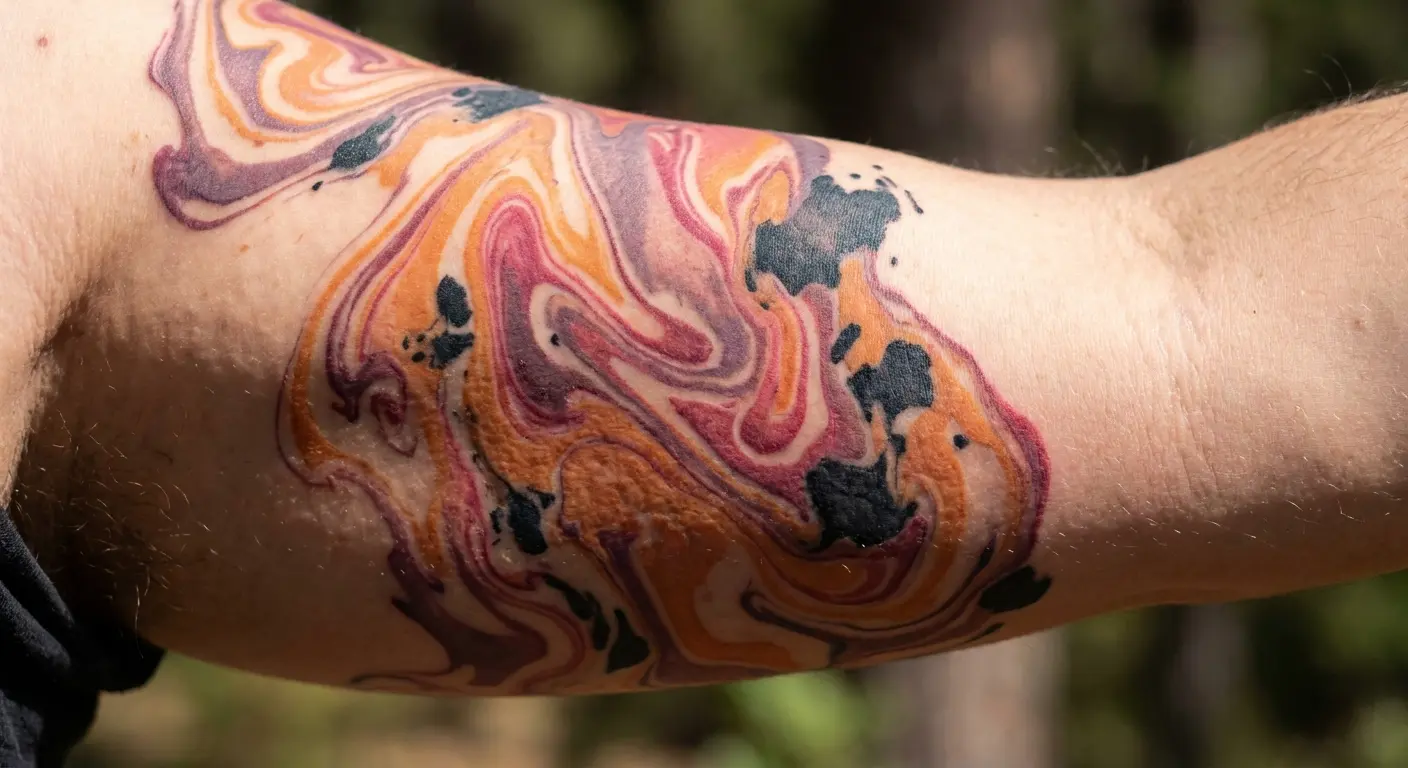
Sunset imagery carries heavy symbolic weight around endings, transitions, and closure. That’s not necessarily a problem, but it does make these designs less emotionally neutral than traditional black work. Signaling something specific about processing change.
Should you add a horizon line? Some people want that grounding element. Others feel it compromises the abstract quality that makes suminagashi interesting. There’s no right answer, but the question itself reveals tension between representation and abstraction that you’ll need to resolve for yourself.
11. Monochrome Purple Study
Purple’s weird for tattoos. Bold enough to make a statement, not so common that it feels played out. Though I’ve been seeing more of it lately, so maybe that’s changing.
The monochrome thing works because you’re keeping the gradations that make the technique recognizable, just doing it all in purple instead of black-to-gray. Simpler than managing multiple colors, and honestly I think it ages better. Though I’ve only been watching purple pieces for like three years, so ask me again in ten.
The spiritual associations are real. Purple carries baggage around mysticism, transformation, and consciousness that you can’t entirely separate from the color itself. If those associations feel authentic to you, great. If they don’t, consider whether you’re choosing purple for the right reasons.
Purple shifts over time, usually toward blue or gray. Which is kind of perfect for suminagashi if you think about it. The tattoo changes just like the original water patterns did. Or that’s what I tell myself when clients come back worried about fading.
Pale lavender sections require special attention. Light colors generally need more frequent touch-ups than dark ones, and lavender can fade toward nearly invisible if not properly saturated initially. Plan for potential maintenance down the line.
12. Red-Black Contrast Composition
Red demands attention in ways that black doesn’t. Introducing visual aggression into a technique traditionally associated with calm contemplation.
High contrast challenges the soft aesthetic directly. Instead of gradual transitions, creating sharp distinctions between red and black areas. Purists can complain all they want, but I’ve seen red-black pieces that hit harder than any traditional work.
Red is kind of a pain in the ass, honestly. Heals slower, fades faster, and some people just react badly to it for no clear reason. Not saying don’t use it, just know you might be back for touch-ups sooner than with other colors.
This color combination appeals to people who connect with the philosophical depth but don’t want the visual softness that usually comes with it. Asking for meditation with teeth, contemplation with edge.
Can you push aesthetic boundaries this far and still call it suminagashi? That’s a definitional question without a clear answer. The flowing patterns remain, but the emotional register has shifted dramatically. You’ll need to decide for yourself whether the technique’s identity lies in its visual softness or its underlying philosophy about controlled chaos.
Minimalist Interpretations for the Modern Wearer
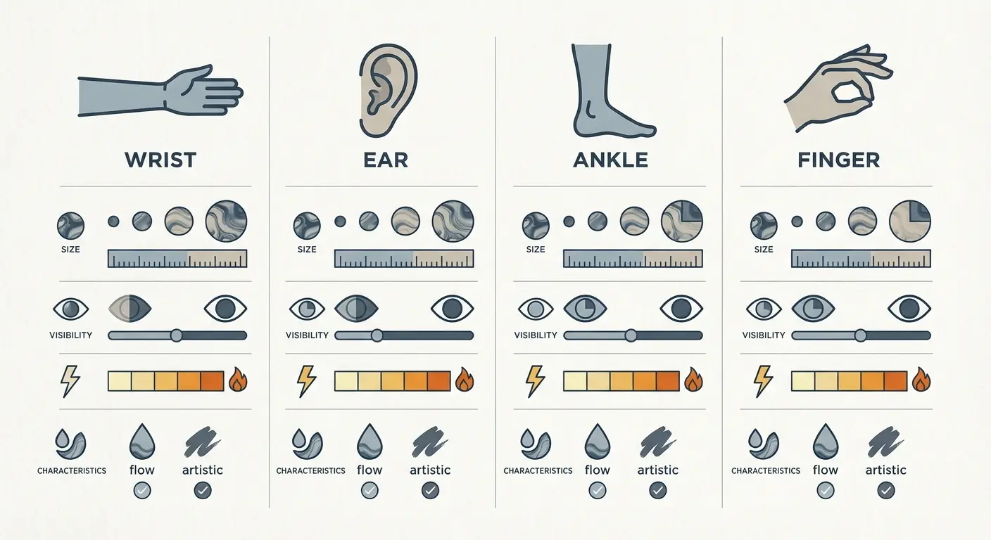
13. Wrist Eddy
You don’t need a full back piece to capture the essence. Sometimes a single eddy says everything that needs saying.
The inner wrist provides 2-3 inches of workable space, which is enough for a contained swirl pattern that demonstrates the technique’s characteristic flow without requiring extensive coverage. Distilling rather than expanding.
Pulse points carry symbolic weight. Some people specifically choose the wrist because they want the piece near where they can feel their own heartbeat. That connection between the body’s internal rhythm and the visual representation of flow creates meaning beyond the design itself.
For those considering small tattoo ideas with depth, minimalist suminagashi offers philosophical weight in compact form.
During healing, you basically live in long sleeves or deal with constant friction. Watches are out. Bracelets are out. Anything that rubs directly on the tattoo is out for at least two weeks.
Wrist tattoos face serious environmental challenges. Your hands get more sun exposure than almost any other body part, and the wrist specifically experiences constant friction from sleeves, watches, and bracelets. Expect fading and plan for touch-ups.
Does minimalist work read as intentionally simple or just incomplete? That depends on execution. A well-designed small piece looks purposeful and contained. A poorly designed one looks like you ran out of money or commitment halfway through a larger design.
Daily visibility matters here. Your wrist stays in your peripheral vision throughout the day, which makes this placement particularly suitable for tattoos with meditative or grounding significance. Not just wearing the design. Living with it constantly.
14. Behind-Ear Whisper
Hidden doesn’t mean meaningless. Behind-ear placements serve people who want this for themselves rather than for display.
Working with 1-2 inches of space on a curved surface near bone and cartilage. That combination creates technical challenges that require precision and a light touch. Not every artist handles this area well.
Pain levels surprise people. The proximity to bone and cartilage means you’ll feel the needle intensely despite the small size and short session time. The area also tends to swell more noticeably than fleshier placements, though the swelling usually resolves quickly.
Does hiding a tattoo defeat its purpose? That question assumes tattoos exist primarily for social communication. Some people get tattooed to mark private experiences or create personal touchstones that don’t require external validation. Behind-ear placements serve that intention perfectly.
If you work in finance, law, or any client-facing corporate job, this location gives you the experience of being tattooed without the professional consequences. That’s pragmatic, not cowardly.
15. Ankle Circulation
Circles have no beginning or end, which makes ankle wraps philosophically aligned with endless flow patterns.
Working with the ankle’s circumference (typically 8-10 inches for most people) provides enough length for patterns to develop without cramping but requires careful planning to make the connection point invisible. A good artist will design the wrap so you can’t tell where the pattern starts and stops.
During healing, you basically live in sneakers or sandals. Boots are out. High-tops are out. Anything that rubs directly on the tattoo is out. Plan your wardrobe accordingly or wait until winter’s over.
Visibility sits in an interesting middle ground. Ankle tattoos show when you’re wearing shorts, skirts, or cropped pants but disappear under professional attire. That flexibility appeals to people who want options rather than constant visibility or permanent concealment.
Does the ankle’s small circumference force too much compression? Sometimes. Suminagashi benefits from space to breathe, and wrapping patterns around a narrow cylinder can make them feel cramped. Your artist needs to adjust the design’s scale and density to work with the ankle’s proportions rather than fighting against them.
16. Finger Flow Mark
Fingers move constantly, which makes them perfect for designs that benefit from kinetic energy. Creating animation through your body’s natural gestures.
Let me be straight with you: finger tattoos fade and blur faster than almost any other placement. The skin on your fingers sheds and regenerates rapidly, and your hands experience constant friction and sun exposure. You’re signing up for maintenance.
But honestly? For suminagashi, that might not be a bad thing. The blurring makes it more authentic to the original technique. Your tattoo ages the way the water patterns aged. Just don’t expect crisp lines after a few years.
Visibility creates interesting social dynamics. Finger tattoos are small enough that people might not notice them immediately, but they’re on your hands, which means they’re present in every handshake, gesture, and transaction. Not hiding them, but they’re not announcing themselves either.
Professional implications vary wildly by industry and region. Some fields don’t care about finger tattoos anymore. Others still consider them deal-breakers for client-facing roles. Know your professional landscape before committing to this placement.
Hybrid Compositions That Merge East and West
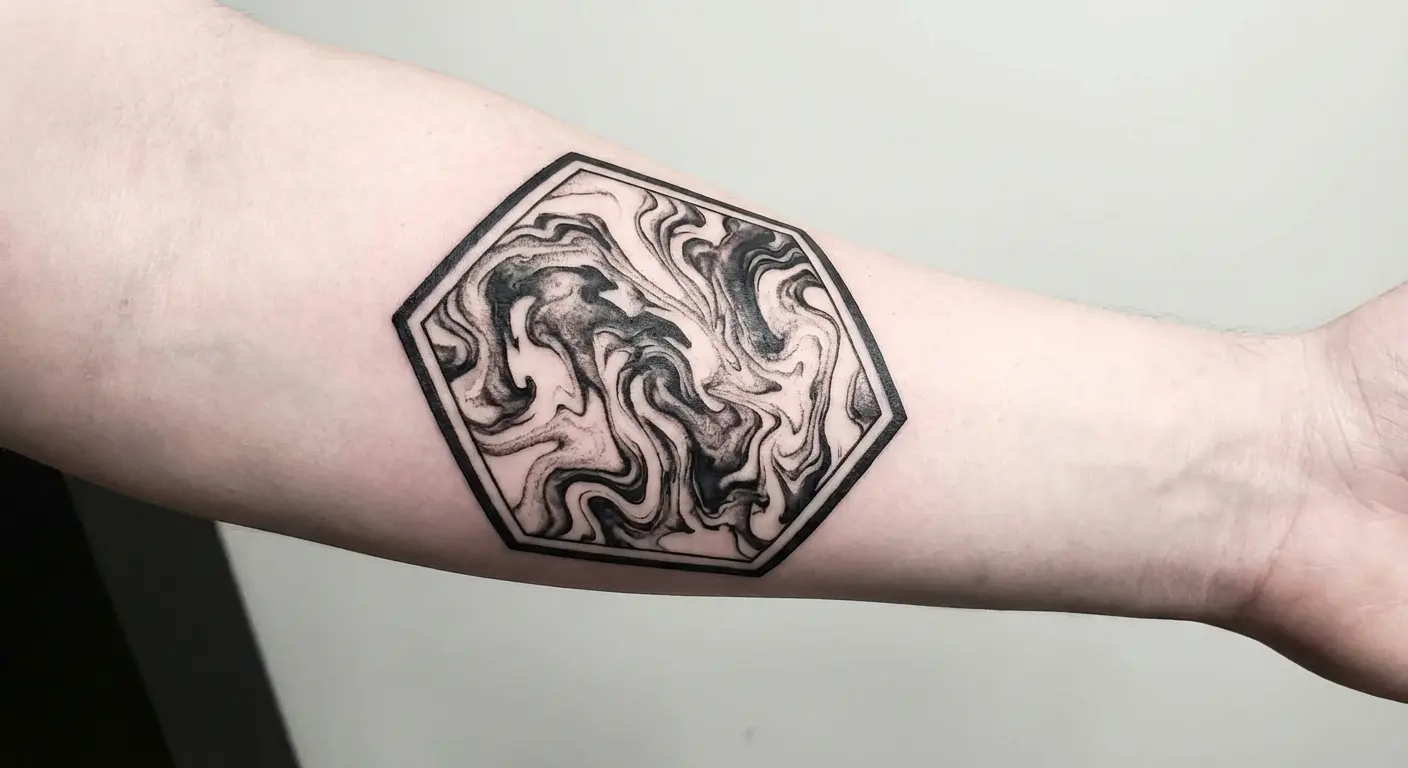
17. Suminagashi With Geometric Framework
Geometry imposes order on chaos. That tension between structure and flow creates visual interest that pure suminagashi or pure geometry can’t achieve alone.
Containing organic patterns within precise shapes: triangles, hexagons, circles, or more complex sacred geometry configurations. The flow continues naturally until it hits the geometric boundary, where it either stops abruptly or fades into the framework.
This hybrid approach reflects something real about modern existence. We’re trying to maintain authentic, organic selves while operating within rigid structures: professional expectations, social media algorithms, economic systems. The visual tension in these designs mirrors the psychological tension many people experience daily.
Does geometric containment enhance or diminish the work? The frames provide contrast that makes the organic patterns more visible and impactful. But they also impose artificial boundaries on a technique philosophically opposed to containment. You’ll need to decide which perspective resonates with your intentions.
Technical execution requires artists comfortable with both styles. Not everyone who does beautiful organic work can execute crisp geometry, and vice versa. You need someone who genuinely understands both approaches and can make them coexist without one element looking like an afterthought.
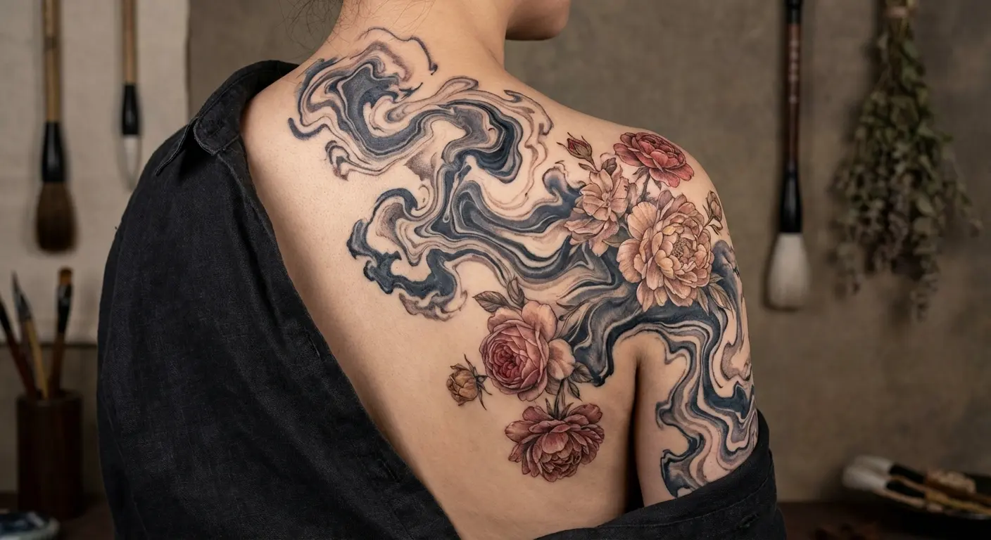
18. Western Florals Emerging From Eastern Flow
Cultural fusion isn’t always appropriation. Sometimes it’s honest representation of hybrid identity or genuine appreciation for multiple traditions.
According to historical documentation, suminagashi was more than just an artistic endeavor, it was a reflection of the Japanese philosophy of Wabi-Sabi, which finds beauty in imperfection and the transient nature of life, a philosophical foundation that resonates deeply with modern tattoo enthusiasts seeking meaningful body art.
This design uses flowing patterns as a foundation from which Western-style realistic flowers (roses, peonies, wildflowers) emerge organically. The flowers aren’t placed on top of the background. They’re growing out of it, suggesting that both elements belong to the same ecosystem.
Mixed cultural backgrounds drive some people toward this hybrid approach. If you grew up navigating multiple cultural contexts, a design that compartmentalizes Eastern and Western elements into separate pieces might feel inauthentic. You want something that reflects how these influences exist in your life: blended and inseparable.
Does mixing representational imagery with abstract patterns dilute both? That’s a risk. Poorly executed, this design can look like you couldn’t decide between two different tattoos and just mashed them together. Well executed, it creates something that transcends either tradition alone.
The technical challenge lies in making the transition feel organic. The flowers need to emerge naturally from the patterns rather than looking pasted on top. That requires planning the composition as a unified whole rather than designing each element separately and trying to combine them later.
Should non-Japanese people get suminagashi tattoos? I’ve gone back and forth on this.
It’s not the same as getting kanji you can’t read or a random Buddha because it looks cool. Suminagashi is a technique, not a sacred symbol. But it’s still Japanese cultural heritage, and pretending that doesn’t matter feels wrong.
My take: if you’re drawn to the philosophy and you’ve actually learned about the technique’s history (not just scrolled Instagram), you’re probably okay. If you just think it looks cool and can’t explain what suminagashi means, maybe reconsider.
But I’m white, so take that with a grain of salt. This isn’t my call to make.
19. Blackwork Linework Intersecting With Suminagashi Wash
Bold blackwork lines cut through soft washes, creating contrast that makes both elements more powerful than they’d be alone.
Combining two aesthetically opposite approaches: precise, deliberate linework and organic, flowing gradations. The lines might be geometric patterns, architectural elements, or abstract shapes. The washes flow around, through, or behind them.
This combination appeals to people who see themselves as both structured and fluid. Not choosing between discipline and surrender. Acknowledging that you contain both qualities and want a visual representation that honors that complexity.
For those interested in bold blackwork approaches, the intersection with suminagashi creates unexpected harmony.
Has this become trendy? Absolutely. Blackwork-meets-watercolor combinations have flooded Instagram over the past few years. That popularity doesn’t automatically invalidate the approach, but it does mean you need to ask yourself whether you’re drawn to it because it genuinely resonates or because you’ve seen it executed well in other contexts.
The visual depth comes from layering. The blackwork provides structural anchors and focal points. The washes create atmospheric depth and movement. Together, they create compositions with more dimensional quality than either element could achieve alone.
Technical execution requires artists who won’t let one element overpower the other. The blackwork needs to be bold enough to hold its own against the washes, but not so dominant that the suminagashi becomes an afterthought. Balance is everything.
Finding the Right Artist
How do you find an artist who actually gets suminagashi?
Start with Instagram, unfortunately. Search #suminagashitattoo and look for artists who:
-
Show healed photos, not just fresh work
-
Explain their process in captions
-
Have done multiple pieces (not just one)
-
Can articulate the philosophy, not just the aesthetic
Red flags:
-
They call it “watercolor tattoo” (different technique)
-
Every piece looks identical (missing the point)
-
They can’t explain how they’ll adapt the design to your body
-
They rush you toward a decision
Book a consultation before committing. Ask them to explain the difference between suminagashi and regular watercolor tattoos. If they can’t, walk away. If they get annoyed by the question, definitely walk away.
Expect to travel. There aren’t that many artists doing authentic work. You might need to go to a different city or wait months for an appointment. That’s normal for specialized work.
The worst pieces I’ve seen all have one thing in common: the artist treated it like watercolor painting. It’s not. Watercolor has control and intention behind every brushstroke. Suminagashi is about controlled chaos. If your artist is painting swirls, run.
What Actually Happens: The Healing Process
The first week is going to be annoying as hell.
Day 1-2: Plasma and ink leaking everywhere. You’re wrapping it in plastic wrap and changing it every few hours. Sleeping is awkward because you can’t lie on it.
Day
Day 3-5: Itching starts. You cannot scratch it. You’ll want to. Don’t. The peeling looks disgusting, big flakes of colored skin coming off. This is normal.
Day 5-10: More itching. The tattoo looks dull and you’ll panic that the color didn’t take. It did. It just looks like shit while healing.
Week 2-4: Finally starting to look normal. Still can’t soak it (no pools, hot tubs, baths). Still moisturizing multiple times a day.
The full heal takes 3-6 months. The surface heals in weeks, but the deeper layers need months. Don’t judge the final result until month three minimum.
Instagram has completely messed up people’s expectations for healing time. Those “fresh tattoo” photos you’re seeing? Professional lighting, filters, and sometimes straight-up Photoshop. Your tattoo will not look like that when you walk out of the shop. It’s going to be red, swollen, and kind of gross for a week. Manage your expectations.
Pain Management (Or Lack Thereof)
Pain management is personal and kind of bullshit.
Numbing cream works for some people, does nothing for others, and some artists refuse to work with it because it changes how the skin takes ink. Ask your artist’s policy before showing up with Dr. Numb.
For long sessions:
-
Eat a real meal before, not just coffee
-
Bring water and snacks
-
Take breaks when you need them (your artist would rather pause than have you pass out)
-
The pain usually peaks around hour two, then your body kind of gives up and it gets easier
What does it actually feel like? Depends on placement. Ribs feel like someone’s dragging a hot needle across your bones for two hours. Shoulder is more like pressure with occasional sharp bits. Forearm is annoying but manageable. Behind the ear is surprisingly intense for such a small area.
If you’re thinking “I’ll just tough it out for six hours straight,” no. You won’t. Plan for breaks.
Let’s Talk Money
A full back piece is going to run you $3,000-$8,000 depending on your city and artist. That’s not a single session. That’s 20-30 hours of work spread across multiple appointments. If that number made you wince, scale down your vision or start saving.
Smaller pieces (forearm, shoulder cap, ribcage) typically range from $800-$2,500. Again, depends on your location and the artist’s experience level.
Touch-ups will be necessary, especially for color work or high-friction areas like wrists and ankles. Most artists include one free touch-up session within the first year. After that, you’re paying hourly rates.
I’ve had three clients ask about removal or cover-ups of suminagashi pieces. Two because life circumstances changed, one because they just got sick of looking at it. That’s a lower regret rate than most styles, but it happens. These pieces are hard to cover and expensive to remove because of the large coverage and gradated shading.
Bringing Your Vision to Life
Here’s the problem nobody talks about: these designs are hard as hell to communicate. You can’t just point to a koi fish or a compass rose and say “that, but on my shoulder.”
You’re trying to articulate something abstract and philosophically complex to an artist who might not share your frame of reference. That communication gap leads to disappointing results more often than anyone wants to admit.
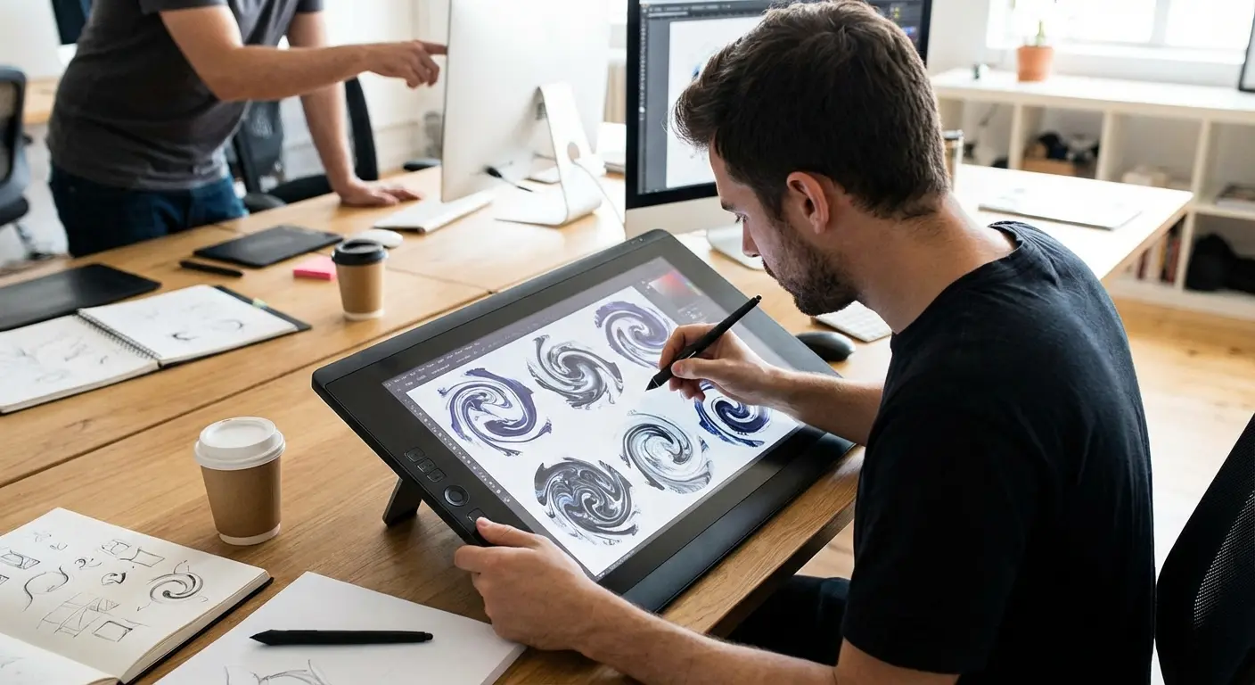
Look, I’m biased because I built Tattoo Generator IQ, but here’s why it actually helps with suminagashi specifically: these designs are nearly impossible to describe verbally.
The tool lets you mess around with different flow patterns and colors until you’ve got something concrete to show. Which means your consultation becomes “let’s refine this” instead of “let me try to read your mind for an hour while you say things like flowing but not too flowing.”
Generate your suminagashi design concept now and walk into your consultation with confidence instead of hoping your artist intuitively understands your abstract vision.
Or don’t use it, whatever. But walk into your consultation with some kind of visual reference, even if it’s just screenshots from Instagram. Abstract concepts don’t translate well when you’re trying to explain them to someone holding a needle.
Final Thoughts
So you’re taking something impermanent and making it permanent. That’s weird and contradictory and it never fully makes sense. Good.
I don’t know if suminagashi is right for you. Maybe you’ll read all this and decide you want a traditional Japanese piece with clear symbolism. Maybe you’ll realize you just liked the aesthetic and don’t actually connect with the philosophy. That’s fine.
But if you’re someone who’s tired of symbols with dictionary definitions, who wants something that acknowledges life’s messiness without trying to fix it, who’s okay with a tattoo that resists easy interpretation, yeah, this might be your thing.
Just find an artist who actually understands the technique. Not someone who draws pretty swirls. Someone who gets the difference between random and intentionally chaotic. That’s harder to find than you’d think.
Your body will carry these patterns through whatever changes come next. The tattoo itself will age, fade slightly, and transform as your skin changes over decades. That transformation isn’t failure. It’s the technique’s philosophy manifesting in the most literal way possible.