
19 Vegvisir Tattoos That Reveal What the Symbol Really Means Today
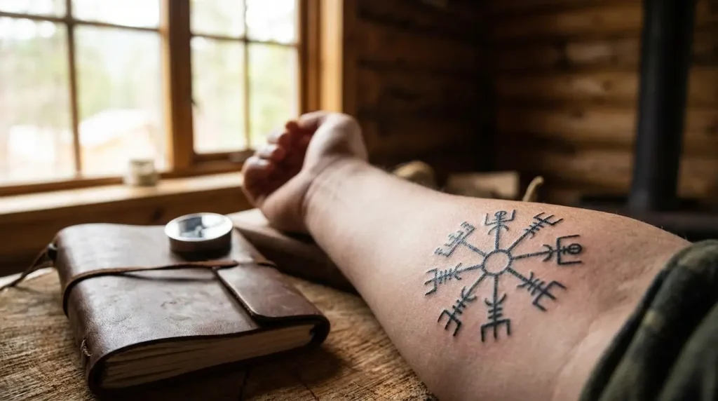
Table of Contents
-
Why We’re Rethinking the Vegvisir Beyond “Viking Compass”
-
Elemental Vegvisir: When Nature Reclaims the Symbol
-
Vegvisir Wrapped in Ocean Waves
-
Mountain Range Integrated Vegvisir
-
Forest Canopy Vegvisir
-
Storm Cloud Vegvisir
-
Desert Sand Vegvisir
-
-
Deconstructed Vegvisir: Breaking the Circle
-
Fragmented Vegvisir with Geometric Gaps
-
Single Stave Extraction
-
Vegvisir in Negative Space
-
Brushstroke Vegvisir
-
Incomplete Circle Design
-
-
Vegvisir as Personal Coordinates: Making It Yours
-
Birth Chart Integrated Vegvisir
-
Coordinates Replacing Staves
-
Family Initials on Directional Points
-
Timeline Vegvisir
-
Constellation Overlay Vegvisir
-
-
Vegvisir in Modern Context: Contemporary Interpretations
-
Circuit Board Vegvisir
-
Architectural Blueprint Style
-
Minimalist Line Work Vegvisir
-
Abstract Color Field Vegvisir
-
TL;DR
The vegvisir isn’t Viking (it’s from 1860s Iceland), but who cares. Use it however you want. Here are 19 ways people are making it personal instead of copying the same circle off Pinterest. Some involve nature elements, some break the traditional structure completely, some turn it into a personal map with your own coordinates, and some strip away the Norse aesthetic entirely for something modern. Bottom line: your vegvisir tattoo should reflect how you actually find direction in your life, not how someone in 17th-century Iceland might have.
Why We’re Rethinking the Vegvisir Beyond “Viking Compass”
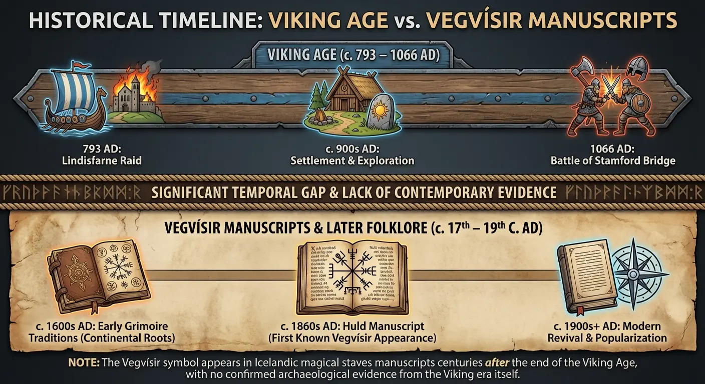
Look, here’s the thing. The vegvisir isn’t a Viking symbol. At all.
It shows up in Icelandic grimoires from the 1600s, specifically the Huld Manuscript that Geir Vigfusson collected in Akureyri in 1860. That’s roughly 800 years after Vikings stopped being Vikings (the Viking Age ended with the Battle of Stamford Bridge in 1066, if we’re getting technical). You can read more about this on Einarr’s Journey, which breaks down the historical timeline pretty thoroughly.
I’m not trying to ruin your tattoo plans. Actually, this historical gap is freeing. You’re not bound by some ancient tradition or worried about getting it “authentically” correct. The vegvisir is a relatively modern magical tool that you can adapt however you need.
What matters is why this symbol resonates with you right now. You’re not navigating storms at sea. You’re navigating information overload, conflicting advice, decision paralysis, career changes, relationship crossroads. The vegvisir’s eight staves can represent whatever directional forces matter to your specific situation.
Most vegvisir content obsesses over historical accuracy or pushes generic “spiritual guidance” interpretations. I’m more interested in how this functions as a customizable navigation system for modern life, where the paths aren’t literal roads but identity shifts, major life decisions, and personal transformations that don’t come with a map.
Understanding the meaning behind your tattoo choice matters way more than surface aesthetics when you’re committing to permanent body art. Your vegvisir tattoo should reflect how you experience direction, protection, and purpose today, not how you think it’s supposed to look based on a Pinterest search.
I’ll show you 19 vegvisir tattoo ideas that move beyond the standard blackwork circle and into territory that reflects how you navigate decisions, uncertainty, and transformation in your actual daily life.
|
Historical Misconception |
Actual Reality |
Why It Matters for Your Tattoo |
|---|---|---|
|
Viking compass used by Norse warriors |
Icelandic magical symbol from 1860s grimoires |
You’re not bound by Viking aesthetics or historical reenactment |
|
Ancient runic protection symbol |
Post-medieval wayfinding sigil |
The symbol’s power comes from intention, not antiquity |
|
Guaranteed to prevent getting lost at sea |
Symbolic guidance tool with inscribed meaning |
Your tattoo functions as personal reminder, not literal GPS |
|
Must include Elder Futhark runes |
Often incorrectly paired with pre-Viking runes |
You can strip away inaccurate additions and personalize freely |
|
Fixed, traditional design only |
Adaptable structure for modern interpretation |
Opens creative possibilities for contemporary redesigns |
Elemental Vegvisir: When Nature Reclaims the Symbol
Water, mountains, forests, storms, deserts. These vegvisir designs don’t just slap nature imagery around the symbol like decoration. The natural elements become part of how the compass functions.
Each element brings its own energy. Water designs suggest you find direction through adaptation rather than fighting currents. Mountain versions are about endurance and getting perspective from higher ground. Forest interpretations focus on growth through complexity, finding your way through dense, interconnected systems.
Storm designs are for people who discovered what mattered during chaos, not after everything calmed down. And desert vegvisirs? Those strip everything down to essentials. You found your way by removing options, not exploring more.
1. Vegvisir Wrapped in Ocean Waves
The staves emerge from wave patterns or dissolve into them. There’s intentional ambiguity about whether the vegvisir guides the water or gets shaped by it.
Works best on curved body parts where the waves can follow your natural contours. Shoulders, calves, ribcage. The flow matters here.
You need to decide if the waves are calm or turbulent because that completely changes what you’re saying. Calm waves mean you’re learning to go with the flow. Turbulent waves mean you’re finding direction despite constant disruption. Both are valid, but they’re different philosophies.

The technical challenge is maintaining the vegvisir’s structure while integrating organic wave movement. Your artist needs to balance both without letting one dominate. Too much wave detail and you lose the compass. Not enough and it’s just a viking compass tattoo with some decorative water lines.
2. Mountain Range Integrated Vegvisir
The eight staves become mountain peaks. Or the circular boundary transforms into a horizon line with ranges in the distance.
I love this one because it grounds the abstract symbol in tangible geography. Mountains are obstacles you’ve overcome or challenges you’re preparing for. Each peak can vary in height and detail, creating your personal topography. Some people assign specific life events to specific peaks. The vegvisir structure provides order to what might otherwise feel like random hardship.
Placement matters here. Forearm designs let you look at your personal mountain range when making decisions. Back pieces create a landscape you carry but don’t constantly see, which changes your relationship to it. The visibility affects how you interact with the guidance it represents.
3. Forest Canopy Vegvisir
Tree branches form the staves. Roots mirror them below. Leaves fill the spaces between.
This creates a living vegvisir that emphasizes growth, interconnection, seasonal change. You’re not locked into static direction. The forest version acknowledges that your path changes as you grow.
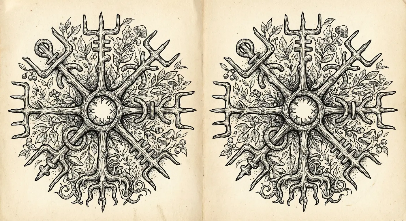
Some designs show the trees in different seasons across different staves. Spring growth on one, autumn decay on another, winter dormancy, summer abundance. All present at once, representing various life phases coexisting simultaneously.
The execution requires careful attention to how organic branch patterns can still read as intentional directional markers. Too much realistic detail and you lose the structure. Not enough and it’s just a compass with some leaves. Finding that balance point is where the design lives or dies.
4. Storm Cloud Vegvisir
Lightning bolts replace staves, or the entire symbol appears formed from storm clouds with the structure barely visible through the chaos.
This appeals to people who found their direction during crisis rather than through careful planning. The storm isn’t something you navigate away from. It’s the condition under which you discovered what matters. That’s a completely different energy than the calm, centered vegvisir most people get.
Color choices impact the message. Pure black and grey creates ominous weight. Adding purple or blue tones suggests there’s beauty in the turbulence. White lightning on darker clouds provides stark contrast that reads well from a distance.
Consider whether you want the storm actively happening or dissipating with the vegvisir emerging as the sky clears. Both tell different stories about where you are in your journey.
5. Desert Sand Vegvisir
The symbol appears partially buried in sand dunes, or the staves are formed by sand patterns and wind-carved formations.
Desert designs strip away everything nonessential. For people who found direction through subtraction rather than addition. You got clarity by removing options and distractions, not by exploring more possibilities. That’s a specific type of navigation that doesn’t get talked about enough.
The minimalist aesthetic of desert landscapes pairs naturally with simplified vegvisir designs. You’re not adding decorative elements. You’re revealing what remains when everything else gets worn away.
Placement on areas with more skin texture (outer forearms, thighs) can enhance the weathered, wind-carved quality. Smooth placement areas might require more shading work to create the sense of dimension and erosion.
Deconstructed Vegvisir: Breaking the Circle
Most people don’t experience guidance as a complete, balanced system with eight equal options. You experience it as fragments, incomplete information, missing pieces, directional pulls that don’t fit neatly into prescribed patterns.
Deconstructed vegvisir tattoos are honest about the gaps.
Some of these will make traditionalists uncomfortable, which might be exactly the point. You’re not looking for a symbol that promises complete guidance. You’re looking for one that reflects the partial, imperfect, actively-being-figured-out nature of finding your way.
6. Fragmented Vegvisir with Geometric Gaps
The circular boundary breaks into segments with deliberate spaces between them. The staves remain but they’re not connected by a unifying structure.
You have directional guidance in some areas of your life and complete uncertainty in others. The gaps aren’t failures. They’re honest acknowledgments of what you don’t know yet.
The geometric precision of the breaks matters. Random fragmentation looks unfinished. Intentional geometric gaps look purposeful. You can fill the negative space with stippling, leave it completely bare, or add subtle elements (stars, dots, small symbols) that represent what you’re still discovering.
Placement on joints (elbows, knees, wrists) lets the natural body creases become part of the fragmentation. The movement of your body activates the design in ways that static placement can’t.
7. Single Stave Extraction
You’re not getting the entire vegvisir. You’re getting one stave that represents the specific direction you’re committing to right now.
This requires you to understand what each stave traditionally represents (or assign your own meaning) and choose deliberately. It’s a bold move that rejects the “all directions available” interpretation in favor of “this is my direction, period.”
The single stave can be small and discreet or large and commanding. Without the circular context, the stave becomes more abstract. Some viewers won’t recognize it as vegvisir-related at all, which creates an insider/outsider dynamic. You know what it means. Most people won’t. That privacy can be valuable if you’re using the symbol for genuinely personal navigation rather than aesthetic purposes.
8. Vegvisir in Negative Space
The symbol isn’t drawn. It’s implied by what surrounds it.
Could be solid black with the vegvisir shape left as bare skin, or a textured background (geometric patterns, organic shapes, dotwork) that reveals the symbol through absence.
Negative space designs require more planning because you can’t easily add to them later. You’re committing to the exact size and placement from the start. The philosophical implication is interesting though. Direction isn’t something you acquire or add to yourself. It’s something you reveal by removing what obscures it. The vegvisir was always there. You just had to clear away everything else to see it.
These tend to age well because the negative space doesn’t blur or fade the way fine line work can. If you’re drawn to this approach, exploring geometric tattoo designs can provide additional inspiration for creating structured negative space compositions.
9. Brushstroke Vegvisir
The symbol appears painted with rough, expressive brushstrokes rather than precise lines.
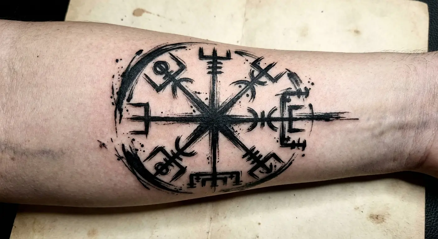
This brings an artistic, imperfect human quality to what’s usually rendered as a precise magical diagram. Works well if you have other artistic tattoos or if you want to emphasize that your direction is something you’re creating rather than following.
The execution requires an artist comfortable with illustrative styles. The brushstrokes need to look intentional and confident, not sloppy. There’s a difference.
Color can enhance this significantly. Traditional black works, but adding a single accent color (red, blue, gold) in specific staves highlights particular directions you’re emphasizing in your current life phase.
10. Incomplete Circle Design
The vegvisir is clearly visible but the circular boundary doesn’t close. There’s a deliberate gap, often at the bottom or top, suggesting the system is still open and under construction.
You haven’t figured everything out yet. The symbol isn’t sealed and finished.
Resonates with people who are suspicious of neat answers and complete systems. Life doesn’t feel complete to you, so why would your navigational symbol pretend otherwise?
The gap’s location matters symbolically. Bottom gap suggests your foundation is still forming. Top gap indicates you’re still reaching for something. Side gaps might represent specific life areas (relationships, career, identity) where you’re still searching.
Some designs show the staves extending beyond the incomplete circle, as if they’re growing past the original structure. I’ve seen this done really well on a friend’s ribcage where the staves literally reach toward her shoulder, like the compass is expanding as she figures things out.
Vegvisir as Personal Coordinates: Making It Yours
Replace or supplement the traditional staves with personal reference points. You’re not using someone else’s directional system. You’re building your own using the vegvisir structure as a framework.
These require more planning because you’re encoding specific information that needs to remain meaningful over time. Birth dates, coordinates, initials, timeline markers are permanent. Be certain about what you’re including.
The risk is creating something so personal that it becomes visually cluttered or loses the recognizable structure. The opportunity is creating a tattoo that functions as a reference tool for your specific life rather than a generic spiritual symbol.
|
Personal Element |
What It Replaces |
Meaning Shift |
Longevity Consideration |
|---|---|---|---|
|
Birth chart positions |
Traditional staves |
From universal guidance to astrological navigation |
Remains constant; birth chart never changes |
|
Geographic coordinates |
Stave endpoints |
From abstract to literal place-based direction |
Stable unless locations lose personal significance |
|
Family initials |
Directional points |
From solitary to relational wayfinding |
Vulnerable to relationship changes over time |
|
Timeline dates |
Each stave section |
From timeless to chronological navigation |
Fixed historical dates remain meaningful |
|
Constellation patterns |
Stave arrangement |
From earthbound to celestial orientation |
Astronomically permanent; personally stable |
11. Birth Chart Integrated Vegvisir
The eight staves align with astrological houses or planetary positions from your birth chart.
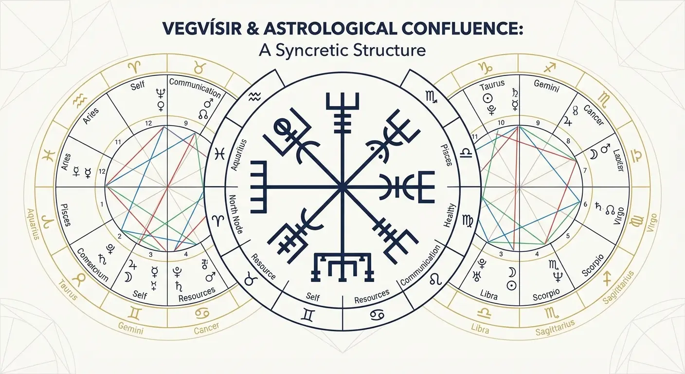
Each stave represents a planet, house, or significant aspect from your chart. You’re layering two directional systems that both claim to offer guidance. Works best if you understand and use astrology in your decision-making. Otherwise, you’re just adding decorative complexity.
The visual execution ranges from subtle (small planetary symbols at each stave endpoint) to elaborate, with a full zodiac wheel integrated with the vegvisir structure. Consider whether you want the astrological elements immediately obvious or subtly embedded for those who look closely.
12. Coordinates Replacing Staves
Geographic coordinates of meaningful locations replace the traditional staves.
Each of the eight directions points to an actual place that shaped you. Where you were born. Where you found love. Where you lost someone. Where you made a crucial decision. Where you felt most yourself.
The vegvisir transforms from abstract guidance system to literal geographic map of your formation. The technical challenge is making coordinate numbers readable at tattoo scale. You might need to simplify to just degrees or use a specific formatting approach.
Some designs alternate between full coordinates and abbreviated versions. The placement should allow enough space for the text to remain legible as the tattoo ages. Forearms, upper arms, and thighs typically provide adequate canvas.
13. Family Initials on Directional Points
Each stave endpoint or directional marker carries the initial or name of someone who guides you. Parents, siblings, children, mentors, friends who became family.
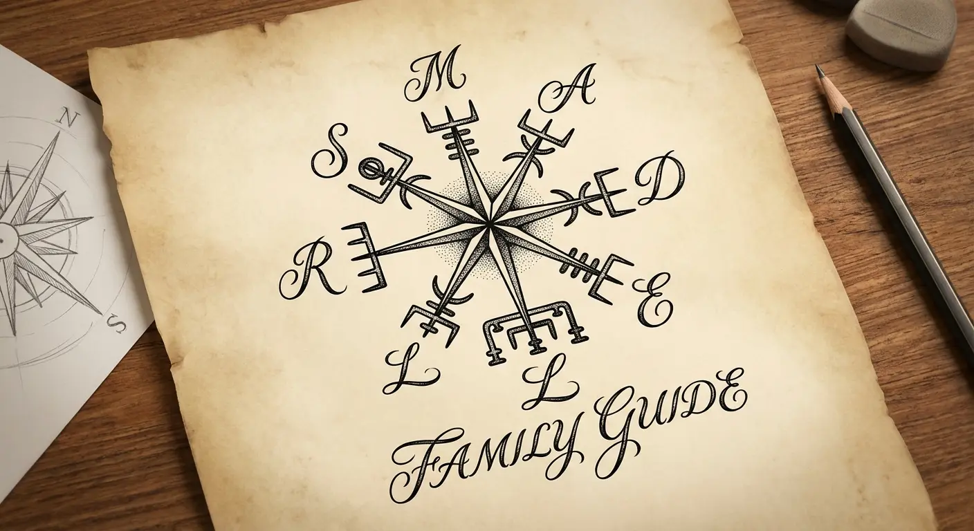
You find your way by considering these people and what they represent. Requires careful thought about who gets included and in what order or position. Is there hierarchy? Are certain people in specific directions for symbolic reasons?
What happens if relationships change? (They will.) Some people leave one or two positions open intentionally, acknowledging that guidance comes from people they haven’t met yet. The visual execution can be subtle with small letters or prominent with names integrated into the stave designs themselves.
I’ll be honest, this one makes me nervous. I’ve seen too many coverups of names that didn’t age well. But if you’re doing it for parents or kids, the risk feels different than romantic partners.
14. Timeline Vegvisir
Each stave represents a different time period in your life, with dates, ages, or year markers indicating when each phase occurred or will occur.
You’re mapping your life’s direction chronologically within the circular structure, which creates interesting implications about cycles and returns. Do you end where you began? Does the circle suggest you’ll eventually come back to earlier concerns or versions of yourself?
The design can include small imagery or symbols representing each time period, or keep it purely text-based with dates. Consider whether you want to include future dates (goals, projected milestones) or keep it strictly historical. Including future elements creates accountability but also risk if circumstances change.
15. Constellation Overlay Vegvisir
Star patterns from specific constellations are mapped onto the vegvisir structure, with the staves aligning with or connecting to particular stars.
You’re combining celestial navigation with symbolic navigation. Each constellation represents a quality, story, or myth that guides you. Works well if you have a connection to astronomy, navigation, or if specific constellations were visible during important life moments.
The visual result creates beautiful texture as the geometric vegvisir structure intersects with organic star patterns. You can render this in simple dotwork or add more elaborate starfield backgrounds. Placement on areas you can see (forearms, wrists) lets you use it as a reference point when making decisions.
Vegvisir in Modern Context: Contemporary Interpretations
Strip away the Norse aesthetic entirely and reimagine the vegvisir’s directional structure through contemporary visual languages.
Circuit boards, architectural drawings, minimalist line work, and abstract color fields don’t reference Vikings or Iceland or historical grimoires. They reference the world you navigate: digital systems, built environments, design principles, and emotional landscapes.
These interpretations might alienate people who want their viking compass tattoo to look “authentic,” but they’ll resonate if you’re more interested in what the symbol does than where it came from. You’re not cosplaying a Viking. You’re finding direction in 21st-century circumstances using a structure that happens to originate from an Icelandic magical tradition.
The vegvisir’s visibility in contemporary culture has also raised important questions about context and appropriation. In July 2024, body camera footage from the fatal shooting of Sonya Massey in Springfield, Illinois revealed that one of the responding deputies bore a tattoo of a wolf with a vegvisir surrounded by what appeared to be Futhark runes and Celtic ribbon work, according to coverage by The Wild Hunt.
The incident prompted The Troth, a major Heathen organization, to release a statement acknowledging the painful reality that symbols many adopt “to show our hope in a faith of peace and welcoming” can appear “in such a scene of violence and injustice.” Your vegvisir tattoo exists not just as personal navigation tool but as public symbol that carries associations, some earned through the actions of others who wear similar imagery. That’s worth thinking about.
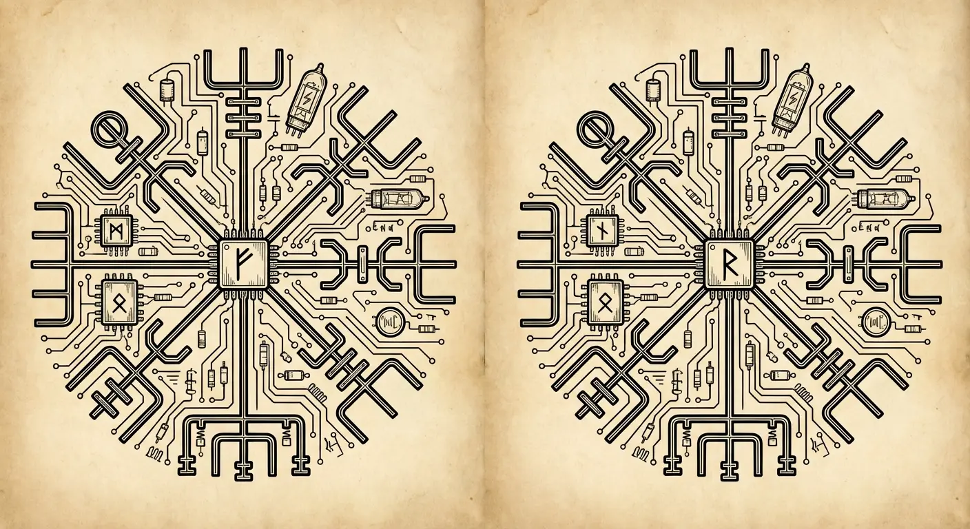
16. Circuit Board Vegvisir
The staves become circuit pathways. The circular boundary becomes a microchip outline. The spaces between are filled with technological components: resistors, capacitors, connection points.
Your decisions are informed by data, algorithms, online communities, and information networks. The circuit board vegvisir represents finding direction in an age where technology mediates almost every choice.
Visually, this creates intricate detail work that rewards close inspection. The challenge is maintaining readability while incorporating enough circuit complexity to make the concept clear. Green and gold accents can reference actual circuit board colors, though black and grey works if you prefer traditional tattoo aesthetics.
Appeals to people in tech fields, engineers, or anyone who recognizes that their guidance system is fundamentally digital.
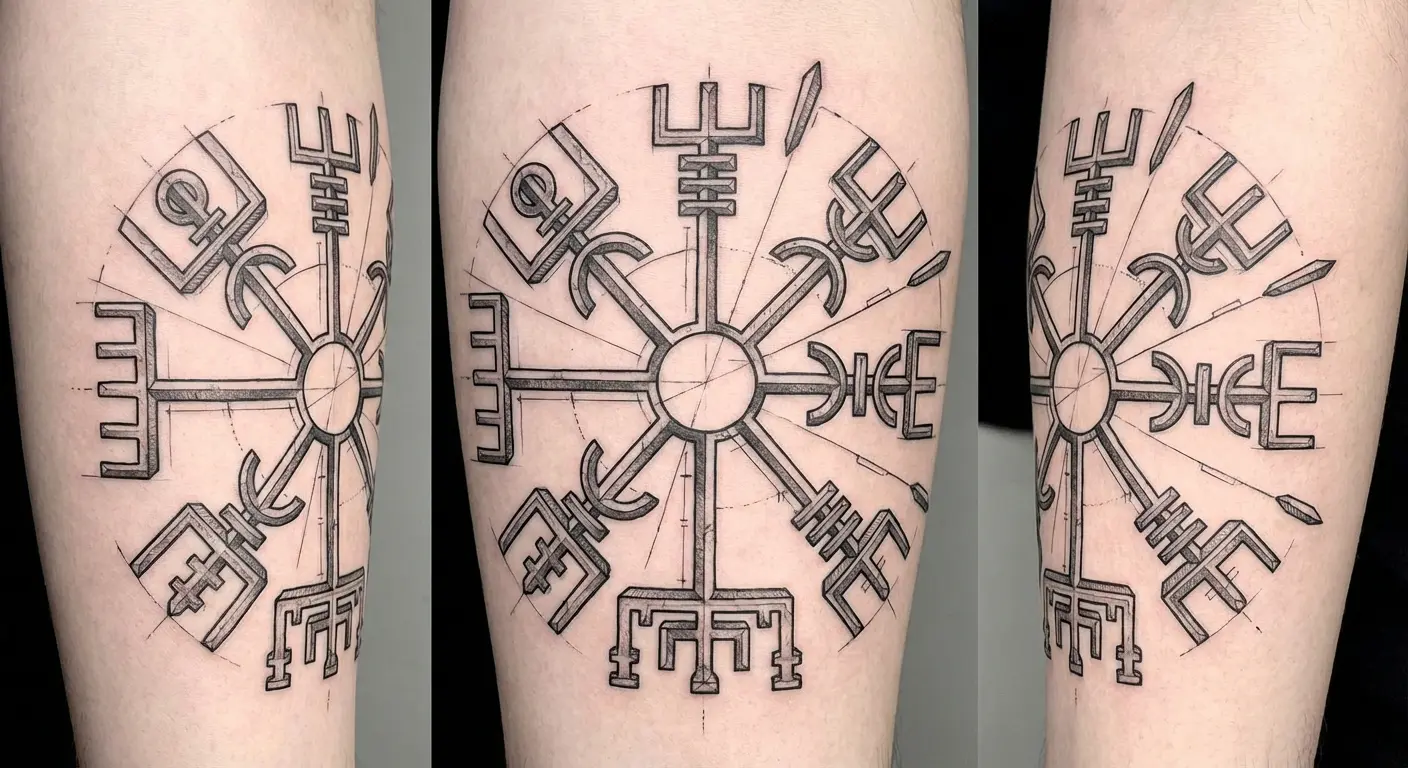
17. Architectural Blueprint Style
The vegvisir is rendered as a technical drawing with dimension lines, notation markers, and blueprint specifications.
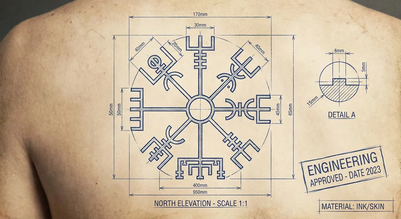
You’re not receiving guidance from magical forces. You’re designing your direction with intention and precision. The blueprint approach works for people who relate to building and construction metaphors, who see life as something you architect rather than something that happens to you.
The visual style includes thin lines, measurement annotations, and the kind of technical precision found in actual architectural drawings. Some designs add a blue tint to reference traditional blueprint paper. Others keep it stark black on white (or negative space).
Placement on flat areas (upper back, chest, thigh) provides the clean canvas this style requires.
18. Minimalist Line Work Vegvisir
The symbol is reduced to its absolute essential lines with no shading, no embellishment, and no additional elements. Single-weight line work creates a clean, contemporary aesthetic that fits modern design sensibilities.
This interpretation strips away all the mystical, historical, and decorative baggage to ask: what’s the core function? Eight directions, one center, a circular boundary. That’s it.
Works beautifully for people who want the meaning without the visual weight of traditional renderings. These designs scale well from very small (wrist, ankle, behind ear) to medium sizes. They don’t typically work as large pieces because the simplicity doesn’t fill space effectively.
The aging consideration is important. Fine single lines can blur over time, so placement on areas with less movement and friction helps maintain clarity. This approach shares aesthetic principles with fineline tattoo techniques, which prioritize delicate precision and contemporary minimalism.
19. Abstract Color Field Vegvisir
The structure is implied through color blocks and abstract shapes rather than explicit lines.
Each directional segment is a different color or tone, creating a composition that reads as abstract art to most viewers but reveals the vegvisir structure to those who know what they’re looking for.
This prioritizes emotional and aesthetic impact over literal representation. The colors you choose carry the meaning. Warm tones might represent passion-driven directions, cool tones could indicate logic-based paths, and the interplay between them shows how you balance different decision-making modes.
Requires an artist skilled in color theory and abstract composition. The vegvisir structure needs to remain architecturally sound even when it’s not explicitly drawn. Placement should consider how colors will age on your specific skin tone and how the abstract composition works with your body’s contours.
Bringing Your Vegvisir Vision to Reality
You’ve seen 19 approaches that move beyond the standard vegvisir. The real challenge now is translating what resonates into a design that works on your body.
Most people struggle with this gap between inspiration and execution. You know generally what you want but can’t articulate it clearly enough for an artist to render it, or you’re combining elements from multiple concepts and aren’t sure how they’ll work together.
I’ve been using this tool called Tattoo Generator IQ to work through ideas before hitting up my artist. You describe your vegvisir concept in regular words (ocean waves with storm elements, minimalist line work with one stave emphasized, circuit board style with specific colors) and it generates multiple design variations in seconds.

You’re not locked into a single artist’s interpretation before you’ve even started. You can explore different executions of the same concept, adjust elements that aren’t quite right, and bring a refined visual reference to your tattoo artist that shows exactly what you’re after.
The designs you generate give you and your artist a concrete starting point instead of trying to describe abstract concepts and hoping they translate correctly.
Final Thoughts
The vegvisir’s power isn’t in its historical accuracy or its connection to Viking culture (which, again, it doesn’t have). Its power is in providing a flexible structure for thinking about direction, guidance, and navigation in whatever context matters to you.
As one researcher candidly admitted, “My first tattoo was the Vegvísir, and I 100% got it with the elder Futhark runes thinking it was the ‘cool Viking compass.’ I’m not about to lie and pretend that I didn’t, just for the sake of sparing my own ego,” according to Einarr’s Journey.
That honest acknowledgment captures something important. Many of us get vegvisir tattoos based on misconceptions. That’s okay. What matters is what the symbol becomes for you after you understand what it is and what you need it to be.
Don’t get the vegvisir you think you’re supposed to get. Get the one that functions as a genuine reference point when you’re lost, confused, or facing decisions that matter.
You’ll know you’ve chosen the right design when looking at it genuinely helps you remember what matters and which way you’re trying to go. Not when people recognize it or compliment the aesthetic. When it works for you, in the moments when you need it most.