
17 Bleach Tattoos for People Who Don’t Want to Look Like a Walking Anime Convention
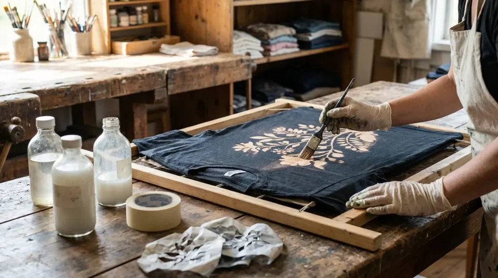
Table of Contents
-
Zanpakutō Spirit Designs (The Stuff People Forget About)
-
Squad Division Insignias That Work as Standalone Art
-
Hollow Mask Fragments Without Looking Like You’re Wearing a Costume
-
Ichigo’s Tensa Zangetsu Blade
-
Rukia’s Sode no Shirayuki Ice Formation
-
Byakuya’s Senbonzakura Cherry Blossom Scatter
-
Kenpachi’s Jagged Blade Outline
-
Yoruichi’s Flash Step Motion Lines
-
Kisuke’s Benihime Fan Detail
-
Grimmjow’s Pantera Claw Marks
-
Ulquiorra’s Bat Wing Silhouette
-
Squad 13 Butterfly Emblem
-
Squad 6 Camellia Flower Symbol
-
Squad 11 Spearhead Badge
-
Squad 10 Daffodil Minimalist Icon
-
White Hollow Mask Eye Slit
-
Partial Vizard Mask Cheekbone Fragment
-
Shattered Mask Pieces Across Collarbone
-
Arrancar Tear Marking
Zanpakutō Spirit Designs (The Stuff People Forget About)
Everyone wants Ichigo’s hollow mask plastered across their chest. I get it. It’s iconic. But here’s what I’ve learned after watching the anime tattoo community for years: the best Bleach tattoos are the ones that make non-fans go “that’s sick” without realizing it’s from an anime.
Let’s start with the most overlooked angle in Bleach tattoo discussions: the actual spirit forms of Zanpakutō rather than their sealed sword states. Most people default to blade designs, but the manifested spirits offer abstract, artistic interpretations that stand alone as compelling ink.
These designs work because you get intricate detail, flowing composition, and symbolic weight without requiring viewers to understand the source material. With over 305,000 posts on Instagram using the #animetattoos hashtag, the anime tattoo community continues to grow. I spent way too long scrolling through them, and here’s what I noticed: most of them are the same five shows, and most of them are way too literal. People are getting full character portraits when they should be getting symbolic elements.
I’m covering six Zanpakutō-inspired designs that emphasize the spirit manifestation or release form rather than the weapon itself. We’ve seen the shift happening in real time: more people are asking for designs that carry weight beyond fandom recognition.
What’s cool about focusing on Zanpakutō spirits rather than sealed forms is that you’re working with energy, movement, and abstract power rather than literal weapon replicas. This opens up possibilities for artistic interpretation that make each piece unique to you and your chosen artist’s style.
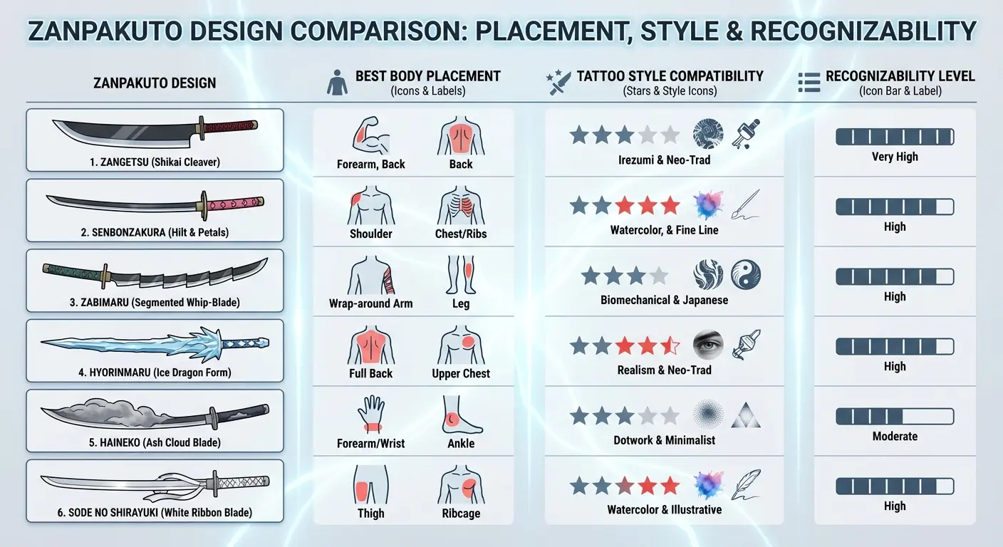
|
Zanpakutō Design Element |
Best Body Placement |
Tattoo Style Compatibility |
Recognizability Level |
|---|---|---|---|
|
Tensa Zangetsu Blade |
Forearm, Spine |
Blackwork, Japanese Traditional |
High (fans only) |
|
Sode no Shirayuki Ice |
Ribcage, Outer Thigh |
Fine Line, White Ink Accent |
Low (nature-inspired) |
|
Senbonzakura Petals |
Shoulder-to-Chest, Sleeve |
Watercolor, Black-and-Grey |
Low (traditional cherry blossom) |
|
Nozarashi Jagged Edge |
Outer Thigh, Full Forearm |
Bold Traditional, Blackwork |
Medium (weapon enthusiasts) |
|
Shunko Motion Lines |
Outer Forearm, Calf |
Abstract Geometric, Minimalist |
Very Low (pure design) |
|
Benihime Fan Detail |
Wrist, Ankle, Bicep Wrap |
Neo-Traditional, Color Realism |
Low (decorative element) |
*Pain levels are BS by the way, everyone’s different. And recognizability is subjective. If you work at an anime convention, everything is “High.”
1. Ichigo’s Tensa Zangetsu Blade
Tensa Zangetsu in its Bankai form offers clean, aggressive linework that tattoo artists love to execute. We’re talking about the slender black blade with the chain attachment, not the oversized cleaver from his Shikai state.
The design works exceptionally well as a forearm or spine piece because the proportions naturally complement these body areas. When considering Japanese traditional tattoo styles, the Tensa Zangetsu blade’s aesthetic aligns perfectly with the bold linework characteristic of this approach. You’ll want to think about whether you’re including the chain element (which adds movement and flow) or keeping it to the blade alone (which reads as more minimalist and modern).
The black-on-black thing works great in blackwork tattoo styles, and the guard’s squared design provides geometric interest without overwhelming the composition. This is one of the most requested designs because it balances recognizability for fans with abstract appeal for everyone else. The squared guard creates a focal point that anchors the piece, while the blade’s length gives you flexibility in sizing based on your chosen placement.
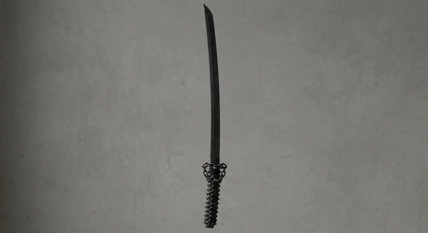
I’ve noticed that people who choose this tend to go for larger scale than they initially planned. There’s something about seeing the design mocked up on their body that makes them realize the impact comes from embracing the blade’s full length rather than trying to compress it into a smaller space.
Real talk about pricing: something like this is gonna run you $300-600 minimum depending on your city and the artist’s experience. Don’t cheap out. Bad tattoos are expensive to fix.
2. Rukia’s Sode no Shirayuki Ice Formation
Sode no Shirayuki’s ice patterns create organic, flowing designs that work particularly well for those wanting something elegant rather than aggressive. The crystalline formations and frost patterns from her Shikai release work as delicate linework with optional white ink highlights that catch light in a cool way.
You’re looking at something that reads as nature-inspired to non-fans while carrying specific meaning for Bleach enthusiasts. The radiating ice circles (particularly from her “first dance” technique) work as standalone circular designs for shoulder caps or upper back placements.
Think about how the directional flow of ice crystals can follow your body’s natural contours, especially along the ribcage or outer thigh where the spreading pattern enhances rather than fights your anatomy. This approach requires an artist who understands how to work with your body’s movement and how the design will shift as you move. The ice formations can expand outward from a central point, creating a sense of frozen explosion that feels dynamic despite depicting ice.
Small versions featuring just a single ice crystal or a small cluster of frost patterns work beautifully for wrist or ankle placements. The geometric nature of ice crystals means they scale down effectively without losing their essential character or becoming muddy over time.
White ink highlights look amazing on lighter skin but can be invisible on darker skin tones. Talk to your artist about alternatives. And FYI, white ink needs touch-ups every 2-3 years if you want it to stay bright.
3. Byakuya’s Senbonzakura Cherry Blossom Scatter
Okay, this is my favorite one on the whole list. The Senbonzakura petals just hit different.
Senbonzakura’s released form provides one of the most visually adaptable concepts because cherry blossoms already carry significant tattoo tradition outside anime contexts. The scattered petal effect works as a partial sleeve, a shoulder-to-chest flow piece, or even as small concentrated clusters behind the ear or on the wrist.
What makes this particularly smart is the dual-nature symbolism: the petals represent beauty and transience in traditional Japanese culture, but they’re also blade fragments for those who know the source. You can push this toward realistic cherry blossom rendering or keep it more stylized with geometric petal shapes that nod to the manga’s art style.
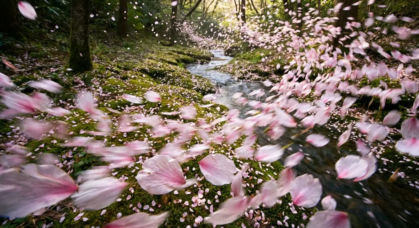
The pink-to-white gradient gives colorwork enthusiasts something to work with, though a black-and-grey interpretation maintains the design’s elegance while improving longevity. I’ve watched both versions age on actual people, and honestly, both hold up fine. The black-and-grey versions tend to require fewer touch-ups over the years though.
The scattered nature of the petals means you can create a composition that flows with your body’s natural lines rather than fighting against them. Think about how the petals might appear to be caught in wind, creating directional movement that guides the eye across your skin. This works whether you want a few delicate petals or a full storm of them swirling across a larger area.
For a full Senbonzakura sleeve, you’re looking at $1,500-3,000+ depending on detail level and color. Plan on multiple sessions.
4. Kenpachi’s Jagged Blade Outline
Look, the Kenpachi blade is kind of boring unless you go huge. There, I said it.
Kenpachi’s Nozarashi in its Shikai state offers brutal, jagged linework that appeals to those wanting aggressive aesthetics without supernatural elements. The massive, cleaver-like blade with its chipped, battle-worn edge tells a story of raw power and constant combat.
This works best as a larger piece (think outer thigh or full forearm) because the scale contributes to the impact. The simplicity of the design, just the blade’s silhouette with emphasis on the damaged edge, makes it one of the more straightforward options for artists to execute while maintaining visual punch.
You’re not dealing with intricate details or complex shading requirements, which often means better aging and clearer readability over time. The jagged edge provides visual interest through its irregular pattern, and each notch and chip in the blade can be positioned deliberately to enhance the overall composition. Some people choose to add subtle texture to suggest the blade’s worn metal surface, while others prefer keeping it as pure silhouette work.
The aggressive nature makes it popular among people who want their ink to project strength and directness. There’s no subtlety here, no hidden meaning to decode. It announces itself clearly and unapologetically.
5. Yoruichi’s Flash Step Motion Lines
Here’s where we get abstract. Yoruichi’s Shunko technique and flash step movements create dynamic motion lines and energy bursts that work as pure design elements. You’re capturing speed and power through linework rather than literal representation.
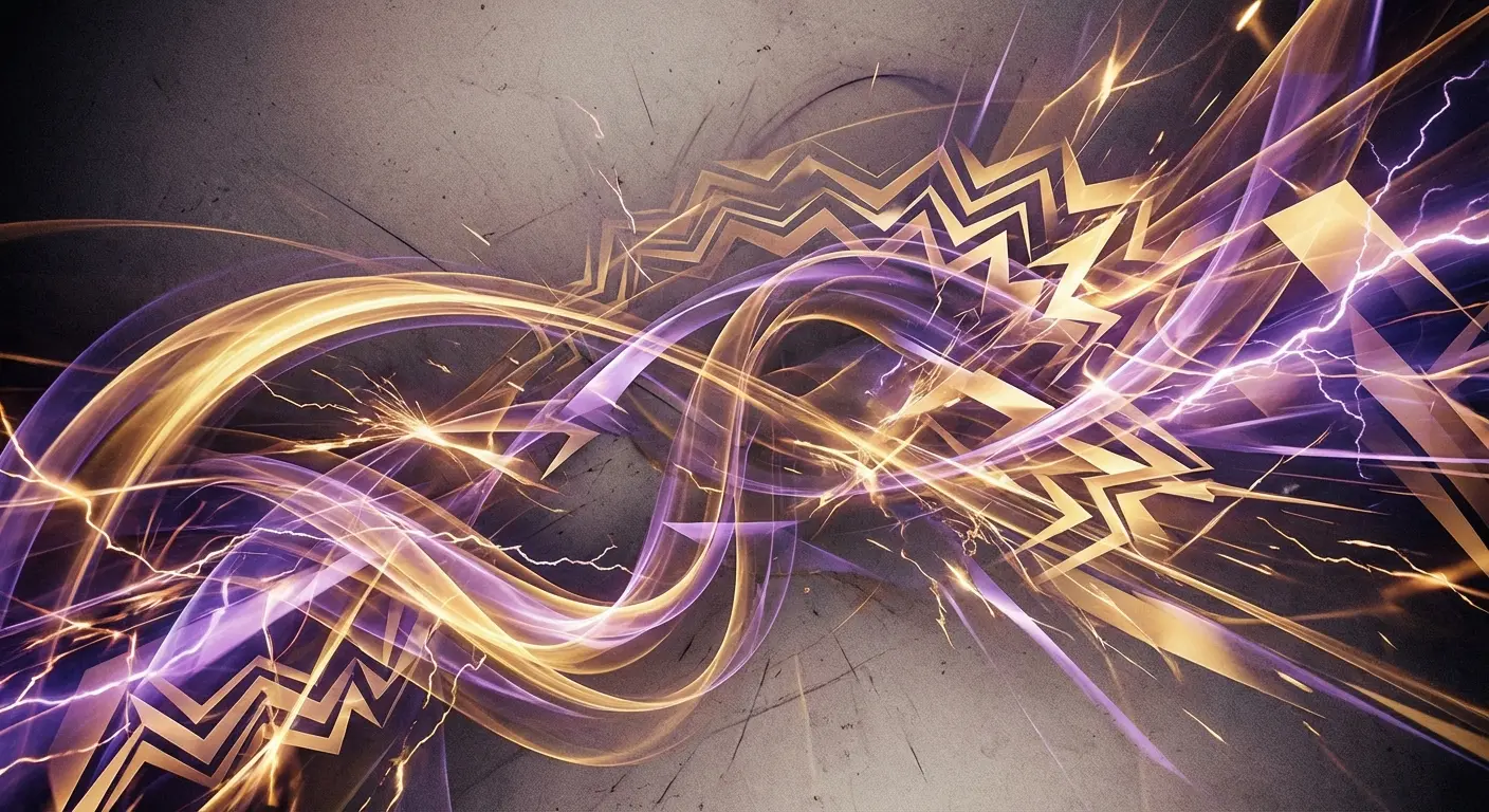
These designs excel as accent pieces that flow around existing tattoos or as standalone statements on areas where the vertical orientation enhances the sense of movement. The electrical energy patterns from her Shunko form add another layer, giving you options for incorporating subtle color (gold or purple highlights) without committing to full color saturation.
This prioritizes the feeling and energy of the character over direct imagery. We’re talking about capturing the essence of movement frozen in time, which creates interesting visual tension. The motion lines can be rendered as sharp, angular streaks or as more flowing curves depending on whether you want to emphasize the violent speed or the graceful control.
The abstract nature means this won’t immediately register as anime-inspired to most viewers. They’ll see dynamic linework and energy, which reads as modern graphic design rather than fandom reference. That’s exactly the point.
I’m weirdly obsessed with this concept and I can’t explain why. It just works.
6. Kisuke’s Benihime Fan Detail
Benihime’s sealed cane form and the fan-like energy blasts from its released state offer elegant, unusual options for those wanting something less combat-focused. The decorative elements on the cane itself, particularly the geometric patterns near the handle, work as sophisticated small tattoos for wrist or ankle placements.
For those exploring small tattoo ideas, the Benihime fan detail offers sophisticated minimalism that scales beautifully for wrist or ankle placement. The crimson energy shields and blasts provide opportunities for bold red colorwork that stands out in the typically dark-heavy world of anime tattoos.
What makes this interesting is how few people choose this route, meaning you’re less likely to match someone else’s ink at a convention. The fan shape also allows for creative placement options: think about how it might wrap around a bicep or follow the curve of a shoulder blade.
The geometric patterns within the fan design give your artist room to showcase technical precision. These aren’t organic, flowing shapes but deliberate, measured elements that require steady hands and careful planning. The result feels refined and intentional rather than spontaneous.
Some people use the red energy blasts as accent elements that connect to other tattoos, using the crimson color to create visual bridges across different pieces. This works particularly well if you’re building a collection over time and want elements that tie everything together thematically.
Even if you want something tiny like this, you’re probably paying the shop minimum, usually $80-150 depending on the city. So that “10-minute tattoo” still costs $100. Keep that in mind.
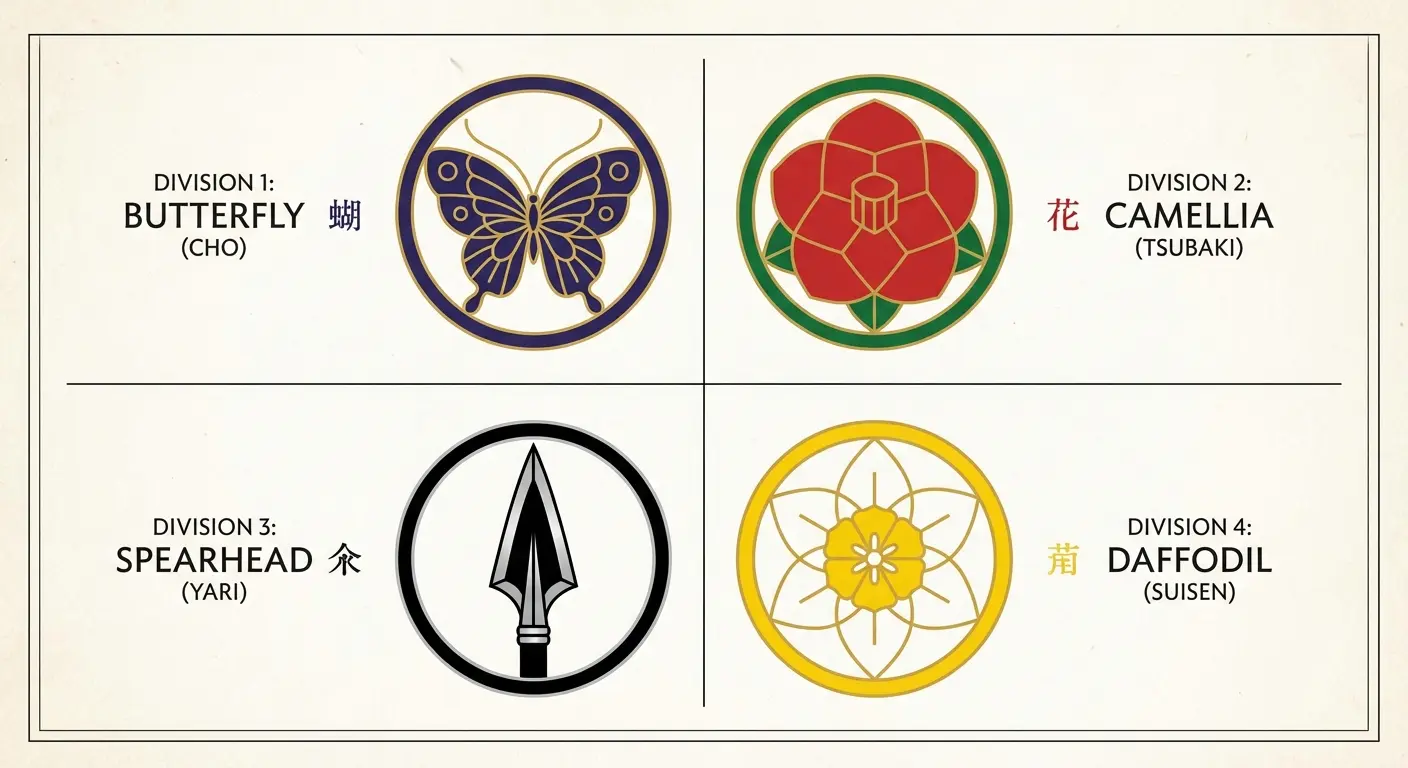
Squad Division Insignias That Work as Standalone Art
Squad division symbols are slept on. Everyone focuses on characters and weapons, but these emblems offer clean, symbolic designs with built-in meaning that doesn’t require explanation.
Each squad’s insignia combines Japanese aesthetic principles with distinct symbolic elements that work beautifully as minimalist tattoos. They scale effectively from tiny (behind-ear or finger placements) to large (back pieces or chest work), and they’re designed to be readable and impactful in their original form.
I’m breaking down four squad symbols that work particularly well as tattoos, considering both their visual composition and the thematic weight they carry. These work for fans who want something recognizable to other enthusiasts but subtle enough to avoid the “obviously anime” read in professional or formal contexts.
The genius of squad insignias is that they function as personal emblems. You’re not getting someone else’s character tattooed on you; you’re choosing a symbol that represents qualities you identify with or aspire to embody. That shift in meaning makes these designs feel more personal and less like fandom merchandise on your skin.
7. Squad 13 Butterfly Emblem
The Squad 13 insignia features a stylized butterfly that carries associations with transformation, freedom, and the soul cycle that’s central to Bleach’s mythology. Butterflies are everywhere in tattoos already, which means this design benefits from existing tattoo tradition while adding specific meaning for fans.
The symmetrical composition makes it ideal for central placements where balance matters: sternum, back of neck, or center of the upper back. You can render this in traditional bold linework for a classic tattoo look or push it toward more delicate, realistic butterfly styling depending on your preferences.
The design’s inherent balance means it won’t feel visually heavy on one side, which matters for placements where symmetry contributes to overall appeal. I’ve seen this executed in everything from tiny minimalist versions to large, detailed pieces with shading and texture work that makes the butterfly feel almost three-dimensional.
Think about whether you want the butterfly in flight (wings spread) or at rest (wings closed). The spread-wing version creates a wider composition that works well for horizontal placements, while the closed-wing version offers a more vertical orientation that suits different body areas. Both carry the same symbolic weight but create different visual impacts.
8. Squad 6 Camellia Flower Symbol
Squad 6’s camellia represents noble beauty and pride, fitting given Byakuya’s association with the division. The flower’s layered petal structure provides natural depth and dimension that gives tattoo artists room to show technical skill through shading and detail work.
This works exceptionally well for those wanting simple ideas that still offer visual complexity. The circular composition of the flower suits round body areas where the design can follow natural curves without distortion. The camellia scales down effectively for smaller placements without losing its essential character.
You’ll want to decide whether you want a single bloom (more minimalist and modern) or a small cluster (more traditional and decorative). The camellia’s cultural significance in Japanese art means this reads as sophisticated rather than juvenile, which addresses a common concern people have about anime-inspired tattoos.
The layered petals create opportunities for subtle shading work that adds dimension without requiring color. A well-executed black-and-grey camellia can have remarkable depth through careful attention to light source and shadow placement. This ages gracefully because the fundamental shapes are strong and clear, even as fine details soften over time.
Honestly though, the cherry blossoms are probably the safer choice, which makes them kind of boring to me, but that’s personal preference.
9. Squad 11 Spearhead Badge
Squad 11’s insignia cuts straight to aggressive, martial aesthetics with its spearhead design. This appeals to those wanting something bold and direct without the softer, nature-inspired elements of other squad symbols.
The strong vertical orientation makes it perfect for forearm, shin, or spine placements where the design’s thrust and direction enhance the body’s natural lines. The geometric simplicity means this ages well and maintains readability even as the tattoo settles into your skin over years.
You’re working with bold shapes and clear negative space, which are fundamentally sound tattoo design principles regardless of subject matter. This is definitely more masculine-coded, though that doesn’t mean it’s exclusively for any particular gender. It just carries different aesthetic energy than floral or insect-based designs.
The spearhead’s pointed tip creates a natural directional element that can guide the eye toward or away from other tattoos in your collection. I’ve seen people use this as an anchor piece that other designs flow from or toward, creating compositional relationships across multiple pieces.
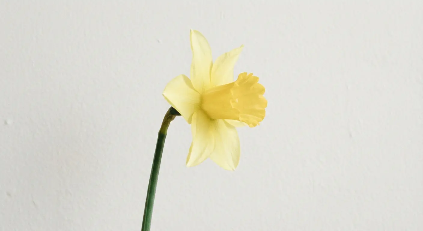
10. Squad 10 Daffodil Minimalist Icon
The daffodil one is pretty self-explanatory. Some people get it. I don’t totally get it. Moving on.
Squad 10’s daffodil offers a less common floral option with its distinctive trumpet-shaped bloom and clean petal arrangement. The design’s natural asymmetry creates visual interest while maintaining overall balance.
This works particularly well for those drawn to minimalist tattoo styles because the daffodil’s essential form can be reduced to simple linework without losing its identity. Think about placement options that allow the flower to “grow” in a natural direction: along the collarbone, up the side of the ribcage, or following the curve behind the ear.
The daffodil’s association with renewal and new beginnings adds symbolic depth beyond its Bleach connection, giving the design meaning that extends past fandom into broader personal significance. This can be rendered in pure linework for a contemporary minimalist look or filled with subtle shading for more traditional tattoo styling.
The trumpet shape of the daffodil’s center draws attention, while the surrounding petals create a frame that completes the composition. This balance between central focus and supporting elements makes the design readable at various sizes, from small and delicate to larger and more prominent.
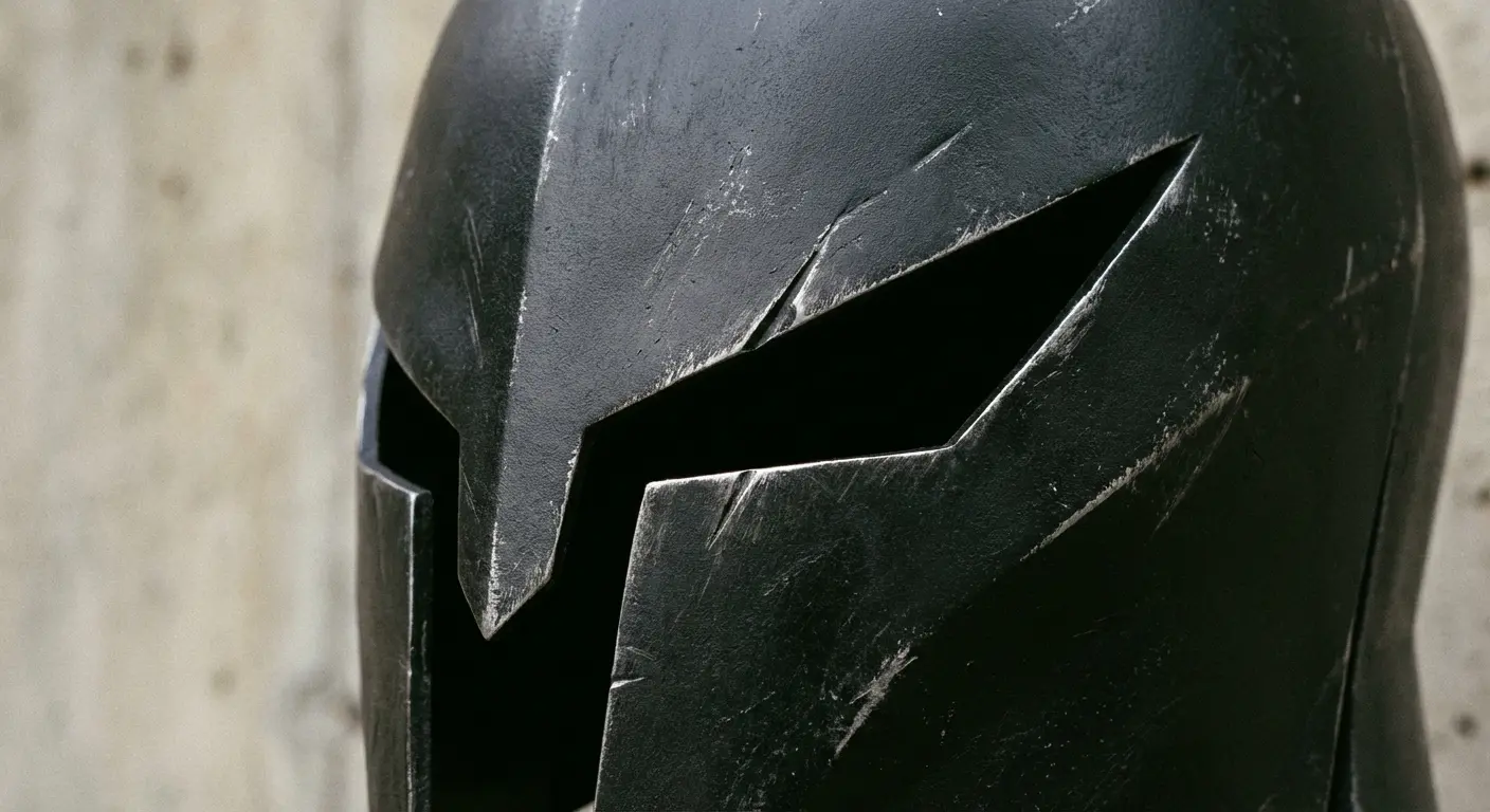
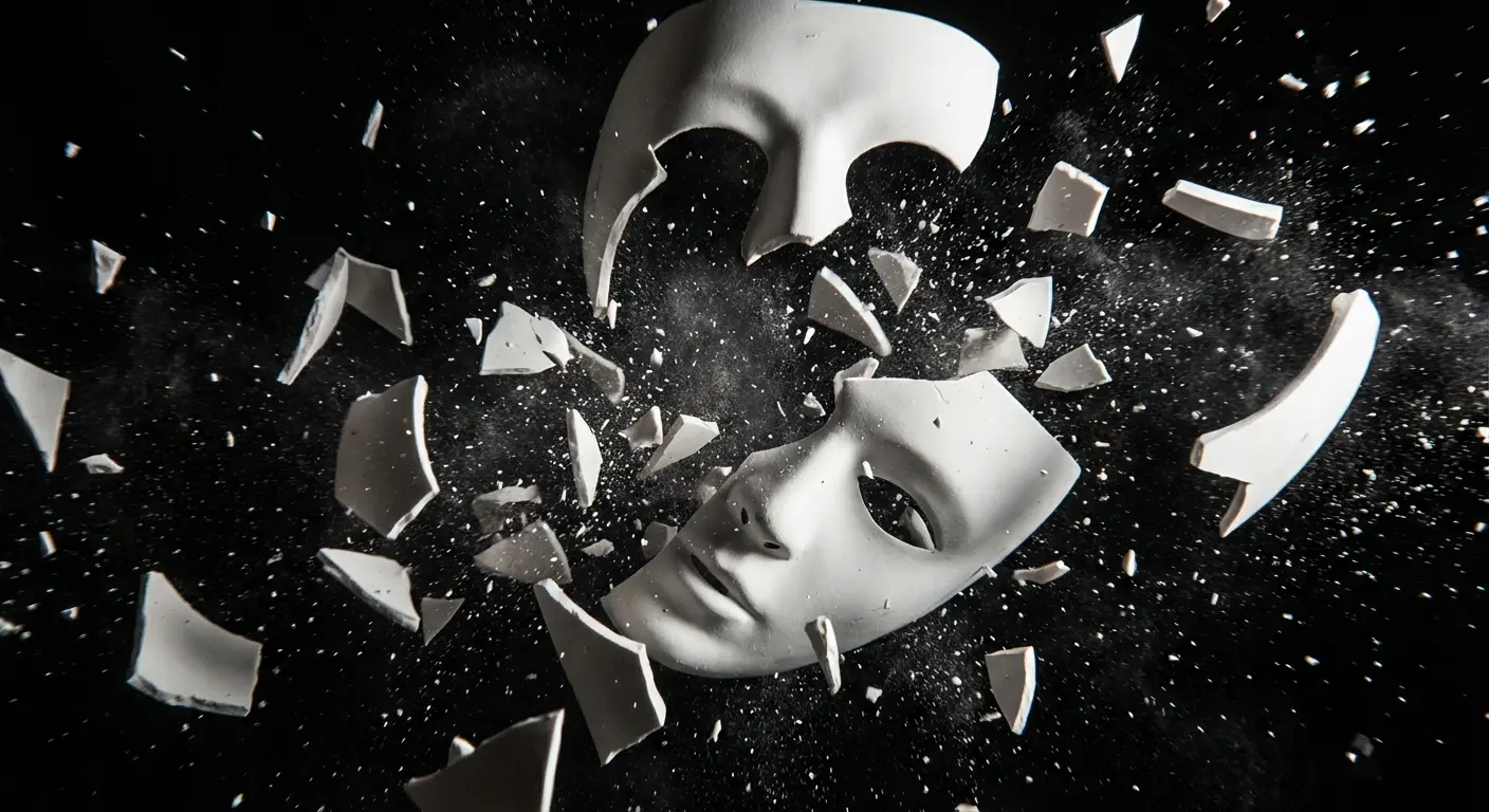
Hollow Mask Fragments Without Looking Like You’re Wearing a Costume
Hollow masks provide the most visually striking and thematically rich option for designs, but most people approach them wrong by trying to recreate full mask designs that read as costume pieces rather than tattoos. The smarter move involves using mask fragments, partial designs, or specific elements that suggest the mask without literally reproducing it.
This approach taps into the psychological tension at Bleach’s core (the struggle between human and Hollow nature) while creating designs that work as abstract, edgy body art for viewers unfamiliar with the source. Mask fragments offer dramatic linework, interesting negative space, and the flexibility to work with your body’s contours rather than fighting them.
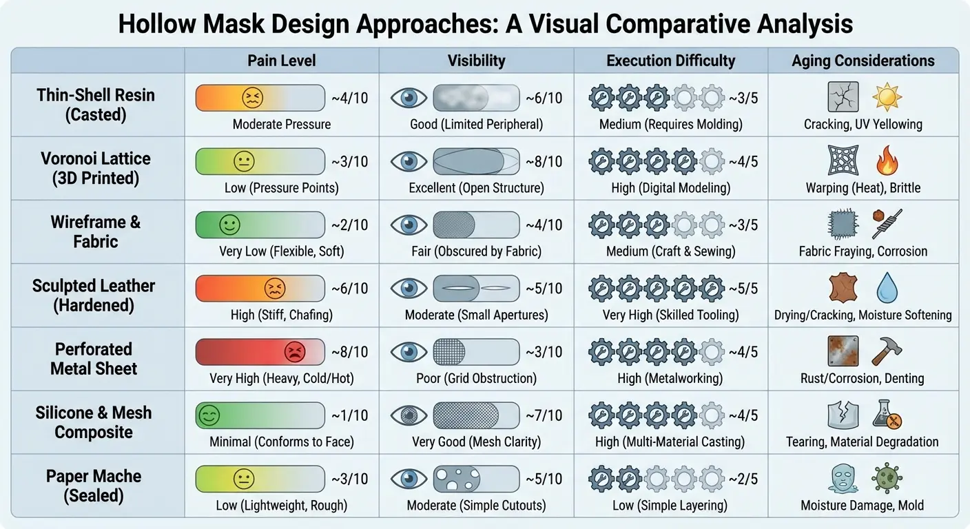
I’m covering seven approaches to Hollow mask tattoos that prioritize artistic impact over literal recreation, showing how small pieces can carry significant visual weight when they focus on suggestion rather than complete representation. The psychological element of these designs resonates with people who connect to the series’ themes about inner darkness and the parts of ourselves we keep hidden.
|
Mask Design Approach |
Pain Level (1-10) |
Visibility in Professional Settings |
Execution Difficulty |
Aging Considerations |
|---|---|---|---|---|
|
Eye Slit Only |
4-7 (varies by placement) |
Low (easily concealable) |
Low (simple linework) |
Excellent (bold shapes hold) |
|
Cheekbone Fragment |
6-8 (facial/bone areas) |
High (facial placement) |
High (contour matching) |
Good (requires touch-ups) |
|
Scattered Collarbone Pieces |
7-9 (thin skin, bone) |
Medium (clothing dependent) |
Medium (composition balance) |
Very Good (distributed design) |
|
Arrancar Tear Mark |
3-8 (face high, body low) |
High if facial |
Low (simple lines) |
Excellent (minimal detail) |
|
Espada Number |
2-6 (placement dependent) |
Low to Medium |
Low (numeric simplicity) |
Excellent (clear shapes) |
|
Hollow Hole Negative Space |
4-9 (varies widely) |
Medium (size dependent) |
Very High (requires expertise) |
Good (depends on surrounding work) |
|
Menos Grande Silhouette |
5-8 (larger coverage) |
Medium (size dependent) |
Medium (silhouette work) |
Excellent (solid black ages well) |
11. White Hollow Mask Eye Slit
Ichigo’s Hollow mask is iconic, but the full design often feels too literal. Isolating just the angular eye slit creates a sharp, aggressive design element that works across various placements.
The distinctive upward-slanting shape carries menace and intensity without requiring the full mask context. This excels as a small, precise piece for areas where its compact form maintains impact without overwhelming the space.
The bold black shape with crisp edges gives tattoo artists a clear execution target, meaning you’re likely to get clean results that hold up over time. I’d add the red accent work in the interior to reference the mask’s eye color without overwhelming the design’s simplicity. Without it, it’s just a black shape.
This distills a complex design down to its most recognizable element, proving that sometimes less delivers more impact. My artist told me she’s done this exact design seven times in the last year, which tells you something about its popularity.
12. Partial Vizard Mask Cheekbone Fragment
Rather than attempting a full mask, a fragment that appears to emerge from or wrap around your actual cheekbone creates an unsettling, powerful effect. This design choice acknowledges that you’re working with a three-dimensional form (your face or body) rather than a flat canvas.
The mask fragment can follow your jaw line, curve around your temple, or accent your actual cheekbone in a way that creates visual dialogue between the tattoo and your anatomy. This is among the more ambitious ideas because it requires careful planning around your specific facial or body structure, but the payoff is a design that feels integrated rather than applied.
You’re essentially creating the illusion that the mask is part of you, which connects directly to the series’ themes about inner darkness and dual nature. The fragment approach works because it suggests transformation in progress rather than completion, which carries more psychological weight than a static full mask design.
Real talk though: if you’re getting a hollow mask on your face, we need to have a conversation about your job situation. Face tattoos will affect your employment. I don’t care how cool the design looks.
13. Shattered Mask Pieces Across Collarbone
Scattered mask fragments across the collarbone or shoulder area suggest breaking free from the Hollow influence, creating a narrative element within the design itself. The shattered pieces can vary in size and angle, creating dynamic composition through implied motion and force.
This approach works well because it transforms a static image (a mask) into a moment of action (the mask breaking). You get multiple smaller elements rather than one large piece, which often feels less overwhelming for those nervous about large-scale tattoos.
The fragments can incorporate different mask designs from various characters (Ichigo’s, the Vizard masks, or Arrancar variations) to create a more personalized composition that references multiple aspects of the series rather than a single character. This allows for creative freedom in how you arrange the pieces, making each version unique to your body and preferences.
The collarbone is brutal though. I watched someone get this and they were white-knuckling the chair. Thin skin over bone. Bring a stress ball.
14. Arrancar Tear Marking
The distinctive tear-like markings that identify Arrancars offer minimal, elegant design options that work as subtle face or body tattoos. These simple lines carry significant meaning for fans while reading as abstract decorative elements to everyone else.
Similar to how fine line tattoos emphasize delicate precision, the Arrancar tear markings require minimal but expertly executed linework for maximum impact. The markings’ placement flexibility means you can position them authentically (following the facial tear duct line) or adapt them to other body areas where vertical line elements make sense compositionally.
Think along the side of the finger, down the side of the neck, or as accent marks near existing tattoos. The simplicity makes these among the most accessible small pieces for those testing the waters with anime-inspired ink, and they’re easy to incorporate into larger pieces later if you decide to expand your collection.
New York City-based tattoo artist EJ Griffith recently told Allure magazine that he receives frequent requests for tattoos based on Bleach, Chainsaw Man, and My Hero Academia, noting that Bleach’s return to screens has reignited fan interest. The tear markings are one of the most requested subtle references because they work in professional environments while still signaling fandom to those who recognize them.
15. Espada Number Integration
Each Espada’s number, tattooed somewhere on their body in the series, provides ready-made design elements that work as standalone tattoos or integrated into larger pieces. The numbers carry specific associations with each character’s personality and power level, letting you choose based on personal connection rather than just aesthetic preference.
The Espada numbers are for people who want to feel like they’re in a secret club. You know who you are.
Numbers are already common tattoo subjects, so this doesn’t immediately register as anime-inspired unless someone knows the specific context. You can render these in various styles: bold and graphic, delicate and minimal, or even incorporated into other design elements.
The placement flexibility mirrors the series itself, where different Espada have their numbers in different locations, giving you canonical justification for putting yours wherever makes sense for your body and existing tattoos. This option works particularly well for people who want something deeply personal that only fellow fans will fully understand.
16. Hollow Hole Negative Space
The Hollow hole concept offers fascinating opportunities for negative space tattoos that create the illusion of depth or emptiness. Rather than tattooing a solid design, you’re using the surrounding tattoo work to define an empty space that suggests the Hollow hole’s presence.
This works particularly well when integrated into larger pieces: imagine a chest piece where the sternum area is left clear, defined by surrounding designs that create the impression of an opening. This is advanced tattoo composition that requires working with an artist who understands negative space and how it interacts with your body’s natural contours and shadows.
The result can be genuinely unsettling in the best way, creating a design that seems to recede into your body rather than sitting on its surface. This approach demands expertise from your artist, but when executed well, it creates something truly unique that stands apart from typical anime-inspired work.
Your artist might have a completely different take on this. Listen to them. They know what works on skin better than I do.
17. Menos Grande Silhouette
The towering Menos Grande form, with its distinctive pointed nose and minimal features, works as striking silhouette work that emphasizes scale and presence. This works best as a larger vertical piece where the elongated proportions make sense compositionally.
What’s cool about this design is its simplicity: you’re working with a black silhouette that relies on shape recognition rather than detailed rendering. The mask’s pointed features and the flowing cloak create a composition that reads clearly from a distance while offering enough detail to remain interesting up close.
This appeals to fans wanting something immediately recognizable to other Bleach enthusiasts while maintaining an ominous, gothic aesthetic that works independent of anime context. The solid black sil houette also ages exceptionally well compared to designs requiring fine detail or color gradients.
I’ve noticed that people who choose this often place it on the outer thigh or ribcage where the vertical space allows the full height to be represented. The scale of the Menos Grande in the series translates to tattoo format when you embrace the design’s need for vertical real estate rather than trying to compress it into a smaller area.
Before You Commit to Your Bleach Ink
You’ve spent hours scrolling through designs, saved dozens of reference images, and you’re ready to book with an artist. But here’s where many people stumble: translating anime art into tattoo format requires understanding how linework, shading, and composition work on skin versus paper.
The gap between concept and execution kills more anime tattoos than any other factor. I’ve seen countless people excited about elaborate sleeve concepts only to end up with muddled, illegible results because they tried cramming too much detail into insufficient space.
Before committing to your design, explore anime tattoo approaches that balance fan recognition with artistic merit to ensure your ink remains visually compelling for years to come. Understanding the difference between what looks good in manga panels and what translates to skin saves you from expensive cover-up work down the line.
Look, I’m gonna be real with you: most people screw this up by bringing their artist a screenshot from the anime and saying “I want this.” That’s not how tattoos work.
I’ve been messing around with Tattoo Generator IQ specifically because it lets you see how these designs actually translate to tattoo style before you commit. You can test whether that Zanpakuto spirit needs to be bigger, or if the squad insignia works better alone than crammed into a sleeve. I tested the Senbonzakura design in it and realized it needed to be way larger than I initially thought to maintain the petal detail. Being able to see how something works on skin versus what works on paper is a game-changer.
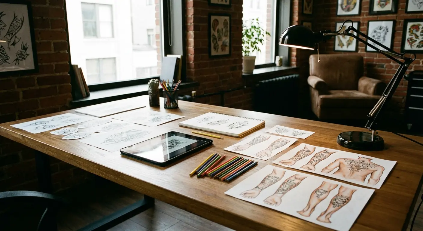
The tool creates multiple variations so you can see how simplifying certain elements or changing the composition improves the design’s viability. This isn’t about replacing your tattoo artist’s expertise but about walking into your consultation with a clear, executable vision instead of a stack of manga panels and vague hopes.
Testing your concept digitally before committing to skin lets you catch problems early. Maybe that intricate Zanpakutō spirit design you loved needs to be larger to maintain detail. Perhaps the squad insignia works better as a standalone piece than crammed into a larger composition. These insights save time, money, and potential regret.
Here’s what actually happens: You’ll spend three weeks stalking artists on Instagram at 2am. You’ll find someone perfect who has a six-month waitlist. You’ll join the waitlist. You’ll keep stalking other artists anyway. You’ll screenshot 47 different reference images. You’ll narrow it down to 12. Your artist will look at them for 30 seconds and say “I got it.” This is the way.
To find artists who can do this style: Search #animetattoo, #bleachtattoo, #animestyle on Instagram. Look at who’s tagged in posts you like. Check their booking info (usually in bio or highlights). Some book through websites, some through DMs, some have waitlists. Be patient and professional in your DMs. Artists get hundreds of requests.
Before you book anyone, check their portfolio for anime work specifically. A lot of traditional tattoo artists can’t nail the clean linework and specific style that anime tattoos need. Look for clean, consistent lines (not wobbly), experience with black-heavy designs if you’re going that route, understanding of negative space, and willingness to say “no” if your idea won’t work. If an artist says they can do anything, they probably can’t do anime well. You want someone who either specializes in it or has a bunch of examples in their portfolio.
Quick disclaimer: I’m not a tattoo artist. Your actual artist might tell you something completely different based on your body, skin, and their style. Listen to them over me. This is just what I’ve seen work and what I’d consider if I were getting these.
Basic stuff but: Don’t drink before your appointment. Don’t take aspirin or ibuprofen (blood thinners equal more bleeding which equals worse tattoo). Eat a real meal beforehand. Bring water and snacks for longer sessions. Your artist will thank you.
For bigger pieces or painful spots, bring a friend. Someone to hold your hand (literally), distract you, and drive you home if you’re shaky after. Plus it makes the time go faster.
Your artist will give you specific aftercare instructions. Follow them, not your friend’s advice. Generally: keep it clean, use unscented lotion, don’t pick the scabs, avoid sun and swimming for 3-4 weeks. It’ll look like shit while it’s healing. This is normal. Don’t panic. Plan on a touch-up after 1-2 years for the fine details. Maybe $100-150 depending on how much needs fixing. Bold lines barely need touch-ups. Fine details and white ink are high-maintenance. If you skip touch-ups, the design will soften and blur but won’t disappear. Some people like the aged look.
Here’s what happens to tattoos over time: Over 10-20 years, lines soften, colors fade, details blur. This isn’t bad, it’s just reality. Bold designs hold up better. Tiny details disappear. Black ink turns slightly blue-ish. Your skin changes texture. This is why simple, bold designs with clear shapes last better than intricate, detailed work.
Don’t get this right before beach season. You can’t swim or sun for like 3-4 weeks while it heals. Winter is ideal for big pieces because you’re covered up anyway during healing. If you have a wedding or event coming up, get it at least 6 weeks before. Healing tattoos look rough. Sun destroys tattoos over time. Sunscreen is non-negotiable if you want these to last.
Be real with yourself about placement. Face, neck, and hand tattoos will limit job options. That’s just facts. If you’re in a creative field or don’t care, cool. If you’re in finance or law, maybe stick to places you can cover. The arrancar tear on your face looks sick until you’re trying to explain it in a job interview.
Tip your artist. Standard is 20% but go higher if they did something complex or spent extra time getting it perfect. Don’t be that person who doesn’t tip. The tattoo community will remember.
Look, some people regret their anime tattoos. Usually it’s because they went too literal or too big too fast. That’s why I’m pushing these subtle designs. If you stop caring about Bleach in 10 years, you’ve still got a cool cherry blossom or ice crystal design. If you DO regret it? Laser removal is expensive ($200-500 per session, need multiple sessions) and hurts worse than getting it. Cover-ups are cheaper but you’re limited by what can cover what. Just think it through.
Here’s the uncomfortable question: will you still care about Bleach in 20 years? Maybe, maybe not. That’s why these designs work. They’re good tattoos that happen to be from Bleach, not Bleach tattoos that happen to be on your body. The cherry blossoms will still look good even if you forget Byakuya’s name. The ice crystals will still be elegant even if you never watch the show again. That’s the whole point of going subtle.
Real talk: Not every tattoo needs to be deeply meaningful. Sometimes you just want a cool design from a show you like. That’s valid. The “but what does it MEAN” crowd can chill. It means you like Bleach and it looks cool. That’s enough.
Final Thoughts
Since the anime came back, I’ve seen a huge spike in Bleach tattoo requests. Which tracks with what I’m seeing on Instagram.
Here’s the thing about Bleach tattoos: the series has been around long enough that we can see which designs actually last (both the tattoos themselves and people’s feelings about them). The ones that work are the ones that were good tattoos first, Bleach references second.
Bleach offers a wealth of tattoo inspiration that extends far beyond the obvious character portraits and fight scene recreations that dominate most discussions. The series’ strength lies in its symbolic visual language: Zanpakutō spirits, squad insignias, and Hollow masks all carry meaning that works beautifully as permanent body art.
Whether you’re considering tattoo ideas with meaning or purely aesthetic appeal, Bleach offers designs that satisfy both approaches through its rich symbolic language. The key involves understanding which elements scale well, how to use negative space effectively, and when to embrace abstraction over literal representation.
Small tattoos often succeed where ambitious sleeve concepts fail because they respect the medium’s limitations while emphasizing its strengths. A single well-executed Zanpakutō element carries more impact than a compressed scene trying to capture too much in too little space.
Unpopular opinion: character portraits are almost always a mistake. The style doesn’t translate and they age like milk. I’ve seen it happen too many times.
Whether you’re drawn to the elegant ice patterns of Sode no Shirayuki, the minimalist power of squad division symbols, or the psychological weight of Hollow mask fragments, your ink should reflect both your connection to the series and your understanding of what makes effective tattoo design.
The best designs balance fan recognition with broader visual appeal, ensuring your ink remains meaningful and aesthetically strong regardless of where anime trends move in coming years. We’ve seen fandoms come and go, but well-designed tattoos that prioritize artistic merit over trend-chasing maintain their appeal decades after the initial needle work.
You can research forever. At some point you just gotta book the appointment and commit. I’ve never met anyone who regretted a well-executed tattoo from a good artist, even if they grew out of the fandom. The experience matters too.
Your skin is gonna have this forever. Make sure it’s something that works as a tattoo, not just as a Bleach reference. Future you will thank you.
Now go book that appointment. And send me pics when it’s done. I wanna see how these turn out.
I could’ve included like 30 more designs (the Quincy crosses, the Fullbring stuff, various Kido symbols) but this was already getting long. Maybe I’ll do a part 2 if people actually want it. Let me know in the comments.
What’d I miss? Drop your favorite Bleach tattoo idea in the comments, especially if it’s weird. I want to see the deep cuts.