
20 Name Tattoo Placements That Won’t Look Like Shit in 10 Years
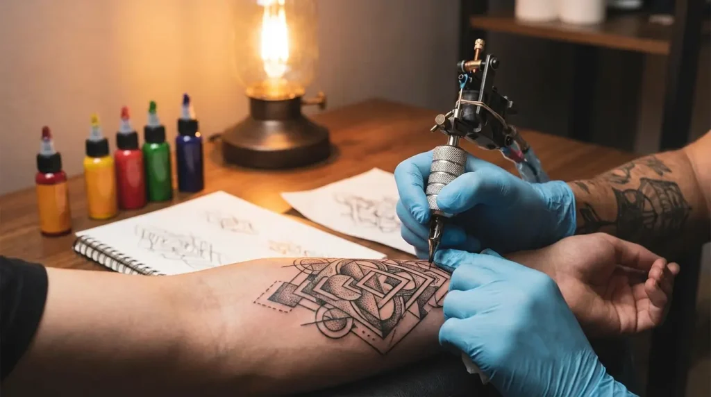
Table of Contents
The Stuff That Actually Matters
-
Collarbone Script That Follows the Curve
-
Ribcage Names That Breathe With You
-
Forearm Wrap That Moves With Your Wrist
-
Spine Alignment That Follows Your Vertebrae
-
Behind-the-Ear Whisper Design
-
Inner Bicep Arc That Flexes Naturally
-
Ankle Wrap That Works With Your Body Structure
Making Sure It Doesn’t Blur Into Nothing
-
Bold Sans Serif That Stays Legible
-
Geometric Letter Blocks With Built-In Spacing
-
Outline-Only Typography That Won’t Fill In
-
Stacked Vertical Names With Wide Kerning
-
Mixed Case With Intentional Weight Distribution
-
Single Initial With Substantial Line Weight
-
Dotwork Names With Future-Proof Spacing
Adding Context So You Have Options Later
-
Integrated Floral Frame That Adds Context
-
Constellation Connection That Maps Relationships
-
Heartbeat Line That Incorporates the Name
-
Watercolor Wash With Protected Lettering
-
Architectural Element That Houses the Name
-
Timeline Design That Shows When, Not Just Who
TL;DR
-
Your body moves. Your tattoo needs to move with it.
-
Delicate script = illegible blob in 5-10 years. Bold, spaced-out letters last 20+ years.
-
Placement isn’t about right now. It’s about when you bend, flex, or gain weight in that area.
-
Add context around the name. Gives you options if things change.
-
Follow your bones (collarbones, ribs, spine). They’re your built-in guides.
-
Spacing between letters matters more than the font you choose. Way more.
The Stuff That Actually Matters
Your body moves. Bends. Flexes. Gains weight. Loses weight. Gets pregnant. Ages. And somehow, most tattoo advice acts like you’re getting inked on a statue.
That collarbone placement that looks perfect while you’re standing still in the mirror? Watch what happens when you turn your head. Or gain fifteen pounds. Or hit forty.
This section is about placements that use what your body already has going on. Bones, curves, natural creases. These spots don’t fight your anatomy. They work with it.
I looked this up because I was curious. Turns out name tattoos are the most-searched tattoo design in America. New Jersey and 12 other states are obsessed with them. The top five searches nationwide? Names, roses, flowers, crosses, and hearts. People want meaningful designs, not random flash art.
Here’s another stat that matters: just over 30% of Americans have at least one tattoo, and those who have a tattoo average having four tattoos total. Four. Which means getting placement right on your first one matters even more when you’re planning where the next three will go.
I’ve seen too many people compromise their second or third tattoo because their first name tattoo didn’t account for how bodies actually work in real life.
1. Collarbone Script That Follows the Curve
Your collarbone isn’t straight. Stop pretending it is.
It curves. Slightly, but it curves. Placing a name here works because the bone itself gives you structure and stability. But you have to follow that curve instead of forcing a straight line across it.
Sit upright when you map this out with your artist. Don’t lie down. Lying down changes everything about how the skin sits and where the bone actually curves. I’ve seen people mark placement lying down, then stand up and realize it’s completely off.
Think about your necklines too. Will this peek out of a crew neck? Does it need to be centered or offset to one side? These aren’t small details.
The collarbone doesn’t stretch much compared to your stomach or thighs. Your name will keep its shape better over time. Font choice matters here though. You want something thick enough to read from a conversational distance but not so bold it overwhelms the area. When you’re looking at script options for this spot, check out different cursive tattoo font styles to find something that balances pretty with readable along that natural curve.
Skip fonts with elaborate flourishes. They blur together as the tattoo ages. I’ve watched twenty-year-old collarbone names turn into illegible smudges because someone chose beauty over practicality. Every time.
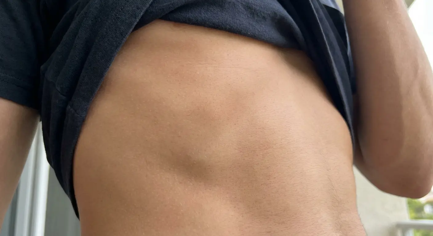
2. Ribcage Names That Breathe With You
Nobody tells you this about ribcage tattoos: they move every time you breathe.
That’s not a problem. It’s actually perfect if you design for it.
Vertical placement along your ribs works way better than horizontal because it follows the natural expansion and contraction of your chest. Position the name between two ribs instead of across them. This placement is intimate. You control who sees it. And you’ve got a large canvas if you want to add stuff later.
The pain factor is real. Not gonna lie to you. But the payoff is a name that feels like it’s part of your body’s rhythm instead of stamped on top of it.
Think about orientation. Do you want it readable when you’re looking in a mirror (which means it faces toward your front) or when someone’s facing you? The ribcage gives you flexibility for additions too. Multiple ribs means multiple options if you want to add more names or expand the design later.
I’ve worked with clients who started with one name on their ribcage and gradually built out a family tree over several years. The vertical nature makes that kind of expansion feel organic instead of forced.
3. Forearm Wrap That Moves With Your Wrist
Your forearm tapers from elbow to wrist. Most people ignore this when placing names. They design like it’s a cylinder.
It’s not.
A wrap design that acknowledges this taper looks intentional instead of slapped on. Position the name so it curves slightly with your arm’s contour, following the muscle structure underneath.
Inner forearm is flatter but shows more in professional settings. Outer forearm has more muscle definition, which can make straight lines look wavy when you flex.
Here’s what you do: have your artist mark the placement while your arm is in multiple positions. Hanging naturally at your side. Bent at 90 degrees. Fully extended. This shows you how the skin stretches and where the design might distort.
Forearm tattoos are visible. They need to work with your daily wardrobe. Will it show under short sleeves? Does it need to stop before your wrist if you work somewhere conservative?
Answer these questions before you commit.
What happens to your forearm in different positions:
Arm just hanging there: Skin is relaxed, you can see the natural taper from elbow to wrist. This is your baseline. Mark placement here.
Bent at 90 degrees: Inner forearm compresses a bit. Check if your letters bunch up or if the design looks squished. If it does, adjust now.
Fully extended: Maximum stretch, especially near the elbow. Do your letters thin out? Do the gaps between them get weird? Fix it now, not later.
Flexed/tensed: Muscles pop, creating contours you didn’t see before. That straight line you wanted? Might look wavy now. Test this position before you commit.
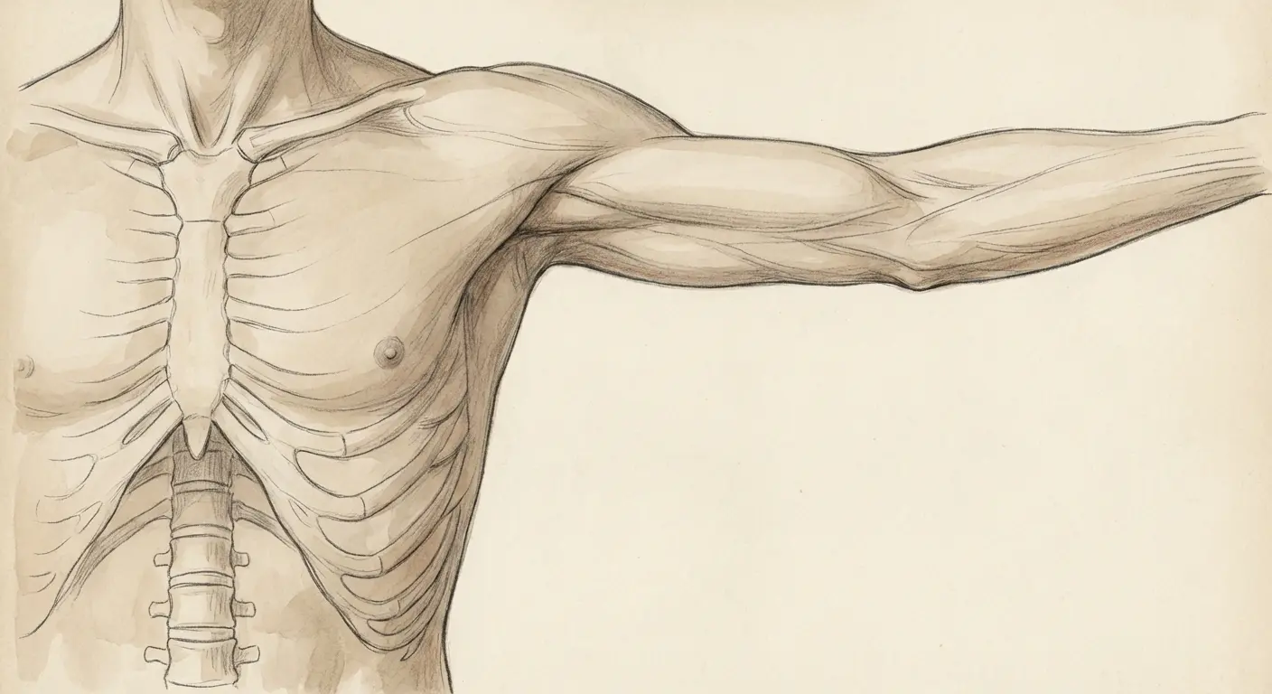
4. Spine Alignment That Follows Your Vertebrae
Your spine is the most obvious natural line on your body. Yet most spine tattoos ignore the actual vertebrae structure.
Each bump you can feel down your back is a built-in guide for spacing and alignment. Use them.
Placing a name vertically down your spine works because it creates a central anchor point that’s symmetrical from both sides. The challenge? Your spine curves. It’s not straight. Your artist needs to account for your natural curvature, especially in the lower back.
Do you want the name centered on your spine or offset to one side, running parallel to it? Centered designs read clearly but limit your options for adding side pieces later. Offset designs give you more flexibility but require careful planning so they don’t look accidental.
The spine area is relatively stable when it comes to weight fluctuation. Helps preserve the tattoo’s integrity over time.
Spine names work particularly well for people who want something meaningful but private. You control when it’s visible. The vertical orientation naturally commands attention when revealed.
5. Behind-the-Ear Whisper Design
Behind-the-ear placements work because they’re discoverable instead of constantly visible. You reveal them when you pull your hair back or tuck it behind your ear.
The area is small. This automatically limits your font choices to simple, clean designs without excessive detail. Elaborate script won’t read well here. You need thick letter forms with good spacing.
Think about orientation carefully. Do you want the name readable when someone’s standing beside you, or when you’re looking at yourself in a profile mirror?
The skin behind your ear is relatively tight and doesn’t stretch much. Helps maintain clarity as the name ages. But this area can be tricky to tattoo because of the contours around your ear and the transition to your neck. Some people experience more pain here because of the proximity to bone and cartilage.
Do you want the name to stand alone or incorporate a small element? A tiny heart or star? I’ve seen beautiful behind-the-ear pieces that combine a name with a single delicate flower or geometric shape.
Just keep it simple. The space demands it.
6. Inner Bicep Arc That Flexes Naturally
The inner bicep creates a natural arc when your arm hangs at your side. This curve becomes more pronounced when you flex.
Design with that curve instead of fighting it.
Most people get their inner bicep tattooed while their arm is in some weird position on the tattoo chair. Bent at 90 degrees, rotated awkwardly. Then they go home, look at it with their arm hanging naturally, and wonder why it looks off.
Test the placement in every position your arm actually lives in. Not just the one your artist found convenient.
This placement is semi-private. You control visibility by how you position your arms. It offers a relatively flat canvas compared to areas with more muscle definition. The inner bicep experiences moderate stretching when you extend your arm fully, so font choice matters. You want letters with enough weight that they won’t look thin and spindly when the skin stretches.
This area is less exposed to sun than outer arm placements. Helps prevent fading.
I’ve seen twenty-year-old inner bicep names that still look crisp and clear. The skin quality remains relatively consistent over time.
7. Ankle Wrap That Works With Your Bone Structure
Your ankle has prominent bones on both sides that create natural boundaries for a wrap design. A name that curves around your ankle (either above the bone or below it) follows your body’s existing structure.
Ankle tattoos are weird. The area is small, the bone is right there, and your ankle swells randomly. But people love them anyway, so here’s how to not screw it up.
Do you want the name readable from the outside (when someone’s standing beside you) or from multiple angles? Ankle tattoos are tricky because the area is small and the skin moves differently when you walk, flex your foot, or wear certain shoes.
You need a font that’s thick enough to remain clear but compact enough to fit the limited space. How will it look with different types of footwear? Will it show above sneakers, or do you need it positioned higher?
The ankle area is relatively stable when it comes to weight fluctuation, but the skin can be sensitive because it’s close to bone.
Do you want the design to wrap completely around your ankle or stay on one side? Staying on one side gives you room to add elements later if you want. I’ve worked with clients who started with a simple name around their ankle and later added small symbols or dates on the opposite side.
Making Sure It Doesn’t Blur Into Nothing
This is the conversation you need to have before you sit in the tattoo chair, not five years later when your delicate script has started to blur.
Tattoo ink spreads slightly under your skin over time. It’s called blowout or migration, and it happens to everyone eventually. Certain design choices either minimize or amplify this effect.
Thin lines placed too close together will merge. Delicate script with elaborate flourishes will lose definition.
I looked this up because the numbers are sobering: about 78% of people polled around the world have at least one tattoo they regret, and in half of those regret cases, the regret was a name tattoo. Half. That’s a lot of laser removal appointments.
This high regret rate often comes from poor design choices that don’t account for aging, placement issues that ignore body mechanics, or relationship changes that make the name itself problematic.
I can’t fix the relationship part. But I can at least help you avoid the first two factors.
These aren’t the most ornate designs you’ll see on Pinterest. They’re the ones you won’t regret when you’re older. I’ve built this approach around what I’ve seen survive decades on real skin, not what looks good in a filtered Instagram photo.
Typography Lifespan Reality Check:
Delicate script with thin lines? Blurs together in 5-10 years. Maybe less if you’re in the sun a lot. The flourishes go first, then the connecting strokes. Eventually it’s just a smudge. I don’t care how pretty it is now.
Bold sans serif? Still readable in 20+ years. Boring? Maybe. Legible when you’re 60? Absolutely.
Outline-only letters? 15-20 years of clarity. The outlines thicken but don’t fill in completely. Modern look that actually lasts.
Standard serif fonts? Depends entirely on the weight. Those decorative elements (the little feet on letters) can blur. If you go serif, go BOLD serif. 10-15 years if you’re lucky.
Dotwork/stippled? Individual dots hold up surprisingly well. 15-20 years. The texture stays interesting as it ages.
Wide-kerned block letters? 20+ years, easy. The spacing prevents merging. Might look aggressive, but it’ll look aggressive forever.
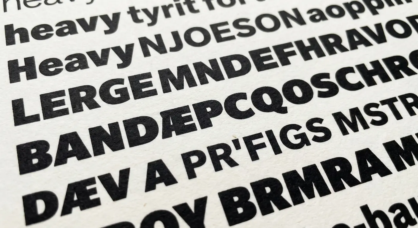
8. Bold Sans Serif That Stays Legible
Sans serif fonts (letters without the decorative feet and flourishes) age better than script for one simple reason: they have consistent line weight and clear letter forms.
When ink spreads slightly over time, a bold sans serif maintains its shape because there’s enough substance to each letter. You’re not relying on thin connecting strokes or delicate details that can blur into illegibility.
Look at fonts like Helvetica, Futura, or custom hand-drawn block letters that your artist can create specifically for your body’s proportions. Go at least medium weight, if not bold. Especially for smaller sizes.
I’ve seen thirty-year-old sans serif names that still read perfectly from across a room. Ten-year-old script pieces? Unreadable blurs.
Sans serif designs also give you flexibility for future additions because they don’t dictate a specific aesthetic. You can add geometric elements, minimalist icons, or even floral details around them without creating visual conflict.
Letter spacing matters. You want enough room between each character that they won’t merge as the tattoo ages. I’m talking at least 2-3mm between letters for anything under an inch tall. More if you can get it.
9. Geometric Letter Blocks With Built-In Spacing
Geometric designs use shapes (squares, triangles, hexagons) as containers or frameworks for letters. This approach builds spacing directly into the design instead of relying on the negative space between letters alone.
Each letter gets its own defined area. Even if the ink spreads slightly, the geometric boundaries keep everything readable.
You might have each letter in its own square, creating a blocky, modern look. Or you could use triangular shapes that point in different directions, adding visual interest while maintaining clarity.
This style works particularly well for initials or shorter names. Three to five letters where you can give each character substantial space.
Do you want the geometric elements to be bold outlines or subtle guides? Bold outlines create a graphic, contemporary feel. Subtle guides maintain focus on the letters while still providing structure.
If you like this structured approach, you can explore geometric tattoo variations that combine letter blocks with angular patterns for a cohesive modern aesthetic.
Clients who appreciate clean lines and architectural design tend to gravitate toward these geometric names.
10. Outline-Only Typography That Won’t Fill In
Here’s a counterintuitive approach: instead of solid filled letters, use outline-only typography.
When tattoo ink ages and spreads, solid letters can become heavier and darker, sometimes losing their original proportions. Outline letters maintain their shape because the spreading happens within defined boundaries.
The outline itself might thicken slightly over time, but it won’t fill in completely if your artist uses appropriate line weight and you follow proper aftercare. This technique works best with substantial letter forms (not delicate script) where the outline is thick enough to remain clear.
You’re essentially creating a hollow letter that shows your skin tone inside. You can add small details inside the outlines (dots, tiny lines, or minimal shading) that give texture without compromising legibility.
The outline style has a contemporary, almost architectural quality that works well with modern aesthetics. The negative space (the hollow part of each letter) becomes part of the design itself.
I’ve seen these hold up remarkably well over fifteen to twenty years.
11. Stacked Vertical Names With Wide Kerning
Kerning is the space between letters. It’s one of the most overlooked factors in tattoo longevity.
Wide kerning (more space between letters) means that even when ink spreads over time, your letters won’t merge into an illegible blob.
Stacking names vertically instead of horizontally gives you more room to work with generous spacing. Each letter sits on its own line, creating a column effect that’s easy to read and ages well. This approach works particularly well for longer names that would be too wide to fit comfortably in a horizontal layout.
Do you want the letters centered, left-aligned, or right-aligned in your vertical stack? Centered creates a formal, balanced look. Left-aligned feels more casual and modern. Right-aligned is less common, which makes it more distinctive.
The vertical orientation also works with your body’s natural lines (spine, forearm, ribcage) instead of fighting against them.
You can adjust the spacing between each letter to create rhythm and visual interest. Make some gaps larger than others intentionally. For names that work well in vertical arrangements, try using stacked letter designs that maximize spacing and create bold visual impact down your spine or forearm.
12. Mixed Case With Intentional Weight Distribution
Mixing uppercase and lowercase letters isn’t just an aesthetic choice. It’s a strategy for creating visual hierarchy and improving readability.
Capital letters provide anchor points that help your eye navigate the name, while lowercase letters fill in the details. This variation in letter height and form makes the overall design more interesting and easier to parse at a glance.
Capitalize the first letter and use lowercase for the rest. Traditional but effective. Or alternate caps and lowercase in a pattern for something more playful. You could also capitalize specific letters that have personal meaning.
Be intentional about your choices instead of random.
Weight distribution refers to how thick or thin different parts of letters are. Some fonts have dramatic variation between thick and thin strokes, while others maintain consistent weight. For tattoo longevity, you want enough weight in the thinnest parts that they won’t disappear as the tattoo ages.
Mixed case designs work well with various font styles, from sans serif to slab serif to custom hand-lettering.
Names using mixed case tend to feel more personal and less formal than all-caps designs, which can sometimes read as aggressive or impersonal.
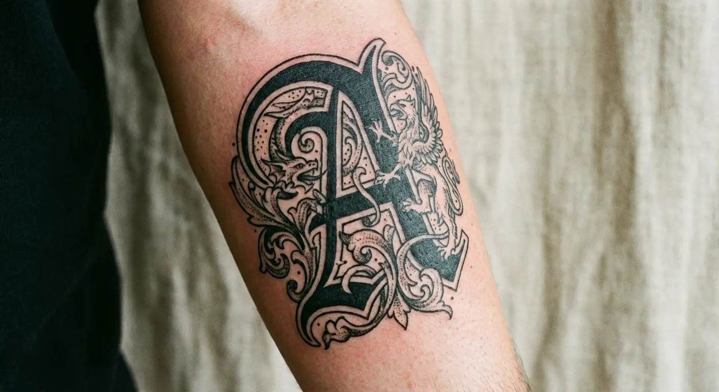
13. Single Initial With Substantial Line Weight
Sometimes the most powerful approach is reducing a name to its initial letter and giving that single character substantial presence.
A large, bold initial with significant line weight will age better than a full name in delicate script. You’re working with one letterform, which means you can be more ambitious with size, detail, and placement.
Look at ornamental initials (letters with decorative elements built into their structure), blackletter styles with dramatic thick and thin strokes, or custom designs where your artist draws a unique version of the letter specifically for you. The substantial line weight ensures the tattoo will remain clear and bold decades from now.
This approach also gives you flexibility. You can add the full name later in smaller text, incorporate the initial into a larger design, or leave it as a standalone element.
Do you want the initial to be purely typographic or integrated with imagery? A floral element growing from one of the letter’s curves, or geometric shapes that frame it?
Single initials work particularly well in highly visible placements because they’re readable from a distance and make a strong visual statement.
I’ve created designs using oversized initials that become conversation starters instead of private tributes.
14. Dotwork Names With Future-Proof Spacing
Dotwork is a technique where your artist creates letters and designs using individual dots instead of solid lines.
This approach ages differently than traditional linework because dots maintain their individual integrity even as ink spreads slightly. The space between dots is built into the technique, which means you get automatic spacing that helps preserve readability.
Dotwork names have a softer, more organic quality than solid letters. They offer flexibility in density. More dots create darker areas, fewer dots create lighter areas.
Do you want uniform dot size and spacing, which creates a technical, precise look? Or varied dots, which feels more hand-crafted and artistic?
The dotwork technique works well with various font styles, though it’s particularly effective with bold, simple letterforms where the dot pattern can shine. You’re essentially creating a stippled effect that has depth and texture.
This technique requires a skilled artist who understands proper dot placement and density. The spacing between dot clusters becomes part of the design language, and it’s this intentional spacing that helps the name age gracefully.
Dotwork also tends to heal well because you’re not saturating large areas with solid ink, which can sometimes lead to blowout in sensitive skin.
I’m not 100% sure about dotwork longevity past 20 years because the technique hasn’t been mainstream that long. But from what I’ve seen so far, it holds up better than I expected.
Adding Context So You Have Options Later
Look, I can’t make your relationship decisions for you. But I can show you how to design name tattoos with built-in flexibility and narrative depth.
Adding visual context around a name does two things: it gives the design more artistic merit (so it reads as a complete piece instead of just text), and it provides framework for future modifications if needed.
You’re not just getting someone’s name inked. You’re creating a meaningful composition that happens to include a name.
These designs incorporate imagery, patterns, or symbolic elements that add layers of meaning and give you more creative options down the road. Frames, connections, integrated elements, and structures that make the name part of a larger visual story.
This approach requires more planning and usually more sessions. But it results in tattoos that feel complete and intentional instead of impulsive.
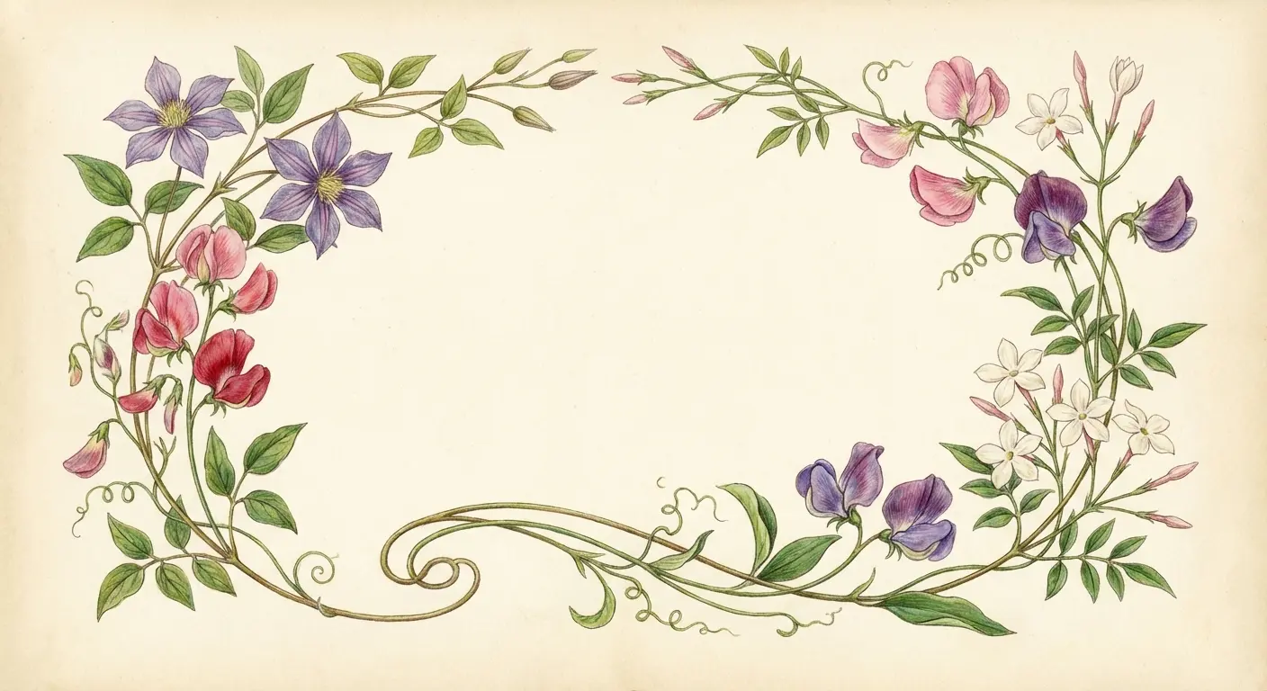
15. Integrated Floral Frame That Adds Context
Flowers carry their own symbolism. Adding floral elements around a name introduces additional meaning beyond the name itself.
You’re not just honoring a person. You’re creating a garden that represents growth, beauty, or remembrance.
The floral frame can be subtle (delicate vines that curve around the letters) or substantial, with bold blooms that anchor each end of the name. Choose flowers that have specific meaning: roses for love, forget-me-nots for memory, lotus for transformation, or birth month flowers for personalization.
The frame structure gives you options if you need to modify the tattoo later. You can add more flowers, extend the vines, or incorporate additional elements without disrupting the original composition.
Do you want the flowers to be realistic or stylized? Colored or black and grey? Symmetrical or organic?
The integration is key here. The flowers shouldn’t look like an afterthought or a separate piece. Your artist should design them to interact with the letters, perhaps wrapping around certain characters or filling negative spaces between them.
When planning floral elements around your name, you can generate custom flower designs that complement your chosen typography and create a cohesive composition.
16. Constellation Connection That Maps Relationships
Constellations are literally about connections between points. Perfect for name tattoos that represent relationships.
You can map out a custom constellation where each star represents a person, and the lines connecting them show relationships.
The name can be integrated into the constellation pattern (perhaps following the connecting lines) or placed as a label beneath a specific star. This approach works particularly well for family pieces where you want to include multiple names without creating a list. Each person gets their own star. You can vary star sizes to represent different relationships or generations.
The constellation framework is infinitely expandable. You can always add another star and connecting lines if your family grows.
Do you want an actual astronomical constellation (using real star patterns that have meaning to you) or a custom arrangement designed specifically for your family structure?
The dotwork technique works beautifully here, with stippled stars that have that authentic celestial quality. Add subtle details like small dates near each star or use different star styles (four-pointed, five-pointed, simple dots) to differentiate between family members.
17. Heartbeat Line That Incorporates the Name
The heartbeat line (that EKG-style zigzag pattern) has become popular in memorial tattoos, but it works for any name that represents someone vital to your life.
The pattern itself symbolizes life, connection, and the impact someone has on you.
You can integrate the name directly into the heartbeat line, using the peaks and valleys of the pattern as a baseline for letters, or place it above or below the line. Have the heartbeat pattern spell out the name in Morse code using the peaks. Adds a hidden layer of meaning.
The continuous line creates movement and energy, suggesting that this person’s influence is ongoing instead of static.
This design works well in horizontal placements (forearm, collarbone, ribcage) where the line can flow naturally.
Do you want a realistic EKG pattern with accurate medical-style peaks and valleys, or a stylized version that’s more artistic?
You can also incorporate the actual heartbeat pattern of the person you’re honoring if you have access to their EKG data. Makes the tattoo incredibly personal and specific.
I’ve worked with clients who’ve used their child’s first heartbeat from an ultrasound. Deeply meaningful pieces.
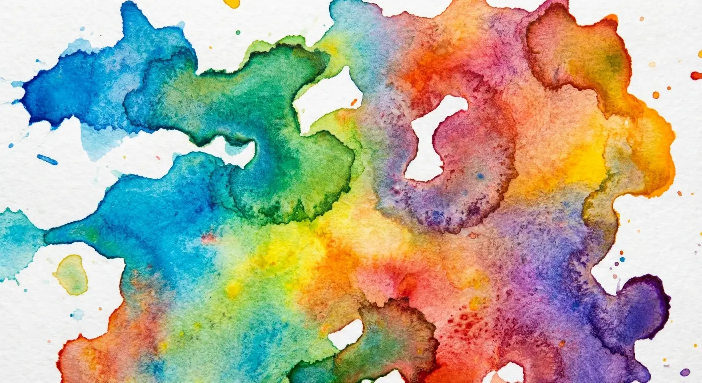
18. Watercolor Wash With Protected Lettering
Watercolor tattoos have gotten criticism for aging poorly. Here’s the workaround: use watercolor as an accent element around solid, well-executed lettering.
The name itself should be done in bold, clear lines (probably black) that will maintain their integrity over time. The watercolor wash provides atmosphere and emotion without compromising readability.
You’re creating a splash of color that frames or highlights the name instead of making the name itself out of watercolor.
Colors that have personal meaning work well. Birth month colors, favorite shades, or hues that represent specific emotions or memories.
The watercolor can be abstract (random splashes and drips) or shaped to suggest something specific, like a subtle heart shape or cloud formation. This technique gives you the artistic, painterly quality of watercolor while keeping the functional part (the name) protected and permanent.
Color saturation matters. Lighter washes will fade faster than deeper, more saturated colors. You might want to plan for touch-ups every few years to keep the watercolor vibrant, while the black lettering will need minimal maintenance.
I’ve criticized watercolor in this article. But I’ve also seen a few watercolor pieces age beautifully when done by the right artist with proper technique. I’m not saying never do it. I’m saying be very, very careful who you trust with it.
19. Architectural Element That Houses the Name
Frames, banners, ribbons, shields. These create a container for the name that adds formality and structure.
You’re essentially building a house for the text, which elevates it from simple lettering to a complete composition.
Banner ribbons (those curved, flowing ribbons that look like they’re waving) are classic for a reason. They provide clear boundaries and create elegant curves that complement letter forms. Shields or crests work well for family names or when you want a more traditional, heraldic feel. Geometric frames (rectangles, circles, hexagons) create modern, clean boundaries.
The architectural element serves multiple purposes. It draws the eye to the name, provides visual interest beyond the letters themselves, and gives you a framework that can be expanded or modified later.
Do you want the architectural element to be ornate, with decorative details and embellishments? Or minimal, with simple lines that define space without overwhelming it?
How does the element interact with the name? Does the text sit on top of it, wrap around it, or integrate into its structure?
The architectural approach works particularly well when you want the tattoo to feel formal, important, or ceremonial instead of casual.
I’ve designed pieces where the banner or shield becomes as important as the name itself, creating a balanced composition that tells a complete visual story.
20. Timeline Design That Shows When, Not Just Who
Adding dates, years, or timeline elements transforms a name from a simple label into a historical record.
You’re documenting not just who matters to you but when they entered your life or when specific moments occurred.
The timeline can be literal (a horizontal or vertical line with dates marked along it) or abstract, using visual elements that suggest progression or passage of time. Incorporate birth dates, anniversary dates, or dates of significant events alongside the name.
Roman numerals often work better than standard numbers because they have a more timeless, classical quality.
You might create a family timeline that shows multiple names with their corresponding dates, mapping out your family tree in a linear format. The timeline approach gives context and narrative structure that makes the tattoo more meaningful to you and more interesting visually.
How do you want to represent time? A straight line suggests steady progression. A curved line suggests the organic nature of life’s journey. A circular design suggests cycles and continuity.
You can use different visual markers (dots, stars, small icons) to indicate different types of events along the timeline.
I’ve created timeline pieces that span entire forearms or ribcages, telling decades of family history in a single cohesive design.
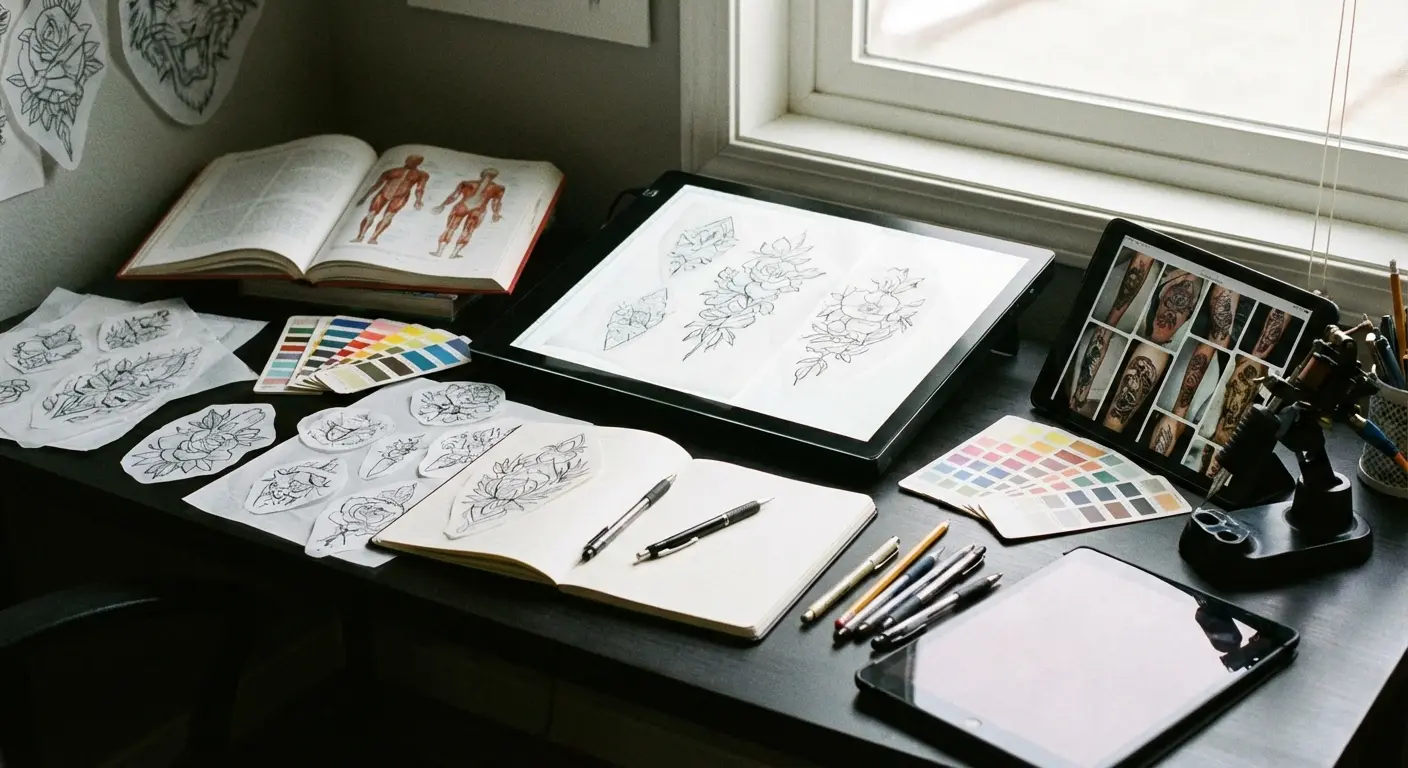
Bringing Your Design to Life
You’ve seen twenty approaches that prioritize placement, longevity, and storytelling over generic script across your wrist.
But here’s where most people get stuck: translating these concepts into a design that works for your specific body, your specific name, and your specific aesthetic preferences.
You’re not a designer. You shouldn’t have to be. Wrestling with design software or trying to communicate your vision through Pinterest screenshots creates frustration and often leads to compromises you’ll regret.
Okay, shameless plug time: This is why I built Tattoo Generator IQ. I was tired of watching people struggle to communicate their vision to artists. You describe what you want (the name, the style, the placement, the elements you want incorporated), and the AI creates multiple professional-quality variations in seconds.
You can explore different fonts, test various placements, add floral frames or geometric elements, and see exactly how everything looks together before you commit.
Your tattoo artist gets a clear, detailed reference that shows them precisely what you’re envisioning. No more hoping they’ll interpret your verbal description correctly. No more settling for clip art or generic flash designs.
You get to experiment with all the concepts I’ve covered here (body-aware placement, aging-resistant typography, narrative elements) and find the exact combination that works for you.
I’ve seen clients go through dozens of variations before landing on the perfect design. That exploration process is what separates tattoos you love forever from ones you tolerate.
End of pitch. Back to reality.
Final Thoughts
Name tattoos carry more weight than almost any other design because they’re tied to people, relationships, and moments that define your life.
Getting them right means thinking beyond the initial aesthetic appeal and asking harder questions. How will this work with my body’s mechanics? How will it age over the decades? What story will it tell beyond just the letters themselves?
The placements I’ve covered acknowledge that your body moves and changes. The typography choices prioritize readability thirty years from now, not just next week. The narrative approaches give you flexibility and depth that standalone text can’t provide.
You’re not just getting a name inked. You’re creating a permanent piece that needs to earn its place on your body.
Take time with the planning. Look at multiple placements. Think about how the design will look in different contexts and at different life stages.
Work with an artist who understands typography and has experience with name tattoos specifically. Ask to see their healed work from five or ten years ago, not just fresh pieces from last week. That’s where you’ll see whether their technique holds up over time.
A lot of tattoo artists will do whatever you ask because they want the money. Find one who pushes back. Who tells you when your idea won’t age well. Those are the artists who care about you, not just their portfolio.
The most meaningful name tattoos aren’t necessarily the most elaborate ones. Sometimes the most powerful approach is the one that’s built to last, designed to move with you, and structured to tell a story that goes deeper than the surface.
I’ve watched clients agonize over font choices and placement decisions, only to realize years later that the time they invested in planning was the best decision they made.
The difference between a name you’re proud to show and one you’re constantly explaining or covering up often comes down to these fundamental choices: placement that respects your anatomy, typography that accounts for aging, and context that gives the name room to breathe and evolve.
Your body is a living, changing thing. Design with that reality in mind, and you’ll end up with a name tattoo that grows with you instead of against you.
Listen, I can’t predict if that name will still mean the same thing in twenty years. What I can do is make sure that if it does, the tattoo still looks good. And if it doesn’t? That you have options.
Plan for the long game. Your future self will thank you.